

Human Experience Design is a pattern catalog for the deliberate composition of moments a person spends inside a designed environment or service flow — the choreography of arrival, threshold, immersion, peak, ending, and afterimage that determines whether a person remembers the time as worth their time. The book covers experiences staged in physical space (hospitality, retail, museums, themed entertainment, immersive theatre, brand activations) and in service flow (hospitality service rituals, customer experience, the seam between digital and physical channels). It does not cover graphic, screen-only UX as its primary subject — UX is well served by Tidwell, IxDF, Welie, and deceptive.design. This book operates above the screen, treating the interface as one channel among several.
The form is Christopher Alexander’s A Pattern Language and the Gang of Four’s Design Patterns. Each entry is a named pattern, antipattern, or concept with consistent anatomy: context, problem, solution, examples with project credits, sources, and links to related entries. Two book-specific fields — Sensory Channels and Inheres-In — name the modality and the canonical setting each pattern lives in.
Browse the Encyclopedia
Introduction — A person can walk into a place that was expensive, staffed, photographed, and still remember mostly friction. The lobby looks good but gives no first move. The queue moves but drains attention. The reveal lands before the guest is ready. The farewell is polite and forgettable. Human Experience Design is a pattern language for designing the physical and service-based experiences people walk into, walk through, and remember. Includes What’s New, Article Map, and more. View all 2 entries →
Foundations — The vocabulary and theory the rest of the book assumes. The on-ramp. Includes Experience Economy, Activation, Servicescape, Biophilic Design, Prospect and Refuge, and more. View all 15 entries →
Arrival and Threshold — The patterns of entry: how the guest crosses from the everyday world into the designed one. Includes Threshold of Disbelief, The Driveway, The Vestibule Pause, The Decompression Zone, The Briefing Ritual, and more. View all 9 entries →
Wayfinding and Choreography — The patterns of movement through the space. Includes The Weenie, The Wayfinding Spine, Kinetic Energy, Decision Point Calibration, The Choreographed Beat, and more. View all 5 entries →
Sensory and Atmospheric Design — Sound, scent, light, material, temperature, taste — the multisensory layer of the servicescape, named at the modality level. Includes Sensory Anchor, Sensory Layering, Sensory Congruence, Light as Choreography, The Soundtrack and the Silence, and more. View all 7 entries →
Narrative and Meaning — Story, theme, backstory detail, the Goffmanian frame, suspension of disbelief, narrative transportation, authenticity, place-identity. Includes Backstory Detail, Theme Coherence, Authenticity-Within-Frame, Place-Identity, Symbolic Crossing, and more. View all 6 entries →
Service and Ritual — The staff-guest contact patterns: greeting, recovery, anticipation, farewell, the brand-as-ritual, the named service standard. Includes The Greeting Standard, Anticipatory Service, Service Recovery Theatre, Farewell as Peak, Front-Stage / Back-Stage, and more. View all 6 entries →
Peak, End, and Memory — The architecture of remembering: the peak moment, the ending, the afterimage, the trophy, the ritual artefact, the share-out. Includes Peak-End Composition, The Trophy Artefact, The Shareable Moment, Duration Neglect, and more. View all 4 entries →
Setting-Specific Patterns — Patterns that genuinely do not transpose: the immersive-theatre mask convention, the museum interpretive-label tradition, the themed-entertainment land, the restaurant tasting menu, the experiential flagship store. Includes The Mask Convention, The Interpretive Label, The Themed-Entertainment Land, The Restaurant Tasting Menu, The Experiential Flagship Store, and more. View all 5 entries →
Ethics and Antipatterns — The dark side of the discipline: experience-washing, manipulated urgency, synthetic scarcity, dark patterns at the threshold of physical space, theme-park pastiche, manufactured authenticity, designed exclusion. Includes Experience-Washing, Synthetic Scarcity, Manufactured Authenticity, Theme-Park Pastiche, Sensory Overload, and more. View all 8 entries →
Human Experience Design
© 2026 BartleyEditions.com. All rights reserved.
No part of this publication may be reproduced, distributed, or transmitted in any form without prior written permission of the publisher, except for brief quotations in reviews and commentary.
About this book
Human Experience Design is a living document maintained by the Bartley engine. It is researched, written, edited, and deployed by AI agents operating under human-defined editorial standards.
The form is Christopher Alexander’s A Pattern Language (1977) and the Gang of Four’s Design Patterns (1994), adapted to a web-first audience and to the specific shape of human experience design.
Trademark acknowledgments. Disney, Walt Disney Imagineering, the Disney parks, Punchdrunk, Aman, Apple, Eleven Madison Park, Ritz-Carlton, Westin, Equinox, Meow Wolf, Sphere, the Smithsonian, the Tenement Museum, MoMA, the Tate, MONA, Restoration Hardware, Six Senses, Four Seasons, Singapore Airlines, ScentAir, Mood Media, and any other named property in this book is the trademark of its respective owner. Names appear descriptively in support of design analysis, never associatively.
A note on advice. This is a reference for design practice. It is not legal advice. Where a pattern interacts with regulation — accessibility (ADA, the European Accessibility Act, the SEGD ADA Task Force standards, IBCCES protocols, AAM frameworks), advertising claims (FTC enforcement of marketing terms such as “experience,” “immersive,” “heritage,” and “small-batch”), consumer-protection law on price-tier and provenance representations, occupancy and child-safety codes at high-density activations, country-of-origin and cultural-property and intellectual-property claims, historic-district zoning and design review, civic-architecture procurement standards, or healthcare facility-design codes — consult a licensed professional in the relevant jurisdiction. This advisory appears once, here, by design; entries that warrant pattern-specific cautions carry their own inline warnings.
“It is the process of buildings becoming alive that I am writing about. … The pattern language is the means.”
~ Christopher Alexander, The Timeless Way of Building (1979)
“Goods and services are no longer enough; what consumers want are experiences — memorable events that engage them in an inherently personal way.”
~ B. Joseph Pine II and James H. Gilmore, The Experience Economy (1999)
“When people evaluate an experience, they are not weighing the totality of what happened. They are remembering the peak and the end.”
~ Daniel Kahneman, Thinking, Fast and Slow (2011)
Introduction
A person can walk into a place that was expensive, staffed, photographed, and still remember mostly friction. The lobby looks good but gives no first move. The queue moves but drains attention. The reveal lands before the guest is ready. The farewell is polite and forgettable. Human Experience Design is a pattern language for designing the physical and service-based experiences people walk into, walk through, and remember.
The pressure is not a lack of craft. Hospitality teams, exhibition designers, themed-entertainment producers, service designers, and experiential agencies all know pieces of the work. The trouble is that the craft is scattered across house doctrine, academic concepts, conference talks, and project lore. Teams keep facing the same forces, but they often lack shared names for them: threshold, servicescape, narrative frame, sensory anchor, wayfinding spine, peak-end composition.
The problem shows up at the handoff between strategy and the lived moment. A brand promise, service blueprint, floor plan, or journey map may name what should happen, but it does not always tell a team how the guest crosses a threshold, finds the next move, trusts the frame, reaches a peak, and carries the ending away.
The book treats human experience design as the deliberate composition of that lived sequence: what a person notices on arrival, feels permitted to do, misunderstands, remembers later, and tells someone else.
The scope is physical and service-based experience. The book covers places and encounters where rooms, staff, objects, queues, screens, streets, and rituals all belong to the same moment: a hotel lobby, a museum gallery, a retail flagship, a themed land, a brand activation, a service recovery.
It is not a screen-only UX catalog, a brand-identity guide, an advertising manual, an event-planning checklist, an architecture or engineering reference, or a therapy and coaching handbook. Screens matter here when they are one channel in a larger situation: the check-in text that changes the arrival, the app that controls a queue, the ticketing flow that shapes the threshold before the guest reaches the door.
The pattern-language method matters because experiences are not made by choosing entries from a bag. A useful language grows from larger wholes into smaller acts. Each pattern, concept, and antipattern is a center in that structure. It names a recurring context, the forces at work, a response that can be applied or refused, the settings where it belongs, and the neighboring entries that support or constrain it.
Use the book generatively. If you are shaping a hotel arrival, you are not merely applying “The Driveway” or “The Vestibule Pause.” You are building a local language for that project: which thresholds matter, which sensory channels carry the promise, how staff behavior supports the frame, where the peak should fall, and what memory the ending should leave. The related links are grammar, not decoration. They show which moves support, complete, constrain, inherit from, or break one another.
Practitioners can enter at the problem surface. If a guest hesitates at the first turn, start with Arrival and Threshold or Wayfinding and Choreography. If the place feels thin despite strong visual design, read through Sensory and Atmospheric Design and Narrative and Meaning. If the experience ends cleanly but leaves no trace, start with Peak, End, and Memory. Follow related entries when the problem crosses into service, setting, ethics, or another layer of the sequence.
Relative outsiders should begin with Foundations. Those pages name the shared substrate: why experiences became an economic offering, how environments act on people, why endings matter, and how narrative frames change behavior. You do not need to be a theatre maker, hotelier, exhibition designer, or service designer to read the book. You do need enough vocabulary to separate ambience from attention, immersion from confusion, hospitality from friendliness, and authenticity from costume.
Ethics and Antipatterns is part of the method, not an appendix. The same tools that help a guest cross a threshold can manipulate urgency, exclude people, overload the senses, or manufacture authenticity. A serious language has to name both the pattern and the failure mode.
The aim is better judgment before better staging. When the language works, a team can see the experience as the guest lives it, choose the small moves that strengthen the whole, and leave people with memories that were designed with care rather than harvested by accident.
Pages
What’s New
Recent changes to Human Experience Design.
2026-06-25
What’s New
- New article: Perceived Control — the three forms of felt control (act, understand, choose) that decide how a wait, a crowd, or a pace actually lands on a guest.
- New article: Prospect and Refuge — the spatial-psychology concept behind why guests choose some seats, pause points, and viewing positions: outward view plus bodily shelter, with the evidence caveats named rather than hidden.
- New article: Environmental Storytelling — how a physical space tells its own story through spatial sequence and the arranged traces of events that already happened, the umbrella construct beneath backstory detail and theme coherence.
- Improved: Biophilic Design — cleaner definition prose, stronger in-book wayfinding, and a sharper distinction between restorative nature connection and decorative green signaling.
- Other: new proposals in the pipeline — Attention Restoration Theory (the named theory behind “restorative” environments) and Proxemics (the spatial-distance vocabulary behind service distance, table spacing, and queue density).
Metrics
- Total articles: 65
- Coverage: 65 of 67 proposed concepts written (97%)
- Articles edited since last checkpoint: 3
2026-06-20
What’s New
- New article: Biophilic Design — the evidence-backed nature-connection framework that separates restorative living-system cues from decorative greenwashing.
- Improved: Timed Entry — tighter prose around scheduled arrival slots, accessibility, and cleaner threshold-design guidance.
- Improved: Goal-Gradient Effect — clearer opening definition and example prose around why motivation rises as a visible finish line nears.
- Improved: Sensory Congruence — cleaner spa-opening example and tighter guidance on diagnosing sensory channels that fight each other.
- Improved: Emotional Contagion — sharper explanation of how authentic staff affect transfers to guests and why hollow service scripts fail.
- Improved: The Soundtrack and the Silence — redrafted the opening so the noise-floor problem lands faster and the article moves more directly into the design pattern.
- Improved: The Greeting Standard — a concrete service moment now opens the entry, and the greeting reads as a trained service system rather than a long script discussion.
- Improved: Service Recovery Theatre — a concrete service-repair opening clarifies that “theatre” means roles, timing, props, authority, and a scene the guest can understand.
- Other: proposed Proxemics as a Foundations concept for the spatial-distance vocabulary behind service distance, table spacing, exhibit boundaries, queue density, and crowding.
Metrics
- Total articles: 62
- Coverage: 62 of 64 proposed concepts written (97%)
- Articles edited since last checkpoint: 7
2026-06-18
What’s New
- New article: Timed Entry — how scheduled entry slots reshape an arrival surge before the line forms, when to use them, and how they fail (online-only gates, unforgiving windows, manufactured scarcity).
- New article: Virtual Queue — how to give guests their waiting time back with boarding groups, return windows, and callbacks, without faking scarcity or excluding the guest who can’t use the app.
- New article: Goal-Gradient Effect — why motivation intensifies as a visible finish line nears, why a punch card endowed with two free stamps beats an identical-effort blank one, and where honest progress design ends and dark-pattern manipulation begins.
- Improved: The Third Place — tighter throughout, with throat-clearing and filler cut so the entry reads more directly.
Metrics
- Total articles: 61
- Coverage: 61 of 63 proposed concepts written (97%)
- Articles edited since last checkpoint: 2
2026-06-16
What’s New
- New article: The Experiential Flagship Store — how a brand-owned retail destination stages the brand through architecture, staff, product trial, service, events, and operating discipline rather than merely selling inventory.
- New article: The Decompression Zone — why the first five to fifteen feet inside a retail entrance should stay clear of selling pressure until the shopper’s body has caught up with the store.
- New article: The Third Place — Oldenburg’s vocabulary for the informal public gathering place beyond home and work, and the test for when a venue earns that role.
- Improved: The Queue as Show — a new opening on-ramp and a shorter, cleaner account of how a queue becomes part of the show rather than a tax against it.
- Improved: Experience Co-Creation — the participation dial, guest-labor boundary, and three named cases now land faster without losing the Prahalad/Ramaswamy lineage or the extraction test.
- Improved: The Decompression Zone — the retail-threshold rule now lands faster: the first five to fifteen feet inside the door stay clear because the shopper is still arriving, not because the entrance is wasted space.
Metrics
- Total articles: 58
- Coverage: 58 of 61 proposed concepts written (95%)
- Articles edited since last checkpoint: 3
2026-06-14
What’s New
- New article: Sensory Congruence — the test of whether a space’s light, sound, scent, and material agree with one another and with the theme, so the body reads one coherent stimulus instead of several competing ones.
- New article: Experience Co-Creation — how the guest becomes a co-producer of the experience, the active-participation end of the experience economy, and where the participation dial pays off versus extracts free labor.
- New article: The Queue as Show — how to compose the waiting sequence as part of the experience rather than a tax against it, across themed entertainment, museums, hospitality, and immersive theatre.
- New article: Emotional Contagion — why a guest catches the staff’s genuine warmth, and why a mandated, hollow smile transfers little or worse: the mechanism beneath the book’s service-ritual patterns.
- Improved: Front-Stage / Back-Stage — shorter, cleaner sentences and a sharper Why It Matters, with the Disney utilidor, Eleven Madison Park, and Mass MoCA cases preserved in full.
- Improved: Farewell as Peak — the Disney, Eleven Madison Park, and Aman case studies now read in shorter, cleaner sentences without losing a single named detail.
Metrics
- Total articles: 55
- Coverage: 55 of 59 proposed concepts written (93%)
- Articles edited since last checkpoint: 2
2026-06-14
What’s New
- Improved: The Trophy Artefact — tighter prose with cleaner rhythm around how small take-away objects carry memory after the experience ends.
- Improved: Light as Choreography — corrected the Aman Tokyo lobby-lighting account and clarified Richard Kelly’s role in the lighting vocabulary.
- Improved: The Shareable Moment — tightened the prose around composing a recordable peak without letting the share displace the lived experience.
- Improved: Sensory Anchor — sharper opening, clearer first-time-reader on-ramp, and tighter prose while preserving every named example and source.
- Improved: Olfactory Throw and Decay — less repetition and more varied phrasing around scent reach, persistence, and clearance.
- Improved: Sensory Layering — clearer anchor-bed-accent grammar, a stronger opening, shorter case studies, and the same factual payload.
- Improved: Anticipatory Service — new recognition prompt and clearer prose around cue-reading, the back-stage substrate, the move inventory, and consequences.
Metrics
- Total articles: 51
- Coverage: 51 of 55 proposed concepts written (93%)
- Articles edited since last checkpoint: 7
2026-06-10
What’s New
- Improved: Register — tightened the baseline and transition argument so the concept reads faster while preserving the name-origin gate.
- Improved: Narrative Transportation — redrafted the opening so the measured construct lands before the theory, with tighter cases and source trail intact.
- Improved: Authenticity-Within-Frame — added faster first-read orientation and clearer case analysis while preserving the Goffman, Pine and Gilmore, MacCannell, Punchdrunk, Aman Tokyo, and Tenement Museum chain.
- Improved: Place-Identity — redrafted the opening around the term itself, then tightened the dual-recognition test, three named cases, and caveats.
- Improved: Symbolic Crossing — redrafted the entry so the threshold act arrives before the theory, with tighter context, solution, cases, consequences, and failure modes.
- Improved: Backstory Detail — compressed the prop-and-finish discipline, diagnostic, cases, consequences, and failure modes while preserving the factual spine.
- Improved: Peak-End Composition — redrafted the opening around the memory-pricing move, then tightened the budget discipline, case examples, consequences, and failure modes.
- Improved: Theme Coherence — clarified the difference between a world and a moodboard, then tightened the enforcement pattern, transfer guidance, cases, and failure modes.
- Improved: Duration Neglect — redrafted the opening around why remembered value does not scale with length, with tighter lab finding, operator implications, setting cases, and caveats.
Metrics
- Total articles: 51
- Coverage: 51 of 55 proposed concepts written (93%)
- Articles edited since last checkpoint: 9
2026-06-07
What’s New
- New article: Sludge — how to recognize unjustified friction, from the cancellation maze to the progress-less queue, and tell it apart from friction that earns its cost.
- New article: Register — the calibrated baseline a room runs at across light, sound, scent, service, and social codes.
- Improved: Ritual Saturation — tightened the How It Plays Out section so all four evidence cases are framed correctly.
- Improved: Sensory Overload — shortened sentences, reduced dashes, and turned the channel-audit and bed-calibration thresholds into scannable checklists.
- Improved: Sludge — redrafted the opening so the friction-turned-rent thesis lands before the supporting craft, with every named case and regulatory citation intact.
- Improved: Flow Channel — added a short opener explaining the challenge-vs-skill geometry and tightened the Disney’s Animal Kingdom example.
- Improved: Dramaturgical Frame — added a plain-language explanation of where the term comes from and tightened the prose throughout.
- Improved: Synthetic Scarcity — tightened the prose and added an Inheres-In section naming where the trap lives across settings.
- Other: added two concept proposals to the pipeline: Sensory Congruence and Experience Co-Creation.
Metrics
- Total articles: 51
- Coverage: 51 of 55 proposed concepts written (93%)
- Articles edited since last checkpoint: 6
2026-05-22
What’s New
- Improved: Activation — redrafted the concept so the four-property test lands sooner, the distinction from experience reads more plainly, and the cases across brand, museum, hospitality, retail, festival, and mixed-channel settings are tighter.
- Improved: Exclusion-by-Design — added a clearer opening, refreshed the accessibility-source citations, corrected the Sleep No More New York dates, and sharpened the distinction between recoverable and constitutive exclusion.
- Improved: Theme-Park Pastiche — clarified the opening, tightened the diagnostics, and made the Celebration, 1990s Las Vegas Strip, and Disney Springs cases easier to read.
- Improved: Manufactured Authenticity — clarified the opening, sharpened the false-provenance diagnostics, and cleaned up the speakeasy-style hospitality and Galaxy’s Edge case treatment.
- Structural: added linked entry lists to each section page so readers can move from a section overview directly into its entries.
Metrics
- Total articles: 49
- Coverage: 49 of 52 proposed concepts written (94%)
- Articles edited since last checkpoint: 4
2026-05-15
What’s New
- Improved: Experiencing Self vs. Remembering Self — redrafted about a third shorter with a plain-orientation note naming Kahneman’s two-selves construct, a cleaner opening that lands the dual-target premise, and tighter case studies for a Magic Kingdom day, an Eleven Madison Park evening, and a Sleep No More run.
Metrics
- Total articles: 49
- Coverage: 49 of 51 proposed concepts written (96%)
- Articles edited since last checkpoint: 1
2026-05-12
What’s New
- Improved: Experience Economy — redrafted about a third shorter with a plain-language note on the 1998 Harvard Business Review coinage, a cleaner opening that lands the four-step progression quickly, and tighter case write-ups for MagicBand+FastPass+, the Sphere, and Aman Tokyo.
- Improved: Servicescape — redrafted about a third shorter with a plain-language note distinguishing Bitner’s 1992 construct from earlier “atmospherics” thinking and a cleaner opening; same three dimensions, five sources, and three named cases (Equinox Hotel Hudson Yards, the U.S. Holocaust Memorial Museum permanent exhibition, the Apple Tower Theatre).
- Improved: Peak-End Rule — redrafted about a third shorter with a plain-orientation note that names the 1993 paper and the trade-press slippage, a clearer opening that lands the working answer in the first paragraph, and three case studies (Disneyland’s kiss-goodnight closing, Ritz-Carlton’s wow-story spend, Aman Tokyo’s send-off) that read as briefable specifications.
- Improved: Material Honesty — redrafted with a plain-language note on the modernist origin of the term, a tighter opening, and compressed case write-ups for Aman Tokyo, Eleven Madison Park, and RH New York that keep every credit, date, and material specification intact.
- Improved: Threshold of Disbelief — redrafted with a plain-language note on the Coleridge lineage, a tighter opening that names the six enacted-acceptance moves (mask, briefing, costume, oath, token, line), and compressed case write-ups for Sleep No More, the USHMM Identification Card, and the Nordic LARP intake conventions.
- Improved: The Façade Promise — tightened by a third with a short etymology note placing the term in Venturi, Scott Brown, and Izenour’s Learning from Las Vegas lineage (the duck / decorated-shed distinction) and Goffman’s 1959 framing of every front as a claim the back has to honor.
- Improved: Experience-Washing — tightened by a third with a short etymology note tracing the term’s lineage to greenwashing and naming Pine and Gilmore’s 1998 coinage of experience as a staged offering.
Metrics
- Total articles: 49
- Coverage: 49 of 51 proposed concepts written (96%)
- Articles edited since last checkpoint: 7
2026-05-10
What’s New
- Improved: Introduction — replaced the scaffold with a full orientation to the book’s scope, reader paths, and pattern-language frame for designed moments.
- Improved: The Briefing Ritual — redrafted the entry about forty-five percent shorter, with a clearer opening that distinguishes the pattern from a welcome speech.
- Improved: The Driveway — redrafted the entry about a third shorter while preserving the same six design decisions, four named cases, and seven failure modes.
- Improved: The Vestibule Pause — tightened the lede, sentence cadence, and case prose while preserving the same named examples and specifications.
- Improved: The Choreographed Beat — added a clearer opening and shortened the case studies around naming, cueing, and rehearsing timed experience moments.
- Improved: The Themed-Entertainment Land — clarified the boundary-and-operations argument and shortened the treatment of where the pattern does and does not transpose.
- Structural: shortened public slugs and section paths across the book so article URLs match the current naming policy.
Metrics
- Total articles: 49
- Coverage: 49 of 50 proposed concepts written (98%)
- Articles edited since last checkpoint: 6
2026-05-09
What’s New
- New article: Olfactory Throw and Decay — how scent reach, persistence, and clearance become operating specifications for lobbies, galleries, retail floors, and other designed places.
- New article: Ritual Saturation — the antipattern of stacking service rituals until care reads as pressure, performance, or surveillance, with diagnostics and correction moves for greetings, anticipation, recovery, and farewells.
- New article: The Interpretive Label — how a museum label becomes a calibrated text object with a tier, reading condition, authorship stance, accessibility floor, and object-side job, with cases at Wellcome Collection, Mona, and Star Wars: Galaxy’s Edge.
- New article: The Shareable Moment — how to compose one photographable, recordable, or retellable peak while keeping the lived experience primary and the share as the afterimage, with cases at Sphere, Meow Wolf, and tasting-menu service.
- New article: The Soundtrack and the Silence — how music, ambient sound, speech intelligibility, noise floor, and deliberate silence shape pace, dwell, attention, rest, and access, with cases at Starbucks, Sleep No More, and Rothko Chapel.
- New article: Light as Choreography — how brightness, darkness, color temperature, direction, contrast, and timed light changes tell guests where to look, how fast to move, when to pause, and what emotional register a room is asking for, with cases at Aman Tokyo, Apple Fifth Avenue, and Sleep No More.
- New article: The Restaurant Tasting Menu — how a multi-course meal becomes a bounded hospitality sequence with a declared frame, scored course arc, protected peak, live table read, and composed close.
- New article: The Trophy Artefact — how small earned or assigned objects carry a peak, crossing, recovery, or farewell into the guest’s later memory, with cases at Disney pin trading, Eleven Madison Park’s granola parting gift, and the United States Holocaust Memorial Museum’s identification cards as the ethical-boundary case.
- New article: Decision Point Calibration — how to place, space, and preview route choices so guests are not asked to choose too early, with too many options, or without a recoverable wrong turn.
- New article: Kinetic Energy — how visible motion from people, vehicles, water, staff, stairs, and timed systems keeps a designed place from feeling inert, with cases at 1967 Tomorrowland, Bellagio, and Apple BKC.
- Improved: The Weenie — added a short Etymology block at the top explaining the dog-training origin of Walt Disney’s coinage (a cocktail wiener held aloft to lure a dog across a room, per John Hench’s Designing Disney) and noting that weenie names the lure function, not physical scale, which is why the same word covers a 189-foot castle, a six-story spiral ramp, and a single carbon-fiber staircase.
Metrics
- Total articles: 49
- Coverage: 49 of 49 proposed concepts written (100%)
- Articles edited since last checkpoint: 1
2026-05-08
What’s New
- New article: Sensory Overload — the over-application of Sensory Layering until the channels compete rather than reinforce; nine diagnostic symptoms, a five-discipline correction, and three named cases — a maximalist casual-dining chain (unrecovered), the 1990s–2000s Las Vegas casino floor (recovered at scale across the Wynn / Cosmopolitan / ARIA renovation cycle), and the IBCCES Certified Autism Center designation in themed entertainment (recovery as working standard).
- New article: The Themed-Entertainment Land — a contiguous, bounded region whose every visible element shares one declared theme, with thresholds at its boundaries and a rule-system that holds the frame; cases at Disneyland Park, Pandora at Disney’s Animal Kingdom, and Aman Tokyo’s Otemachi tower.
- New article: The Briefing Ritual — a short, scripted, staff-led moment at the threshold that turns an implicit crossing into a witnessed contract; cases at Sleep No More, the U.S. Holocaust Memorial Museum, and Nordic LARP intake conventions.
- New article: The Mask Convention — Punchdrunk’s invention of the white-masked, silent audience as the structural condition that licenses immersive theatre’s whole-building dramaturgy; with a refusal to claim the convention transposes.
- New article: The Choreographed Beat — the time-axis cousin of the Wayfinding Spine and the Weenie; cases at Walt Disney Imagineering’s Pirates of the Caribbean, Sleep No More, and Eleven Madison Park’s tasting menu.
- New article: Symbolic Crossing — the small, repeatable ritual move that marks a guest’s transition between regions and that other guests and staff read; cases at Sleep No More’s mask handoff, the USHMM’s identity card, and Disney character meet-and-greets.
- New article: The Vestibule Pause — the small, sized, held interior between the entry door and the venue’s primary room, calibrated to drop the body’s sensory baseline; cases at Aman Tokyo, Eleven Madison Park, and Sleep No More.
- New article: The Driveway — the slow choreographed approach that relocates the body’s transition outdoors, with four named calibrations (Amanpuri, Amangiri, the Getty Center tram, Disneyland’s berm-and-tunnel sequence).
- New article: Synthetic Scarcity — manufactured time-pressure, capacity-pressure, or limited-edition framing where the underlying constraint is fictional; with diagnostics, a five-move recovery, and worked cases at the booking-flow and venue surfaces.
- New article: Activation — the field’s working unit of commission, defined by four constitutive properties; cases at the Adidas Originals “Glitch” pop-up, the Tate Modern Hyundai Commission, and the Hotel Saint Vincent Pop-Up Restaurant Series.
- New article: The Façade Promise — calibrating a venue’s exterior face against its interior so the promise the façade makes is neither over- nor under-delivered; cases at the Apple Fifth Avenue Cube, Aman Tokyo, and the Apple Tower Theatre.
- New article: Threshold of Disbelief — the explicit invitation to suspend ordinary causal reasoning that gates entry to immersive experiences; grounded in Huizinga’s magic circle, Goffman’s frames, and Bell’s ritual theory.
- New article: Theme-Park Pastiche — naming and refusing the import of theme-park surfaces (forced perspective, costumed greeters, scripted “magic moments”) into corporate, healthcare, residential, and civic settings that have not earned them.
- New article: Material Honesty — the position that materials should read as what they actually are, drawn from architectural modernism and the Pawson-Hill-Aman lineage; cases at Aman Tokyo, Eleven Madison Park, and RH New York.
- New article: Flow Channel — Csikszentmihalyi’s calibration of perceived challenge against perceived skill, with the narrow band between anxiety and boredom as the substrate the field’s hand-waved word engagement rests on.
- New article: Place-Identity — the move that distills a real place’s culture, history, and ecology into a designed environment, with the dual-recognition test as the working yardstick.
- New article: Narrative Transportation — Green and Brock’s measurable construct of being absorbed into a narrative such that the surrounding world recedes; cases at Sleep No More, Pandora, and the Tate Modern Turbine Hall.
- New article: Dramaturgical Frame — Goffman’s metaphor of social life as theatre, applied as the working analytic for service and experience design; cases at Eleven Madison Park, Walt Disney Imagineering, and Sleep No More.
- New article: Manufactured Authenticity — the antipattern of pretending a designed environment is an organic discovery rather than a deliberate composition; with diagnostics, recovery, and two named cases.
- New article: Farewell as Peak — how to author the closing minute of an experience as a deliberately composed peak rather than as administrative cleanup; cases at Disney park close, Eleven Madison Park, and Aman Resorts.
- New article: Backstory Detail — the prop-and-finish-layer discipline that asks of every visible element “where does this come from in our world?”; cases at Galaxy’s Edge, Sleep No More, and the Tenement Museum.
- New article: Theme Coherence — the venue-level rule structure that distinguishes a coherent place from a Vegas-strip pastiche; cases at Disneyland Main Street, Aman Tokyo, and MONA Hobart.
- New article: Experience-Washing — the antipattern of marketing a superficial engagement as an experience without doing the compositional work the price tier and the vocabulary imply; with diagnostics, a five-discipline recovery, and two named cases.
- New article: Exclusion-by-Design — the antipattern of composing an experience whose participation requires a baseline that excludes substantial populations without naming the filter as a design decision.
- New article: Sensory Layering — the deliberate composition of multiple sensory channels into a single coherent stimulus, organized as one signature anchor against a steady ambient bed and a small inventory of rotating accents.
- New article: The Greeting Standard — the named, scripted, calibrated first contact between staff and guest; cases at the Ritz-Carlton, Disney, and Aman across the scripted-versus-licensed axis.
- New article: Anticipatory Service — the discipline of acting on a guest’s need before it is voiced; cases at Aman, Four Seasons, and Eleven Madison Park.
- New article: Sensory Anchor — the discipline behind a single signature sensory cue (scent, sound, or visual) so consistently bound to a place that re-encountering it triggers memory; cases at Westin White Tea, United Airlines’s “Rhapsody in Blue,” and Magnolia Bakery.
- New article: Service Recovery Theatre — the deliberately composed, pre-authorized front-stage repair that converts a service trough into the encounter’s most-told moment; cases at the Ritz-Carlton, Disney, and Apple’s Genius Bar.
- New article: The Wayfinding Spine — the layout-scale pattern that organizes a complex venue’s circulation into a sequenced journey; cases at the Magic Kingdom, IKEA, and the U.S. Holocaust Memorial Museum.
- New article: Authenticity-Within-Frame — the position that authenticity in a designed experience is the consistency of artifice within a declared frame, not the absence of artifice; defended with a four-question test and three cross-genre cases.
- New article: Duration Neglect — the Kahneman finding that the length of an experience contributes very little to its remembered evaluation, and the licensing argument it makes for short, well-composed experiences over long, average ones.
- New article: The Weenie — Walt Disney’s term for a sized visual landmark placed where the guest’s choice of direction is being asked; runs at the Cinderella Castle, Guggenheim, and Apple Park staircase scales.
- New article: Front-Stage / Back-Stage — Goffman’s distinction translated into the working service-design boundary; cases at WDW’s underground utilidor, Eleven Madison Park, and Mass MoCA.
- New article: Peak-End Composition — the book’s first Pattern entry; the compositional discipline of authoring an experience’s peak and end together while letting the middle hold an operational floor.
- New article: Experiencing Self vs. Remembering Self — Kahneman’s framework distinguishing the self that lives an experience from the self that summarizes and rates it after the fact, with the cold-pressor study as the founding case.
- New article: Peak-End Rule — Kahneman’s finding that the remembered quality of an experience is dominated by its peak intensity and its end; cases at Disneyland’s “kiss goodnight,” the Ritz-Carlton, and Aman Tokyo.
- New article: Servicescape — Mary Jo Bitner’s 1992 model treating the physical environment of a service setting as a deliberate stimulus on customers and employees; cases at the Equinox Hotel Hudson Yards, USHMM, and the Apple Tower Theatre.
- New article: Experience Economy — the founding vocabulary that frames staged experiences as a distinct paid offering, with the four-quadrant grid and the contested fifth offering of transformation; cases at Disney, Sphere, and Aman Tokyo.
Metrics
- Total articles: 39
- Coverage: 39 of 49 proposed concepts written (80%)
- Articles edited since last checkpoint: 0
Explore the Map
This interactive graph shows every pattern, concept, and antipattern in Human Experience Design and how they connect through their Related Articles links. The layout clusters articles by section, and the connections reveal the deep structure of the pattern language across the staged moments of an experience, the ensembles that perform them, and the operational systems that let an organization run them at scale.
The key below names each type and defines what it covers. Larger nodes have more connections. Hover to see details and highlight connections. Click any node to read its article.
| Symbol | Type | What it covers |
|---|---|---|
| Pattern | A named solution to a recurring problem. | |
| Antipattern | A recurring trap that causes harm — learn to recognize and escape it. | |
| Concept | Vocabulary that names a phenomenon. |
Foundations
The vocabulary and theory the rest of the book assumes. The on-ramp.
This section names the core concepts every later entry leans on without re-introducing: the experience-economy framing that says experiences are a distinct paid offering above commodities, goods, and services; the activation construct that names the field’s working unit of commission; the peak-end rule and duration neglect that explain why the shape of an experience matters more than its average; the flow channel that calibrates challenge against skill; the servicescape that treats the physical environment of a service setting as a deliberate stimulus on customers and employees; the narrative-environment tradition that lets the room itself do the storytelling; the dramaturgical frame that names the front-stage / back-stage distinction running underneath every service entry; the difference between the experiencing self that lives the moments and the remembering self that retrospectively summarizes them.
The reader does not need to come in with this vocabulary. The entries here introduce it, citing primary sources — Pine and Gilmore, Kahneman, Csikszentmihalyi, Bitner, Mehrabian and Russell, Goffman, Green and Brock, Austin — at a depth a working practitioner can absorb in one sitting and refer back to when an entry in a later section invokes the term.
Foundations is the longest concept-heavy section in the book by deliberate choice. The field’s biggest gap is shared vocabulary; entries here close that gap. Pattern entries that depend on a concept in this section link back to it via Understand This First and via the depends-on graph relation. Concepts here are entry points to multiple downstream patterns rather than dead-end definitions.
What comes after Foundations is the seven-section sequence that follows the experience itself in time and in scale: arrival and threshold; wayfinding and choreography through the body of the experience; the sensory and atmospheric layer that gives the body texture; the narrative and meaning layer that gives it significance; the service and ritual layer that names the staff-guest contact patterns; the peak, end, and memory layer that determines what the guest carries home; the setting-specific patterns that genuinely do not transpose; and finally the ethics and antipatterns that name the dark side of the discipline.
Read straight through, or land on a specific concept and follow its outgoing links into the rest of the book.
Entries
- Experience Economy
- Activation
- Servicescape
- Peak-End Rule
- Experiencing Self vs. Remembering Self
- Flow Channel
- Goal-Gradient Effect
- Narrative Transportation
- Dramaturgical Frame
Experience Economy
The macro-framing that experiences are a distinct paid offering above commodities, goods, and services, and that staging them is a discipline with its own substrate, vocabulary, and economics.
B. Joseph Pine II and James H. Gilmore coined the phrase in a Harvard Business Review essay in July 1998. Their claim was narrower than the term sounds today: experiences price differently, scale differently, and compete on different axes. The label has since drifted into ad copy for anything aspiring to feel premium. The construction underneath stays specific, and that specificity is what makes the term useful in a brief.
Definition
The experience economy is the claim that economic offerings have followed a four-step progression (commodities, goods, services, experiences) and that experiences are now a distinct paid category (Pine and Gilmore, The Experience Economy (Harvard Business Review Press, updated edition 2019), pp. 1–9). A coffee bean is a commodity; ground coffee in a tin is a good; a cup at a diner is a service; the same cup poured on a velvet banquette while a pianist plays Cole Porter is an experience. Cents, a dollar, three, ten or fifteen. The customer is paying for time spent in a particular way.
Pine and Gilmore organize the offering on two crossed axes: active against passive participation, absorption against immersion. The crossing produces four offering categories, what they name the four realms: entertainment (passive absorption, a concert), educational (active absorption, a cooking class), esthetic (passive immersion, Tate Modern’s Turbine Hall), and escapist (active immersion, a Punchdrunk show, a Sphere screening, Rise of the Resistance). The richest experiences sit near the center, in what Pine and Gilmore call the sweet spot.
The 2011 second edition added a contested fifth offering: transformation, the claim that some firms charge to change the customer. Therapists, fitness coaches, education-as-degree, hospitality formats. Pine and Gilmore treat it as worth naming and worth holding at arm’s length. The word has since drifted into a generic compliment in wellness copy and guru-coded design talks. Where this book uses it, it points back to Pine and Gilmore; everywhere else, it is banned.
Why It Matters
The framing does three things at once that no surrounding discipline does on its own.
It names the offering. Before Pine and Gilmore, the work was called “atmospherics” (Kotler, “Atmospherics as a Marketing Tool,” Journal of Retailing (Winter 1973–1974)), “servicescape” (Bitner, Journal of Marketing (April 1992)), “themed environment” (Karal Ann Marling on the Disney parks; the Imagineering Field Guide series), or nothing at all. Each name covers a piece. “Experience” names the whole, including the part the customer pays for. A hotel director can now brief design an experience, priced at the experience tier instead of we want it to feel nice. The two briefs produce different buildings.
It declares the economics. A service is bought to save time (a haircut, a tax filing). An experience is bought to spend time well. That inversion explains why a tasting menu prices on duration rather than calories, why a museum charges admission rather than per object viewed, and why a themed ride sells the line as well as the ride. It also explains why experience-business unit economics are unforgiving: a rented seat does not refresh between guests at no marginal cost the way a saved file does.
It opens the design space. Every choice the designer used to call “production design” or “service design” becomes legible as one discipline with patterns, antipatterns, and measurable outcomes. The four offering quadrants give the practitioner a coordinate system. A brand activation in the entertainment quadrant is doing one thing; one pulling toward absorption and immersion is doing four.
How It Shows Up
Three cases where the priced product is unmistakably the experience.
MagicBand and FastPass+ at Walt Disney World (rolled out 2013–2014; Frog Design with the Walt Disney Imagineering interaction team; reported investment north of USD 1B). The system’s value is not faster transactions. It is a smoother staging of the day, with the wait absorbed into anticipation and every touchpoint scripted as a beat. Per-guest spend rose after rollout. The Walt Disney Company adopted Pine-and-Gilmore vocabulary internally in the early 2000s; the longer arc is the company’s transition from “park” to “vacation destination” since 1971.
The Sphere at the Venetian, Las Vegas (opened September 2023; Madison Square Garden Entertainment with Populous; USD 2.3B construction cost). A venue built for one offering: a 90-minute escapist-quadrant experience inside an 18,600-seat sphere lined with a 16K LED inner surface and a 167,000-speaker beamforming sound system. Tickets price between USD 109 and USD 349, an order of magnitude above conventional cinema. The guest enters the experience and the work enters the guest. Roughly USD 200M in opening-year revenue is the pricing thesis tested at architectural scale.
Aman Tokyo’s lobby (opened December 2014; Otemachi Tower 33rd floor; Kerry Hill Architects with Aman’s interior-design team). A 1,200-square-meter room whose work-product is the threshold sequence (paced cedar planks, a 12-meter washi paper lantern, a controlled-temperature stone basin) the guest crosses before the front desk. The sequence nets to roughly 15 seconds. Aman charges no admission. The operating room rate (USD 1,800–4,500 per night against USD 800–1,200 for a comparable five-star nearby) prices in the staging.
The framing shows up at lower price points wherever the staging is the differentiator. Third-wave coffee shops priced on the room rather than the bean (Heart Coffee Roasters in Portland, Verve Coffee Roasters in Tokyo). Retail flagships built as visit destinations (the Apple Tower Theatre in Los Angeles, the RH Marin gallery). Immersive theatre priced at three to four times a comparable seat (Punchdrunk’s Sleep No More at the McKittrick Hotel in New York, 2011–2024).
Caveats and Open Questions
Three open seams matter to working practice.
The transformation question. Pine and Gilmore’s claim that transformation is the next offering above experiences has not been validated as a separate category in the operations-management literature. The word is sometimes a useful framing for outcomes-based service contracts (a coaching engagement priced on the change in the client’s behavior) and sometimes a marketing flag the seller cannot honor. See Authenticity-Within-Frame for the adjacent question of when staged experiences earn the term authentic.
The commodification critique. A live thread, sharpest in critical hospitality studies and the theatre-studies literature on Punchdrunk and Meow Wolf, holds that pricing time-spent-with-meaning bends the meaning out of shape. Pine and Gilmore answer with the authenticity argument; the academic literature is not satisfied. The working stance: the critique is sometimes right and rarely an excuse to refuse the work. See Experience-Washing for the canonical antipattern.
Measurement. The pricing claim has held up across a twenty-five-year line of Cornell Hotel Quarterly and Journal of Service Research studies. The four-quadrant typology has been adopted by practitioners but has weak independent confirmation as a measurement instrument. The sweet spot claim is best read as a design heuristic, not a tested construct.
A separate caveat about vocabulary discipline. “Experience” now appears in ad copy where the offering is plainly a service or a good. The framework is most useful when its specific construction stays intact (the four-step progression, the two crossed axes, the four offering categories, the pricing thesis) and most diluted when “experience” is used as a generic upgrade label.
Related Articles
Sources
- B. Joseph Pine II and James H. Gilmore, The Experience Economy: Competing for Customer Time, Attention, and Money (Harvard Business Review Press, updated edition 2019), originally published 1999. The founding work; the four-step progression, the two-axis four-quadrant grid, and the transformation thesis are all elaborated here.
- B. Joseph Pine II and James H. Gilmore, “Welcome to the Experience Economy,” Harvard Business Review (July–August 1998). The argument’s first compact form; still the most-cited single article in the literature.
- Mary Jo Bitner, “Servicescapes: The Impact of Physical Surroundings on Customers and Employees,” Journal of Marketing (April 1992). The environmental-psychology substrate that experience-economy thinking operates on at venue scale; co-canonical with Pine and Gilmore in the academic literature.
- Philip Kotler, “Atmospherics as a Marketing Tool,” Journal of Retailing (Winter 1973–1974). The pre-Pine-and-Gilmore name for part of what the experience economy frames as the whole; cited for the lineage Pine and Gilmore explicitly built on.
- Erving Goffman, The Presentation of Self in Everyday Life (Doubleday, 1959). The dramaturgical metaphor Pine and Gilmore borrow without citation in their core staging argument; visible in the front-stage and back-stage vocabulary every service-design entry in this book uses.
Activation
The field’s working unit of commission: a bounded-duration, branded engagement composed by an operator to shift a participant’s relationship to a brand, theme, place, product, story, or moment.
“Activation” is one of those agency words that becomes mush unless the brief pins it down. A room, a campaign, a product launch, a pop-up, and a sponsored gallery can all be called activations. The useful question is not whether the word sounds fashionable. It is whether the work has a clear operator, a visible end date, voluntary participants, and a commercial frame someone must defend after the lights come down.
Definition
An activation is a bounded-duration, branded engagement composed by an operator to shift a participant’s relationship to a brand, theme, place, product, story, or moment. The word entered practitioner vocabulary through experiential marketing in the late 1990s and early 2000s, before “experience design” became a job title. It still travels fastest through agencies, brand teams, marketing P&Ls, and trade publications.
Four properties define the unit.
- An operator with composition authority. A brand, agency, museum, hotel, or producer can commission the engagement, brief the team, sign the lease, hire the staff, and accept or reject the install. Without that single authority, the thing is a venue or a market.
- A declared duration whose end is public from the start. A five-day pop-up, three-month museum installation, season-long campaign, or one-evening flagship event is bounded in a way a permanent restaurant, flagship, or attraction is not. The visible end date gives Peak-End Composition unusual force.
- A voluntary participant. The participant chooses to walk in, can walk out, and pays with time, attention, money, or some mix of the three. A mandatory training session or customs queue is not an activation, because the person is captive.
- A defensible commercial frame. The activation has a sponsor, P&L, KPI structure, and case for the spend. Even a museum installation or foundation-backed civic event has a board-facing reason to exist.
When one property fails, the work is something else: a permanent venue, captive program, marketplace, or private gathering. When one property wobbles, the brief should name the stretch.
The word is older than “experience design” and younger than “atmospherics” or Servicescape. It gained force in the 2000s as experiential marketing professionalized, then saturated trade-press copy in the 2010s. By 2020 most brand-strategy decks used the noun without defining it. This entry keeps the word useful by giving it a test.
Why It Matters
Activation and experience name different units. The activation is the format commissioned. The experience is the offering category the format may or may not deliver; see Experience Economy for the larger pricing frame. A five-day brand pop-up can be honest as an activation. It becomes Experience-Washing when the copy sells it as an “immersive experience” without paying for staging, choreography, service ritual, or a real peak.
The four-property test is a brief-stage diagnostic. If the operator is unclear, the work may be a market or venue. If the duration is indefinite, it may be a building. If the participant cannot leave, it is a captive program. If no one must defend the spend, it is closer to a private gathering. The test is faster than a discovery workshop and often more honest.
The properties also change the budget. A bounded duration concentrates remembered evaluation, so the closing beat matters more in a five-day pop-up than in a building people revisit for years. A voluntary participant defines the sample for dwell, return-visit, and conversion measures. The commercial frame tells the sponsor, board, P&L owner, or foundation what was bought: this unit, for this population, over this duration, with these outcomes.
How It Shows Up
The four constitutive properties are most visible where the operator, the duration, the voluntariness, and the commercial frame are all explicit and easy to point at.
Brand activation: Adidas Originals “Glitch” pop-up at 12 Hanbury Street, London (Adidas with brand-experience agency Lippe Taylor and event production by INVNT, opened February 2018 for a six-week run; variants in Tokyo and Berlin through 2018; covered in Event Marketer, BizBash, and the brand’s published case study). The six-week ticketed pop-up occupied a 4,500-square-foot Spitalfields shopfront to introduce a modular-football-boot product. Adidas controlled the visible decisions; the run had a public close date; the participant chose to download the invite-only app, queue, enter, and play the in-store mini-game; the commercial frame was awareness, trial, earned media, dwell, return-visit, and product-trial conversion.
Museum gallery activation: Tate Modern Turbine Hall Hyundai Commission, ongoing since 2015. Hyundai’s ten-year sponsorship produces a sequence of bounded activations: each commission opens in October and closes in March, the artist is announced, and the brief is public. The 2018 Tania Bruguera commission, 2019 Kara Walker Fons Americanus, and 2023 El Anatsui Behind the Red Moon are all six-month instances of the same unit. The museum holds composition authority through its curatorial team; the visitor is voluntary; the commercial frame is the sponsor-museum compact covered in The Art Newspaper, Frieze, and Tate’s commission catalogues.
Hospitality activation: Hotel Saint Vincent “Pop-Up Restaurant Series,” New Orleans (Hotel Saint Vincent with rotating chef partners, ongoing since the property’s 2021 opening). The hotel runs three-to-six-week guest-chef residencies: Camille Lindsley in 2022, Maison Premiere’s bar takeover in 2023, Compère Lapin’s garden residency in 2024. The hotel controls the venue and format, the duration is public, the diner is voluntary, and the commercial frame is the hotel’s hospitality P&L, reputation draw, and food-and-beverage revenue, documented in Eater, Bon Appétit, Hospitality Design, and the hotel’s F&B calendar. The permanent venue is the substrate; the activation is the temporary unit composed on top.
The same unit appears at smaller scales: WeTransfer’s “Please Leave” pop-up exhibitions at Boiler Room events (London, Berlin, New York, 2018-2022); Nike “House of Innovation” gallery activations inside permanent flagships (NYC, Paris, Shanghai, 2018 onward); SXSW “Brand House” sponsorships that take over Austin storefronts for the festival’s nine-day window; and Apple “Today at Apple” classes that activate permanent retail space through bounded sessions.
A permanent themed-attraction land such as Galaxy’s Edge at Disneyland or Pandora at Disney’s Animal Kingdom is not an activation because its duration is not public and bounded. It is a venue. A limited-time overlay inside that venue, such as Halloween Time at Disneyland from September through October or Disneyland Paris Marvel Season, is an activation by the four-property test.
Caveats and Open Questions
Activation versus experience. Pine and Gilmore reserve “experience” for a staged offering with an engineered peak, engineered end, sensory layering, narrative beat, service ritual, and measured outcome (Pine and Gilmore The Experience Economy, 2019, pp. 1-9). The field uses “activation” for the unit and “experience” for the category the unit may deliver. The words coexist when the brief respects the distinction. They collide when the marketing copy sells a brand-awareness moment, product-trial event, service-flow demonstration, or photo-feed touchpoint as an experience without paying the staging cost.
Permanent venues. A permanent flagship can run an activation series, as Nike House of Innovation and Apple flagships do through “Today at Apple.” The unit applies at the program scale, not the building scale. A pop-up that extends once and then becomes permanent crosses the boundary the other way. Once the duration becomes indefinite, the work has graduated into a venue and should be rebriefed.
Digital and mixed-channel work. This entry is written for physical and service-flow design, but the unit also appears in brand-led Discord event sequences, Twitch-streamed product launches, TikTok creator takeovers, and Roblox or Fortnite activations. The four properties translate with care: the operator is the brand or platform partner, the duration is bounded, the user can leave, and the commercial frame is the marketing P&L. The Mixed-Channel CX section carries the seam.
Measurement. The four-property definition is a working construct, not a validated measurement instrument. Empirical work on activation outcomes is scattered across brand-experience studies in the Journal of Product & Brand Management, dwell and return-visit studies in the Cornell Hospitality Quarterly, and narrative-transportation work in the Journal of Consumer Research. There is no accepted scale on which one operator can say an activation scored 7 and the comparison case scored 5. Treat activation as the format. Measure the outcome through the relevant constructs: peak-end composition, narrative transportation, flow channel, conversion, dwell, or return visit.
The word still carries marketing baggage. Readers from museums, immersive theatre, civic architecture, and public art may hear agency-deck shorthand. The book uses the word because the field uses it and because no neutral substitute does the same work. The four-property test is the price of admission.
Related Articles
Sources
- B. Joseph Pine II and James H. Gilmore, The Experience Economy: Competing for Customer Time, Attention, and Money (Harvard Business Review Press, updated edition 2019), originally published 1999. The founding work whose experience construct sits in tension with the field’s working activation construct; the four offering categories and the staging-discipline argument are the substrate against which this entry’s contrast operates.
- B. Joseph Pine II and James H. Gilmore, Authenticity: What Consumers Really Want (Harvard Business Review Press, 2007). Pine and Gilmore’s later argument about the rendering of experiences as authentic or inauthentic; cited here for the brand-activation case studies in the second half of the book that import the “activation” vocabulary into the experience-economy frame for the first time in the authors’ published work.
- Bernd H. Schmitt, Experiential Marketing: How to Get Customers to Sense, Feel, Think, Act, and Relate to Your Company and Brands (Free Press, 1999). The founding work in the marketing literature on staged brand engagements; the source from which “brand activation” entered the agency vocabulary as a distinct tactic. Schmitt’s later Customer Experience Management (Wiley, 2003) is the practitioner-facing follow-up that elaborates the brief-stage discipline.
- Tricia Austin, Narrative Environments and Experience Design: Space as a Medium of Communication (Routledge, 2020). The Royal College of Art professor’s synthesis of narrative-environment practice across museums, brand activations, civic spaces, and themed environments; cited here for the chapter-level treatment of the brand activation as a format with its own compositional discipline, drawing on the RCA’s MA in Narrative Environments curriculum.
- Mary Jo Bitner, “Servicescapes: The Impact of Physical Surroundings on Customers and Employees,” Journal of Marketing (April 1992), Vol. 56, No. 2, pp. 57–71. The substrate construct on which most physical activations are composed; cited inline in the Servicescape entry’s Sources, included here because the four-property activation construct uses Bitner’s three dimensions as its physical-design substrate.
- The World Experience Organization (WXO) Campfire Reports and the WXO weekly newsletter coverage of the activation format and its professionalization argument, 2019 through 2024. The practitioner-publication-of-record source for the field’s own working taxonomy of activation formats and the standing reform argument that the discipline needs a working reference at the brief stage; the four-property definition above is consistent with that argument.
- Trade-press coverage of the activation format across Event Marketer, BizBash, Adweek (the experiential desk), Hospitality Design, Frame, Wallpaper, the SEGD Communicator, and the SDN’s Touchpoint, 2010 through 2025. The substrate of working examples on which the four-property test was generalized; cited in aggregate rather than per-article because no single trade-press piece installs the construct, and because the construct’s working definition is best read as the field’s emergent consensus across the corpus.
Servicescape
The physical environment of a service setting, treated as a deliberate stimulus on customers and employees, with three named dimensions and a measurable chain from environment to behavior.
Mary Jo Bitner coined the term in Journal of Marketing in April 1992. Before the paper, the field had Philip Kotler’s “atmospherics,” the same effect named at the marketing level without specifying the variables a designer could touch. Bitner closed that gap.
Definition
A servicescape is the physical environment of a service setting, treated as a deliberate stimulus that shapes how customers and employees feel and behave (Bitner, “Servicescapes: The Impact of Physical Surroundings on Customers and Employees,” Journal of Marketing (April 1992), pp. 57–71). Every service runs inside some environment; the environment does work whether the operator intends it or not.
The model has three dimensions. Any move that touches the room rather than the script reduces to one of them.
Ambient conditions are the background stimuli the senses register without conscious attention: temperature, humidity, light, color, sound, scent, music, air quality. These are the variables a lighting designer specifies in lux and Kelvin, a sound consultant in dB and frequency, a scent specialist in throw and decay. Ronald Milliman’s 1982 supermarket study (Journal of Marketing, pp. 86–91) found that slow-tempo background music produced about 38% higher gross sales than fast-tempo, with measurably slower foot traffic. The paper is the canonical demonstration that an ambient variable can be moved deliberately and the behavioral effect measured.
Spatial layout and functionality is how the room is arranged and how the equipment in it works. Layout is the geometry of furniture, fixtures, and equipment. Functionality is whether that geometry helps the customer or employee accomplish the goal. A queue that snakes for productive reasons is a layout move; the same queue with no place to set down a bag is a functionality failure.
Signs, symbols, and artifacts are the explicit and implicit communicators in the room: signage, decor, materials, finishes, the visible work of the staff. Some are literal (“Please wait to be seated”); most are tacit (the wood is old, the brass unlacquered). A reader will distrust a sentence and trust a wall.
Bitner threads the three dimensions through a stimulus-organism-response (S-O-R) chain borrowed from Albert Mehrabian and James Russell’s An Approach to Environmental Psychology (MIT Press, 1974). The room is the stimulus; the cognitive, affective, and physiological state of the customer and employee is the organism response; approach or avoidance behavior is the response. The chain is testable, and a sizable empirical literature has tested it.
Why It Matters
Without the vocabulary, environmental work gets sold as “atmosphere,” “feel,” or “vibe”: words that have no defenders when a CFO asks why the line item is what it is. With it, the same work becomes a managed stimulus on a measurable response. The conversation moves from taste to hypothesis: this room runs at 350 lux because the merchandise is small; the music sits at 65 BPM because the dwell goal is six minutes; the maple is unstained because the brand argument is durability and the unstained surface ages legibly.
The dimensions also travel. They apply intact to a hospital lobby, a luxury hotel arrival, a Maggie’s Centre, a Trader Joe’s, a museum gallery, a fast-casual quick-serve, a crematorium, an Apple flagship, and a SaaS recruiting center. Most experience-design vocabulary is biased toward one industry; this one is structurally neutral.
How It Shows Up
The cleanest cases are the ones where one dimension is doing most of the lifting.
Ambient conditions taking the lead: Equinox Hotel Hudson Yards (New York, opened July 2019; Rockwell Group with Joyce Wang Studio for the spa). The brand thesis is “performance luxury”; sleep is the priced product as much as the room is. The 212-key hotel was designed around an ambient specification that reads like a sleep-lab protocol: STC-rated walls suppressing hallway noise, blackout shades that reach genuine zero, integrated circadian-cycle lighting, motion-activated low-level strips under the bedframe so a guest can navigate at three in the morning without spiking cortisol, and HVAC tuned to a cool delivery temperature consistent with the sleep-medicine literature. Layout and artifacts are competent; the ambient stack is what the guest pays the rate premium for.
Spatial layout and functionality taking the lead: the U.S. Holocaust Memorial Museum permanent exhibition (Washington, D.C., opened April 1993; building by Pei Cobb Freed & Partners; permanent exhibition by Ralph Appelbaum Associates). The layout is the argument. Visitors enter a steel-clad freight elevator that climbs three stories in dim silence, then opens onto the start of the chronological narrative. The route is forced; there is no skipping ahead. Gallery widths compress and expand to track the emotional weight of the chronology. The exhibition’s spine is a narrow bridge crossing over a floor of victims’ photographs, a layout decision that delivers a felt argument no plaque could make. The exhibition is a turning point in museology because it treats the route as the primary medium of meaning, with the artifacts as evidence.
Signs, symbols, and artifacts taking the lead: the Apple Tower Theatre, Los Angeles (opened June 2021; Foster + Partners; original 1927 building by S. Charles Lee). Apple bought a Baroque-revival downtown movie palace and restored it: the terra-cotta facade, the clock tower, the Palais Garnier-influenced plasterwork, the grand staircase, the marquee. Product tables sit under chandeliers in the lobby; the Genius Bar occupies the orchestra. The work is being done by the artifacts. The room reads as civic stewardship rather than chain footprint, and the brand claim is delivered by the building instead of by a wall sticker. You don’t write that sentence. The room writes it for you.
Strong servicescapes use all three dimensions in coordinated service of one outcome; the single-dimension cases above are pedagogical. The model’s contribution is that the coordination is legible. The designer can name which dimension is shouldering the argument and which is supporting.
Caveats and Open Questions
Measurement scope. The literature is most rigorous on retail, hospitality, and healthcare with short dwell times and explicit transactional outcomes. Reach into long-dwell, meaning-laden settings (immersive theatre, museums, themed-entertainment lands) is more programmatic than measured.
The digital seam. Bitner specified the model in 1992 for physical environments. Customer-experience work has since extended it toward the digital (“e-servicescape”) with mixed results: the dimensions translate clumsily (there is no temperature on a website, the layout analogue is information architecture, the artifacts are interface chrome). The digital seam belongs in the Mixed-Channel CX section, not forced back through the physical model.
Staff as part of the room. Bitner’s original treats employees as a population acted on by the environment alongside customers. Later service-marketing work folded staff appearance, demeanor, and visible competence into the artifacts dimension. The later usage is the one to use: a service ritual is a servicescape move when the staff is part of what the customer registers, which is almost always. Front-Stage / Back-Stage treats the staff dimension explicitly.
A separate caveat about names. “Servicescape,” “atmospherics,” “experiential environment,” “designed environment,” and “physical evidence” all refer to overlapping but not identical constructs. Servicescape is the right word in Bitner’s three-dimensional sense; atmospherics is reserved for Kotler’s earlier formulation; the more general phrasing is used only when context is loose enough that precision would obscure the point.
Related Articles
Sources
- Mary Jo Bitner, “Servicescapes: The Impact of Physical Surroundings on Customers and Employees,” Journal of Marketing (April 1992), Vol. 56, No. 2, pp. 57–71. The founding paper; the three dimensions, the S-O-R chain, and the moderator framework are elaborated here. Bitner is Professor Emeritus and Emeritus Executive Director of the Center for Services Leadership at Arizona State’s W. P. Carey School of Business, where service-marketing scholarship has been concentrated since the 1980s.
- Albert Mehrabian and James A. Russell, An Approach to Environmental Psychology (MIT Press, 1974). The pleasure-arousal-dominance framework Bitner imports as the organism layer of her S-O-R chain.
- Philip Kotler, “Atmospherics as a Marketing Tool,” Journal of Retailing (Winter 1973–1974), Vol. 49, No. 4, pp. 48–64. The pre-Bitner naming of the phenomenon at the marketing level; the canonical first cite for the field.
- Ronald E. Milliman, “Using Background Music to Affect the Behavior of Supermarket Shoppers,” Journal of Marketing (Summer 1982), Vol. 46, No. 3, pp. 86–91. The single most-cited demonstration that an ambient-conditions variable, varied alone, produces a measurable behavioral and revenue effect.
- Stephen J. Grove and Raymond P. Fisk, “The Service Experience as Theater,” Advances in Consumer Research (1992), Vol. 19, pp. 455–461. The companion-year paper that imports Goffman’s dramaturgical metaphor into service marketing; with Bitner’s paper, it gives the field both the room and the cast as objects of design.
Biophilic Design
The framework that treats human affiliation with living systems as a measurable experiential variable: something a venue can supply, withhold, overclaim, or fake.
If you have ever felt a hotel lobby settle your breathing because daylight, air, water, timber, and view all seemed to belong together, you have felt the good version of this concept. If you have ever seen a preserved moss wall pasted behind a reception desk and wondered why it made the room feel less alive, you have felt the fake version. Biophilic design is the vocabulary that separates the two.
Definition
Biophilic design organizes built environments around the human tendency to affiliate with living systems. The phrase comes from Edward O. Wilson’s biophilia hypothesis: the argument that human beings carry an innate affiliation with life and life-like processes because we evolved inside them, not outside them. Stephen Kellert, Judith Heerwagen, and Martin Mador turned that hypothesis into the design-language form in Biophilic Design: The Theory, Science and Practice of Bringing Buildings to Life (Wiley, 2008).
The practitioner framework most teams cite is William Browning, Catherine Ryan, and Joseph Clancy’s 14 Patterns of Biophilic Design for Terrapin Bright Green. It sorts design moves into three families. Nature in the Space covers direct presence: visual connection to nature, water, air movement, dynamic light, non-rhythmic sensory stimuli. Natural Analogues covers indirect cues: biomorphic forms, natural materials, complexity and order. Nature of the Space covers spatial conditions that echo adaptive environments: prospect, refuge, mystery, and risk or peril. The 2024 anniversary edition adds awe as a fifteenth pattern.
The evidence base is uneven, and that honesty is part of the framework’s value. Roger Ulrich’s 1984 Science study is the canonical anchor. Patients recovering from gallbladder surgery who viewed trees from their hospital windows had shorter post-operative stays and needed fewer strong painkillers than matched patients who viewed a brick wall. Visual connection to nature, daylight access, prospect, refuge, and some material-contact effects have stronger evidence than more speculative claims about biomorphic ornament. Biophilic design is useful because it lets the practitioner make that distinction before the client buys a green wall and calls the job done.
Why It Matters
The field already knows how to talk about light, sound, scent, material, and service; Sensory Layering is the working craft of composing those channels. It has weaker language for nature-connection itself. Without this concept, a planted courtyard, operable window, water sound, timber surface, and mountain view get treated as separate aesthetic choices. With it, they become one design hypothesis: this environment supplies a kind of contact with living systems that changes stress, mood, attention, or recovery.
That matters across working settings. A resort lobby uses view, water, air, and timber to turn arrival into decompression. A museum uses daylight and garden thresholds to give visitors cognitive rest between dense galleries. A retail flagship uses planting and natural materials to hold people longer without making the store feel like a mall. A wellness property may sell restoration directly. In each case, the nature cues are not generic softness. They’re part of the experience’s operating argument.
The concept also protects the work from shallow decoration. The moss-wall problem is the clean diagnostic. A preserved moss panel can be a legitimate material cue when the rest of the room supports it: low-glare light, humidity story, quiet acoustics, material continuity, and a reason for the plant form to be there. The same panel behind a white reception counter under 4000K office light is Experience-Washing in a green costume. The body reads the contradiction even when the camera likes the wall.
How It Shows Up
Khoo Teck Puat Hospital (Yishun, Singapore; opened 2010; CPG Consultants with RMJM and planting design by Peridian Asia). The hospital was designed around gardens, water, daylight, views, and biodiversity rather than treating planting as a lobby finish. Patient wards look onto planted courtyards and a lake; public routes pass through layered greenery; the building’s edges pull air and shade through the campus. The move is biophilic at systems scale. Nature is not a mural viewed from a waiting chair. It is part of the recovery environment.
The case matters because healthcare is where the evidence burden is least forgiving. Ulrich’s hospital-window study made the design claim testable: view quality and living systems can affect recovery-related outcomes. Khoo Teck Puat extends that claim from a window view to a whole campus. A designer using the case should still be precise. The hospital is not proof that every garden cures people. It is a strong worked example of nature connection treated as infrastructure, not decor.
Aman Tokyo (Otemachi Tower, Tokyo; opened 2014; Kerry Hill Architects). The 33rd-floor lobby is not a garden room, yet it is deeply biophilic. Its washi-filtered light changes with the city outside; stone, water, timber, and height give the room prospect, refuge, and material contact; the view to Tokyo carries weather and horizon into the arrival sequence. The property does not need to say “nature” for the body to register the cues.
This is the hospitality lesson. Biophilic design does not require maximal planting. Sometimes the stronger move is atmospheric: daylight softened through paper, a water basin at low sound, air and height, real material under the hand. The design works because those cues agree with the property’s larger service register. Add a loud fragrance, a glossy plastic plant wall, or theatrical bird sound, and the room would lose the discipline that makes it work.
Apple Park Visitor Center (Cupertino, California; opened 2017; Foster + Partners). The visitor center sits at the edge of a campus whose public story is circular form, meadow, orchard, natural ventilation, and site integration. Inside, the augmented-reality model explains the campus systems while the building itself uses glass, timber, daylight, and direct view to the grounds. The visitor experiences the claim in two channels at once. The interpretive model shows ecological and architectural systems; the room gives the body daylight, material, and prospect.
The case is useful because it shows the mixed risk. Apple Park’s nature claims have been debated, including the scale of the project, the resource cost, and the contradiction between an ecological story and a vast corporate campus. Biophilic design doesn’t settle that argument. It gives the practitioner a sharper way to hold it: which nature-connection cues are directly experienced, which are symbolic, and which are doing reputational work the environment itself may not have earned?
Caveats and Open Questions
The first caveat is the evidence ladder. A view of trees, daylight access, water presence, prospect, and refuge sit higher on the ladder than a leaf-shaped pattern on a wall. The Terrapin framework is useful partly because it grades evidence rather than pretending all patterns are equally proven. A serious brief names which claim it is making and which evidence supports it.
The second caveat is maintenance. Living systems keep living after opening day. Plants need light, soil, water, pruning, replacement, pest control, and staff authority. Water needs filtration and acoustic tuning. Natural ventilation needs operations discipline. A biophilic environment that cannot be maintained decays into a worse experience than a simpler one would have been. Dead plants are not neutral. They tell the guest the operator cannot care for the living systems it invoked.
The third caveat is cultural and ecological fit. Nature connection is not a universal visual style. A desert resort, a Tokyo tower lobby, a Singapore hospital, and a Nordic spa should not share the same plant palette or the same scent register. The right question is not “how much greenery can we add?” It is “which living systems belong to this place, this audience, this climate, and this operating model?”
The fourth caveat is green signaling. Biophilic design is often mistaken for sustainability and sometimes used to imply it. The two overlap but they’re not the same. A lobby full of imported plants can feel restorative while carrying a poor ecological footprint. A low-carbon building can be experientially barren. The honest brief keeps the claims separate: restorative contact with living systems on one line, environmental performance on another.
Related Articles
Sources
- Edward O. Wilson, Biophilia (Harvard University Press, 1984). The originating hypothesis: human beings have an innate tendency to affiliate with life and life-like processes.
- Stephen R. Kellert, Judith Heerwagen, and Martin Mador, eds., Biophilic Design: The Theory, Science and Practice of Bringing Buildings to Life (Wiley, 2008). The practitioner-facing codification that turns Wilson’s hypothesis into a design discipline.
- William Browning, Catherine Ryan, and Joseph Clancy, 14 Patterns of Biophilic Design (Terrapin Bright Green, 2014; tenth-anniversary edition 2024). The working pattern framework, organized into Nature in the Space, Natural Analogues, and Nature of the Space, with evidence notes for each pattern.
- Roger S. Ulrich, “View through a window may influence recovery from surgery”, Science 224:4647 (1984), pp. 420-421. The canonical measured-outcome study behind the hospital-window evidence line.
Prospect and Refuge
The spatial-psychology construct that explains why people prefer positions where they can see outward while feeling sheltered from behind.
Also known as: prospect-refuge theory, see-without-being-seen positions.
You already know this concept if you have watched a restaurant’s corner booths fill before the exposed center tables, or if you have taken the lobby chair with its back to a wall and a clean view of the entrance. The point is not shyness. It’s bodily intelligence. People want to read a room without becoming its object.
Definition
Prospect and Refuge is Jay Appleton’s name for a paired spatial preference: prospect is an outward view across usable territory; refuge is a sheltered position from which to hold that view. Appleton introduced the construct in 1975 as part of his habitat-theory account of environmental preference. The shorthand is familiar because it is exact: people like to see without being seen.
For human experience design, the useful unit is not the whole room. It is the position inside the room. Two chairs in the same lobby can live in different psychological conditions. One faces a door with a wall at the guest’s back; the other sits in the middle of the traffic field with people crossing behind it. Both may be equally comfortable in upholstery terms. Only one gives the body prospect and refuge.
Carry the evidence honestly. Annemarie Dosen and Michael Ostwald’s 2016 meta-analysis of thirty-four environmental-preference studies found real support for prospect-refuge effects, but not a universal rule. The support is strongest in natural scenes and less consistent in interiors and urban scenes. That caveat matters. Prospect and Refuge is a design hypothesis with a strong lineage, not a law that lets a team declare every booth, balcony, or alcove automatically better.
Why It Matters
Experience designers argue about position constantly. Which table gets booked first? Where should the museum bench sit? Where can a guest wait without feeling stranded? Which lobby chairs support lingering, and which ones are only furniture in the photograph? Prospect and Refuge gives that argument a name.
The concept also makes Servicescape more precise. Bitner tells the designer that spatial layout and functionality shape approach and avoidance. Prospect and Refuge explains one reason a particular spatial layout produces approach: the guest can hold a view while feeling protected enough to stay. It is the occupant-position layer inside the broader servicescape.
The commercial cost is mundane and real. A restaurant can overbuild seats that no one wants because too many are exposed to servers, door swings, or traffic. A hotel can buy expensive lounge furniture that reads as a waiting-room display because the seats don’t give guests a defensible back. A museum can place rest benches where the curator had leftover floor area rather than where the tired visitor can recover and still see the next room.
The ethical consequence is just as practical. Some guests need refuge more than others: neurodivergent visitors managing sensory load, solo guests in a bar, parents watching children, wheelchair users negotiating traffic, older visitors who need rest without isolation, and anyone carrying social risk into a room. A place that offers only exposed positions may look open and democratic in plan. In use, it can become Exclusion-by-Design.
How It Shows Up
Aman Tokyo (Otemachi Tower, Tokyo; opened 2014; Kerry Hill Architects, lighting by Lighting Planners Associates). The 33rd-floor lobby gives prospect first: height, city view, and a calm luminous volume above the street. It gives refuge through a slower interior register: softened washi light, deep material tone, seating zones set back from the main movement field, and a room that lets the guest look outward without being pulled into a crowd stream.
The lobby’s strength is that prospect and refuge don’t compete. The view to Tokyo would feel exposed if every seat sat in the traffic path. The sheltered seating would feel dead if it faced only inward. The design holds both conditions at once, so the guest can arrive, decompress, and choose to stay. This is why the room’s biophilic cues work as experience rather than as decor: view, material, light, and bodily shelter support the same position.
Apple Park Visitor Center (Cupertino, California; opened 2017; Foster + Partners). The visitor center has a different job. It is a public-facing edge of a private corporate campus: part store, part overlook, part interpretive room. Its glass, timber, daylight, and roof terrace give visitors a broad read of the grounds while keeping the visit socially contained. The guest can look toward the campus without crossing into it.
That is a prospect-refuge problem as much as a brand problem. The room has to offer access without full access, visibility without trespass, and a place to stand that doesn’t make the visitor feel as if they are loitering at a perimeter fence. The visitor center solves this by turning the edge into a proper place: a room, a model, a store, a cafe, and a terrace. The visitor is given a legitimate position from which to see.
The U.S. Holocaust Memorial Museum permanent exhibition (Washington, D.C.; opened 1993; building by James Ingo Freed of Pei Cobb Freed & Partners, permanent exhibition by Ralph Appelbaum Associates). This case matters because it does not simply maximize refuge. The exhibition controls prospect and refuge ethically. The route begins with elevator confinement, opens into chronological galleries, compresses and releases the visitor, and includes bridges and sightlines that make the historical argument bodily legible. At some moments the visitor is not meant to feel safely hidden.
That does not make refuge irrelevant. It makes it a serious curatorial decision. A museum about trauma needs places to pause, recover, orient, and leave without shame. It also has moments where too much comfort would falsify the material. Prospect and Refuge helps name the difference between an intentional exposure in the exhibition’s argument and an accidental lack of shelter that only punishes the visitor.
Caveats and Open Questions
The first caveat is evidence strength. Prospect-refuge theory is older and more famous than the quantitative support is clean. Dosen and Ostwald’s meta-analysis found context-dependent evidence, with stronger findings for natural stimuli and weaker findings for interiors. A practitioner should use the construct as a design lens, then test the actual room through observation, seat-choice data, dwell time, and staff reports.
The second caveat is variety. A room with only refuge positions can feel withdrawn, suspicious, or socially dead. A room with only prospect can feel exposed. Good venues usually offer a range: open communal tables, edge seats, protected booths, perch points, standing rails, window counters, and quieter side pockets. The goal isn’t one ideal position. It is enough choice that different bodies can find their preferred risk level.
The third caveat is culture and context. A corner booth in a restaurant, a hotel armchair, a public-library carrel, a museum bench, and an immersive-theatre hiding place do not ask the same thing of the guest. Privacy, gender, safety, group size, staff surveillance, and local norms all alter how prospect and refuge read. A sheltered seat can feel welcoming in one setting and unsafe in another if it is too hidden from help.
The fourth caveat is operational drift. A designer may place refuge correctly on opening day, then lose it to queue stanchions, laptop campers, staff stations, retail fixtures, stroller parking, or event furniture. Prospect and Refuge has to be checked in live operation, not only in plan. Walk the room at peak time and ask which seats are taken first, which are avoided, and which ones guests move away from when the crowd changes.
Related Articles
Sources
- Jay Appleton, the originating prospect-refuge theory book (Wiley, 1975; revised edition 1996). The source for the prospect/refuge pair and the “see without being seen” formulation.
- Annemarie S. Dosen and Michael J. Ostwald, “Evidence for prospect-refuge theory: a meta-analysis of the findings of environmental preference research”, City, Territory and Architecture 3:4 (2016). The best compact evidence audit, useful because it supports the construct while naming the setting-dependent caveats.
- William Browning, Catherine Ryan, and Joseph Clancy, 14 Patterns of Biophilic Design (Terrapin Bright Green, 2014; tenth-anniversary edition 2024). The practitioner framework that treats prospect and refuge as Nature of the Space patterns and connects the construct to broader biophilic design.
- Lighting Planners Associates, “Aman Tokyo”. Project record for the lobby’s washi-glass luminous volume, day-to-night light change, design credits, and award context.
- Foster + Partners, “Apple Park Visitor Center”. Project record for the visitor center’s public campus-edge role, glass pavilion, roof terrace, store, cafe, and relationship to the grounds.
- Edward T. Linenthal, Preserving Memory: The Struggle to Create America’s Holocaust Museum (Penguin, 1995; revised edition 2001), and Tiina Roppola, Designing for the Museum Visitor Experience (Routledge, 2012). The institutional and visitor-experience sources behind the permanent exhibition’s route, compression, release, and visitor-support burden.
Peak-End Rule
Kahneman’s finding that the remembered quality of an experience is dominated by its most intense moment and its end, with the duration of the rest largely neglected.
Daniel Kahneman and three co-authors reported the regularity in Psychological Science in November 1993. “Peak-end” is shorthand for what they named more precisely as the retrospective evaluation of extended outcomes by a peak-end average. The phrase has since slipped into customer-experience copy as a permission slip for “end on a high note,” usually without the duration-neglect half of the finding or the caveats the literature has accumulated since.
Definition
The remembered quality of an extended experience is predicted, with surprising accuracy, by the average of two anchor points: the most intense moment (the peak) and the final moment (the end). Everything in between contributes little, including the duration. The rule was reported in Kahneman, Fredrickson, Schreiber, and Redelmeier, “When More Pain Is Preferred to Less: Adding a Better End,” Psychological Science (November 1993), Vol. 4, No. 6, pp. 401–405. The companion finding is duration neglect: length barely registers in the retrospective summary, even when the difference is large.
The cleanest demonstration is the paper’s cold-pressor study. Subjects held a hand in painfully cold water for 60 seconds (short trial), then in a separate trial for 60 seconds at the same temperature plus 30 seconds during which the water was raised to a slightly less painful but still uncomfortable temperature (long trial). The long trial contains every second of pain in the short plus 30 more. Asked which trial they would prefer to repeat, a majority chose the longer one. The choice is locally irrational by any theory respecting a strictly-worse interval. It makes sense only if the remembered quality is something close to the average of peak and end intensities; the long trial, whose end was milder, wins on the summary that drives the choice.
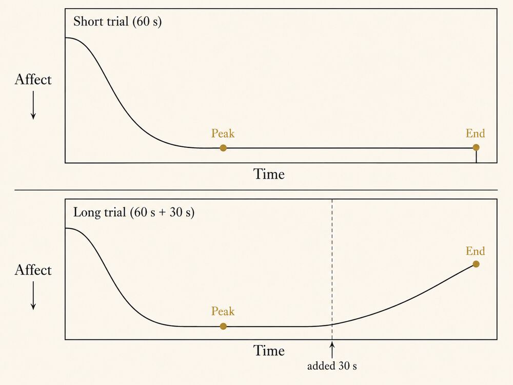
The result has held up across heterogeneous settings. Redelmeier and Kahneman replicated it clinically in “Patients’ Memories of Painful Medical Treatments,” Pain (July 1996), Vol. 66, Nos. 1–2, pp. 3–8: extending a colonoscopy by a few minutes of lower-intensity discomfort at the end produced better remembered evaluations and a measurable lift in willingness to return for follow-up screening. Meta-analytic work has confirmed the shape across vacations, music listening, sports outcomes, and consumer-service encounters, with the clearest signal in experiences of moderate length and a single dominant valence (Cojuharenco and Ryvkin, “Peak–End Rule versus Average Utility,” Journal of Mathematical Psychology (2008), Vol. 52, No. 5, pp. 326–335; surveyed in Geng et al., 2013, and updated in a 2022 piece in the Journal of Consumer Psychology).
The rule is not a claim that the experiencing self is irrelevant. It is a claim about the remembering self, the one that books the next visit, writes the review, and tells the friend. That self compresses an extended experience into a single number, dominated by two anchor points.
Why It Matters
Peak-end is the most actionable cognitive finding in experience design. Three things change once it enters the brief.
The budget. Distributing a fixed budget of attention, money, staff training, lighting, scent, and choreography evenly across a duration is the wrong loss function. The same spend buys more remembered quality if it concentrates on the peak and the end. The Cornell Hospitality Quarterly and Journal of Service Research literature on guest-experience interventions converges on the same conclusion: a signature culinary course, a recognition gesture, an architectural reveal, a memorable departure, a hand-written note. These outperform the same money spread thin.
What the operator measures. Real-time pulses and in-app ratings sample the experiencing self; retrospective surveys and net-promoter scores sample the remembering self. The two will disagree, often sharply, on the same trip. Peak-end predicts the shape: remembered ratings track peak and end; in-the-moment ratings track the running average. An operator who measures only one is missing half the picture.
The shape of the brief. The goal stops reading “a great hotel stay” and starts reading “a stay whose remembered curve has a strong third-day peak (signature dinner at the rooftop) and a strong end (driver-assisted send-off, hand-written note in the car), with operational consistency in between sufficient to hold the average above a defensible floor.” The peak and the end can be observed; the floor can be operationalized; the budget allocation has a defensible logic. Peak-End Composition, Farewell as Peak, the Trophy Artefact, and the Shareable Moment are the patterns that take the finding into practice.
How It Shows Up
Three cases at three settings and three price tiers.
Disneyland’s “kiss goodnight” closing sequence (Walt Disney Imagineering; original instruction from Walt Disney in 1955, ritual codified in the late 1990s). The closing fifteen minutes are choreographed as an engineered end. Main Street, U.S.A. lights soften toward a warmer color temperature, a final fireworks beat times against the John Williams “When You Wish Upon a Star” cue, the bandstand plays an instrumental version of the closing music, and crowd-control cast members are scripted to thank departing guests by name where possible. The internal name is the kiss goodnight, documented in The Imagineering Field Guide to the Magic Kingdom at Walt Disney World and traceable to Walt Disney’s 1955 instruction that the last impression “must equal the first.” Schmitt’s Experiential Marketing (1999) and recurring Cornell Hospitality Quarterly features cite it as the clearest applied case in commercial practice.
The Ritz-Carlton’s “wow story” structure (Ritz-Carlton Hotel Company L.L.C., 1983–present). Every line employee is empowered to spend up to USD 2,000 per guest, per incident, without seeking approval, to resolve a complaint or stage a remembered moment. The practice logs each spend as a wow story, circulates it in the daily lineup meeting, and tracks count and cost. The logic is peak-end at the moment scale: a stay can have its most intense moment authored by a front-line employee on the spot. The Ritz-Carlton Leadership Center has published the framework as the Three Steps of Service and the Twelve Service Values; case work in the Journal of Service Research and the Cornell Hospitality Quarterly has measured the lift on satisfaction scores.
Aman Tokyo’s farewell (Aman Resorts; property opened 2014; playbook documented in chain training literature and in Hospitality Design Magazine’s 2018 feature on Aman’s signature departures). A guest checking out is escorted to the elevator by the staff member who handled their stay, who waits for the doors to close before turning away — a ritual called the send-off. The driver, briefed on the itinerary, takes one detour the guest did not request: a slow loop past the Imperial Palace gardens, ten minutes off the route to Haneda or Narita. On the back seat is a hand-folded paper bag with a single yokan slice and a thank-you note signed by the staff member, not the manager. Total operational cost, one lost driver-shift slot included, runs USD 80–120 per departure. A USD 100 spend on the last twenty minutes outperforms USD 100 spread across the stay’s room-service touch points by a factor the property’s revenue-management team has come to predict.
Three price tiers (a roughly USD 130 theme-park day; a USD 700 hotel night; a USD 2,200 hotel night), three time scales (the closing fifteen minutes of a day; a single in-stay incident; the closing twenty minutes of a stay). Same move: spend the marginal budget on the moment the remembering self will price.
Caveats and Open Questions
Four open seams matter to working practice.
Scope of duration. The original effect was reported on experiences of seconds to minutes. Vacations and multi-day stays are tested less rigorously; in longer experiences peak-end competes with episodic-memory effects (the strong first day, the day-of-arrival imprint, the standout excursion). A brief for a five-day stay should engineer two or three peaks across the days plus a strong final morning, not collapse to one peak and one end.
Valence assumption. Peak-end is cleanest when the experience has a single dominant valence. Mixed-valence experiences (a museum exhibition that pairs distress and reflection, an immersive-theatre production that braids dread and elation, a retreat that pairs catharsis and quiet) do not summarize on a single peak. The operator must decide which peak is being optimized. A cancer-care environment like the Maggie’s Centres network is not designed to push the peak as high as possible; it is designed to keep the experiencing self comfortable while ensuring the remembering self does not associate the visit with an avoidable spike.
Cultural variation in the close. The rule has been replicated in North American, Western European, and Japanese samples with the same shape. Less is known where retrospective summarization is socially mediated (a family unit reviews the trip, not the primary guest), or where the salient evaluative moment is a particular ritual within the experience rather than the close (a wedding peak, a celebratory toast).
The clinical-application caveat. Kahneman has been explicit that peak-end findings should be applied carefully in mental-health contexts. An intervention that “engineers a better end” can shade into manipulation if the experiencing self’s distress is being prolonged for the benefit of the remembering self’s survey response. The colonoscopy study sat on this seam; Redelmeier extended the procedure rather than worsening it deliberately. In palliative care, trauma-informed therapy, and end-of-life experiences, peak-end is a description of how memory works, not a license to extend suffering. The corresponding antipattern is named in Synthetic Scarcity.
A last note on competitive misuse. “Peak-end” appears in customer-experience copy weekly, almost always without the caveats above and as a warrant for a single closing-moment intervention. Where an entry in this book cites the rule, it cites the source and the relevant caveat, not the trade-press summary.
Related Articles
Sources
- Daniel Kahneman, Barbara L. Fredrickson, Charles A. Schreiber, and Donald A. Redelmeier, “When More Pain Is Preferred to Less: Adding a Better End,” Psychological Science (November 1993), Vol. 4, No. 6, pp. 401–405. The founding paper; the cold-pressor protocol, the duration-neglect finding, and the joint statement of the rule are elaborated here.
- Daniel Kahneman, Thinking, Fast and Slow (Farrar, Straus and Giroux, 2011), chapters 35–36. Kahneman’s retrospective treatment of peak-end and the experiencing-self / remembering-self distinction, with the colonoscopy replication and the “vacation memory” thought experiments now standard in the field.
- Donald A. Redelmeier and Daniel Kahneman, “Patients’ Memories of Painful Medical Treatments: Real-Time and Retrospective Evaluations of Two Minimally Invasive Procedures,” Pain (July 1996), Vol. 66, Nos. 1–2, pp. 3–8. The clinical replication; source for the recommendation that extending a procedure with a milder ending improves remembered evaluation and predicts return for screening.
- Irina Cojuharenco and Dmitry Ryvkin, “Peak–End Rule versus Average Utility: How Utility Aggregation Affects Evaluations of Experiences,” Journal of Mathematical Psychology (2008), Vol. 52, No. 5, pp. 326–335. The most-cited formal treatment of when the peak-end heuristic predicts retrospective evaluations better than an average-utility model and when it does not.
- Daniel Kahneman, “The Riddle of Experience vs. Memory,” TED talk, February 2010. The shortest public explanation of the experiencing-self / remembering-self distinction in Kahneman’s own voice.
Experiencing Self vs. Remembering Self
Kahneman’s distinction between the self that lives the moments of an experience and the self that retrospectively summarizes them and decides whether to repeat — a distinction that makes experience design a dual-target discipline.
Daniel Kahneman named the two selves in Thinking, Fast and Slow (2011) and in his 2010 TED talk “The Riddle of Experience vs. Memory.” The formal economic statement is older: Kahneman, Wakker, and Sarin’s 1997 Quarterly Journal of Economics paper separated experienced utility (the experiencing self’s running stream) from decision utility (the remembering self’s basis for what to do next). Trade-press copy now uses the phrase as a slogan for “design the ending,” usually without the duration-neglect half of the finding or the ethical caveat Kahneman attached.
Definition
The experiencing self lives the present moment. It feels what is happening as it happens: the warmth of the lobby, the music at 62 dB, the smell of cypress at 12 lux. Kahneman’s operationalization is roughly the answer to “how do you feel right now?” sampled across the duration. The integral of those samples is experienced utility.
The remembering self sits outside the experience and looks back. It has no access to the sample stream, only to a compressed summary dominated by the most intense moment and the final moment, with the middle largely thrown away. That summary is what gets reported on a survey, written in a review, told to a friend, and used to decide whether to come back. Its operationalization is the answer to “how was it?” asked some time after.
Kahneman puts the distinction at its cleanest: the experiencing self lives the present moment; the remembering self keeps the score and writes the story. The two are not redundant. They disagree, and the disagreement is structural, not noise.
The classic demonstration is the 1993 cold-pressor study by Kahneman, Fredrickson, Schreiber, and Redelmeier (the same paper that anchors the peak-end rule). Subjects held a hand in painfully cold water for 60 seconds (the short trial), then in a second trial for the same 60 seconds followed by 30 more at a slightly less painful but still uncomfortable temperature (the long trial). The long trial contains every second of the short plus 30 more. Asked which they would prefer to repeat, a majority chose the longer. The choice is locally irrational on any theory respecting strictly more pain. It makes sense only if the remembering self, whose summary is dominated by the milder ending, is being asked.
The premise on which experience design rests: an experience can be poorly lived and well remembered, or well lived and poorly remembered. The operator who designs for only one self leaves the other on the table.
Why It Matters
The distinction resolves three contradictions the working brief routinely produces.
The long-pleasant-versus-short-painful paradox. A five-day Caribbean trip with calm weather, decent food, and a curt last interaction at the front desk gets rated lower in retrospect than a three-day trip with one extraordinary peak and a great send-off. The long trip lived through more pleasant minutes; the short trip beats it because the remembering self is not averaging, it is pricing peak and close.
The in-stay metric trap. Hospitality and themed-entertainment operators measure satisfaction in real time (in-app pulse, post-ride survey) and again weeks later (net promoter score, post-stay review). The two streams diverge on the same trip, often sharply. The divergence is read as noise or methodology error; it is neither. It is the gap between the two selves talking. An operator measuring both can pinpoint where the experiencing self was unhappy that the remembering self forgave, and where the experiencing self was content that the remembering self downgraded for a bad close.
The design-for-whom question. Repeat-business models (luxury hotels, theme parks with annual passes, immersive-theatre productions that depend on returning audiences) are financially addressed almost entirely to the remembering self, the one who books again, recommends, and signs up for the loyalty tier. One-shot models (a destination wedding, a museum blockbuster, a single-night brand activation) are nearer the experiencing self, plus whatever social residue the remembering self produces after. The framework lets the brief say which self the budget is buying.
Once the two selves are in the operator’s vocabulary, design stops reading as a single optimization and starts reading as a dual-target one. The choreographed beats and flow-channel pacing target the experiencing self. Peak-End Composition, Farewell as Peak, and the Trophy Artefact target the remembering self. The brief allocates across the two.
How It Shows Up
Three cases at three time scales and three settings.
A theme-park day at Walt Disney World (Walt Disney Imagineering, 1971–present; closing-sequence design recurringly featured in The Imagineering Field Guides and in Cornell Hospitality Quarterly coverage of themed-attraction design). A Magic Kingdom day is engineered as a dual-target sequence. The experiencing self is held in flow through wayfinding choreography, ride pacing calibrated to guest tolerance, and queue-line theming that turns a forty-minute wait into a deliberate prologue. The remembering self is paid in large beats: a signature ride that produces the day’s peak, the fireworks at the end of the night, and the choreographed “kiss goodnight” (the Main Street lighting ramp, the John Williams musical cue, the cast-member send-off described in peak-end rule). The day’s working spreadsheet treats the two budgets separately: the middle is held above a floor; the peak and the end are spent into deliberately.
A tasting-menu evening at Eleven Madison Park (New York, opened 1998; documented in The New York Times Magazine, Eater, and Will Guidara’s Unreasonable Hospitality). A two-and-a-half-hour seven-course tasting menu is a miniature dual-target environment. The experiencing self is paid second by second: the table choreography, the bread course, the first wine pour, the small plate cleared at the right beat. The remembering self is paid in the peak (the rotating signature dish, at EMP often a celery-root preparation with fresh black truffle) and in the close (the post-dessert kitchen tour, the picnic-basket take-home of granola, the hand-written thank-you note delivered as the table is walked to the door). Guidara’s playbook is explicit: the kitchen runs the experiencing self’s clock; the front-of-house team runs the remembering self’s.
Sleep No More at the McKittrick Hotel (Punchdrunk and Emursive, NY run 2011–2024; design analyzed in Studies in Theatre and Performance, 2023). Sleep No More is an unusually pure case. The experiencing self is held in flow and narrative transportation for three hours of free-roam masked exploration. The remembering self is paid in two deliberate moves on the front and the back of that middle: a briefing ritual at arrival (mask handoff, freight-elevator ride, bartender’s preface) and a strong emotional close (the third-act reunion in the ballroom, the final unmasking outside the venue). The reviews fixate on the close. The choreography of the middle hours is, by industry standards, austere; the front-and-back beats are not.
Three time scales (a fourteen-hour park day, a two-and-a-half-hour meal, a three-hour immersive run); three settings (themed entertainment, restaurant service, immersive theatre); the same shape: budget the experiencing self’s curve to stay above a defensible floor, then spend the marginal dollar on the moments the remembering self will price.
Caveats and Open Questions
Four seams matter to working practice.
The recursive-return-visit case. Repeat customers are not naïve subjects. The second visit’s experiencing self carries memories of the first, so the first visit’s remembering self sits inside the second visit’s experiencing self, shaping expectations and anchoring comparisons. In the field, the gap the lab filled with a survey is filled by reviews, photographs, anticipation, and conversation, all of which continuously re-edit the summary between visits. The Trophy Artefact and the Shareable Moment are designed to exploit this re-editing.
Aggregate vs. individual. The framework was validated on individual decision-making. Group experiences (a family at a theme park, a four-top at a restaurant, a couple on a Punchdrunk weekend) have a socially mediated remembering self: the stored summary is a co-constructed account stitched together over post-trip conversation, not the average of individual summaries. The dominant moments of the group account are not always the dominant moments of any individual curve. The model predicts well at the individual level and predicts the shape of group summaries without resolving how voices are weighted. Design for moments that read as peaks for at least one member, not an averaged curve no group will compute.
Cultural variation. The lab work has been replicated in North American, Western European, and Japanese samples with the same shape. Less is known where retrospective summarization is socially mediated beyond what WEIRD-sample data captures, or where the salient evaluative moment is a culturally specific ritual (a wedding peak, a religious procession, a celebratory toast) rather than the close of the experience itself.
The ethical guardrail. The tempting reading is that the experiencing self’s distress can be traded for the remembering self’s satisfaction. Kahneman has been explicit, in the colonoscopy case in particular, that this trade is permissible only when the experiencing self is not worse off in net terms. Extending a procedure with a milder ending was acceptable because the original distress was already determined; making the experiencing self’s life worse to give the remembering self a better story is manipulation, not design. The corresponding antipatterns are Synthetic Scarcity and the broader Manufactured Authenticity family.
A last note on trade-press misuse. The phrase appears in customer-experience copy weekly, almost always without the caveats above. Where this entry is cited, it should be cited with them attached.
Related Articles
Sources
- Daniel Kahneman, Thinking, Fast and Slow (Farrar, Straus and Giroux, 2011), Part V, chapters 35–38. The canonical book-length treatment of the two-selves distinction in Kahneman’s own voice, with the colonoscopy-extension thought experiment, the vacation-memory thought experiment, and the formal contrast between experienced utility and decision utility.
- Daniel Kahneman, Barbara L. Fredrickson, Charles A. Schreiber, and Donald A. Redelmeier, “When More Pain Is Preferred to Less: Adding a Better End,” Psychological Science (November 1993), Vol. 4, No. 6, pp. 401–405. The cold-pressor study and the founding experimental statement of the two-selves distinction; cited together with the peak-end rule entry that draws on the same paper.
- Daniel Kahneman, “The Riddle of Experience vs. Memory,” TED talk, February 2010. The shortest and most-cited public explanation of the two-selves distinction in Kahneman’s own voice.
- Donald A. Redelmeier and Daniel Kahneman, “Patients’ Memories of Painful Medical Treatments: Real-Time and Retrospective Evaluations of Two Minimally Invasive Procedures,” Pain (July 1996), Vol. 66, Nos. 1–2, pp. 3–8. The clinical replication of the cold-pressor finding and the source of the colonoscopy thought experiment that Thinking, Fast and Slow later popularized.
- Daniel Kahneman, Peter P. Wakker, and Rakesh Sarin, “Back to Bentham? Explorations of Experienced Utility,” The Quarterly Journal of Economics (1997), Vol. 112, No. 2, pp. 375–406. The formal economic statement of the experienced-utility framework that distinguishes the experiencing self’s instant utility from the remembering self’s decision utility.
Flow Channel
Mihaly Csikszentmihalyi named the channel in Beyond Boredom and Anxiety (Jossey-Bass, 1975) and carried it into the trade-readable Flow (Harper & Row, 1990). The word is geometric, not poetic: plot challenge on one axis and skill on the other, and the channel is the diagonal corridor running between the anxiety above it and the boredom below. “Flow” is the felt state inside that corridor; the channel is the band you have to stay inside to keep it. Trade-press copy now uses “flow” as a mood word for any absorbing activity, usually without the calibration that is the whole point.
Mihaly Csikszentmihalyi’s calibration of challenge against skill — the narrow band between anxiety and boredom in which an activity absorbs the participant fully — and the substrate the field’s working “engagement” rests on whenever the word means anything more than “attention paid.”
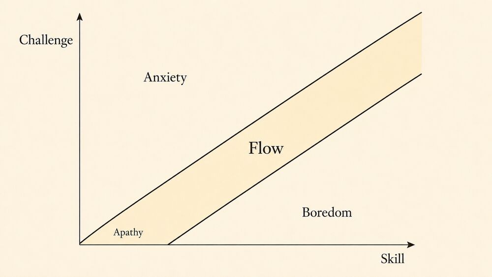
Definition
The flow channel is the construct, named and operationalized by Mihaly Csikszentmihalyi across roughly thirty years of research starting with the interview studies in Beyond Boredom and Anxiety (Jossey-Bass, 1975) and developed into its trade-readable form in Flow: The Psychology of Optimal Experience (Harper & Row, 1990), that names the narrow region in which a person’s perceived challenge and their perceived skill are both high and roughly matched. Outside that corridor, the person drifts: into anxiety when the challenge outruns the skill, into boredom when the skill outruns the challenge, and into apathy when both fall low together. Inside it, attention narrows onto the activity, action and awareness merge, the sense of self recedes, time perception distorts, and the activity becomes its own reward.
Csikszentmihalyi reports nine recurring elements that subjects in flow describe in interview after interview, across chess players, surgeons, rock climbers, dancers, and assembly-line workers who had managed to engineer flow into a bounded job. The nine, as collected in Flow (1990) and refined in Jeanne Nakamura and Csikszentmihalyi’s “The Concept of Flow,” in the Handbook of Positive Psychology (Snyder and Lopez, eds., Oxford University Press, 2002), are: clear proximate goals; immediate feedback on progress; a challenge-skill match at the upper edge of the participant’s current capacity; deep, narrowed concentration; a felt merger of action and awareness; a sense of control over the activity that does not depend on guaranteed success; loss of self-consciousness; transformed time perception; and the activity becoming autotelic, pursued for its own sake. The first three are the design substrate (clear goals, immediate feedback, calibrated challenge); the remaining six are the experienced state that follows when the substrate holds.
The construct sits in the same neighborhood as narrative transportation but isn’t a synonym for it. Narrative Transportation, as Melanie Green and Timothy Brock developed it in 2000, names absorption into a narrative; flow names absorption into a challenging activity. A reader transported into a novel isn’t necessarily in flow (the activity of reading is rarely calibrated as a challenge), and a rock climber in flow isn’t necessarily transported (the activity contains no narrative). An immersive-theatre production with a navigable architecture and a participatory protocol typically engineers both at once: the audience is transported into the fictional world and held in a calibrated activity (find the next scene, read the room’s clues, time the chase against an actor’s loop). When the field uses immersive without qualification, it usually points at the joint engineering of the two states.
Why It Matters
The construct converts the field’s hand-waved word engagement into something the practitioner can specify, brief, and audit.
It supplies a calibration variable. Engagement in the trade press is a one-axis quantity, where more is better. The channel is two-axis: engagement fails in two distinct ways, anxiety (overload) and boredom (underload), and the design moves that recover from each are different. A wayfinding sequence in which the guest cannot find the next decision point overshoots into anxiety; the recovery is a clearer landmark, a shorter sightline, a one-step signage tier. A wayfinding sequence the guest has already solved before the third decision point undershoots into boredom; the recovery is a fresh challenge, perhaps a branching choice, a new sensory register, or a story beat that asks something. Knowing which of the two failures the guest is experiencing is half the diagnostic, and the channel is the construct that makes the diagnostic possible.
It supplies a budget question. Most experience-design briefs allocate budget across moments without an explicit theory of where the budget should land. The channel argues that budget spent below its threshold (low-challenge, low-skill background activity) is largely lost, because the participant is in apathy and any expense on apathy moments yields a small return on remembered quality. Budget spent at the upper edge of the channel, at the moment where the participant’s skill is being asked to grow, returns far more remembered quality per dollar. The Imagineering practice of investing disproportionately in threshold rooms and peak beats (the ride-vehicle’s mid-show set-piece, the immersive-theatre’s third-act room, the tasting menu’s signature reveal) and accepting an operational floor across the rest of the journey reads, in this vocabulary, as a flow-channel budget allocation: the operator pays for the channel’s upper edge and accepts the lower-edge cost as the price of holding the channel at all.
It supplies an ethical seam. The channel is morally neutral on its own; the same calibration produces a working-condition flow at a craftsman’s bench and a hostile flow at a slot machine. Natasha Dow Schüll’s Addiction by Design (Princeton University Press, 2012) made the case that machine-gambling architecture is a deliberate flow engineer at the bench scale, with goals (next pull), feedback (light, sound, near-miss), and a calibrated challenge-skill ratio (the player’s “skill” being the trivial decision of when to pull) all coordinated to extend time-on-device. The same construct that licenses the curated flow at a Punchdrunk show licenses the predatory flow at a Las Vegas slot bank. Working practice keeps the seam visible: declare what the activity is, declare whose interests the calibration serves, refuse briefs that ask the construct to operate against the participant. The discipline pairs with Authenticity-Within-Frame: a frame that licenses absorption is honest only when the participant’s interests are not the operator’s loss function.
How It Shows Up
The construct is most legible where the operator stages a calibrated activity and the participant reports the channel’s signatures.
Punchdrunk’s Sleep No More at the McKittrick Hotel (2011–2024, NYC). Felix Barrett’s six-floor environmental adaptation of Macbeth engineers a calibrated activity inside the transported state. The challenge is layered: navigate a six-floor, hundred-room building in semi-darkness; track loops of actors performing across rooms on a roughly hour-long cycle; assemble a coherent reading of Macbeth from the fragments the guest happens to witness. The skill grows over the run, and first-time guests who return for second and third visits report exactly the channel’s signature, that the activity has become harder and easier at the same time, harder because they now know what they missed and easier because they’ve learned the hotel. The mask convention removes social-judgment load from the challenge side, and the silent-audience rule narrows attention to the activity. The Studies in Theatre and Performance environment-behavior analysis (Routledge, 2023) of audience movement patterns shows the channel’s predicted effect: experienced visitors plan their loop runs against actor schedules, dwell longer in rooms whose challenge-skill ratio matches their current state, and report the time-perception distortion that is the construct’s clearest experiential signature.
Disney’s Animal Kingdom daily ride and live-show beat sheet (Walt Disney Imagineering, 1998–present, Florida). Joe Rohde’s portfolio at Animal Kingdom is the cleanest published case of channel-engineered themed entertainment at park scale. Rohde’s TEA SATE talks (collected in the Themed Entertainment Association’s Bigger Picture archive) describe the park’s day-long beat sheet as a deliberately sequenced channel. A low-challenge approach opens it: the entry path through the Oasis gardens at low sensory load. Mid-channel exploration follows, with the Africa and Asia themed lands pitched at progressively higher challenge. Then the peak beats: the Avatar Flight of Passage simulator, the Festival of the Lion King theatre piece, and the Rivers of Light nighttime water show, which ran until its 2019 retirement and gave way to KiteTails and then Disney KiteTails: Discovery River Floating Spectaculars across a sequence of post-pandemic redirections. Decompression carries the guest out. The land-scale sightlines, the queue-side preshow architecture, and the cast-member training all converge on a working brief that reads, in Csikszentmihalyi’s vocabulary, as a calibrated activity with sequenced challenge: the guest is asked to do something at every beat, and the asks rise and fall in a shape Imagineering has been engineering since the original Disneyland in 1955. The park’s per-guest dwell-time data, published in the Themed Entertainment Association / AECOM Theme Index, registers the construct’s predicted behavioral signature; visitors stay longer at properties that hold them in the channel than at properties that don’t.
Apple Park Visitor Center augmented-reality experience (Foster + Partners, 2017–present, Cupertino). The visitor-center’s central interactive (an augmented-reality model of the campus that visitors explore through provided iPads while standing around a 1:200 architectural model) is a working flow case at room scale. The challenge is calibrated by the iPad interface: the model is opaque without the device, becomes legible through the iPad’s overlay, and rewards exploration with progressively detailed reveals of the campus’s mechanical, ecological, and acoustic systems. Visitors typically dwell ten to fifteen minutes, orders of magnitude longer than the typical visitor-center exhibit, and the interaction’s design conforms to the construct’s substrate (clear goals: explore the building; immediate feedback: the overlay updates as the iPad moves; calibrated challenge: the model is interesting at any level of effort the visitor brings). Architectural Record and Frame coverage of the visitor-center hasn’t used Csikszentmihalyi’s vocabulary in its readings, but the design moves are the construct’s standard substrate, transposed into a brand-experience setting.
The construct also shows up at smaller scales whenever the operator engineers calibrated challenge with feedback: the docent-led museum tour that asks the visitor to make observations and read against them; the high-end tasting menu that asks the diner to identify components and rewards the attempt with the chef’s commentary; the climbing-wall format used in modern bouldering gyms that grades routes inside a working flow band for the average visitor and provides immediate haptic feedback. The principle travels wherever the substrate holds, and it breaks wherever it doesn’t.
Caveats and Open Questions
The construct is well-established and contested at its edges. Four open seams matter for working practice.
The first is measurement transfer. Csikszentmihalyi’s experimental program rested on the Experience Sampling Method (pagers and self-reports collected in the participant’s daily life) rather than on a single validated questionnaire. Subsequent work has produced flow scales (the Flow State Scale of Susan Jackson and Csikszentmihalyi, 1996; the Flow Short Scale of Rheinberg, Vollmeyer, and Engeser, 2003), but the construct has not been validated for built environments at venue scale the way servicescape research has been validated for retail. Practitioners use the channel as a design substrate and an audit vocabulary, not yet as a number on a post-occupancy dashboard. The honest reading is the same one Narrative Transportation’s entry takes: the construct is mature as a design discipline and immature as a venue-scale metric.
The second is the autotelic-personality question. Csikszentmihalyi’s later work (the construct refined in Finding Flow, Basic Books, 1997) argued that some people are dispositionally more flow-prone than others, having developed an autotelic personality that finds calibrated challenge in more of life than the average participant. Designed environments that depend on the participant bringing a flow disposition (long-form immersive theatre, complex themed-attractions, multi-day interactive experiences) risk over-selecting for the autotelic visitor and producing a narrower-than-intended audience. The accessibility implication runs through the rest of the book; the design move is to provide low-floor entry paths into a calibrated activity so participants with weaker autotelic dispositions can find the channel before the activity demands they already be in it.
The third is the video-game translation. Penelope Sweetser and Peta Wyeth’s GameFlow model (ACM Computers in Entertainment 3, 2005, “GameFlow: A Model for Evaluating Player Enjoyment in Games”) translated the channel into a working game-design framework, with eight criteria that read as the construct’s elements with one or two additions for the medium (social interaction, in particular). The translation has been generative for game design and useful as a partial template for venue-scale work; the danger is the false transposition where a venue-scale designer treats the calibrated activity as a single-player loop and engineers an experience that fails for groups, where the social-skill load and the activity-skill load interact in ways the single-player model does not predict. The honest reading is that the game-design literature is the closest neighboring tradition and that its lessons travel selectively.
The fourth is the manipulation seam already named above. The same calibration that produces a working flow at an honest activity produces a hostile flow at a predatory one. Schüll’s slot-machine analysis is the canonical bad case; gambling architecture, micro-transaction-heavy mobile games, and certain attention-economy product surfaces all read as flow-engineering with the participant’s interests excluded from the loss function. The book’s working position is that the channel is morally neutral as a construct and morally evaluable as a deployment; the curator’s responsibility is to police the deployment side of the line. The corresponding antipatterns are named in the Ethics and Antipatterns shelf, and any pattern entry in this book that depends on the channel cites the seam where the deployment turns hostile.
A separate caveat about vocabulary discipline. Engagement is not a synonym for flow; the channel is the more precise term, and the looser word should be reserved for the casual writing where it carries its trade-press usage. When this book uses engagement without qualification, it points back to one of the two operationalized constructs (flow or Narrative Transportation); everywhere else, the word is a candidate for replacement.
Related Articles
Sources
- Mihaly Csikszentmihalyi, Flow: The Psychology of Optimal Experience (Harper & Row, 1990). The trade-readable statement of the channel; the source for the nine elements, the challenge-skill diagram, and the autotelic-activity claim.
- Mihaly Csikszentmihalyi, Beyond Boredom and Anxiety (Jossey-Bass, 1975). The founding interview studies; the source the 1990 trade book digests, where the channel was first described in the empirical literature.
- Jeanne Nakamura and Mihaly Csikszentmihalyi, “The Concept of Flow,” in C. R. Snyder and Shane J. Lopez, eds., Handbook of Positive Psychology (Oxford University Press, 2002), pp. 89–105. The cleanest summary of the construct’s measurement, conditions, and consequences in the post-1990s literature; cited here as the field’s working reference.
- Mihaly Csikszentmihalyi, Finding Flow: The Psychology of Engagement with Everyday Life (Basic Books, 1997). The construct’s later refinement, with the autotelic-personality argument and the working-life applications that the trade press most cites.
- Penelope Sweetser and Peta Wyeth, “GameFlow: A Model for Evaluating Player Enjoyment in Games,” ACM Computers in Entertainment 3, no. 3 (2005). The closest neighboring tradition’s translation of the channel into a working design framework; cited here as the model that working venue-scale practice borrows from selectively.
Goal-Gradient Effect
Hull’s finding, carried into consumer behavior by Kivetz: motivation rises as perceived distance to a goal shrinks, and visible or illusory progress speeds the approach.
Clark Hull named the goal gradient in 1932 from animal-learning work: rats in a straight runway ran faster on the segments nearest the food box than on the segments near the start. The construct sat mostly in behaviorist psychology for seventy years until Ran Kivetz, Oleg Urminsky, and Yuhuang Zheng resurrected it for consumer behavior in 2006, retitling their paper “The Goal-Gradient Hypothesis Resurrected.” The phrase has since drifted into customer-experience copy as a license for progress bars, usually without the endowed-progress refinement that is the more useful half of the finding.
Definition
The goal-gradient effect is the finding that effort rises as the perceived remaining distance to a goal shrinks. People work harder, move faster, and abandon less often when the finish feels near. Clark L. Hull first reported it in “The Goal-Gradient Hypothesis and Maze Learning,” Psychological Review (1932), Vol. 39, No. 1, pp. 25–43, then elaborated it in his 1934 straight-alley experiments: rats accelerated as they approached the reward box.
For experience design, the operative variable is perceived distance, not actual distance. That is what makes the effect a design lever rather than a curiosity of animal learning.
Ran Kivetz, Oleg Urminsky, and Yuhuang Zheng carried the construct into human consumer behavior in “The Goal-Gradient Hypothesis Resurrected: Purchase Acceleration, Illusionary Goal Progress, and Customer Retention,” Journal of Marketing Research (February 2006), Vol. 43, No. 1, pp. 39–58. Their cleanest demonstration is a café loyalty field experiment. Customers carried a card stamped on each purchase toward a free coffee. Purchase frequency rose as the card filled: the average interval between visits shortened as the reward neared, exactly the acceleration Hull’s rats showed in the runway.
The same paper isolated the design-relevant refinement, endowed progress. One group received a card requiring ten purchases for the free coffee. A second group received a twelve-stamp card with two stamps already filled in, also requiring ten further purchases, an identical remaining distance. The endowed group completed the card faster and at a higher completion rate. Framing the customer as already two stamps along a longer journey beat framing them as zero along a shorter one, even though the work demanded was the same. Perceived progress, not actual remaining effort, drove the acceleration.
The effect doesn’t claim the participant misjudges the total work. It says motivation tracks the felt fraction completed rather than the absolute units remaining, and that a designer who controls how progress is displayed controls part of that motivation. It isn’t a trick played on a fool; it’s how a normal mind weighs an approaching reward.
Why It Matters
The goal-gradient effect names the motivational physics under any experience that makes its progress visible. Once it enters the brief, three things change.
Where the spend goes. Motivation is not flat across a progression; it rises toward the finish. A budget of staff attention, signage, or sensory intensity spent evenly across a sequence underweights the segment where the participant is already most willing to push and most vulnerable to a stall. The endowed-progress finding sharpens this further: the cheapest intervention is often not adding a real reward but reframing where the participant stands. A loyalty program that opens the customer two units along a longer scale buys completion that an identical-effort blank scale does not.
What a wait costs. Abandonment is not uniform along a queue. A participant near the front of a line they can see ending behaves differently from one at the back of a line whose end is hidden. Making the remaining distance legible, with a numbered position, a shrinking estimated wait, or a named return window, converts the dead middle of a wait into a goal gradient that holds the participant in place. The same minutes feel different depending on whether their end is visible.
Where the honest line sits. The effect runs on perceived distance, which means it can be engineered with real progress or faked with illusory progress. A countdown that genuinely counts down toward a real reward uses the gradient honestly. A timer that resets on reload, a progress bar that crawls and never resolves, or a “you’re almost there” that is always almost and never there manufactures the felt nearness of a goal that is not approaching. The construct is therefore one of the field’s clearest places to name where motivation design ends and dark-pattern manipulation begins.
How It Shows Up
Three cases at three settings, each making remaining distance visible to move the participant through it.
Starbucks Rewards and the Stars-to-reward display (Starbucks Corporation; current Stars program launched 2016, restructured 2019). The app’s home screen foregrounds a single number: stars remaining to the next reward, rendered as a filling ring rather than a count of stars already earned. The choice is endowed-progress framing in software. A returning customer sees how few stars stand between them and a free drink, not how many they have spent. The display updates the instant a purchase posts, so the gradient is felt at the moment of action. Bonus-star promotions (“earn triple stars this week”) are timed interventions that compress the remaining distance precisely when the program wants the acceleration. The structure is the Kivetz café card moved onto a phone, with the endowment varied promotionally.
Disney’s virtual queue and the boarding-group countdown (Walt Disney Imagineering; Disney Genie and the virtual-queue system, rolled out across U.S. parks from 2019). When demand for an attraction exceeds the physical queue, the park issues a boarding group and shows the guest a position that descends through the day. The guest is freed from standing in line but stays inside a goal gradient: the app’s falling boarding-group number is a visible, shrinking distance to the ride. The design problem the countdown solves is abandonment of intent. A guest with no legible progress toward the attraction wanders off and reallocates the day; a guest watching their group approach holds the goal. The same mechanism powers the named one-hour return windows on Lightning Lane: a window that visibly nears converts waiting into approaching.
Duolingo’s streak and the lesson-progress bar (Duolingo, Inc.; streak mechanic central since the mid-2010s). Two gradients run at once. Within a lesson, a progress bar fills toward completion, and the documented drop-off pattern is that learners who stall mid-lesson are far less likely to abandon once the bar passes the midpoint, because the near end pulls them through. Across days, the streak counter is a longer gradient, and the perceived cost of breaking it rises with its length. A four-hundred-day streak is a goal the user has already endowed with four hundred days of progress. Protecting it is the goal gradient operating over months. The streak-freeze item exists precisely because the program understands that a broken long gradient is a churn event, not a missed lesson.
The cases span loyalty retail, themed entertainment, and a digital-physical learning habit; the time scales run from a single transaction to a multi-month streak. The operating move is constant: render the remaining distance, place the participant as near the goal as the truth allows, and let the gradient supply the motivation the flat middle cannot.
Caveats and Open Questions
The first caveat is the reality of the progress. The endowed-progress finding is powerful precisely because perceived distance, not actual distance, drives the acceleration, which is also what makes it abusable. Endowing a customer with two genuine stamps toward a real reward is honest. A countdown that resets when the page reloads, or a progress bar engineered to stall at ninety percent, manufactures a gradient toward a goal that is not approaching. The line is not whether the display motivates, since both honest and dishonest versions do, but whether the goal the display points at is real and reachable on the terms shown. That edge is where the effect shades into Synthetic Scarcity and the motivational variant of Sludge.
The second caveat is the post-reward reset. Kivetz and colleagues documented a post-reward resetting effect: immediately after a customer earns the reward and the gradient resets to zero, motivation drops and the next-purchase interval lengthens before the gradient rebuilds. A loyalty program that punishes the customer with a long, flat climb right after the celebratory moment loses the very acceleration it just produced. The design implication isn’t to shorten the whole next cycle but to keep its early segment shorter or endowed rather than blank.
The third caveat is the difference between extrinsic gradient and intrinsic goal. The effect is cleanest when the goal is external and legible: a stamp count, a boarding number, a streak. Experiences whose value is intrinsic and open-ended can be damaged by a progress meter. A contemplative museum visit, an unstructured resort afternoon, or a meditation retreat can shift from absorbing activity into a task to be completed. Making the gradient visible is not free; it reframes the experience as goal-directed, which is the wrong frame for some experiences and the right one for others. The designer’s first question is whether the experience should feel like progress toward a finish at all.
The fourth caveat is the comparison to flow. The goal gradient and the flow channel can pull in opposite directions. Flow is sustained by a challenge calibrated to skill, with the participant absorbed in the activity rather than the finish; a salient, fast-shrinking goal can break that absorption by pulling attention to the endpoint. A progression that wants both (a themed-entertainment land, a tasting menu, a long museum sequence) has to titrate how visible the goal is, supplying enough gradient to prevent abandonment without converting the experience into a race to the exit.
A last note on trade-press flattening. “Goal-gradient effect” appears in conversion-optimization copy as a one-line warrant for adding a progress bar, almost always without the endowed-progress refinement, the post-reward reset, or the honest-versus-illusory distinction. Where an entry cites the effect, it cites Kivetz’s field experiment and Hull’s original construct, not the blog summary.
Related Articles
Sources
- Clark L. Hull, “The Goal-Gradient Hypothesis and Maze Learning,” Psychological Review (1932), Vol. 39, No. 1, pp. 25–43. The founding statement of the goal-gradient hypothesis; the straight-runway acceleration that gives the effect its name and its behaviorist lineage.
- Ran Kivetz, Oleg Urminsky, and Yuhuang Zheng, “The Goal-Gradient Hypothesis Resurrected: Purchase Acceleration, Illusionary Goal Progress, and Customer Retention,” Journal of Marketing Research (February 2006), Vol. 43, No. 1, pp. 39–58. The primary consumer-behavior source; the café-loyalty field experiment, the endowed-progress manipulation, and the post-reward resetting finding that anchor the design applications.
- Daniel Kahneman, Thinking, Fast and Slow (Farrar, Straus and Giroux, 2011), chapters 31–34. Kahneman’s treatment of framing and reference points, the cognitive machinery behind why a twelve-stamp card endowed with two stamps outperforms an identical-effort ten-stamp blank card; useful background to the endowed-progress result rather than a source for the goal gradient itself.
Narrative Transportation
Melanie Green and Timothy Brock used transportation because the reader is carried somewhere else in attention, imagery, and emotion. The body may still be in a chair, a gallery, a hotel lobby, or a queue, but the mind is busy inside the story. The term matters because it is not a mood word for “immersive.” It is a measured construct with a scale, known precursors, and failure points a designer can audit.
Green and Brock’s measured term for absorption into a narrative: the state in which the surrounding world recedes, imagery becomes vivid, and the story temporarily quiets the audience’s counter-arguments.
Definition
Narrative transportation is the absorbed state Green and Brock named in “The Role of Transportation in the Persuasiveness of Public Narratives”, Journal of Personality and Social Psychology 79(5) (2000), pages 701–721. Attention narrows onto the story, the surrounding world recedes, mental imagery becomes vivid, and prior commitments quiet down. Green and Brock’s hard claim is blunt: a transported audience does not refute, because they are not arguing. They are inside.
The paper also supplies the Transportation Scale, an eleven-item self-report instrument later refined in Green and Brock’s work. It asks readers to rate absorption across cognitive, emotional, and imagery-based items: “I could picture myself in the scene,” “I was mentally involved in the narrative while reading it,” and the reverse-scored “After finishing the narrative, I found it easy to put it out of my mind.” In the 2000 experiments, higher transportation scores predicted stronger belief change, warmer evaluation of protagonists, and reduced counter-arguing. The instrument turned a loose phrase (“the audience was really into it”) into a number that can travel across studies.
Compare it with two neighboring vocabularies. Mihaly Csikszentmihalyi’s Flow (Harper & Row, 1990) names absorption into challenging activity under a calibrated challenge-skill ratio; transportation names absorption into narrative. Coleridge’s “willing suspension of disbelief,” from Biographia Literaria (1817), names the audience’s voluntary permission for a fiction to operate; transportation is what happens inside that permission when the work earns it. They overlap without collapsing into one term. Transportation earns its place here because it is measured and outcome-linked.
Why It Matters
Without transportation, the field falls back on immersion, now stretched across projection-mapped restaurants, retail pop-ups with one mirror room, and product pages with a 360-degree photo. The construct is narrower: a narrative state with precursors, break points, and a measurable persuasive effect.
It gives the brief a mechanism. Transportation rises with vivid imagery, narrative coherence, emotional engagement, and identification. It falls when the frame breaks: the out-of-period prop, the mistimed soundtrack cue, the staff member visibly out of role, the corporate sans-serif sign inside a mediaeval-themed environment. Once that mechanism is named, the design problem becomes a frame-break audit. Backstory Detail and Theme Coherence protect the transported state; Manufactured Authenticity and Experience-Washing violate it.
It gives the walk-through a test. “An immersive lobby” is not a brief. “A lobby designed to support transportation, with frame-break risk minimized at the threshold and across the front-desk interaction” can be checked against vividness, coherence, confirming detail, and absence of intrusion. Few venue teams run the Transportation Scale in post-occupancy studies, but the construct still tells the design team what to look for.
It also exposes the ethical seam. Green and Brock foreground that transportation reduces counter-arguing, making transported audiences unusually persuadable. The same mechanism helps a Pixar film land, lets a Disney park hold emotional attention, and powers propaganda films or multi-level-marketing sales-room performance. Working practice keeps the seam visible: declare the frame, earn transport with craft rather than coercion, and refuse briefs that ask for transport in service of claims the operator cannot honor.
How It Shows Up
The construct is most legible where the operator stages narrative deliberately and the audience reports the absorbed state in the standard vocabulary.
Punchdrunk’s Sleep No More at the McKittrick Hotel (2011–2024, NYC). Felix Barrett’s company built a six-floor environmental adaptation of Macbeth in a staged 1939 hotel. Masked audience members wandered freely while actors performed narrative loops across rooms. A 2023 Studies in Theatre and Performance environment-behavior analysis, plus thirteen years of New York Times, New Yorker, and Time Out coverage, described the experience in transportation vocabulary: time-perception distortion, vivid mental imagery, reduced awareness of the surrounding city, and emotional attachment to actor-room beats. The threshold of mask-on, the silent-audience rule, the room-scale period detail, and the chase-the-actor convention all minimize frame-breaks. The two-and-a-half-hour run was priced at three to four times comparable conventional theatre, and that price held for thirteen years. Transportation is the cleanest explanation of what the price bought.
Disney’s Pandora: The World of Avatar at Disney’s Animal Kingdom (2017, Florida). Joe Rohde and the Walt Disney Imagineering portfolio team’s $500M land treated transportation as a master-plan problem. The biolume forests, floating mountains, banshee-rookery sound design at thirty-plus speakers per acre, and costumed Pandoran Conservation Initiative cast members all answer to one frame. The Imagineering Field Guide to Disney’s Animal Kingdom (Disney Editions 2018) and Rohde’s TEA SATE talks read like a frame-break audit: every visible surface that does not answer to Pandora is screened, recolored, or moved. The opening dwell-time signature matches the construct. Guests averaged 3.5 hours per visit in the land, against a park-wide average of 1.2 hours per land. Transported guests do not leave quickly.
Tate Modern’s Turbine Hall commissions (2000–present, London). The annual program works in the esthetic register: passive-immersion installations that ask visitors to enter the work and stay. Olafur Eliasson’s The Weather Project (2003), Doris Salcedo’s Shibboleth (2007), Tino Sehgal’s These Associations (2012), and Kara Walker’s Fons Americanus (2019) all build coherent atmospheric narrative without a conventional plot. Eliasson’s The Weather Project drew an estimated 2 million visitors over six months, with average dwell time at thirty-plus minutes in Tate’s published visitor research. Interviews used absorption vocabulary directly: “I lost track of time,” “I forgot the museum was around me.” The suspended sun obscured the industrial ceiling, the mirror floor doubled the volume, and the orange monochrome quieted the gallery’s visual chatter. The work removed frame-breaks, supplied a vivid imagery anchor, and let visitors choose a narrative inside the room.
The construct also appears at lower budgets when a designer minimizes frame-breaks and guests report absorption: the Aman Tokyo lobby’s 33rd-floor cedar threshold, the Eleven Madison Park dining room under Will Guidara, and Meow Wolf’s House of Eternal Return in Santa Fe. The price difference is the economic signature.
Caveats and Open Questions
The construct is established, not finished.
The first caveat is measurement transfer. The Transportation Scale was built for printed narrative and later validated for film, video, and gaming by Hamby, Brinberg, and Daniloski (Journal of Consumer Research, 2017) and by van Laer, de Ruyter, Visconti, and Wetzels (Journal of Consumer Research, 2014). It has not been cleanly validated for built environments at venue scale. A hotel team can use transportation as a design vocabulary and walk-through test; it cannot put a published “transportation score” on the lobby dashboard yet.
The second is the manipulation question. Green and Brock showed that transportation reduces counter-arguing. Critics are right to worry that narrative environments designed to maximize transportation can reduce an audience’s capacity to refuse the operator’s claims. The construct itself is morally neutral. The working position, defended in Authenticity-Within-Frame, is to declare the frame openly so the audience consents to the transport rather than entering it unawares. The line is in the declaration, not in the mechanism.
The third is mixed-channel customer experience. Transportation was developed for sustained, single-channel narrative engagement. It travels into film, immersive theatre, and themed environments because they preserve sustained attention, coherent frame, and vivid imagery. It travels poorly across a brand’s app, email tone, retail floor, and ambient marketing, where channel-switching becomes the frame-break. The construct weakens each time the audience has to step in and out of the frame every two minutes. Ad-funnel sequences and onboarding flows rarely earn the word.
Vocabulary discipline matters. Immersion is not a synonym for transportation; it is the older, looser word that carried the 1990s lineage in Janet Murray’s Hamlet on the Holodeck (Free Press, 1997). When this book uses immersive without qualification, it points back to transportation or Flow Channel. Everywhere else, the word is a candidate for replacement.
Related Articles
Sources
- Melanie C. Green and Timothy C. Brock, “The Role of Transportation in the Persuasiveness of Public Narratives,” Journal of Personality and Social Psychology 79(5) (2000), pages 701–721. The founding paper; the Transportation Scale, the absorbed-state mechanism, and the counter-arguing finding all originate here.
- Tom van Laer, Ko de Ruyter, Luca M. Visconti, and Martin Wetzels, “The Extended Transportation-Imagery Model: A Meta-Analysis of the Antecedents and Consequences of Consumers’ Narrative Transportation,” Journal of Consumer Research 40(5) (2014), pages 797–817. The decade-on synthesis; consolidates the precursors (vividness, coherence, identification with characters) and the consequences (attitude change, brand evaluation) across roughly seventy studies.
- Mihaly Csikszentmihalyi, Flow: The Psychology of Optimal Experience (Harper & Row, 1990). The parallel absorption construct in challenging activity; cited here as the cousin vocabulary that transportation differentiates from in the field’s working substrate.
- Tricia Austin, Narrative Environments and Experience Design: Space as a Medium of Communication (Routledge, 2020). Routes the transportation literature into venue-scale design vocabulary; the working bridge between Green and Brock’s psychology lab and the practitioner’s brief.
- Janet H. Murray, Hamlet on the Holodeck: The Future of Narrative in Cyberspace (Free Press, 1997). The pre-construct vocabulary for what the field then called immersion; cited here for the lineage and for the historical reading the looser word still carries inside, before the construct gave practitioners a more precise term.
Dramaturgical Frame
Erving Goffman’s metaphor of social life as theatre, applied as the working analytic for service and experience design: every guest-facing setting contains a performance, a stage, and a back region, and the discipline of the work is to design all three deliberately.
“Dramaturgical” is the adjective for dramaturgy, the craft of staging a play. Goffman borrowed it for sociology in 1959 to argue that people in front of other people are doing what actors do: holding a role, managing what the audience sees. The term sounds academic, but it names something every host, docent, and floor manager already feels: the difference between being watched and not, and the work of staying in character when you are.
Definition
The dramaturgical frame is Erving Goffman’s claim, in The Presentation of Self in Everyday Life (Doubleday, 1959), that face-to-face interaction runs on the same logic as theatre. A participant takes a role, projects a definition of the situation, and sustains it in front of an audience whose belief is the product. The language of theatre (performer, audience, role, script, props, front, team, stage, back region) is the cleanest vocabulary for what people actually do in public.
Three terms carry most of the load. Performance is the activity that shapes the observer’s read of the situation. Front is the part the audience sees: setting, appearance, manner. Back region is where the performer steps out of role: the kitchen behind the dining room, the staff corridor behind the lobby desk, the dressing room behind the gallery. The performers police the boundary themselves, and the failure mode is predictable. When it breaks, the audience’s belief collapses, the performer is exposed, and the social fact dissolves.
Pine and Gilmore lift the frame into design vocabulary in Chapter 5 of The Experience Economy (Harvard Business School Press, 1999; updated 2019), titled “Work Is Theatre, & Every Business a Stage.” They cite Goffman and borrow his terms: the encounter is a performance, the venue a stage, the staff players, the customers an audience whose belief is the priced product. The service-marketing literature reaches the same place independently, in Stephen Grove and Raymond Fisk’s “The Service Experience as Theater” (Advances in Consumer Research, 1992) and Mary Jo Bitner’s servicescape paper (Journal of Marketing, 1992).
The frame names a substrate, not a slogan. To call a service a performance is not to call it fake. It is to say it has a performer, a stage, a script, a curtain, and a backstage, and that designing it means designing each one. The line between honest and dishonest performance runs inside the metaphor.
Why It Matters
Without the frame, the field’s vocabulary collapses into agency words. Service ritual reads as buzzword, front of house as estate-agent jargon, staging as something other people do. The frame supplies a shared vocabulary, anchored in sixty years of sociology and forty years of service-marketing research, that lets a practitioner say what they’re doing without sounding evasive. It does three things for the working brief.
It names the ethics. The worry that staging a service for a paying guest is a kind of deception has an answer inside the metaphor: a performance that declares itself is not a deception; a play is not a lie. The harm comes when the performer disowns the performance and denies the audience the courtesy of knowing they’re watching something composed. Manufactured Authenticity is that refusal; Experience-Washing is its marketing version.
It names the operating discipline. Once the frame is in the room, the requirements become enumerable. A performance needs a stage: a Servicescape designed deliberately, not inherited from real-estate convention. It needs a script: a service blueprint with named beats, not improvisation under pressure. It needs a back region adequate to the front: Front-Stage / Back-Stage discipline in the floor plan. It needs an audience whose attention can be held, the work Peak-End Composition and Anticipatory Service do.
It names what is being charged for. The frame bridges the literature on service performance and the line item on the invoice. The price of a tasting menu, a hotel night at Aman, a Punchdrunk ticket, a Sphere screening, a Disney park-day: none makes sense as a transaction in goods or services. Each is a price for time spent inside a designed performance. The Experience Economy entry argues that case; this argues the prior point. The performance is a real offering, and staging it is the product.
How It Shows Up
The frame is clearest where the operator names it.
Will Guidara at Eleven Madison Park (2006–2019, NYC), in Unreasonable Hospitality (Optimism Press, 2022). Guidara’s working language is the frame itself: the dining-room floor is “the stage,” the kitchen “the back of house,” the pre-service lineup “the warmup,” the chef-out-of-kitchen course “the curtain call.” The playbook (a dossier sheet on every guest, the “one-percent” rule for personalizing a course, the license to abandon the script for a recovery) depends on a back region that lets the diner experience the front as effortless. Hospitality is a discipline, not a disposition. The restaurant’s two-decade run atop The World’s 50 Best Restaurants is the pricing thesis at venue scale.
Walt Disney Imagineering’s “cast member” vocabulary (1955–present). Walt Disney called park employees cast members, the park a show, the public areas onstage, the staff-only corridors backstage, and the costumed roles characters. Recorded in Van France’s training materials of the late 1950s and elaborated in the Imagineering Field Guides (Disney Editions, 2005–2018), the language has run company-wide for sixty-plus years because it solved a working problem. It gave staff a shared reason why the back-of-house tunnels matter, why a sweeper’s costume is calibrated to the land they stand in, and why a guest seeing a Cinderella character on break is a performance failure. The parks price at the experience tier on belief the staff are credited for sustaining.
Punchdrunk’s Sleep No More at the McKittrick Hotel (2011–2024, NYC). Felix Barrett’s company built its production on an explicit inversion of the frame: the audience puts on a mask, becomes the performer-without-script, and wanders a six-floor stage where actors perform whether or not they’re watched. The inversion only reads because the metaphor is in the room. Barrett’s interviews in The Stage and Time Out, the program notes, and the Studies in Theatre and Performance environment-behavior analysis (2023) explain the work by naming what it inverts. The masked audience, the silent rule, the chase-the-actor convention, the apothecary speakeasy as social back region: each is intelligible because Goffman’s vocabulary is the substrate. The ticket priced three to four times a conventional seat, for thirteen years of nightly performances.
It shows up at lower price points wherever an operator treats the work as theatre: the Ritz-Carlton “we are ladies and gentlemen serving ladies and gentlemen” credo (in the Cornell Hotel Quarterly literature on the Gold Standards); the U.S. Holocaust Memorial Museum’s docent training (Ralph Appelbaum Associates, 1993); the Apple “Town Square” store rebrand under Angela Ahrendts (2017). Each names the encounter as a performance and stages it accordingly.
Caveats and Open Questions
The frame is foundational, not finished. Three contested edges matter to working practice.
The first is the manipulation worry. The same vocabulary that names an honest performance can dress up a dishonest one. A retailer who calls the floor “the stage” while running a synthetic-scarcity countdown is using Goffman’s language to disguise Synthetic Scarcity. The frame is morally neutral. The line is in what the script asks the audience to believe, and whether the operator stages a back region that can sustain the front honestly. The book’s position, in Authenticity-Within-Frame, is that declared performance is the form of honesty available to staged work.
The second is the agency-and-consent question. Goffman’s original setting, face-to-face interaction in mid-century life, assumed a more symmetrical exchange than venue-scale performance permits. A guest at Eleven Madison Park, a visitor to Galaxy’s Edge, a ticket-holder at Sphere, a masked attendee at Sleep No More: each is in an audience that doesn’t negotiate the script and can’t easily refuse a beat. The asymmetry is sometimes a feature (consent is given at the door) and sometimes a problem (the audience can’t refuse without leaving). Working practice keeps it visible: scripts with opt-outs, beats that respect a refusal, recovery moves that don’t punish the guest who steps off.
The third is the transposition question. Goffman wrote about face-to-face interaction; Pine and Gilmore extended the frame to commercial venues. The frontier is whether it extends into mixed-channel customer experience, the seam between an app, an email tone, a phone tree, a retail floor, and ambient marketing. The frame holds to the point where the audience can see staff, and loses traction on pure-digital surfaces where the audience performs for an algorithm rather than another person. Where an interface replaces the human, a different vocabulary is needed.
One caveat about vocabulary discipline. “Theatre” and “performance” carry their own art-form prestige. The book’s use of the frame is operational, not aesthetic: practitioners borrow the vocabulary to name what the work actually is, not to claim it is high art. Where that blurs, the borrowing reads as pretension. The corrective is Goffman’s own: name the metaphor as a metaphor, then use it.
Related Articles
Sources
- Erving Goffman, The Presentation of Self in Everyday Life (Doubleday, 1959). The founding work; every term in the dramaturgical vocabulary used in this book traces to a chapter or sub-chapter here. Chapters 1 (Performances), 3 (Regions and Region Behavior), and 6 (The Arts of Impression Management) are the load-bearing references for service and experience design.
- B. Joseph Pine II and James H. Gilmore, The Experience Economy, updated edition (Harvard Business Review Press, 2019; originally Harvard Business School Press, 1999), Chapter 5, “Work Is Theatre, & Every Business a Stage.” The borrow that brought Goffman’s metaphor into design vocabulary at scale; the cleanest single statement of the frame as an operating discipline.
- Stephen J. Grove and Raymond P. Fisk, “The Service Experience as Theater,” in Advances in Consumer Research Volume 19 (1992), pages 455–461. The canonical academic citation in the service-marketing literature; reaches the same vocabulary as Pine and Gilmore independently, seven years earlier.
- Mary Jo Bitner, “Servicescapes: The Impact of Physical Surroundings on Customers and Employees,” Journal of Marketing (April 1992), pages 57–71. Routes the front-stage and back-stage distinction into spatial-design vocabulary; co-canonical with Goffman in the field’s working substrate.
- Will Guidara, Unreasonable Hospitality (Optimism Press, 2022). The clearest contemporary working-practitioner statement of the frame as an operating ethic; sourced here for its vocabulary and named playbook, not as theory.
Register
The calibrated baseline an environment runs at across its sensory, service, and social channels: the working level the body matches before it reads anything else in the room.
The word is borrowed twice. Sociolinguists, after M. A. K. Halliday, use register for the variety of language a situation selects. The way you speak at a funeral is a different register from the way you speak at a tailgate, set by field, tenor, and mode rather than by grammar. Musicians use it for the working range of a voice or instrument: a singer “drops a register,” a horn “sits in its low register.” Experience design inherits both senses at once. A room runs at a register the way a voice does, and it selects that register from a situation the way speech does.
Definition
A register is the calibrated baseline of an environment: the working level at which its sensory channels, service signals, and social codes are set, and against which everything inside the room is dosed and read.
The construct is multi-channel. The sensory channels are the ones a designer specifies in units: light in lux and Kelvin, sound in dB and BPM, scent in throw and decay, temperature in degrees, plus material, texture, and the kinesthetic feel of the floor and route. The service signals are the ones the front-of-house team holds: voice volume and pace, posture, the cadence of eye contact, how soon a guest is acknowledged and how. The social codes are the unwritten rules a guest reads in the first seconds: how loud it is permissible to be, whether children are expected, whether you keep your coat on.
A room can hold a register as clearly as an instrument holds a pitch. The Aman Tokyo lobby holds around 35 dB, low lux, a hinoki note at low throw, and a service voice barely above a murmur; that is its register. Madison Avenue at noon runs at 75 dB, full daylight, exhaust and warm asphalt, and the social code of a public street; that is a different register. One is not better than the other. They are set to different baselines, and a body crossing between them needs an interval to recalibrate.
Register also has a time axis. A property does not hold one register; it holds several across the day and across its zones. There is a daytime register and a night register, a service register and a back-of-house register, a regional register the building carries against its locale. A bar that runs at a library hush at 4 p.m. and a 90 dB roar at 11 p.m. has changed register deliberately. The staff working that transition are managing the change the way a lighting board manages a cue.
Two clarifications keep the term precise. First, a register is read against itself, not against an absolute scale: a single candle reads as a peak in a 5-lux register and as nothing in a 400-lux one. The baseline is what makes a dose legible. Second, register is not the same as the Servicescape it sits inside. The servicescape is the substrate: Bitner’s three dimensions of ambient conditions, spatial layout, and signs and symbols. The register is that substrate held at a setting and experienced as a single working level. A servicescape is the instrument; the register is the note it is tuned to right now.
Why It Matters
Most environmental decisions are decisions about register, and without the word they get argued as taste. A designer who says “it feels too loud in here” is making a register claim with no baseline attached, and the claim is easy to dismiss when a client pushes back. A designer who says “this room is running 15 dB above the register the dwell goal needs, and the conversation promised in the brief can’t happen above 70 dB” has turned a matter of feel into a matter of calibration. The number is arguable; the frame is not.
The word earns its place in four practical moves.
You can specify the baseline before you dose the channels. A lighting plot, a sound spec, and a scent brief are each easier to write once the room’s register is fixed, because every dose is relative to it. A Sensory Anchor that lands as a signature in a quiet register reads as clutter in a loud one. The anchor didn’t change; the baseline did.
You can name a transition as a move on a gradient. Arrival is a register transition: driveway, façade, vestibule, lobby, each step walking the body from the street’s register to the room’s. The Vestibule Pause is not decoration; it is the interval that lets the nervous system catch up so the next room lands on a recalibrated body rather than a startled one.
You can protect a frame. Narrative Transportation and the Dramaturgical Frame both depend on a register that holds. A single channel that falls out, such as a fire exit lit at office-fluorescent brightness inside a candlelit register or a staff radio breaking the hush, is enough to break the frame. The practitioner who has the word can point at exactly which channel did it.
You can separate register from quality. A diner and a three-star tasting room run at different registers and can both be excellent. The mistake the word prevents is reading “expensive register” as “good design.” A loud, bright, fast register executed with discipline beats a hushed one executed by accident.
Register is not tone, mood, or vibe. Those words describe the felt result and name no variable a designer can touch. Register is the set of dosed channels that produce the felt result, which is why it can be specified, measured where the channels are measurable, and held or changed on purpose.
How It Shows Up
The clearest cases are the ones where the register is held with obvious discipline, or where a single transition is doing the work of moving it.
A register held: Aman Tokyo (opened December 2014; Kerry Hill Architects). The hotel occupies the top six floors of the Otemachi Tower, above one of the densest business districts on earth. The arrival is engineered as a register drop. A guest leaves a street running at full urban intensity, rides a lift in near-silence, and steps into a 30-meter atrium held at low light, a sustained quiet measured in the low tens of decibels, a single washi-and-stone material grammar, and a service voice pitched to match. Nothing in the room is loud, and the discipline is that nothing is allowed to be. The register sets a budget every subsequent design decision spends against. The rate premium is partly priced on the held baseline.
A register changed on a schedule: the cocktail bar that runs two rooms in one. Consider a hotel bar built to serve afternoon meetings and late-night crowds from the same footprint. At 4 p.m. it runs at a working register: bright enough to read a contract, quiet enough to take a call, music sitting under 60 BPM and well below speech level. By 11 p.m. it has moved to a different register entirely: lights down two-thirds, music up past 80 dB, the social code shifted from “you may work here” to “you may not.” The operator who designed this on purpose has a lighting cue, a playlist transition, and a staffing change scheduled to walk the room from one register to the other. The operator who didn’t ends up with an afternoon crowd that finds the room too loud to work and a night crowd that finds it too bright to loosen up. One register serves neither situation.
A register that broke frame: the immersive show with the wrong exit light. Immersive theatre lives or dies on a register that does not break. A production might hold a candlelit, low-decibel, period-material register across forty rooms, and then a single code-required exit sign or a house-lit corridor between scenes drops a 4000K fluorescent rectangle into the field. For the seconds the guest registers it, the Threshold of Disbelief collapses; the body reads “building” instead of “world.” The fix is always register-aware: a warmer exit fixture within code, a transition corridor staged at the show’s baseline rather than the building’s. Naming the variable as register turns “it felt off back there” into a punch list a designer can act on.
A strong environment uses every channel in coordinated service of one register, and the contribution of the concept is that the coordination becomes legible: the designer can say which channel sets the baseline, which channels support it, and exactly where a break would cost the most.
Caveats and Open Questions
Measurability is uneven across channels. Light, sound, temperature, and tempo have units and meters; a register’s lux and dB targets can be written into a spec and checked on site. Scent throw and decay are specifiable but harder to verify. The social-code channel, what a guest reads as permissible, has no meter, which is why register stays a working construct rather than a single measured index. Treat the term as a calibrated baseline you can mostly instrument, not a number you can read off a single dial.
The word is borrowed, and the borrow has limits. The sociolinguistic and musical senses both transpose well, but neither maps perfectly. Halliday’s register is selected by a communicative situation; a room’s register is selected by an operator and an architecture as much as by the occasion. The musical sense implies a continuous range, where a property’s registers are often a small set of held settings with engineered transitions between them. Use the analogy to introduce the term, then drop it; the design construct stands on its own.
Register is not a synonym for the servicescape, the atmospherics, or the brand. It is the setting a servicescape is held at, the dosed level Kotler’s atmospherics produce, the working baseline a Place-Identity is read against. Where these terms are used loosely in the trade, the precise move is to ask which one the speaker means: the substrate, the felt result, the identity, or the calibrated level. Register names the calibrated level.
A held register can be a trap. A property that calibrates a register it cannot operationally sustain (a hush its staffing breaks at the front desk, a material grammar its climate cannot maintain) has crossed into Manufactured Authenticity. And a register driven past its own tolerance, with every channel turned up at once, becomes Sensory Overload. The concept names both the baseline and its ceiling; the failures live at the edges of what the operator can actually hold.
Related Articles
Sources
- M. A. K. Halliday, Language as Social Semiotic: The Social Interpretation of Language and Meaning (Edward Arnold, 1978). The source of the sociolinguistic sense of register: language variety selected by field, tenor, and mode. Its multi-channel logic is the closest extant theory that transposes to environmental design.
- Mary Jo Bitner, “Servicescapes: The Impact of Physical Surroundings on Customers and Employees,” Journal of Marketing (April 1992), Vol. 56, No. 2, pp. 57–71. The three-dimensional model of the substrate a register is held against; ambient conditions, spatial layout, and signs and symbols are the channels the register calibrates.
- Albert Mehrabian and James A. Russell, An Approach to Environmental Psychology (MIT Press, 1974). The pleasure-arousal-dominance framework that explains why a body reads a room’s baseline as a single affective level before parsing any of its parts.
- Philip Kotler, “Atmospherics as a Marketing Tool,” Journal of Retailing (Winter 1973–1974), Vol. 49, No. 4, pp. 48–64. The earlier naming of the felt result a register produces, useful precisely for marking the boundary: atmospherics is the effect; register is the calibrated level that yields it.
Experience Co-Creation
C. K. Prahalad and Venkat Ramaswamy chose co-creation to mark a shift in where value lives. In the older view, the firm produces and the customer consumes. In theirs, value forms in the interaction, so the customer becomes a co-producer. The warning is built into the term: once the guest does part of the work, the operator has to make that work feel generative rather than like an unpaid shift.
Prahalad and Ramaswamy’s framing that experiential value forms with the guest as co-producer rather than being delivered to a passive recipient: the active-participation pole of the experience economy’s participation spectrum.
Definition
Experience co-creation is the design stance in which the guest produces part of the experience instead of receiving it whole. Value comes from the guest’s choices, participation, and meaning-making inside the frame the operator builds. Prahalad and Ramaswamy make the lineage explicit in “Co-Opting Customer Competence,” Harvard Business Review (January-February 2000), then in “Co-Creation Experiences: The Next Practice in Value Creation,” Journal of Interactive Marketing 18(3) (2004), pages 5-14: value forms in the interaction between company and customer, not inside the firm alone.
In experience-design terms, co-creation is the active end of Pine and Gilmore’s participation spectrum. The Experience Economy (Harvard Business Review Press, updated edition 2019) crosses active/passive participation with absorption/immersion. A fireworks display sits near the passive pole; the guest mostly tilts their head. A Punchdrunk performance, where a masked guest chooses which character to follow through which rooms, sits near the active pole. The guest authors a personal cut of the show.
The construct is a dial, not a switch. Turning it up buys engagement, personal investment, and memories formed around something the guest did rather than watched. It costs control, consistency, and the ability to guarantee the same run to every guest. The craft is in the constraints: frame, props, permission cues, and rules that make participation feel like authorship rather than chores.
Why It Matters
Co-creation supplies the parent concept for patterns the book already carries. The Mask Convention, The Choreographed Beat, The Briefing Ritual, and the participatory surfaces of The Themed-Entertainment Land all hand the guest part of the work. Co-creation names the decision underneath them: how much of the experience does the guest produce?
It also completes the axis Experience Economy starts. Pine and Gilmore’s staging thesis explains experiences designed for the guest; Prahalad and Ramaswamy explain value made with the guest. Naming both lets the practitioner price the trade-off before the client falls in love with “participation.” A participatory activation may be right, but participation costs throughput, consistency, and staff control.
The construct matters most at the dark edge. Co-creation language is easy to weaponize: the “tag us to unlock the next room” activation, the user-generated-content campaign dressed as a creative invitation, the queue that asks guests to film and post before they reach the front. The honest version gives the guest something they want to make. The extractive version gives them a job. The test is plain: did the contribution buy the guest something, or only the operator? If only the operator benefits, the participation is decorative cover, and the sharper name is Synthetic Scarcity.
How It Shows Up
The construct is clearest where the operator builds infrastructure for guest production and the guest’s contribution changes the outcome.
Punchdrunk’s Sleep No More at the McKittrick Hotel (2011 through 2024, NYC). Felix Barrett’s company built a six-floor adaptation of Macbeth and handed the audience the edit. Masked guests chose which actors to follow, which rooms to enter, and which narrative threads to chase across a two-and-a-half-hour run. The mask was the permission device; the silent-audience rule was the constraint; the room-scale period detail supplied the props. A 2023 Studies in Theatre and Performance analysis and thirteen years of New York Times and New Yorker coverage described the appeal in co-production terms: guests reported the show as theirs. The price held at three to four times comparable conventional theatre for thirteen years because the guest paid partly for the thing the guest made.
Meow Wolf’s House of Eternal Return (2016-present, Santa Fe). The permanent installation is a non-linear narrative the guest assembles by exploration. There is a mystery to solve, the disappearance of the Selig family, but no enforced route, docent, or correct order. Guests open refrigerator doors into other worlds, read letters in any sequence, and reconstruct the story from fragments they choose to notice. Meow Wolf treats the visitor’s investigation as the product. Its growth from a Santa Fe artist collective to multi-city operations is the commercial test: guests do the meaning-making and pay admission to do it.
Build-A-Bear Workshop (1997-present, global retail). This is the plainest case because participation is the whole offering. The guest selects an unstuffed animal, watches and triggers the stuffing, inserts a fabric heart with a wish, names the bear, and prints a birth certificate. The store sells a teddy bear at a multiple of its shelf-good price; the multiple is the co-creation premium. The constraints are tight, but the child’s participation is real, and the object is unmistakably theirs.
The dial shows up in the interactive queue that gives waiting guests a role, the tasting menu where the chef stages a course the guest finishes at the table, and the museum gallery that asks visitors to add to a collective wall. Each case asks the same question: how much does the guest produce, and what did producing it buy them?
Caveats and Open Questions
Three seams matter to working practice.
The free-labor seam. The sharpest critique, made in marketing and labor scholarship since the term’s rise, is that co-creation can dignify unpaid customer work as participation. User-generated content, queue-time data entry, and self-service can all be reframed as “co-creation” while shifting labor from firm to guest. Ask what the contribution bought the guest. A Build-A-Bear child gets a bear they made; a “post to unlock” guest gets only the unlocking the operator gated behind the post. The first is co-creation. The second is extraction wearing its vocabulary. See Experience-Washing for the antipattern.
The consistency cost. The more the guest produces, the less the operator can guarantee. A guest who co-authors their path can also co-author a bad one: get lost, miss the payoff beat, or carry an empty stretch a tighter staging would have cut. High-participation formats need more invisible scaffolding, not less. The dial up the participation axis is also a dial down the consistency axis.
The participation-spectrum measurement gap. Pine and Gilmore’s participation axis is a widely used design heuristic, not a settled measurement instrument. There is no scale that scores a venue’s co-creation level the way the Transportation Scale scores absorption. The construct tells the design team what to dial and what it costs; it does not yet put a number on the dashboard.
Co-creation is not a synonym for interactive. A touchscreen the guest taps may be interactive without changing the experience. Co-creation requires a load-bearing contribution: the experience is different because the guest participated.
Related Articles
Sources
- C. K. Prahalad and Venkat Ramaswamy, “Co-Opting Customer Competence,” Harvard Business Review (January–February 2000). The article that coined co-creation and reframed the customer as a competent co-producer of value rather than a passive recipient.
- C. K. Prahalad and Venkat Ramaswamy, “Co-Creation Experiences: The Next Practice in Value Creation,” Journal of Interactive Marketing 18(3) (2004), pages 5–14. The fuller statement; locates value “in the space of interactions” between firm and customer and centers it on the consumer’s experience.
- B. Joseph Pine II and James H. Gilmore, The Experience Economy: Competing for Customer Time, Attention, and Money (Harvard Business Review Press, updated edition 2019). The participation spectrum (active against passive, absorption against immersion) that locates co-creation at the active-participation pole; the axis this entry completes.
- Tricia Austin, Narrative Environments and Experience Design: Space as a Medium of Communication (Routledge, 2020). Routes the co-creation literature into venue-scale design vocabulary; the working bridge between the value-creation scholarship and the practitioner’s brief.
Perceived Control
The guest’s felt ability to act, understand, or choose within an experience, in three forms (behavioral, cognitive, and decisional) that mediate how a wait, a crowd, or a pace actually lands.
James Averill named the three forms in a 1973 Psychological Bulletin review of the stress literature. Michael Hui and John Bateson carried the construct into the service encounter in 1991, showing that crowding and choice change how a guest feels by changing how much control they feel, not by acting on behavior directly.
Definition
Perceived control is the guest’s felt ability to influence, understand, or choose within an experience. The word that matters is felt: the construct tracks what the guest believes they can do, which is not always what they can actually do, and the belief is what drives the response. Averill’s review of the stress literature (“Personal Control over Aversive Stimuli and Its Relationship to Stress,” Psychological Bulletin 80:4 (1973), pp. 286–303) sorts it into three forms, and the three are the working vocabulary an experience designer needs.
Behavioral control is the ability to act on what happens: to take a shortcut, leave a line, pace your own meal, skip a room, summon staff. The guest can do something, and the doing changes the situation.
Cognitive control is the ability to understand and predict what happens: to know why the train is held, how long the wait runs, what comes after this room, what the rules of the frame are. Nothing about the situation changes; what changes is that it stops being opaque. David Maister’s queue propositions turn on this form: an explained wait and a known wait both feel shorter than an unexplained or open-ended one of the same clock length (“The Psychology of Waiting Lines,” 1985).
Decisional control is the ability to choose among real alternatives: a table by the window or the bar, the guided route or the open one, the immersive experience with the safeword or without. The choice has to be genuine. A decision between options the guest doesn’t want isn’t decisional control, and a forced choice dressed as a free one reads as manipulation.
Hui and Bateson placed the construct inside the service encounter (“Perceived Control and the Effects of Crowding and Consumer Choice on the Service Experience,” Journal of Consumer Research 18:2 (September 1991), pp. 174–184). Their finding is the load-bearing one: crowding and the presence or absence of choice affect a guest’s emotion and their approach-or-avoidance behavior through perceived control, not through objective density on its own. A full room and an empty room are not two stimuli with two fixed responses; they are two stimuli whose responses run through how much control the guest feels in each. Control is the mediator, which is why two guests in the same crowd can have opposite experiences and both be reacting correctly.
The construct sits one layer in from the room itself. Servicescape names the physical environment as a stimulus; perceived control is one of the organism-layer states that stimulus acts on before any behavior comes out the other side. Naming that layer lets the designer reach a variable the room’s physical specification cannot touch directly.
Why It Matters
The practitioner already makes control decisions constantly, usually without the word. When to offer a shortcut. When to explain a delay instead of just absorbing it. When to show a boarding group on a screen. When to let a diner set the pace and when to run the meal on the kitchen’s clock. When to constrain a museum route to a single forced sequence and when to open it. When an immersive-theatre consent device hands the guest enough agency for the frame to hold. Every one of those is a perceived-control decision, and without the name they get made as taste (this feels too controlling, this feels too loose) with no defensible account of which lever moved or why.
With the name, the conversation moves from feel to mechanism. The pace complaint is not “the service was slow”; it is “the guest had no behavioral or cognitive control over the pace, so the slowness read as neglect.” Breffni Noone, Jochen Wirtz, and Sheryl Kimes showed exactly this in a restaurant setting: diners were markedly less sensitive to a fast or a slow service pace when their perceived control of that pace was high (“The Effect of Perceived Control on Consumer Responses to Service Encounter Pace,” Cornell Hospitality Quarterly 53:4 (2012), pp. 295–307). The same eleven-minute gap between courses lands as relaxed or as abandoned depending on a variable that has nothing to do with the kitchen’s speed. That’s the kind of decision the concept lets you defend to an operator who wants to “just make it faster.”
It also draws the line between agency and manipulation. Real decisional control and faked decisional control look identical in the moment and diverge entirely in what they do to trust. A genuine choice respects the guest; a synthetic scarcity countdown that resets on reload fakes the conditions of a real decision. Naming the construct lets the designer say which one they are building, and lets the critic say which one they are looking at.
How It Shows Up
The cleanest cases are the ones where one form of control is doing the work and you can watch the response track it.
Behavioral and decisional control over a wait: Disney’s virtual-queue and Lightning Lane systems (Walt Disney World; the FastPass lineage from 1999, the Genie+ and virtual-queue systems from 2021). The physical wait for a marquee attraction can run two hours. A virtual queue does not shorten the line; it hands the guest behavioral control over how to spend the line. You hold a return time and eat, shop, or ride something else instead of standing in place. The objective wait is similar; the felt wait is not, because the guest is acting on it rather than enduring it. The system’s failures are control failures too: when a return window is unpredictable or a paid tier removes a choice the guest thought was free, the same mechanism that bought goodwill spends it. The lever is control, in both directions.
Cognitive control over an opaque delay: the held-train announcement, anywhere it is done well. A subway train stops in a tunnel. Two operators, same delay. The first says nothing; the wait is open-ended, unexplained, and within ninety seconds the car’s mood has curdled. The second names it (held for a signal ahead, expected to move in two minutes) and the same two minutes pass as an inconvenience rather than a threat. No one can do anything either way, so it isn’t behavioral control that’s doing the work. What changed is cognitive control: the situation became predictable and accountable. Maister’s queue work is the canonical statement that the explained, bounded wait beats the silent, open one of equal length, and the held train is its most ordinary demonstration.
Decisional control as the engine of a frame: Punchdrunk’s immersive theatre (Sleep No More at the McKittrick Hotel, New York, 2011–2024; The Burnt City, London, 2022). The mask is a consent device and a control device at once. The audience chooses where to go, which character to follow, whether to open a drawer, when to leave a room: a degree of decisional control no proscenium show offers. That control is what makes the frame hold; the guest is not watching a story but authoring a path through one. The dosage is deliberate, not maximal: the building is a sealed loop, the mask sets the rules, and the staff redirect bodies without breaking the world. Remove the choice and the form collapses into a haunted house; remove the constraint and it collapses into a crowd in a warehouse. The pattern works in the narrow band where decisional control is real but bounded.
The three cases above isolate one form each for clarity. In practice, as with the servicescape dimensions, strong experiences move more than one at once. A good queue gives you cognitive control (you can see the wait) and behavioral control (you can leave the virtual line) and sometimes decisional control (pay to skip, or don’t). The concept’s contribution is that the coordination becomes legible: the designer can name which form each move supplies and which guest it serves.
Caveats and Open Questions
More control is not automatically better. This is Averill’s own caution, and it is the one most often dropped when the construct gets popularized. His review found that personal control can reduce stress, increase it, or do nothing, depending on circumstance; being handed control over an outcome you feel unequipped to manage is itself a stressor. Co-creation runs straight into this: Experience Co-Creation offers the guest agency, and past a threshold the agency reads as homework. The design question is never “maximize control”; it is “supply the form of control this guest wants, at the dose they can carry, at this moment.”
The forms trade against each other. Timed Entry buys cognitive control, a known and bounded wait, by spending decisional control over when to arrive. A forced museum route buys narrative cognitive control by removing the behavioral control of skipping a room. The practitioner is rarely adding control in the abstract; they are choosing which form to grant and which to withhold, and the construct’s value is making that trade explicit rather than accidental.
Measurement is strongest where dwell is short and outcomes are transactional. The rigorous studies (Hui and Bateson on crowding, Noone and colleagues on pace) sit in retail, restaurant, and short-encounter service settings with measurable approach-avoidance outcomes. Reach into long-dwell, meaning-laden settings (a four-hour immersive show, a half-day museum) is more programmatic than measured. The mechanism almost certainly carries; the published effect sizes do not transfer one-to-one, and an entry that claims a restaurant-pace number applies to a museum is overreaching.
Adjacent constructs it is confused with. Perceived control overlaps with but is not identical to agency, autonomy, self-efficacy, or locus of control. Self-efficacy is the belief you can execute a specific action; locus of control is a stable trait about who you think governs outcomes in general; perceived control in this book’s sense is situational and designed, the felt control a particular experience grants in a particular moment. When precision matters, this is the construct, and the others are reserved for their own meanings.
Related Articles
Sources
- James R. Averill, “Personal Control over Aversive Stimuli and Its Relationship to Stress,” Psychological Bulletin 80:4 (1973), pp. 286–303. The founding distinction among behavioral, cognitive, and decisional control, and the standing caution that more control is not uniformly beneficial. Averill was a psychologist at the University of Massachusetts Amherst whose work on emotion and control anchors the construct’s lineage.
- Michael K. Hui and John E. G. Bateson, “Perceived Control and the Effects of Crowding and Consumer Choice on the Service Experience,” Journal of Consumer Research 18:2 (September 1991), pp. 174–184, DOI 10.1086/209250. The paper that establishes perceived control as the mediator between service density and consumer choice on the one side and emotional and approach-avoidance response on the other.
- Breffni M. Noone, Jochen Wirtz, and Sheryl E. Kimes, “The Effect of Perceived Control on Consumer Responses to Service Encounter Pace: A Revenue Management Perspective,” Cornell Hospitality Quarterly 53:4 (2012), pp. 295–307, DOI 10.1177/1938965512460343. The demonstration that high perceived control of pace makes diners markedly less sensitive to a fast or slow encounter pace.
- David H. Maister, “The Psychology of Waiting Lines” (1985). The queue propositions — occupied waits, explained waits, and known waits feel shorter — read in this entry as cognitive-control moves on the wait.
- John E. G. Bateson, “Perceived Control and the Service Experience,” in Teresa A. Swartz and Dawn Iacobucci, eds., Handbook of Services Marketing and Management (SAGE, 2000), pp. 127–144. The construct’s standing reference-literature statement inside service marketing.
The Third Place
Ray Oldenburg coined third place to distinguish informal public gathering from the two places modern life already named: the first place, home, and the second place, work. The number is not a ranking. It marks the third social anchor, after the two everyone already has.
Oldenburg’s name for the informal public gathering place beyond home and work, and the diagnostic for when a venue earns that social role.
Also known as: third space, great good place, community hub.
Definition
A third place is the informal public setting where regular, voluntary, unplanned social life happens outside home and work. Ray Oldenburg introduced the term in The Great Good Place (Paragon House, 1989) to defend the cafe, coffee shop, bookstore, bar, hair salon, public bench, and local tavern as civic infrastructure, not leisure decoration.
Oldenburg’s diagnostic is practical enough for a design brief. A third place is neutral ground. It is a leveler, meaning status matters less once people are inside. Conversation is the main activity. It is accessible and accommodating. It has regulars. It keeps a low profile rather than announcing itself as a spectacle. The mood is playful, and the place feels like a home away from home.
That list is not a mood checklist. It is an operating test. A hotel lobby with a fireplace and lounge chairs may look third-place-like, but if no regulars use it, if the pricing filters the neighborhood out, if staff treat non-guests as suspicious, or if the room is too polished for unplanned conversation, it hasn’t earned the name. A bookstore cafe with battered tables, a staff who know the morning readers, and enough slack in the seating plan may pass with less capital.
Commercial venues keep trying to buy what third places historically grew. The hotel lobby becomes the neighborhood living room. The flagship store becomes the brand’s clubhouse. The museum atrium becomes civic commons. The coffee chain promises a place between home and work. Sometimes the attempt works. Often it only borrows the language.
Why It Matters
Third place gives practitioners a name for a social job that otherwise hides under softer words: community, warmth, hospitality, belonging, local relevance. Those words are easy to claim and hard to audit. Oldenburg’s eight characteristics make the claim testable. If the venue doesn’t permit lingering, doesn’t host regulars, doesn’t level status, or doesn’t make conversation easy, the design team can stop calling it a third place.
It also keeps the social role separate from the commercial wrapper. A third place may sell coffee, books, beer, memberships, tickets, haircuts, or nothing at all. The transaction is not the point. The point is that people return because the place receives their ordinary social life. That puts the idea in tension with Experience Economy. The experience economy explains priced time and staged offerings. The third place names a setting whose value depends on not feeling too staged.
For hospitality and retail clients, the distinction matters in the budget meeting. “Make the lobby feel like a living room” is not a brief. “Design for third-place use” is closer: seating that works for pairs and solo regulars, a sound bed low enough for conversation, staff rules for non-transactional dwell, visible permission to stay, prices that don’t filter the desired community, and programming that gives regulars a reason to recognize one another.
The ethical edge is just as important. A commercial operator can harvest community without hosting it. A brand can ask customers to perform belonging, post from the space, join the line, wear the merch, and lend the venue social proof while giving them no real standing in return. The third-place test catches that failure. It asks whether the venue gives people a place to belong, or only asks them to make the place look belonged-to.
How It Shows Up
The concept is clearest when the same physical signals produce different social results.
Starbucks and the chain third place. Starbucks made the third-place promise central to its modern brand: a place between home and work, more hospitable than a counter-service transaction, more public than a living room. The working moves are familiar: seating for one person and small groups, visible dwell permission, ambient music, warm lighting, names called across the bar, and a menu that lets the guest buy a low-cost claim on a seat. The model made third-place language commercially legible at global scale. It also exposes Oldenburg’s critique. A chain can host routine social life, but the money, rules, and design standards flow outward from the locality. The place may feel local before it is locally accountable.
The retail flagship as clubhouse. The Experiential Flagship Store often borrows third-place ambition. The brand wants a place people visit when they are not ready to buy: workshops, repairs, launches, talks, classes, coffee, community tables, product tryouts. The test is whether visitors can become regulars on terms other than purchase. A store with a packed event calendar but no everyday hospitality is still an event venue. A store whose staff know repeat visitors, whose seating is not treated as lost selling floor, and whose programming helps people meet around a shared practice starts to become a third place.
The public library as civic third place. The library is the cleanest non-commercial case because it makes the social role visible without requiring a sale. Contemporary libraries host reading rooms, teen rooms, story hours, makerspaces, job-search help, civic meetings, quiet refuge, and ordinary daytime presence. The design challenge is to hold different registers in one building: silence and conversation, children and retirees, digital access and paper browsing, privacy and public visibility. When it works, the library is not merely a service counter for books. It is a low-cost civic room with regulars.
The cases show why a third place is not a style. Cafe tables, lounge seating, warm light, plants, and bookshelves are not enough. They are props until the operating model lets regular life happen there.
Caveats and Open Questions
The first caveat is commercialization. Oldenburg was explicit that chain and corporate third places are weaker than locally rooted ones. That doesn’t make commercial third places impossible, but it does change the burden of proof. The more the venue extracts money, data, content, or brand affinity from the gathering, the harder it has to work to give real standing back.
The second is exclusion. Third places level status inside the room, but every room has a door. Price, location, police presence, dress code, language, hours, music volume, seating design, toilet access, and staff discretion can all decide who gets to be a regular. A venue that calls itself a community hub while filtering out the community is not a third place. It is Exclusion-by-Design with softer furniture.
The third is digital substitution. Online communities can supply regularity, play, conversation, and recognition, but they don’t answer the same bodily need for local, low-stakes public presence. Treating every social platform as a third place erases the spatial point of Oldenburg’s argument. The digital version may be useful, but it needs its own test.
The fourth is over-design. A third place needs enough design to welcome use and enough slack not to prescribe every use. If the venue is too precious, too branded, too observed, or too programmed, guests behave as visitors to an authored experience rather than as regulars in a shared room. The paradox is simple: a third place has to be designed well enough to disappear.
Related Articles
Sources
- Ray Oldenburg, The Great Good Place (Paragon House, 1989). The founding source for third place and for the eight-characteristic diagnostic used throughout this entry.
- Ray Oldenburg and Karen Christensen, “A Q&A with Ray Oldenburg,” Steelcase 360 Magazine. Oldenburg’s later interview on the commercial and workplace implications of third places, including why external public venues do social work internal company cafes cannot fully replace.
- NewGround, “The Emergence of the Third Space in Workplace and Retail Design,” practitioner treatment of third-place logic as a deliberate retail and workplace design target.
- West Village Interior, “The Retail Third Place: Designing Stores as Community Hubs and Gathering Spots,” contemporary retail-design framing of the third place as a commercial community-hub strategy.
Arrival and Threshold
The patterns of entry: how the guest crosses from the everyday world into the designed one.
Arrival is the first design surface. Before a guest can read a label, hear a soundtrack, or be greeted by a host, they cross some threshold — a driveway, a queue, a façade, a vestibule, a lift lobby, a briefing — that transforms them from a person who has just been driving in traffic into a person ready to be present where they are. This section catalogs the patterns of that transformation.
A great threshold compresses transition time, dampens the everyday world, and frames the destination’s first sightline at the right moment. The Aman driveway buys 90 seconds of cedar-and-gravel before the lobby becomes legible. The Apple façade telegraphs restraint and craft before a single product is touched. The Punchdrunk mask handoff says, in 30 seconds, here are the rules of this world; you are now inside them. The Holocaust Museum’s identity card says, in less than a minute, you are about to be told a specific person’s story. These are not interchangeable moves; they are calibrated to the experience that follows.
The entries here cover the recurring threshold moves: the slow approach, the small dim pause, the briefing that transmits the rules of the imagined world, the façade that promises what the interior will deliver, the queue choreographed as itself an experience rather than a tax. Each names what the move does, when it lands, when it falls flat, and which canonical projects illustrate it.
The section connects forward into wayfinding-choreography (where threshold ends, movement through the body of the space begins) and into sensory-atmospheric (the threshold is itself a deliberate sensory composition — the dim lobby is a low-lux choice, the hush is a low-dB choice, the cedar is an olfactory choice). The Threshold of Disbelief, a coined-vocabulary entry in Foundations, is the cognitive ground; the patterns here are how it is operationalized in physical and service space.
A book that begins by talking about wayfinding before threshold has skipped the moment that determines whether the guest is willing to follow the wayfinding. Threshold is first because the experience is not yet underway until the guest has agreed, by crossing it, to be present.
Entries
Threshold of Disbelief
The explicit invitation to suspend ordinary causal reasoning that gates entry to an immersive experience, and the design moves that operationalize the suspension; distinct from Coleridge’s literary “willing suspension of disbelief” by being designed, staged, and delivered by a venue rather than by the reader’s private effort.
Samuel Taylor Coleridge coined willing suspension of disbelief in 1817 to name a private move the reader makes alone with a poem. Threshold of disbelief keeps the cognitive shift Coleridge named but moves the work outside the reader’s head: a venue stages the move, the guest enacts it in front of other guests and staff, a ritual makes it visible. The threshold word marks the spatial and temporal location (a before and an after, with a gating event between them) and distinguishes the venue-scale construct from the colloquial trade-press use of suspension of disbelief as a near-synonym for “paying attention.” When this book uses threshold of disbelief without qualification, it points to the operationalized construct described below.
Definition
The threshold of disbelief is the named moment, in a designed experience, at which the operator invites the guest to set ordinary causal reasoning aside, and the guest visibly accepts. The acceptance is enacted: a mask put on, a briefing heard, a costume worn, an oath spoken, a token exchanged, a line crossed. The everyday self parks at a known location and resumes on exit. Inside, different rules apply: the cast member is a character, not an employee; the next door is to be opened, not knocked on.
The threshold names both the invitation (the operator’s design move) and the acceptance (the guest’s enacted consent). The construct sits near Coleridge’s willing suspension of disbelief, named in chapter XIV of Biographia Literaria (Rest Fenner, 1817), and is not the same. Coleridge’s phrase named a private move the reader makes alone with a poem; the venue version is staged, enacted, and witnessed. It is closer to what Johan Huizinga, in Homo Ludens (Tjeenk Willink, 1938; English translation, Routledge & Kegan Paul, 1949), called the magic circle of play: the bounded zone in which alternative rules apply by mutual consent. It is also a special case of the kind of frame Erving Goffman analyzed in Frame Analysis (Harper & Row, 1974): an organization of experience whose entry and exit are themselves part of the framing work.
The threshold of disbelief is not the threshold of fear, curiosity, or surprise. It names the cognitive move, not the affective register the move enables. A horror walk-through and a children’s storybook attraction both depend on it; what they engineer past it differs.
Why It Matters
The construct closes a vocabulary gap.
It distinguishes immersive theatre from themed entertainment. Punchdrunk and Disney both engineer absorbing environments; the practitioner who treats them as the same pattern under-reads both. A themed-entertainment land delivers its guest through implicit boundary work (blocked sightlines, music and ground-material transitions, calibrated lighting), the machinery Karal Ann Marling catalogued in Designing Disney’s Theme Parks (Flammarion, 1997). The guest crosses without being asked to consent. An immersive-theatre piece requires a named consent move (the mask handoff, the briefing, the costume exchange) that licenses a participatory mode. The two forms make incompatible claims on the guest, which is why neither runs inside the other.
It supplies a brief variable. A working brief names four parts the operator owes the guest: transmission of the rules of the imagined world; a constraint that makes the new mode visible (mask, costume, badge); an enacted acceptance (donning, signing, crossing); and the protected interior the acceptance unlocks. Janet Murray’s Hamlet on the Holodeck (Free Press, 1997) made the case that participatory digital fictions need an analogous threshold convention; the venue-scale field has caught up slowly.
It supplies a diagnostic. A common failure: the operator builds an evocative interior (dim corridor, period set dressing, wandering cast) but skips the entry ritual. Guests wander in with phones out, ask cast members for the bathroom, post selfies through the climactic scene. The interior is doing work the entry was supposed to do, and no amount of interior commitment recovers the mode. Catherine Bell’s Ritual Theory, Ritual Practice (Oxford University Press, 1992) is the substrate: ritual works through ritualization, the felt difference between this act and the rest of the day. An entry that does not feel ritualized does not produce the shift the operator counts on.
It supplies a position on a contested ethical seam. The operator who asks the guest to set causal reasoning aside owes an interior that earns the suspension and a visible exit the guest can take without shame. A constructed interior that traps the guest, manipulates them outside the declared frame, or refuses to let them leave is not a threshold of disbelief; it is coercion in a threshold’s clothes. (See Authenticity-Within-Frame for the curatorial discipline policing the seam, and the Ethics and Antipatterns shelf for the named failures.)
How It Shows Up
Punchdrunk’s Sleep No More at the McKittrick Hotel (2011–2024, NYC). Felix Barrett’s environmental adaptation of Macbeth across six floors of a converted Chelsea warehouse made the threshold into a compositional device. The entry runs in sequence: ticket exchange in the King James lobby; descent into the dim Manderley Bar, where the period soundtrack and the bartender’s in-character demeanor begin dampening the everyday; assignment of a numbered playing card; transit through an elevator with an in-character operator who speaks the rules (“you are not to speak; you are to wear the mask at all times; if you are separated from your party, you will not be reunited until the show ends”); the handoff of the white Bauta-style mask. The guest puts the mask on at the elevator door and steps into the hotel; the show begins at that step. Interviews with Barrett in The Stage and the McKittrick’s published audience-protocol materials describe the sequence as the architecture’s most-engineered surface. Rebecca Schneider’s Performing Remains (Routledge, 2011) reads the participatory turn the mask licenses against older theatre-historical lineage.
The U.S. Holocaust Memorial Museum’s Identification Card protocol (USHMM, opened 1993, Washington DC). Architect James Ingo Freed and the museum’s interpretive-design team built a threshold of a different register. The visitor receives at entry a small card carrying the name and biography of a real person who lived through the Holocaust; the card travels through the upper floors with updates on the person’s fate at marked stations. The visitor accepts a constraint (this is now your traveling companion, you will read the updates, you will learn at the end whether the person survived), and the museum delivers an interior whose claim depends on that acceptance. The interpretive-design literature (Tiina Roppola, Designing for the Museum Visitor Experience, Routledge, 2012, on threshold devices) names the card as one of museum design’s clearest threshold moves: small ritual, light constraint, consequential interior. The protocol predates by two decades much of the immersive-theatre literature that converged on the same insight.
Live-action role-playing intake conventions (the Nordic LARP tradition, mid-1990s onward). The threshold in Nordic LARP (Knutpunkt, the Solmukohta convention proceedings, the Nordic Larp Yearbook series since 2014) is the most worked-out version the form has produced. A typical intake runs from the registration table through a costume check and a workshop on the world’s social rules (who speaks to whom, which forms of address are in- vs. out-of-character, the safe-word and tap-out signals) into a bounded “calibration” exercise where players practice the constructed mode before the game begins. The constraint, its transmission, and the enacted acceptance are all explicit and named. The community has also made the exit ritual (the de-roling circle that closes a game) a first-class design surface, which the venue-scale field could profitably borrow.
Smaller scales follow the same logic: the gallery talk that asks visitors to sit for fifteen minutes before the docent speaks, the tasting menu that asks the diner to set the phone aside, the quiet car of a long-distance train. The principle travels where the substrate holds, and breaks where the entry skips the consent step.
Caveats and Open Questions
Four open seams matter in practice.
The transposition question. The threshold travels cleanly into immersive-theatre, museum, themed-attraction, and certain hospitality settings; it travels poorly into ambient formats whose business model depends on casual drop-in (open-format flagship retail, public plazas, transit-hub activations). The designer who imports an explicit threshold into the wrong setting forces casual visitors to perform a consent they did not come to make. The form requires a setting in which the operator can legitimately ask for consent at entry. (See The Mask Convention for the canonical worked case.)
The strength-of-suspension question. Coleridge’s phrase carried a willing in front of suspension, and the literature on narrative transportation (Green and Brock 2000) treats the suspension as graded. A designed threshold can produce a heavy suspension (the LARP the player sustains across forty-eight hours), a moderate one (the immersive-theatre piece the audience member breaks at a whisper and re-enters), or a light one (the museum identification card carried half-attentively). The brief variable is not “produce a threshold” but “produce a threshold at the dosage the interior can earn.” Over-dosing produces fatigue and exit refusal; under-dosing produces the unentered interior already named.
The cultural-calibration question. A threshold ritual carries assumptions about who performs the consent and what it costs. A standing oath may read as theatrically charming to one guest and religiously presumptuous to another. A required costume change may be welcomed by some guests and refused by others; the refusal isn’t the guest’s fault. The threshold should offer multiple acceptance forms: a quiet alternative to a spoken oath, a private changing room for the costume, a low-stakes form of the badge for guests whose mobility makes the standard form difficult. Design that takes one form for granted produces an unintended exclusion the operator fails to register until a guest writes about it.
The measurement question. The construct is well-established as a design discipline and weakly validated as a measurement: there is no Threshold Quality Scale the field administers post-occupancy. Practitioners use it as a brief variable and an audit vocabulary, not a number on a dashboard. The honest reading is the same one Narrative Transportation and Flow Channel take: mature as design discipline, immature as venue-scale metric.
Related Articles
Sources
- Samuel Taylor Coleridge, Biographia Literaria (Rest Fenner, 1817), chapter XIV. The historical origin of the willing suspension of disbelief phrase the construct extends and distinguishes itself from; the literary lineage the field’s vocabulary inherits.
- Johan Huizinga, Homo Ludens: A Study of the Play-Element in Culture (Tjeenk Willink, 1938; English translation, Routledge & Kegan Paul, 1949). The magic circle construct that the threshold operationalizes for designed experiences; the canonical analytic substrate for bounded zones of consensual alternative rule.
- Erving Goffman, Frame Analysis: An Essay on the Organization of Experience (Harper & Row, 1974). The framing-and-keying analysis the threshold construct inherits from; the source for the position that the entry and exit of a frame are themselves part of the framing work.
- Catherine M. Bell, Ritual Theory, Ritual Practice (Oxford University Press, 1992). The contemporary ritual-studies framework the threshold’s enacted-consent move rests on; the source for the ritualization construct the diagnostic depends on.
- Janet H. Murray, Hamlet on the Holodeck: The Future of Narrative in Cyberspace (Free Press, 1997). The early statement that participatory fictions need a threshold convention to license the participatory state; the source the venue-scale field has converged on slowly.
- Rebecca Schneider, Performing Remains: Art and War in Times of Theatrical Reenactment (Routledge, 2011). The contemporary performance-studies reading of the participatory turn that the mask convention and other immersive-theatre threshold devices license; the substrate the Sleep No More case rests on.
The Driveway
The slow, choreographed approach to a destination that compresses transition time, dampens the everyday world, and frames the destination’s first sightline.
Also known as: the approach, the entry drive, the allée (in formal grounds), the porte-cochère sequence (where it ends at a covered drop-off).
A driveway, in this book’s sense, is not the strip of asphalt between road and building. It is a designed sequence. The operator owns the last two-to-five minutes between the public street and the porte-cochère and uses that span to do work the lobby cannot: drop the guest’s heart rate, retune the senses, and frame the building’s first sightline.
Understand This First
- The Façade Promise — the visible payoff at the end of the approach; the driveway and the façade compose the entry sequence and either alone is unstable.
- Sensory Layering — the composition discipline the approach operationalizes across visual, auditory, olfactory, and kinesthetic channels at once.
Context
A property whose entry sits far enough from the public road, the parking structure, or the nearest transit drop that the operator owns the last two-to-five minutes of approach. A resort on land. A ranch at the end of an unpaved spur. A museum on a hill above a parking deck. A house of worship at the end of a tree-lined allée. A wine estate at the head of a planted approach. A campus building reached by a controlled drive. A themed-attraction whose ticket-and-tram structure runs the same pattern at park scale.
Two conditions have to meet: the operator owns enough land between public street and building to compose a sequence rather than a transition, and the brief privileges arrival enough to spend that land on it instead of on parking, recreation, or interior square footage.
The driveway is one of two outdoor anchors in the entry sequence; the porte-cochère, where the service handoff happens, is the other. The approach sits one notch above the façade in scale and one notch below the larger site composition.
Problem
Every guest arrives carrying the day’s residue: the airport queue, the highway exit, the rental-car dashboard, the email that arrived as the seatbelt sign came on. The body is calibrated to the last environment it was in, which is transactional. The first interior has to do work the property’s whole budget depends on: a felt drop in heart rate, a retuning of attention from screen-distance to room-distance, a re-cueing of the senses. A guest delivered straight from valet to marble lobby has no transition. The lobby reads as ordinary because the body is still in the freeway.
The transition cannot happen inside the building. The interior cannot decompress a body that hasn’t yet noticed it is compressed. It has to happen before the guest reaches the entry, in space the operator owns and on a clock the operator can stretch.
The pattern relocates the transition outdoors, into a sequenced approach the guest cannot rush. Done well, the guest reaches the porte-cochère with attention already returned to the room they are about to enter. Done badly, the driveway is a length of tarmac with planting on either side, and the property has paid for the land without buying any of the work it can do.
Forces
- Distance versus expectation. A long approach builds anticipation; one longer than the guest expects produces irritation. The working envelope is roughly two-to-five minutes at the operator’s specified speed.
- Reveal versus framing. A drive that delivers the destination’s sightline at the start loses the reveal; one that hides it until the last bend earns a peak but commits to a tighter planting and topography brief.
- Speed versus convenience. A drive that holds 8–25 km/h earns the work the slow speed buys (sightlines that read, surface texture that registers, vegetation at touch distance). A drive built for 50–80 km/h is a thoroughfare with planting.
- Climate versus year-round legibility. A composition has to hold across the seasons the property operates in. Spring planting that goes bare for six months reads as a property closed for the season.
- Operations versus arrival. The drive has to host service vehicles, deliveries, and emergency access. The working answer is usually a service spur that splits off early, often invisibly behind planting.
- Maintenance versus opening day. The gravel that crunches at opening has to crunch at the third anniversary. The pattern is a maintenance contract the operator signs with the guest at every arrival.
Solution
Compose a sequenced outdoor approach across two-to-five minutes of property the operator owns, calibrated against a single declared frame, with the body’s transition from public street to venue interior treated as the design problem.
Six decisions and one ongoing audit.
-
Declare the frame. The drive is briefed against the same frame as the interior. A 24-suite Aman-tradition property at the USD 2,500 nightly tier on a coastal headland; the approach should read as serious, regional, and not for everyone. Or: a 220-room urban resort on a reclaimed industrial site; the approach should read as confident, contemporary, and walk-in welcoming. The frame governs every later choice.
-
Pick the speed. Reading distance is set by approach speed. At 8–15 km/h the guest reads vegetation at touch distance, hears the surface under the tires, registers individual specimens. At 25–40 km/h the reading is massed plantings, framed vistas, silhouette. Above 40 km/h the composition is invisible at sensory distance. Speed is set by signage, surface specification, and geometry; a winding road with a low radius forces deceleration without a posted limit.
-
Compose the planting against climate and regional vernacular. The species lining the approach are the property’s first claim on place-identity. Native or naturalized species read as a property that grew where it stands; species imported from a different climate band read as costume. Planting is also a working sound and scent surface: cedar lines a coastal Pacific drive; cypress lines a Mediterranean one; eucalyptus lines a Cape drive; bamboo lines a Japanese one. Specify what the climate and soil can sustain. Refuse a regional fantasy that requires irrigation, replacement, or seasonal closure.
-
Specify the paving against working speed and auditory register. Gravel reads at low speed, registers as an auditory signature, and is unsuitable above 30 km/h. Honed stone reads as serious property at medium speed, has no auditory signature, and is a real maintenance line item. Asphalt reads as municipal infrastructure and is the default surface most properties default to without thinking through what it is signaling. Compacted decomposed granite, brick, sett, and crushed-shell each carry their own reading. Paving is a load-bearing decision, not a finish-schedule afterthought.
-
Stage the sightlines. The drive has at minimum two designed views: the first sightline (what the guest sees crossing the property line) and the destination reveal (what the guest sees when the venue’s primary mass clears the planting). Most working examples stage three: first sightline, an intermediate framed vista (a courtyard, a water feature, a specimen tree, a bend that opens onto a coastline), and the destination reveal. The intermediate vista is the move that prevents the approach from reading as a tunnel.
-
Light for every operating hour. Most arrivals at hospitality properties happen between 14:00 and 22:00; most at restaurants between 18:00 and 22:00; most at evening cultural events between 19:00 and 21:00. The lighting design is specified for daylight, dusk, and full-night separately, with the night composition treated as a distinct surface rather than a dimmed daylight scheme. A drive calibrated only for the architectural-photograph hour is uncalibrated for the working majority of arrivals.
The audit. The frame, the speed, the planting, the paving, the sightlines, and the lighting are revisited at every operations milestone (first season, first refurbishment, first ownership change, first brand pivot, first significant climate shift). One question: does the approach still condition the body in the way the lobby was designed against? A property whose interior has been re-briefed without re-briefing the approach has often kept a calibration that no longer matches what the interior delivers, and the entry sequence pulls apart under the strain.
Sensory Channels
- Primary: visual (controlled sightlines, framed vistas, regional planting silhouette; reading distance 5–25 m at slow speed, 25–80 m at medium speed; lux dropping from public-street levels to a calibrated approach register, often 30–80 lux at dusk).
- Secondary: auditory (gravel at 60–70 dB, honed stone at 55–60 dB, asphalt at the property’s quietest register; the absence of public-street noise; running water or wind in regional planting where the site permits).
- Tertiary: olfactory (regional planting at low throw: cedar, cypress, eucalyptus, jasmine, bay, pine, citrus; throw calibrated to approach speed and prevailing wind).
- Quaternary: kinesthetic (the speed and rhythm in the body: deceleration over a transition surface, the bank of the road, the change in seat pressure as the suspension reads the new surface).
Inheres-In
- Primary: hospitality. The pattern is canonical at resorts and high-end urban hotels with sufficient land; the most-cited working examples sit in the Aman, Six Senses, Rosewood, Belmond, Singita, and Nihi portfolios.
- Transposes to: museum (the Getty Center tram approach is the canonical worked example; Storm King Art Center is a quieter one), themed-entertainment (Disneyland’s tram-and-berm sequence at park scale, with the parking structure replacing the public road), brand-experience (gated drives at private brand activations), service-flow (the approach to a high-end hospital, clinic, or wellness facility whose brief privileges arrival).
- Does not transpose: retail at urban scale (a flagship has no land for the approach; the operator relocates the transition work to the threshold and façade), restaurant at urban scale (same constraint; the city-block restaurant runs the vestibule pause as its working transition surface), immersive-theatre at most working scales (the venue is selected for its building rather than for its land), brand-experience at urban-pop-up scale.
How It Plays Out
Three calibrations: the long luxury approach on a property whose brief privileges arrival; the museum tram that compresses the pattern into a service operation; the themed-entertainment berm that runs the pattern at park scale on industrial land.
Amanpuri (Pansea Beach, Phuket, Thailand; opened 1988; the Aman portfolio’s founding property; architects Ed Tuttle and Anouska Hempel with the resort’s land planners). A 600-meter coconut-grove drive from the Phuket-Patong road to the check-in pavilion, on compacted decomposed granite at 12–15 km/h. 70-year-old coconut palms hold the visual register; regional understory holds the lower band. There is no signage past the property line: a single brass plate set flush in stone marks the gate, and the rest of the work is done by the planting and the slow-moving service Land Cruiser that meets arriving guests there. The auditory signature is tire on decomposed granite at low speed, the sea audible to the south through the planting, and the absence of public-road traffic by the second bend. The destination reveal lands about 80 meters before the pavilion, where the planting clears and the pavilion’s roof line, the sea behind it, and the first courtyard pool are visible together for roughly four seconds before the drive curves to the porte-cochère. Adrian Zecha’s published account of the property’s siting in Aman: A Story (Wallpaper, 2022) treats the approach as the property’s first design surface. Later Aman properties (Aman Kyoto’s machiya-tradition gravel approach, Amangiri’s red-rock arrival, Aman Tokyo’s relocation of the pattern indoors when the urban site removed the land) are each calibrated against the Amanpuri precedent. Wallpaper (2024) and EHL Hospitality Insights (2024) cite the Aman drive as the most-imitated single move in luxury resort design across the past three decades, with imitation usually breaking on speed (a faster surface erodes the kinesthetic register) or on planting (a regional fantasy the climate cannot honestly carry).
Amangiri (Canyon Point, Utah; opened 2009; Wendell Burnette, Marwan Al-Sayed, and Rick Joy as the project’s architects). Three kilometers of red-rock terrain from gate to pavilion, on a surface that absorbs the desert’s thermal register without competing with it. The composition refuses regional importation: there is no regional planting on the approach, because the desert’s planting is what the resort sits in. The destination reveal lands where the road clears the last sandstone fin and the resort’s primary mass (a single concrete-and-steel volume calibrated against the surrounding rock’s color register) comes into view roughly 600 meters before the porte-cochère. This is the honest minimal register: the approach absorbs the public-road residue at the gate and delivers the body to the property in the same regional state it would be in if it had walked the last kilometer on foot.
The Getty Center tram (Los Angeles; opened December 1997; Richard Meier and Partners architecture; tram designed by Otis with the Getty’s operations team). The Getty sits 270 meters above the Sepulveda Pass and 800 meters from its parking structure; the site’s geometry refused a conventional driveway. The operator’s answer is a six-minute funicular tram on a 2.7-kilometer alignment up the hillside, climbing at roughly 16 km/h. The lower half runs through chaparral planting that holds the regional vernacular against freeway-noise dampening as the elevation rises. The upper half opens to a panoramic view of the Westside, the Pacific to the west, and downtown to the east, before the tram rounds the final curve and the museum’s primary mass becomes the windshield’s sole subject for forty seconds. The destination reveal is staged about thirty seconds before arrival, when the alignment crosses a saddle and the travertine clears the planting line. Richard Meier’s Architectural Record (December 1997) account and the Getty’s own siting account treat the tram as the museum’s first design surface. Coverage at the property’s twenty-fifth anniversary (Getty Magazine, 2022; Los Angeles Times, 2022) treats the tram as the move that distinguishes Meier’s Getty from a museum on a hilltop one drives up to.
Disneyland’s berm and the parking-tram-Main-Street arrival sequence (Anaheim, California; opened July 1955; Disney’s WED Enterprises and the park’s land planners; the berm’s continuous form completed in stages from the 1955 opening through the 1959 Disneyland expansion). A 65-hectare site on former orange grove, ringed by a continuous earthen berm averaging 5–6 meters high, planted on its outer face with regional planting and on its inner face with thematic planting calibrated to the lands beyond. The arrival runs in three composed moves. First, the parking lot to the perimeter on a six-minute open-bed tram at 10–12 km/h. Second, an entry plaza, a managed sign-and-rope queue, and the ticket gate into the railroad-station underpass. Third, the underpass and the Main Street vista: the guest emerges at the foot of Main Street, U.S.A., and reads, at the planned reveal moment, Sleeping Beauty Castle framed at the head of the street roughly 250 meters away. Each phase relocates a piece of the pattern to a surface the park can honestly compose: the open-bed tram replaces the property-owned drive; the queue replaces the symbolic crossing; the underpass replaces the destination reveal’s framing; Main Street replaces the porte-cochère. Karal Ann Marling’s Designing Disney’s Theme Parks: The Architecture of Reassurance (1997) treats the berm-and-tunnel sequence as the operative single composition that holds the park’s frame across operating hours. The trade-press coverage of the seventieth anniversary (Disney Parks Blog, 2025; D23, 2025) and the Imagineering Field Guide to Disneyland both name the underpass-to-castle reveal as the most-rehearsed single arrival move in themed entertainment. The cost is the operating discipline that holds the berm intact: any sightline from inside the park to a contemporary building, a freeway sign, or an off-property fixture would break the calibration, and holding the perimeter is one of the park’s standing line items.
Same discipline at four calibrations. Amanpuri runs the long luxury approach; Amangiri runs the honest minimal register where geology replaces vernacular planting; the Getty runs the service-operation calibration where topography refused a conventional drive; Disneyland runs the park-scale berm-and-tunnel on industrial land. The form factor adjusts to the land, the climate, and the declared frame.
Consequences
The pattern buys a guest delivered to the porte-cochère with attention already returned to the venue’s register, a felt drop in heart rate the lobby’s staging can land on, a first-sightline reveal whose weight the approach has earned, a sensory baseline reset, and an arrival the remembering self holds onto across years. The trade press tracks it: the building gets photographed at the destination reveal, the approach is described as a piece of the property’s identity, and the operator’s brief on the next property assumes the approach is part of the work.
It costs the land, foreclosed for parking, recreation, or interior square footage. The planting and irrigation budget the regional vernacular is honestly carried at, a real opening line item and a recurring maintenance commitment. The paving specification, which on serious properties is more expensive than asphalt. The lighting design for every operating hour, a separate consultancy. The operations discipline that protects the approach from service-vehicle traffic, which means a parallel service drive specified early and held against schedule pressure. And the staff training: the gate guard, the valet, and the porte-cochère runner are part of the composition the planting alone cannot complete.
The pattern stops working in venues without the land. An urban hotel on a city block, a museum on a corner site, a restaurant in a converted bay each lack the preconditions; the operator relocates the transition work to the threshold and façade, where The Vestibule Pause and The Façade Promise carry the load. It is also degraded when infrastructure the operator does not control dominates the approach (a freeway sound wall, a power line crossing, a flight path’s noise corridor). In those cases the approach has to absorb the constraint (sound walls planted with regional species, water features tuned to the dominant noise frequency) or shift more of the transition work onto the vestibule and the lobby.
Failure Modes
-
The thoroughfare driveway. Composed at a speed that defeats the composition (40 km/h or above on conventional asphalt). The sensory register is invisible to the body; the guest arrives at the porte-cochère in the same kinesthetic state they left the freeway in. Diagnostic: drive the approach as a first-time guest at the operator’s posted speed; if the body has not slowed by the destination reveal, the approach has not done the work. Recovery: constrain the speed by surface specification, by tighter geometry, or by a posted limit honest about what the surface is for.
-
The mood-board approach. Composed against the brand’s preferred photograph rather than against the property’s declared frame. Regional planting that looks correct in the architectural photo dies in the actual climate; paving fails by year two; the destination reveal is staged at the angle the photograph requires rather than the angle the body actually approaches. Diagnostic: walk the approach at the calibrated speed three years after opening, in the season the property operates in. Recovery: re-brief against the working frame and absorb the cost of replacement.
-
The unmaintained driveway. Calibrated correctly at opening but allowed to age out of register: gravel patched with asphalt at the working potholes, topiary grown out of its silhouette, lighting replaced with cheaper fixtures whose color temperature reads as municipal infrastructure, regional planting thinned by drought without seasonal replacement. The promise becomes we are a property that no longer keeps what we promised. Recovery: restoration to the calibrated specification, a maintenance budget the operator should have been carrying since opening.
-
The mismatched approach. The drive signals one frame and the lobby signals another. A hospitality property whose approach is composed in a regional vernacular has been re-briefed to a brand-portable hotel-chain register inside. The break is read by the body before the head. Recovery: re-calibrate one against the other, which usually means re-briefing the interior because the approach is harder to alter without replacing the planting. This shades into Manufactured Authenticity when held in place by an operator unwilling to pay for the correction.
-
The night-blind approach. Lit for the daylight photograph and uncalibrated for the eight other hours of operating reception. Regional planting is invisible at full night; the destination reveal lands on a guest whose eyes have not yet adjusted; the porte-cochère is the first composed light source on the entire approach, collapsing the transition work into the last twenty meters. Most hospitality arrivals happen between dusk and 22:00, exactly the window the daylight calibration ignores. Recovery: a separate lighting design for the night approach, with low-level path lighting, calibrated up-lighting on specimen planting, and a tuned destination reveal whose lit register matches the lobby.
-
The pastiche approach. The drive borrows a regional register the property has not earned and the climate cannot sustain. A US-suburban office park dresses its entry in a Tuscan-village register (Italian cypress imported from a different climate band, faux-vernacular paving, a borrowed gate arch) over a Class-B office floor. The promise is unrecoverable because the interior cannot meet it without rebuilding. The cheaper move is to re-brief the approach to a register the interior can honor. This shades fully into Theme-Park Pastiche; the boundary between the two is whether the operator believes the pastiche is honest. It usually isn’t.
-
The valet-shaming arrival. The approach is calibrated correctly but the porte-cochère’s service handoff breaks the register: a valet uniform off-tier, a runner who reads the guest’s car as a signal of how to greet them, a luggage hand-off rushed because the next vehicle is already at the threshold. The staff at the porte-cochère are part of the composition; front-of-house training uncalibrated against the approach’s emotional register undoes the work the planting just did. Recovery is in The Greeting Standard and in the operations discipline that holds the porte-cochère as a designed surface rather than as a parking transaction.
Related Articles
Sources
- B. Joseph Pine II and James H. Gilmore, The Experience Economy: Competing for Customer Time, Attention, and Money (Harvard Business Review Press, updated edition 2019), originally published 1999. The founding work whose staging argument frames the approach as a designed offering: the property is charging for the way the guest arrives, and the land between public road and porte-cochère is the surface where part of that charge is honored.
- Kevin Lynch, The Image of the City (MIT Press, 1960). The urban-design substrate for the position that buildings are read against the visual sequence the approach composes; Lynch’s five-element framework (paths, edges, districts, nodes, landmarks) is the academic vocabulary the architectural press imports when explaining why a calibrated drive does what it does.
- Karal Ann Marling, ed., Designing Disney’s Theme Parks: The Architecture of Reassurance (Flammarion, 1997). The Canadian Centre for Architecture’s exhibition catalogue. The treatment of the Disneyland berm, the parking-tram sequence, and the underpass-to-Main-Street reveal is the most-cited academic account of how a calibrated approach absorbs the guest into a declared frame.
- Christopher Alexander, Sara Ishikawa, and Murray Silverstein, A Pattern Language: Towns, Buildings, Construction (Oxford University Press, 1977). Alexander’s entries on transitions, gateways, paths, and the entry sequence (patterns 53, 110, 112, 130, 131) are the substrate for reading the approach as a composed surface rather than as circulation infrastructure.
- William H. Whyte, The Social Life of Small Urban Spaces (Project for Public Spaces, 1980; reissued 2001). The empirical-observation substrate for the position that designed transitions between public and semi-public space have predictable effects on the body’s arrival; Whyte’s filmed studies of Seagram Plaza, Paley Park, and Greenacre Park are the closest academic analogue to the working observation that a calibrated approach changes the kinesthetic register of the guest crossing it.
- Erving Goffman, The Presentation of Self in Everyday Life (Doubleday, 1959). The dramaturgical substrate that explains why honest calibration matters: the approach is a front-stage region the guest is being asked to enter, and the calibration discipline makes the entry a continuous performance rather than a series of breaks.
The Vestibule Pause
A small, dim, low-stimulus interior between the outside world and the venue’s primary room, sized to drop the guest’s sensory baseline and held long enough that the next room lands on a body that has caught up.
Also known as: the threshold room, the entry vestibule, the genkan (Japanese tradition), the airlock (restaurant operations slang), the antechamber (formal architecture), the narthex (religious architecture, from which the modern pattern partly descends).
Understand This First
- The Driveway — the outdoor sibling that conditions the body before the pause delivers the reset. The two compose into the working entry arc; the vestibule is the operator’s answer where there is no land for a drive.
- Sensory Layering — the composition discipline the pause operationalizes by dropping most channels to a low register so the next room can dose them up against a known baseline.
Context
A venue whose first room is calibrated against a sensory register the public street cannot match. A hotel lobby at 35 dB. A restaurant’s dining room at 60–120 lux against a noon sidewalk. A museum gallery whose first artefact wants low light. A private club whose recruiting move is a quiet the boulevard can’t deliver. A nave the narthex has been preparing the body to enter for fifteen centuries. An immersive-theatre venue whose first scene is candlelit. A spa whose treatment-room calibration depends on an interior baseline different from the parking lot’s.
The pattern lives where two conditions meet. The primary room is calibrated against a register the street, the office lobby, the hospital corridor, or the parking deck cannot match. And the operator owns at least the small space between entry door and primary room, even without owning the approach. The pattern is the discipline of using that small space to compress the body’s transition before the primary room asks it to be there.
The vestibule is the indoor sibling of The Driveway. On properties with land for both, the two compose the entry arc. On urban properties without a driveway, the vestibule is the entire indoor approach. On properties whose drive does little of the work (a city-block hotel with only a porte-cochère; a restaurant whose drive is a valet stand on a busy street), the pause has to do most of it. It sits one notch below the driveway in scale (4–40 square meters; the drive lives in hectares) and one notch above the briefing ritual in journey order (the briefing happens inside a calibrated vestibule on venues that brief their guests).
Problem
Every guest crosses the entry door carrying the register of where they were thirty seconds ago. A noon sidewalk runs 30,000 to 100,000 lux; a serious dining room sits at 60–120; an Aman lobby at 15–40; the first room of Sleep No More at 4–8 with a candle. Pupils calibrated to the brighter register need 90 to 300 seconds to adjust. Mid-day urban ambient runs 70–80 dB; fine dining sits at 55–65; an Aman lobby at 35–45; a meditation room below 30. The auditory cortex is in noise-suppression against the street and reads a 35 dB room as a held breath the moment the door closes, if the closure is clean. The street’s olfactory register is exhaust, food-cart steam, asphalt; the venue’s is one signature at low throw. Kinesthetically, the body is still decelerating from a moving stride.
The primary room can’t do work the body hasn’t had time to do. A 35 dB lobby opening directly onto a 75 dB sidewalk receives a guest whose ears still suppress noise and whose pupils are still constricted. The careful staging (the single ikebana, the held silence, the dim wash on the front-desk plane) lands on a body that can’t yet read it. The first thirty seconds are spent re-tuning, not receiving. The lobby’s work is done badly because the body wasn’t ready, and the operator has paid for a register the guest experiences as muddied.
The reverse failure is more common in mid-tier and casual properties. Nothing is held between the door and the main room; the guest crosses straight from the boulevard into the dining floor, and the operator wonders why the cost-controlled atmosphere keeps reading as a cafeteria.
The pattern interposes a sized, held room between the door and the primary register, and drops most channels below the threshold of perception so the body is free to re-tune. Ten to thirty seconds is the operator’s budget. The room is small enough that the guest can’t stay in it, dim enough that the eyes adjust before the next door opens, quiet enough that the auditory cortex drops noise-suppression, and held long enough by door geometry and staff choreography that the body catches up before the primary room asks it to be there. Done well, the lobby’s staging lands on a body with adjusted pupils, open ears, and attention on the room rather than on the residue of the street. Done badly, the pause is a decorated airlock the guest crosses too fast, and the primary room is no better off than if the door had been a single hinge.
Forces
- Size against speed. Under three square meters and the body has no time to register the change before the next door opens. Over forty at typical urban traffic and the room reads as a second lobby. The working envelope is four to twenty square meters at urban scale, ten to forty at resort scale; the larger numbers are earned by genuine ceremonial weight (a religious narthex, an Aman-tradition foyer where the pause is itself the event).
- Lux drop versus safety code. The pause sits at half to a quarter of the street the guest is leaving, and two to four times the primary room. A true low-lux register (under 5 lux) requires accessibility provisions for low-vision guests, occupancy egress lighting per code, and a lit handrail or floor-edge marker the body can read. The dishonest move specifies a noir level the operator quietly raises for inspections; the honest one specifies a level that meets code at the calibrated darkness and budgets for the fixtures.
- Quiet versus operations. A 35–45 dB pause is broken by the espresso machine in the corner, the bell-stand radio the captain forgot to turn down, the pneumatic door-closer that hisses with every entry. The sound budget is real and is a maintenance commitment, not a one-time spec.
- Held duration versus throughput. The body needs ten to thirty seconds; the operator can’t make the guest wait. Door geometry (both doors visible, the second one closed), staff choreography (a host’s two-second acknowledgment), and a single framing object (a flower arrangement, a shoji screen, a calligraphy scroll) hold the duration without making the guest feel held.
- Channel subtraction versus signature note. The pause’s logic is to drop most channels low. But it is also where the operator places one chosen signature: an olfactory note at low throw, a fixture lighting a single object, a sound (a fountain, a chime, a tonal hum) calibrated against the dropped baseline. One signature, not three.
- Threshold-as-pause versus pause-as-room. Some venues use the threshold itself (a wide door surround, a deep lintel, a one-meter recess). Others use a held room. Threshold-as-pause works at restaurant and small-retail scale where land is at a premium; pause-as-room is what serious hospitality and museum properties earn when they have the square footage. The choice is what the footprint allows, not aesthetic preference.
Solution
Interpose a sized, held interior between the entry door and the primary room. Calibrate it to drop the body’s sensory baseline against the street and to hold the guest in it long enough to catch up. The discipline runs in six decisions and one ongoing audit.
-
Size the pause to its job. Four to twenty square meters at urban scale; ten to forty at resort and ceremonial. The Aman Tokyo 33rd-floor foyer is thirty square meters, held by ceremony. The Eleven Madison Park host-stand vestibule is six, held by door geometry and the maître d’s greeting. The Sleep No More arrival corridor is eight linear meters, held by candlelight and silence. Below three square meters the room is a coat closet with a door; above forty the operator has paid for a second lobby without earning the beat.
-
Drop the lux against the street. The vestibule lands at half to a quarter of the street and two to four times the primary room. A noon sidewalk at 30,000 lux delivers into a vestibule at 100–500 and a primary room at 20–60. An evening sidewalk at 200–1,000 lux delivers into a vestibule at 40–80 and a primary room at 10–25. The 90-to-300 seconds of pupil adjustment is what the gradient is buying. Specify the lux for every operating hour separately. Treat night and dusk as primary; a vestibule lit only for the architectural-photograph hour is uncalibrated for two-thirds of operating reception.
-
Drop the dB against the street. Target 30–45 dB ambient with no music and no operational equipment audible. The primary moves are acoustic isolation of the entry door (sealed gasket, drop-down threshold, two-to-three-second close, no slam); absorptive ceiling and wall finish (heavy textile, acoustic plaster, perforated wood with insulation behind); and a removed operational substrate (no front-desk equipment, no espresso machine, no two-way radio audible). Spec all three at construction; audit quarterly. The dishonest move lowers the spec at value-engineering and absorbs the resulting ambient as “the room’s character.”
-
Specify one sensory signature. A regional olfactory note (cedar, cypress, hinoki, jasmine, sandalwood, citrus blossom) at a throw calibrated to the room’s geometry; or a fixture-lit object (a flower arrangement, a calligraphy scroll, a single specimen plant, a hand-thrown bowl); or a sound (a fountain at 28–35 dB, a chime on a calibrated trigger, a tonal hum at the room’s resonance). The pause is subtractive against the street and additive at one channel only. Three signatures dose the room above the threshold the next room is calibrated against, and the lobby reads as a second pause rather than as the primary register.
-
Hold the duration. Ten to thirty seconds. Three moves hold the guest in place without making them feel held. Door geometry: a closed second door the guest must reach for; a sliding door that opens after a one-second delay; a host-side door the front desk releases by remote. Staff choreography: a host or doorman who looks up and holds the guest’s eye for two to three seconds before motioning forward (canonical at the Ritz-Carlton, in the Aman portfolio, and at Sleep No More). Framing: one object the eye lands on while the body is still (the centered ikebana, the calligraphy scroll, the lit specimen, the framed view through a shoji screen). The honest pause uses at least two; the lazy pause uses none, and the guest is at the front desk before the pupils have adjusted.
-
Calibrate the handoff. The work is wasted if the next room and the next staff register break the calibration in the first three seconds. The host-stand greeting holds a calibrated voice register; the attendant moves at a calibrated tempo; the door to the primary room opens silently without an air-pressure surge; the threshold doesn’t require a step over a pronounced sill. A calibrated pause whose handoff breaks at the front desk has paid for the room without buying its work.
The ongoing audit. Revisit size, lux, dB, signature, duration, and handoff at every operations milestone: the first season after opening, the first refurbishment, the first ownership change, the first brand pivot, any significant operations shift (new front-of-house team, new closing-door spec). Walk the entry as an auditor at peak hour and ask: did the body catch up to the room by the time the primary register asked it to? Specification drift is the most-cited single failure on properties correctly specified at opening: the closer that now slams; front-desk equipment that has migrated in; the value-engineered fixture that raised the lux; the espresso bar the F&B director added to capture in-house revenue.
Sensory Channels
- Primary: visual (controlled low-lux register at roughly half-to-a-quarter the street level; one fixture-lit object as the only positive visual signature; controlled sightline that does not yet reveal the primary room).
- Secondary: auditory (30–45 dB ambient; no music; no operational equipment audible; door closing at two-to-three seconds with no slam; one optional low-amplitude signature such as a fountain at 28–35 dB or a chime on a calibrated trigger).
- Tertiary: olfactory (one low-throw regional signature note such as cedar, hinoki, cypress, jasmine, sandalwood, or citrus blossom, calibrated to the room’s geometry; the public-street register absorbed by the entry door’s seal).
- Quaternary: kinesthetic (held duration of ten-to-thirty seconds delivered by door geometry and staff choreography; temperature and humidity set against the season’s outdoor register; textile and material register at hand-touch distance for door handle, wall surface, and any guest-side seating).
Inheres-In
- Primary: transposable. The pattern lives at the boundary between any venue’s calibrated interior register and the street the body is leaving.
- Transposes to: hospitality (luxury-resort lobbies that are themselves pauses; urban hotels whose 33rd-floor foyers relocate the pause to a brand-controlled floor); restaurant (the host-stand vestibule at fine-dining and serious-casual properties); museum (the entry vestibule between ticketing and the first gallery on collections requiring low light or controlled acoustics); immersive-theatre (the candlelit corridor at Sleep No More-tradition productions); service-flow (the antechamber to a treatment room at a serious spa, clinic, or wellness venue); brand-experience (the entry foyer of a high-touch retail flagship).
- Does not transpose: strip-mall and quick-service retail (the calibration relocates to façade and threshold per The Façade Promise); themed-entertainment at park scale (the operator relocates the pause to a queue-and-tunnel sequence; Disneyland’s berm-and-tunnel is canonical); large-event venues with single-mass entry such as stadiums and arenas (throughput defeats held duration; calibration is absorbed by the concourse register).
How It Plays Out
Three cases run the pattern at three calibrations: a honest serious register on a property composed against the same brief throughout; a deliberately ceremonial register on a property whose pause is itself a designed event; and an immersive-theatre register on a venue whose first scene is calibrated against a street the production can’t quiet.
Aman Tokyo’s 33rd-floor arrival foyer (Aman; Pacific Century Place Marunouchi by Pelli Clarke & Partners, 2002; Aman lobby and interiors by Kerry Hill Architects; opened December 2014; Otemachi, Tokyo). The hotel occupies floors 33–38 of a Class-A office tower. The brand inherited a building it didn’t design, with no driveway, no porte-cochère, no curb-side façade. Its answer was a relocated, ceremonial pause on the 33rd floor. The guest reaches it through an underspecified ground-floor entry (a brass plate the size of a paperback, no doorman, no stanchion), an unmarked elevator vestibule, and a controlled elevator ride to the floor where the actual arrival happens.
The foyer is thirty square meters of washi-paper and honed-stone volume with a 6-meter ceiling, a single ikebana on a black granite plinth, a single lit lantern, and slot windows above seating that frame the city. The front-desk acknowledgment holds the guest in place for the host’s eye contact, slight bow, and walk-around. The room runs at 40 lux against the city’s daytime register (the elevator absorbs the daylight gradient over forty seconds), 35 dB ambient on a sealed gasket and a two-second close, a hinoki-cedar note at low throw, and a held duration of forty-five seconds from elevator arrival to the first guest-facing room.
Kerry Hill Architects’ account in Architectural Record (December 2014) and Wallpaper (January 2015) treats the foyer as the property’s true vestibule. Trade-press coverage (Travel + Leisure 2015, Condé Nast Traveler 2016, Hospitality Design 2018) names the 33rd-floor arrival as the most-cited single arrival composition in luxury hospitality of the past decade and the property’s most-imitated move. Imitations usually break on duration (the imitator doesn’t hold the guest long enough), signature (three rather than one), or handoff (the front-desk register breaks within three seconds and the calibration is wasted).
Eleven Madison Park’s host-stand vestibule (Daniel Humm and Will Guidara at Eleven Madison Park; vestibule by Brad Cloepfil at Allied Works for the 2017 renovation; New York City). A worked example at urban-restaurant scale on a property whose pause is six square meters. The 2017 renovation rebuilt the entry between the Madison Avenue sidewalk and the dining room with a single gold sconce, a hand-finished walnut floor that absorbs the heel register a marble lobby would have amplified, a custom door with a three-second closer on a sealed gasket, and a single host stand. The maître d’ acknowledges the guest, takes the coat, and holds the cadence for the seven to twelve seconds the dining-room captain takes to walk over.
The pause sits at 60 lux against a 40,000-lux Madison Avenue noon (the dining room is at 30 lux; the vestibule is the bridge), 38 dB ambient, no music, and a white-narcissus or seasonal floral signature at low throw on the host stand. The seven-to-twelve-second hold is delivered by the host’s greeting and the geometry of the second door (set back two meters; the captain’s walk-over is the held beat). Will Guidara’s account in Unreasonable Hospitality (2022) treats the vestibule as the property’s version of the pattern at a footprint where forty square meters wasn’t available. Third-party reviews (New York Times dining 2017–2024, Eater 2017, Food & Wine 2018) consistently name the entry handoff as the moment the dining experience begins, not as a service prelude to it. The discipline holds through front-desk training (the maître d’ is hired for the held-eye-contact-plus-walk-around the foyer requires) and a daily check on the closer (one that has shifted to one second is rebalanced before service).
Sleep No More at the McKittrick Hotel (Punchdrunk and Emursive Productions; Felix Barrett, Maxine Doyle, and Steven Hoggett creative team; opened March 2011, closed January 2024 after a thirteen-year run; Chelsea, New York). The pattern at immersive-theatre scale on a venue whose first scene is calibrated against a public street the production can’t quiet. The arrival ran in three composed pauses: the street-level entry into the McKittrick lobby, the registration-and-mask-handoff antechamber, and the Manderley Bar gateway corridor that delivered the guest into the building’s first scene.
The corridor sat at 4–8 lux on a candlelit calibration (candle count, replacement cadence, and emergency-egress fall-back lighting were specified separately), 30 dB ambient with the Manderley door sealed against the bar’s audio program, no music other than the production’s distant cued sound, and the burnt-wax olfactory signature of the candles. The held duration was one to three minutes, during which guests were assembled into elevator-loading groups and given the audience protocol: a one-page handoff with the rules of the masked, silent, can-go-anywhere convention.
Felix Barrett’s interviews in The Stage (2011, 2018) and Time Out New York (2017, 2019), the McKittrick Hotel’s published audience protocol, and the Studies in Theatre and Performance analysis of the masked-audience convention (2023) all treat the corridor pause as the precondition the first scene’s lighting and silence depend on. Thirteen years of operations depended on the calibration. Imitators across the immersive-theatre wave of 2014–2022 (Then She Fell, Shakespeare in the Dark, Punchdrunk’s London revival of the Drowned Man) retained the corridor pause; those that dropped it for faster throughput or weaker venue control produced a documented drop in audience-immersion register that the New York Times and The Stage tracked entry-by-entry.
A note on the three. Aman Tokyo runs the ceremonial version on a property that relocated the pause to a brand-controlled floor. Eleven Madison Park runs the honest serious version, six square meters held by staff choreography and door geometry. Sleep No More runs the immersive-theatre version, the operational precondition for everything the production’s reputation rested on. The discipline is the same; the form adjusts to the footprint, the brief, and the next room.
Consequences
What the pattern buys: a guest delivered to the primary room with pupils adjusted, the auditory cortex out of noise-suppression, the olfactory channel cleared of street residue, and attention released from the last thirty seconds. The lobby, dining room, gallery, treatment room, or first scene reads as the operator composed it. The trade press tracks the pattern: a calibrated arrival is the most reliably-cited single feature in third-party coverage of luxury hotels, fine-dining restaurants, serious museums, and immersive-theatre productions, and the property whose pause is documented usually earns the architectural and design-press feature it would otherwise have had to pitch for.
What it costs: the interior square footage the pause requires (foreclosed lobby, retail, or seat space on urban properties). Construction-phase specs for the door, gaskets, closer, acoustic finish, and lighting fixture across all operating hours, each a real budget line and often a separate consultancy. A maintenance spec that holds the pause through operations drift: the closer audited quarterly, the lighting fixtures replaced before failure, the olfactory diffusion checked at the calibrated throw, the front-desk training that holds the held-eye-contact-and-walk-around through staff turnover. An operations discipline that refuses the espresso bar, the bell-stand radio, the front-desk equipment, and the merchandising display the pause’s commercial-pressure successors will try to insert. And maintenance of the calibrated greeting register, which matures from a training cost into a hiring criterion at properties whose calibration becomes part of the brand’s standing claim.
Where it stops working: in venues without interior square footage to compose the pause. A strip-mall format, a quick-service restaurant, a kiosk-format museum, or a pop-up retail flagship lacks the precondition; the calibration relocates to threshold and façade per The Façade Promise. The pattern also degrades when entry traffic exceeds the duration the room can absorb (an arena concourse at peak hour; a museum’s free-admission Saturday at opening; a flagship retail format on launch day). The calibration then shifts to a queue-and-staging composition borrowed from themed-entertainment (the Disneyland tunnel-and-Main-Street reveal). A property whose traffic regularly exceeds the pause’s duration but hasn’t relocated to a queue is one whose pause is the bottleneck the staff resent.
Failure Modes
The predictable failures, drawn from active portfolios of mid-tier and large-tier hospitality, restaurant, museum, and immersive-theatre properties.
-
The decorated airlock. The pause has the form (a sized room, a single fixture, a closed second door) but lacks the calibration. The lux is at lobby register; the dB is broken by an espresso machine in the corner; three signatures compete (fragrance, fountain, and music); the closer slams at one and a half seconds. The room reads as decoration, and the body is at the front desk before the work has happened. Diagnostic: walk the entry as a first-time guest at peak hour and ask whether the eyes have adjusted by the time the primary room is visible. Recovery is item-by-item at the operations level (closer rebalanced; espresso bar relocated; signature reduced to one; lighting fixture re-spec’d at the calibrated lux), with construction-phase specs restored from the original brief if the property has retained it.
-
The held-too-long pause. Geometry, signature, or staff choreography hold the guest beyond the body’s re-tuning budget, and the duration becomes a wait. The case is a thirty-square-meter Aman-tradition foyer at a property without the discipline to deliver front-desk acknowledgment in a calibrated window; the guest stands ninety seconds in a silent room without a host. The pause has re-tuned the body and then failed to deliver it. Diagnostic: time the wait from pause entry to acknowledgment; if it exceeds forty-five seconds at peak hour, the choreography has broken. Recovery is staff-side: an additional host on shift, a remote-trigger for the second door, or a re-cut of the signature so the guest’s attention has somewhere to go.
-
The handoff break. The pause is calibrated correctly but the front-desk or host-stand register breaks it in the first three seconds. The case is a restaurant whose vestibule sits at 38 dB and whose dining-room door opens onto a host stand with a busy phone, an audible printer, and a coat-check operation that has migrated from a side room into the host’s footprint. The dining room’s hush, composed at the same dB as the vestibule, reads as the dining room failing rather than as the host stand failing the handoff. Recovery is operations-side: rebalance the host stand (phone removed, printer relocated, coat-check returned), and recalibrate training against the held register the vestibule earned.
-
The broken-seal pause. Acoustic isolation correct at construction but degraded through operations. The gasket has worn; the closer has been adjusted faster than spec; the ceiling’s acoustic plaster has been patched with a non-absorptive substitute; the wall’s textile finish has been replaced with paint at a value-engineered moment. The ambient has risen to 50–55 dB and the calibration is functionally absent; the room reads as small and ordinary. Diagnostic: dB-meter against the original spec at the next operations review. Recovery is restoration to spec, a maintenance budget the operator should have been carrying since opening and usually only discovers when a third-party reviewer notes that the arrival “isn’t what it used to be.”
-
The night-blind pause. The pause was calibrated for the daylight photograph and is uncalibrated for the eight other hours of operating reception. The case is a hotel whose vestibule is composed against the noon register; the 11 p.m. register is a bright-lit lobby (lights raised against the night for “safety”) with a security-screen reader added at the host stand and a back-of-house service door opening onto the pause for the 10 p.m. shift change. The calibration is gone for the window in which most arriving guests cross the door. Recovery is a separate lighting design for every operating hour and an operations review that relocates the back-of-house traffic. One of the most cost-effective single moves a property can make against the underpromise failure mode.
-
The mood-board pause. Composed against the brand’s preferred photograph rather than the property’s declared frame. The result is a regional material the climate can’t honestly carry (Japanese hinoki in a room whose HVAC dries the wood), an olfactory note imported from a vendor catalog rather than calibrated to the property’s location, a fixture lit for the noir register at a property whose tier can’t honestly hold it. Diagnostic: walk the pause at the calibrated speed three years after opening, in the operating season, with no architectural photographer on site. Recovery is a re-brief against the frame the rest of the property is composed against, which usually means absorbing the cost of a material correction the original brief failed to budget. This shades into Manufactured Authenticity when the imported register is held in place by an operator unwilling to pay for the correction.
-
The pause as merchandising shelf. The pause is appropriated by the F&B director, the retail manager, or catering operations as a high-traffic surface for an espresso bar, a small retail display, a coat-check register, a bag-storage operation, or a printed-promotion table. The calibration is gone within ninety days; the room reads as a small lobby with operations equipment in it. Recovery is operations-side: the appropriated function is relocated (retail display to the lobby’s far end; espresso bar into the lobby itself; coat-check back to its dedicated room), and the pause is restored. The hardest move is the operator’s annual refusal at budget review, when F&B and retail directors return to the request.
Related Articles
Sources
- Christopher Alexander, Sara Ishikawa, and Murray Silverstein, A Pattern Language: Towns, Buildings, Construction (Oxford University Press, 1977). Patterns 130 (Entrance Room), 110 (Main Entrance), 112 (Entrance Transition), 53 (Main Gateways), and 131 (The Flow Through Rooms) read the indoor entry sequence as a composed transition rather than a circulation problem. Entrance Transition names the logic the modern pause inherits: the body needs a held interval between street and primary room, and the operator’s answer is a deliberately sized room that does work the primary room can’t.
- Mary Jo Bitner, “Servicescapes: The Impact of Physical Surroundings on Customers and Employees,” Journal of Marketing 56, no. 2 (April 1992): 57–71. The founding marketing-academic statement on physical environment in service consumption, and the servicescape construct that became the field’s substrate vocabulary. Bitner’s call for the deliberate composition of ambient conditions, spatial layout, and signs-and-symbols at the entry is the lineage the calibration discipline inherits.
- Erving Goffman, The Presentation of Self in Everyday Life (Doubleday, 1959). The dramaturgical substrate. The venue is a front-stage region the guest is being asked to enter, and the pause is the surface on which the staged claim is either confirmed or burned in the first six seconds. Goffman’s argument that an ordered transition between regions holds a continuous staged claim is the lineage the modern handoff discipline inherits.
- Aradhna Krishna, Customer Sense: How the 5 Senses Influence Buying Behavior (Palgrave Macmillan, 2013). The marketing-academic synthesis on multisensory composition in retail and hospitality. A subtractive sensory register at the entry lets the primary room’s additive register land as designed. Krishna’s treatment of over-application failures (channel competition; dosage above the body’s threshold of cognitive control) is the substrate for the pause’s role at the entry to a heavy-stimulus zone.
- Dan Hill, City of Sound (ongoing blog and book chapters, 2003–present), and Dark Matter and Trojan Horses: A Strategic Design Vocabulary (Strelka Press, 2012). The practitioner substrate for reading indoor transitions as designed dark matter. Hill’s argument that the unloved interior surfaces of contemporary venues are the ones that most reward design discipline is the substrate for the operator-side commitment the pattern asks for.
- William H. Whyte, The Social Life of Small Urban Spaces (Project for Public Spaces, 1980; reissued 2001). The empirical-observation substrate. Whyte’s filmed studies of plaza-and-lobby seams are the closest empirical analogue to the field observation that a calibrated pause changes the kinesthetic register of the guest crossing it.
The Decompression Zone
Keep the first five to fifteen feet inside a retail entrance deliberately clear, because the shopper is still arriving and cannot yet register the store’s first ask.
Also known as: the shopper transition zone, the entrance decompression strip, the landing zone, the no-merchandise zone.
Paco Underhill gave retail operators a sentence they didn’t want to hear: the most visible space in the store can be the worst place to sell. A shopper crosses the door still carrying the street, the car park, the mall concourse, the weather, the phone, the child, and the bag. For a few seconds they aren’t shopping yet. They are changing speed, widening peripheral vision, reading temperature and sound, and deciding whether the store feels safe enough to enter. Put a sale sign there and the body walks past it.
Understand This First
- Servicescape — the physical-service environment as a managed stimulus on customer behavior.
Context
This pattern lives at the retail threshold: the first five to fifteen feet inside the door of a store, flagship, showroom, museum shop, food hall stall, or brand-owned retail room. It matters most when the store wants the shopper to make a choice soon after entry: pick up a basket, turn toward a feature wall, notice a launch product, join a queue, scan a QR code, accept a sample, or follow a sales associate’s first cue.
The pattern comes from Underhill’s shopper-observation work at Envirosell, made public in Why We Buy: The Science of Shopping (1999; revised 2009). His finding is blunt enough to be useful: shoppers do not absorb much in the first few feet after crossing the door. They are adjusting. The practitioner version is even blunter: don’t place anything load-bearing there.
That makes the decompression zone the retail sibling of The Vestibule Pause, but the intent is opposite. A vestibule is a room built to slow the guest on purpose. A decompression zone is a strip kept clear because the shopper is already in transition and can’t be sold to yet. Same human threshold. Different operating answer.
Problem
Retail teams overload the entrance because the entrance looks valuable. It is visible from the street. It is the first photograph in the lease deck. It is where management wants the seasonal launch table, the loyalty sign-up, the baskets, the security desk, the donation message, the sale rack, and the staff greeting. Every department makes a reasonable claim on the same square footage, and the result is a threshold that asks for attention before the shopper has any to give.
The failure is measurable in ordinary behavior. Shoppers walk past the sign-up sheet and say later they never saw it. They bypass baskets and then juggle product in their hands. They miss the map. They turn right without reading the front table. They dodge a greeter because the greeting arrived as an obstacle, not as help.
The store concludes the sign was weak, the fixture was wrong, or the staff needs a sharper script. Often the real problem is simpler: the ask was placed inside the body’s arrival interval.
The pattern protects that interval. It treats the entrance as a landing zone first and a merchandising surface second. Sell after the body catches up.
Forces
- Visible square footage versus usable attention. The entrance is visually prime, but the shopper’s attention is not yet available.
- Rent pressure versus threshold physics. The operator wants every square foot to work. The decompression strip works by appearing under-used.
- First impression versus first ask. The store needs to make a strong first impression without immediately demanding action.
- Traffic flow versus merchandising density. A clear entry improves movement, but a dense entry looks more productive on a planogram.
- Security and greeting versus freedom to enter. Staff, gates, and loss-prevention fixtures have to read as orientation, not interception.
- Flagship theatre versus retail legibility. A flagship may spend the entry on a dramatic sightline, but it still has to delay the first selling ask until the visitor has landed.
Solution
Keep the first five to fifteen feet inside the door clear of anything the shopper must register. Use the strip for landing, speed change, visual orientation, and bodily adjustment. Put the first real merchandising move just beyond it, where recovered attention naturally lands.
Start by drawing the zone on the plan. Measure from the inside face of the entry door along the primary walking path. The small-store rule is roughly five feet; the larger-store, mall, and flagship rule is closer to ten to fifteen. The exact distance depends on brightness change, door type, crowding, climate, bag load, stroller traffic, and whether the shopper enters from street, car park, escalator, or enclosed mall. The zone is not a styling preference. It is the amount of floor the body needs before it can shop.
Keep the zone low-demand. No launch table. No stacked baskets in the first step. No QR-code sign. No staff script that forces a reply before the shopper knows where they are. No freestanding sign that narrows the path. The entrance can still carry a brand cue: material, light, scent, music, a long sightline, a single object ahead. But the cue should orient rather than ask.
Then compose the handoff. Underhill paired the decompression zone with the “invariant right,” the observation that most shoppers turn right after entry. The exact ratio matters less than the design discipline it creates. The first load-bearing display belongs where the shopper’s recovered attention is likely to land, often beyond the decompression strip and to the right of the main path. It should say what kind of store this is without making the shopper feel trapped.
Move operational supports out of the dead zone or make them legible after the landing interval. Baskets can sit just beyond the strip, not at the door. A greeter can stand to the side and acknowledge rather than block. Security gates can align with the path without turning the threshold into a checkpoint. Loyalty capture can wait until the shopper has found the first meaningful object. If a store needs a map, the map sits where the shopper has slowed enough to use it.
Audit with bodies, not with the plan. Stand outside the store with a shopper’s bag in one hand and a phone in the other. Walk in at normal speed. Note the first thing you actually register, not the first thing the plan wanted you to register. Repeat in daylight, at night, during peak traffic, with a stroller, with a mobility aid, and with a group entering together. If the first thing you register is clutter, pressure, or staff interception, the zone is not decompressed.
Sensory Channels
- Primary: visual-spatial (clear floor, open sightline, first display placed beyond the landing strip, no sign clutter at eye height).
- Secondary: kinesthetic (walking speed change, shoulder clearance, stroller and wheelchair turning radius, no forced stop before orientation).
- Tertiary: auditory (street-to-store noise shift, staff voice held until the shopper has entered, music bed low enough not to compete with orientation).
- Quaternary: thermal and olfactory (air curtain, HVAC shift, scent throw, food or material smell calibrated so the first breath doesn’t read as a pitch).
Inheres-In
- Primary: retail.
- Transposes to: brand-experience, museum, hospitality retail, mixed-channel-cx when a physical pickup, showroom, or service point has a door threshold.
- Does not transpose: hospitality arrival rooms whose goal is to slow the guest deliberately; those are The Vestibule Pause. It also does not transpose cleanly to a queue whose entry is itself the show; that belongs closer to The Queue as Show.
How It Plays Out
Underhill’s Envirosell retail audits (Paco Underhill and Envirosell; published in Why We Buy, 1999, revised 2009; clients discussed publicly include McDonald’s, Gap, and Starbucks). Underhill’s hidden-camera and field-observation practice made the entrance problem visible. Shoppers crossed the door, adjusted speed and vision, then walked past the very signs and fixtures operators had placed in the most visible position. The field finding is the pattern’s core: a sign can be in the shopper’s line of sight and still be outside the shopper’s attention. The correction is not a better sign. It is a clear entry strip, followed by the first ask where the shopper is ready to see.
Apple Fifth Avenue (Bohlin Cywinski Jackson with Apple’s industrial-design team; opened May 2006, refurbished and reopened September 2019; New York City). The store spends its above-ground entry on a glass cube and descent rather than on immediate product selling. The visitor crosses Fifth Avenue into a transparent marker, descends, and arrives at the retail floor after the body has left the street register. The cube and stair function as a high-budget decompression sequence: the first load-bearing retail encounters sit below, after the visitor has adjusted to the store’s scale, light, and crowd. Apple can make the decompression zone theatrical because the selling ask is delayed, not because the rule is ignored.
Apple Tower Theatre (Foster + Partners with the Apple retail team; opened June 2021; restored 1927 Tower Theatre by S. Charles Lee; Los Angeles). The entry does not throw product at the door. It lets the restored theatre do the first work: facade, marquee, lobby volume, ornament, and threshold into the auditorium. The first Apple tables are legible only after the visitor has entered the heritage frame. That is the flagship version of the same discipline. The zone is not empty in the literal sense; it is empty of selling pressure. The visitor gets a moment to understand the place before the store asks them to browse.
The ordinary version is less expensive and more common. A small shop that removes the sale rack from the door, moves baskets ten feet in, places the first display beyond the right turn, and lets the greeter stand to the side has done the pattern. The craft is not the drama. The craft is refusing to spend the first seconds on an ask the shopper can’t receive.
Consequences
The pattern buys a calmer entry, a more legible first display, better basket pickup, less staff interception, fewer missed signs, and a retail sequence that starts after the shopper has actually arrived. It also makes the store feel more generous. A clear threshold reads as confidence: the operator is not desperate to capture the shopper in the first two steps.
It costs visible square footage. Someone will ask why the entrance is “empty.” The answer has to be operational, not aesthetic: the zone is doing work by letting the first real merchandising move land. The designer also has to fight security, marketing, operations, and leasing instincts that all want to occupy the strip.
The pattern stops working when the store cannot keep the first ask delayed. A kiosk with three square meters of total selling space cannot afford a fifteen-foot zone. A convenience store may need speed over landing. A pop-up with a timed crowd may need queue control before orientation. In those formats, the decompression discipline shrinks rather than disappears: one clear step, one side-mounted sign, one greeter off-axis, one first display placed where the body has turned.
Failure Modes
- The false clear zone. The floor is open, but the walls scream: posters, screens, hanging signs, scent, music, staff pitch, and security gate all fire at once. The body reads clutter even when the path is clear.
- The dead strip. The operator hears “empty” and leaves a blank, unwelcoming gap. A decompression zone still needs a brand register, a sightline, and a reason to continue forward.
- The basket miss. Baskets sit inside the first five feet, where shoppers walk past them, then staff spend the visit recovering from a problem the plan created.
- The greeter blockade. The staff member stands squarely in the path and forces a reply. Greeting becomes interception.
- The flagship exception that isn’t. A brand argues that the entry must be spectacular, then fills the first interval with product, screens, sign-up prompts, and staff scripts. Spectacle does not repeal the body’s arrival interval.
- The over-applied airport. The store stretches decompression into a long, empty funnel. The shopper feels processed instead of welcomed.
- The right-turn superstition. The operator applies the invariant-right claim mechanically and ignores actual traffic, sightlines, culture, handedness of the path, stroller flow, or the anchor tenant next door. The point is to observe where recovered attention lands, not to worship a diagram.
Related Articles
Sources
- Paco Underhill, Why We Buy: The Science of Shopping (Simon & Schuster, 1999; revised edition 2009). The canonical practitioner source for the decompression zone, the invariant-right observation, and the hidden-camera shopper-observation method behind the rule.
- NPR, “Paco Underhill: The Science of Shopping” (interview transcript, 2008). Public interview material on Underhill’s field-observation practice and the shopper behaviors behind Why We Buy.
- Explorer Research, “The Shopper Transition Zone”. Practitioner confirmation of the entrance-strip rule, including the common failure of placing baskets, sign-up sheets, and promotional messages too close to the door.
- Mary Jo Bitner, “Servicescapes: The Impact of Physical Surroundings on Customers and Employees”, Journal of Marketing 56, no. 2 (April 1992): 57-71. The academic substrate for treating the entrance as part of the service environment that shapes approach behavior.
- Robert V. Kozinets, John F. Sherry Jr., Benet DeBerry-Spence, Adam Duhachek, Krittinee Nuttavuthisit, and Diana Storm, “Themed Flagship Brand Stores in the New Millennium: Theory, Practice, Prospects”, Journal of Retailing 78, no. 1 (2002): 17-29. The retail-flagship substrate for the cases where the decompression zone becomes part of a larger brand-stage sequence rather than a plain store-layout rule.
The Briefing Ritual
A short, scripted threshold moment in which staff transmit the rules of participation, witness the guest’s acceptance, and release the group into the constructed world.
Also known as: intake briefing, audience briefing, threshold address, rules briefing, the doorway script.
A briefing ritual is what happens when the doorway has terms. Before the mask goes on, the wristband is tied, the phone goes away, or the first gallery opens, someone with the operator’s authority says what rules apply here and what permission those rules grant. The useful briefing is not a welcome speech. It is a compact contract, spoken in public, accepted in public, and followed by a clean release.
Understand This First
- Threshold of Disbelief — the cognitive condition the briefing operationalizes.
- The Vestibule Pause — the spatial preparation that often lets the briefing land.
- Front-Stage / Back-Stage — the dramaturgical substrate the briefer performs against.
Context
A venue has declared a frame the guest is about to enter: an imagined world, a participation register, a service modality, or a sensory protocol. The rules differ from the public-self register the guest arrived in. An immersive-theatre production asks the audience to wear a mask and stay silent. A live-action role-playing game asks players to remain in character for forty-eight hours. A themed attraction teaches story and safety through the queue and pre-show. A tasting-menu host names the duration, photography policy, and chef’s working method before the first course. A docent frames how to look before the group enters the first gallery. A spa attendant explains silence and towel protocol before the wet area.
The pattern needs three conditions. The frame has rules the guest must hold. Those rules cannot be absorbed reliably from signage, ambient cues, or building grammar alone. The venue can fund a staffed threshold moment whose job is to transmit the rules and register acceptance.
The briefing sits inside the arrival sequence: after The Driveway, or whatever approach the venue owns, has slowed the body; after The Vestibule Pause has dropped the sensory baseline; and before the Symbolic Crossing that makes the rules visible. Without the approach and pause, the briefing carries the entry load alone. It usually cannot carry that much.
Problem
A constructed interior runs on rules the guest’s public-self register does not know. The mask must stay on. The voice must drop to a whisper. The phone must go away. The character must be addressed by their in-game name. The pace must match the chef’s clock, not the diner’s. The next door is to be opened, not knocked on. The rules are not arbitrary, and they are not optional. The construction falls apart if enough guests treat them as suggestions.
The rules have to land on someone who arrived two minutes ago ready for none of them. Signage is partial and private. Ambient cues can signal that the register has shifted, but a dim corridor does not specify the new rules. Materials, lighting, and proportion can declare a frame; they cannot enumerate a contract.
When the briefing is missing, the rules move onto the cast’s time. A performer breaks a tableau to ask an audience member to put their phone away. A host interrupts service to remind the diner that the chef is sending courses on a fixed timeline. A docent stops a gallery talk to manage a side conversation. Each interruption is a frame break, and the team spends the shift policing rules instead of performing the work it was hired to do.
The briefing closes that gap. The rules become audible, witnessed, and enacted. Guests hear the same contract in the same room. The cast is freed from rule-policing. The threshold becomes a designed event the operator can rehearse, time, and improve.
Forces
- Speech versus signage. Speech creates shared acceptance; signage is cheaper but private, partial, and easy to miss. Treat signage as reinforcement, not as the briefing’s substitute.
- Authority versus warmth. The briefer has to sound authoritative enough that the rules count and warm enough that acceptance feels like an invitation. Either register alone fails.
- Rule density versus reception capacity. The threshold can hold roughly three to five operative rules. Above that, the rules collapse into advice. Below it, the briefing does not earn the staffed slot. Save later rules for later beats; brief only what must be in force for the next sixty minutes.
- Live performance versus repeatability. The briefing has to feel addressed to this group and still transmit the same rules across shows or shifts. A written script, rehearsed with defined variation, is the working answer.
- Briefing versus over-briefing. A briefing that runs too long, explains the whole experience, or previews discovery beats displaces what it should license.
- Funding versus elimination. A briefing costs a staff line, a designated room or moment, and often a labor hour per show or shift. Emails, videos, and kiosks remove the shared, witnessed acceptance the pattern exists to create.
Solution
Stage a short, scripted, staff-led briefing at the threshold. Transmit the load-bearing rules, register the guest’s acceptance through an enacted move, and release the group into the experience those rules license. The pattern lives in five composing decisions plus one ongoing rehearsal discipline.
-
Choose the room and the moment. The briefing wants its own slot: after the public edge, before the constructed interior. The reliable form is a dedicated room or held point: the Punchdrunk briefing room before the elevator at Sleep No More; the Nordic LARP workshop room before the game opens; the docent’s gathering point at the gallery entrance; the host stand at a tasting-menu restaurant before the first course. A briefing piggybacked onto ticket-check or coat-handoff reads as logistics.
-
Write the script and reduce it to load-bearing rules. A working script runs sixty seconds to three minutes. It names the frame (“you are entering a 1930s noir hotel; the show has begun”), the operative rules (“wear the mask; do not speak; reunite at the end if separated”), the guest’s licenses (“follow any character; read letters; sit in any unoccupied chair”), and the safety floor (“if you need to step out, the second-floor bar will help you”). Three to five operative rules is the ceiling.
-
Cast and rehearse the briefer. The briefer performs front-stage labor. They read from a written script, vary within a defined range, and do not improvise the rules. Costume, voice, and bearing belong to the brief: period dress for a 1930s noir hotel, an institutional lab coat for a science-museum demonstration, the customer-facing version of the chef’s uniform for a tasting menu. The briefer also reads the room; a small attentive group earns a quieter delivery, and a large distracted group earns a slower one.
-
Stage enacted acceptance. The briefing is incomplete without a witnessed move: mask donned, wristband tied, phone silenced and pocketed in a visible pouch, oath spoken, numbered card shown, guest book signed. The Symbolic Crossing is the embodied half of the contract.
-
Release cleanly. The last line hands the group to what comes next. The Punchdrunk briefer delivers the audience to the elevator; the elevator operator delivers them to the show. The LARP workshop releases players to the calibration exercise before the game proper. The docent walks the group to the first object. The host seats the diners. A fuzzy release lets the contract dissipate before the experience begins.
The rehearsal discipline runs across all five decisions. A briefing performed ten, thirty, or three hundred times a day will drift. Review the script quarterly against added rules, retired rules, and audience feedback the briefer has learned to absorb. Rehearse the briefer pool before the next quarter’s shifts. Write it once and it decays into stock phrases; revise it weekly and staff cannot hold it. Quarterly is the working cadence the documented productions converge on.
Sensory Channels
- Primary: auditory (the spoken script at conversational dB; the briefer’s voice carrying authority; silence between sentences; no music or competing audio).
- Secondary: visual (costume and bearing; the briefer framed as a single point of attention; other guests receiving the same rules; the working object, such as mask, wristband, or card, visible before acceptance).
- Tertiary: kinesthetic (standing or sitting in the briefing room; the body’s calibration to the briefer’s stillness; the small physical act at the close: mask donned, hand raised, card shown).
Inheres-In
- Primary: immersive-theatre, themed-entertainment, museum, hospitality, service-flow.
- Transposes to: brand-experience (LARP-derived activations; corporate-event opening addresses), retail (rare; flagship-tour briefings at high-design properties).
- Does not transpose: mixed-channel CX, where the digital threshold collapses the briefing into onboarding; quick-service formats whose throughput forecloses a staffed entry slot; walk-in retail without a constructed interior whose rules differ from public-self register.
How It Plays Out
Three cases run the pattern at three weights: immersive-theatre audience contract, institutional educational frame, and long-form LARP intake.
Punchdrunk’s Sleep No More at the McKittrick Hotel (Punchdrunk and Emursive Productions; creative direction by Felix Barrett, co-direction and choreography by Maxine Doyle, associate choreography by Steven Hoggett; opened in New York at 530 West 27th Street in March 2011, closed in January 2024 after a thirteen-year run). The intake gave the briefing its own slot. Audience members entered the McKittrick lobby, exchanged tickets for numbered playing cards, descended to the Manderley Bar, and were called by card number into a small dim room. A costumed briefer in the production’s 1930s register delivered roughly ninety seconds to two minutes of script: this is the McKittrick Hotel; the show has begun; keep the mask on; do not speak; move freely; follow whichever character draws you; reunite in the Manderley Bar if separated; return to the bar if you need help. The audience donned the white half-mask under the briefer’s gaze, entered the elevator, and was released floor by floor.
That briefing carried four compositional moves: the mask convention’s audience contract, the silence rule, the safety-and-stewardship floor, and the placement of the show’s start at the mask-donning beat rather than at the elevator door. Interviews with Felix Barrett in The Stage and American Theatre, Josephine Machon’s Immersive Theatres (Palgrave Macmillan, 2013), and Adam Alston’s Beyond Immersive Theatre (Palgrave Macmillan, 2016) document the apparatus. The case supplies this entry’s calibration numbers: script duration, room sizing, warmth-and-authority, and the dedicated briefing slot rather than a piggyback on ticket exchange.
The U.S. Holocaust Memorial Museum’s permanent-exhibition opening sequence (designed by Ralph Appelbaum Associates with the museum’s interpretive-design team; building by James Ingo Freed of Pei Cobb Freed & Partners; opened April 1993; Washington, D.C.). Visitors gather in the Hall of Witness, receive an identity card carrying the name and biography of a real person who lived through the Holocaust, and pass into a four-person elevator lined with the steel of a deportation car. A docent, or for self-guided visitors a recorded elevator voice, delivers the briefing as the elevator rises: this is the period you are entering; this is the person whose story you carry; this is the protocol of looking. Read slowly. Take time. The exhibition is not a tour but a witnessing. The elevator opens onto the fourth floor, and visitors walk downward through the chronology.
The docent variant ran for years across the museum’s docent-led tours; the recorded variant served self-guided visitors. The interpretive-design team observed both across the museum’s first decade. Tiina Roppola’s Designing for the Museum Visitor Experience (Routledge, 2012) reads the identity-card-and-elevator sequence as a briefing-and-symbolic-crossing pair doing threshold work the building cannot do by grammar alone. The museum’s interpretive records, collected in The Holocaust Museum in Washington and published planning materials, track the specification and changes across the building’s first three decades.
Live-action role-playing intake conventions in the Nordic LARP tradition (the Knutpunkt / Solmukohta convention proceedings since 1997; Nordic Larp edited by Jaakko Stenros and Markus Montola, 2010; ongoing in the Nordic Larp Yearbook series since 2014). A typical Nordic LARP intake is a concentrated version of the pattern. It takes thirty to ninety minutes: registration and costume check, then a workshop on social rules, including who may speak to whom, which forms of address are in-character or out-of-character, safe-word and tap-out signals, and consent protocols for physical contact, conflict, romantic scenes, and discomfort. The rules are not only transmitted; they are practiced in low-stakes calibration exercises before the game proper begins. The exit ritual matters too. The de-roling circle closes the game because an intake without a corresponding de-role leaves players holding characters past the contract’s end.
The tradition is documented in the Solmukohta proceedings, the Nordic Larp book series, Markus Montola, Jaakko Stenros, and Annika Waern’s Pervasive Games: Theory and Design (Morgan Kaufmann, 2009), and the Nordic Larp edited collection (Fëa Livia, 2010). Its working documentation is the field’s clearest source on reception capacity, warmth-and-authority, and the exit-ritual addition venue-scale practice has been slow to absorb.
The cases differ in register. Sleep No More treats rules as non-negotiable because the audience contract is the production’s central condition. The U.S. Holocaust Memorial Museum uses the briefing as a protocol of looking. Nordic LARP turns it into an extended workshop. All three share the four load-bearing structures: dedicated room or slot, rehearsed script, witnessed acceptance, and clean release.
Consequences
The briefing buys a guest population that has heard the rules, witnessed others accepting them, and entered already inside the contract. The cast spends less time policing rules mid-scene. The threshold becomes a designed beat the operator can rehearse, time, and improve. Guests for whom the rules will not work get a clean exit before the experience begins, and the production avoids the later frame break.
It costs a staff line per shift or show, a designated room or moment, a written script, a rehearsal cadence, and the discipline to keep the briefing alive across the run. It also creates an attrition window: a fraction of guests hear the rules and choose not to enter. The operator needs a refund-and-redirect path and has to accept the audience-side selection effect. For most experiences this is a feature. For venues whose economics depend on through-the-door capture above the briefing-attrition floor, it is a real cost.
The pattern stops working when operations do not hold the rules it announces. A briefer who forbids speech in a building whose bar staff license loud audience speech has burned the contract before the second floor. A briefer who forbids photography while the production’s own Instagram shows audience photos has made the rule theatrical rather than operational. If back-stage operations cannot honor the contract, run something else, perhaps a Greeting Standard or a quieter signage-only entry, until operations catch up.
Failure Modes
The predictable failures:
-
The briefing without the rehearsal. The script exists, but the briefer has read it once. Delivery varies by shift, and the audience contract varies with it. Fix: rehearse the script against a specific warmth-and-authority calibration and hold the briefer pool to it.
-
The briefing without the room. Rules are transmitted at the ticket counter, in the queue, on the way to the elevator, or while the coat is checked. The logistics dominate, and the guest hears paperwork. Fix: give the briefing its own slot.
-
The over-briefing. The script crosses the reception ceiling: eight rules, twelve rules, a five-minute lecture on compositional theory. The guest stops absorbing after the third rule. Fix: three to five operative rules at the threshold; later rules wait.
-
The briefing as preview. The briefer narrates what the audience will see, which rooms reward attention, or how the production’s three loops work. Discovery arrives pre-spent. Fix: license the experience; do not perform it.
-
The cosmetic briefing. The briefer sounds warm and friendly but transmits no rules. The front thirty minutes of every show becomes cast-side rule policing. Fix: keep warmth, but name the rules.
-
The briefing without the enacted acceptance. Rules are spoken, but the guest performs no move that registers acceptance. The contract is announced but not signed. Fix: close with a witnessed move, such as mask donned, wristband tied, oath spoken, or card shown.
-
The mismatched briefing. The bar staff license speech the briefing forbade. The named exit door is locked. The accommodations are not staffed. The audience reads the mismatch as dishonesty within fifteen minutes. This shades into Manufactured Authenticity at threshold scale. Fix: commit only to what back-stage operations are funded to honor.
-
The briefing as obstacle. The pattern is imported into a flagship retail store, walk-in restaurant, public-park installation, or quick-service venue that cannot support a staffed rule-transmission slot. The casual visitor reads it as friction. Fix: move the threshold work to signage, ambient cues, or the Greeting Standard.
-
The accessibility omission. The default form assumes a guest who can stand, hear, see, follow spoken English at conversational pace, and process several rules in the briefing window. Fix: design accommodations from the start: written script in advance and at threshold, translated copies in plausible audience languages, sensory-friendly slower delivery, accessible seating, and a private alternative for guests who cannot perform acceptance in public. Otherwise the pattern shades into Exclusion-by-Design.
Related Articles
Sources
- Erving Goffman, Frame Analysis: An Essay on the Organization of Experience (Harper & Row, 1974). Goffman’s keying-of-activity vocabulary is the dramaturgical substrate the briefing uses.
- Catherine M. Bell, Ritual Theory, Ritual Practice (Oxford University Press, 1992). Bell’s account of ritualization explains why the briefing has to feel distinct from the surrounding day and embodied by a witnessed act.
- Janet H. Murray, Hamlet on the Holodeck: The Future of Narrative in Cyberspace (Free Press, 1997). Murray’s threshold convention gives the conceptual case for staffed rule-transmission as a design surface rather than overhead.
- Josephine Machon, Immersive Theatres: Intimacy and Immediacy in Contemporary Performance (Palgrave Macmillan, 2013). Machon’s interviews with Felix Barrett, Maxine Doyle, and other directors document the immersive-theatre audience contract from the production side.
- Adam Alston, Beyond Immersive Theatre: Aesthetics, Politics and Productive Participation (Palgrave Macmillan, 2016). Alston’s apparatus analysis supports the failure-mode distinction between a contract the venue holds and a device the venue merely displays.
- Gareth White, Audience Participation in Theatre: Aesthetics of the Invitation (Palgrave Macmillan, 2013). White’s invitation-and-contract frame names the warmth-and-authority calibration the briefer carries.
- Jaakko Stenros and Markus Montola, eds., Nordic Larp (Fëa Livia, 2010), and the ongoing Nordic Larp Yearbook series. The LARP literature documents intake, workshop, reception ceiling, calibration exercise, and de-roling practice.
- Tiina Roppola, Designing for the Museum Visitor Experience (Routledge, 2012). Roppola’s museum-threshold analysis supports the U.S. Holocaust Memorial Museum identity-card-and-elevator case.
- The Imagineering Field Guide to Magic Kingdom at Walt Disney World, by The Walt Disney Imagineers (Open Library OL8571359W; Disney Editions, 2005). The queue-and-pre-show variant shows briefing distributed across signage, video, safety script, and the lap bar’s lowering at dispatch.
The Façade Promise
The exterior face of a venue calibrated against the interior so the promise the façade makes to a passerby is neither over- nor under-delivered when they cross the threshold.
Also known as: arrival promise, exterior contract, building-as-billboard.

Architectural critics named the problem before designers named the pattern. In Learning from Las Vegas (1972), Robert Venturi, Denise Scott Brown, and Steven Izenour drew the distinction between the duck (a building shaped like its function) and the decorated shed (a generic shed with applied signage); both claim something from the curb, and the question is whether the interior keeps it. Erving Goffman’s The Presentation of Self in Everyday Life (1959) supplied the social-theory frame: every front is a claim the back has to honor. The compound façade promise is the working term operators use when they have to brief an exterior and an interior together against one declared frame.
Understand This First
- Authenticity-Within-Frame — the position the calibrated façade enacts; without the within-frame discipline, “calibration” collapses into either timidity or overpromise.
- The Driveway — the choreographed approach that conditions how the façade reads; the two patterns compose the entry sequence and either alone is unstable.
Context
A venue with a public-facing exterior and an interior the passerby cannot sample from the street. A flagship retail store on a city block. A hotel whose lobby sits one elevator ride from the curb. A museum whose collection is two rooms in. A restaurant behind an unmarked façade in a converted bay. A themed attraction whose ticket booth is a hundred yards from the queue marshal. A brand-experience pop-up with fourteen operating days to recruit its audience.
Two conditions meet. The operator owns the exterior reading, and the passerby has to decide whether to enter on the strength of what the building tells them from the curb. The pattern is the discipline of designing the first claim so the second decision is honest. It sits one notch above the briefing ritual in the journey (the façade is read before the briefing is heard) and one notch below the driveway in scale (the driveway conditions how the façade is read; the façade is the visible payoff). Where the venue has no driveway, the façade is the entire approach.
Problem
Every exterior is a promise whether the operator intends it or not. The passerby reads the façade in the first seconds of approach and forms a working hypothesis: this is the kind of place that delivers this kind of experience at this price tier. The hypothesis runs on material grammar, proportion, light, signage, planting, and condition. It is mostly unconscious and mostly correct. A façade that looks expensive usually fronts an expensive interior; one that looks neglected usually fronts a neglected interior; one that looks confused usually fronts a confused operator.
The cues that drive the hypothesis are knowable: material grammar (honed stone or pebble-dash render), proportion (a 12-meter monolith or a strip-mall slot), light (a single pendant or a fluorescent ceiling), signage (a brass plate flush in stone or a backlit Helvetica box), planting (a single specimen tree or no plant at all), condition (recently restored or quietly maintained). The operator doesn’t always know what the façade is promising. A brief that calls for “warmth” produces a façade signaling casual, mid-tier, walk-in welcome; the operator opens the doors and finds they have promised approachability and delivered a USD 1,200 tasting menu, and the right guest walked past. The reverse failure is more common: a brief for “exclusivity” produces an unmarked door with no signage, no menu, no posted hours. The operator has promised that this is the kind of place where one knows, and the audience the operator wanted has a thirty-second window of curiosity before they walk on.
Calibration closes the gap between what the building says and what the building delivers. Exterior and interior get specified together, by the same hand or by tightly coordinated hands, against a single declared frame. Where the calibration succeeds, the first reading is confirmed in the first thirty seconds of interior. Where it fails, the experience reads as bait, dishonesty, or amateurism even when the interior is competent on its own terms.
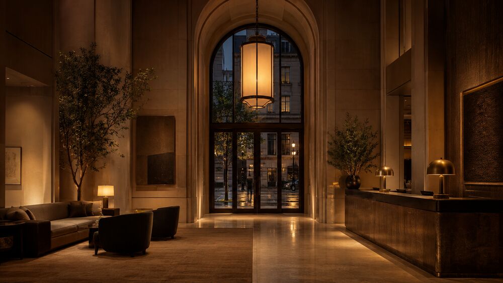
Forces
- Promise versus delivery. Overpromise loses the guest after the first visit; underpromise loses them before the first.
- Recognition versus discovery. A loud façade recruits the right passerby on first reading. A quiet one recruits the in-the-know audience and forfeits the rest.
- Street voice versus brand voice. A flagship on a designer-brand boulevard reads against its neighbors’ façades; a roadside hotel reads against the highway sign that came before it.
- Material grammar at price tier. Honed stone fronts a serious property; honed stone bolted onto a strip-mall format reads as a costume.
- Day versus night. A building calibrated only for the architectural-photograph hour is uncalibrated for the eight other hours of operating reception.
- Standing maintenance. A façade that depends on weekly stone-honing or daily window-washing is a maintenance promise the operator has to keep for the life of the property.
Solution
Specify the exterior and the interior together, against a single declared frame, with the façade’s promise sized to what the interior actually delivers. The discipline runs in five decisions and one ongoing audit.
-
Declare the frame in writing. Name the frame before the façade is briefed. A 1939 noir hotel; a contemporary Japanese ryokan-tradition property in a non-Japanese hand; an Adirondack guide camp in a fourth-generation family format; a tech-company flagship that wants to read as a civic institution. The frame is the working artifact every later decision calibrates against. A brief written without one calibrates against the brand’s preferred mood board, which isn’t the same thing.
-
Brief the façade against what the interior actually delivers. One page that names what the interior is, what it costs, what guest it serves, and what reading the passerby should form on first sight. A 24-suite Japanese ryokan-tradition property at the USD 2,500 nightly tier; passerby reads as serious, regional, and not for everyone. Or: a 220-room urban resort at the USD 600 tier; passerby reads as confident, contemporary, and walk-in welcoming. Two briefs, two façades, both correct.
-
Specify materials at the property’s actual price tier. The façade’s materials are read as claims about what the interior is built from. The honest move is exterior materials that match the interior. Specifying exterior materials that exceed the interior, on the theory that the curb-side photograph sells the booking, costs the property its repeat business after the first stay.
-
Calibrate signage to the recognition strategy. Recruiting broadly: name on the façade in a register matching the price tier (a brass plate at a serious property; a backlit blade sign at a casual property; a freestanding monolith at a roadside property). Recruiting selectively: reduce signage to a minimum the in-the-know guest will recognize and the casual passerby will not. The choice is consequential, and both are legitimate.
-
Light the façade for every operating hour. Specify lighting for noon, dusk, and 11 p.m., not only for the architectural-photograph hour. A property that reads correctly at noon and reads as a parking structure at 10 p.m. has lit half its operating reception.
The ongoing audit. Revisit the frame, the brief, the materials, the signage, and the lighting at every operations milestone: the first season after opening, the first refurbishment cycle, the first ownership change, the first brand pivot. The audit asks one question: does the façade still promise what the interior still delivers? A property whose kitchen leadership, brand positioning, or service standard has drifted has often shifted its delivery without re-briefing its exterior, and the mismatch reads as a property in decline before the operator has noticed the drift.
Sensory Channels
- Primary: visual (proportion, material grammar, signage register, condition; reading distance 5–60 m for a city-block property, 60–250 m for a roadside or resort property).
- Secondary: auditory in some cases (the fountain in an Aman driveway, the Aurebesh signage that hums at Galaxy’s Edge, the ambient register of an open-air restaurant whose façade is the dining room itself).
- Tertiary: olfactory in some cases (the cedar of a Pacific-Rim property whose entry is open-air, the eucalyptus of a Cape Town property whose driveway is planted in regional species). Rarely available at city-block scale; one of the under-used calibration moves at resort and roadside scale.
Inheres-In
- Primary: transposable. The pattern lives at the boundary between any venue’s interior and its public-facing exterior, and the calibration discipline applies wherever an operator owns the exterior reading.
- Transposes to: hospitality, retail (a flagship whose façade is read against a designer-brand boulevard’s other façades), museum (the entry to a building whose collection cannot be sampled from the curb), themed-entertainment (the gate to an attraction whose interior is famously not visible from outside), brand-experience (the temporary façade of a pop-up that has fourteen operating days to recruit its audience), service-flow (the entry to a clinic, salon, or service venue whose interior register is not curb-readable).
- Does not transpose: immersive-theatre with a deliberately concealed venue (a Punchdrunk-style production whose entry strategy is “the front door is unmarked and the audience finds it through the briefing communications”). The operator has refused the calibration in favor of a different recruiting move, and the pattern does not apply.
How It Plays Out
Three cases at three calibrations: honest serious, deliberately quiet, and honest deference. Each is documented in published architectural and trade-press coverage; each succeeds against the frame the operator declared.
The Apple Fifth Avenue Cube (Bohlin Cywinski Jackson with Apple’s industrial-design team; opened May 2006, refurbished and re-opened September 2019; New York City). The 32-foot glass cube on the southeast corner of 59th Street and Fifth Avenue sits above a 24-hour subterranean retail store. Its promise is structurally identical to the products inside: we will spend the engineering budget to make the visible work disappear into a single confident gesture. The 2006 cube was specified at 90 insulating-glass panels with internal mullions invisible at street distance; the 2019 refurbishment reduced the panel count to 15 (three per face), the corner joints engineered as point-supported structural-glass connections. Bohlin Cywinski Jackson’s accounts in Architectural Record (May 2006 and October 2019) treat the cube as the firm’s most demanding façade brief, because the building was the entire above-ground footprint of the store and had to function as both signage and structure. The interior delivers: a single 32-foot-tall hardwood-and-stainless stair descends to a column-free retail floor calibrated against the same engineering-budget premise. The passerby’s first reading is confirmed within five steps of descending. Exterior and interior were specified by the same hands against the same brief.
Aman Tokyo (Aman; building Pacific Century Place Marunouchi by Pelli Clarke & Partners with completion 2002; Aman lobby and interiors by Kerry Hill Architects; Aman Tokyo opened December 2014; Otemachi, Tokyo). Aman inherited a curb it did not own. The property occupies floors 33–38 of an existing Class-A office tower whose exterior the brand could not change. The solution: refuse the curb-side façade entirely and relocate the façade promise to the 33rd-floor lobby, which the guest reaches via a controlled elevator ride. The ground-floor entry is intentionally underspecified: a brass plate the size of a paperback at eye level on a black granite wall; no doorman; no stanchion-and-rope; an unmarked elevator vestibule that delivers the guest to a second elevator behind a wood door, which delivers them to the 33rd floor. The “façade” in the brand’s working language is a 30-meter washi-paper-and-honed-stone volume: 6-meter ceilings, a single ikebana arrangement, a single lit lantern, the city out the slot windows above the seating. Kerry Hill’s accounts in Architectural Record and Wallpaper (December 2014 and January 2015) treat the lobby as the property’s true façade. The promise is calibrated to what the suites deliver: serious Japanese material grammar, contemporary proportions, omotenashi service in a Western luggage-bearing format, USD 1,800–4,500 nightly. A backlit signage band at this tier would have read as inauthentic; a sumptuous ground-floor lobby with an underwhelming 33rd-floor arrival would have read as overpromise. The brand calibrated against both by relocating the promise to the floor that delivers it.
The Apple Tower Theatre flagship (Foster + Partners with the Apple retail team; opened June 2021; Broadway and 8th Street, downtown Los Angeles). A calibration applied to a building Apple did not design and could not replace. The property occupies the restored 1927 Tower Theatre, a Beaux-Arts and Spanish-Renaissance-revival former movie house by S. Charles Lee, vacant since 1988 and on the National Register of Historic Places since 1979. The exterior had to read as the restored Tower Theatre (city, heritage organizations, National Register required it); the interior had to read as a contemporary Apple flagship. The reconciling move was honest declaration of two frames stacked on the same property. The façade is restored to its 1927 specification (Renaissance-revival ornament, original blade marquee re-fabricated from documentary photography, corner clock tower repaired and re-mechanized) without contemporary signage; the only Apple identifier is a small Apple logo etched into the new glass entry doors at human height, visible at five meters and not at fifty. The promise is this is the restored Tower Theatre, and what is inside has been entrusted with respecting it. Inside, the Apple register is applied with discipline against the heritage frame: the original auditorium’s barrel-vaulted ceiling, gilded ornament, and proscenium arch are restored and uncovered as the retail floor’s overhead surface; the contemporary fixtures (the Genius Grove benches, the demonstration tables, the staircase to the Forum upper floor) are detailed at a quieter scale than the brand’s purpose-built flagships, reading as inserted rather than dominant. Architectural Record (July 2021) and the Los Angeles Times heritage-coverage both note that the calibration succeeds because Apple briefed against the building rather than against its own house brief.
Same discipline at three calibrations. The form factor adjusts to what the operator controls and what the declared frame absorbs.
Consequences
What it buys: a passerby whose first hypothesis is confirmed in the first thirty seconds of interior; an experience read as authentic from the curb forward; a recruiting strategy that selects the right guest at the lowest cost the operator can spend; a property whose external reputation tracks its actual delivery. A calibrated façade earns the architectural feature without the operator pitching for it, because the building does the pitching.
What it costs: coordination across exterior and interior against one written frame, absorbed only when the project is large enough or the brand mature enough to support a single hand on both sides; materials specification at the actual price tier (an honest minimal façade costs more than a noisy minimal one, because the honesty comes from material that reads correctly at touch distance); a lighting consultancy across operating hours; a recurring maintenance budget for the life of the property.
Where it stops working: in venues whose exterior is not the operator’s to specify (relocate the promise inside, as Aman Tokyo did, and accept that booking sites, brand reputation, and in-the-know referral do part of the recruiting). Also in venues whose street register is dominated by visual noise the operator cannot quiet (a Times Square retail flagship competes with Times Square; a roadside attraction competes with the highway sign that came before it). The calibration has to be re-briefed against what the passerby is actually reading.
Failure Modes
-
Overpromise. Façade signals a tier the interior cannot deliver. Classic case: a faux-ornate exterior fronting a chain-restaurant interior. Diagnostic: walk in as a first-time guest at peak hour and time the moment the curb-side hypothesis breaks. Under thirty seconds and the façade overpromised. Recovery: downward calibration; operators usually resist because the curb-side photograph is doing booking work the corrected façade would do less of. Shades into Theme-Park Pastiche and Manufactured Authenticity when the overpromise extends to a fabricated heritage claim.
-
Underpromise. Façade signals below what the interior delivers; the right guest walks past. Case: a serious restaurant behind an unmarked door in a converted bay, with a USD 350 tasting menu, recruiting entirely through reservation networks. Recovery: selective amplification to the minimum signal the right guest will read (a brass plate, a single specimen tree, a posted menu under glass) without losing the deliberate-quiet calibration. Often misdiagnosed as a branding problem when it is a calibration problem at the entry.
-
Mismatched register. Façade signals one frame, interior signals another. Case: a hospitality property whose exterior signals contemporary Japanese minimalism and whose interior is fitted in a brand-portable hotel-chain register that ignores the exterior’s claim. The break is read by the guest’s body before their head and is the most-cited single mode of disappointment in trade-press coverage of hotel renovations that altered the interior without re-briefing the exterior. Recovery: re-calibration, usually of the interior (the exterior is harder to change).
-
The aging façade. Calibrated correctly at opening, allowed to age out of register. Stained stone, overgrown planting, replaced fixtures, an overlaid re-brand the architect did not coordinate. The current promise reads we are a property in decline, and the trade press follows. Recovery: restoration to the calibrated specification, which is a maintenance budget the operator should have been carrying since opening.
-
The night-blind façade. Calibrated for the noon photograph and uncalibrated for the other operating hours. Case: a city-block property whose daytime register is a confident contemporary block in honed stone and whose night register is a blackout box with a single dim sconce by the door. Most arrivals at hospitality and restaurant properties happen between 6 p.m. and 10 p.m.; the night reading is the one most guests see. Recovery: a separate lighting design for the night façade, which is a real line item and one of the most cost-effective single moves against the underpromise failure mode.
-
The pastiche façade. Façade borrows a heritage register the building has not earned and the interior cannot honor. Case: a US-suburban office park dressed in a Tuscan- or Mediterranean-village pastiche fronting a Class-B office floor with drop ceilings, fluorescent lighting, and a vending alcove. Unrecoverable without rebuilding the property; the cheaper move is to re-brief the exterior to a register the interior can honor. Shades fully into Theme-Park Pastiche; the boundary is whether the operator believes the pastiche is honest (it isn’t).
Related Articles
Sources
- B. Joseph Pine II and James H. Gilmore, Authenticity: What Consumers Really Want (Harvard Business School Press, 2007). The follow-up to The Experience Economy whose “rendering authenticity” argument is the operative framing for the calibration discipline this pattern names. Pine and Gilmore’s working test (is the offering true to itself, and is it what it says it is to others?) translates directly to the façade-and-interior calibration.
- Robert Venturi, Denise Scott Brown, and Steven Izenour, Learning from Las Vegas (MIT Press, 1972; revised 1977). The founding architectural-criticism statement on the building-as-billboard question and the relationship between exterior signage register and interior delivery. The “duck” / “decorated shed” distinction is the substrate the modern façade-promise discussion sits on.
- Karal Ann Marling, ed., Designing Disney’s Theme Parks: The Architecture of Reassurance (Flammarion, 1997). The Canadian Centre for Architecture’s exhibition catalogue with essays from architectural and cultural historians. The treatment of Main Street, U.S.A. and the park entry sequence is the most-cited academic account of how a calibrated entry façade absorbs the guest into a declared frame; the essays on the Cinderella Castle gateway and the entry plaza articulate the calibration discipline at theme-park scale.
- Kevin Lynch, The Image of the City (MIT Press, 1960). The urban-design substrate for the broader argument that buildings and venues are read against their visual context. Lynch’s five-element framework (paths, edges, districts, nodes, landmarks) is the academic vocabulary the architectural-press coverage of flagship and hospitality façades imports.
- Erving Goffman, The Presentation of Self in Everyday Life (Doubleday, 1959). The dramaturgical substrate that explains why an honest calibration matters: the façade is a front-stage claim, the interior is the next front-stage region, and a guest’s reading of the property is a continuous performance. A façade-and-interior mismatch is, in Goffman’s vocabulary, an unrecoverable break in the staged claim.
The Queue as Show
The waiting sequence composed as a designed unit of the experience rather than a tax against it, so the time the guest already spends becomes part of the show.
Also known as: queue theming, the interactive queue, the pre-show, the standby experience, line entertainment, the holding sequence.
If you have ever stood in a ride line where the walls, props, sound, and staff made the wait feel like the story had already started, you have seen this pattern. The queue is not decoration around delay. It is the experience’s first sustained room: the place where the guest’s body slows, the rules arrive, anticipation rises, and the showpiece earns a better opening.
Understand This First
- The Vestibule Pause — the held-duration entry reset the queue scales up when one room cannot absorb the arriving crowd.
- Duration Neglect — the cognitive accounting failure this pattern uses when an occupied, framed wait feels shorter than its clock length.
Context
A queue becomes design material when demand exceeds what a single threshold can hold. A theme-park attraction carries a 90-minute standby line on a summer Saturday. A museum runs timed entry for a headline show. A restaurant holds a 45-minute wait at the bar. A flagship store has a drop line down the block. An immersive-theatre production batches a masked audience into elevator-loading groups. A brand activation may be judged almost entirely by how its sidewalk line behaves.
The pattern needs two conditions. The wait is honest and unavoidable: demand outruns capacity, and scheduling can’t remove it without creating another kind of friction. The operator also owns the envelope of the wait, even if they do not own its duration. That time is already being paid for in floor space, staffing, guest attention, and first impression. It can be composed or wasted.
The queue sits between The Driveway and the vestibule in scale. The drive conditions the body across acreage; the vestibule resets it in a room; the queue does both when traffic is measured in throughput. It is the batched threshold.
Problem
A wait is a debit against patience. Left alone, the standby line reads as tax: dead time before the thing the guest came for, accruing irritation by the minute. Bare switchbacks are the purest version of the failure. They move bodies but drain attention.
The reverse failure is quieter. Paid line-skips, virtual queues, and timed-entry slots reduce the visible line, but they can hollow out the very surface that could have done the most work. A park that sends its most engaged guests into a priority lane while the standby route decays has not solved the wait. It has stratified it. The guests who wait longest receive the weakest version of the experience. The FastPass and Lightning Lane era made that visible, and the post-2019 return to physically interactive standby queues is part of the correction.
The pattern converts the wait by using the queue’s envelope, content, and pacing. A composed queue orients the guest, builds anticipation, establishes the world, transmits rules, and drops the body toward flow before the showpiece begins. Done well, the wait stops being subtracted from the experience. Done badly, the queue is a decorated holding pen, no better than bare rails and more expensive to build.
Forces
- Occupied versus empty time. Occupied time feels shorter than empty time, but filler can feel longer than honest emptiness. The content has to be something the guest would choose, not a screen announcing that time is being killed.
- Anticipation versus fatigue. A queue can prime the peak, but it can also spend the guest before the door opens. The build has a budget measured against the real wait.
- Density versus legibility. The queue is the field’s densest substrate for in-world detail. Dose every channel at once and it becomes Sensory Overload. Layer; do not pile.
- Fairness versus throughput. The standby guest watches the priority guest pass. If the fairness logic is hidden or visibly weighted against standby, resentment becomes the line’s main content.
- Interactivity versus operations. A decoder station, panel, or game is a maintenance contract. A broken feature advertises neglect more loudly than a queue that never promised interactivity.
- Designed wait versus manufactured wait. An unavoidable wait can be composed. A wait extended to manufacture scarcity is dishonest. The pattern patrols that boundary.
Solution
Treat the waiting sequence as a designed compositional unit. Six decisions matter.
-
Choose the queue’s narrative job. A queue can orient, build anticipation, establish a world, brief the guest, or recover the body after a high-affect prior scene. Trying to do all five usually does none. Pick the job the showpiece needs. The mask handoff uses the line for briefing; Indiana Jones uses it for world-establishment; a museum headline show may use it for orientation.
-
Choose the envelope. A switchback hides length but doesn’t control reveal. A corridor controls sightline but exposes duration. A holding room batches cohorts but interrupts flow. A virtual queue returns time but removes the physical surface. Choose the envelope the narrative job requires, not the one the site plan defaulted to.
-
Compose the surface. This is the queue’s servicescape: theming, sightlines, lighting on a time axis, soundscape, scent, backstory detail, and interactive features. Dose them against the wait and against one another per Sensory Layering. A slow guest has time to read. That is the queue’s advantage.
-
Calibrate the pacing. Entry rate, dispatch rate, batch size, dwell at each feature, and the reveal moment keep the guest inside the flow band. A queue calibrated for a 60-minute wait reads thin at 15 minutes and like homework at 120 minutes. Design for the wait’s real range, not the brochure range.
-
Compose the emotional gradient. Maister’s waiting-line checklist still holds: occupy the wait, frame its duration, explain its structure, keep groups from fragmenting, manage fairness, and treat the wait as visible service. A queue composed this way feels shorter than its clock. That is duration-neglect engineered on purpose.
-
Audit the decay. A composed queue degrades quickly because it is operational. Walk standby as a first-time guest at peak hour, on the wait’s worst day. Test every feature. Watch the priority merge. Ask the only question that matters: did the wait read as part of the show, or as the price of admission to it?
Sensory Channels
- Primary: visual (controlled sightlines; time-axis lighting; layered signage and props; the weenie or showpiece as the magnet at the line’s far end).
- Secondary: auditory (looped score, ambient bed, withheld silence, pre-show audio, and live staff handoffs carrying the briefing; operational noise kept off the guest-facing channel).
- Tertiary: olfactory (where earned, a scene-appropriate note dosed on the wait’s clock with calibrated throw and refreshment).
- Quaternary: kinesthetic (advance, dwell, tactile features, shade, seating where the format allows, temperature, and reveal-and-dispatch geometry).
Inheres-In
- Primary: themed-entertainment. The queue-as-show was invented and most fully developed in theme parks, where waits are long, daily, and unavoidable.
- Transposes to: museum (timed-entry line as interpretive surface); hospitality (restaurant bar-and-lounge wait, hotel check-in line); retail (flagship drop line); immersive-theatre (batched door queue and mask handoff); brand-experience; service-flow.
- Does not transpose: reservation-only formats with no line, single-mass entries where throughput defeats sequence, and settings where the honest move is to remove the wait. Dressing a solvable wait is staging the surface of the problem.
How It Plays Out
Three cases show the same discipline at different jobs: world-establishment, anticipation-build, and briefing-as-batching.
The Indiana Jones Adventure standby queue (Walt Disney Imagineering; opened March 1995; Adventureland, Disneyland Park, Anaheim) is the world-establishment case. The line runs through a constructed temple: caverns and chambers with twelve in-narrative letters and telegrams, Maraglyphics decoded with a paper card from the entrance, a pole that triggers a spike-room gag overhead, and a three-newsreel pre-show that batches guests for loading. A guest can spend forty minutes inside the story before reaching the dispatch bay. The queue has done the ride’s exposition, so the vehicle can go straight to motion. Published Imagineering accounts and trade coverage treat the queue, not the ride system alone, as the attraction’s design breakthrough.
Seven Dwarfs Mine Train’s interactive queue (Walt Disney Imagineering; opened May 2014; Fantasyland, Magic Kingdom, Walt Disney World, Florida) is the anticipation-build case for families. The line builds games into the physical surface: water-filled tubs that sort tumbling jewels by color, musical taps, and projection-mapped vignettes that respond to motion. The games occupy without exhausting, which matters on an attraction whose wait can test a four-year-old’s patience. For a parent managing a tired child, the line itself becomes the thing to do.
The arrival queue at Sleep No More (Punchdrunk and Emursive Productions; Felix Barrett, Maxine Doyle, and Steven Hoggett creative team; opened March 2011, closed January 2024; the McKittrick Hotel, Chelsea, New York) is the briefing-as-batching case. Guests moved through registration and mask handoff into a holding bar, then into elevator cohorts. The wait taught the convention the production depended on: masked, silent, free to roam, free to follow one character through the building. It was onboarding, not delay. The published audience protocol and creative-team interviews treat the queue-and-bar sequence as the precondition for the first scene’s silence and darkness.
Indiana Jones runs the world-establishment version, Seven Dwarfs the anticipation-build version, and Sleep No More the briefing version. The discipline is the same. The narrative job, envelope, and pacing change with what the showpiece needs.
Consequences
The pattern converts a wait from a debit into a contribution. The guest emerges oriented, anticipating, or already inside the world. The showpiece lands on a primed guest, not a depleted one. The day’s average rises even when the peak does not, and the entry-point trough that would contaminate the whole memory of the day is prevented. A composed queue also becomes a photographic surface, often the day’s first contribution to the guest’s social archive.
It costs the build and the operation. A composed queue is a constructed environment with theming, lighting, audio, props, and interactive systems specified, installed, commissioned, and maintained. Its last twenty seconds are also a staffing commitment: the dispatch handoff either lands the guest into the show or handles them like paperwork. The calibration has to hold across a duration the operator cannot fully predict.
It stops working when the wait can be removed. Staggered reservations, a virtual queue that genuinely returns time, or capacity expansion all beat a composed line when the line itself is the problem. The pattern composes time the guest must spend. It is not permission to make them spend it. Once a queue is held longer than demand requires, it has inverted into Synthetic Scarcity.
Failure Modes
The predictable failures recur across themed-entertainment, museum, hospitality, and immersive-theatre operations.
-
The hollowed standby line. Paid or virtual priority lanes receive the investment; standby decays into bare rails. The wait has been stratified, not solved. Recovery is a priority model that keeps enough investment in standby for it to remain an experience, plus re-composition where the route was hollowed by design. The post-2019 return to physically interactive standby queues is this recovery at industry scale.
-
The broken interactive feature. A decoder station, motion-triggered panel, or game goes dark and stays in place. The prop now advertises neglect. Recovery is a maintenance and replacement budget, or honest removal when the operator can no longer maintain the feature.
-
The flooded queue. A switchback built for a 45-minute peak now holds 120 minutes of guests. Features pass too fast to register, pacing collapses, and overflow rails carry no theming at all. Recovery is a capacity decision: more dispatch throughput, a virtual queue that honestly returns time, or expansion. A composed queue cannot absorb unbounded demand.
-
The competing queue. The line is richer than the showpiece. Guests leave talking about the queue, not the ride. Recovery is a re-cut that primes the peak without becoming it, holding back the reveal and highest-affect content for the showpiece.
-
The filler queue. The wait is occupied by material the guest reads as filler: a looping advertisement, generic corridor theming, music unrelated to the show. An honest empty wait may feel shorter. Recovery is content the guest would choose and interactivity the guest can affect.
-
The hidden accessibility track. The accessible path is missing, undecorated, hard to find, or separate from the composition everyone else receives. The investment reaches every guest except those for whom the wait is hardest. This shades into Designed Exclusion. Recovery is an accessible route designed with the same composition from the start, plus virtual or assisted entry that does not isolate the guest who uses it.
-
The manufactured wait. The operator pads a queue algorithmically, holds a drop line long past supply, or inflates virtual-queue times so scarcity can do the marketing. The composition becomes a cover for extraction. Recovery is honesty about the wait’s true length and an end to the padding; a composed queue can make an unavoidable wait better, but it can’t make a manufactured wait honest.
Related Articles
Sources
- David H. Maister, “The Psychology of Waiting Lines” (Harvard Business School note, 1985). The founding statement of waiting psychology and the eight propositions that became the field’s working checklist: occupied versus unoccupied time, pre-process versus in-process waits, anxious versus relaxed waits, uncertain versus known durations, unexplained versus explained waits, unfair versus equitable waits, the value of the service against the wait it justifies, and solo versus group waits. Every composed queue is, knowingly or not, an answer to Maister’s eight.
- Anita Tucker Arveson and colleagues, “40 Years of The Psychology of Waiting: A Celebration and Update of Maister’s Eight Propositions” (working paper, 2024). The four-decade retrospective that consolidates how Maister’s propositions were operationalized and extended across operations management, services marketing, themed entertainment, healthcare queuing, and hospitality, and the state-of-the-art update for a practitioner composing a queue today.
- Mihaly Csikszentmihalyi, Flow: The Psychology of Optimal Experience (Harper & Row, 1990). The construct the interactive queue’s pacing is judged against. A composed queue that occupies the guest with absorbing, appropriately challenging activity is, at its best, dropping the body into the flow band before the showpiece, and Csikszentmihalyi’s account of the conditions for flow is the substrate for what “occupied” can mean at its highest.
- Christopher Alexander, Sara Ishikawa, and Murray Silverstein, A Pattern Language: Towns, Buildings, Construction (Oxford University Press, 1977). The pattern-language form the queue inherits, and specifically the reading of circulation and transition space as composed sequence rather than as the residue between rooms. Alexander’s treatment of the path and the gateway as designed thresholds is the lineage the queue-as-threshold argument descends from.
- The history of the queue-as-show in themed entertainment is documented in the published Walt Disney Imagineering accounts and in the long-form Imagineering-history literature, which trace the lineage from the 1955 switchback queue through 1960s pre-show batching, 1980s queue theming as standard practice, the 1995 interactive-queue breakthrough at the Indiana Jones Adventure, the 2014 interactive games of Seven Dwarfs Mine Train, and the post-2019 return to physical interactivity after the priority-lane era hollowed the standby line.
Virtual Queue
Letting a guest hold a place in a constrained experience without standing in the physical line for the whole wait, so the operator returns time while keeping capacity, order, and re-entry honest.
Also known as: boarding groups, the return-time ticket, virtual line, the callback queue, timed return, the digital queue, the wait-list app.
If you have ever tapped a button at a theme park and then gone to lunch while the system held your place, you have used this pattern. The line still exists. The order still holds. What changed is that you didn’t have to stand in it with your body for the whole wait. The operator converted your queue position into a commitment the system tracks for you: a boarding group, a return window, a text you will get when it is time.
Understand This First
- The Queue as Show — the complementary move. When the wait can be composed into the experience, compose it. The virtual queue is for when the honest answer is to give the time back.
- Decision Point Calibration — the discipline that governs whether the join, return, and cancel choices read as fair and legible or as a hidden trap.
Context
A virtual queue becomes the right move when three conditions hold at once. Demand outruns capacity, so a wait is unavoidable. The wait is long enough that asking a body to stand in it is a real cost, not a minor one. And the surrounding venue has something else worth doing while the wait runs.
The pattern lives most fully in themed entertainment, where it carries names the public now recognizes: boarding groups at Disney, the Virtual Line at Universal, the TapuTapu wristband at Volcano Bay. But it transposes the moment those three conditions appear anywhere. A restaurant with a 90-minute Friday wait and a shopping district around it. A flagship store with a product drop and a neighborhood of cafés. A clinic waiting room where the patient could sit in their car. A museum with a single high-demand timed exhibit inside a building full of other galleries. The Nielsen Norman Group treats the virtual queue as a cross-setting user-experience pattern for exactly this reason: the design problem is the same whether the wait is for a roller coaster, a table, a fitting room, or a doctor.
The pattern needs a substrate to carry the held place. That substrate is usually a smartphone app, but it does not have to be: a wristband, a paper return-time ticket, a kiosk-printed slot, a text-message thread, or a staffed callback list all work. The choice of substrate is the choice of who can use the queue, which is where the pattern most often fails.
Problem
A physical line forces a trade the guest never agreed to: to hold a place, you must spend the wait standing in it. For a short wait, that trade is fine. For a long one, it is a tax paid in the guest’s most finite resource. Two hours in a switchback is two hours not spent on anything else the venue offers, and the venue has been paid for those two hours in floor space, staffing, and a guest’s depleted patience.
The standby Queue as Show answers this by making the wait worth standing in. That answer is right when the operator owns the envelope and can compose it. It is the wrong answer when the wait cannot carry composition, when the venue around it is richer than any line could be, or when the honest move is simply to hand the time back. A bare switchback with nothing to compose, fronting a park full of other attractions, doesn’t need decoration. It needs to release the body.
The virtual queue solves that. It decouples holding a place from occupying it. But the moment it does, it creates a new set of problems the physical line did not have. The guest can’t see the line anymore, so the operator now owns the legibility the line used to provide for free. Scarcity becomes invisible and therefore easy to fake. The return moment depends on a notification that can fail. And the substrate that carries the held place can exclude the guest who cannot use it. The pattern is not “remove the wait.” It is “remove the standing, and take ownership of everything the line was silently doing while the guest stood in it.”
Forces
- Returned time versus phone anxiety. The pattern gives the guest their wait back, but it can replace standing-in-line with checking-the-app: a low-grade vigilance that taxes the very freedom it promised. A queue that demands constant monitoring has not returned the time; it has fragmented it.
- Capacity honesty versus invisible scarcity. A physical line is self-auditing: the guest can see how long it is. A virtual queue hides the line, which means the operator can pad it, and the guest can’t tell. The freedom to fake the wait is the pattern’s central temptation.
- Convenience versus access. The smartphone app is the most convenient substrate and the most exclusionary one. Every channel that makes the queue easier for the connected guest can make it impossible for the one without it. A charged phone, a data plan, the right language, the dexterity, the sight: each is a precondition the connected guest never notices and the excluded guest cannot meet.
- Flexibility versus the missed window. A return window respects the guest’s time only if missing it is recoverable. A queue that voids the place the instant the guest is two minutes late has converted flexibility into a penalty.
- Automation versus the human fallback. The system scales; the system also fails. When the notification does not arrive, when the app crashes, when the guest’s situation does not fit the rules, the only recovery is a staff member with the authority to fix it. A virtual queue with no human fallback fails completely for the guest it fails at all.
Solution
Decouple holding a place from standing in it, then take explicit ownership of the four things the physical line used to handle for free: legibility, fairness, the return moment, and access. Six decisions matter.
-
Decide whether to virtualize at all. The honest test is what the returned time buys. If the wait can be composed into the experience and the operator owns the envelope, compose it. That is The Queue as Show. Virtualize when the wait cannot carry composition, when the surrounding venue is richer than any line, or when the wait is doing no threshold work and the body should simply be released.
-
Choose the substrate for the widest guest, not the median one. App, wristband, kiosk, paper ticket, text thread, or staffed list. Pick the one the broadest set of guests can use, and provide a staffed fallback for everyone the primary channel misses. The connected guest with a charged phone is the easy case; design for the one without it, and the easy case takes care of itself.
-
Make the join obvious and the rules visible up front. State the distribution time, the one-at-a-time constraint, the return-window length, and the no-guarantee caveat before the guest commits, not after. The Nielsen Norman Group’s first rule is to explain the queue; the most common violation is a join button that commits the guest to rules they discover only when it is too late to choose differently.
-
Communicate position and progress honestly. The guest cannot see the line, so the operator must show it: where they stand, roughly how long, and any change. The number does not have to be precise, but it has to be honest. A countdown that resets, a wait that inflates without cause, or a position that mysteriously slips is the pattern inverting into Synthetic Scarcity.
-
Design the return window to forgive. The callback is a promise; the return window is how much slack the promise carries. Give a window wide enough to absorb a guest who was mid-meal, mid-restroom, or across the park when the alert fired, and make a missed window recoverable (a rejoin, a grace period, a staffed exception) rather than a silent void. The return window is where the pattern either respects the guest’s time or punishes them for trusting it.
-
Staff the failure. Notifications fail. Apps crash. Guests fall outside the rules. Put a human at the return point with the authority to honor a place the system dropped, re-issue a window, and assist the guest the channel excluded. This is Anticipatory Service applied to the queue: the staff member who closes the gap before the guest has to argue it.
Sensory Channels
- Primary: none by design. The pattern’s intent is to remove the guest’s body from the sensory field of the wait, returning them to the venue’s other sensory environments. Its “channel” is the venue at large.
- Secondary: the return alert — auditory (a chime, a call), haptic (a vibration, a wristband buzz), or visual (a screen banner). The alert must be perceptible across the venue’s ambient conditions and on more than one channel, since a single-channel alert excludes the guest who cannot perceive it.
- Tertiary: the rejoin threshold — the brief physical line at the return point, which is itself a short Queue as Show and a Briefing Ritual surface where the last rules and readiness instructions land.
Inheres-In
- Primary: themed-entertainment. The boarding-group and return-ticket systems were invented and most fully developed in theme parks, where waits are long, daily, and surrounded by other attractions worth releasing the body toward.
- Transposes to: hospitality (restaurant and bar wait-list apps, hotel callback check-in); retail (drop-line return times, fitting-room queues); museum (a single high-demand timed exhibit inside a larger building); mixed-channel-cx (the call-center callback, the appointment-system virtual line); service-flow (clinic and pharmacy callback queues, the DMV ticket-and-screen).
- Does not transpose: waits short enough that virtualizing adds more friction than it removes; venues with nothing else to do, where releasing the body strands the guest rather than freeing them; and waits doing real threshold work, where The Queue as Show is the honest answer and dissolving the line would dissolve the crossing.
How It Plays Out
Three cases show the same decoupling at different scales: the park-wide app, the wearable, and the cross-setting service rule.
Disney’s boarding-group system (Walt Disney World and Disneyland Resort guest services; in service since the 2019–2020 launch of high-demand attractions) is the app-based case at park scale. A guest joins through the official app at a set daily distribution time, receives a boarding group, and then moves freely through the park until a notification and a designated return window call them back. The guest-services pages name the one-at-a-time constraint, the return-window rule, the late-arrival risk, and the explicit caveat that a boarding group does not guarantee participation or admission. The system’s honesty is in that caveat: it sells a held place, not a promise the operator cannot keep. At read time, the Walt Disney World page also noted that no virtual queues were currently active while preserving the system for future high-demand launches. The pattern is kept as standing infrastructure, not a one-off.
Volcano Bay’s TapuTapu wristband (Universal Orlando Resort; opened May 2017) is the wearable case, and it answers the substrate problem most directly. At a water park, a smartphone is a liability, because guests are wet, swimsuited, and pocketless. TapuTapu moved the held place onto a waterproof wristband: a guest tapped a totem at a slide to hold a place in its virtual line, then swam, floated the lazy river, or sat in the sun while the wait ran, and the band signaled when it was time to return. Universal’s release material framed the wristband as the way to wait for one attraction while enjoying another. The design lesson is the substrate choice: the channel was matched to the body the venue actually had, not to the device the guest happened to carry.
The cross-setting best-practice rule (Nielsen Norman Group, “Virtual Queues: 13 Best Practices for Managing the Wait,” 2023) is the case that shows the pattern is not a theme-park trick. NN/g treats the virtual queue as a user-experience pattern spanning theme-park rides, restaurants, retail stores, and doctors’ offices, and reduces the design to a small set of rules that recur in every setting: explain the queue, make entry obvious, communicate closure, let users prepare, and preserve their time. The same rules that govern a boarding group govern a restaurant wait-list text and a clinic callback. The setting changes; the contract with the guest does not.
Consequences
The pattern returns the guest’s most finite resource. Two hours that would have been spent standing become two hours of the venue’s other offerings, and the guest who would have arrived at the showpiece depleted arrives fresh. For the operator, the released body is a spending body and a circulating one: a guest freed from the line eats, shops, and explores rather than burning down their patience in a switchback. The venue’s other surfaces get the attention the line would have absorbed. And a well-run return window plus a staffed fallback can read as Anticipatory Service: the system that met the guest before the wait could fail them.
It costs the operator the legibility the physical line provided for free. A hidden line must be narrated, and narrating it honestly is a discipline most operators discover only after a padded wait gets caught. It costs a notification system reliable enough to be trusted, a return window generous enough to forgive, and a staffed return point with the authority to fix what the system breaks. The cheap version (an app, a join button, and no human behind it) is worse than a physical line, because at least the physical line was visible.
It stops working when the wait is short, when the venue has nothing else to offer the released guest, or when the wait is doing threshold work. A virtual queue fronting an empty venue strands the guest. A virtual queue that dissolves a wait the experience needed has thrown away the crossing. The pattern returns time; it cannot manufacture somewhere to spend it.
Failure Modes
The predictable failures recur across themed-entertainment, hospitality, retail, and service operations.
-
Phone-tethered freedom. The queue returns the body but captures the attention: the guest spends the “free” interval checking the app every few minutes for fear of missing the call. Recovery is a reliable, multi-channel alert with enough lead time and a wide enough return window that the guest can stop monitoring and trust the system to find them.
-
The padded return time. The operator inflates the displayed wait, holds back capacity, or lets the number drift so scarcity does the marketing. The guest cannot see the real line to check. This shades directly into Synthetic Scarcity. Recovery is honest position and progress reporting, and an end to the padding. A hidden line is a trust contract, and a padded one breaks it the moment a guest compares notes with another.
-
The smartphone-only gate. The join requires an app, a data plan, a charged battery, and the literacy to operate it, with no other path. Every guest without all four is locked out of a queue everyone else can use. This is one of the field’s most common forms of Designed Exclusion. Recovery is a second channel (a kiosk, a paper ticket, a staffed list) and a fallback that is equal to the app, not a worse afterthought.
-
The inaudible alert. The return notification fires on a single channel the guest cannot perceive: a chime in a loud venue, a banner on a phone in a pocket, a vibration on a band a guest with a sensory limitation cannot feel. The place is voided for a guest who never got the message. Recovery is redundant alerting across more than one sense and a return window wide enough to absorb a late-received signal.
-
The unforgiving window. The return window is too narrow or voids the place the instant it closes, so a guest mid-meal or across the venue loses a place they earned. The flexibility the pattern promised becomes a penalty. Recovery is a wider window, a grace period, and a staffed exception path for the guest who arrives just after it closes.
-
The pay-to-skip dressed as the queue. The “free” virtual queue is starved of capacity while a paid lane absorbs it, so the honest path becomes unusable and the paid one becomes the only real queue. The guest is nudged toward paying for what was framed as complimentary. Recovery is enough capacity in the free queue to keep it a genuine option, and honesty about what the paid tier actually buys.
-
The orphaned guest. The notification fails, the app crashes, or the guest falls outside the rules, and there is no human with the authority to fix it. The system’s one failure becomes the guest’s total failure. Recovery is a staffed return point empowered to honor a dropped place, re-issue a window, and resolve the case the rules did not anticipate.
Related Articles
Sources
- Walt Disney World and Disneyland Resort, “Virtual Queues” (official guest-services pages). The operating documentation for the boarding-group system: app-based join, daily distribution times, callback notifications, designated return windows, the one-at-a-time constraint, the late-arrival risk, and the explicit caveat that a boarding group does not guarantee participation or admission. The published rules are a working specification for an honest virtual queue, and the no-guarantee language is the model for selling a held place rather than a promise the operator cannot keep.
- Kim Flaherty, “Virtual Queues: 13 Best Practices for Managing the Wait” (Nielsen Norman Group, 2023). The cross-setting treatment that establishes the virtual queue as a user-experience pattern across theme-park rides, restaurants, retail stores, and service settings. Its design rules — explain the queue, make entry obvious, communicate closure, let users prepare, and preserve their time — are the substrate for this entry’s solution sequence and the evidence that the pattern is not a themed-entertainment trick but a general arrival-design move.
- Universal Orlando Resort, the Virtual Line app feature and the Volcano Bay TapuTapu wristband (in service since the park’s May 2017 opening). The wearable implementation that answers the substrate problem directly: a waterproof band carrying the held place where a smartphone cannot go, with a guest tapping a totem to hold a place and receiving a signal to return. The case for matching the queue’s substrate to the body the venue actually has rather than to the device the guest is assumed to carry.
- David H. Maister, “The Psychology of Waiting Lines” (Harvard Business School note, 1985). The founding statement of waiting psychology underwrites the virtual queue as much as the physical one: the propositions that unexplained and uncertain waits feel longer, that unfair waits breed resentment, and that anxiety lengthens the felt wait are precisely the failures a hidden line amplifies when its legibility, fairness, and honesty are not deliberately rebuilt. The virtual queue removes the body from the line but inherits every one of Maister’s propositions about the mind that is still waiting.
Timed Entry
Converting an undifferentiated arrival surge into pre-declared entry slots, so the operator smooths demand, protects capacity, and shortens or prevents the line before it forms.
Also known as: timed tickets, timed-entry passes, entry-slot booking, the timed reservation, admission windows, the scheduled-arrival ticket.
If you have ever booked a museum for 11:30 on a Saturday and walked past the people without tickets, you have used this pattern. You didn’t get a faster line. You got a different deal: a window instead of a right to walk up, and the building agreed to receive you when you came. The crowd that would have piled against the door at opening was spread across the day before it arrived, in a booking system far from the threshold itself.
Understand This First
- The Queue as Show — the downstream move. When a wait is unavoidable and worth composing, compose it. Timed Entry is the upstream move that tries to keep the wait from forming at all.
- Decision Point Calibration — the discipline that governs whether the booking, grace-period, and walk-up choices read as fair and legible or as a hidden penalty.
Context
Timed entry becomes the right move when a crowd wants to arrive faster than the interior can receive it, and the arrival surge is predictable enough to reshape. A museum at 10 a.m. on a holiday weekend. A blockbuster exhibition with a fragile object and a fixed gallery capacity. A headline retail drop, a brand activation, an observatory deck, a historic house with rooms too small for a free-for-all. In each, demand is concentrated in time, the interior has a hard ceiling, and the operator can see the surge coming.
The pattern lives most fully in museums and cultural sites, where it carries names the public now recognizes. The Smithsonian’s National Air and Space Museum in Washington requires free timed-entry passes for every visitor, lets a guest hold up to nine at once, and says the pass does not cap how long you stay: it shapes when you come in, not how the visit unfolds once you are inside. That distinction is the pattern’s spine. A timed slot governs the threshold and releases its grip the moment you cross it.
Timed entry transposes the moment those conditions appear elsewhere. A flagship store metering a product launch. A festival gate spreading a peak into half-hour bands. A civic attraction with a viewing platform that holds a fixed count. It needs a booking surface to carry the slot and a threshold willing to honor it. The booking surface decides who can get a slot, which is where the pattern often fails.
Problem
An open door is the cruelest scheduler. It admits everyone at once and then makes the building absorb the consequences: a line that snakes outside in the weather, galleries that swing between empty and impassable, a fragile object pressed by more bodies than its conservation limits allow, and staff who cannot pace a threshold they cannot predict. The guest pays in a wait they did not choose. The operator pays in a crowd they cannot shape.
The standby Queue as Show answers this once the line exists by making the wait worth standing in. That answer is right when the wait is unavoidable and the operator owns the envelope. It is wrong when the surge could have been prevented, when the building’s true constraint is a count it must never exceed, or when the better move is to spread arrivals before they reach the door. A conservation ceiling isn’t a wait to decorate. It is a limit to respect upstream of the threshold, in the schedule.
Timed entry solves that. It reshapes the demand curve before the crowd assembles, trading the open door’s right of walk-up for a window the building can plan around. The moment it does, it inherits problems the open door did not have.
The slot is booked through a channel that can exclude. The window can be cut so narrow it punishes the guest who runs late. The displayed availability can be throttled below true capacity to manufacture urgency. A guest who arrives without a slot now faces a rule, not a line. The pattern is not “remove the crowd.” It is “reshape the crowd, and take ownership of the fairness the open door never had to think about.”
Forces
- Smoothed arrivals versus the booking barrier. Spreading the surge requires a slot, and the slot requires a booking step the open door never demanded. Every gain in flow is paid for in a hurdle placed before arrival, and the hurdle lands hardest on the guest least able to clear it.
- Capacity honesty versus invisible throttling. The guest cannot see the building’s real ceiling, so the operator can set displayed availability wherever they like. Slots that track capacity protect the experience; slots throttled to manufacture a sold-out screen sell scarcity the guest cannot audit.
- Schedule certainty versus the rigidity penalty. A window is a promise in both directions: it tells the guest when to come, and it tells the building when to expect them. The same precision that smooths the day punishes the guest whose train was late, whose toddler melted down, or whose meeting ran over. A window with no give converts a courtesy into a forfeit.
- The planner versus the wanderer. Timed entry rewards the guest who decided days ago and penalizes the one who woke up wanting to go. Tourists with fixed itineraries, locals with spontaneous afternoons, and travelers between connections meet the same window with very different ability to hit it.
- Reservation versus walk-up. A pure reservation system maximizes the operator’s control and strands every guest who did not book. A pure walk-up system serves spontaneity and surrenders the smoothing. The strong design holds both: a booked majority and a real walk-up channel that is not a lesser afterthought.
Solution
Reshape the arrival surge into pre-declared windows, then own the three things the open door never had to manage: honest capacity, a forgiving window, and an access path wide enough for the guest who did not book. Six decisions matter.
-
Decide whether to schedule at all. The test is what the slot protects. If the wait is unavoidable and worth composing, compose it: that is The Queue as Show. Schedule when the surge is predictable and preventable, when the building’s true constraint is a count it must not exceed, or when conservation, safety, or the experience itself degrades past a threshold of bodies. Don’t schedule a building that has no ceiling and no surge; you’ll add a barrier that buys nothing.
-
Size the slot to the building, not the demand. The window’s capacity should track what the interior can receive and hold well, not what the operator could sell. The Uffizi Gallery in Florence ran exactly this calculation at scale: a 2022 study in Information Technology & Tourism described a data-driven system that predicts arrivals and assigns 15-minute admission slots to keep the line off the piazza. Each slot is sized against the gallery’s measured flow rather than against raw ticket demand. The slot is a capacity instrument first and a convenience second.
-
Keep displayed availability honest. The guest can’t see the true ceiling, so the number on the screen is the building’s word. Show real availability, sell real capacity, and resist the temptation to throttle slots below what the building can hold to manufacture a sold-out screen. A slot scheme that shows “fully booked” over empty galleries has inverted into Synthetic Scarcity, and the guest who walks in to find half-full rooms has caught the operator at it.
-
Make the window forgive. A timed slot respects the guest’s time only if missing the exact minute is recoverable. Publish the grace period, hold a margin for the late arrival, and make a missed window a re-slot rather than a forfeit. The National Archives Museum in Washington frames its timed tickets as a way to guarantee a preferred date and time and skip the wait, while still admitting walk-ups. The booked guest gets certainty without the unbooked one getting locked out. The window is where the pattern either honors the schedule or punishes the guest for trusting it.
-
Keep a real walk-up path. A reservation-only door strands the tourist between connections, the local on a spontaneous afternoon, and the guest whose phone died. Hold a walk-up allotment, a same-day release, or a standby line that admits people, and make it equal in dignity to the booked path, not a holding pen for the unworthy. The booked majority smooths the day; the walk-up channel keeps the door from becoming a wall.
-
Choose the booking surface for the widest guest. Online booking is the most convenient channel and the most exclusionary. Provide a phone line, an on-site kiosk, a box office, or a staffed desk alongside it, so the guest without stable internet, a smartphone, or schedule control is not locked out of a building that belongs to the public. This is Decision Point Calibration applied to the threshold: every channel that makes booking easier for the connected guest can make it impossible for the one without it.
Sensory Channels
- Primary: none by design. Timed entry’s intent is to govern the threshold’s timing, not its sensory field. Its effect is felt as the absence of crush: fewer bodies, a shorter line, a gallery that breathes.
- Secondary: the threshold confirmation: visual (a scanned pass, a screen, a printed slot) and auditory (the gate agent’s greeting). The confirmation should read in seconds and never become its own bottleneck, since a slow scan rebuilds the very line the slot was meant to prevent.
- Tertiary: the interior’s restored pacing, which is the sensory benefit the slot buys indirectly. A metered gallery delivers the Vestibule Pause and the Briefing Ritual to a sized cohort, so those sensory beats land on a group the building can actually choreograph.
Inheres-In
- Primary: museum. Timed-entry passes were developed most fully by museums and cultural sites managing daily surges against fixed galleries and conservation limits, and the public recognizes the pattern largely from this setting.
- Transposes to: themed-entertainment (timed-ticket entry to a headline exhibit or land); retail (drop-window booking, appointment shopping); brand-experience (slotted entry to a pop-up or activation); service-flow (timed civic and government appointments); mixed-channel-cx (the online-booked, on-site-honored slot that bridges the digital reservation and the physical door).
- Does not transpose: venues with no real ceiling and no surge, where a slot adds a barrier that buys nothing; experiences whose value is spontaneity, where pre-declaration kills the visit; and waits doing genuine threshold work, where The Queue as Show is the honest answer and scheduling the line away would dissolve the crossing.
How It Plays Out
Three cases show the same upstream reshaping at different scales: the free public pass, the data-driven slot engine, and the booked-but-not-walled door.
The Smithsonian’s National Air and Space Museum (Washington, D.C.; timed-entry passes retained through the institution’s post-2021 pass policy) is the free-public-pass case. Every visitor needs a timed-entry pass, the pass is free, a guest can hold up to nine at once for a group, and the museum says the pass does not limit how long you stay. The design lesson is in that last clause: the slot governs arrival and then lets go. When the Smithsonian announced in 2021 that it would phase out timed-entry passes at most of its museums while keeping them at selected high-demand sites, it confirmed that timed entry is an operating control for capacity, not a pandemic artifact to be discarded the moment a crisis passed. The pattern is kept where the surge is real and dropped where it is not.
The Uffizi Gallery’s visitor-flow system (Florence, Italy; described in Information Technology & Tourism, 2022) is the data-driven case, and it shows the slot as a capacity instrument rather than a ticketing convenience. The study reported a system that uses predictive and prescriptive models to forecast arrivals and assign 15-minute admission slots, with the stated goal of avoiding the long lines that used to form outside the gallery on the piazza. The slot is sized against the gallery’s measured ability to receive and hold visitors, so the window is the output of a flow calculation, not a marketing tool. Honest timed entry begins with the building’s true capacity and works backward to the schedule, not the reverse.
The National Archives Museum (Washington, D.C.; timed tickets via the museum’s visit and tickets pages) is the booked-but-not-walled case. The museum encourages timed-entry tickets to guarantee a preferred date and time and to reduce waiting, while still admitting walk-up visitors. The booked guest buys certainty; the unbooked guest is not turned into a trespasser. The design lesson is that the strongest timed-entry systems treat the reservation as a courtesy the guest can choose, not a gate that punishes the guest who did not. The walk-up path is what keeps a public building public.
Consequences
Timed entry buys the operator a crowd they can shape. A surge that would have crushed the opening hour spreads across the day, the line that would have snaked outside in the weather shrinks to a verification check or disappears, and a fragile object or a small room stays inside the count its conservation and safety limits demand. The guest who books gets certainty: a known time, a guaranteed admission, a visit that begins without a wait. A metered interior breathes, so the Vestibule Pause, the sightlines, and the dwell time the experience was designed around can land instead of being trampled by overcrowding.
It costs the operator the fairness the open door never had to manage. A booking surface must be built and kept honest; a grace period must be published and held; a walk-up channel must be staffed and admit people. It costs the guest a planning step the open door did not demand, and it asks the guest to decide in advance in exchange for not waiting on arrival. The cheap version is online-only booking, a rigid window, no walk-up, and slots throttled to look scarce. That is worse than an open door, because at least the open door admitted everyone it could hold.
It stops working when the building has no real ceiling and no predictable surge, where a slot adds friction that protects nothing. It stops working when the experience’s value is spontaneity, where pre-declaration converts a visit into a chore. And it stops working when the wait was doing threshold work the experience needed, where scheduling the line away throws out the crossing the line was performing. Timed entry reshapes a surge; it cannot create a constraint that is not there, and it should not be deployed as though every door had one.
Failure Modes
The predictable failures recur across museums, exhibitions, cultural sites, and any attraction that meters its door.
-
The online-only gate. Booking requires a website, an account, a smartphone, or a data plan, with no phone line, kiosk, or box office behind it. Every guest without all four is locked out of a building that is often public and often free. This is a common form of Designed Exclusion. Recovery is a second booking channel equal to the first and a staffed path for the guest the website misses.
-
The unforgiving window. The slot voids the instant it closes, so a guest whose train was late or whose child melted down loses an admission they reserved in good faith. The certainty the pattern promised becomes a penalty for ordinary life. Recovery is a published grace period, a held margin for late arrivals, and a re-slot rather than a forfeit.
-
The manufactured sold-out. The operator throttles displayed slots below true capacity so scarcity does the marketing, and the guest who finally gets in finds half-empty galleries. This shades directly into Synthetic Scarcity. Recovery is honest availability that tracks the building’s real ceiling, and an end to the throttling the moment a guest can catch it.
-
The walk-up wall. The system goes reservation-only with no real walk-up channel, so the tourist between connections, the local on a spontaneous afternoon, and the guest whose phone died are turned away from a door they could have walked through a year ago. Recovery is a genuine walk-up allotment or same-day release, treated as an equal path rather than a grudging exception.
-
The slot that outlives its surge. The building keeps timed entry after the crowd that justified it has gone, so guests now clear a booking hurdle to enter rooms that are never full. The control has become a habit that protects nothing and excludes anyway. Recovery is to drop the slot where the surge has faded, as the Smithsonian did across most of its museums while keeping it only where demand still warranted it.
-
The threshold bottleneck. The slot smooths arrivals, but verification at the door is slow: a fumbled scan, a single agent, a confused screen. The line the schedule prevented reassembles at the gate. Recovery is fast, redundant verification sized to the slot’s release rate, so the upstream smoothing is not undone at the last meter.
Related Articles
Sources
- Smithsonian National Air and Space Museum, official visit information (Washington, D.C.). The operating documentation for a free timed-entry-pass system: every visitor needs a pass, a guest may hold up to nine at once, and the pass does not limit visit duration. The published rules are a working specification for an honest, free capacity control, and the duration clause is the model for a slot that governs arrival and then releases its grip rather than metering the whole visit.
- Smithsonian Institution, the 2021 decision to phase out timed-entry passes at most of its museums while retaining them at selected high-demand sites. The evidence that timed entry is an operating control matched to a real surge, kept where capacity management genuinely warrants it and dropped where it does not, rather than a temporary measure to be discarded the moment a crisis passes.
- Marta Attanasio, Lorenzo Maravalle, Henry Muccini, Eugenio Rossi, Bernardino Scatena, and Alessio Tarquini, “Visitors flow management at Uffizi Gallery in Florence, Italy,” Information Technology & Tourism 24 (2022). The data-driven case that establishes the slot as a capacity instrument: a system using predictive and prescriptive models to forecast arrivals and assign 15-minute admission slots so the line stays off the piazza. The evidence for sizing the window against the building’s measured flow rather than against raw ticket demand.
- National Archives Museum, official visit and tickets information (Washington, D.C.). The booked-but-not-walled case: timed tickets that guarantee a preferred date and time and reduce waiting, while still admitting walk-up visitors. The model for a reservation that the guest can choose for certainty without turning the unbooked guest into a trespasser, and the evidence that a real walk-up channel is what keeps a public building public.
Wayfinding and Choreography
The patterns of movement through the space.
Once the guest has crossed the threshold, the question shifts: where do they go, how do they get there, and at what pace? This section catalogs the moves that organize a guest’s travel through a complex space — the visual magnets that pull them from one zone into the next, the spines that organize circulation, the decision points that ask them to choose, the beats that land at specific moments along the way.
Wayfinding is the spatial axis: the layout of zones, the placement of weenies (Disney Imagineering’s term for a sized visual magnet), the design of the wayfinding spine, the calibration of decision points so the guest is never asked to choose too early, with too many options, or without a visible target behind each option. Choreography is the time axis: the cued moments at minute 7, the chef-out-of-kitchen at the third course, the lighting shift that signals the gallery is about to end. Both axes share the same underlying discipline — the deliberate authoring of where and when something happens — but practitioners often master one and improvise the other. The section addresses both as named, teachable patterns.
The reader will find entries on the weenie and the wayfinding spine for the spatial axis; entries on the choreographed beat, kinetic energy, and decision-point calibration for the time axis. Cross-setting transposition is heavily emphasized here: the weenie is a Disney-coined term that transposes cleanly to museum (the Guggenheim spiral), retail (the central staircase at flagship Apple stores), and convention design. The Inheres-In field on each entry names the canonical setting and any verified transposition.
The section connects forward into sensory-atmospheric (the wayfinding cues are themselves sensory — sightline, light, sound, ground material) and into narrative-meaning (the wayfinding spine is also the narrative spine — what the guest passes is what the experience says it is). It depends backward on Foundations’ concepts of flow and narrative transportation, which are the cognitive mechanisms wayfinding patterns work through.
A space that is well-themed but poorly wayfound is a kitsch — the surface of an experience without its body. Wayfinding is what makes the body legible.
Entries
The Weenie
Walt Disney’s term for a sized visual landmark placed where a guest’s choice of direction is being asked, designed to read from where the choice is made and to pull the guest toward it without instruction.
Also known as: visual magnet, landmark, focal node.
The term comes from dog training, not from any judgment about scale. According to John Hench’s Designing Disney (2003), Walt Disney named the device after his own habit of holding a cocktail wiener aloft to coax a dog across a room: the desirable thing held at a distance, so the subject moves toward it on its own. Weenie refers to the lure function, not the physical size of the object doing the luring. The same word covers a 189-foot castle visible from a quarter mile, a six-story spiral ramp inside a museum rotunda, and a single carbon-fiber staircase rising through one room. The function is what is named.

Understand This First
- The Wayfinding Spine — the layout-scale path the Weenie sits on; without the spine the device is a sculpture rather than a wayfinding move.
- Servicescape — the three-dimension model that explains why a sized artifact is a stimulus on circulation and recall, not just decoration.
Context
A complex venue with several zones, several reasonable directions a guest might go from a given point, and a designed intent that the guest move along a particular sequence rather than sample at random. A theme-park central plaza with five lands radiating off it. A museum atrium where the chronological route is one of three legible options. A retail flagship whose lower floor has to deliver the guest to the upper floor without staff directing the move. A convention venue whose keynote stage has to be reachable from a cross-corridor a thousand people deep.
The Weenie is a moment-scale pattern in the wayfinding section, sitting one notch below the spine in scale. The spine is the path; the Weenie is what makes a particular point on the path read as the next thing to walk toward. The pattern lives where the guest is asked to choose a direction without realizing they are choosing, and where the operator wants the choice to be made by the eye rather than by a sign.
Problem
Guests arriving at a junction in an unfamiliar space have a choice to make and very little to make it on. Signs work, but they cost time, intrude on the guest’s perceptual register, and read as institutional rather than designed. Staff direction works, but it does not scale and it breaks the illusion that the guest is finding their own way. Floor markings work, but they belong to a different visual language than the rest of the venue and they cap the experience’s quality at the floor of the cheapest rendering.
The recurring difficulty is to give the guest’s eye a reason to commit to a direction without telling them to commit. Done well, the move feels effortless: the guest walks toward something that interests them and arrives at the next zone. Done badly, the guest pauses at the junction, scans for a sign, asks a staff member, doubles back, or picks a direction at random and stops sampling the venue altogether. The pattern is what closes the gap between we know where we want them to go and they know where they want to go, and there’s no substitute for it that doesn’t read as institutional.
Forces
- Legibility versus the institutional voice. A sign tells; a sized object pulls. The pull is more elegant and more expensive.
- Sightline geometry versus visual variety. A landmark works only if it is seen from the choice point, which constrains massing, foreground heights, and lighting in the intervening space — a constraint the rest of the venue’s design will resist.
- Iconicity versus theme coherence. The pull works best when the landmark is more iconic than its surroundings; if every zone gets its own landmark, no one of them dominates and the pattern degrades into noise.
- The cost of being big. A real Weenie is a structure, a scaled architectural element, or a serious piece of art. The line item is not small, and the value capture happens at one reading per visit.
- Cross-setting transposition. The pattern was named in themed entertainment, where the operator owns the entire sightline budget. In retail, museum, and convention design, the pattern has to compete for the sightline with operations the operator does not control.
Solution
Place a sized, distinctive landmark at the destination zone, and design the intervening sightline so the landmark reads from the choice point with no obstruction. Size the landmark so it dominates the foreground when seen from the pull point — not so it dominates the destination zone itself, which is a separate question. Light it so it remains the brightest object in the frame at the time of day the venue is open. Theme it so it could not be confused with a landmark in any other zone, and so it tells the guest something true about what is in the destination zone (the storybook castle of a fairy-tale land, the stylized tree of an animal kingdom, the geodesic sphere of a future-themed land, the volcanic peak of a mysterious-island land).
The pattern lives in three discrete decisions:
- Pick the choice points. Walk the spine. At each junction, identify the place where the guest’s eye should commit. Mark each one. There will be more than one Weenie in any non-trivial venue.
- Pick a landmark per choice point. The landmark must read from the choice point and theme the destination zone. The form factor is whatever the venue can support — a building, an artifact, an animatronic, a sculpture, a tree, a window, a stair, an art installation. The form factor is not the pattern; the moment of designed pull is the pattern.
- Pay the sightline cost. Foreground heights, planted screens, signage placement, paving rhythm, lighting cones, and the placement of operations equipment must all work to keep the landmark visible from the choice point at all times. A Weenie obscured by a parked utility truck is a Weenie that did not work that day.
A separate move that distinguishes a working Weenie from a sculpture: the device must answer two questions on first reading from the choice point. What’s over there? (the destination zone, named by what the landmark looks like). Should I go? (yes, because the landmark is more interesting than the foreground the guest is currently standing in). When the device answers only the first question, the guest registers the landmark and walks the other way; what’s been produced is a souvenir image, not a wayfinding move.
Sensory Channels
- Primary: visual (sized, distinctive, lit to dominate the frame seen from the choice point; typical reading distances 60–250 m at theme-park scale, 15–60 m at retail or museum scale).
- Secondary: auditory in some cases (a fountain, a marching band on the platform of a station, an animatronic, a working clock); used to compound the visual pull when the landmark would otherwise be static.
- Tertiary: kinetic motion in some cases (Mary Blair’s audio-animatronic figures, the working ride vehicles visible from a station’s pull point, the rotating earth at Spaceship Earth’s interior). See Kinetic Energy for the broader pattern.
Inheres-In
- Primary: themed-entertainment.
- Transposes to: museum (the Guggenheim spiral; the Holocaust Museum’s Hall of Witness atrium; the National Gallery of Art’s East Building rotunda); retail (the central staircase at Apple flagship stores; the spiral ramp of the Issey Miyake 132 5. flagship; the central atrium of the Galeries Lafayette); convention design (the keynote tower at the WWDC venue; the central column of the SXSW expo floor).
- Does not transpose: immersive-theatre, where the guest’s path is choreographed by performers and the visible landmark would shortcut the work the company is trying to do; service-flow, where the wayfinding question is rarely about a sized destination object.
How It Plays Out
Three cases run the pattern at three scales and three settings.
Cinderella Castle from Main Street, U.S.A. (Walt Disney Imagineering, Magic Kingdom at Walt Disney World, opened October 1971; Disneyland’s Sleeping Beauty Castle is the 1955 prototype). Cinderella Castle is the canonical Weenie. The 189-foot-tall structure sits at the back of the Hub at the head of Main Street, U.S.A., and the entire opening sequence of the park is engineered to deliver the guest to a vista where the castle dominates the frame. Forced-perspective architecture on Main Street makes the buildings shorter at the upper stories than at the ground floor, which compresses the apparent depth and exaggerates the castle’s height when seen down the street. The American flag on the Town Square pole is sized to fall just below the castle’s silhouette. The trees along the Main Street curb are pruned to a height that holds the castle’s lower turrets visible from every position on the sidewalk. The fireworks show is timed to a music cue that brings the castle’s projection-mapping payoff to its peak in the same beat. Walt Disney’s instruction to his designers, recorded in the company’s design literature and explained at length by John Hench (who joined Disney in 1939 and led theme-park design for the next 65 years), was that a guest standing at the gate needed a weenie — a sized, distant object pulling the eye down the street. The naming convention is glossed at the top of this entry. The architectural and operational cost of holding the sightline open along Main Street is enormous: it constrains every building height, every tree size, every operations placement on a 75-foot-wide public street in perpetuity. The justification is exactly the wayfinding payoff. A guest at the Town Square end of Main Street is two minutes’ walk from a five-way decision point at the Hub; the castle picks the direction without asking. The pattern is documented in Designing Disney (John Hench with Peggy Van Pelt, Designing Disney, Disney Editions, 2003), in the Imagineering Field Guide to the Magic Kingdom at Walt Disney World (Disney Editions, 2005), and in the Karal Ann Marling–edited Designing Disney’s Theme Parks: The Architecture of Reassurance (Flammarion, 1997).
The Guggenheim’s spiral ramp (Solomon R. Guggenheim Museum, New York; Frank Lloyd Wright, opened October 1959). The Guggenheim’s central atrium is a six-story rotunda topped by a glass dome, with a continuous quarter-mile spiral ramp wrapping the inner wall and the galleries opening off the ramp. The ramp itself is the Weenie. Stepping off the elevator at any level, the guest sees the ramp curving up and away — both the ramp above (which they have not yet walked) and the ramp below (which they may have walked) are visible at once, and the visual pull of the ascent is the wayfinding device the building substitutes for signs. The Guggenheim publishes no signs at the gallery thresholds because none are needed; the ramp’s geometry tells the guest where the next gallery is, and the dome tells them where the route ends. Wright’s published rationale, recorded in his correspondence with Hilla Rebay and in the building’s design notes, is structurally identical to the Disney pattern: a guest who can see the route does not need to be told the route. The cost is the building. The Guggenheim’s exhibition program has had to absorb the curatorial constraint that comes with a non-orthogonal gallery in perpetuity, and the trade has been argued continuously since the building opened. The pattern survives the argument because the wayfinding move is doing work no orthogonal gallery would have done: a guest’s read of the museum is one continuous spatial gesture, and the gesture is the building’s signature in cultural memory. Kevin Lynch’s broader argument about urban legibility in The Image of the City (MIT Press, 1960) — that cities are legible to the extent they offer “imageable” landmark elements at decision points — is the academic frame the design literature later imported to explain why the Guggenheim’s ramp does what it does.
Apple Park’s central staircase, Apple Park Visitor Center (Foster + Partners, opened November 2017; Cupertino, California). The visitor center’s lower floor is a retail and exhibit space; the upper floor is an outdoor terrace with a designed view back across Apple Park’s circular main building. The wayfinding question is how to bring a guest from the lower floor to the upper floor without staff direction, without an obvious elevator detour, and without a sign that would intrude on the building’s visual register. The answer is a single carbon-fiber staircase rising through the center of the lower floor’s atrium, sized to dominate the room from the entrance and lit so the upper landing is the brightest object in the lower-floor sightline. The staircase reads as the destination from the moment the guest crosses the entry threshold: the guest does not deliberate, does not consult a sign, does not ask a staff member, and walks toward the upper floor on a path the geometry has already chosen. The retail merchandising on the lower floor is positioned so the guest cannot reach the staircase without traversing it, which is the same circulation move IKEA makes at venue scale and a flagship Apple store makes at room scale. The Apple Park staircase is interesting precisely because it is the pattern operating at the smallest legitimate venue size: a single room with one designed direction, and a sized object at the destination that makes the direction obvious.

A note on the three cases. Cinderella Castle runs the pattern at the maximum legitimate scale, where the Weenie is a structure visible from a quarter mile. The Guggenheim runs the pattern at venue scale where the Weenie is the building’s interior geometry. Apple Park runs it at room scale where the Weenie is a single piece of architecture inside a single room. The pattern is the same move at all three scales; the form factor adjusts to the venue.
Consequences
What the pattern buys: a wayfinding move that operates on the eye rather than the sign, a memorable landmark that doubles as the venue’s identity image, a circulation discipline that scales without staff supervision, and a cross-setting vocabulary that travels from theme park to museum to retail to convention floor. The guest’s experience of choosing a direction becomes the experience of being pulled by something interesting, which is a strictly better experience than the experience of consulting a sign.
What it costs: the architecture that holds the sightline open in perpetuity, including building heights, tree heights, operations placement, lighting cones, and signage placement on every parcel between the choice point and the destination. The construction line item for the landmark itself, which at theme-park scale is in the tens of millions of dollars and at museum scale is the building. The opportunity cost of every other thing the operator might have wanted in the foreground that they cannot have because it would obscure the landmark.
Where it stops working: in venues whose sightlines are not the operator’s to control. A flagship retail store on a city street competes with the visual register of the street outside; a convention floor competes with the venue’s pre-existing roof structure and rigging. In those cases the pattern has to be implemented at the smallest scale that the operator’s sightline budget actually permits, which often means the device has to live inside one room rather than across the venue. The pattern also fails when the venue has too many of them: a park with a sized landmark at every land’s entry from the central hub is a park where no one of them does the wayfinding work, because the guest’s eye has nothing to commit to first. A working Weenie is the dominant object in the frame; a vista with multiple Weenies isn’t a vista with several pulls — it’s a vista with none.
Failure Modes
The predictable failures, drawn from a working portfolio of mid-tier and large-tier venues:
-
The obscured Weenie. The landmark exists, the sightline does not. A parking structure, a tree allée, a back-of-house dock, or a temporary signage installation sits between the choice point and the landmark and the guest cannot see what they were supposed to see. The diagnostic is to walk the spine at peak hour with a working camera and photograph every choice point; if the landmark is not in the frame from the choice point, the sightline is broken. This is the most common failure mode and the cheapest one to fix: relocate the obstruction, prune the tree, screen the operations dock with a backstaged hedge.
-
The dispersed Weenie. The venue tries to give every zone a landmark of equal weight. The result is a vista with no dominant object, where the guest’s eye has nothing to commit to first and the pattern degrades into a sculpture park. The diagnostic is whether one landmark clearly wins the frame from each choice point; if every landmark is equally interesting, none of them is doing the wayfinding work and the operator is paying for several landmarks while getting no pulls.
-
The scenic Weenie. The landmark is sized and lit but is not theming a destination zone — it is decoration. A guest pulled by a scenic Weenie arrives at a zone that has nothing to do with the landmark and registers the move as a bait-and-switch. This is the antipattern shading: a Weenie that is not earned by the destination zone reads as Manufactured Authenticity, and the cost of the device is being paid without the wayfinding payoff.
-
The mis-scaled Weenie. The landmark is sized for the wrong reading distance. A retail-scale staircase visible from across a 200-meter convention hall reads as a small object the guest has to walk a long way to reach; a theme-park-scale castle inside a 400-square-meter retail flagship looks like a movie prop. The move is to size the landmark to the choice point, not to the operator’s preferred photograph. The landmark isn’t sized for the postcard; it’s sized for the eye that’s making a decision.
-
The crowded Weenie. The landmark is correct, the sightline is held, but the foreground at the choice point is a queue, a vending zone, or an operations footprint that visually saturates the frame. The guest reads the foreground first and never registers the pull. The fix is foreground discipline at the choice point itself, often the hardest part of the move because the choice point is also where the venue’s commerce wants to live.
Related Articles
Sources
- John Hench with Peggy Van Pelt, Designing Disney (Disney Editions, 2003). Hench was Disney’s lead theme-park designer for 65 years; the book is the company’s published account of the working vocabulary, including Disney’s own coinage of “weenie” and the design rationale behind the Main Street vista. The text is the closest thing to a primary-source treatment of the pattern, written by the practitioner who worked with Walt Disney directly on the original Disneyland sightline budget.
- The Disney Imagineers, The Imagineering Field Guide to the Magic Kingdom at Walt Disney World (Disney Editions, 2005). The Imagineering staff’s own walking guide to the park; the entries on Main Street, the Hub, and Cinderella Castle articulate the wayfinding intent in the company’s working language and are the reference the trade press repeats most often when explaining the pattern.
- Karal Ann Marling, ed., Designing Disney’s Theme Parks: The Architecture of Reassurance (Flammarion, 1997). The Canadian Centre for Architecture’s exhibition catalogue with essays from architectural and cultural historians; the academic frame on Disney’s sightline discipline and the source most cited outside the company’s own publications. The Yi-Fu Tuan and Greil Marcus essays in the volume situate the pattern in a broader tradition of staged civic landmarks.
- Kevin Lynch, The Image of the City (MIT Press, 1960). The urban-design source for the broader claim that cities and venues are legible to the extent they offer “imageable” landmark elements at decision points. Lynch’s five-element framework (paths, edges, districts, nodes, landmarks) is the academic vocabulary the design literature imports when it explains why the Disney pattern does what it does at the city scale.
- Mary Jo Bitner, “Servicescapes: The Impact of Physical Surroundings on Customers and Employees,” Journal of Marketing (April 1992), Vol. 56, No. 2, pp. 57–71. The peer-reviewed substrate that explains why a sized artifact at a decision point produces measurable approach behavior; Bitner’s spatial-layout-and-functionality dimension is the construct the pattern operates within.
The Wayfinding Spine
A continuous primary path through a complex venue that sequences the guest’s circulation, with named landmarks at each junction and decision points placed where the guest naturally pauses.
Also known as: primary circulation route, narrative spine, forced path (in retail), chronological spine (in museum design).
Understand This First
- The Weenie — the moment-scale landmark that sits at junctions along the spine; the spine without Weenies at the joints is a corridor with no pull.
- Servicescape — Bitner’s spatial-layout-and-functionality dimension is the construct the spine operationalizes at venue scale.
Context
A venue large enough that a guest cannot see all of it at once. A theme park with five lands radiating from a central hub. A museum with six galleries arranged around a chronological argument. A retail flagship with three floors and a designed merchandising sequence. A convention venue with a keynote stage, an expo floor, and breakout rooms. A resort with a lobby, a restaurant cluster, a pool, and three room wings. The Spine is a layout-scale pattern that sits one notch above the Weenie in scale and one notch below the venue’s overall composition. It is the answer the venue gives to the question what order do guests pass through these zones in, and a venue without an answer to that question is one where every guest invents their own answer.
The pattern lives anywhere the venue’s whole point depends on a sequence the operator wants to author. A wine cave whose tour ends at the tasting room. A factory experience that ends at the company store. An immersive-theatre space that requires the audience to find each scene in the correct order. A natural history museum whose Hall of Evolution leads to the Hall of Mammals because the curatorial argument requires that order. The Spine is also the diagnostic for whether the venue’s whole point depends on a sequence: if the answer is no, the venue doesn’t need a spine, and trying to impose one produces friction the design budget can’t pay for.
Problem
The venue’s operator wants the guest to encounter the place in a particular order and at a particular pace. The guest, walking in cold, has no obligation to oblige. Architecture defaults to one of three circulation conventions when no spine is authored: the orthogonal grid (the guest picks a column, walks it, picks another), the radial fan (the guest picks a spoke from a center and may or may not return), or the maze (the guest wanders and self-organizes). All three produce circulation that works, in the sense that the guest doesn’t get permanently stuck. None of them produces a sequenced journey, which is the thing the operator’s design and operations budget is being spent on.
The recurring difficulty is to organize the venue so the next zone is always the obvious destination from where the guest currently stands, without resorting to floor markings, signs, or staff direction. Done well, the guest moves through the venue in roughly the authored order, registers each zone as a discrete chapter, and arrives at the end with a coherent memory of the place. Done badly, the guest backtracks, doubles up on zones, misses the operator’s intended payoff, and leaves with a shapeless impression that “there was a lot to see.” A venue with a working spine reads as a journey the guest took. A venue without one reads as a list of rooms the guest visited.
Forces
- Authorship versus agency. The more tightly the spine constrains the path, the more confidently the operator authors the sequence; the looser the constraint, the more the guest feels they are choosing. The pattern lives along the gradient and every venue must pick its point on the line.
- Linear versus looped versus branching. A linear spine maximizes sequenced certainty (the IKEA forced path, a wine-cave tour) and minimizes guest agency. A looped spine returns the guest to the start (the museum’s circular argument, the theme-park hub-and-spoke). A branching spine offers parallel arms (the convention floor with a primary aisle and secondary cross-aisles). Each shape buys different things.
- Operations footprint. A spine has to host the venue’s restrooms, food service, wayfinding signage, staff stations, and emergency egress along its length. A spine that ignores operations becomes a back-of-house obstacle course; a spine that makes operations its centerpiece reads as utilitarian.
- Capacity and pinch points. A spine concentrates guest density on a single primary route. The pinch points along that route must be sized for peak-hour throughput, which is a structural cost the venue may not have budgeted.
- Reversibility. Some spines are walk-once, exit-only (the ride queue, the immersive-theatre walkthrough). Others assume the guest will retrace their steps. The two design problems aren’t the same and conflating them produces a route that fails at one or the other.
Solution
Lay a continuous primary path through the venue that connects every zone the operator wants the guest to encounter, in the order the operator wants them encountered, and design the path so the next destination is visible (or strongly implied) from every point along the way. Pick the path’s shape: linear when the sequence is the point and reversal would damage it; looped when the venue’s argument returns to its start; branching when several legitimate sub-routes need their own primary discipline. Place a Weenie at every junction so the next-direction choice is made by the eye. Put the venue’s anchor moments — the architectural reveals, the named beats, the operator’s most expensive single setpiece — along the spine, not off it.
The pattern lives in five concrete decisions:
- Pick the shape. Linear, looped, or branching. The shape follows from the sequence: a wine cave is linear because the tour ends at the tasting room; the Magic Kingdom is hub-and-spoke because the lands are equal-weight chapters; a department store is a branching tree because the merchandising sequence has a primary route per floor.
- Pick the start and end. A spine has a designed first vista and a designed last impression. For walk-once spines (rides, immersive theatre), the end is a load-bearing peak per the peak-end rule. For looped spines, the end is the return to the start, and the architectural decision is what the guest sees on the way back in.
- Place the junctions. A junction is a point along the spine where the guest is asked to choose. The right number is the smallest number that gives the operator the routing discipline they need. Too many junctions overwhelm; too few collapse the spine into a single forced corridor.
- Land Weenies at every junction. Each junction gets a sized landmark visible from the choice point that reads as the destination of the next leg. Without Weenies, the spine collapses into wayfinding-by-signage and the venue pays for the route without getting the pull.
- Pace the venue’s anchor moments. The architectural reveals, the operator’s signature peaks, the named setpieces are placed along the spine at intervals that hold the guest’s attention curve. The peak-and-end loading is the spine’s tempo.
A separate move that distinguishes a working spine from a corridor: the operator must be able to walk the spine end-to-end and name what each leg is for. A spine whose middle leg is “you walk through this part to get to the next part” is a spine with a hollow center, and the venue’s budget is paying for circulation rather than experience. Every leg should be doing curatorial work the operator can articulate.
Sensory Channels
- Primary: visual (sightlines from each junction to the next destination, lighting cues that brighten at zone arrivals and dim at transitions; typical reading distances 30–250 m at park scale, 10–60 m at museum or retail scale).
- Secondary: auditory (zone-specific soundscapes that fade in as the guest enters and out as they leave; the spine’s audio palette is its sequenced score).
- Tertiary: haptic (ground material changes that mark zone thresholds — paving rhythm shifts, carpet borders, ramp grades; the foot reads the change before the eye does).
Inheres-In
- Primary: themed-entertainment.
- Transposes to: museum (the chronological-argument galleries at the U.S. Holocaust Memorial Museum and the National Museum of African American History and Culture; the spiral at the Guggenheim), retail (the IKEA showroom-marketplace-warehouse path; the floor sequencing at flagship Apple stores), hospitality (the lobby-to-bar-to-restaurant arrival sequence at most resort-format hotels), brand-experience (the Olympic-Park spectator route; large pop-up activations).
- Does not transpose: immersive-theatre, where the production typically refuses a primary path and asks the audience to invent its own; service-flow, where the spine is the staff-side workflow (front-of-house behind the back-of-house wall) rather than a guest-side route.
How It Plays Out
Three cases run the pattern at three shapes and three settings.
Main Street to the Hub to the lands at the Magic Kingdom (Walt Disney Imagineering, Magic Kingdom at Walt Disney World, opened October 1971). The Magic Kingdom is the canonical hub-and-spoke spine. The guest enters under the Main Street, U.S.A. railroad station, walks the 1,500-foot length of Main Street with Cinderella Castle as the terminal Weenie, arrives at the Hub plaza, and chooses one of five spokes (Adventureland, Frontierland, Liberty Square plus Fantasyland through the castle, Tomorrowland). Each spoke is a self-contained land with its own internal circulation and its own anchor attractions. The hub is the routing center, the spokes are the chapters, and the route the operator authors is Main Street as overture, Hub as decision point, one or more lands as the day’s body, return to Main Street for the kiss-goodnight close. The shape carries an operations cost and an architectural commitment in perpetuity: the hub’s pinch capacity sets the park’s effective throughput at peak hour, the sightline budget along Main Street constrains every building height for half a mile, and the spokes have to be entered and exited in roughly the same place because the geometry requires it. The shape’s payoff is the legibility of the day. A guest’s after-the-fact account of a Magic Kingdom visit is reliably structured around the spokes (the lands they did, the lands they skipped, the order they did them in) rather than around the attractions in isolation, and the chapter-organized memory is the spine’s wayfinding discipline working through the remembering self. The pattern is documented in Designing Disney (John Hench with Peggy Van Pelt, Disney Editions, 2003) and in the Imagineering Field Guide to the Magic Kingdom at Walt Disney World (Disney Editions, 2005).
The IKEA showroom-marketplace-warehouse path (IKEA, store template formalized in the 1970s under Ingvar Kamprad’s operational direction; the canonical layout deployed across the global store fleet through the 1990s and 2000s). A standard IKEA store runs a single linear spine roughly a mile long, organized in three named legs: the Showroom on the upper floor (room-set vignettes arranged in a fixed walking order, exposing the guest to every product category), the Marketplace on the lower floor (smaller, browsable goods after the showroom path drops the guest down a staircase), and the Self-Service Warehouse at the end (where the guest picks the flat-pack boxes for the items they marked with a pencil on the showroom card). Shortcuts exist (the marked staff doors that bypass legs of the path) but are deliberately understated; the default route is the path, and the path is the spine. The architectural commitment is enormous: every IKEA store is a single building shaped to host that route, with no convenient way to reach the warehouse without traversing the marketplace, and no convenient way to reach the marketplace without traversing the showroom. The operations payoff is exposure: a guest who came in for a single bookcase has been walked past the categories of bedding, kitchen storage, lighting, soft furnishings, and houseplants by the time they reach the warehouse. Academic case work in the Journal of Retailing and the operational analyses in The Wonderful Everyday and Bertil Torekull’s Leading by Design document the spine’s intent: maximize per-visit category exposure under the constraint that the guest is the picker, and accept the friction of a long forced path as the price of high attach-rate sales. The pattern shows up under the trade name forced path and is the most-studied retail spine in the working literature.
The chronological galleries at the United States Holocaust Memorial Museum (Pei Cobb Freed & Partners, James Ingo Freed, opened April 1993; Washington, D.C., with the exhibition design by Ralph Appelbaum Associates). The Permanent Exhibition occupies three floors organized as a single linear spine following the chronology of the Holocaust from 1933 to 1945. The guest takes an elevator to the fourth floor, receives an identification card of a real victim or survivor, and walks downward through the exhibition by ramp and stair, never crossing themselves and never given the option to skip a chapter. The architecture refuses a return route: the guest can’t easily go back to revisit a zone, because the design proposition is that the chronology must be experienced as the chronology unfolded. The Hall of Witness atrium is the spine’s start and end, and the route closes at the lower-floor Hall of Remembrance. The architectural commitment is the building itself: every operational decision (queue management, accessibility provisions, capacity throttling) is downstream of the choice to make the chronology the spine. The pattern is documented in Designing Disney contemporaries’ coverage of museum work, in Appelbaum’s published case material, and in academic work by Edward T. Linenthal in Preserving Memory: The Struggle to Create America’s Holocaust Museum (Penguin, 1995, revised 2001) and Jeffrey Karl Ochsner in Lights, Camera, History (essays in the Journal of Architectural Education, 2010). The Holocaust Museum’s spine is also the clearest case of the pattern’s ethical dimension: the spine’s refusal of agency is the design decision, and the venue’s whole credibility rests on the guest being denied the easy way out.
A note on the three cases. Magic Kingdom runs the pattern as hub-and-spoke at a 100-acre scale where the spine is the routing logic across the whole park. IKEA runs it as a linear forced path inside a single building, with the spine optimized for category exposure under retail conditions. The Holocaust Museum runs it as a linear chronological argument inside a building, with the spine refusing the agency to skip. The pattern is the same compositional move at three scales and three operating logics; the shape and the constraint each shifts to fit the venue’s purpose.
Consequences
What the pattern buys: a sequenced journey rather than a list of rooms, a remembered chapter structure that survives the visit, a reliable place to land the venue’s anchor moments at the spacing the design budget can afford, an operational pattern that is easy to staff and to throttle for capacity, and a vocabulary the curator and the architect can share when they disagree about where a given zone should sit. The guest’s after-the-fact memory of the venue is the memory the spine authored, which is a strictly better outcome than a memory the venue did not author at all.
What it costs: an architectural commitment that constrains every subsequent decision the venue makes for the life of the building. Pinch capacity at the spine’s narrowest point caps peak-hour throughput, which can be the binding constraint on revenue at theme-park and retail scales. Operations equipment, food service, and restroom placement must work the spine, not bypass it, which forces back-of-house circulation into a reduced footprint. Reconfiguration is expensive. Once the spine is built, changing it is a building project; once the spine is published, changing it is also a guest-expectation project, because returning visitors expect the venue to feel the way it felt last time.
Where it stops working: in venues whose argument is genuinely non-sequenced. An immersive-theatre production may want the audience to invent its own path; imposing a spine breaks the production. A natural-history museum whose collection is encyclopedic rather than narrative may serve readers better with a grid layout that rewards browsing. A flagship retail store that stocks a curated, ungeneric range may not need a forced path because every aisle is doing curatorial work. The pattern also fails when the spine’s middle is a hollow corridor: a spine whose chapters do not earn their place reads as friction, and the operator’s investment in the route is wasted.
Failure Modes
The predictable failures, drawn from a working portfolio of mid-tier and large-tier venues:
-
The hollow-middle spine. The spine has a strong start, a strong end, and a middle the operator has nothing to say about. The guest reads the middle as filler and develops a habit of skipping it; the venue’s effective spine becomes a shorter route between the two strong zones, and the budget spent on the middle leg is consumed without a wayfinding payoff. The diagnostic is to walk the spine and ask, at every fifty feet, what is this leg for. If the answer at any station is to get to the next part, that station isn’t earning its place.
-
The unmarked-junction spine. The route is laid down, the architecture supports it, but the junctions have no Weenies. The guest arrives at each choice point with no visible target behind any option and defaults to the path of least resistance, which is rarely the path the operator authored. The fix is to land a sized landmark at every junction — see The Weenie for the moment-scale pattern. The spine without Weenies is a corridor; the corridor without a destination is a hallway; and the operator is paying spine-scale architecture costs for hallway-scale wayfinding outcomes.
-
The over-junctioned spine. The opposite failure. The spine has a junction every fifty feet because the design team could not pick which zones were chapters and which were sub-chapters. The guest is asked to choose constantly, decision fatigue arrives early, and the route’s sequencing intent dissolves into a branching tree the operator cannot reliably author. The fix is curatorial subtraction: collapse adjacent zones into a single chapter, demote weaker spokes to side-paths off a junction rather than junctions of their own.
-
The accessibility-singleton spine. The pattern has a primary route the operator designed and an accessible route bolted on as an exception. A guest using the accessible route walks a different journey, and the chapter sequence the spine was authored to deliver is not the sequence the accessible-route guest gets. The fix is to design the accessible route as a first-class variant of the spine from the start, with the same junction sequence and the same Weenies. A spine that produces two different journeys for two different guests is a spine that contains Exclusion-by-Design, and the fact that the alternate route exists at all does not buy the operator out of the design failure.
-
The mis-shaped spine. The venue chose linear when the argument was looped, or branching when it was linear. A linear spine in a venue whose guests want to revisit favorite zones produces backtracking against the flow, which collides operationally; a looped spine in a venue whose argument requires the chronology to read in one direction produces a guest who reads it backwards. The diagnostic is to ask, at design time, whether the venue’s argument needs the order to be authored (linear), closes on a return (looped), or parallels across legitimate alternates (branching). Pick the shape from the answer, not from the architectural fashion of the moment.
Related Articles
Sources
- John Hench with Peggy Van Pelt, Designing Disney (Disney Editions, 2003). Hench’s published account of the working vocabulary of theme-park composition; the chapter on circulation and the hub-and-spoke pattern is the closest thing to a primary-source treatment of the spine pattern at park scale, written by the practitioner who worked with Walt Disney directly.
- The Disney Imagineers, The Imagineering Field Guide to the Magic Kingdom at Walt Disney World (Disney Editions, 2005). The Imagineering staff’s walking guide; the entries on Main Street, the Hub, and the spokes articulate the spine’s intent in the company’s working language.
- Bertil Torekull, Leading by Design: The IKEA Story (HarperBusiness, 1999). The authorized biography of Ingvar Kamprad, with first-hand documentation of the showroom-marketplace-warehouse template’s design and the operational reasoning behind the forced-path commitment. The closest published source on the spine’s evolution at IKEA.
- Edward T. Linenthal, Preserving Memory: The Struggle to Create America’s Holocaust Museum (Penguin, 1995; rev. 2001). The full account of the United States Holocaust Memorial Museum’s design and the deliberations that led to the chronological-spine decision, including the architect-curator collaboration between Pei Cobb Freed and Ralph Appelbaum Associates.
- Mary Jo Bitner, “Servicescapes: The Impact of Physical Surroundings on Customers and Employees,” Journal of Marketing (April 1992), Vol. 56, No. 2, pp. 57–71. The peer-reviewed substrate that names the spatial-layout-and-functionality dimension the spine pattern operationalizes; Bitner’s framework is the academic vocabulary the design literature imports when explaining why the route does what it does.
- Tiina Roppola, Designing for the Museum Visitor Experience (Routledge, 2012). The current academic synthesis of museum-circulation design, with detailed case work on the chronological-spine pattern at the Holocaust Museum and at other major narrative-environment institutions.
Kinetic Energy
A controlled field of visible motion that keeps a place feeling alive while the guest moves through it.
Also known as: kinetics, visible motion, moving foreground, living field.
If a theme-park land has no moving vehicles, no water, no performers, no visible staff rhythm, and no crowd eddies to watch, it can be beautifully built and still feel dead. The guest may not say “this place lacks kinetic energy.” They say it feels empty, flat, or oddly fake. The craft problem is that stillness reads as absence unless the venue has deliberately chosen stillness and paid for it with silence, light, and ritual. Most settings haven’t.
Understand This First
- The Wayfinding Spine — the path that gives the moving field a direction and lets guests read where motion is going.
- The Weenie — the static pull that motion can orbit, frame, or activate.
- The Choreographed Beat — the foreground event that lands against the moving bed this pattern supplies.
- Servicescape — the environmental frame for treating motion as a stimulus that affects approach, attention, and memory.
Context
Kinetic Energy matters in venues large enough for the guest to read motion across time: a theme-park land, a casino floor, a hotel arrival hall, a retail flagship, a museum atrium, a festival concourse, a cruise-ship promenade. It is not the same as crowding. A queue spilling out of a shop is motion, but not necessarily designed motion. The pattern names motion that has been selected, placed, paced, and protected because the visible movement itself is part of the experience.
The pattern sits between wayfinding and atmosphere. Wayfinding cares that motion tells the guest where the route goes. Atmosphere cares that motion tells the body the place is alive. A boat passing under a bridge, a staircase full of shoppers, a staff member crossing the lobby with a tray, a curtain lifting at the right interval, a fountain beginning its cycle every fifteen minutes: all of these change the perceived state of the venue before anyone reads a sign.
Kinetic Energy is one of the reasons themed entertainment taught the rest of the field something real. A fully authored place can use moving vehicles, water, crowds, performers, smoke, light, and staff tempo as compositional material. The same lesson transposes to hospitality and retail, but at lower dosage. A hotel lobby doesn’t need a monorail overhead. It may need the bar in view, the elevator arrivals framed, and one visible service movement that proves the place is being tended.
Problem
Designed places often die between set pieces. The threshold worked, the Weenie pulled, the main attraction or service moment is still ahead, and the guest is walking through a middle that has no visible life. The materials may be expensive and the theme may be coherent, but the body reads the interval as dead air.
The recurring difficulty is to keep the place in motion without turning every surface into spectacle. Too little movement makes the venue feel inert. Too much movement creates visual competition, accessibility strain, and operational noise. The pattern asks for the middle register: enough motion to make the guest feel carried, not so much that they can’t tell what matters.
Forces
- Life versus clutter. Motion makes a place feel inhabited, but every moving element competes for attention.
- Foreground versus bed. The moving field should support the major beats, not steal their role.
- Guest motion versus object motion. Sometimes the most useful moving object is the guest population itself, if the design makes that motion visible and legible.
- Operations versus show. The best kinetic field often comes from work the venue already has to do: staff movement, vehicle circulation, service carts, water, doors, elevators, turnstiles, ride systems.
- Continuity versus fatigue. Constant motion can hold attention; constant foreground motion exhausts it.
Solution
Design a steady field of visible motion that the guest can read while moving through the venue. Pick one primary moving layer, two supporting layers at most, and protect the sightlines that let those layers be seen from the spine. The motion should answer a simple question at every interval: what is alive here right now?
Start with the motion the venue already owns. A theme park owns ride vehicles, watercraft, parades, cast movement, and guest circulation. A hotel owns the lobby bar, the porte-cochère handoff, elevator arrivals, room-service movement, and the service corridor’s visible edge. A retail flagship owns shopper movement, staff approach paths, demonstration sessions, stairs, escalators, and product tables. A museum owns visitor flow, docent groups, media pieces, doors, lifts, and occasional performance or interpretation.
Then make three decisions:
- Choose the visible layer. Name the motion that will carry the bed. It might be boats on a river, people on a stair, water on a timed cycle, a rotating scenic element, a staff handoff, or a sequence of guest clusters moving through a gallery. Don’t choose five. One layer carries the room; others support it.
- Place it where the spine can see it. Motion hidden behind a wall is operational motion, not kinetic energy. Put the moving layer across the guest’s long sightline, not at the guest’s feet. Let the guest see motion before they reach it and after they pass it.
- Pace it below the beat ceiling. Kinetic motion is usually bed, not beat. It should be present enough to keep the room alive and quiet enough that a Choreographed Beat can still arrive as foreground.
The working discipline is to audit the route by time, not by plan. Walk the spine in normal operating conditions and mark every thirty-second interval. At each mark, ask what visibly moves in the frame. If the answer is “nothing but the guest,” the design is asking the guest to supply all the life. Sometimes that is acceptable, especially in a contemplative museum or a high-ritual hospitality setting. In most venues, it’s an accidental austerity.
Audit motion from the guest’s eye height, not from the site plan. A fountain, escalator, ride vehicle, or service path that looks active in plan can disappear behind planting, a sign, a counter, or the crowd itself.
Sensory Channels
- Primary: visual (people, vehicles, water, doors, lifts, flags, curtains, performers, staff choreography, scenic rotation, or timed media held in the guest’s long sightline).
- Secondary: auditory (water, wheels, footsteps, crowd bed, service sounds, cue music, machinery masked into the venue’s register).
- Tertiary: kinesthetic (the guest’s own walking pace aligning with visible motion, such as a stair, moving walkway, bridge, ride load, or crowd stream).
- Quaternary: light (motion made readable by shadow, reflection, chasing fixtures, or time-of-day lighting changes).
Inheres-In
- Primary: themed-entertainment.
- Transposes to: hospitality, retail, museum, brand-experience, immersive-theatre, service-flow.
- Does not transpose: settings whose value proposition is deliberate stillness, such as certain memorial rooms, chapels, high-contemplation galleries, spa treatment rooms, and listening rooms. In those settings the absence of motion is itself a designed condition and should be handled through The Soundtrack and the Silence, lighting, and staff restraint rather than through kinetic fill.
How It Plays Out
The 1967 New Tomorrowland at Disneyland (WED Enterprises, Anaheim, California; opened July 1967). Tomorrowland’s second generation is the canonical high-density case. The land layered the PeopleMover, the Disneyland Monorail, Rocket Jets, the Skyway, Autopia, submarines in the lagoon, the rotating Carousel Theater, and the Tomorrowland Terrace stage rising from below. Former Disney Imagineer Eddie Sotto later described this as a “world on the move,” and the phrase fits because the land’s argument was visible before the guest rode anything. The future was not represented by one building. It was represented by many speeds of movement crossing the same field.
The design move was not simply to add rides. It was to make ride systems visible from the pedestrian field and to let the guest see other guests in motion. The PeopleMover moved above head height at a slow enough speed to read as continuous civic transport. The Monorail cut across the land at a different scale. The submarines crawled through water below the guest’s eye line. The Rocket Jets gave the center a rotating vertical marker. Each layer had a distinct speed, height, and sound. The guest’s body walked through a demonstration of the land’s premise before the guest entered a queue.
The same logic explains why a dead track hurts a land even when the track is not the main attraction. A moving overhead vehicle is not only capacity. It is evidence that the place is operating as a world. Remove the motion and the land still has buildings, color, and signage, but the bed thins out. The pattern’s practical rule follows: if an attraction or vehicle system is doing kinetic work for the land around it, its closure affects more than ride capacity. It removes visible life from the setting.
The Fountains of Bellagio (Bellagio Resort & Casino, Las Vegas; JERDE, Mirage Resorts, WET Design; opened 1998). Bellagio uses water as a public kinetic field. The hotel and retail village form the backdrop; the lake and fountain system do the visible-motion work along the Strip. MGM describes the show as more than a thousand fountains moving across more than 1,000 feet, with water reaching up to 460 feet. The important design fact is not just scale. It is schedule. The fountain cycle gives the frontage a public clock: every fifteen or thirty minutes, depending on the hour, the still lake becomes a performance surface and the sidewalk turns into an audience condition.
The fountain is a beat when it starts. Between shows, the lake is bed: reflective surface, frontage, pause, anticipation. That alternation solves a problem Las Vegas properties face constantly. The Strip is saturated with visual claims, so a static façade has to shout to survive. Bellagio’s moving frontage can afford to be calmer between cycles because the motion returns on a known interval. The property doesn’t need every architectural surface to compete every second. It lets the water carry the public memory.
The case also shows the hospitality transposition. The kinetic layer is outside the hotel, free to non-guests, and visible from restaurants, rooms, sidewalks, taxis, and the opposite side of Las Vegas Boulevard. It pulls people who may never gamble, eat, or stay at the property. That is not a failure of capture. It is part of the field. The property becomes the place where motion happens, and that identity is hard for a static frontage to copy.
Apple BKC (Foster + Partners with Apple design teams, Mumbai; opened April 18, 2023). At retail scale, kinetic energy often comes from people rather than machines. Apple BKC is useful because the store’s designed motion is ordinary retail motion made visible: customers entering through an 8-meter glass front, staff greeting first visitors, people testing devices at tables, Today at Apple sessions gathering around the Forum, and a stainless-steel staircase with glass balustrades connecting the ground level to the mezzanine. Foster + Partners describes the staircase as a delicate connection between the levels, while Apple describes the store as a place where customers gather, explore products, receive service, and learn in sessions.
The pattern is the store’s refusal to hide its activity. Product tables sit in visible avenues. The Forum is a learning and event surface, not a back room. The stair makes vertical movement part of the room’s image. The customer population supplies much of the motion, but the design chooses where that population is visible: across the glass front, around the tables, up the stair, toward the Forum. A quiet moment in the store still contains moving evidence of use.
This is the transposition most useful to retail and brand-experience teams. You may not have a fountain, a ride system, or a parade. You do have guests and staff. If the plan hides all staff movement behind counters, hides workshops in enclosed rooms, and turns the stair into a code-compliance object at the back, the store forfeits its most honest kinetic layer. If the plan places those movements in the long view and gives them enough clearance to read, the store can feel active without adding spectacle.
Consequences
What the pattern buys: the venue feels inhabited before the guest has a direct interaction. Motion tells the guest that the place is operating now, not merely open. It also gives the guest something to read during intervals that would otherwise be dead: the slow approach to a ride load, the walk from lobby to lift, the pause between courses, the drift between galleries, the wait before a show starts.
Kinetic Energy also strengthens memory because motion captures attention and can become a retrieval cue. The cognitive literature should be handled carefully here. It doesn’t prove that every moving fountain or ride vehicle improves place memory. It does support the narrower claim that dynamic scenes can be remembered differently from static ones, and that biological motion carries special attention value. The design translation is modest and useful: motion gives the eye change to index, and a venue with no change asks the remembering self to reconstruct the visit from surfaces alone.
What it costs: maintenance, operations coordination, accessibility review, and a stronger brief. Moving things break. Moving people block routes. Moving water creates sound, humidity, safety, and weather exposure. Moving media competes with signs. Moving staff may become theatre whether the staff were trained for it or not. If the pattern is used honestly, the operations team has to own it after opening day.
Where it stops working: in spaces that need rest, solemnity, privacy, or low stimulation. A memorial room that uses visible motion casually may cheapen the room. A spa corridor with too much staff movement can feel like a service hallway. A gallery designed for a single painting may want no moving field except the viewer’s own approach. The pattern is not “add motion.” The pattern is “keep the place alive where life is part of the promise.”
Failure Modes
-
The dead middle. The venue has a strong threshold and a strong peak, with nothing moving between them. The guest walks through expensive surfaces and feels the air go out of the experience. The fix is not more decoration. It is one visible moving layer placed across the walk.
-
The everything-moves room. Every screen loops, every light chases, every prop cycles, every staff member crosses the same frame, and the guest can’t find the signal. The pattern has crossed into Sensory Overload. The fix is subtraction: choose the one moving layer that carries the room and quiet the rest.
-
The hidden operation. The venue already has good motion, but the plan hides it. The kitchen pass, the lift, the workshop, the stair, the ride load, the rehearsal room, the staff handoff: all are sealed behind opaque walls while the public room is asked to feel active by surface treatment alone. The fix is to expose the right operation at the right dosage.
-
The fake kinetic prop. A small animated element is installed because the room feels dead, but the element has no relationship to the spine, theme, service, or guest motion. The prop becomes evidence that the design team knew the room was inert and added a toy. The shading is into Theme-Park Pastiche.
-
The broken heartbeat. A moving layer that carries the room fails often enough that the room feels wrong when it is down: a fountain cancelled by wind without a fallback bed, an escalator out of service in a store whose vertical movement depends on it, a ride vehicle visible from the land but unavailable half the day. If the kinetic layer is load-bearing, maintenance is not a support function. It is part of show quality.
-
The staff-as-scenery failure. The brief relies on staff movement to make the place feel alive but does not train staff in the movement’s register. Staff hurry, cluster, cut through guest sightlines, or perform a visible task in a way that contradicts the venue’s tone. The fix is not to hide staff. It is to choreograph the visible part of the work and leave the rest back-stage.
-
The contemplative misfire. A designer imports kinetic energy into a room that needs stillness. The movement may be technically well executed and still wrong because it solves a problem the room did not have. The recovery is to treat stillness as a positive design condition, not as a gap waiting to be filled.
Related Articles
Sources
- Eddie Sotto, “‘Worlds on the Move’ and the importance of kinetics in theme park design” (Blooloop, 2018). A former Disney Imagineer’s practitioner account of why 1967 Tomorrowland worked as layers of visible motion rather than as static futurist scenery.
- Walt Disney Imagineering, “Our Process”. The official WDI process page is useful here for its account of testing and tuning ride motion, sound, and Audio-Animatronics until the timing and feeling of the show work.
- William H. Whyte, The Social Life of Small Urban Spaces (Conservation Foundation, 1980). The observational foundation for treating people-in-motion as a design material; Whyte’s street-life studies are the urban-design ancestor of the guest-as-kinetic-layer move.
- Mary Jo Bitner, “Servicescapes: The Impact of Physical Surroundings on Customers and Employees,” Journal of Marketing 56, no. 2 (1992). The servicescape frame that makes ambient conditions, spatial layout, and signs part of approach and avoidance behavior rather than mere setting.
- Ayşe Candan Şimşek, Nazif Karaca, Berk Can Kırmızı, and Furkan Ekiz, “What makes a visual scene more memorable? A rapid serial visual presentation (RSVP) study with dynamic visual scenes”, Visual Cognition 31, no. 6 (2023): 452-471. A useful cognition-side caution: dynamic scenes and biological motion can improve recognition, but the finding should not be inflated into a blanket venue-recall claim.
- JERDE, “Bellagio”, and Bellagio Las Vegas, “Fountains of Bellagio”. Project and operator documentation for the lakefront village, fountain field, scale, schedule, and WET Design collaboration.
- Foster + Partners, “Apple BKC”, and Apple Newsroom, “Apple BKC now open in Mumbai”. Project and operator documentation for the store’s glass front, Forum, staircase, and opening-day public use.
Decision Point Calibration
The placement, spacing, and information design of route choices, calibrated so a guest is asked to choose only when their body, attention, and sightline are ready for the choice.
Also known as: choice-point design, decision-node spacing, junction calibration.
A guest who hesitates at a junction is not always lost. Sometimes the venue has asked a good question too early. Sometimes it has asked three questions at once. Sometimes it has given the guest six doors, two signs, a crowd pushing from behind, and no visible evidence of what waits behind any option. Decision Point Calibration is the discipline of asking for the choice at the moment when the guest can make it without dropping out of the experience.
Understand This First
- The Wayfinding Spine — the route that hosts the choice points; without a spine there is nothing to calibrate.
- The Weenie — the visible target that should sit behind each primary option.
- The Vestibule Pause — the reset that should precede the first consequential choice.
- Servicescape — the environmental-psychology frame for treating spatial layout, signs, and symbols as behavior-shaping stimuli.
Context
The pattern lives anywhere a guest moves through a complex venue without already knowing the route. A theme-park hub. A museum atrium. A retail flagship with several floors. A resort lobby feeding a restaurant, elevators, spa, and pool. A conference venue whose main concourse branches toward a keynote hall, breakout rooms, and an expo floor. The operator has more than one legitimate destination to offer, and the guest has to commit their body to one of them.
The choice point is smaller than the spine and larger than the sign. It is the specific place where the route asks: which way now? The answer can be given by architecture, sightline, lighting, a staff gesture, a label, a map, a visible queue, or a landmark. The calibration question is not only what information exists. It is when the information is asked for, how many options are competing, how fast the guest is moving, and how easily a wrong turn can be repaired.
The pattern matters because decision points are where authored experiences quietly become ordinary buildings. A venue can have a strong threshold, a beautiful spine, and a working set of landmarks, then lose the guest at the first badly timed junction. Once the guest starts solving the route as a problem, the designed sequence has been interrupted. The operator may recover them later, but the guest has already stepped out of the frame and into wayfinding labor.
Problem
Design teams often treat choice as a sign problem. The plan has a junction, so the signage package adds arrows. The map names destinations. The wall graphic says “Galleries 1-6,” “Restaurants,” “Restrooms,” “Exit.” The information exists, but the choice still fails because the guest is being asked to process it at the wrong moment or in the wrong state.
The recurring difficulty is that the guest’s attention is not evenly available across the journey. The first thirty seconds after entry are spent crossing registers. A crowd compresses attention. A high-stimulus room narrows attention. A group with children, mobility devices, luggage, or language friction has a different decision budget from a solo regular. The route can ask for a choice only when the guest has enough perceptual bandwidth to make it and enough information to trust it.
Done well, the guest arrives at a choice point already slowed, already oriented, and already seeing what each option means. Done badly, the guest stops short, scans, asks a companion, follows the crowd, picks the nearest opening, or commits to the wrong branch and feels foolish walking back. The injury is small, but it is cumulative. Three bad choices in a row teach the guest that the place can’t be trusted.
Forces
- Authored route versus guest agency. A tighter route protects sequence; a looser route lets the guest choose. The pattern calibrates where agency is offered, not whether agency exists.
- Choice count versus confidence. More options can feel generous in plan and punishing on the floor. The guest needs enough options to feel agency and few enough to commit.
- Preview versus surprise. A visible target helps a choice land, but too much preview can spoil the reveal the next room is meant to deliver.
- Speed versus reading. A walking guest at 1.2 meters per second has only a few seconds to read the choice point before the group behind them changes the decision.
- Reversibility versus operational flow. A reversible wrong turn protects dignity; too much reversal can create cross-flow and capacity problems.
- Universal legibility versus setting voice. A sign that is clear enough for everyone can break the venue’s register; a sign that preserves the register can exclude guests who need literal guidance.
Solution
Place each route choice at a natural pause, limit the number of primary options the guest has to compare, put a visible or readable preview behind every option, and make the first recovery from a wrong choice painless. A calibrated decision point is not a place where the guest solves a puzzle. It is a place where the route gives the guest enough confidence to keep moving.
The pattern lives in six decisions.
-
Delay the first consequential choice. Don’t ask for a serious route decision in the first thirty seconds after arrival unless the entire venue is designed as a self-selection field. Let the threshold, vestibule, greeting, or first vista do its reset before the route branches. A guest who has not yet crossed into the venue’s register should not be asked to choose the venue’s structure.
-
Ask one question at a time. A junction should answer one primary question: which zone, which floor, which route, which program, which service counter. If the guest has to choose a floor, a category, and a service mode at the same moment, the junction is doing the work of three spaces and will fail at all of them.
-
Keep primary options to three when possible. This is not a law of nature. The Magic Kingdom hub works with more than three spokes because the choices are land-scale, visibly previewed, and offered after an overture. The working rule is stricter in smaller venues: three primary options at a museum atrium or retail floorplate is usually the upper limit before the guest starts comparing instead of moving. If the plan requires more, cluster them into named groups and ask the second choice later.
-
Preview each option. Every primary option should have a visible target, a readable label, an audible call, a staffed gesture, or a direct sightline that tells the guest what they are choosing. The best preview is a Weenie: a target the eye wants to walk toward. The next best is an honest label whose typography, contrast, and placement match the guest’s speed. The worst is a list of destinations without a visual clue behind any of them.
-
Make the wrong turn recoverable. The guest should be able to reverse, loop, or rejoin without embarrassment. The first correction should be visible before the guest has invested more than a minute in the wrong branch. If the route requires a staff apology, a backtrack through a queue, a stair reversal for a wheelchair user, or a walk against traffic, the choice point is too expensive to fail.
-
Audit in the live condition. A choice point that works in an empty plan may fail at peak hour, under event lighting, with stroller traffic, after a show dump, or with half the guests reading a second language. Walk it when the venue is open. Stand at the exact point where the guest must decide. Ask what the body can see, hear, read, and recover from in the next five seconds.
Test the junction with the slowest legitimate guest, not the fastest regular. A choice point that works for a solo designer with a site plan may still fail for a family with a stroller, a guest using a mobility device, or a first-time visitor carrying two bags.
Sensory Channels
- Primary: visual (sightlines to destination cues, landmarks, threshold openings, typographic labels, color or material fields, and the crowd stream itself).
- Secondary: kinesthetic (the body slowing, turning, queuing, looping, or reversing without shame; floor texture and route width tell the body whether a choice is primary or secondary).
- Tertiary: auditory (staff calls, docent orientation, sound leaking from a destination, and ambient cues that distinguish one branch from another).
- Quaternary: light (brightness gradients and fixture focus that mark the next path without forcing the guest to read a sign first).
Inheres-In
- Primary: transposable.
- Strongest settings: themed-entertainment, museum, retail, hospitality, brand-experience, service-flow.
- Transposes with care to: immersive-theatre, where the production may deliberately withhold route clarity to create exploration or narrative uncertainty.
- Does not transpose: moments where disorientation is the authored effect and the operator has accepted the ethical and accessibility cost of that effect. Even there, the exit, restroom, staff-help, and accessibility routes still require calibration.
How It Plays Out
Main Street to the Hub at the Magic Kingdom (Walt Disney Imagineering, Walt Disney World, opened October 1971). The Hub is a difficult decision point because it offers more than three options. Adventureland, Frontierland, Liberty Square, Fantasyland through the castle, and Tomorrowland all sit within the same radial choice. On paper, that should be too many. On the floor, the calibration works because the guest is not asked the question at the gate.
Main Street, U.S.A. functions as the overture. The guest enters under the railroad station, walks toward Cinderella Castle, passes shops, vehicles, music, food odor, street performance, and crowd movement, then arrives at the central plaza after the body has already crossed into the park’s register. The castle is the dominant target, but the land entries are visible or implied around the Hub. Each option is not a small door with a label. It is a region with its own threshold, sightline, sound, and crowd stream. The decision point can carry more options because the venue has spent the previous two minutes preparing the guest to read them.
The working lesson is not “five options are fine.” The lesson is that option count is priced against preparation and preview. The Magic Kingdom can ask for a many-way choice because it delays the question, gives the guest a center, and makes each branch land-scale. A mid-size museum atrium with five same-width corridors and five identical signs can’t borrow that rule. It has the choice count without the preparation budget.
The IKEA showroom path (global store template developed from the 1970s onward under Ingvar Kamprad’s operating model). IKEA does the opposite. It avoids early choice by making the default route stronger than the alternatives. The guest enters the showroom, follows a single signed path through room sets, descends toward the marketplace, then reaches the self-service warehouse after product selection has already been primed. Shortcuts exist, but they are secondary. The plan gives agency to the regular who knows exactly what they need while protecting the first-time visitor from having to solve the store.
The decision points are calibrated as defaults plus escape routes. The primary question is not “which department do you want?” at entry. It is “follow the path or take a shortcut?” Once inside, smaller choices are deferred until the guest has seen the relevant room category. The showroom turns what could be a large category-selection problem into a sequence of smaller, situated decisions. You choose sofas when you are among sofas, kitchen storage when you are in kitchen sets, lighting when the route has brought you to lighting. The path is commercial, but the calibration is real.
The failure mode is familiar to anyone who has tried to make a fast errand in a store whose default route is not their route. IKEA’s recovery is the shortcut. It is not visually equal to the default path, because the business does not want it equal. But it is present, signed, and socially acceptable. That is the calibration: default route for the newcomer, recoverable bypass for the regular, no shame attached to choosing either.
The U.S. Holocaust Memorial Museum’s Permanent Exhibition (building by James Ingo Freed of Pei Cobb Freed & Partners; exhibition design by Ralph Appelbaum Associates; opened April 1993, Washington, D.C.). The museum’s permanent exhibition is the hard case because the right decision-point calibration is the removal of choice. Visitors begin in the Hall of Witness, receive an identity card, take an elevator to the upper floor, and move downward through the chronology from 1933 to 1945. The route does not invite sampling. It does not ask visitors to choose between parallel episodes. The chronology is the argument, and the decision architecture protects it.
This is not authoritarian wayfinding by default. It is a design judgment tied to the content. A museum that presents a collection can often permit wandering. A museum that presents an atrocity as a historical sequence may need to refuse wandering at the level of the primary path. The choice points that do exist are service and recovery points: accessibility route, staff help, restrooms, exits, places to pause. Those routes still need legibility, but they are not allowed to become parallel interpretations of the exhibition’s argument.
The lesson is that calibration includes the decision not to offer a decision. If the venue’s ethical or narrative contract depends on sequence, asking the guest to choose can be a failure of responsibility. The route should be honest about the constraint, disclose support routes clearly, and avoid turning the refusal of choice into a physical filter. A forced sequence that preserves dignity is a calibrated route. A forced sequence that hides the accessible path or leaves the overwhelmed guest no recovery route shades into Exclusion-by-Design.
Consequences
What the pattern buys: fewer stalls at junctions, less staff correction, fewer wrong turns, lower decision fatigue, better protection for the authored sequence, and a stronger sense that the place knows what it is doing. The guest feels agency because the choice arrives when it can be made. The operator keeps authorship because the options have been pruned, timed, and previewed.
The pattern also makes disagreements visible inside the design team. The architect may want a symmetrical atrium with four equal exits. The operator may want a retail route that exposes all categories. The curator may want chronological sequence. The accessibility consultant may insist that the step-free route must be the same journey, not a service corridor. Decision Point Calibration gives those arguments a shared object: the exact spot where the guest is asked to choose.
What it costs: subtraction. The design team has to demote options, collapse branches, move signs, relocate thresholds, and sometimes give up a dramatic reveal because the guest needs a preview more than the operator needs surprise. It also costs live testing. You can’t calibrate decision points from a plan alone. You have to stand there when the floor is crowded and watch where bodies slow, split, and turn back.
Where it stops working: in venues whose value proposition is open browsing, deliberate wandering, or self-authored discovery. A gallery district, an art fair, a library stack, a city market, and some immersive-theatre productions may all want more self-directed navigation than this pattern would normally prescribe. Even there, the pattern does not disappear. It moves to the safety, service, and recovery routes. Freedom to wander is not freedom to make help impossible to find.
Failure Modes
-
The first-thirty-seconds choice. The guest crosses the threshold and is immediately asked to choose ticketing, coat check, galleries, shop, cafe, restrooms, and elevators at once. The body has not yet arrived. The fix is to delay, stage, or default the first decision.
-
The equal-corridor fan. Five identical corridors radiate from an atrium with no hierarchy, no target behind any option, and no difference in light, width, sound, or crowd stream. The plan is balanced; the floor is unreadable. The fix is to make one path primary, cluster the rest, or give each option a visible preview.
-
The label-only junction. The route depends entirely on signs. The signs may be clear, but the guest has to stop reading to proceed. The fix is to pair signs with spatial evidence: sightline, landmark, threshold, crowd stream, or staff gesture.
-
The irreversible mistake. A wrong branch forces the guest into a queue, a stair, a one-way gallery, a staff-only corridor, or a public backtrack against traffic. The guest’s embarrassment becomes part of the experience. The fix is an early loop-back, a visible rejoin, and a correction that doesn’t require asking permission.
-
The accessible-route split. The primary choice point works for ambulatory guests and the accessible route is hidden, indirect, or staff-mediated. This is not merely a wayfinding defect. It is Exclusion-by-Design at the junction scale. The correction is to make the accessible route part of the same decision point, with the same preview and dignity as the primary route.
-
The over-corrected wayfinding package. The venue responds to one failed junction by adding more signs, more arrows, more floor decals, and more staff instructions until the place reads as a transit terminal. The fix is not more information. It is better placement, fewer primary choices, and stronger environmental cues.
-
The false mystery. The operator withholds destination information to preserve surprise, then discovers that guests are anxious rather than intrigued. Surprise works after trust. At a decision point, the guest needs enough preview to know the category of what they are choosing, even if the full reveal is still held.
Related Articles
Sources
- Romedi Passini, Wayfinding in Architecture (Van Nostrand Reinhold, 1984). The architectural-wayfinding substrate for treating wayfinding as spatial problem-solving and decision-making rather than as signage alone.
- Kevin Lynch, The Image of the City (MIT Press, 1960). Lynch’s paths, nodes, edges, districts, and landmarks frame why decision points need legible spatial evidence rather than only directional text.
- W. E. Hick, “On the Rate of Gain of Information”, Quarterly Journal of Experimental Psychology 4, no. 1 (1952): 11-26. The cognitive source behind the narrower claim that choice count and uncertainty affect reaction time; the article uses the finding cautiously, as a calibration warning rather than a universal “three choices” law.
- Mary Jo Bitner, “Servicescapes: The Impact of Physical Surroundings on Customers and Employees”, Journal of Marketing 56, no. 2 (1992): 57-71. The servicescape source for treating spatial layout, functionality, signs, and symbols as stimuli that shape approach, avoidance, and service behavior.
- John Hench with Peggy Van Pelt, Designing Disney (Disney Editions, 2003), and the Disney Imagineers, The Imagineering Field Guide to the Magic Kingdom at Walt Disney World (Disney Editions, 2005). The practitioner lineage for the Main Street-to-Hub case and the theme-park vocabulary of landmarks, hubs, and land-scale choices.
- Bertil Torekull, Leading by Design: The IKEA Story (HarperBusiness, 1999). The published business-and-design account of IKEA’s store template and the operating logic behind the showroom-marketplace-warehouse route.
- Edward T. Linenthal, Preserving Memory: The Struggle to Create America’s Holocaust Museum (Penguin, 1995; revised 2001), and Tiina Roppola, Designing for the Museum Visitor Experience (Routledge, 2012). The institutional and museum-experience sources for the Holocaust Museum’s chronological route and the threshold-to-sequence discipline around it.
The Choreographed Beat
A named moment in the experience timeline where a designed event lands, so the guest’s movement through the venue is punctuated rather than averaged.
Also known as: cued moment, beat sheet entry, scripted beat, ride beat, story beat (in attraction development), event in stage time.
In theatre and screenwriting, a beat is the smallest unit of dramatic movement: the point where something changes. Experience design borrows the word because venues have timelines too. A guest doesn’t remember every second of a ride, dinner, tour, keynote, or arrival sequence. They remember the drop, the reveal, the chef appearing, the room going silent, the light cue landing. The Choreographed Beat is the discipline of naming those moments before opening day, placing them on the timeline, and rehearsing them until they land.
Understand This First
- The Wayfinding Spine — the space-axis path the beat sequence is laid against. A beat sequence without a spine is a script without a stage.
- Peak-End Composition — the larger compositional pattern that picks which beats are load-bearing; a beat without a place in the peak-and-end argument is a beat the operator hasn’t decided whether to fund.
- Duration Neglect — the cognitive substrate that explains why a small number of well-engineered beats can carry the remembered evaluation against an averaged baseline.
Context
The pattern lives anywhere the operator owns enough of the clock to score the experience: a twelve-minute attraction, a two-and-a-half-hour immersive-theatre run, a seventy-minute keynote, a four-hour tasting menu, a guided museum tour, a brand activation, or a resort-arrival sequence from curb to room key. The unit is not the room or the object. It is the moment on the timeline when something specific lands.
A beat sits at the same scale in time that The Weenie occupies in space. It is small enough for a team to author and rehearse, but large enough to deserve a name in the brief. A beat might be a light cue, a music swell, a character entrance, a held silence, a scenic reveal, a scent released at the right second, or a chef stepping out of the kitchen. The form varies. The discipline does not: name it, locate it, specify what channel carries it, and rehearse the cue.
This is the time-axis cousin of The Wayfinding Spine. The spine sequences where the guest is. The beat sequences when the designed events land. Most wayfinding language treats the journey as a path; this pattern treats it as a scored timeline.
Problem
Venues default to even intensity. The soundtrack stays on, the lighting holds its setting, the staff performs at a steady register, and the ambient choreography never drops below a respectable level. That can feel professional in the room and still fail in memory. The guest leaves with a summary mood rather than a sequence of events.
The cognitive problem is familiar from Duration Neglect: the remembering self does not price the whole area under the curve. It prices anchors. A flat curve gives memory little to hold. A beat at minute seven of an attraction, course six of a tasting menu, or room three of an exhibition gives the guest a thing to recount.
The operational problem is that beats are expensive. A cue at the right second may require lighting, sound, performers, front-of-house, stage management, and the operations director to agree on what the beat is for and how it lands. A beat named in concept but not rehearsed lands intermittently. A beat rehearsed in rehearsal but not named in the operating brief disappears when budget or staffing gets tight.
The opposite failure is beat saturation. Once a team discovers the device, it may try to score every thirty seconds. That reads as panic. Beats need a bed: the steady field of motion, light, sound, service, and pacing they rise from. Without contrast, every event becomes ambient.
Forces
- Foreground versus bed. A beat is a foreground event. It needs Kinetic Energy, Sensory Layering, and baseline choreography underneath it.
- Density versus force. Beats gain force from rarity. Too many foreground events flatten into a new background.
- Rehearsal cost versus reliability. A beat lands every show only when the venue rehearses it every show.
- Clock-cued versus spine-cued. Some beats run on a fixed clock; others trigger when the guest reaches a position. Each mode has a different operations cost.
- Shared crowd versus staggered guest. A keynote beat lands once for everyone. A tasting-menu beat lands table by table. An immersive-theatre beat may land for whichever cluster happens to be in the room.
Solution
Author the experience as a sequence of named beats, calibrate their density to the venue’s tempo, and rehearse each cue until the event lands reliably.
Start with the timeline the operation already uses. Some venues run on clock time: a ride, show, keynote, or parade. Others run on story stations: the third room, the chef’s table visit, the gallery threshold, the resort handoff from driveway to lobby. Pick one axis. Mixed timelines tend to produce clever diagrams and confused schedules.
Give each beat a working title, location, duration, delivery channel, cueing mode, and intended register. Keep the title short enough for a stage manager, docent, server, producer, or technician to say during a brief. “Burning town reveal” works. “A tonal shift into heightened emotional discovery” does not.
Calibrate density against the experience’s tempo. At attraction scale, one foreground beat every four to eight minutes can be enough if the bed is strong. At immersive-theatre scale, a cluster may need only three to five foreground beats across a long loop because the guest is already doing wayfinding work. At tasting-menu scale, each course is a minor beat, but only one or two cross-course beats should carry peak weight. At keynote scale, the audience usually needs a major shift every twelve to eighteen minutes. These are starting bands, not laws.
Choose the cueing mode per beat. A clock-cued beat runs from a console, script, show clock, or kitchen pass. A spine-cued beat triggers when the guest reaches a place: a door sensor, a docent’s turn, a performer seeing the cluster arrive. An emergent beat is set up by the environment but not guaranteed; the guest sees it if their attention and position converge. The brief should name the mode, because the staffing, sensing, and failure tolerance differ.
Then protect the bed. The bed is the steady motion-and-sensory field underneath the timeline: the soundtrack, baseline lighting, staff tempo, crowd flow, scenic motion, material register, and ordinary service rhythm. A beat without a bed reads as an isolated trick. A bed without beats reads as atmosphere.
Finally, rehearse the cueing. The beat sheet is not a creative artifact until operations owns it. The morning show check, pre-service meeting, docent warm-up, production call, or keynote run-of-show should name the beats and say what each one is for. A team should be able to walk the timeline and explain why each beat earns its place: recognition payoff, act-one peak, comic release, dread reset, transition cue, end-anchor.
Sensory Channels
- Primary: varies by beat. Common channels include light, sound, motion, performer action, voice, scent, scenic reveal, service gesture, and silence.
- Secondary: the bed against which the beat lands: ambient sound, baseline lighting, kinetic field, service tempo, and crowd movement at moderate intensity.
- Tertiary: scent and haptic effects. They can be powerful, but they install and clear slowly, so they usually work better as one-per-experience peak beats than as frequent punctuation.
Inheres-In
- Primary: themed-entertainment, where the ride beat and story beat have the deepest published working vocabulary.
- Transposes to: immersive-theatre, hospitality, brand-experience, museum, and keynote-scale event design.
- Does not transpose: retail, where the guest usually controls dwell time too strongly for a scored beat sequence; service-flow, where rituals are sequential but not usually clock-owned in the same way.
How It Plays Out
The cued ride beats of Pirates of the Caribbean (Walt Disney Imagineering, Disneyland, opened March 1967). The ride runs as a sequence of named scenes: bayou opening, waterfall drop, burning-town reveal, comic-and-dread tableaux, jail-and-dog gag, and closing cellar. Each beat is located in the boat’s path and carried by synchronized sound, light, scenic motion, and Audio-Animatronics programming. The attraction has absorbed later revisions, including character additions and restaged scenes, because the underlying beat structure is strong enough to host change. The beat sheet is the show’s spine.
The McKittrick Hotel beat sheet of Sleep No More (Punchdrunk and Emursive Productions, New York, opened March 2011, closed January 2024). The production ran a three-hour audience window across several floors, with performers moving through repeated loops. The audience wandered in masks, but the show itself was not random. Bedroom scenes, ballroom ensemble work, intimate character encounters, and loop-ending climaxes happened at known places and times. A single guest saw only part of the beat sheet on one visit. That partial view was the repeat-attendance engine: the rest of the timeline was still there, waiting to be found.
The course-by-course beat structure of Eleven Madison Park (chef Daniel Humm and general manager Will Guidara, 11 Madison Avenue, New York). A long-form dinner works as a beat sequence at hospitality scale. The opening bites settle the guest into the room. Mid-meal technical courses raise complexity. A chef-out-of-kitchen moment, a kitchen visit, a tableside preparation, a final taste, or a personalized farewell can become the peak or end-anchor. The difference from ordinary service is the pre-service brief: front-of-house and kitchen know which beats the evening needs to land, not only which courses need to leave the pass.
The three cases differ in cueing mode. Pirates runs on automation and show control. Sleep No More runs on performer memory, music, stage management, and an audience allowed to miss things. Eleven Madison Park runs on kitchen pace and front-of-house timing. The pattern is the same: a named event placed against a timeline and made reliable by rehearsal.
Consequences
The pattern buys memory structure. A guest can recount the drop, the reveal, the chef’s visit, the room going silent, the table gathering in unison. That specificity matters operationally: reviews become more concrete, word of mouth gets easier, repeat attendance has a reason, and the design team can defend why a cue, prop, staffing move, or rehearsal block deserves budget.
It also gives teams a shared object. Producers, lighting designers, sound designers, choreographers, docents, chefs, stage managers, and operators can argue about a named beat. They can cut it, move it, lower its intensity, or give it more rehearsal time. Without the name, the argument becomes taste.
The cost is sustained operations discipline. A beat is never only a design idea. It is a rehearsal obligation, a staffing obligation, a technical obligation, and a maintenance obligation. If the cueing infrastructure slips, the beat erodes faster than the scenery does, because the guest only notices the event when it lands.
The pattern stops working when the operator does not own the timeline. A flagship retail store, open gallery, city market, or browsing-heavy museum may support isolated events, but the visit itself is self-paced. Trying to impose a beat sheet there can make the place feel over-managed. The pattern also stops working when the bed is already foreground, as with a venue whose entire surface is continuously animated. There is no quiet ground left for the beat to rise from.
Failure Modes
-
The unscored timeline. The venue runs at steady intensity with no named events. The guest leaves with a mood, not a sequence. Fix it by naming the few beats the venue can reliably fund and rehearse.
-
The over-saturated beat sheet. Every interval becomes a foreground event. Attention runs out before the end-anchor. Fix it by lowering density and letting the bed do more work.
-
The unrehearsed beat. The concept exists, but operations does not own it. The cue lands during preview and disappears by month four. Fix it with a published rehearsal rhythm and an intent line for every beat.
-
The cueing-mode mismatch. A clock cue fires when the guest is not in position, or a position-triggered cue is expected to behave like a show clock. Fix it by matching the cueing mode to the venue’s real substrate.
-
The beat without a bed. The event lands into emptiness. The guest experiences a trick followed by dead air. Fix the background field before adding more events.
-
The hollow-middle beat. A team adds middle beats only to break up duration. They land, but they do not build the peak, reset attention, or carry story. Cut them or give them a real job.
-
The beat performed against an empty timeline. A chef visit, music swell, character entrance, or light cue is staged without the surrounding moments being designed. The beat reads as theatre without the play, shading into Manufactured Authenticity at the time scale.
Related Articles
Sources
- The Disney Imagineers, The Imagineering Field Guide to Magic Kingdom at Walt Disney World (Disney Editions, 2005), and The Imagineering Workout (Disney Editions, 2005). The Imagineering team’s published vocabulary for the story-beat tradition; the Field Guide documents the beat structure of Pirates of the Caribbean and the other canonical Magic Kingdom attractions, and the Workout gives the brief-and-rehearsal language the Imagineering team uses internally.
- John Hench with Peggy Van Pelt, Designing Disney (Disney Editions, 2003). The closest thing to a primary-source treatment of theme-park show composition by the practitioner who worked with Walt Disney directly; the chapters on rhythm, pacing, and the deliberate sequencing of show elements are the canonical published account of beat composition at theme-park scale.
- Karal Ann Marling (ed.), Designing Disney’s Theme Parks: The Architecture of Reassurance (Flammarion, 1997). The canonical academic-side treatment of the Disney parks’ design discipline; the essays on circulation, scale, and the choreography of the guest experience supply the academic substrate the Imagineering practitioner accounts assume.
- Robert McKee, Story: Substance, Structure, Style and the Principles of Screenwriting (ReganBooks, 1997). The canonical screenwriting craft text on beat structure; though the book addresses film rather than experience design, the underlying vocabulary of named beats placed on a designed timeline is the same vocabulary themed-entertainment and immersive-theatre teams import when they brief against a beat sheet.
- Will Guidara, Unreasonable Hospitality (Optimism Press, 2022). The published account of the Eleven Madison Park front-of-house discipline; the working chapters on the pre-service brief, the chef-out-of-kitchen moment, and the engineered farewell are the field’s most-cited working playbook for tasting-menu beat composition.
- Heston Blumenthal, The Big Fat Duck Cookbook (Bloomsbury, 2008). The cookbook is unusual in the genre for its explicit experience-design framing; Blumenthal’s account of the multisensory composition of dishes and the deliberate sequencing of courses across The Fat Duck’s tasting menu is the published parallel to Eleven Madison Park’s working method, and the cross-channel design discipline (sound and scent integrated with taste at named beats) is the most explicit treatment of beat composition in the working hospitality literature.
- Daniel Kahneman, “Evaluation by Moments: Past and Future,” in Choices, Values, and Frames (Cambridge, 2000). The cognitive-side substrate that explains why beats are priced more than duration in the remembered evaluation; the methodology behind the peak-end-and-duration-neglect findings that the time-axis amplification depends on. The substrate is also the load-bearing reference behind Peak-End Composition, Duration Neglect, and Experiencing Self vs. Remembering Self.
Sensory and Atmospheric Design
Sound, scent, light, material, temperature, taste — the multisensory layer of the servicescape, named at the modality level.
Every designed environment is, at root, a sensory composition. The lobby is a specific lux at a specific color temperature, a specific dB at a specific frequency band, a specific scent at a specific throw, a specific ground material under the guest’s foot. The patterns in this section name those compositions — what to use each channel for, how to calibrate dosage, how to make channels reinforce rather than compete, where the line is between layering and overloading.
The entries draw on Bitner’s three servicescape dimensions (ambient conditions; spatial layout and functionality; signs, symbols, and artifacts), Krishna’s sensory-marketing literature, the multisensory hospitality scholarship in the International Journal of Hospitality Management, and the working vocabulary of vendor practice (ScentAir, Mood Media, Sound Strategies, Architectural Lighting). Where the academic literature has measurable findings, the entries cite them; where popular claims circulate without support, the entries name the absence and refuse to repeat the claim.
The reader will find entries on the sensory anchor — the single signature cue tied to place-memory, like the Westin White Tea scent — and on sensory layering, the deliberate composition of channels into a coherent stimulus. Lighting earns its own pattern as the most under-discussed channel in the practitioner literature; the soundtrack and the silence treats the ambient bed and the deliberate use of silence as itself a designed condition. Material honesty names the principle that materials should read as what they are. Olfactory throw and decay quantifies a craft variable that most experience-design books gloss.
The Sensory Channels field on every Pattern entry is built on the modality vocabulary established here. A pattern in any other section may invoke “primary visual, secondary auditory, tertiary olfactory” and the reader knows what those terms commit to because of the entries in this section. Likewise, the Sensory Overload antipattern in Ethics and Antipatterns inverts the patterns here; the inversion only makes sense once the positive patterns are named.
This section connects forward into narrative-meaning (sensory composition is also a meaning-making medium) and into setting-specific patterns (the museum exhibition lighting standard, the hospitality turndown scent, the immersive-theatre 3D-mixed sound). It connects backward into Foundations’ servicescape entry, which is the model these patterns operationalize.
Entries
- Sensory Anchor
- Sensory Layering
- Sensory Congruence
- Light as Choreography
- The Soundtrack and the Silence
- Material Honesty
- Olfactory Throw and Decay
Sensory Anchor
A single, deliberate, signature sensory cue tied so reliably to a place that re-encountering the cue triggers memory of the place — and naming the move teaches when not to make it.
Walk into any Westin lobby and the same White Tea scent is in the air, saying Westin before the signage does. United Airlines’s “Rhapsody in Blue” follows a flyer from gate to cabin to hold line. Each is a sensory anchor: one cue, deployed the same way every time, until re-encountering it returns the place. This entry names the move so you can specify it, and know when not to make one.
Definition
A sensory anchor is a single, deliberately chosen sensory cue (most often a scent, sometimes a sound, occasionally a tactile or visual signature) that an operator binds to a place or brand so consistently that the cue becomes a memory address for the place itself. Singapore Airlines’s Stefan Floridian Waters scent has trailed its cabin crews and hot towels since 1990 and rides home on the linen long after the flight; the Aman group’s lobbies share a teak-and-cedar baseline that returns guest-to-guest across continents.
The concept is older than its vocabulary. Aristotle’s De Anima names smell as the sense most tied to memory; Proust’s madeleine made involuntary olfactory recall the touchstone of twentieth-century memoir; the psychology of why Proust was right accumulated as the Proust Phenomenon and odor-evoked autobiographical memory in the Cognition and Emotion and Memory literatures. What changed in the last twenty years is the move from that memory works this way to therefore you can design with it. Mary Jo Bitner’s 1992 “Servicescapes: The Impact of Physical Surroundings on Customers and Employees” (Journal of Marketing) named ambient conditions (temperature, light, sound, scent, music) as the dimension where these cues live, whether the operator manages them or not. Aradhna Krishna’s Sensory Marketing (Routledge, 2010) and Customer Sense (Palgrave Macmillan, 2013) turned that literature into a manager’s vocabulary; Charles Spence’s Sensehacking (Viking, 2021) collected the cross-modal correspondences and dosage thresholds; Martin Lindstrom’s BRAND sense (Free Press, 2005) made the popular case that brands have to be felt at five senses, not two.
Four words define the anchor as the smallest unit of that discipline. The cue is one: an olfactory accord, a single track or sting, a specific material at a specific finish. The deployment is consistent: same cue, same dosage, same location class. The placement is deliberate: chosen against the brand and the room, not handed over by a vendor. The binding is learned: the first encounter is a curiosity, the third a recognition, the tenth a memory. If it doesn’t survive the third encounter, it isn’t an anchor.
The anchor is neither the bed nor the accent. The bed is the ambient soundscape underneath, a playlist or a restaurant murmur, designed to disappear. The accent is a one-off designed to surface and recede, a fanfare or a thunderclap. The anchor sits between them, recurrent enough to be learned and distinctive enough to be remembered. Sensory Layering composes all three; the anchor is what it composes around.
Why It Matters
Naming the anchor as a concept changes four conversations practitioners have every week.
The what should we have conversation. Newcomers reach for “we should have a scent.” Without the concept it becomes a vendor-catalog walk-through; with it the question has structure: what cue, in what modality, against what bed, at what dosage, in what locations, learned by what cadence. Sometimes the answer is no anchor: a quick-serve with a sixty-second dwell can’t teach a scent association, and the concept makes that respectable.
The is it working conversation. The anchor’s effect lives in the remembering self, not the experiencing self, so it stays below conscious attention in real time. NPS and post-stay surveys catch it; in-stay sentiment trackers don’t. Kahneman’s finding that the Experiencing Self vs. Remembering Self are different audiences tells you where to look: a scent that scores low on real-time atmosphere ratings can be the strongest single contributor to a guest’s I want to come back answer twelve weeks later. The concept gives the operator language to defend the spend against the wrong metric.
The what is this costing us conversation. A good anchor is cheap: once the dispensers, speakers, or material specs are in place, each new deployment costs little and accrues memory with every guest. A bad one is expensive in ways the line item doesn’t show: the artisan bakery scent in the corporate lobby, the heavy oud in the family quick-serve, taxes every guest’s dwell. The concept gives the belongs here test before the contract is signed.
The who is this for conversation matters less often but acutely. Anchors aren’t culturally neutral: a cue that lands as familiar comfort to one population reads as alienating display to another, which makes the served population a designed variable rather than an afterthought (the cultural-fit edge below).
How It Shows Up
Three cases, at three modalities, show what the concept asks for.
Westin White Tea (olfactory anchor; brand-wide from 2003; ScentAir as dispensing vendor). Westin’s parent Starwood Hotels & Resorts hired the New York fragrance house Sept Sens to compose a signature accord (white tea, geranium, and freesia over a soft cedar base) and rolled it across the chain’s lobbies in 2003. The cue runs at low throw, perceptible but not foreground, reinforced by a White Tea spa line under the same name; Hospitality Design documented it as one of the field’s earliest disciplined scent programs. By the late 2010s it was being copied at formula level; Westin kept the cue and let the imitations dilute their own brands. The cost is dispensing equipment and refill subscriptions across roughly 240 properties; the return is a cue that registers before anyone reads a sign.
United Airlines “Rhapsody in Blue” (auditory anchor; first licensed in 1976; standardized across cabin, gate, and on-hold since the late 1980s). United licensed George Gershwin’s 1924 Rhapsody in Blue for a 1976 campaign, and the orchestrations have been its signature sound since 1987’s Friendly Skies relaunch. The same melodic kernel runs at multiple contact points: a long-form arrangement in terminal video, a thirty-second excerpt at the gate, a cabin-safety underscore, a hold-music orchestration on the reservations line. A single guest hears it four times across one round trip, on systems United already operates. The binding is strong enough that the piece is hard for U.S. listeners to hear without cuing United; Aviation Week and Space Technology’s coverage of United’s 1980s and 1990s brand work treats it as one of the few cases where a major airline gave its audio identity the discipline of a print identity. The vulnerability is the inverse of the strength: when service quality declines, the cue that signaled premium service starts signaling the gap. The anchor doesn’t fail; the experience does, and the cue makes the gap legible.
Magnolia Bakery’s black-and-white cookie in the window (visual anchor; at the Bleecker Street original from 1996; replicated since). The first West Village location set a tray of black-and-white cookies in the front window in 1996, and the cue has run since. Every store (New York, Los Angeles, Tokyo, Doha, Mumbai) uses the same tray in the same window position with the same icing, the first-encounter signal even before the Sex and the City cupcake-window crowd arrives at the original. The cue says Magnolia before the awning does and anchors the brand to a New York vernacular even in stores that can’t claim New York origin. When the company tried seasonal alternates in the window, the trade press noted it and the brand reverted within two seasons. An anchor that drifts isn’t an anchor.
The bakery is privately held; its founders (Allysa Torey and Jennifer Appel) and current parent (Magnolia Bakery LLC, owned by SerendipityBrands and ITC Limited’s Goldfarb investment in the U.S. operations) are documented in New York Times and Bloomberg coverage of the chain’s expansion. None of the three is multisensory; each is a single-modality anchor, with Sensory Layering the entry for the composed case.
Caveats and Open Questions
The concept is well-supported and the discipline durable, but four edges are worth naming.
The measurement edge. The trade-press claim that “scent increases dwell time by thirty percent” is repeated across a generation of collateral without a citation that survives inspection. The peer-reviewed work tells a narrower story. Eric Spangenberg’s 1996 Journal of Marketing study, his 2006 Journal of Business Research follow-up, the Hultén, Broweus, and van Dijk Sensory Marketing (Palgrave, 2009) survey, and Krishna’s two books support a directional claim: congruent ambient scent improves perceived quality and purchase intention in some retail contexts, with effects real but smaller and more conditional than the trade number. Anchors work through memory binding more than real-time behavior; the recall payoff is sturdier than the traffic payoff. The book sides with the measured literature and refuses the figure.
The cultural-fit edge. Olfactory associations are heavily learned and unevenly distributed; what reads as warm in one population reads as foreign or aversive in another. Aman’s lobby base notes vary across regions, and Singapore Airlines’s Stefan Floridian Waters was composed to read as warm without being narrowly Asian or Western: single-anchor global deployment works for transnational audiences and breaks for regionally specific ones. An operator who picks an anchor without naming its population hasn’t finished the work.
The over-rotation edge, the Sensory Overload antipattern’s territory. An anchor at twice the dosage that earned its binding becomes the cue everyone remembers as oppressive; the same scent in a 2,000-square-foot lobby and a 200-square-foot elevator vestibule is a different signal at the second site. Dose by location class, not by formula. The second failure is proliferation — a second scent for the spa, a third for the restaurant, a fourth for retail, until none of them anchor anything. One anchor per modality per identity tier, not one per room.
The standing edge, which Authenticity-Within-Frame treats more fully. An anchor that borrows a cue from a culture the brand doesn’t belong to (the heavy oud in a Western brand’s Middle East-themed lobby, the koto sting in a non-Japanese house’s Japanese-themed retail concept) raises a question the anchor concept alone can’t answer: who has standing to deploy it. The within-frame test is where that belongs; the anchor concept locates the question, not the answer.
Related Articles
Sources
- Mary Jo Bitner, “Servicescapes: The Impact of Physical Surroundings on Customers and Employees,” Journal of Marketing 56 (April 1992), pp. 57–71. The peer-reviewed model that names ambient conditions as the dimension where anchors live, and the paper every entry in the sensory-atmospheric section eventually depends on.
- Aradhna Krishna, ed., Sensory Marketing: Research on the Sensuality of Products (Routledge, 2010), and Krishna, Customer Sense: How the 5 Senses Influence Buying Behavior (Palgrave Macmillan, 2013). The two volumes that turned multisensory psychology into a working brief vocabulary for managers and gave the practitioner a defensible academic substrate for the should we have a signature cue conversation.
- Charles Spence, Sensehacking: How to Use the Power of Your Senses for Happier, Healthier Living (Viking, 2021). The most current synthesis of the cross-modal correspondence literature; the source the entry draws on for dosage thresholds and the anchors-act-on-memory framing.
- Martin Lindstrom, BRAND sense: Build Powerful Brands through Touch, Taste, Smell, Sight, and Sound (Free Press, 2005). The trade-press distillation that put the multisensory argument in front of brand directors a generation ago and named the discipline at a vocabulary level executives could act on.
- The 2003 Westin White Tea program, documented in Hospitality Design Magazine’s coverage of Starwood’s ambient-scent rollout and in ScentAir’s published case-study materials. The earliest disciplined deployment of an olfactory anchor at hospitality scale, and the case the field still cites when a designer needs an example with a verifiable opening date and a public design lineage.
- Eric Spangenberg, Ayn Crowley, and Pamela Henderson, “Improving the Store Environment: Do Olfactory Cues Affect Evaluations and Behaviors?” Journal of Marketing 60:2 (April 1996), pp. 67–80; and Spangenberg, Sprott, Grohmann, and Tracy, “Gender-Congruent Ambient Scent Influences on Approach and Avoidance Behaviors in a Retail Store,” Journal of Business Research 59:12 (December 2006), pp. 1281–1287. The peer-reviewed retail-environment literature the entry sides with against the trade-press dwell-time claim.
- Bertil Hultén, Niklas Broweus, and Marcus van Dijk, Sensory Marketing (Palgrave Macmillan, 2009). A survey volume the entry draws on for the European retail case literature and for the bed-anchor-accent vocabulary distinction.
Sensory Layering
Composing one signature anchor, one steady bed, and a few timed accents across sensory channels, with each dosage chosen against the rest rather than a vendor catalog.
Also known as: multisensory composition, sensory choreography, anchor-bed-accent grammar.
If you have walked into a hotel lobby where scent, low music, warm light, and surface texture seemed to agree before you noticed any one of them, you have felt sensory layering. The craft is not adding more channels. It is deciding which cue leads, which cues recede, and which cues appear only long enough to punctuate the visit.
Understand This First
- Sensory Anchor — the signature single-channel cue concept; the figure layering composes around.
- Servicescape — Bitner’s ambient-conditions / spatial-layout / signs-and-symbols frame; the academic substrate this pattern operationalizes.
- Experiencing Self vs. Remembering Self — the Kahneman dual-self distinction; the cognitive frame that locates the pattern’s payoff and defends the spend against the wrong metric.
Context
A staged environment can use this pattern when the operator controls several channels for long enough that the guest encounters them together: a hotel lobby, flagship retail floor, museum gallery sequence, themed-attraction queue, immersive-theatre site, tasting-menu room, or brand-activation pop-up. The practical floor is three controlled channels among light, sound, scent, temperature, material, and taste, plus a dwell window of at least three to five minutes. Shorter exposures can carry accents. They rarely teach a layered composition.
The work happens twice. In the brief, the operator chooses the anchor, beds, and accents: the signature cue, the steady ambient ground, the rotating punctuation, the time-of-day phasing, and the location classes. In tuning, the composition is tested against the room: lux at the eye-line, dB at the seated guest’s ear, scent throw at the threshold and back wall, and temperature differential between a queue and a showbuilding interior. The pattern fails where the venue lacks channel control, as in a public street activation, or where the building’s noise floor dictates the bed, as in many museum galleries.
Problem
The default sensory brief is a checklist. A practitioner reads that ambient scent can work in retail, music can affect dwell, and lighting matters in hospitality. The brief becomes three bullets: we should have a scent, a soundtrack, a lighting design. Each bullet goes to a separate vendor. Each vendor returns a catalog default. The result is three competing signatures: high-throw vanilla candle at the door, uptempo retail playlist on the floor, and over-bright LED daylight at the fixtures.
Guests read that as ambient noise. The operator reads the post-survey complaint that the music was too loud / the smell was too strong / the lighting was wrong and replaces one channel. The real fault is usually composition. The field has channel-by-channel literatures: Krishna’s sensory-marketing volumes for retail, Spence’s cross-modal correspondence work for restaurants and hospitality, Bitner’s servicescape model, Kotler’s atmospherics paper from 1973, and per-channel research in Lighting Research and Technology and the International Journal of Hospitality Management. It also has practitioner case literature: Hospitality Design on Aman lobbies, Frame and Wallpaper on Apple stores and Equinox Hotel Hudson Yards, and the Imagineering field guides on the parks. What is missing in most briefs is the rule structure that names the figure, the ground, and the punctuation at once.
Forces
- Dominance versus reinforcement. Channels can either fight for attention or reinforce a common register, and the brief default is fight; reinforcement requires the operator to name a single intended affect and tune every channel against it.
- Channel count versus dosage discipline. Adding a fourth channel is cheap when the first three are loud; the fourth always lands. Adding a fourth channel is hard when the first three are tuned for a low-arousal coherent register; the fourth has no headroom and any addition damages the composition.
- Vendor catalog versus place selection. Each vendor optimizes for its own sale; selecting against the place is what distinguishes composition from a checklist.
- Memory layer versus moment-by-moment layer. A composed sensory stratum’s payoff lives in the remembering self; the experiencing self can be slightly less satisfied at any single point and the remembered evaluation can still be higher. The metrics the operator has at hand (real-time satisfaction trackers, in-stay sentiment) sample the wrong layer.
- Cultural-register span versus signature specificity. A signature cue calibrated for one cultural baseline can read as foreign to another; scent and music need explicit population calibration.
Solution
Compose multisensory environments as figure, ground, and punctuation. Select one signature anchor in one modality. Support it with a steady ambient bed in one or two complementary modalities. Reserve a small inventory of rotating accents for time-axis punctuation. Then tune each stratum against the others and verify it on the floor at the eye-line, the ear, the threshold, and the back of the room. The pattern is not the channel list or the dosage table. It is the grammar that keeps those channels in relation.
The operator authors five decisions before install:
- Pick the anchor. One modality, one signature cue, one identity tier: a single olfactory accord, sonic signature, material register, or light register that says this place before anything else does. The Aman lobby’s teak-and-cedar olfactory baseline is one end of the range; the Apple store’s diffuse daylight ceiling is the other. Select against the brand, the place, and the local conditions. If no defensible anchor exists, declare no anchor and run the bed alone. A missing anchor is better than a borrowed one.
- Compose the bed. One or two channels run as the steady ambient ground: an auditory bed at 35 to 50 dB depending on setting, higher for retail and hospitality and lower for museum and tasting-menu; a temperature and humidity profile chosen for the activity; a haptic stratum through seat, door pull, and floor; or baseline lighting at working lux. The bed should disappear while reinforcing the anchor. A bed that competes with the anchor is the common field error.
- Reserve accents for the time axis. Three to seven rotating, time-cued accents across the visit give the composition phrasing: a fanfare on the cast-member’s introduction, a fractional temperature drop at the showbuilding threshold, or the espresso machine’s sound layered for thirty seconds at the beginning of meal service. Accents fire one channel at a time. If an accent fires three channels at once, it is really an anchor, or the composition is overdosed.
- Tune dosage against the whole composition. Specify dB at seated ear, lux at eye-line, scent throw in cubic-meter coverage at perceptible-but-not-foreground concentration, threshold temperature differential in degrees Celsius, and haptic stratum by material, finish, and contact area. The seated-conversation scene may require a 35 dB ceiling on the auditory bed, which changes the scent throw, lighting register, and haptic finish that can remain legible.
- Verify on the floor. Walk the install. Stand at the threshold, sit at the table, queue at the line, look up to the eye-line, and look down to the floor. Bring an SPL meter, lux meter, thermometer, and the operator’s senses. The paper dosage table rarely survives contact with the room.
Use this five-minute diagnostic when the preconditions are uncertain. Stand at three points: threshold, most-occupied position, and back of the room. Close your eyes and try to name the anchor in one modality. If you can name it without effort, the pattern is present. If two channels compete for the anchor slot, the composition is overdosed. If you can name three channels but no anchor, the brief was a checklist.
Sensory Channels
- Primary: the channel selected as the anchor: most often olfactory in hospitality (the Aman teak-cedar baseline, the Westin White Tea), visual or sonic in themed entertainment (the Galaxy’s Edge daylight-shift, the Sleep No More cued underscore), and haptic-and-visual in retail (the Apple store’s daylight ceiling, the Aesop store’s stone-and-water register).
- Secondary: the bed, run in one or two channels at the steady ambient register: 35 to 50 dB on the auditory side, the lighting baseline at working lux, the temperature and humidity profile, the haptic stratum at the floor and the seat. The bed is the channel-or-channels whose job is not to be noticed; the operator knows the bed is working when the post-stay survey doesn’t mention it.
- Tertiary: the accents, one channel at a time, on a time-axis schedule: a sonic punctuation at the threshold, a temperature differential at the showbuilding entrance, a fragrance shift at the spa transition, a lighting cue at the act break. The accents are episodic; running them constantly converts them into a second anchor and breaks the composition.
This is a composition discipline before it is a channel discipline. A brief that reaches the floor without naming anchor and bed has not engaged the pattern, even when the individual channel specs are defensible.
Inheres-In
- Primary: transposable. The pattern’s canonical form genuinely lives nowhere; the anchor-bed-accent grammar is a cross-setting move whose specifics vary by domain but whose shape is invariant.
- Transposes to: hospitality (olfactory anchor); retail (visual or haptic anchor); museum (lighting and acoustic strata); themed-entertainment (showbuilding anchor and temperature threshold); immersive-theatre (cued underscore with haptic and acoustic strata); brand-experience (short-duration pop-up with unforgiving dosage); service-flow (staff-guest interaction at small scale).
- Does not transpose: mixed-channel-cx without modification. The asynchronous channel cross (web session, app interaction, voice response) does not share the temporal and spatial co-presence this pattern depends on; in digital work the same discipline becomes multimodal interface design. Public-space interventions where the operator does not control the bed, such as the open street or airport concourse outside the airline’s lounge boundary, also resist clean deployment.
How It Plays Out
Three cases show the same grammar in different channels.
Aman Tokyo’s lobby register. Aman Resorts opened the property in 2014 in Tokyo’s Otemachi Tower; Kerry Hill Architects designed the 33rd-floor lobby, and the operating philosophy appears in interviews with founder Adrian Zecha and the Aman: A Story monograph from 2020. The anchor is olfactory: the group’s teak-and-cedar accord runs at low throw through lobby and circulation, dispensed through HVAC at perceptible-but-not-foreground concentration for the cubic meterage of a roughly 30-meter ceiling. The bed has three channels: low 30s dB auditory layer with one low BPM ambient track and silence where staffing density allows; haptic layer through camphor-wood floor, washi-paper ceiling, and wool-silk upholstery; and hospitality-neutral thermal profile with a fractional drop from elevator core into lobby. Accents are monthly ikebana, late-afternoon sunlight crossing the lobby for forty minutes, and the suite bath-product reset that creates a next-day fragrance shift. The cost sits in lighting, HVAC engineering, and regional supply for camphor wood and washi paper. Published critiques consistently name the same affect: unhurried, quiet, and deeply Japanese without becoming theatrical.
The Apple Tower Theatre flagship. Apple Inc. opened it in Los Angeles in 2021, restoring Charles H. Lee’s 1927 theatre interior with Foster + Partners; Architectural Record, Wallpaper, and Frame covered the project through 2021 and 2022. The anchor is visual-spatial: restored proscenium, historic theatre vault, and Apple’s diffuse daylight register at the orchestra floor, with product display held to a perimeter band that respects the sightlines. The bed is thin: interior acoustic at the high 30s dB on most days, no added music over the original resonance, and a retail-neutral thermal profile. Accents are episodic: Today at Apple audio cue, video wall change at the half-hour, and the staff greeting’s small-store-warmth register. Apple’s Fifth Avenue cube and Marina Bay Sands sphere also treat building as anchor; Tower Theatre is cleanest because the anchor is found, not designed.
Punchdrunk’s Sleep No More at the McKittrick Hotel. Punchdrunk’s NYC run lasted from 2011 to 2024, with lighting by Felix Barrett and sound by Stephen Dobbie; technical credits appear in McKittrick Hotel materials and Studies in Theatre and Performance coverage of Barrett’s work. The anchor is auditory: a 3D-mixed cued underscore that follows the audience through five floors, with pre-recorded radio and voice bands. The bed has three channels: restored 1939 hotel materials, including hardwood floors, wallpapered walls, brass fixtures, and velvet drapes; thermal profile roughly two degrees below comfortable; and olfactory bed of cedar, dust, candle wax, and damp masonry in the cellar level. Accents fire by time and position. The third-act Macbeth-banquet waltz peak layers choreography, lighting, music, and audience funneling into a thirty-second cross-channel cue that resolves to silence. Punchdrunk’s dosage table changes by room and moment; the evidence is affective consistency across thousands of routes for thirteen years.
The cases do not match by channel. Aman is olfactory anchor with a three-channel bed. Apple is visual-spatial anchor with a deliberately minimal bed. Punchdrunk is auditory anchor with a haptic-thermal-olfactory bed. The transposable part is the grammar: figure, ground, accents.
Consequences
What the pattern buys, what it costs, where it stops working.
Benefits. A coherent multisensory environment that resolves to one legible affect rather than three competing ones. A brief structure that lets the operator specify channels together and defend dosage against vendor-catalog defaults. A cleaner accessibility floor because the bed’s discipline caps the loudest, brightest, most-saturated cue. A memory payoff in the remembering self: the room you remember is the layered composition, not one channel. A brand-coherence vector that survives renovation; the Aman accord can remain the anchor while the interior bed changes.
Liabilities. Install costs are real: dosage measurement, cross-channel briefing time, a senior designer who composes rather than coordinates, and the floor-verification pass that belongs in the schedule. Procurement often resists the allocation. A layered composition may cost the same as a checklist at the same channel count, but it spends more on authorship and less on hardware. The pattern is also insufficient by itself. A beautifully composed sensory layer over poor service or weak narrative makes the failure more expensive, not less.
Where it stops working. Open streets, airport concourses, and other high-traffic public spaces are bad fits when the surrounding environment sets the bed. Sub-minute fast-casual and drive-by retail are too short for anchor formation; the pattern needs at least three to five minutes to begin memory work. Globally varied transit-hub audiences also raise cultural-register risk. The answer is either an anchor that survives the span or local bed-level adaptation, not one global composition.
Failure Modes
The predictable ways the pattern goes wrong in the wild.
- Channel-count drift toward Sensory Overload. The first three channels work; the fourth, fifth, and sixth are added without dosage rebalancing; the resulting composition reads as cacophony rather than as composition. The discipline is a hard ceiling on simultaneous active channels and a willingness to subtract.
- The anchor-becomes-bed failure. The anchor is dosed at the bed’s register because the operator did not differentiate them. The composition has three beds and no figure. The diagnostic catches this in the first thirty seconds at the threshold.
- The bed-becomes-anchor failure. The bed is dosed too aggressively, usually at the auditory channel where the vendor’s BPM defaults run high, and the bed displaces the intended anchor. The Westin lobby with the playlist running at 50 dB and the White Tea throw turned down for staff comfort is the canonical case; the playlist becomes the anchor in operation and the brand’s signature cue does not register.
- Vendor-driven channel selection. Each channel is specified by its own vendor against its own catalog optimum, so no one authors the cross-channel composition. The fix is one cross-channel briefing before vendor engagement, with one decision-maker assigning anchor, bed, and accents.
- Mis-transposition into a sub-threshold timescale. The pattern is deployed in a setting whose average dwell does not support anchor formation (the sixty-second checkout line, the drive-through window). The pattern fails not because it is wrong but because it has not been given the time to land; the operator’s response is to either invest in dwell or to abandon the pattern in that setting.
- Cultural miscalibration at the anchor. The signature cue is chosen on a cultural register the audience does not share, so the composition reads as foreign. The fix is to name the served population in the brief and assign channels against that population rather than the operator’s home cultural defaults.
- Manufactured-Authenticity drift. The anchor-bed-accent grammar is applied to a place the brand does not belong to (the heavy oud at the Western brand’s Middle East-themed lobby; the Japanese-incense bed at the non-Japanese restaurant); the composition is technically correct and substantively dishonest. The within-frame test is the right place to take that question; the pattern’s discipline is to refuse the composition where the place doesn’t earn the cues.
- Verification-skipped failure. The dosage table is right on paper and wrong in the room because no one walked the install. The operator finds out in the first quarter’s metrics. The five-minute floor walk is the pattern’s cheapest insurance.
Related Articles
Sources
- Mary Jo Bitner, “Servicescapes: The Impact of Physical Surroundings on Customers and Employees,” Journal of Marketing 56 (April 1992), pp. 57–71. The peer-reviewed three-dimension model (ambient conditions; spatial layout and functionality; signs, symbols, and artifacts) the layering pattern operationalizes; the substrate every entry in the sensory-atmospheric section eventually depends on.
- Aradhna Krishna, ed., Sensory Marketing: Research on the Sensuality of Products (Routledge, 2010), and Krishna, Customer Sense: How the 5 Senses Influence Buying Behavior (Palgrave Macmillan, 2013). The two volumes that turned multisensory psychology into a working brief vocabulary for managers and supply much of the per-channel research the pattern’s dosage discipline draws on.
- Charles Spence, Sensehacking: How to Use the Power of Your Senses for Happier, Healthier Living (Viking, 2021). The most current synthesis of the cross-modal correspondence literature; the source the entry draws on for what reinforces what across channels and which combinations are predictably dominant or recessive.
- Philip Kotler, “Atmospherics as a Marketing Tool,” Journal of Retailing 49:4 (Winter 1973–1974), pp. 48–64. The founding-statement paper naming the deliberate sensory environment as a working marketing instrument; the paper every sensory entry across the field’s literature traces back to.
- Ronald E. Milliman, “Using Background Music to Affect the Behavior of Supermarket Shoppers,” Journal of Marketing 46:3 (Summer 1982), pp. 86–91. The foundational dwell-and-tempo study on the auditory-bed channel; cited here for the per-channel dosage discipline rather than for the pattern as a whole.
- Bertil Hultén, Niklas Broweus, and Marcus van Dijk, Sensory Marketing (Palgrave Macmillan, 2009). A survey volume drawn on for the European retail case literature and for the channel-by-channel taxonomy that prefigures the bed-anchor-accent vocabulary the pattern names.
- Walt Disney Imagineering, The Imagineering Field Guide to the Magic Kingdom at Walt Disney World (Disney Editions, 2005). The published practitioner reference on themed-entertainment showbuilding composition, cited for the time-axis-accent practice the pattern’s third stratum draws from.
Sensory Congruence
The degree to which an environment’s sensory channels agree with one another and with the theme the space asserts, so the body reads one coherent stimulus rather than several competing ones.
You have walked into the spa that felt wrong before you could say why. The towels were folded, the scent was expensive, the price was high, and the room still read false. Stand in it long enough and the fault names itself: 4000K light, the cool white of an office, while every other channel asks you to relax. The light disagrees with the scent, music, and brochure promise. Your body registers the mismatch as unease before you find the word. That mismatch is incongruence. Its absence is sensory congruence.
Definition
Sensory congruence is the degree to which an environment’s sensory channels (light, sound, scent, material, temperature, and the kinesthetics of how a body moves through the space) agree with one another and with the theme the space is asserting. When the channels agree, the body reads one coherent stimulus and the experience feels settled, legible, of-a-piece. When they disagree, the body reads several competing stimuli and registers the conflict as unease, cheapness, or manipulation, usually before the guest can name the cause.
The concept rests on perceptual psychology: crossmodal correspondences, the shared, largely involuntary associations the perceptual system holds across senses. A high pitch reads as bright and small; a low pitch reads as dark and large. A rounded form reads as sweet; an angular one reads as bitter or sharp. A warm light reads as comfortable; a cool blue reads as clean and clinical. Charles Spence’s 2011 review in Attention, Perception, & Psychophysics gathered the experimental literature and named these as correspondences with structural, statistical, semantic, and emotional origins. They are not synaesthesia, the rare neurological crossing of senses. They are the ordinary perceptual grammar nearly everyone shares. Congruent design recruits those correspondences so the channels reinforce one reading. Incongruent design sets them against each other.
The eCampusOntario teaching text Sense-It!: Insights into Multisensory Design gives the practitioner definition: sensory congruity is present “when the sensory message is aligned with the overall product interaction experience,” and incongruity can be a deliberate strategy rather than an accident of layering. That distinction matters. Congruence is measurable in the units this section already uses (lux for light, color temperature in Kelvin, dB for sound, BPM for tempo, scent throw in cubic meters), because the test is whether each channel’s register points the same direction as the others. It is the calibration discipline that decides whether a composed environment lands or fights itself.
Three things congruence is not. It is not the same as having many senses engaged: a room can engage five channels and have them all disagree. It is not the same as intensity: a quiet, sparse room can be perfectly congruent and a loud, dense one perfectly incongruent. And it is not the same as quality of execution on any single channel: the 4000K spa lighting may be a flawless lighting install and still be a congruence failure, because the fault is directional, a matter of which way the channel points relative to the others, not how well it was built.
Why It Matters
Naming congruence as a concept gives the practitioner a test, a vocabulary, and a defense.
The test is portable. Every multi-channel composition has to pass it, and most briefs never run it. A designer can specify a scent, a soundtrack, a lighting design, and a material palette as four separate line items, each defensible on its own, and ship a room where the four point four different directions. The congruence test asks one question across all of them: does each channel’s register agree with the others and with the theme? It is the question Sensory Layering presupposes but does not name. Layering says compose figure, ground, and accent; congruence says check that figure, ground, and accent agree.
The vocabulary is brief-ready, which is the harder thing to get. A designer can say to a client “the scent and the soundtrack aren’t congruent” and the client can act on it. “The vibe is off” leaves both of them stuck. The concept converts an intuition into a located fault: which channels disagree, in which direction, by how much. That is the difference between a note a junior can execute and a complaint that recurs.
The defense matters when a single channel is optimized in isolation. A facilities manager raises the lobby light to 4000K because the cleaning crew can see better; a vendor sets the playlist BPM high because the catalog default is high; a procurement lead picks the cheaper laminate because the spec sheet allows it. Each decision is locally reasonable and globally a congruence failure. Without the concept, the designer can only object on taste. With it, the objection has a name and a measured basis: the change moves one channel out of agreement with the rest, and the body will read the conflict whether or not anyone audits it. Spence’s work on multisensory atmosphere makes the sharper point: the unaudited environment defaults to cue conflict rather than coherence. Agreement is the thing you design for, not the thing you get for free.
How It Shows Up
Three cases show congruence at work, two as success and one as the diagnostic failure.
Aesop’s store register (congruence as a designed constant; stores worldwide, each architecturally distinct). The skincare brand commissions a different architect for nearly every store: concrete in one city, reclaimed timber in another, brushed steel in a third. Yet the chain reads as one brand across all of them. The constant is not the material. It is the congruence of the channels within each store. The botanical, herbaceous product scent agrees with the muted, low-saturation lighting, which agrees with the raw, honest materials and the unhurried, low-dB acoustic. Each store asserts the same register, apothecary restraint with nothing decorative that isn’t functional, and every channel points at that register. Wallpaper and Frame have covered the program as a case where brand coherence survives radical architectural variation because the variation is held inside a congruent sensory rule. Congruence is a register the channels agree on, not a material or palette you repeat.
Disney’s Galaxy’s Edge land (congruence as theme enforcement; opened at Disneyland Park, Anaheim, 2019, and Disney’s Hollywood Studios, Florida, 2019). Walt Disney Imagineering built the Star Wars-themed land on a rule that every sensory channel reinforce the fiction that you are standing in the planet Batuu’s Black Spire Outpost. The food belongs to the fiction rather than to American park-food convention; the music is the in-world environmental score, not the orchestral film cues; the cast members speak in-world; the architecture, worn surfaces, signage glyphs, and absence of visible real-world brand marks all point one direction. The Imagineering Field Guides and the studio’s published design accounts treat this as the land’s central discipline. Any channel that breaks the fiction, whether a recognizable pop song, a real-world logo, or a smell that belongs to a different planet, is a congruence failure the design hunts and removes. The land is the maximal case of congruence as theme enforcement: dozens of channels, all auditioned against one asserted register.
The 4000K spa (the diagnostic failure; a composite of a recurring field fault, not a single named property). The most useful case is the failure, because it is the one practitioners meet most often and the one the concept was built to catch. A spa or wellness space gets every channel right except one: the lighting is specified by an electrical contractor to a generic commercial standard, 4000K cool white at high lux, because that is the default on the fixture spec and no one overrode it. The scent says calm, the music says calm, the materials say calm, the brochure says calm, and the light says office. The guest reads the conflict as a vague wrongness and rates the room lower without being able to say why. The fix costs little (warmer lamps at lower lux, 2700K to 3000K, dimmed) but it is invisible until someone runs the congruence test channel by channel and finds the one that disagrees. The case is composite rather than named because the fault is generic; it recurs across the wellness, hospitality, and retail literatures wherever a single channel is specified in isolation against a catalog default.
Caveats and Open Questions
The concept is well-supported, but four edges are worth naming.
The incongruence-as-strategy edge. Congruence is not always the goal. Deliberate incongruence, a jarring channel introduced on purpose, is a real design move: the cold, harsh light at the climax of an immersive-theatre scene, the discordant sound cue that signals a shift, the wrong-feeling room a narrative wants you to distrust. The Sense-It! text is explicit that incongruity is a strategy, not a defect. The concept does not say always be congruent. It says know whether you are congruent, and be incongruent on purpose, never by accident. An unaudited room that turns out incongruent is a failure; a designed dissonance is a tool.
The cultural-register edge. Crossmodal correspondences are mostly shared across populations, but the theme a set of channels agrees with is culturally specific. What reads as luxury to one population reads as cold or garish to another; the warm-light, low-saturation register that signals calm in one tradition signals dim or cheap in another. Congruence is agreement with a theme, and the theme carries cultural assumptions the designer has to name. A composition can be internally congruent and still miscalibrated to its audience.
The simple-versus-complex edge. Spence and Di Stefano’s recent work distinguishes simple, mid-level, and complex correspondences, from low-level feature pairings (pitch to brightness) up to learned, semantic, and emotional associations. The simple correspondences are robust and near-universal; the complex ones are more learned and more contestable. A congruence claim resting on a simple correspondence (warm light reads comfortable) is on firmer ground than one resting on a complex semantic association, and the designer should know which kind of agreement a given channel pairing depends on.
The standing edge, which Manufactured Authenticity treats more fully. A set of channels can be perfectly congruent with one another and congruent with a register the property has not earned: the heavy oud and carved screens of a “heritage” lobby in a brand with no such heritage. Internal congruence is necessary but not sufficient; the channels can agree on a lie. The congruence test answers whether the channels point the same direction; it does not answer whether the property has standing to point that way. That question belongs to the within-frame test, which the antipattern entry carries.
Related Articles
Sources
- Charles Spence, “Crossmodal Correspondences: A Tutorial Review,” Attention, Perception, & Psychophysics 73:4 (May 2011), pp. 971–995. The canonical review defining crossmodal correspondences as the consensual associations between features in different sensory modalities, with the structural, statistical, semantic, and emotional taxonomy of their origins; the perceptual substrate the congruence concept rests on.
- Charles Spence, “Senses of Place: Architectural Design for the Multisensory Mind,” Cognitive Research: Principles and Implications 5:1 (2020), article 46. Applies crossmodal congruence directly to built atmosphere, including lighting color against thermal comfort and sound against the perceived safety of public space; source for the claim that an unaudited multisensory environment defaults to cue conflict rather than coherence.
- “Sensory Congruity and Multisensory Integration,” ch. 7.9 of Sense-It!: Insights into Multisensory Design (eCampusOntario open textbook, 2021). The teaching treatment that defines sensory congruity as alignment of the sensory message with the overall experience and contrasts it explicitly with incongruity as a deliberate design strategy rather than a layering accident.
- Eric R. Spangenberg, David E. Sprott, Bianca Grohmann, and Daniel L. Tracy, “Gender-Congruent Ambient Scent Influences on Approach and Avoidance Behaviors in a Retail Store,” Journal of Business Research 59:12 (December 2006), pp. 1281–1287. The measured retail evidence that a congruent scent-environment fit drives approach behavior while an incongruent fit does not; the empirical anchor for treating congruence as a behavioral variable, not only an aesthetic one.
- Mary Jo Bitner, “Servicescapes: The Impact of Physical Surroundings on Customers and Employees,” Journal of Marketing 56 (April 1992), pp. 57–71. The peer-reviewed three-dimension model whose ambient-conditions dimension supplies the channels that congruence measures: temperature, light, sound, and scent.
Light as Choreography
The deliberate scoring of brightness, darkness, color temperature, direction, contrast, and change over time so light tells the guest where to look, how fast to move, when to pause, and what emotional register the room is asking for.
Also known as: lighting choreography, light scoring, perceptual lighting design, luminous sequencing, theatrical lighting for place.
If you have ever slowed down because a doorway ahead was dimmer than the room you were leaving, turned toward the only lit object in a gallery, or felt a restaurant’s energy change when the room warmed after sunset, you have already followed this pattern. Your body read the lighting before your mind named it. Light is not only visibility. It is a timing system, a wayfinding system, and an attention system.
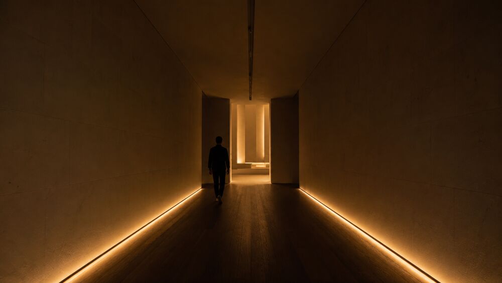
Understand This First
- Sensory Layering — the larger channel composition lighting joins.
- The Choreographed Beat — the time-axis event that light often delivers.
- Material Honesty — the material discipline light either supports or exposes.
- Servicescape — the ambient-conditions frame that puts light inside the designed environment rather than outside it.
Context
The pattern applies anywhere the operator controls light across a guest’s route and duration: hotel lobbies, restaurants, retail flagships, museum galleries, attraction queues, showbuildings, immersive-theatre sites, brand activations, conference rooms, and evening arrival sequences. It does not require darkness. It requires authority over at least three lighting decisions: the baseline state, the focal state, and the state change between them.
Lighting work normally starts in adjacent disciplines. The architect asks whether the room is legible. The engineer asks whether the space meets code, energy, glare, and maintenance requirements. The photographer asks whether the room reads in the press image. The operator asks whether staff can clean and secure the space. Those questions matter, but none is the experience question. The experience question is what the light asks the guest to do at each point in the journey.
Richard Kelly’s mid-century lighting vocabulary gives the pattern its technical spine. His three-part grammar — ambient luminescence, focal glow, and play of brilliants — moved lighting design away from blanket illumination and toward perception: general light for orientation, directed light for attention, and visible sparkle or luminous effect as information in its own right. Kelly’s own buildings were architecturally restrained; he kept clear of color and theatrical contrast. Human experience design inherits the perceptual vocabulary and adds a clock. The lighting state at 2 p.m., 6 p.m., 9 p.m., preshow, peak, and exit is not the same state dimmed up or down. It is a score.
Problem
The default lighting brief asks for enough light. Enough for circulation, enough for product inspection, enough for safety, enough for photography, enough for cleaning. The result is often competent and dead: a uniformly lit room with no focal hierarchy, no eye rest, no shift at the threshold, no cue that tells the guest when a beat has started or ended. The room is visible, but it doesn’t move.
The opposite failure is theatrical overreach. A hospitality lobby gets programmed like a nightclub. A museum gallery gets object spots so aggressive that every object is equally urgent. A retail flagship runs a feature ceiling at peak output all day because the launch photography looked good. The lighting is active, but it isn’t choreographed. It asks for attention everywhere at once.
The recurring difficulty is that light is specified as a fixture schedule when the guest experiences it as sequence. The fixture schedule names instruments, optics, control zones, color temperature, and output. The guest reads approach, threshold, pause, reveal, focus, release, and exit. If the design team doesn’t translate the fixture schedule into that sequence, the venue ships a technical plan rather than a human one.
Forces
- Visibility versus attention. More light makes more things visible; good lighting makes the right thing available at the right time.
- Safety versus shadow. A venue has to meet egress, accessibility, and staff-safety requirements, but a room with no shadow has no hierarchy and no rest for the eye.
- Daylight versus operating state. Daylight changes by hour and season; the venue still needs a coherent register at every operating hour.
- Photograph versus body. The press image rewards high contrast and drama; the guest’s eye has to adapt, move, and recover in real time.
- Architectural light versus show light. Architecture wants durable states; experience often needs cues, fades, and timed transitions. The two can share equipment, but they can’t share assumptions.
- Control cost versus operational reliability. A choreographed system needs controls, presets, maintenance, and staff fluency. Without those, opening-night lighting decays into whatever state the last operator left on the panel.
Solution
Score light as a sequence of guest-readable states: baseline, approach, threshold, focus, beat, release, reset, and operations. For each state, specify what the guest should do, what the eye should read first, what should recede, and how the state changes over time. Then translate the score into fixtures, controls, measured levels, and staff procedures.
The pattern lives in six working decisions.
-
Name the luminous job before choosing the fixture. Is the light helping the guest find the door, slowing the body at the threshold, pointing to the object, flattening the room for product inspection, protecting a quiet conversation, or landing a peak? A single fixture type can do several jobs badly. A lighting score gives each job its own state.
-
Set the baseline low enough to give the cue headroom. A cue only reads if the room around it is quieter. In a gallery, that may mean low ambient light with object accents. In a retail store, it may mean a diffuse daylight ceiling with higher focus on the tables. In a restaurant, it may mean table-level warmth and a darker perimeter. The number matters less than the relationship: the baseline has to leave room for a focal state to arrive.
-
Design adaptation, not only illumination. The eye needs time to move from exterior brightness to interior dimness, from retail daylight to tasting-menu intimacy, from public lobby to showbuilding darkness. A vestibule, corridor, lift ride, or preshow room can carry that adaptation if the lighting state is designed for it. Without the adaptation state, the first room after the threshold is wasted while the guest’s eye catches up.
-
Use contrast as information. Brighter areas attract attention. Darker areas release it. A lit door says enter; a darker side corridor says not yet; a warm pool at the host stand says stop here; a cooler field beyond it says the room continues. If everything is equally bright, wayfinding and hierarchy have to be carried by signs, staff, or repetition.
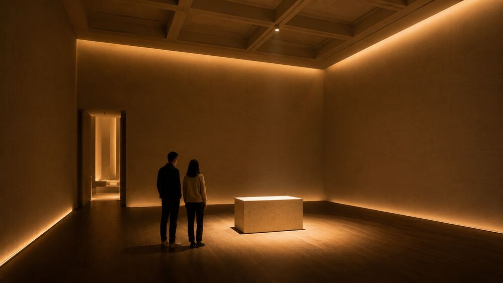
-
Time the changes to the body’s movement. A lighting state can change with the clock, the guest’s position, the show cue, or the staff action. The important thing is that the timing fits the guest’s experience. A lobby that warms after sunset is clock-cued. A haunted attraction that drops to black as the group crosses a sensor is spine-cued. A tasting menu that narrows to the table when the peak course arrives is service-cued. The cueing mode is part of the brief.
-
Separate guest states from operations states. Cleaning, stocking, maintenance, security, emergency egress, and staff briefings need light too. If those states are not named separately, staff will use the guest state for operations and slowly normalize the room upward. A venue that opens every day with the cleaning state still active has lost the pattern before the first guest arrives.
The operator-walkable diagnostic is simple. Walk the guest route at the actual operating hour with the house lights in guest state, not cleaning state. At each threshold, ask four questions: where does my eye go first; where does my body want to move; what is deliberately allowed to stay in shadow; what changes if I stand here for thirty seconds? If the answer is “everything is visible,” the room may be safe, but it isn’t choreographed. If the answer changes at the right moments, the score is working.
Sensory Channels
- Primary: visual. The variables are brightness, contrast, color temperature, beam direction, glare, visible source, shadow, reflectance, and rate of change. Measure at the guest’s eye-line and at the surface the guest is meant to read, not only at the floor plane.
- Secondary: kinesthetic. Light changes how the body moves: faster through evenly lit corridors, slower at dim thresholds, still at a focal pool, more cautious at low-level side light, more exploratory when the destination is visible but not yet fully revealed.
- Tertiary: auditory and haptic by synchronization. A light cue paired with a music swell becomes a beat; a low sidelight paired with a change underfoot makes a threshold register in the body. The pattern usually works with other channels, but light carries the hierarchy.
Inheres-In
- Primary: transposable. Light is present in every in-scope setting, but the pattern’s canonical form is the scored relation among states rather than a setting-specific fixture type.
- Transposes to: hospitality (arrival, lobby, restaurant, spa, room turn); retail (daylight register, product focus, Today-at-Apple-style event state); museum (object hierarchy, gallery adaptation, conservation constraints); themed-entertainment (queue, preshow, showbuilding, exit); immersive-theatre (blackout, practicals, sightline hiding, performer cueing); brand-experience (short-duration cueing where the score has to work on the first pass); service-flow (table, counter, host stand, farewell).
- Does not transpose: uncontrolled public space where the operator can’t control the luminous bed; mixed-channel-cx where light is a screen variable rather than a spatial condition; daylight-only exterior work without an operating-hour night state.
How It Plays Out
Three cases show the pattern at three settings: slow hospitality time, retail time that has to operate all day, and immersive-theatre time scored to a loop.
Aman Tokyo’s 33rd-floor lobby (Aman Resorts, Otemachi Tower, Tokyo; interior by Kerry Hill Associates, architecture by KPF, lighting by Lighting Planners Associates; 2014). The lobby is a six-story atrium wrapped in washi glass that reads as a single luminous volume. The light behind that glass is not daylight pouring through it. Lighting Planners Associates hid linear fixtures in the cavity behind the washi, bounced them off the structure, and tuned the result to change with the outdoor light, so the lobby’s register follows Tokyo outside the glass rather than denying it. The lighting is not a decorative wash added after the room. It is the room’s timekeeping system. The guest moves from the elevator into a quieter, softer state, then sits inside a luminous volume that shifts as the city shifts.
The choreography is slow. No show cue, no dramatic reveal every few minutes, no fixture calling attention to itself. The pattern is working because the lighting tells the guest to lower their pace. The washi diffuses the hidden source into a shadowless field; the city view carries the horizon; the lobby’s height gives the eye somewhere to travel without asking the body to move. The light scores arrival as decompression, not spectacle.
The case also shows why material honesty matters. The light works because the washi, stone, wood, and glass have surfaces worth revealing. A false material in the same luminous state would become easier to inspect and easier to distrust. The lighting doesn’t rescue the material register. It makes the register legible.
Apple Fifth Avenue (Apple and Foster + Partners, New York; redesigned store reopened 2019). The store is below a public plaza, which creates the basic problem: how does an underground retail hall feel connected to daylight rather than buried under it? Foster + Partners solved the problem by making light the descent sequence. The glass cube and mirrored skylenses pull daylight down from the plaza. The stair and lift carry the guest through reflected light. Below, a back-lit, cloud-like ceiling combines artificial and natural light and shifts with the real-time tones of sunlight through the day. Rings of focus lighting around the skylights draw attention back to the product tables.
The pattern’s retail lesson is that light can make a large store feel continuous with the city above while still giving product inspection the clarity it needs. The baseline state is diffuse and public, matching the plaza’s daylight. The focal state is local and commercial, landing on the tables. The descent is adaptation. The ceiling is not a feature for its own sake; it is the system that lets the store stay open every hour without reading as a basement.
The case also shows the difference between photograph and body. The glass cube is the photograph. The choreography is the descent, the changing ceiling, the product focus, and the twenty-four-hour operating state. A store that only has the cube would have an icon. Apple Fifth Avenue has a lighting score.
Punchdrunk’s Sleep No More at the McKittrick Hotel (Punchdrunk and Emursive Productions, New York; opened 2011, closed 2024; lighting by Felix Barrett with Euan Maybank). The production’s lighting begins from darkness. Live Design’s technical account describes Barrett’s method as starting from pitch black so the team can control shadow, concealment, and emergence. Many rooms run on practicals and static states; the main spaces carry cued shifts. A single go cue starts the performance, with a synchronized sound and lighting system looping once per hour across the three-hour audience window.
The pattern’s immersive-theatre lesson is that light can guide without announcing that it is guiding. Sleep No More did not light performers the way a proscenium show does. Often the room was lit and the performer was allowed to emerge from it. That choice turned the audience into active searchers: follow the warm practical, avoid the dead corridor, slow when the light pools, move when a room drops or rises. Lighting led the body while preserving the fiction that the guest was discovering the building.
The technical burden was the cost of the pattern. The show needed darkness, cue synchronization, daily maintenance, and performers whose routes were set against the lighting loop. If a performer missed the cue, the cue was gone. That is the difference between atmosphere and choreography: atmosphere can be left on; choreography has to be run.
Consequences
What the pattern buys: legible attention, better pacing, stronger thresholds, more durable peaks, and fewer explanatory signs. A lit object needs less copy. A threshold whose light lets the eye adapt needs less staff correction. A restaurant whose room warms with the evening can shift from arrival to intimacy without announcing the change. A show that can drop to black and recover safely owns one of the strongest timing devices in the field.
The pattern also gives the operator a better argument in budget and operations meetings. The question is no longer whether the lighting package is “nice.” The question is which guest-readable states are required and what equipment, control, maintenance, and training each state needs. That makes the cost more visible and the design harder to cut by accident.
What it costs: controls, commissioning, maintenance, and staff discipline. A lighting score that depends on presets will fail if staff don’t know which preset belongs to which operating state. A room with carefully tuned color temperature will drift when lamps are replaced piecemeal. A daylight-dependent composition will fail if the exterior glazing is shaded by a later tenant fit-out, a new sign, or a neglected cleaning contract. The pattern is not a one-time fixture selection. It is an operating system.
Where it stops working: places without lighting authority, venues whose staff cannot protect states, and settings where the safety requirement properly dominates the experience register. A hospital corridor, emergency egress path, or school staircase may need a brighter, flatter state than the designer wants. The pattern doesn’t override that. It asks whether, after the safety floor is met, the remaining luminous decisions are doing human work or merely filling the space.
Failure Modes
The predictable failures are easy to spot once the pattern has a name.
- The full-bright venue. Every operating state drifts upward until the guest state and the cleaning state are the same. The recovery is a locked guest preset, a separate cleaning preset, and a daily opening check.
- The architectural-photograph state. The room looks good in the launch image and punishes the body in use. The contrast is too high, glare lands at seated eye-line, or the one dramatic feature leaves the rest of the route unresolved.
- The safety excuse. The operator invokes safety to justify flat light everywhere, even where the code requirement has already been met. The recovery is to document the safety floor, then design the hierarchy above it.
- The under-scored threshold. The exterior and interior states are both good, but the transition between them is not. The guest enters blind, squints, slows for the wrong reason, or misses the first designed cue while the eye adapts.
- The cue with no bed. A lighting effect fires in a room whose baseline has not been composed. The cue reads as a trick because there is no quieter luminous field for it to land against.
- The source-out-of-frame failure. A visible fixture breaks the venue’s declared world: the modern track head in a period room, the exposed emergency fitting in a luxury corridor, the generic LED strip in a restaurant claiming regional craft. The fix is not always concealment. It is frame coherence.
- The daypart collapse. The noon, dusk, evening, late-night, and closed-house states are not separately authored. Staff improvise, the venue’s mood changes by accident, and the room’s strongest register exists only during the hour the photographer used.
- The material-exposure failure. Light reveals the material substitution the design hoped would pass. Lowering the light may hide the problem briefly, but the real repair is material, not luminous.
Related Articles
Sources
- Richard Kelly, “Lighting as an Integral Part of Architecture,” College Art Journal 12:1 (1952), pp. 24-30; and Elizabeth Donoff, “Richard Kelly’s Three Tenets of Lighting Design”, Architectural Lighting / Architect Magazine, 2016. Kelly’s ambient luminescence / focal glow / play of brilliants vocabulary is the lighting-side substrate this pattern translates into experience-design sequence.
- ERCO, “Ambient luminescence, focal glow and play of brilliants”. A clear practitioner summary of Kelly’s three-part grammar and its perception-oriented implications for attention, hierarchy, and atmosphere.
- Richard Pilbrow, Stage Lighting Design: The Art, the Craft, the Life (Design Press, 1997). The theatre-side working manual behind the cueing, darkness, focus, and timing logic this entry imports into places that are not conventional theatres.
- Lighting Planners Associates, “Aman Tokyo”. Project record for Aman Tokyo’s 33rd-floor atrium, its washi-glass luminous volume, day-to-night light change, design credits, and 2016 IALD Award of Merit.
- Foster + Partners, “Apple Fifth Avenue”, and Apple Newsroom, “Apple Fifth Avenue: The cube is back” (2019). Project records for the redesigned plaza, glass cube, skylenses, skylights, cloud-like ceiling, and focus lighting around the display tables.
- Live Design, “Stages Of Sleep No More, Part 2: The Lighting” (2011). The most useful public technical account of how Barrett, Doyle, and Maybank used darkness, practical fixtures, automation, looped cues, and synchronized sound-light control inside the McKittrick Hotel.
The Soundtrack and the Silence
Scoring music, ambient sound, speech, noise floor, and silence so the room tells the guest how to move, stay, notice, and rest.
Also known as: auditory bed, soundscape design, acoustic atmosphere, sonic branding for place.
If you’ve ever left a restaurant because you couldn’t hear across the table, lingered in a quiet-but-alive hotel lobby, or followed a distant music swell through an attraction before you saw the next room, you’ve felt this pattern. Sound isn’t decoration added after the room is finished. It is one of the room’s instruction systems.
Understand This First
- Servicescape — the model that puts sound inside service.
- Sensory Layering — the larger composition this layer joins.
- Sensory Anchor — the signature cue that can ride on the bed.
- Light as Choreography — the visual counterpart.
Context
Use this pattern wherever the operator controls what guests hear: hotel lobby, restaurant, retail flagship, museum gallery, attraction queue, brand pop-up, immersive-theatre building, spa corridor, or quiet room after a high-affect exhibit. Control may come through speakers, acoustics, staff voice, mechanical noise, door seals, surfaces, or a no-phone rule.
Sound often arrives too late. The architect has chosen surfaces, the AV vendor has installed speakers, operations has a playlist, staff turn the volume up behind the bar, and a museum adds three local media speakers to one gallery. The guest hears one field.
The useful literature starts with atmospherics and servicescape research: Philip Kotler on the designed buying environment in 1973; Mary Jo Bitner’s 1992 servicescape model; Ronald Milliman’s 1982 supermarket and 1986 restaurant studies on tempo, pace, spend, and length of stay; Barry Blesser and Linda-Ruth Salter on reverberation and echo.
A soundtrack is not the songs. Silence is not blankness. The auditory layer is the relation among noise floor, staff voice, guest speech, music or sound bed, cue, and chosen quiet.
Problem
Sound is easy to add and hard to subtract. Retail adds a playlist because music seems cheaper than architecture. Museums add audio because objects need interpretation. Hotels add background music because silence feels risky. Immersive productions add drones and period songs because the building needs pressure. Together, defensible choices muddle the room’s instruction.
The failure is not always loudness. Some rooms are too quiet for their register: every tray scrape in the fast-casual dining room, surveillance silence in the luxury lobby, one cough taking over the gallery. Others fail because the bed competes with the guest’s task: tasting menu as nightclub, memorial room as AV installation, flagship store as employee playlist.
Decide what the room asks from the ear before anyone chooses music. Conversation, contemplation, movement, suspense, tempo, privacy, spectacle, and rest each need different beds. The playlist comes later, if it comes at all.
Forces
- Energy versus intelligibility. Music can lift the room, but speech is often the service surface.
- Brand voice versus guest task. A brand may want sonic identity; the guest may need to read, choose, eat, grieve, or negotiate.
- Staff comfort versus guest comfort. Staff may tune music toward endurance; guests receive the same choice as atmosphere.
- Masking versus overload. A low bed can mask mechanical noise and private speech; a loud bed becomes fatigue.
- Silence versus vacancy. Silence can make attention available; unmanaged silence can feel abandoned, tense, or over-formal.
- Local acoustics versus central programming. One playlist behaves differently in a wood-lined lobby, a glass retail hall, a concrete gallery, and a carpeted restaurant.
Solution
Score the auditory layer as guest-readable states: noise floor, bed, cue, speech surface, quiet state, and reset. For each state, specify the job, target experience, measured variables, staff handoff, and when silence is right. Six decisions make the score usable.
-
Name the auditory job before naming the genre. A lobby may need decompression; a retail floor, light motion; a tasting-menu room, conversation plus privacy screen; an immersive theatre, directional pull; a memorial room, inward attention. “Jazz,” “ambient,” “upbeat,” and “cinematic” are materials, not jobs.
-
Set the noise floor in the room, not in the deck. Measure at the guest’s ear with doors open, staff working, espresso machine running, HVAC on, crowd at expected density, and surfaces installed. A museum-soundscape study at Rensselaer’s Cognitive Immersive Room treated “silence” as 41 dB of ambient room noise: mechanical sound, room tone, and human presence held at a designed floor.
-
Treat tempo as movement instruction. Beats per minute (BPM) is pace, not taste. Milliman’s studies are old and narrow, but the lesson holds: tempo changes movement and dwell. Name whether the operator wants dwell, softer service pace, or throughput, then test it in the room.
-
Protect speech where speech carries the service. In a restaurant, hotel, museum, or service counter, the key sound may be staff voice or a companion across the table. If the bed makes those voices compete, adjust volume, absorption, speaker placement, frequency content, mechanical systems, or layout.
-
Use cues sparingly and reset them cleanly. A swell, bell, dropped score, spoken announcement, or sudden quiet can mark a beat because the bed around it is stable. If every minute has a cue, no cue registers. If the cue doesn’t reset, the score drifts upward.
-
Give staff operating authority and limits. Staff need to know the room state, who can change it, which controls are off-limits, and how to respond to complaints. A usable policy names dayparts, volume ceilings, quiet exceptions, event overrides, cleaning states, and the person accountable for reset.
Stand at the threshold, main service point, and most occupied guest position. Ask what is loudest, what the room asks the body to do, whether two guests can speak at the required distance, what is foreground, and where the ear can rest. If the team can’t answer, the soundtrack has not been designed yet.
Sensory Channels
- Primary: auditory. Specify sound pressure at the guest’s ear, tempo in BPM where music is used, frequency balance, reverberation time, speaker direction, speech intelligibility, mechanical noise, and quiet-state targets. Use decibels (dB or dBA) as field measurements.
- Secondary: kinesthetic. Sound changes speed and posture. A slow bed lengthens the step; a tight rhythmic bed pulls the body forward; a low drone holds suspense; silence makes small sounds ceremonial.
- Tertiary: visual and service. Sound works with light, staff movement, signage, and queue choreography. A dim vestibule with a lower noise floor is different from one with a bright speaker bed. A briefing ritual with clear speech beats the same words shouted over music.
Inheres-In
- Primary: transposable. The canonical form is the scored relation among bed, cue, speech, noise floor, and silence. It lives wherever the operator can set those relations.
- Transposes to: hospitality, retail, museum, themed-entertainment, immersive-theatre, brand-experience, and service-flow. Examples include lobbies, restaurants, spa corridors, brand playlists, product-inspection floors, gallery acoustics, media-station leakage, area loops, queue sound, showbuilding cues, zoned score, silence rules, event cueing, staff voice, and privacy masking.
- Does not transpose: open public space where the operator can’t control traffic, construction, weather, or adjacent tenants; pure mixed-channel-cx where sound is a device notification rather than a spatial condition; safety-critical alarm surfaces, where code, evacuation, and accessibility requirements rule.
How It Plays Out
Three cases show the pattern at three weights: a brand-scale retail bed, an immersive-theatre score, and a place where silence is the designed bed.
Starbucks in-store music (Starbucks Coffee Company; curated coffeehouse music since 1994; current public playlist surfaces on Spotify and Apple Music). Starbucks sets a dwell contract when music plays in the store. Its public music page says music has been part of the Starbucks experience for more than forty years and that the company handpicks songs played around the world; its Apple Music curator page dates the coffeehouse-sound program to 1994. The move is a brand-operated environmental layer across thousands of spaces, dayparts, seasons, and local rooms. Hard surfaces, espresso bar, crowd density, and staff-controlled volume can still push the bed into foreground. Then the guest who came to work, talk, or wait hears interference.
Punchdrunk’s Sleep No More at the McKittrick Hotel (Punchdrunk and Emursive Productions; New York, opened 2011 and closed 2024; sound by Stephen Dobbie). Live Design documents Dobbie’s separate soundtracks for 17 zones. The score used sourced period songs and composed material on a controlled timing system, helping the audience move through partial sightlines and withheld spoken instruction. Darkness belonged to the work; unintended silence would read as a technical break. The quiet elevator worked because it was framed as a threshold and quickly occupied by the operator’s voice. Elsewhere, the room needed song, drone, room tone, crowd murmur, or score. Rare silence had to be framed, or it became failure.
Rothko Chapel (Houston, opened 1971; Mark Rothko murals; original building by Philip Johnson, Howard Barnstone, and Eugene Aubry; 2020 restoration and campus work by Architecture Research Office with George Sexton Associates as lighting designer). The Chapel is the counter-case to the playlist instinct. Its auditory bed is silence, but not vacancy. Visitor guidance asks guests to respect the silent, contemplative atmosphere, keep technology away, and use the room for meditation, prayer, viewing, or inward attention. The brochure invites visitors to sit in silence among the fourteen Rothko murals. The 2020 restoration strengthened the visitor sequence and moved more programming pressure into the expanded campus. Silence here costs rules, visitor preparation, staff posture, threshold sequence, program strategy, and tolerance for small human sounds. HVAC, footfall, clothing, breath, and distant city residue stay low enough that the guest notices attention itself.
Consequences
The pattern buys a room whose energy matches its task: clearer guest pace, better speech access, fewer signs and corrections, stronger thresholds, and a credible sensory layer. Retail can feel active without rushing. A restaurant can feel intimate without becoming inaudible. A museum can use media without leakage. An immersive production can lead the body without breaking the fiction.
It also gives operators a better budget argument. Sound becomes an operating system with procurement consequences: absorptive materials, speaker placement, commissioning time, playlist licensing, staff training, quiet-room rules, measurement, and maintenance. A quieter room may need fewer signs, corrections, and service recoveries.
The cost is measurement, discipline, and restraint. The strongest move is often to remove, lower, absorb, localize, or refuse. That can disappoint stakeholders who expected a soundtrack to prove the room was designed, and it can frustrate staff if the guest state doesn’t match staff working energy.
The pattern stops working without sound authority, with an irreparable noise floor, with conflicting audience needs, or in venues that won’t maintain operating states. A day-one soundtrack fails by month six if staff use the guest state for cleaning, events use the contemplative room as overflow, or no one rebalances speakers after a furniture change.
Failure Modes
- Playlist-as-strategy. The team chooses a genre before naming the room’s job. The result may be tasteful without supporting pace, speech, rest, or movement.
- Staff-volume drift. Staff turn music up so it feels present behind the bar, desk, or counter. Guests receive the amplified version at seated ear, and the bed becomes foreground.
- The dead-silent wrong room. A venue removes music without designing the noise floor. Every chair scrape, cough, and service error becomes foreground.
- The masking excuse. Music hides mechanical noise, crowd noise, or bad acoustics instead of fixing the source. The room gets louder, and the defect stays.
- The media-station bleed. A museum or brand activation installs multiple local sound sources without isolation. Each source is intelligible only when the others are turned up, and the gallery enters an acoustical escalation loop.
- The cue with no bed. A bell, swell, announcement, or drop marks a beat in a room whose baseline is already unstable. The cue reads as interruption rather than timing.
- The one-playlist building. A property runs one central program across lobby, bar, corridor, retail, and quiet room. The brand is consistent; the experience is wrong in every room that needed a different state.
- The inaccessible sound bed. The brief ignores hearing aids, auditory processing differences, speech access, and sensory fatigue. The design may please the average guest while excluding the guest who needed a quieter path, captioned alternative, or predictable refuge.
- Silence as austerity. The operator mistakes silence for seriousness and removes the warmth, staff posture, threshold, and material support that make silence hospitable. The room becomes intimidating rather than contemplative.
Related Articles
Sources
- Mary Jo Bitner, “Servicescapes: The Impact of Physical Surroundings on Customers and Employees”, Journal of Marketing 56:2 (1992), pp. 57-71. The servicescape model that places ambient sound, music, and noise inside the physical surroundings that shape customer and employee behavior.
- Philip Kotler, “Atmospherics as a Marketing Tool”, Journal of Retailing 49:4 (1973), pp. 48-64. The founding marketing-side statement that treats the designed atmosphere as a planned environmental instrument rather than decoration.
- Ronald E. Milliman, “Using Background Music to Affect the Behavior of Supermarket Shoppers”, Journal of Marketing 46:3 (1982), pp. 86-91, and “The Influence of Background Music on the Behavior of Restaurant Patrons”, Journal of Consumer Research 13:2 (1986), pp. 286-289. The two classic tempo field studies that give the pattern its caution about pace, dwell, and overgeneralized music claims.
- Adrian C. North, David J. Hargreaves, and Jennifer McKendrick, “In-store music affects product choice”, Nature 390 (1997), p. 132. The wine-store field study that shows how background music can bias interpretation and choice without the guest naming the influence.
- Barry Blesser and Linda-Ruth Salter, Spaces Speak, Are You Listening? Experiencing Aural Architecture (MIT Press, 2006/2009). The spatial-hearing source behind the article’s claim that rooms have an audible architecture before music is added.
- Natalie Robin, “Stages Of Sleep No More, Part 3: The Sound”, Live Design (2011). Public technical account of Stephen Dobbie’s zoned sound design for the McKittrick Hotel, including the production’s timing system and its treatment of silence.
- Starbucks, “Coffee Loves Music”, and Starbucks on Apple Music. Public company surfaces for the brand’s long-running in-store music program and its current playlist system.
- Rothko Chapel, “Visitor Info” and English visitor brochure, plus Architecture Research Office, “A New Campus for the Rothko Chapel”. Project and visitor sources for silence as an explicit operating state, the 1971 contemplative program, and the 2020 restoration / campus work that protects the Chapel’s visitor sequence.
Material Honesty
The principle, inherited from architectural modernism, that the materials a guest sees and touches should read as what they are: stone as stone, wood as wood, metal as metal. The substitute almost always fails at the touch range a paying guest reaches.
The phrase is inherited from twentieth-century architectural modernism’s rejection of nineteenth-century painted-wood-pretending-to-be-marble. Adolf Loos gave it the polemical form in 1908; Kenneth Frampton gave it the careful form in 1995. The discipline travels into experience design without the modernist polemics attached.
Definition
Real stone reads as stone, real wood reads as wood, real metal reads as metal. The substitutes engineered to imitate them at lower cost almost always read as substitutes once the guest is close enough. The discipline applies wherever the haptic and visual register of the visible work is part of what the customer is paying for: hospitality, retail, museum, themed entertainment.
Three sources carry the lineage. Adolf Loos’s Ornament and Crime (lectures of 1908 and 1910, collected in 1929; Ariadne Press reissue, 1997) argued that ornament imitating a material it isn’t is cultural fraud: the labor saved on the substitute is spent disguising it. Mies van der Rohe distilled the position to “God is in the details.” Kenneth Frampton’s Studies in Tectonic Culture (MIT Press, 1995) gave the careful version: architecture’s truthfulness lives in the joint, the load path, and the way material registers its own structural behavior. John Pawson’s Minimum (Phaidon Press, 1996) translated the position into a working brief for hospitality and retail. The Aman properties, with the Pawson-influenced register the house has carried since the 1980s under Kerry Hill Architects, Ed Tuttle, and Pawson himself across various commissions, are the field’s most-cited working cases: long lobbies in honed stone and oiled timber, joinery in declared joints, bathroom basins carved from single blocks.
A parallel register travels through Junichiro Tanizaki’s In Praise of Shadows (originally In’ei Raisan, serialized in Keizai Orai, 1933; Leete’s Island Books translation by Thomas J. Harper and Edward G. Seidensticker, 1977), which values lacquerware that has acquired its patina and unfinished cedar that smells of the forest the day it is cut. Tanizaki’s argument isn’t modernism’s, but it lands the same conclusion: the material’s behavior over time is part of what the guest reads, and the substitute forfeits the depth.
The working test. Walk the property and stand where guests actually touch the material: door pull, chair arm, railing, basin, the ground underfoot, the wall at shoulder height where a hand goes when reading a label. At each touch point, ask whether the material reads as itself. A door pull cast in zinc and finished to imitate bronze does not read as bronze, because bronze warms differently, weathers differently, and accumulates patina the imitation cannot. A teak deck reads as teak by the way it greys, absorbs summer rain, and darkens under an umbrella’s ferrule. A faux stone facing reads as faux because the joints, the corners, and the incident light all read wrong. The test is not whether the property passes in a photograph; it is whether it passes at the range a paying guest reaches.
Why It Matters
The concept does three jobs the surrounding vocabulary cannot.
It separates premium design from theatrical pastiche. The line between a serious flagship and a stage set is rarely the budget. Pastiche can cost more, and imitation often consumes more labor. The line is whether the operator declared an honest material register and paid the bill, or declared a register the construction cannot deliver and tried to cover the gap. The difference reads, to a fellow practitioner, as the difference between a Soho House club and a regional facsimile that imported the visual language without the joinery.
It supplies a position on a recurring craft argument. Walt Disney Imagineering’s Galaxy’s Edge at Disneyland Park and Walt Disney World (both 2019) invested in declared materiality (real rockwork at planet Batuu’s spires, real metal in the Millennium Falcon‘s hardware, real fabric in the costumes) inside a frame that is openly fictional. The field disagrees about whether honest materials can read true inside a frame that isn’t. Karal Ann Marling’s Designing Disney’s Theme Parks (Flammarion, 1997) argues that the parks’ material grade has drifted across decades. The original New Orleans Square (1966) was built with real ironwork from New Orleans-trained smiths; many later equivalents substituted fabricated copies. This book takes a position: an honest material grade inside a fictional frame is part of what makes the frame readable, and Marling’s evidence plus the Galaxy’s Edge work supports the call.
It supplies a move practitioners can argue with the developer. A flagship brief that claims “premium” without naming the material grade can be value-engineered into pastiche by construction. A brief that names the materials, the dosage, and the expected behavior over time gives the architect something to defend in the value-engineering meeting. Eleven Madison Park’s 2017 redesign by Brad Cloepfil’s Allied Works Architecture is the worked case in the entry below.
How It Shows Up
The concept is legible at touch range. Three cases at premium scale.
Aman Tokyo (Aman Resorts; opened December 2014; in the Otemachi Tower at Pacific Century Place Marunouchi; Kerry Hill Architects). The 33rd-floor lobby is a single 30-meter cubic volume in honed black granite and Japanese washi, lit from a continuous slot above. The granite is the material; nothing is stone-look composite. The hinoki cedar at the spa is the wood; the bathwater carries the cedar’s note for the day the bath is fresh, and the note recedes as the wood ages. Each guest bath basin is a single block of stone, carved rather than veneered. Wallpaper and Hospitality Design coverage at opening cited the discipline explicitly; Architectural Record’s Kerry Hill profile (2015) documents specifications down to joint tolerances.
Eleven Madison Park (Allied Works Architecture, 2017 redesign; Daniel Humm and Will Guidara as operators at the time; the property opened in its current form in 1998 on the MetLife Building ground floor at Madison Square Park). The 2017 redesign rebuilt the room around real white oak floors, a single block of Calacatta marble at the bar, and oak chairs with thick leather upholstery, all chosen for how they would age across decades of dinner service. Brad Cloepfil’s brief, documented in Architectural Record’s opening coverage and in Will Guidara’s Unreasonable Hospitality (Optimism Press, 2022), was that the room had to age into itself: the leather had to develop an oak chair’s wear pattern, the marble had to acquire wine-glass rings, the floor had to gather the patina that thousands of dinner-service crossings produce. Critics have argued about the pricing, the menu’s evolution, and the 2021 plant-based reconception, but not about the room’s material discipline.
RH New York (Restoration Hardware; opened 2018 in the former Manhattan Stock Exchange Annex on West 18th Street in the Meatpacking District, a 1900-era cast-iron building, redesigned by RH’s in-house team). Six floors of furniture display sit inside a building whose own architectural materiality is preserved. The rooftop restaurant uses real wood, real brass, and real stone at full saturation. Frame and Wallpaper coverage have argued about whether the gallery is retail or hospitality (it is both); they have not argued about whether the materials are what they look like. The strategic point is that retail flagship material grade has been driven up across the high end of the field over the past decade.
The discipline also shows up at smaller scales: the museum case with real archival-grade glass, the immersive-theatre prop crafted in the period workshop, the hospitality turndown amenity that is the actual in-house product. The principle travels where the substrate holds and breaks where it does not.
Caveats and Open Questions
Four open seams matter to working practice.
Legitimate substitutes. Some substitutes are honest. A laminate-finished door in a back-of-house corridor where guests do not go is honest because no claim is being made. A fire-rated door clad to match the surrounding finish is honest if the fire-rating is the load-bearing claim and the cladding is acknowledged as cladding. The discipline is not “always specify the most expensive material.” It is “do not claim a material register the construction cannot deliver.”
The theatrical-set defense. A film set, a stage set, a one-night pop-up, a five-day brand activation: the materials need to read at the camera or audience distance for the duration, and no claim is made about long-run truth. The defense applies to set conditions. A venue marketed as a permanent property cannot invoke it for materials that will not survive the year, because the marketing is the operator’s claim about what the property is.
Historical restoration. When an original material is unavailable, what counts as honest? The Tenement Museum at 97 Orchard Street (founded 1988 as a working interpretation of an 1863 building) acknowledges reconstruction as reconstruction in its interpretive plans, and the docent script names the boundary: this floor is original; this stove is a reconstruction based on a photograph; this wallpaper is documented to the period but installed in 2018. The honesty is in the acknowledgment, not the avoidance.
Technical substitutes that outperform. Engineered stone resists wine stains in a working bar; composite decking does not warp in coastal humidity; fire-resistant fabric is required by code. The substitute is honest when it is allowed to read as itself, not when it is finished to imitate the material it has replaced. An engineered-stone bar whose coloration does not pretend to be Calacatta is honest. The same engineered stone polished to mirror Calacatta’s veining is not.
A separate caveat about names. Some practitioners use “honest materials” as a generic compliment; some use “real” where this book uses “honest”; some use “tectonic” in Frampton’s narrower sense. The vocabulary is unsettled. This book uses material honesty because the term names the operative move (the material reads as itself) rather than gesturing at a register.
Related Articles
Sources
- Adolf Loos, Ornament and Crime: Selected Essays (Ariadne Press, 1997; English translation of the 1908 and 1910 lectures). The polemical statement of the modernist case against material imitation.
- Kenneth Frampton, Studies in Tectonic Culture: The Poetics of Construction in Nineteenth and Twentieth Century Architecture (MIT Press, 1995). The careful, period-spanning argument that architecture’s truthfulness lives in the joint and the load path.
- John Pawson, Minimum (Phaidon Press, 1996). The practitioner translation of the modernist material discipline into a working brief for hospitality and retail. Pawson’s worked examples — the Calvin Klein flagship, the early Aman commissions — are the chain through which the discipline reached the contemporary field.
- Karal Ann Marling, ed., Designing Disney’s Theme Parks: The Architecture of Reassurance (Flammarion, 1997). The canonical academic-leaning treatment of the parks’ design discipline and the most careful analysis of material-grade drift across the parks’ history.
- Junichiro Tanizaki, In Praise of Shadows (originally In’ei Raisan, serialized in Keizai Orai, 1933; Leete’s Island Books English translation by Thomas J. Harper and Edward G. Seidensticker, 1977). The Japanese material register the contemporary Pawson-Hill-Aman lineage carries.
- Will Guidara, Unreasonable Hospitality (Optimism Press, 2022). The operator-side account of the Eleven Madison Park 2017 redesign and the material brief inside it.
Olfactory Throw and Decay
The reach, persistence, and clearance curve of a scent in a designed place, treated as an operating specification rather than a mood word.
Definition
Olfactory throw is how far a scent travels from its source before falling below useful detection. Olfactory decay is how that scent weakens, changes character, or disappears over distance and time. Together, they turn “the lobby should smell like white tea” into a designable condition: where the scent should first be noticed, where it should stay below conscious attention, where it must not intrude, how long it may linger after the diffuser stops, and how the air should clear before the next guest, meal, scene, or service state begins.
The terms sit at the meeting point of perfumery, environmental psychology, and building operations. Perfumery gives the vocabulary for volatility, diffusion, tenacity, top notes, middle notes, base notes, and drydown. Calkin and Jellinek’s Perfumery: Practice and Principles treats a fragrance as a timed composition whose materials evaporate at different rates, so the first minute and the fourth hour are not the same smell. Servicescape theory gives the reason this matters for experience design: scent is one of Bitner’s ambient conditions, part of the physical surroundings that shape customer and employee response whether the operator manages it or not (Bitner 1992). Ambient-scent research then gives the caution: pleasant scent can improve evaluations and behavior, but effects depend on congruency, concentration, service setting, other sensory conditions, and whether people even detect the scent (Spangenberg, Crowley, and Henderson 1996; Roschk and Hosseinpour 2020).
Throw is not simply strength. A scent can be strong and short, weak and long, bright near the nozzle and absent by the desk, or invisible near the device but legible after the air handler carries it through a large volume. Decay is not simply disappearance. Citrus may open first and vanish quickly; woods may appear later and sit in upholstery; musk may persist long after the guest has left. The designed question isn’t “Do we have scent?” It is: what radius, what concentration, what time curve, what drydown, what clearance, under what airflow, and for which people?
If the brief doesn’t say where the scent should start, where it should stop, and how long it may remain after the system changes state, it hasn’t specified olfactory design yet. It’s only selected a fragrance.
Why It Matters
Olfactory design fails most often at the operating layer, not at the fragrance-selection layer. The accord may be right, the brand fit defensible, the guest research competent. The failure arrives when the same output is applied to a tall hotel lobby, a low-ceiling elevator vestibule, a restaurant host stand, and a corridor outside guest rooms. One location reads as elegant. Another reads as trapped. The formula didn’t change; the throw and decay did.
Naming the concept gives designers and operators four practical controls.
The first is the line between scent identity and scent delivery. The fragrance house creates the accord; the building decides what happens next. Air volume, ceiling height, return-air placement, door cycling, humidity, temperature, finishes, textiles, filtration, cleaning chemicals, and food service all change how a scent behaves. A cold-air diffuser connected to HVAC is not the same instrument as a local cartridge device behind a reception desk. Air Aroma’s Ecoscent documentation describes cold-air diffusion through HVAC ducts, with adjustable output and coverage up to 6,000 cubic meters when connected to an air system. ScentAir’s Stream documentation similarly frames the product as an HVAC-connected system for large spaces, with programmable scheduling and intensity, and coverage over 3,000 square feet. Those are vendor materials, so they don’t settle the theory. They do show the operating variables a real scent program has to specify.
The second is restraint. Scent is harder to opt out of than light or sound. A guest can look away from a display, step out of a music zone, or lower a screen. They can’t stop breathing the lobby air, so olfactory design carries a higher duty of care. The target is usually a low, barely named recognition: the guest notices freshness, calm, warmth, or continuity before noticing “a fragrance.” When the guest can name the scent at every step, the dosage is probably no longer ambient.
Throw and decay also make scent compatible with time. Many experience settings change state across the day. A hotel lobby shifts from morning departure to afternoon arrival to evening bar spillover. A museum moves school groups through, then opens for a donor event. A store goes from retail browsing to private appointment. If decay is too long, the previous state remains in the air and confuses the next one. If decay is too short, the program turns intermittent, leaving gaps where guests enter unscented air and wonder if something is off. The right specification is a curve, not a constant.
Last, the concept gives staff a real complaint language. “It smells too strong” is hard to diagnose. “The scent is reaching the elevator bank,” “the drydown is sitting in the drapery,” “the dinner service is masking the base note,” and “the morning schedule doesn’t clear before breakfast” are actionable. Good olfactory operations turn subjective irritation into a maintenance ticket the team can test.
How It Shows Up
Westin White Tea, Westin Hotels & Resorts, brand deployment with ScentAir as scent-system vendor. Westin’s White Tea program is the best-known hotel case because it treats scent as a repeatable brand condition rather than a local decor choice. The scent appears in lobbies and public areas, then extends into retail products sold through Westin’s own store. ScentAir’s Westin case materials describe a custom White Tea fragrance delivered across properties through scent systems, including the ScentWave line in the case-study copy. The project lesson is not that every hotel should have a signature scent. It’s that a hospitality scent anchor only works when throw stays gentle enough for arrival, repeatable enough for recognition, and contained enough not to invade food, sleep, meeting, or elevator conditions. Westin’s program has lasted because the scent reads as a brand atmosphere, not as an object placed in front of the guest.
Air Aroma Ecoscent in large-volume hospitality, exhibition, airport, casino, and office settings. Air Aroma’s Ecoscent documentation is useful because it names the physical delivery problem directly. The system disperses fragrance oil as a dry mist through filtered cold air and can connect to HVAC ducts so existing airflow carries the scent through the target area. The stated design intent is consistent scent across large open areas or multiple zones without visible devices. In practice, that means the scent designer is working with the building’s air, not against it. Throw is produced by duct routing and output, while decay is shaped by ventilation, exchange rate, surface absorption, and schedule. The concept becomes especially important in exhibition halls and airports, where the same device may serve people who are moving quickly, dwelling at queues, or crossing the edge of a zone.
ScentAir Stream in large commercial interiors. ScentAir’s Stream product documentation describes an HVAC-mounted diffuser with atomized fragrance delivery, intensity settings, weekly programmable events, and stated coverage over 3,000 square feet. That matters because the product is not only a fragrance source; it is a timing and distribution instrument. A programmable schedule lets an operator vary output by hour, which is one of the few ways to manage decay across changing traffic and air movement. A lobby with heavy morning departures may need a different output pattern from a quiet midafternoon lobby even if the scent identity stays constant. The lesson for the practitioner is to brief scent as an environmental system: output, schedule, radius, clearance, and service access belong in the same conversation as the accord.
These cases are vendor-adjacent by necessity. Ambient scent is often documented by the firms that install the systems, and those firms have sales interests. Treat their specifications as evidence of available operating controls, not as proof that a scent program is good. The peer-reviewed studies carry the behavioral claims; the product documents carry the equipment facts.
Caveats and Open Questions
Start with measurement. Roschk and Hosseinpour’s 2020 meta-analysis integrated 671 effects from ambient-scent experiments and found positive average effects on customer responses, with reported increases in the 3% to 15% range across response levels. That is meaningful, but it isn’t a license to promise a universal revenue lift. The effects vary by service context, scent congruency, detection, and other atmospheric conditions. A scent with good throw in one room can become an experimental contaminant in another.
Congruency narrows the claim further. Spangenberg, Crowley, and Henderson’s 1996 study showed that ambient scent can affect evaluations and behaviors in store settings, but later work has repeatedly tightened the finding: fit matters. A clean tea note in a hotel lobby, a cedar note in a spa, or a bread note near a bakery can support the room. The same note in the wrong setting reads as manipulation. Throw and decay can’t rescue a scent that shouldn’t be there.
Then there is material interaction, the one practitioners forget. Air does not stay separate from surfaces. Carpet, upholstery, drapery, unfinished wood, old plaster, and cleaning residues can hold or alter scent. This is where olfactory design touches Material Honesty: if the room smells like cedar but the visible material is plastic laminate, the air is making a claim the room won’t support. Guests may not articulate the mismatch, but they’ll feel the thinness of it.
The hardest caveat is accessibility and health. Ambient scent can be pleasant for most guests and painful for some. Migraine, asthma, pregnancy, chemical sensitivity, and cultural aversion all make scent more ethically charged than many brand teams admit. The conservative posture is low concentration, bounded zones, no scent in unavoidable confined spaces, staff authority to reduce output, and clear maintenance logs. When in doubt, the right decay curve is faster and quieter.
Related Articles
Sources
- Mary Jo Bitner, “Servicescapes: The Impact of Physical Surroundings on Customers and Employees,” Journal of Marketing 56, no. 2 (April 1992), pp. 57-71.
- Eric R. Spangenberg, Ayn E. Crowley, and Pamela W. Henderson, “Improving the Store Environment: Do Olfactory Cues Affect Evaluations and Behaviors?” Journal of Marketing 60, no. 2 (April 1996), pp. 67-80.
- Holger Roschk and Masoumeh Hosseinpour, “Pleasant Ambient Scents: A Meta-Analysis of Customer Responses and Situational Contingencies,” Journal of Marketing 84, no. 1 (2020), pp. 125-145.
- Robert R. Calkin and J. Stephan Jellinek, Perfumery: Practice and Principles (Wiley, 1994).
- Air Aroma, “Ecoscent”, product documentation, accessed May 9, 2026.
- ScentAir, “ScentAir Stream Diffuser”, product documentation, accessed May 9, 2026.
- ScentAir, “Elevating Hospitality with Westin,” hotel case study, 2021 case-study PDF, accessed May 9, 2026.
Narrative and Meaning
Story, theme, backstory detail, the Goffmanian frame, suspension of disbelief, narrative transportation, authenticity, place-identity.
A space can be sensorially well-composed and still feel hollow. The patterns in this section name the moves that give an experience significance — that make the room legible as being about something, that let the guest read the visible elements as carrying answers to questions the experience is asking. The vocabulary is narrative; the medium is space, service, ritual, and detail.
The entries here include Joe Rohde’s backstory detail principle, which says every visible element should carry an answer to “where does it come from in the story?”; theme coherence as the discipline that distinguishes a coherent place from a Vegas-strip pastiche; authenticity-within-frame, the position that authenticity is not the absence of artifice but the consistency of artifice within a declared frame; place-identity, the move that distills a real place’s culture, history, and ecology into the designed environment in a form that locals recognize as accurate; and the symbolic crossing, the small repeatable ritual move that marks a guest’s transition between narrative regions.
The section takes a position. Authenticity is one of the most-confused words in the field’s discourse; the book’s stance — that authenticity is consistency-of-artifice within a declared frame, not absence of artifice — is named, defended, and applied to specific cases. Sleep No More is “authentic” because nothing in the McKittrick Hotel breaks its 1939-noir frame; the Cheesecake Factory is “inauthentic” because the frame keeps slipping. The section invites disagreement; the curator names where they stand.
The relationship to the rest of the book is dense. Narrative-and-Meaning depends on Foundations’ Goffmanian dramaturgical frame, the narrative-transportation construct, and the Threshold of Disbelief coined-vocabulary entry. It feeds forward into setting-specifics (the immersive-theatre mask convention is a narrative-meaning move with a setting-specific operationalization) and into ethics-antipatterns (manufactured authenticity is the inversion of authenticity-within-frame, theme-park pastiche is the inversion of theme coherence).
A book about human experience design that treated narrative and meaning as decorative — separate from the “real” patterns of layout, sensory, and service — would have missed the point. The field’s most-cited practitioners (Rohde, Austin, Barrett, Appelbaum, Walsh at MONA) all argue, in different vocabularies, that the meaning layer is load-bearing. This section organizes that argument as a set of named, teachable patterns.
Entries
Backstory Detail
Every visible element in the staged environment carries an answer to “where does it come from in this world?”, so small in-world decisions hold the declared frame against the scrutiny no audience advertises but every audience runs.
Also known as: prop logic, in-world consistency, the answer-the-question discipline, world-building at the prop scale.
Backstory detail is not lore pasted onto a wall. It is the discipline that keeps a staged world from leaking through its smallest visible choices: the receipt paper, the staff shoes, the back of the menu, the bathroom sign, the bottle behind the bar. If a guest can touch it, read it, smell it, lift it, or catch it from the corner of the eye, the object has to answer the same world-question as the facade.
Understand This First
- Theme Coherence — the venue-level rule structure this pattern enacts at the prop and finish scale; the parent that names which dimensions the theme rides on.
- Authenticity-Within-Frame — the editorial position the pattern operationalizes object by object.
- Dramaturgical Frame — Goffman’s front-stage substrate; the prop has to read as in-frame even when no actor is touching it.
Context
Use this pattern when an environment has declared a world and many hands will furnish it. The architect chooses the door pull. The interior designer chooses the upholstery weave. The prop master writes the letter on the desk. The graphic designer sets the sign. The F&B operator buys glassware. The merchandise buyer stocks the shelf. The costume designer specifies footwear. The AV vendor chooses the speaker grille. Each choice can either answer the world or answer the vendor catalog.
The canonical settings are the ones where a declared world is specific enough to police. Galaxy’s Edge is a frontier outpost on Batuu. The Wizarding World is the cultural-material world of the books. Sleep No More is a 1939 noir McKittrick Hotel. Then She Fell is a Carrollian dreamscape. The Tenement Museum interprets documented 1860s–1930s tenement life. The U.S. Holocaust Memorial Museum works from a documented historical record. Aman Tokyo declares contemporary Japanese discipline. An Adirondack lodge may declare a mid-twentieth-century guide-camp register.
The pattern starts at the brief stage, where the world’s working facts are written down: who is from where, when the world is set, what trades are practiced inside it, what is exotic, what is mundane, what the climate is, what the supply chain looks like, what is contested, what is settled. It continues at every later decision the brief didn’t foresee. The recurring question is simple: where does this come from in our world? The pattern does not help a venue whose only declared position is “premium,” “modern,” or “luxury.” A moodboard is not a world.
Problem
The default brief directs the headline elements and abandons the connective tissue. The architecture, showpiece rooms, and named characters are authored. The operational leftovers are not. A creative director writes “1939 noir hotel.” The architect builds the rooms. The prop master furnishes the desks. Then the F&B vendor ships modern OSHA-compliant back-bar signage, the merchandise buyer orders tote bags with 2010s-minimal graphics, the costume designer buys contemporary black trousers, the desk letter is laser-printed on a 24-pound office sheet, and the bartender’s receipt comes from a contemporary point-of-sale system.
Each choice may pass its own discipline’s test. Each fails the world’s test. The venue no longer reads as a 1939 noir hotel. It reads as a hotel dressed up as one.
The missing piece is not more lore. It is an interrogation habit at the smallest scale of decision. Theme Coherence can say “no contemporary advertising, no visible plastic, no music outside the era.” Backstory detail asks the next question at the actual object. Joe Rohde, the Walt Disney Imagineering portfolio creative executive behind Animal Kingdom, has named this distinction for two decades in lectures and trade-press interviews: a coherent themed environment is not a stage set whose paint hasn’t dried. It is a world whose small evidence holds up when the guest gets close.
Forces
- Detail density versus operations. The denser the backstory, the slower and more expensive the build. The looser the discipline, the faster the world erodes at prop scale.
- Fidelity versus legibility. Perfect period fidelity can produce signs guests can’t read, menus they can’t order from, and costumes they read as strange rather than specific.
- Photographable detail versus sampled detail. The brochure angle is easy to police. The back of the menu, underside of the table, bathroom typography, and prop substrate are where the frame usually breaks.
- Author knowledge versus audience knowledge. The design team has read the brief. The guest has not. The object has to carry its answer without a footnote unless an Interpretive Label, guide voice, or companion artifact is doing that job.
- Surface fidelity versus substrate honesty. A surface can look in-world while the material under the hand betrays the vendor default. Backstory detail and Material Honesty are strongest together.
Solution
Hold the declared world at prop scale by asking every visible element where it comes from in that world. Refuse to ship elements that can’t answer. Give that question standing across disciplines and budget for it to overrule the vendor default.
The pattern works through five decisions, authored at brief stage and renewed at each specification milestone.
-
Author the world’s working facts. Before props are specified, document the world in short declarative form: time, place, trades, climate, supply chain, ordinary objects, impossible objects, conflicts, and settled facts. At Walt Disney Imagineering this is the story bible or land bible. At Punchdrunk’s Sleep No More it is the research dossier on 1939 hotel-noir Manhattan. At the Tenement Museum it is the documentary record of the families who lived in the building. Without this document, the question has no answer to test against.
-
Make the question a brief requirement. Review every discipline’s deliverable for in-world legibility, not only for its native craft: drawings, lighting specs, menus, back-bars, merchandise, costuming, signage, music, receipts. Imagineering calls this theme review. Museum work often calls it interpretive review. Immersive theatre calls it show review. The name varies; the discipline is identical.
-
Carry it into the connective tissue. Ask the question of back-bar signage, the underside of the desk, bathroom typography, prop-letter stock, ledger contents, freight-elevator music, and the receipt at the cash wrap. Walt Disney Imagineering’s shorthand is layered detail. Rohde’s lecture phrasing is the audience always finds the seam. This is where the seam is removed.
-
Translate where legibility demands it. Period typography that no longer reads as signage becomes period-influenced typography that works. Period vocabulary no guest can order from becomes period-tone vocabulary a guest can act on. Period accommodations that cannot pass code become period-styled accommodations that can. The discipline is not antiquarian transcription; it is in-world fidelity for the audience that will read it. The world document names which dimensions are antiquarian and which are translated.
-
Carry the surface into the substrate. The wood grain visible to the eye is the wood under the hand, not printed laminate. The leather ledger is leather inside the cover, not paperboard sheathed. The cocktail vocabulary is supported by the bottles behind the bar, not by empty period bottles in front of a contemporary commissary. This is where the pattern joins Material Honesty.
A useful site-walk diagnostic: name the declared world in one sentence at the threshold, choose ten visible elements at random, and write down the answer to “where does this come from in our world?” If you can’t answer for more than two of ten, the discipline was never authored. If all ten answer the same world, the pattern is in place. If they answer three worlds or no world, taste is governing what the brief should govern.
Sensory Channels
- Primary: visual at prop and finish scale: signage typography, upholstery weave, fixture finish, furniture period, bottle lettering, paper stock, staff footwear, and tailoring.
- Secondary: haptic and olfactory at the substrate: the wood underfoot, leather under the hand, the weight of a prop letter, the smell of period paper, the temperature of a door pull, the texture of upholstery.
- Tertiary: auditory and gustatory where the world declares them: period-correct staff pronunciation, cocktail vocabulary, freight-elevator background music, and the menu’s in-world taste profile.
The pattern is a multi-channel discipline at the smallest scale of decision. Theme Coherence supplies the cross-channel rule structure. Sensory Layering supplies the dosage grammar. Backstory detail decides which individual cue earns its place because it answers an in-world question.
Inheres-In
- Primary: themed-entertainment, where the discipline is most explicit and best documented through the Imagineering Field Guides and Joe Rohde’s twenty-plus years of lectures.
- Transposes to: immersive-theatre (Punchdrunk’s research-and-prop discipline, Then She Fell, the Sleep No More descendants); museum (the Tenement Museum, the U.S. Holocaust Memorial Museum, the National Museum of African American History and Culture); hospitality (the Adirondack lodge in regional vernacular, Aman properties in material-cultural registers); brand-experience (period-and-place pop-ups in fashion and hospitality); retail (Hermès maison houses, RH galleries).
- Does not transpose: mixed-channel-cx without modification. This is a co-presence discipline. Asynchronous channel systems have their own brand-system logic. Generic “premium,” “modern,” and “luxury” registers are also poor fits because the pattern needs a world.
How It Plays Out
Three cases show the pattern at different fidelity registers: fictional consistency, period-and-place consistency, and documentary-record consistency.
Galaxy’s Edge at Disneyland Park (Walt Disney Imagineering, opened 2019 in Anaheim; show producer Scott Trowbridge with the broader Imagineering creative leadership). The declared world is Black Spire Outpost on Batuu, a frontier trading port at the edge of the Star Wars galaxy in the sequel-trilogy era. The published rule structure runs through the Imagineering Field Guide to Disney’s Animal Kingdom at Walt Disney World (Disney Editions, 2007), the field-guide series more broadly, Joe Rohde’s Themed Entertainment Association SATE lectures, and Walt Disney Imagineering’s own materials.
The prop work is dense: Aurebesh on back-of-house and operational signs, merchandise marked with in-world provenance and pricing in galactic credits, menus in Outpost vocabulary (blue and green milks, kat food kebab, Batuu-bound bread), F&B containers and glassware specified to the world, staff in costume and in-world register, documented backstories for cantina and merchandise staff, weathering and patina carried through the architecture, and the Rise of the Resistance queue furnished as a Resistance-base interior. The pattern is clearest in the low-status objects: Aurebesh bathroom signage, fire-extinguisher housings disguised as Outpost equipment, vending-machine equivalents reskinned as in-world food and drink, and trash-receptacle housings weathered and labeled as Outpost industrial equipment. The critical disagreement around Galaxy’s Edge is mostly about whether Disney chose the right Star Wars world, not whether the chosen world was furnished with discipline.
Sleep No More at the McKittrick Hotel (Punchdrunk, New York, ran from 2011 to 2024 at 530 W 27th Street; production designer Felix Barrett, Stephen Dobbie, and Livi Vaughan). The declared world is a 1939 hotel where Macbeth and Rebecca unfold across six floors. The prop-and-research discipline is visible in the production’s materials and in Studies in Theatre and Performance analyses of Punchdrunk’s craft.
Every desk drawer, ledger, letter, and prop document carries period stationery, typography, ink, and content. The bar’s cocktail program uses 1939 vocabulary and period-correct glassware and bottles. Hotel signage draws from period sources rather than contemporary set-dressing catalogs. Staff costuming is specified at the period’s break, rise, fabric weight, and shoe construction instead of approximated with contemporary uniforms. The audience’s white masks do more than manage spectatorship; they remove contemporary street identity above the neck. Prop letters reward close reading on repeat visits. Music stays inside the period through Bernard Herrmann, dance-band recordings, and radio recordings. The discipline extends upstairs and sideways because the audience can move anywhere. At the McKittrick, the absence of contemporary objects is the pattern’s work.
The Tenement Museum’s restored apartments at 97 Orchard Street (Lower East Side Tenement Museum, restored from 1988 onward at 97 Orchard Street, New York; founder-director Ruth Abram). The declared world is the documented life of specific families who lived in the building between the 1860s and 1930s. The institution’s interpretive plan and restoration practice make the pattern unusually explicit.
The restored apartments are furnished to documented family inventories: the Levines, the Rogarshevskys, the Baldizzis, and the Moores. Wall coverings, floor finish, cabinet construction, lighting fixtures, garment fabrics, and kitchen utensils are tied to the record where the record supports them. When the record runs out, the interpretive program names the substitution instead of hiding it. The original brick, wood frame, tin ceilings, water runs, and sewage runs are preserved where possible, with the period of each restored layer named where layers diverge. Docent tours use the same documentary record the prop discipline uses. This is the demanding form of the pattern: not “make it feel like the period,” but “match what the record says about these families in this period, and say where the record stops.”
The three cases differ in fidelity. Galaxy’s Edge uses fictional in-world fidelity. Sleep No More uses period-and-place fidelity. The Tenement Museum uses documentary-record fidelity. The pattern survives the change because its form is stable: declare the world, ask the in-world question, apply it at the smallest visible scale, honor the substrate, and translate only where legibility demands it.
Consequences
Benefits. The world holds at every scale a guest can sample. The in-world question gives architects, operators, buyers, prop masters, chefs, and service trainers a shared reference when their defaults conflict. Procurement changes: the in-world spec becomes the baseline, and the vendor default becomes the downgrade. The world document becomes a staff onboarding artifact. Repeat visits improve because the second and third visit reveal more evidence rather than more seams.
Liabilities. The costs are real: the world document, cross-discipline review, substrate review, translation calls, rework, and schedule gates before deliverables ship. The cost scales with surface area. A 200-room hotel carries more prop-and-finish labor than a 20-room production. The budget conversation must be defended against vendors who see the discipline as decoration rather than as the spec.
Where it stops working. The pattern fails when the declared position is only a register, when audience contact with prop scale is too brief to collect the detail, or when a multi-tenant setting exposes the seam between an operator and a host venue with different disciplines. Quick-service formats, dark high-throughput queues, and fast rides often pay for detail the guest can’t sample.
Failure Modes
The predictable ways the pattern goes wrong in the wild.
- Headline-only discipline. Showpiece spaces pass; corridors, restrooms, back-of-house-visible signage, and merchandise stock fail. Extend in-world review to every discipline’s deliverable, including what the brochure photographer won’t frame.
- Substrate dishonesty under in-world surface (drift toward Manufactured Authenticity). The surface is impeccable; the touched substrate is a vendor default. Pair the pattern with Material Honesty.
- Antiquarian fidelity at the cost of legibility. Period-correct typography becomes illegible signage. Period vocabulary becomes a menu the guest can’t order from. Translate the dimensions the audience has to use.
- World document never authored. The brief names a world and never writes the facts. Individual taste takes over. Require the world document as a brief-stage deliverable.
- Discipline-as-its-own-reward drift. The team specifies detail no audience will sample at a fidelity register no audience can read. Keep the audience-sampling check inside the discipline.
- Borrowed-world pastiche (drift toward Theme-Park Pastiche). Props from unrelated worlds furnish one room. The in-world question has three answers and the world has none. Declare the world before specifying the props.
- Cultural miscalibration at the prop scale. Detail authored against the operator’s home register reads as exoticization or condescension to the visiting audience. Name the audience and test prop choices against that audience’s register.
- Discipline erosion at refresh. A new vendor specifies stock items from a contemporary catalog. The refresh ships with quietly changed props no one named. Treat the world document as a review peer at every replacement.
- Translation drift into vendor default. “Period-influenced” becomes permission to buy contemporary stock. Keep the world document explicit about translated dimensions and specify translation as authored work.
Related Articles
Sources
- The Imagineering Field Guide to the Magic Kingdom at Walt Disney World (Disney Editions, 2005). The most-cited published practitioner reference on the discipline at the themed-entertainment scale; the field-guide series carries the prop-and-finish-layer discipline’s working vocabulary across the parks and is the closest thing the discipline has to a published manual.
- The Imagineering Field Guide to Disney’s Animal Kingdom at Walt Disney World (Disney Editions, 2007). The companion volume covering the park whose creative executive Joe Rohde has been the discipline’s most-quoted public voice; the volume’s accounts of the in-world research-and-design discipline at Animal Kingdom (the Africa and Asia lands, the Tree of Life carving program, the prop-and-finish-layer discipline at every scale) are the named published source for the pattern as Rohde teaches it.
- Karal Ann Marling, Designing Disney’s Theme Parks: The Architecture of Reassurance (Flammarion / Canadian Centre for Architecture, 1997). Marling’s analysis of the prop-and-finish-layer discipline at Main Street and across the Disneyland-era Imagineering practice is the closest academic articulation the field has of the discipline, written before the contemporary trade-press literature absorbed the language into branded vocabulary.
- B. Joseph Pine II and James H. Gilmore, Authenticity: What Consumers Really Want (Harvard Business School Press, 2007). The strategic frame within which the prop-and-finish-layer discipline is one of the moves the staged offering depends on to render as authentic-within-frame; the volume’s “rendering authenticity” framework is the source the prop-discipline literature most often refers back to.
- B. Joseph Pine II and James H. Gilmore, The Experience Economy (Harvard Business School Press, 1999, updated 2019). The strategic frame within which the venue-level discipline lives; the “theming” chapter is the working source the prop-level discipline is cited against in the practitioner literature.
- Erving Goffman, The Presentation of Self in Everyday Life (Doubleday, 1959). The substrate text the pattern depends on; the front-stage discipline carries through to the inanimate elements of the staged environment and the prop-as-front-stage-prop is the working extension.
- Tricia Austin, Narrative Environments and Experience Design (Routledge, 2020). The Royal College of Art professor’s working translation of narrative-environments theory into a practitioner brief; Austin’s treatment of declared worlds and the working discipline of in-world detail in museum and exhibition design is the closest contemporary academic articulation of the pattern at the museum-exhibition scale.
Theme Coherence
Use a declared theme as an operating rule set, so every visible decision knows what belongs, what does not, who decides, and how exceptions are handled across the venue’s life.
Also known as: thematic discipline, the rule-set discipline, theme enforcement, the in-theme test.
Theme coherence is the difference between a place that has a world and a place that has a moodboard. A Florentine palazzo, a 1920s railway hotel, a Pacific Rim spa, or a 1939 noir hotel can survive thousands of small decisions only when the theme has rules attached to it. Without those rules, the guest finds the fluorescent emergency fixture, the plastic menu holder, the K-pop track, or the stock vendor fixture before the design team has finished explaining what the place was meant to be.
Understand This First
- Authenticity-Within-Frame — the editorial position the pattern operationalizes; theme coherence is what holds the within-frame test across the venue’s lifecycle.
- Dramaturgical Frame — Goffman’s substrate; a theme is a frame the operator has declared and committed to enforce.
- Narrative Transportation — the cognitive payoff a coherent theme produces; the construct the pattern’s rule structure is in the business of protecting.
Context
Use this pattern when a staged environment makes visible decisions across many disciplines: architecture, interior design, signage, lighting, sound, scent, costuming, service script, merchandise, and food and beverage. Use it when those decisions have to hold beyond opening night, through fit-out, operation, refresh, staffing change, and eventual renovation.
The canonical settings are themed-entertainment lands, luxury-hospitality properties, museums with a declared interpretive register, immersive-theatre sites, flagship retail formats, and brand environments where architecture and service have to say the same thing. The pattern needs one precondition: an operator with enough standing to write rules across disciplines and time.
The pattern lives twice. At the brief stage, the team names the theme, writes what is in-theme and out-of-theme, assigns a theme owner, and defines the exception path. In operation, the owner holds the rules against drift: the new fixture supplier, the compressed training script, the seasonal merchandise stock, the refreshed playlist, the renovation architect who inherits a room without inheriting its discipline. A venue whose only position is “premium,” “modern,” or “luxury” has named a register, not a theme.
Problem
The default brief names the theme in the deck and loses it on the floor. A creative director writes “Florentine palazzo” or “1920s railway hotel” on a moodboard. The architect, interior designer, lighting consultant, AV vendor, F&B operator, merchandise buyer, and service trainer each interpret that moodboard through a discipline default. The opening photographs work because the photographer composes for the intended sightlines. The first guest sees everything else.
The failures are usually small: a fluorescent-tube emergency fixture above the Florentine doorway, a vendor-default plastic menu holder on the railway tabletop, a contemporary K-pop track on the spa playlist. Each break can be defended as operationally minor. Together they make the venue read as a stage set whose paint has not dried.
The missing layer is enforcement between moodboard and operation. The field has strategic literature on positioning, including Pine and Gilmore’s staging argument, and tactical literature by discipline. What the working team still needs is a cross-discipline rule structure: what is in-theme at the level of fixture, menu holder, playlist, shoe, sign, and staff phrase; who has standing to enforce it; and how that standing survives a twenty-year operating life.
Forces
- Coherence versus operation. Tight rules slow the operation; loose rules let the theme erode. Write rules only at the dimensions the theme rides on.
- Rule density versus exception path. Rules cannot foresee every case. A small rule set needs a named protocol for what it misses.
- Cross-discipline authority versus craft expertise. The theme owner must not overrule the lighting designer, chef, tailor, or merchandiser on craft. The owner asks each discipline to do its best work inside the theme.
- Written rules versus trained instinct. Written rules onboard people quickly but can become brittle. Trained instinct lasts longer but is harder to transfer. Strong programs use both.
- Coherence versus over-theming. Past a threshold, discipline starts to feel like costume. The high-end failure is Theme-Park Pastiche, or pure costume-shop kitsch.
Solution
Write the theme as an enforceable rule structure, not as a moodboard. The structure names the theme, the load-bearing dimensions, the theme owner, the exception protocol, and the operating moments when the rules are rehearsed. It lives between brand book and floor, and it has standing.
The pattern has five decisions.
- Name the theme in one sentence. If a senior staff member cannot say the theme without opening the deck, the rule structure has no anchor. Disneyland’s Main Street is a romanticized turn-of-the-twentieth-century American small town. Aman Tokyo is contemporary Japanese hospitality executed by a non-Japanese hand with deference to Japanese material discipline. The McKittrick Hotel is a 1939 noir hotel where Macbeth and Rebecca unfold across six floors. The Museum of Old and New Art is a working contemporary collection installed in hewn-rock subterranean architecture with no labels. This is not a tagline. It is the sentence the rules protect.
- Write the rules at the dimensions that matter. Keep the rule set small and dimensional. Examples: no contemporary advertising visible from inside the berm; no plastic visible to guests; no labels in the galleries; no music outside the era; no fluorescent lighting in guest-facing space; no vendor-default fixtures without theme review. A contemporary Japanese luxury hotel may care fiercely about material origin and little about period. A 1939 hotel-noir immersive show may care fiercely about era and less about what hides beneath the surface.
- Assign one theme owner with cross-discipline standing. The owner can reject a vendor default, send back a fixture, refuse a menu addition, pull a track, or require a costuming change. The role continues past the architect’s drop-off date. At Walt Disney Imagineering this is the show producer or theme producer; at Aman it is the property’s general manager working against brand standards; at Punchdrunk it is the resident artistic director; at Mona it is the founder-director.
- Publish an exception protocol. The protocol names who decides, how fast, and how the decision is logged. Imagineering routes exceptions through the show producer. Aman routes them through the property general manager against brand-positioning standards. The point is not bureaucracy. It is preventing edge cases from becoming either silent exceptions or a thicket of new rules.
- Rehearse at every operations milestone. Install, opening, staffing cycle, refresh, renovation. Each new supplier, music director, chef, merchandise buyer, general manager, or renovation architect is a drift point. The practice may be called theme review, brand-standards walk-through, or show-note review. The name varies; the discipline is the same.
A useful diagnostic is operator-walkable. Stand at the threshold, name the theme in one sentence, and make two columns: what the theme positively requires, and what it excludes. If you cannot fill either column, the rule structure was never authored. If the columns are full and the visible work matches them, the pattern is in place. If the columns are full and the floor does not match, the rules exist but lack enforcement. That is a better problem.
Sensory Channels
- Primary: the channel the theme rides on: visual-spatial in themed-entertainment lands; material-and-haptic in luxury hospitality; auditory-and-visual in immersive theatre; curatorial-and-spatial in museum work.
- Secondary: the supporting channels the rule structure names, including staff vocabulary and posture, olfactory baseline, merchandise selection, food-and-beverage vocabulary, and guest-facing fixture language.
- Tertiary: the channels left to discipline discretion: air-handling acoustics, back-of-house operations the guest does not see, and digital booking flows that stop at the threshold.
The pattern is a cross-channel discipline before it is a sensory one. A venue with rules for one channel and silence everywhere else has not authored a theme.
Inheres-In
- Primary: themed-entertainment, where the discipline is most explicit, documented, and rule-dense. Walt Disney Imagineering’s “show” terminology and the Imagineering Field Guides are the field’s most-cited written articulation.
- Transposes to: hospitality (Aman, Aesop, Soho House); museum (Mona, the Tenement Museum, the Holocaust Memorial Museum); immersive-theatre (Punchdrunk, Then She Fell, Sleep No More descendants); brand-experience (high-discipline fashion and hospitality pop-ups); retail (Apple, Aesop, RH).
- Does not transpose: mixed-channel-cx without modification. Theme coherence depends on spatial and temporal co-presence; web, app, voice, and mail systems use a related but different brand-system discipline. Public-space interventions also resist clean deployment when the operator cannot control the boundary the guest sees.
How It Plays Out
Three cases show the pattern at different rule densities and enforcement architectures.
Disneyland Park’s Main Street, U.S.A. Walt Disney Productions opened it in 1955 in Anaheim. Its ongoing operation is documented in The Imagineering Field Guide to the Magic Kingdom (Disney Editions, 2005) and Karal Ann Marling’s Designing Disney’s Theme Parks: The Architecture of Reassurance (Flammarion / Canadian Centre for Architecture, 1997). The declared theme is a romanticized turn-of-the-twentieth-century American small town. The rule structure bars contemporary advertising from inside the berm, fluorescent lighting in guest-facing space, music outside the period range, and out-of-period costuming in guest-facing roles. It also protects sightlines from later lands, keeps the castle “weenie” as the visual pull, and selects Main Street merchandise against the period theme even when the products are contemporary IP. The theme owner is the show producer, a role that evolved from Walt Disney’s original supervision into Imagineering’s production-creative pairing. The exception protocol runs through theme-review meetings at each refresh and renovation. The rule structure has held for seven decades because it is enforced, not because Main Street is frozen.
Aman Tokyo. Aman Resorts opened it in 2014 on the 33rd floor of the Otemachi Tower in Tokyo. Kerry Hill Architects designed the interiors. The rule structure is published in Architectural Record, Wallpaper, the property’s opening collateral, and Aman: A Story (Editions Assouline, 2020). The declared theme is contemporary Japanese hospitality executed by a non-Japanese hand with deference to Japanese material discipline. The rule structure bans visible plastic and contemporary advertising in guest-facing space. It specifies washi paper at the ceiling, hinoki cedar at the floor, honed black granite at the entry sequence, and wool-silk upholstery. It ties in-room amenities and the F&B program to regional supply, adapts the service register from omotenashi, polices costuming and footwear, and contracts the ikebana program to a working master rather than a vendor default. The theme owner is the property’s general manager working against Aman’s brand-positioning standards, rooted in the Adrian Zecha-era founding standards and carried through later ownership. The same enforcement architecture lets the brand transpose the discipline across Aman Tokyo, Aman Kyoto, Amangiri, and Amanyara without copying one property’s surface.
The Museum of Old and New Art (Mona). Founder-director David Walsh opened it in 2011 in Hobart, Tasmania. Nonda Katsalidis was the principal architect. The rule structure is published through Walsh’s writings and the museum’s own interpretive materials. The declared theme is a working contemporary collection inside hewn-rock subterranean architecture, with no labels, a curatorial voice that courts disagreement, and no signage hierarchy borrowed from conventional museum interpretation. The rule structure is simple and sharp. There are no labels in the galleries; the O device is the only interpretive layer; its voice is curated by the museum rather than ghostwritten in an official register. The floor is not chronological or movement-based, the rock substrate remains visible, and the Source restaurant and Wine Bar are part of the frame. Walsh, as founder-director, is the theme owner. His published essays about exceptions make the exception protocol unusually explicit: the institution bends rules in public, with a rationale, rather than burying the bend.
The cases differ in density. Disneyland runs the densest rule structure and the most institutionalized enforcement. Aman runs a medium-density structure that moves across geographies. Mona runs a sparse structure with founder-director enforcement. The transferable form is stable: named theme, rule structure, standing owner, exception protocol, and rehearsal at milestones.
Consequences
Benefits. Visible decisions converge over years instead of diverging by discipline. The rule structure gives architects, lighting designers, chefs, merchandisers, operators, and service trainers a shared reference for what belongs. It changes procurement: the theme-coherent spec becomes the baseline, not the premium upgrade. It also becomes a staff onboarding artifact that survives turnover better than instinct. In many settings it improves cognitive legibility because the venue has one readable frame.
Liabilities. The work costs money and authority. Someone has to author the rules, attend reviews, document exceptions, and defend the spec at each operating milestone. The workload grows with lifespan; weak ownership at one renovation can undo years of discipline. The pattern also has an inclusion risk: enforced too hard, it makes the venue feel like a costume rather than a place.
Where it stops working. The pattern is a poor fit when the operator does not control the boundary. Examples include a brand activation inside a host venue with a stronger theme, a partial-occupancy pop-up in a public concourse, or a multi-tenant setting where no party has shared standing over visible work. It also fails when the declared position is only a register. “Premium” and “modern” do not give the rules anything specific to enforce.
Failure Modes
The predictable failures are easy to spot once the rule structure is named.
- Theme-as-moodboard substitution. The theme appears on a slide and never becomes a rule structure. Require the rule structure as a brief-stage deliverable and refuse the moodboard as an enforcement artifact.
- No standing owner. The rules exist, but no continuing owner holds them after opening. Name the owner as an operating role, not a project closeout.
- Rule density without enforcement. The rule set is comprehensive and unused. On the first operator walk, identify the few rules the theme rides on and enforce those before adding more.
- Over-theming drift toward Theme-Park Pastiche. The owner enforces rules past the point where the place feels lived in. Ask whether each rule protects the intended affect or merely proves the owner is in charge.
- Mis-transposition into a multi-tenant setting. The pattern is deployed where the guest’s visible context spans parties and no one controls the whole boundary. Secure standing across parties or do not deploy the pattern in this form.
- Cultural miscalibration at the rule level. Rules written from the operator’s home register read as exclusion or condescension to the visiting audience. Name the audience at brief stage and test the rules against that audience’s register.
- Drift through staff turnover. The rules live only in trained instinct. When senior staff leave, the instinct leaves with them. Write the rules down even when the operating culture prefers oral transfer.
- Rule erosion at refresh. The refresh architect specifies fixtures from a supplier whose defaults match a different register. Put the theme owner in the renovation review as a peer to the architect, with the rule structure named in the brief.
- Authentic-looking surface without substrate honesty (drift toward Manufactured Authenticity). The visible surface complies while the substrate lies: painted-MDF columns in a serious-materials lobby, period-correct cocktails built on premix syrup, regional cuisine from a centralized commissary. Check the substrate when the surface passes.
Related Articles
Sources
- The Imagineering Field Guide to the Magic Kingdom at Walt Disney World (Disney Editions, 2005). The most-cited published practitioner reference on the rule-structure approach in themed entertainment, with the show producer role, the theme-review practice, and the sightline-and-merchandise rule examples drawn directly from this volume and its companion guides for the other parks.
- Karal Ann Marling, Designing Disney’s Theme Parks: The Architecture of Reassurance (Flammarion / Canadian Centre for Architecture, 1997). The Canadian Centre for Architecture exhibition catalog turned working monograph; Marling’s analysis of Main Street’s rule structure and of the Imagineering enforcement practice is the closest thing the field has to an academic articulation of the discipline, written before the contemporary trade-press literature absorbed the language into branded vocabulary.
- B. Joseph Pine II and James H. Gilmore, The Experience Economy (Harvard Business School Press, 1999, updated 2019). The strategic frame within which the venue-level discipline of theme coherence is one of the moves the staged offering depends on to register as a staged offering rather than a cluttered one. Pine and Gilmore’s “theming” chapter (Chapter 4 in the 2019 edition) is the source the venue-level discipline is most often referred back to in the practitioner literature.
- B. Joseph Pine II and James H. Gilmore, Authenticity: What Consumers Really Want (Harvard Business School Press, 2007). The follow-up volume that ties the rule-structure discipline to the question of whether the theme reads as honest; the within-frame test the entry pairs with theme-coherence is a refinement of Pine and Gilmore’s two-axis “rendering authenticity” framework, and the source is the more useful of the two volumes for the rule-enforcement question.
- Erving Goffman, The Presentation of Self in Everyday Life (Doubleday, 1959). The substrate text the pattern depends on; the dramaturgical framing supplies the working theory of why the rule structure has to hold across decisions taken by different hands, and the front-stage / back-stage distinction is the substrate the operations-stage half of the pattern lives on.
- Tricia Austin, Narrative Environments and Experience Design (Routledge, 2020). The Royal College of Art professor’s working translation of narrative-environments theory into a practitioner brief; Austin’s treatment of declared frames and rule structures in museum and exhibition design is the closest contemporary academic articulation of the cross-discipline rule-enforcement discipline this entry names, and is the most useful single source for a practitioner who wants the pattern argued at book length.
Authenticity-Within-Frame
The position that authenticity in experience design is not the absence of artifice but the consistency of artifice within a declared frame.
Every designed experience asks the guest to accept a staged agreement. A hotel lobby, museum apartment, immersive-theatre building, or themed land can be all artifice and still feel honest if the operator declares the frame and keeps every visible decision inside it. Authenticity-within-frame names that discipline.
Definition
Authenticity-within-frame is the position that authenticity in a designed experience is the consistency of artifice within a declared frame, not the absence of artifice. It rejects the everyday sense of “authentic” as “natural,” “unstaged,” or “not fake.” A designed experience is authentic when every visible element honors the frame the operator has declared. It is inauthentic when the frame slips. The question stops being whether the operator is staging anything. The answer is always yes. The useful question is whether the staging holds together.
The concept inherits directly from Erving Goffman’s The Presentation of Self in Everyday Life (Doubleday, 1959). Goffman’s argument, compressed, is that social life is staged. Every interaction is a performance with front-stage and back-stage regions, scripts, props, and a frame the participants negotiate without saying so. The frame is the working agreement about what kind of interaction this is: a doctor’s appointment, a sales call, a first date, a graduation. Goffman’s claim isn’t that staging is bad. His claim is that recognizing the frame is the precondition for thinking clearly about social life. Authenticity in Goffman’s reading is not the absence of frame; it’s the absence of frame-breaks the participant can’t recover from.
The design-side inheritance runs through B. Joseph Pine II and James H. Gilmore’s Authenticity: What Consumers Really Want (Harvard Business School Press, 2007), the follow-up to their 1999 Experience Economy thesis. Pine and Gilmore argue that once experiences are a paid offering, “rendering authenticity” becomes the operator’s competitive axis. The more openly an experience is staged, the more the customer’s purchase decision turns on whether the staging reads as genuine. Their simplified working test is a 2x2 of real-versus-fake on two dimensions: is the offering true to itself, and is it what it says it is to others? The 1999 Experience Economy book and the 2007 Authenticity book sit in productive tension. The first says staging is the point; the second says the staging has to feel true. Authenticity-within-frame is this book’s position on that seam.
The working test is short. Has the operator declared a frame? A 1939 noir hotel. Wabi-sabi tea-ceremony minimalism. A Pacific-Rim retreat. An early-twentieth-century Adirondack lodge. Does every visible element honor that frame? Materials, staff costuming, signage typography, music, scent, food vocabulary, service script, the in-room minibar. Are frame-breaks recoverable when they happen? A staff member stepping out of role briefly to handle an emergency, then stepping back in, is recoverable. A faux French interior bolted onto a faux Romanesque exterior is not. An experience that passes all three is authentic-within-frame. An experience that fails any of them is inauthentic in this book’s vocabulary.
The position is clearest in immersive theatre, where the frame is declared at the briefing ritual and enforced by structural devices like the mask. Sleep No More at the McKittrick Hotel, a Punchdrunk production that ran in New York from 2011 to 2024, is authentic-within-frame because nothing in the McKittrick breaks the 1939 hotel-noir frame across roughly three hours of audience presence. The building’s interior carries six floors of room-by-room set design. The cast’s costuming and choreography stay in period. The bar program serves period cocktails. The few visible signs use period typography. The music is era-appropriate. The audience wears a white mask, so street clothes disappear above the neck. The frame is declared at intake and structurally enforced for the run.
The position is most cleanly failed by venue formats that combine borrowed surface elements without declaring a frame those elements live inside. The common chain-restaurant pastiche combines faux Tuscan exterior, faux French dining-room ornamentation, and a menu spanning Mexican, Italian, Cajun, and Asian items in one building. The problem isn’t bad food or bad service. It is a frame that doesn’t exist. Each surface element calls a different frame. Nothing arbitrates between them. The visible elements share only their inconsistency, so the experience reads as inauthentic.
Why It Matters
The concept gives practitioners refusal language, briefing language, and a walkable test. Without it, teams tend to argue over whether a venue is “real” or “fake,” which is the wrong argument for work that is staged by definition.
It defuses the bad question. The everyday “is this experience authentic?” question is malformed for designed environments because the answer is always “no, in some sense.” The hotel was built; the staff was trained; the lobby was furnished. The honest question (did the operator declare a frame, and does the visible work honor it?) keeps the conversation about craft rather than about metaphysics. A practitioner who can name the frame and point to the moves that hold it can defend a budget; a practitioner stuck inside the malformed question can’t.
It provides a working test. The scan above is brief enough to run on a site walk-through and specific enough to disagree about. A team can stand in a hotel lobby, name the declared frame, and walk the eye across every visible element asking whether each honors it. Where a frame-break appears, the team can decide whether the break is recoverable (a back-of-house door visible behind reception, fixable with a screen) or unrecoverable (the lobby’s whole material grammar contradicts the brand’s positioning, fixable only with a substantial rebuild). The test produces action items, not aesthetic verdicts.
It makes a controversial position defendable. The stance is explicit: Sleep No More is authentic; chain-restaurant pastiche is not. That contradicts a common reading in tourism studies and design-school literature, where authenticity is treated either as an unattainable absolute (Dean MacCannell’s “staged authenticity” thesis from The Tourist (Schocken Books, 1976)) or as a marketing veneer that disqualifies any commercial claim. The within-frame reading refuses the false choice between absolutism and dismissal. A practitioner arguing with a skeptical client now has a citation chain (Goffman 1959; Pine and Gilmore 2007; the immersive-theatre criticism around Punchdrunk) and a test instead of an opinion.
The position also unlocks a class of design conversations that the malformed question shut down. A frame doesn’t have to be a fictional world. A frame can be a real place’s culture, history, and ecology, declared honestly. Aman Tokyo’s frame is contemporary Japanese minimalism executed in honest materials; the Tenement Museum’s frame is the documented life of an 1860s Lower East Side tenement, restored or reconstructed where the documentary record permits and acknowledged where it doesn’t; an Adirondack lodge’s frame is the regional vernacular of mid-twentieth-century guide camps. In each case the operator has declared what the experience is of, and the visible work either honors that declaration or doesn’t. The frame is the unit of evaluation; the artifice is the medium; consistency-with-the-frame is the test.
How It Shows Up
Three cases run the concept across three settings and three different framings of artifice. Each is chosen for the specificity of the declared frame and the visibility of the moves that hold it.
Punchdrunk’s Sleep No More at the McKittrick Hotel (Punchdrunk, with Felix Barrett directing; New York 2011–2024).
The production’s declared frame is a six-floor 1939 noir hotel where a free-running adaptation of Macbeth and Hitchcock’s Rebecca unfolds across roughly three hours of audience presence. The frame is declared explicitly at intake. The McKittrick front desk gives the audience member a white mask, a numbered playing card, and a verbal protocol: no talking, no phones, follow whichever character draws you, keep the mask on until you exit.
The mask is load-bearing. It makes audience legible as audience and cast legible as cast, lets the audience stand inches from a scene without breaking it, and dissolves the social pressure to react audibly that ordinary theatre depends on. Set design (Felix Barrett, Livi Vaughan, Beatrice Minns) carries the frame across roughly 100 rooms: period furniture, era-appropriate cosmetics on a bedroom vanity, real letters in a desk drawer, real food in a kitchen pantry, real water in a fountain, period music drifting from a record player. The Manderley Bar carries the frame in cocktails, glassware, and music. Even a performer crossing a public hallway between scenes stays in-frame: the performer walks in character, in costume, and the audience reads the crossing as a beat rather than a break. The frame held for thirteen years across thousands of performances. The show closed in 2024 because the lease did, not because the frame wore out.
Aman Tokyo (Aman, opened December 2014; building by Pacific Century Place Marunouchi; interiors by Kerry Hill Architects).
The frame Aman declares at this property is contemporary Japanese hospitality executed in the brand’s pan-Asian register: serious Japanese material grammar (washi panels, hinoki cedar, honed black granite, raked stone in the entry sequence), a contemporary plan that respects scale and proportion rather than imitating a temple or a ryokan, and a service register lifted from Japanese omotenashi adapted to a Western luggage-bearing arrival sequence. The authenticity test is run inside Japan, where the local critical apparatus is unforgiving about Western pastiche of Japanese form.
Aman Tokyo passes because the standpoint is declared and the visible work honors it. Kerry Hill, an Australian architect with a thirty-year body of pan-Asian work, framed the project as “contemporary Japanese executed by a non-Japanese hand with deference to Japanese material discipline,” not as “Japanese tradition reproduced.” The lobby on the 33rd floor of the Otemachi Tower is a single 30-meter cubic volume in honed stone and washi, lit from slot windows above. The ikebana program is contracted to a working master. Breakfast offers a Western tray and a Japanese tray composed by the property’s Japanese chefs. The in-room amenities are sourced regionally. Staff training prioritizes Japanese hospitality language and gesture. Wallpaper, Hospitality Design, the property’s own opening collateral, and Architectural Record coverage of the Kerry Hill project describe the frame in those terms. A property that combined Asian material elements without declaring whose Asianness or how it was being interpreted would not pass the same test.
The Tenement Museum at 97 Orchard Street (Lower East Side Tenement Museum, founded 1988; building 1863).
The museum declares an unusual frame: the historical record of immigrant tenement life in late-nineteenth- and early-twentieth-century New York, documented in city archives, oral histories, and surviving artifacts. The frame also declares its own limits. The museum’s interpretive moves are explicit about where reconstruction has been done and where restoration is genuine.
The 97 Orchard Street building was condemned in 1935 and sealed for fifty years, so the surviving floors, visited by guided tour, are in some respects original to the periods being interpreted. The Levine apartment, a Jewish garment-shop tenement of the 1890s, and the Baldizzi apartment, a Sicilian tenement of the 1930s, are interpreted with surviving wall coverings, finishes, and hardware where present, and reconstructions where the documentary record supports a detail. The declared frame is documentary truth where possible, named reconstruction where necessary. The docent’s script makes the boundary explicit: “this wallpaper is original to the apartment; this stove is a reconstruction based on the photograph the Baldizzi family donated; this is what the room would have looked like in 1935 based on what the family remembered.”
The frame is, in effect, a frame about the limits of frames. No period-accuracy claim is made that the documentary record won’t support, and no acknowledged reconstruction is presented as original. The result, by the within-frame test, is authentic. The museum’s own published interpretive plans by founding director Ruth Abram and her successors treat this as the operating discipline. Ralph Appelbaum Associates, the exhibition designers behind the museum’s later expansions, approach the work in those terms. Tricia Austin’s Narrative Environments and Experience Design (Routledge, 2020) uses the Tenement Museum as a worked example of the discipline.
A note on the three cases. The three cover the field’s main framings of artifice: declared fiction (Sleep No More), declared interpretation (Aman Tokyo’s contemporary Japanese-by-a-non-Japanese-hand), and declared documentary (the Tenement Museum’s historical record with named reconstruction). All three pass the within-frame test, and the test produces the same verdict across the three despite the very different relationships each has to the question of what is “real.” That is the point. The concept is durable across genres because it doesn’t depend on the category of the frame; it depends on the consistency of the work with whatever frame the operator declared.
Caveats and Open Questions
The concept is foundational; it isn’t the whole story, and four open seams matter to working practice.
The first is who declares the frame, and on what authority? The within-frame reading licenses any frame that is declared honestly, but a frame declared by the operator can still be presumptuous, extractive, or wrong. A Western luxury operator declaring a “tribal” frame on Indigenous land has declared a frame. Whether the operator has standing to declare that frame is a different question, and the within-frame test alone doesn’t answer it. Authenticity-within-frame is necessary, not sufficient. It is a craft test about consistency. A separate ethical test about standing, consent, governance, and benefit runs alongside it. A designed experience can pass the within-frame test and still fail the standing test.
The second is the staged-authenticity critique. Dean MacCannell’s The Tourist (Schocken Books, 1976) introduced “staged authenticity” as a critique of tourism’s habit of constructing apparently authentic experiences for visitors. MacCannell’s reading is that the deeper authenticity tourists chase is asymptotic: every “behind the scenes” moment turns out to be a more sophisticated front-stage. The within-frame reading doesn’t dissolve that critique. It takes a position beside it. MacCannell is right that designed experience cannot deliver the unstaged sense of authenticity. The within-frame position is that the unstaged sense isn’t the relevant standard for designed experiences, because designed experiences are staged by definition. What the within-frame reading recovers from MacCannell is the discipline of refusing to claim an unstaged sense the work can’t deliver. An experience that passes the within-frame test and refuses the unstaged claim is the version of authenticity available to designed work.
The third is the contested-frame case. Some frames are contested at the moment of declaration. Disney’s Galaxy’s Edge (Walt Disney Imagineering, opened 2019 at Disneyland Park and Walt Disney World) declared a Star Wars frame at a level of fidelity that included Aurebesh on every sign, galactic credits at the Black Spire Outpost, and a refusal to break frame for guest interaction. The frame is declared honestly, and the within-frame consistency is among the most rigorous in contemporary themed entertainment. Reception was split. Some guests and critics read Galaxy’s Edge as a high-water mark of theme-park craft; others read the level of in-frame commitment as alienating, expensive, and limiting in ways that hurt repeat visitation. The within-frame test rates Galaxy’s Edge highly on consistency. Whether that was the right frame for a Disneyland land is a different commercial and editorial question.
The fourth is the frame-relaxation case. Some experiences deliberately relax the frame at chosen moments because the relaxation is part of the design. The all-front-stage formats discussed in Front-Stage / Back-Stage, including the chef’s counter, the open kitchen, and cast members visibly preparing in a museum corridor, relax the frame on purpose. A guest who reads the relaxation as a frame-break has misread the design. The within-frame test applies to the frame the operator actually declared, not to the frame the practitioner expected. If visible preparation is a designed beat, the visible preparation is in-frame and the test passes. A practitioner running the test has to identify the declared frame before scoring against it.
A separate caveat about names. Some practitioners use “honest” where this book uses “authentic-within-frame”; some use “coherent” where this book uses “consistent.” The vocabulary is unsettled. The book uses authenticity-within-frame because the term carries the Goffman lineage explicitly and because the within-frame qualifier is the operative move that distinguishes this position from the everyday sense of “authentic.” Where another vocabulary is in play (a client briefing in “honesty” language, an academic paper in “staged authenticity” language), the practitioner can translate. The substantive position translates intact.
Related Articles
Sources
- Erving Goffman, The Presentation of Self in Everyday Life (Doubleday, 1959). The founding text. The dramaturgical metaphor and the front-stage / back-stage distinction are the substrate from which the within-frame position is derived; Goffman’s argument that all social interaction is staged is the move that makes “absence of artifice” the wrong test for designed experience.
- B. Joseph Pine II and James H. Gilmore, Authenticity: What Consumers Really Want (Harvard Business School Press, 2007). The follow-up to The Experience Economy that names “rendering authenticity” as a competitive axis once experiences are a paid offering. The 2x2 of real-versus-fake on each of two dimensions (true to itself; what it says it is to others) is the working test the book builds on; the within-frame reading sharpens the test by making the frame the unit of evaluation.
- B. Joseph Pine II and James H. Gilmore, The Experience Economy (Harvard Business School Press, 1999, updated 2019). The earlier book whose staging-is-the-point thesis sits in productive tension with the 2007 authenticity argument; the seam between the two books is where this concept lives.
- Dean MacCannell, The Tourist: A New Theory of the Leisure Class (Schocken Books, 1976). The founding statement of the “staged authenticity” critique in tourism studies. The within-frame reading takes a position alongside MacCannell rather than against him: he is right that designed experience cannot deliver the unstaged sense of authenticity, and the discipline the within-frame test asks for is the refusal to claim a sense the work can’t deliver.
- Tricia Austin, Narrative Environments and Experience Design (Routledge, 2020). The Royal College of Art professor’s working translation of narrative-environments theory into a practitioner brief. Austin’s treatment of declared frames in museum and exhibition design — including the Tenement Museum case used above — is the closest contemporary academic articulation of the within-frame position, and the most useful single source for a practitioner who wants the concept argued at book length.
Place-Identity
The distillation of a real place’s culture, history, and ecology into a designed environment, in a form that locals recognize as accurate and visitors receive as transmitting something real.
Place-identity borrows its name from environmental psychology, where it describes how people build part of the self from the places they inhabit. Experience design uses the term from the other side of the exchange. The question isn’t only whether a person belongs to a place; it is whether a property has earned the right to claim a place as its frame.
Definition
Place-identity is the discipline of declaring a real place as the frame of a designed environment and then honoring that declaration across materials, service, food, sound, scent, signage, and staff register. It is the real-place form of authenticity-within-frame. A fictional world is tested against internal consistency. A place-identity claim is tested against a place that already exists.
Harold M. Proshansky, Abbe K. Fabian, and Robert Kaminoff introduced “place-identity” in a 1983 Journal of Environmental Psychology paper, defining it as part of self-identity formed through “cognitions about the physical world.” Their sense runs from person to place. This entry uses the design-side inversion: the property’s identity claim against the place. Where the environmental-psychology sense matters, the entry names it.
The architectural substrate runs through Christian Norberg-Schulz’s Genius Loci: Towards a Phenomenology of Architecture (Rizzoli, 1980), which translated the Latin genius loci into an architectural discipline, and through the place-attachment literature collected by Irwin Altman and Setha Low in Place Attachment (Plenum, 1992). The useful practitioner claim is simple: the place has a character before the operator arrives. Experience design extends that reading from the building to the whole visit.
The working test has four questions. Has the operator declared a real place: Kyoto’s contemporary craft tradition, the Lower East Side’s documented immigrant history, Mallorca’s stone-and-shutter vernacular, the high-desert Southwest’s adobe-and-sage register? Does every visible layer honor that declaration? Would a knowledgeable local read the work as accurate rather than caricature? Does the visitor receive the work as transmitting something real rather than as a regional mood board? An experience that passes all four belongs in this category. One that passes the visitor test without local recognition drifts toward Manufactured Authenticity, Theme-Park Pastiche, or both.
Why It Matters
Place-identity gives practitioners a sharper answer to a commercial question that global hospitality keeps asking: is this property of its region, or is it a brand template with regional styling applied? Aman, Six Senses, Rosewood, COMO, and the Edition all operate across continents. The category lives or dies on whether each property can pass the local-read test rather than only the brand-standard test.
It also gives designers a defensible refusal. When a developer asks for “Tuscan,” “tribal,” “rustic,” “Asian-inspired,” or “Mediterranean,” the place-identity test asks the harder questions: whose Tuscany, whose Asia, documented by what source, and honored by which visible work? If the operator cannot answer those questions, the frame hasn’t been earned.
The concept connects strategy to operations. A regional claim commits the operator to sourcing, craft, furniture, finishes, staff training, signage language, music, food, and scent. Without that chain, the marketing claim drifts away from the executed property and becomes Experience-Washing.
How It Shows Up
Three cases show the test at different scales: region, building, and neighborhood.
Aman Kyoto (Aman, opened 2019; architecture and interiors by Kerry Hill Architects). The property is a 24-suite contemporary ryokan on a 32-hectare forested site in Kyoto’s Takagamine district, near Kinkaku-ji. Its honest declaration is not “traditional Kyoto ryokan.” It is contemporary Japanese hospitality by a Singapore-based practice with a thirty-year pan-Asian body of work. Kerry Hill died in 2018 and his practice later closed, so Aman Kyoto is largely his successors’ execution of a finished design. The visible work honors that standpoint: timber-and-stone pavilions that quote sukiya without copying it; cedar, hinoki cypress, local stone, and washi; onsen-fed bath pavilions; Japanese kaiseki by Japanese chefs; and omotenashi adapted to Western luggage-bearing arrival. Wallpaper, Architectural Record, and the Japanese press treated the design discipline as the operative move. Guest reception confirmed the same read.
The Lower East Side Tenement Museum (97 Orchard Street, founded 1988 by Ruth Abram and Anita Jacobson). The declared frame is a single building that housed roughly 7,000 immigrants from twenty-plus nations between 1863 and 1935. Because 97 Orchard Street was condemned in 1935 and sealed for fifty years, surviving floors retained wall coverings, finishes, and hardware from the periods being interpreted. Each apartment tour is keyed to a named family: the Levines, the Baldizzis, the Moores, the Confino family, or the Wong family, reconstructed from city records, oral histories, and surviving artifacts. The script names what is original, reconstructed, and interpretive. Descendants have confirmed the Levine and Baldizzi apartments against family memory, while visitor count, public-history syllabus adoption, American Alliance of Museums coverage, and Tricia Austin’s Narrative Environments and Experience Design (Routledge, 2020) confirm the broader read.
Hotel Casa Camper Barcelona (Camper, opened 2005; designed by Fernando Amat and Jordi Tió). The property is a 25-room hotel in Barcelona’s Raval district, inside a renovated nineteenth-century building, run by the footwear company Camper as an extension of its Mallorcan-and-Catalan sensibility. Its declared frame is contemporary Catalan hospitality with Camper’s working-clothes-and-craft register, situated in the Raval rather than the tourist Eixample. It is a brand’s hotel, not a luxury hotel, and the brand had spent forty years declaring that frame in retail and footwear. The work honors it through preserved structural ironwork, contemporary intervention instead of period imitation, a self-service breakfast and all-day snack pantry, food from Raval markets, and a refusal of luxury-hotel signal vocabulary. Barcelona design press and the Raval community read Casa Camper as a Barcelona property; repeat-visit evidence and broad design-press coverage have sustained that read for two decades.
The three cases use different scales. Aman Kyoto declares a region, the Tenement Museum declares a building, and Casa Camper declares a neighborhood. The concept survives the scale shift because the test is the same: declare a real place and honor it where guests can read the claim.
Caveats and Open Questions
The first question is standing. An operator with no historical or cultural standing in a place can pass the craft test and still fail the ethical test. A non-Indigenous operator declaring an Indigenous-themed property has named a frame; that doesn’t mean the operator has the right to declare it. The standing question asks whose story it is, on whose behalf, with whose consent, and under what royalty or governance arrangement.
The second is the globalized-brand seam. Aman, Six Senses, Rosewood, COMO, the Edition, and Park Hyatt operate in twenty-plus countries. Some operators, including Aman and Six Senses, publish place-specific protocols and field operating manuals that the test can inspect. Others run a brand template with regional cosmetics. A practitioner has to read local press, walk the craft community, check food sourcing, and listen to the staff register. The brand claim is not evidence.
The third is the invented-place case. “Mediterranean,” “Asian,” and “Pacific Rim” are composite frames, not single places. They can pass an Authenticity-Within-Frame test if they are declared and held, but they forfeit the dual-recognition test because there is no local critical apparatus for “the Mediterranean.” If the operator wants local recognition, the operator has to commit to a real place.
The fourth is time. Kyoto in 2026 is not Kyoto in 1996; the Lower East Side’s contemporary demographics are not the demographics of 1900; the Raval that Casa Camper opened into in 2005 has changed, partly because of Casa Camper’s success. The Tenement Museum handles this by declaring a historical frame. Contemporary properties have to re-run the test and either re-declare the frame or pay the cost of drift.
One naming caveat remains. Some practitioners say “sense of place” where this book says “place-identity.” Sense of place is more common in site planning and urban design; place-identity carries the Proshansky-Fabian-Kaminoff environmental-psychology lineage and makes the identity claim testable. In a client brief or an architectural paper using genius loci, the practitioner can translate. The test remains intact.
Related Articles
Sources
- Harold M. Proshansky, Abbe K. Fabian, and Robert Kaminoff, “Place-identity: Physical world socialization of the self,” Journal of Environmental Psychology 3(1), pp. 57–83 (1983). The founding paper. The term is theirs and the environmental-psychology framing is the substrate the design-side reading inverts; the design-side reading retains the name and shifts the angle from person-against-place to property-against-place.
- Christian Norberg-Schulz, Genius Loci: Towards a Phenomenology of Architecture (Rizzoli, 1980). The architectural-side substrate. Norberg-Schulz restated the older Latin genius loci as a working architectural discipline and is the most useful single source for the practitioner who wants the concept argued at the level of the building’s first move.
- Irwin Altman and Setha M. Low, editors, Place Attachment (Plenum Press, 1992). The collected statement of the place-attachment literature. The volume’s essays catalog the variety of relationships people form with places and the design-relevant subset of those relationships that an experience can cultivate or violate.
- Tricia Austin, Narrative Environments and Experience Design (Routledge, 2020). The Royal College of Art professor’s working translation of narrative-environments theory into a practitioner brief. Austin’s treatment of the Tenement Museum as a worked example of place-identity executed against documentary truth is the closest contemporary academic articulation of the design-side reading, and is the most useful single source for a practitioner who wants the concept argued at book length.
- The published opening collateral for Aman Kyoto (2019) and the Architectural Record and Wallpaper coverage of Kerry Hill’s design discipline; the Lower East Side Tenement Museum’s published interpretive plans and the Public Historian journal coverage of the museum’s documentary methodology; Frame and the Catalan design press on Hotel Casa Camper Barcelona. The trade-press and journal coverage is the running sample of where the dual-recognition test gets exercised in print, and is the source the working practitioner most often consults when running the test on a new property.
Symbolic Crossing
A small, repeatable ritual move (a mask put on, a stamp received, a candle lit, a guest book signed, a wristband tied) that marks a guest’s transition between regions of a designed experience and that the guest enacts visibly enough that other guests and staff can read the acceptance.
Also known as: the rite of passage at threshold scale, the entry token, the boundary ritual, the transitional act, the participation handshake, the consent move.
A symbolic crossing is the moment when the guest does something small enough to fit at the threshold and large enough to change the terms of the visit. The mask goes on. The identity card is accepted. The wristband is tied. The act tells the body: the ordinary street frame has ended, and the venue’s frame now applies. Without that visible act, the first room has to do the crossing’s work while also doing its own.
Understand This First
- The Threshold of Disbelief — the invitation to suspend ordinary causal reasoning at the entry.
- The Vestibule Pause — the quiet ground that lets a small act read as intentional.
- The Briefing Ritual — the staff-side rule transmission that usually precedes the guest’s enacted consent.
Context
A symbolic crossing belongs at the boundary between an everyday frame and a declared experience frame. It matters in immersive theatre, where the first scene depends on the audience accepting the rules; in museums, where a visitor may need to enter as a witness rather than a tourist; in hospitality, where a high-touch service program needs a registered guest, not a passerby; and in temples, spas, clubs, LARP intakes, and brand activations where the first act changes the guest’s role.
Two conditions make the pattern available. The venue’s primary interior must require a different frame than the public approach supplies. The operator must also own a small moment between approach and interior, long enough to stage an act. That moment can be brief. It only has to be held.
The pattern sits between The Briefing Ritual, which carries words, and The Vestibule Pause, which prepares the body through subtraction. Its cultural lineage runs through Arnold van Gennep’s The Rites of Passage (originally Les rites de passage, Émile Nourry, 1909) and Catherine Bell’s Ritual Theory, Ritual Practice (Oxford University Press, 1992). Its design lineage runs through the Disney photographer’s hand gesture, the Sleep No More mask handoff, the LARP costume room, and the museum identity-card ritual.
Problem
Guests arrive with the self the sidewalk produced. That self may be in commuter mode, tourist mode, service-receiver mode, distracted-by-phone mode, or social-judgment mode. The venue may need a different self: audience, witness, participant, worshipper, patient, player. The gap between those selves is not solved by decor alone.
An interior composed for one frame cannot reliably perform on a guest who has not stepped into that frame. The first scene of Sleep No More presupposes a silent, masked audience. The first room of a Holocaust memorial museum presupposes a visitor ready to witness. A fine-dining room presupposes a diner who has handed off the coat and accepted the room’s pace. If the crossing has not happened, the first scene, room, or service beat has to absorb the guest’s unfinished negotiation.
The pattern works because visible acts bind attention. A guest who puts on a mask in a room of mask-wearers is held by the room as well as by personal consent. A guest who accepts an identity card, wristband, token, or candle has a bodily remainder that carries the contract forward. Done well, the act gives the visit a clean before and after. Done badly, it reads as entry decoration, and the guest keeps bargaining with the frame after the experience has already begun.
This is why the operator complaint often appears as “the room won’t land for the first table at peak hour.” The room may be well designed. The problem is that the first table arrived inside the wrong frame, and the opening beats are being spent on orientation instead of on the experience the room was built to deliver.
The crossing keeps that cost from moving downstream.
Forces
- Brevity against weight. The act must fit the guest’s threshold attention, roughly three to thirty seconds at urban scale and ten to ninety seconds at ceremonial scale, while still reading as designed.
- Visibility against intimacy. Other guests and staff need to read the acceptance, but the guest should not feel they are performing for an audience. Punchdrunk’s mask works because the room sees the result after the private act.
- Repeatability against erosion. The act may repeat hundreds or thousands of times a night. Staff rotation every hour or two, rehearsed register, and a short act protect it from fatigue.
- Ritual weight against comfort. A bow, oath, or sustained eye contact carries weight but can alienate first-time guests. A stamp, card, or wristband carries less weight and absorbs more easily.
- Frame-specificity against transposability. A candle, passport stamp, costume element, mask, or name change must fit the frame the venue can honor. A spa that imports a Punchdrunk mask has probably borrowed the wrong crossing.
- One crossing against many. A stamp, wristband, token, signing, and bow in the first ten paces collapse into service noise. One held crossing beats five performed ones, which is the dosage line before Ritual Saturation.
- Operator commitment against drift. Battery candles, stickers, cheap wristbands, rushed bows, and under-trained staff each look like small substitutions. Together they kill the act.
Solution
Stage one designed act at the threshold. Match its weight to the frame the venue declares. Make it visible enough to be read, durable enough to repeat, and small enough to survive operations.
-
Choose the frame the act declares. A contemplative register may ask for a candle, stone, or still object. A participatory register may ask for a wristband, token, or card. An exploration register may ask for a passport, stamp, or map. A play register may ask for a mask, costume element, or name change. A worship register may ask for shoes off, head covered, or water at the entry. The test is whether the declared frame still holds thirty minutes later.
-
Choose the working object. The object should fit a three-to-thirty-second handoff, survive the visit, and feel specified rather than bought from a default catalog. The wristband cannot snap, the candle cannot feel fake, the stamp cannot smudge, the mask cannot scratch the face. Value engineering often kills this pattern first.
-
Choose who performs the act. Guest-enacted crossings, such as a lit candle, signed guest book, donned mask, or tied wristband, carry more weight because the guest’s body did the work. Staff-enacted crossings, such as a stamped program, bowed greeting, handed token, or offered drink, are easier to run at volume. The strongest form is often hybrid: staff offers, guest acts, staff acknowledges. Aman Tokyo’s reception, the Disney photographer’s gesture, the Sleep No More mask handoff, and the synagogue’s tallit handoff all sit in that register.
-
Calibrate duration. Urban crossings usually need three to thirty seconds; ceremonial crossings can hold ten to ninety. The mask is offered, taken, and put on in roughly fifteen seconds. The candle is offered, lit, and placed in roughly twenty. The wristband is snapped on and acknowledged in roughly eight. The bow is exchanged in roughly five. Below that budget, the act becomes procedure. Above it, throughput starts to fight back.
-
Specify the residue. The crossing should leave a remainder that travels with the guest: a wristband on the wrist, a stamp on the program, a token in the pocket, a candle burning at the entry, a mask on the face. That residue may become the guest’s trophy artefact, but its first job is more immediate. It keeps the contract in the body.
Audit the crossing at each operations milestone: first season, first refurbishment, first ownership change, first major operations shift. Walk in at peak hour and ask whether the body registers the act as designed or as procedural noise. Watch the hand, eye contact, and first ten paces after the act. A strong crossing changes those details. A weak one vanishes within five.
Sensory Channels
- Primary: kinesthetic. The body puts on a mask, ties a wristband, lights a candle, bows, steps over a sill, or signs a book. The dose is the held duration and the weight of the object in hand.
- Secondary: visual. The guest and staff member acknowledge each other; other guests perform the same act; the working object’s material and finish are legible at hand-touch distance, usually in the low-lux register of the vestibule pause.
- Tertiary: auditory. The act needs calibrated quiet, the staff member’s offer register, and sometimes a small sound: a stamp’s thud, a candle’s strike, a wristband’s snap. The useful band is roughly 30 to 45 dB ambient, with no music or operations equipment competing.
- Quaternary: olfactory. A threshold scent may carry the act’s residue: warm wax, linen, leather, or the venue’s chosen signature note. Keep the dose inside the pause’s olfactory budget.
Inheres-In
- Primary: transposable. The pattern lives wherever the operator owns a brief boundary between the everyday frame and a declared experience frame.
- Transposes to: immersive-theatre, with the Sleep No More mask handoff as the contemporary high-weight example; museum, including the identity-card ritual at the U.S. Holocaust Memorial Museum, the audio-guide handoff at the National Gallery, and the timed-ticket handoff at the Frick after its 2024 reopening; themed-entertainment, including the Disney photographer’s gesture, rope-drop, and boarding-pass exchanges; hospitality, including high-touch room keys, private-club ribbons, and spa robe-and-slipper handoffs; brand-experience, including wristbands, embossed passes, and the locker-key handoff at Equinox-tradition fitness clubs; service-flow, including the maître d’s offered seat, docent program handoff, and concierge stamped voucher.
- Does not transpose: quick-service formats, drive-through, kiosk-format retail, large-event general-admission, stadiums and arenas at gate opening, free-admission museum days at peak hour, or any venue whose interior cannot honor the frame the crossing declares.
How It Plays Out
Three cases show the pattern at different weights: high ritual, documented witnessing, and cheap high-volume coordination.
Sleep No More at the McKittrick Hotel, the white-mask handoff (Punchdrunk and Emursive Productions; Felix Barrett and Maxine Doyle, creative direction; opened March 2011, closed January 2024 after a thirteen-year run; Chelsea, New York). The audience entered the McKittrick Hotel on West 27th Street, registered, was assembled into elevator-loading groups of twenty to thirty, and received a white mask, numbered playing card, and protocol: silence, mask on, no phones, follow whichever character draws you, no talking to masked guests or cast. The Bauta-derived mask form came from Punchdrunk’s first London staging in 2003. The guest put it on at the desk, in front of other guests doing the same act, while staff acknowledged the moment and sent the group toward the elevator. The act took roughly ten to fifteen seconds; the residue stayed on the face for three hours and was returned at exit. Felix Barrett interviews in The Stage (2011, 2018), American Theatre (2012), and Time Out New York (2017, 2019), the Studies in Theatre and Performance analysis of the masked-audience convention (2023), and Punchdrunk’s published protocol all point to the same calibration: specified mask, controlled voice register, visible collective compliance, elevator dwell time, and cast enforcement. The elevator ride matters because it gives the mask time to settle before the first scene. The guest has already acted, seen others act, and felt the room accept the new convention before the production asks anything more. Across roughly two thousand performances, the crossing was the precondition of the production. The 2014 to 2022 immersive-theatre wave, including Then She Fell, Shakespeare in the Dark, The Drowned Man, and the New York and London versions of The Burnt City, preserved a structural intake crossing when the form worked.
The U.S. Holocaust Memorial Museum, the identity-card handoff (designed by Ralph Appelbaum Associates; building by James Ingo Freed of Pei Cobb Freed & Partners; opened April 1993; Washington, D.C.). At the entry to the permanent exhibition, each visitor receives a folded identity card bearing the name, photograph where one survives, and biography of a person who lived through the Holocaust. The visitor consults the card at three stations as panels reveal the person’s fate across successive stages of the Nazi era. The attendant offers the card near the elevator that brings visitors to the top floor; the visit then descends through three floors. Accepting and reading the first panel takes roughly thirty to ninety seconds, and many visitors carry the card home. Jeshajahu Weinberg and Rina Elieli’s The Holocaust Museum in Washington (Rizzoli, 1995), Edward Linenthal’s Preserving Memory (Viking, 1995; revised Columbia University Press, 2001), Appelbaum’s accounts in Curator: The Museum Journal (1995) and Communication Arts (1993), and visitor-research literature in Visitor Studies and Curator document the device. The card converts a collective catastrophe into one named life the visitor has accepted responsibility to follow. It also gives the visit a sequence: first acceptance, then return to the card, then a later return when the unfolding panels disclose what happened. Later adaptations, including the Apartheid Museum in Johannesburg’s randomized “white” or “non-white” entry pass and the Tenement Museum at 97 Orchard Street’s documented-family handoff, work when they keep that documentary discipline.
Disney character meet-and-greets, the photographer’s “Mickey-finger” gesture (Walt Disney Imagineering’s standard photo-pin program; documented in The Imagineering Field Guide to the Magic Kingdom at Walt Disney World and Joe Rohde’s SCAD Themed Entertainment lectures; widely deployed across Disney parks since the 1980s). At a Mickey, Minnie, Disney princess, or Star Wars character meet-and-greet, the cast member makes a small curled-index-finger gesture near the eye before the photograph. It tells the guest to look at the camera and marks the encounter’s photographed beat. The act takes roughly one to two seconds. The working object is the finger and the staff member’s eye contact; the residue is the photograph and, in the full program, the photo-pin that becomes a trophy artefact. The gesture also solves an operations problem: families arrive from the queue at different attention levels, often with bags, strollers, children, and a private agenda for the photograph. A spoken instruction would break the character register and slow the encounter. The small gesture holds attention without making the guest feel corrected. Imagineering field guides, cast-training materials, Theme Park Tourist, Disney Parks Blog, the TEA Bigger Picture, and Karal Ann Marling’s Designing Disney’s Theme Parks (Flammarion, 1997) treat the gesture as a high-volume crossing held by brevity and training rather than by ceremonial weight.
The cases differ in force, not in kind. Sleep No More needs the crossing for the production to exist. The U.S. Holocaust Memorial Museum uses the crossing to turn sightseeing into witnessing. Disney uses a one-to-two-second act to mark a photographic beat across an eight-hour shift and a thousand encounters. The same discipline scales because the act’s weight is calibrated to the frame the operator can honor.
Consequences
The pattern delivers a guest into the venue’s primary frame in the body, not only in the head. Later scenes, rooms, and service beats land on a guest who has accepted the rules. The small residue on the body or in the hand also gives the visit a cheap memory anchor: the wristband, stamp, candle, card, photograph, or photo-pin that third-party coverage often remembers. That residue is not a souvenir first. It is an operating device that keeps the contract present while the experience is still underway.
It costs specification and operations discipline. The working object has to be designed, procured, replaced, and protected against downgrade. Staff have to rehearse the act and hold its register through turnover. The threshold needs enough attention, often through the vestibule pause, for the act to be read. The operator also has to resist program multiplication: the food-and-beverage director’s tasting-card crossing, the retail manager’s coupon-card crossing, the marketing team’s hashtag-card crossing. The budget argument is usually small in capital terms and large in ownership terms. Someone has to keep saying no to cheaper objects, faster handoffs, and extra threshold moments that would make the crossing easier to operate and less able to work.
It stops working where throughput defeats even three seconds; where the venue cannot honor the declared frame; where the audience composition turns the act into parent-child negotiation or corporate photo-op; and where staff churn compresses the act below the threshold. A high-weight crossing in a venue that breaks frame within twenty paces shades into Manufactured Authenticity or Experience-Washing.
Failure Modes
The predictable failures recur across immersive theatre, museum, themed entertainment, hospitality, and brand experience.
- The procedural crossing. The stamp, wristband, or token exists, but the object has been downgraded, staff sound bored, the duration is too short, and the residue fails within twenty paces. The body registers service noise, not crossing. Recover by restoring the working object, staff register, and duration to the brief.
- The over-saturated entry. Five crossings in the first ten paces turn the threshold into a service program. The last act lands as performance. Recover by choosing one crossing per region and moving secondary acts elsewhere. Refusal to simplify becomes Ritual Saturation.
- The frame-broken crossing. The mask, wristband, candle, or costume change declares a frame the venue cannot honor in the next room. Reviews say “the entry was great but the rest didn’t deliver.” Recover by re-briefing the interior to honor the frame or lowering the crossing’s weight. The failure is the entry-scale form of Manufactured Authenticity.
- The cost-engineered crossing. Procurement replaces the specified object within ninety days: molded mask, Tyvek strip, battery candle, sticker instead of stamp. The residue stops carrying the contract. Recover by restoring the brief-stage specification and carrying its replacement cost as an operating budget.
- The unrehearsed staff member. A week-one host, under-trained substitute, or new manager misses voice register, eye contact, placement, and pace. The act is handed across instead of offered. Recover through rotation, rehearsed intake, and peak-hour audit.
- The throughput-defeated crossing. Free-admission museum days, peak-hour parks, and sold-out end-of-run immersive theatre compress the act below its working duration: the identity card loses its explanation, the photographer gesture drops from two seconds to a half-second, the mask moves to a self-service basket. Recover by folding the crossing into queue staging or staffing the threshold properly. If neither move is funded, the act erodes quietly through year-three operations until the team can no longer remember what the crossing was supposed to do.
- The bracketed-out crossing. The wristband station, identity-card desk, or mask basket moves to a side region the actual guest path no longer crosses. The ritual exists in the program but not in the body. Recover by moving it back into the path or redesigning the path so the crossing is unavoidable.
Related Articles
Sources
- Arnold van Gennep, The Rites of Passage (originally Les rites de passage, Émile Nourry, 1909; English translation by Monika B. Vizedom and Gabrielle L. Caffee, University of Chicago Press, 1960). The founding text. Van Gennep’s tripartite scheme of separation, liminality, and incorporation is the substrate the modern symbolic crossing operates on; the act’s working logic is the separation phase rendered as a designed moment, the liminality phase carried by the residue and the rest of the visit, the incorporation phase delivered at the closing crossing. The lineage is the substrate the modern design vocabulary inherits from cultural anthropology rather than invents.
- Catherine Bell, Ritual Theory, Ritual Practice (Oxford University Press, 1992). The contemporary academic reading of ritual as a strategic, embodied practice rather than as a residual cultural form. Bell’s argument that ritualization is a practice (a way of acting that distinguishes itself from other ways of acting) rather than a type (a category of object the analyst can classify) is the substrate for the design-side reading of the crossing as an act the operator stages and the guest enacts. The book’s account of how ritual produces ritualized agents — bodies that read the world differently after the act than before it — is the closest academic articulation of the working logic the pattern relies on.
- Erving Goffman, Frame Analysis: An Essay on the Organization of Experience (Harper & Row, 1974). The frame-analytic account of how participants in a social situation arrive at a working agreement about what kind of situation it is. Goffman’s argument that frame transitions are themselves part of the framing work, and that the keying of an activity (the move from a serious frame to a play frame, from a functional frame to a ceremonial frame) is staged at the boundary between regions, is the substrate for the modern reading of the crossing as a designed keying device. The lineage runs through Goffman’s earlier dramaturgical work and lands on this book as the framework for the boundary discipline the pattern operationalizes.
- Victor Turner, The Ritual Process: Structure and Anti-Structure (Aldine, 1969). The anthropological treatment of liminality as a designed condition of the social — the in-between state in which ordinary structure is suspended and a different working order applies. Turner’s account of how communitas (the equal-under-the-frame condition of all participants in a liminal phase) is produced by the boundary’s ritual discipline is the substrate for the working observation that other guests’ visible compliance reinforces each guest’s own. A crossing in a room of crossing-doers is held by the room as much as by the guest.
- Jeshajahu Weinberg and Rina Elieli, The Holocaust Museum in Washington (Rizzoli, 1995). The founding director’s account of the institutional, design, and interpretive decisions that produced the U.S. Holocaust Memorial Museum, including the identity-card device. The book is the closest single source on the working calibration of a documented modern museum crossing, with Appelbaum’s design-side decisions narrated alongside the curatorial reasoning. The lineage is the substrate the museum-side reading of the pattern descends from.
- Karal Ann Marling, Designing Disney’s Theme Parks: The Architecture of Reassurance (Flammarion, 1997). The canonical academic-leaning treatment of Disney theme-park design, including the small-ritual register the photographer’s gesture and the rope-drop opening operate on. Marling’s treatment of the cumulative effect of small ritualized acts across a park’s working program is the substrate for the themed-entertainment-side reading of the cheap-but-effective register of the pattern.
Environmental Storytelling
A physical space carrying its own narrative through spatial sequence, arranged traces of events that seem to have already happened, and atmosphere, so the guest reconstructs the story by moving through the place rather than by being told it.
Also known as: spatial storytelling, narrative environment, embedded narrative, the space-as-narrator construct.
Understand This First
- Theme Coherence — the rule structure a told environment narrates within.
- Backstory Detail — the prop-and-finish discipline that furnishes the construct object by object.
- Narrative Transportation — the measurable absorption a well-told environment produces.
Definition
Environmental storytelling is the practice of letting a physical space convey narrative on its own, so the guest reads the story by walking through the place rather than by being addressed by a narrator. The space does the telling: through the order in which rooms unfold, through the arrangement of objects that imply events already past, through what the light and sound and smell announce about where the guest now stands. The overturned chair, the half-eaten meal, the scorch mark on the doorframe, the dust on everything but the chair seat: each is a clause in a sentence the guest finishes.
Don Carson coined the term in Game Developer in 2000, drawing on his years as a Senior Show Designer at Walt Disney Imagineering, where he worked on Splash Mountain and Mickey’s Toontown. His formulation is the one the field still uses: “the story element is infused into the physical space a guest walks or rides through. In many respects, it is the physical space that does much of the work of conveying the story.” The construct didn’t originate with Carson; theme parks, world’s fairs, and museums had been narrating through space for a century. But he named it, and the name gave practitioners across game level design, museum work, immersive theatre, and experiential retail a shared term for a move they had each been making in isolation.
The construct names two modes that practitioners use distinctly, and the distinction matters because the design moves differ.
The detective, or cause-and-effect, mode asks the guest to read traces and reconstruct events. The arranged vignette implies a prior cause: someone sat here, then left in a hurry; something happened in this room before the guest arrived. The guest pieces together a sequence of events that the space never states. This is the mode of the abandoned-station diorama, the crime-scene tableau, the period room frozen mid-life.
The atmospheric mode asks for no solving. The wandering guest experiences the space affectively, taking in its register, its mood, its claim on the senses, without assembling a plot. Immersive-theatre scholarship on Punchdrunk names this split cleanly: some audience members detective their way through a Sleep No More floor, reading letters and tracking causes; others simply drift through the rooms, absorbing the noir atmosphere without reconstructing anything. Both are environmental storytelling. A strong told environment supports both readings at once and does not force the guest to choose.
Carson named a working set of principles the construct depends on. A strong told environment rests on a foundational narrative, a set of world rules that every spatial decision answers to. It orients the guest fast: a well-told space answers where am I and what is my relationship to this place within seconds of entry, before the guest has consciously asked. It uses cause-and-effect vignettes that imply what happened before and foreshadow what lies ahead, so the space reads as a moment in an ongoing world rather than a static set. It plants familiar anchors in alien settings, giving the guest a known handhold from which to read the unknown. And it exercises restraint with detail, because a space that shouts every cue at once tells no story; the guest needs negative space to do the reconstructing.
Why It Matters
Environmental storytelling lets a practitioner name a thing the field does constantly but rarely sets down as a concept in its own right. Once you’ve got the term, you can say the space is doing the telling here and mean something specific, and you can diagnose why a space that should be narrating is merely decorated.
The construct lets you specify the work at the brief stage. A designer who knows the difference between the detective mode and the atmospheric mode can decide, deliberately, which one a given room is built for, and can stop forcing a plot onto a space that wants to be felt, or stop expecting affect to substitute for the legible sequence a detective room needs. A designer who knows Carson’s fast-orientation principle can audit an entry sequence against it: does the guest know within seconds where they are and what their relationship to this place is, or do they spend the first room confused? The term turns an intuition into a checklist.
It bridges settings cleanly, which is rare for a piece of field vocabulary. The same construct governs a Star Wars: Galaxy’s Edge land, a Tenement Museum apartment, a Punchdrunk floor, and a retail flagship’s set-dressing. A practitioner who learned the move in one setting can transpose it to another by naming what transfers (the foundational narrative, the spatial sequence, the cause-and-effect vignettes) and what does not. The museum’s traces are documented and the theme park’s are invented, but the spatial grammar is shared, and the shared name is what makes the transposition teachable rather than merely intuited.
It also marks a line the practitioner has to patrol. Environmental storytelling implies events that seem to have already happened. When those implied events are honest about the substrate (a genuinely old building, a documented family, a fictional world the venue commits to), the construct produces depth. When they’re dishonest (fabricated patina on a six-month-old build, an invented “heritage” the place never had), the construct shades into Manufactured Authenticity. The term lets you name the line before you cross it.
How It Shows Up
Galaxy’s Edge at Disneyland Park (Walt Disney Imagineering, opened 2019 in Anaheim; show producer Scott Trowbridge). Black Spire Outpost on the planet Batuu is environmental storytelling at full theme-park density, and it is the lineage Carson himself came from. The land tells a story no plaque states: this is a working frontier trading port, lived-in and slightly disreputable, at the galaxy’s edge during the sequel-trilogy era. The spatial sequence runs the guest from the spire-marked entry into a market of stalls and back-alley vendors. The cause-and-effect vignettes are everywhere in the detective mode (fuel stains under a parked freighter, scorch marks where something was recently repaired, cargo stacked as if mid-transit), implying a port that was busy minutes before the guest arrived and will be busy minutes after they leave. The fast-orientation principle is satisfied at the threshold: the architecture, the Aurebesh signage, and the weathered surfaces tell the guest within seconds that this is the edge of a frontier, not the polished core of a galactic capital. The published rule structure runs through the Imagineering Field Guides and Joe Rohde’s Themed Entertainment Association SATE lectures, where the cause-and-effect-and-restraint discipline is treated as the working method, not as decoration.
Sleep No More at the McKittrick Hotel (Punchdrunk, New York, ran 2011–2024; creative direction Felix Barrett and Maxine Doyle). The McKittrick is the cleanest worked example of the construct supporting both modes at once. Across six floors, the masked, silent audience moves through a 1939 noir hotel where Macbeth and Rebecca are implied through arranged rooms rather than narrated. A detective-mode guest reads the letters in the desk drawers, tracks the bloodstains, reconstructs who was here and what they did. An atmospheric-mode guest simply drifts through the candy shop, the ballroom, the taxidermist’s study, absorbing the dread without solving a plot. Immersive-theatre scholarship on Punchdrunk names exactly this split between the audience that detectives and the audience that wanders, and treats both as legitimate readings of the same told space. The production’s whole logic is environmental: there is no narrator, the rooms carry the story, and the guest’s freedom to move is the freedom to read the environment in whatever mode suits them.
The Tenement Museum’s restored apartments at 97 Orchard Street (Lower East Side Tenement Museum, restored from 1988; founder-director Ruth Abram). The museum tells the documented life of specific families through their restored rooms, and it is the construct in its most disciplined, honest form. The apartments of the Levines, the Rogarshevskys, and the Baldizzis are furnished to documented family inventories: the half-set table, the garment-work bundle, the kitchen mid-use. The detective mode is everywhere, with the guest reading the room as the trace of a life lived, but the implied events aren’t invented, they are researched, and where the record runs out the interpretive program says so rather than fabricating a vignette. This is the line between environmental storytelling and Manufactured Authenticity made institutional policy: the traces imply a history the place actually had, and the cases the room cannot carry are handed to the docent and the Interpretive Label rather than papered over with set-dressing.
Caveats and Open Questions
It is not the same as theming, and it is not the same as backstory detail. A space can be themed (coherent, rule-governed, on-register) without telling a story; a luxury spa may enforce a flawless material theme and narrate nothing, because nothing in it implies prior events or a sequence to read. And backstory detail can be present at the prop scale without the venue scale doing any storytelling, if the detailed objects do not arrange into an implied sequence. Environmental storytelling is the umbrella construct; Theme Coherence is the rule structure it narrates within, and Backstory Detail is the object-by-object discipline that furnishes it. Confusing the three is the most common misuse of the term.
The two modes can interfere. A space over-engineered for the detective mode, where every object is a clue and every room a puzzle, can defeat the atmospheric reading, because the guest who wants to feel the place is instead made to work it. Carson’s restraint principle is the corrective: the negative space that lets a detective reconstruct is the same negative space that lets a wanderer absorb. A space that shouts every cue serves neither mode.
The honesty question is unsettled at the edges. Everyone agrees a fabricated heritage on a new build is dishonest and a documented family’s restored room is honest. The contested middle is the fictional world that commits fully to its own invented history: Batuu never existed, yet its arranged traces are not usually called dishonest, because the frame is declared and the guest consents to it. The line the construct patrols isn’t invention versus fact; it’s whether the implied events are consistent with the substrate the venue actually offers, which is the within-frame test the book applies elsewhere. Where exactly a half-declared frame falls is a judgment the curator makes case by case, not a rule the construct settles.
The construct is strongest where the guest moves freely and weakest where the path is fixed and fast. A told environment depends on the guest having enough dwell time and enough freedom of movement to read the space. A high-throughput dark ride or a fixed-tempo queue gives the guest seconds, not minutes, and the cause-and-effect vignettes have to be coarsened to read at speed or abandoned for atmospheric cues alone. The construct does not disappear at speed, but its detective mode largely does.
Related Articles
Sources
- Don Carson, “Environmental Storytelling: Creating Immersive 3D Worlds Using Lessons Learned from the Theme Park Industry,” Game Developer (Gamasutra), March 1, 2000. The canonical coinage, by a former Walt Disney Imagineering Senior Show Designer; the source of the working definition (“the physical space does much of the work of conveying the story”) and of the working principles the entry names: foundational narrative, fast spatial orientation, cause-and-effect vignettes, familiar anchors in alien settings, and compositional restraint. https://www.gamedeveloper.com/design/environmental-storytelling-creating-immersive-3d-worlds-using-lessons-learned-from-the-theme-park-industry
- Don Carson, “Environmental Storytelling, Part II: Bringing Theme Park Environment Design Techniques to the Virtual World,” Game Developer, 2000. The companion essay extending the principles from physical theme-park design into virtual-world technique, and the confirmation that the construct was conceived as a multi-part canon rather than a single coinage. https://www.gamedeveloper.com/design/environmental-storytelling-part-ii-bringing-theme-park-environment-design-techniques-to-the-virtual-world
- B. Joseph Pine II and James H. Gilmore, The Experience Economy (Harvard Business School Press, 1999, updated 2019). The strategic frame within which a told environment is one of the moves a staged offering depends on to register as worth the price; the “theming” argument is the venue-level discipline environmental storytelling operationalizes at the narrative scale.
- Tricia Austin, Narrative Environments and Experience Design (Routledge, 2020). The Royal College of Art professor’s book-length translation of narrative-environments theory into a practitioner brief; the closest contemporary academic articulation of the construct as a cross-setting experience-design concept rather than a game-design or theme-park term of art, and the most useful single source for a practitioner who wants the construct argued at length.
- Erving Goffman, Frame Analysis: An Essay on the Organization of Experience (Harper & Row, 1974). The substrate text for the honesty question the construct raises; Goffman’s account of how a frame is declared and how participants agree on what kind of situation they are in is the theory behind the within-frame test that separates honest environmental storytelling from manufactured authenticity.
Service and Ritual
The staff-guest contact patterns: greeting, recovery, anticipation, farewell, the brand-as-ritual, the named service standard.
Every experience that involves a staff member involves service design. The patterns in this section name the recurring moments of contact — first greeting, mid-stream check-in, recovery when something goes wrong, anticipation of unspoken need, farewell that doubles as peak — and treat them as engineered moves rather than as expressions of “good attitude.” Hospitality is a designed system, not a cultivated mood.
The entries draw on the published service standards of the field’s most-cited operators. Disney’s Four Keys greeting, the Ritz-Carlton Three Steps of Service, Aman’s anticipatory unobtrusiveness (“noticed before asked”), the Apple “Welcome to Apple” hand-off, Eleven Madison Park’s Will Guidara playbook, Singapore Airlines’ grief-flight protocol — each is a named, repeatable pattern with documented training, measurable outcomes, and identifiable failure modes. The book treats them as sources, not as case studies; the patterns are what the entries name.
The reader will find positive-pattern entries on the greeting standard, anticipatory service, service recovery theatre (the Hart-Heskett-Sasser HBR finding that recovered episodes can be remembered better than smooth ones), farewell as peak (treating the goodbye moment as a deliberately composed peak), and the front-stage / back-stage distinction (Goffman’s metaphor applied to where the boundary is, who polices it, what happens when it is breached). Antipatterns appear in Ethics and Antipatterns: ritual saturation, the high-end equivalent of dark patterns where well-meaning moves applied without restraint become their own failure mode.
The section connects forward into peak-end-memory (service rituals, especially recovery and farewell, are peak-and-end leverage points) and into setting-specifics (some service rituals are setting-specific — the hospitality turndown service, the museum docent’s interpretive walk, the themed-attraction queue host’s pre-show patter — and earn entries there rather than here). It connects backward into Foundations’ dramaturgical frame, which makes the service-as-performance metaphor teachable rather than felt-out by intuition.
A book about experience design that put service in the appendix — the way many practitioner books do, treating it as someone else’s discipline — would be missing the layer where the experience usually wins or loses. Service is foreground.
Entries
- The Greeting Standard
- Anticipatory Service
- Service Recovery Theatre
- Farewell as Peak
- Front-Stage / Back-Stage
The Greeting Standard
The named, scripted, calibrated first contact between staff and guest, deployed consistently by the front-stage team so the opening seconds read as competence and care rather than as shift luck.
Also known as: the welcome standard, the greeting protocol, the service opening, the named hand-off, “the first ten feet,” the brand’s hello.
You have seen this pattern when a host makes eye contact before you reach the stand, when a bell attendant names you without making the reservation sheet feel visible, or when a museum visitor-services lead gives you the next step before you ask. The move feels small. It is not. The greeting is the first human proof that the venue has rehearsed how care starts.
Understand This First
- Front-Stage / Back-Stage — the operational substrate (training, scheduling, hand-off protocols, station readiness) the visible greeting rides on.
- Dramaturgical Frame — Goffman’s performance metaphor that makes a scripted-yet-personal opening teachable rather than felt-out by intuition.
- Servicescape — Bitner’s three-dimension model of the room the greeting is performed in; the greeting’s tone, tempo, and vocabulary are calibrated to the stage.
Context
Use this pattern where staff are the first human contact at the threshold: a hotel lobby, restaurant host stand, flagship-store entry, museum admissions desk, club reception, airline gate, or themed-attraction queue. The contact window is short, typically three to fifteen seconds. The guest is still in transition, and the staff member has the first read on what the guest needs.
The pattern fits premium hospitality, flagship retail, high-touch museum admissions, and named-attraction entry. It loses force in unmanned lobbies, kiosk-only check-in, galleries without door staff, and fast-throughput formats where the contact window is sub-three seconds. The operating scale is per-shift: every front-stage team member delivers the standard every shift, not only when a strong host happens to be working.
Problem
The default opening is improvised. A staff member working the seventh hour of a long shift produces whatever opener fatigue, mood, and training leave available: warm, flat, “hi,” or nothing. The guest reads the variance before they read the brand. A venue that greets warmly at six and nods silently at midnight has taught the guest that care depends on the shift.
The difficulty is to create reliable warmth without turning the first contact into recital. A single script lifts the floor and flattens the person. A free-form greeting preserves warmth on a strong shift and collapses on a weak one. The operator needs a frame staff can inhabit: clear components, licensed choice, cue-reading, and a substrate that holds when the team is tired.
The greeting also has to travel across cultural registers, languages, and guest populations. A line designed for a North American business traveler will not serve a returning regional guest, a first-time international guest, a child, a regular who wants no fuss, and a guest already upset. The standard is a small inventory of openings, calibrated to the read.
Forces
- Consistency versus warmth. The frame has to be stable while the words stay alive.
- Scripted versus personal. Disney’s Four Keys, Ritz-Carlton’s Three Steps of Service, Aman’s discretion model, and the Apple hand-off sit at different points on the axis; copying one brand’s point without refitting it signals the wrong brand.
- Universal versus calibrated. One greeting is brittle. A library of greetings is harder to train but handles real guest variation.
- Brand declaration versus guest register. Some venues need the greeting to declare the brand. Others, like Aman, need it to recede so the guest’s register fills the room.
- Scaling versus enforcement. A five-person team can hold the standard by feel. A fifty-person team needs training cadence, observation, correction, role rotation, and hand-off protocol.
Solution
Author three to seven named openings that cover the readable cases the venue serves. Train staff to choose from that inventory, including the choice to abstain when the guest signals a need for quiet. Then run the back-stage substrate that keeps the standard working after induction: training, observation, hand-off protocol, role rotation, and gentle correction.
The pattern is not the words. It is the calibrated inventory, cue-reading discipline, licensed authority, and substrate running as one system.
-
Define the components. Name what the greeting includes and when each component appears: acknowledgment (eye contact, smile, body orientation, a beat of attention), welcome, named hand-off, first offer, and attention discipline. Aman’s standard names acknowledgment and offer. Ritz-Carlton’s Three Steps name the warm welcome, anticipated needs, and fond farewell. Disney’s Four Keys (Safety, Courtesy, Show, Efficiency, plus Inclusion since 2021) name the priorities the greeting expresses.
-
Set the inventory. Build the standard greeting for the unknown guest, the named greeting for the guest on the manifest, the returning-guest greeting, the quiet greeting, and the recovery greeting for the guest already signaling a problem. Three to seven options is enough. More trains as checklist; fewer lacks coverage.
-
Train cue-reading. Teach the cues alongside the options: looking around versus looking at the phone, arrival with children, reservation time, driver-delivered versus walk-in arrival, a phone call in progress, a crying child, a companion conversation. Cue-reading is venue-specific and culturally specific. Disney Institute’s Be Our Guest (Disney Editions, 2001) treats it as observable, teachable work.
-
License authority and abstention. Staff need permission to choose without escalation, including permission not to approach yet. Aman’s service register, described in Hospitality Design and Frame, makes the abstain default visible: the staff member who reads “do not approach me yet” and does not approach is doing the standard correctly. Without that default, the greeting becomes saturation.
-
Run the substrate. The standard needs induction, refreshers, role rotation, observation, and hand-off protocol. This is the cost line operators cut first and the cost line the standard cannot survive without. The front-line greeting is the visible surface of the invisible discipline underneath.
A walkable diagnostic: stand at the entrance for a continuous half-hour across morning open, mid-afternoon trough, and evening peak. Record every opening blind to the staff. Code each for acknowledgment, welcome, hand-off, first offer, attention discipline, and selected cue. If the components drop out in the trough shift, the standard exists in training but not operation. If the components appear uniformly while cue selection never varies, the standard is running as recital.
Sensory Channels
- Primary: kinesic — eye-line, body orientation, the unhurried walk to the entry point, the held-open door, the offered hand. Most of the greeting’s signal arrives before words.
- Secondary: linguistic — the welcome, named acknowledgment, and first offer. The vocabulary is short by discipline and calibrated to the venue’s register.
- Tertiary: acoustic — tempo and volume: Aman’s unhurried softness, Apple’s bright crispness, Ritz-Carlton’s warm measure, or the heightened theatrical tempo of a themed attraction.
The pattern does not depend on light, scent, or sustained ambient music in the way a sensory-design pattern does. Its dosage discipline is enough: warmth enough to register, words enough to deliver, attention enough to land, and none of it so much that the greeting reads as performance.
Inheres-In
- Primary: service-flow — the pattern is a service-discipline pattern wherever staff are the first human contact.
- Transposes to: hospitality (premium hotels, resorts, restaurants, spas); retail (flagship first-ten-feet greeting, appointment salon, members-club entry); brand-experience (high-touch flagship and members-only venues); themed-entertainment (Disney cast-member greeting, queue-host opening, location-based entertainment lobby host); museum (admissions desk, docent first contact, visitor services).
- Does not transpose: mixed-channel-cx without modification — chat openers, app onboarding, and email auto-responses can calibrate a line to a profile, but the kinesic primary is absent. Immersive-theatre also resists clean transposition because threshold cast serve the diegesis rather than the service welcome.
How It Plays Out
Three cases show the same standard at different points on the scripted-versus-licensed axis.
The Ritz-Carlton Three Steps of Service (Ritz-Carlton Hotel Company, codified under founding president Horst Schulze in the Gold Standards documentation, in continuous use 1983–; summarized in Joseph A. Michelli’s The New Gold Standard, McGraw-Hill, 2008). Ritz-Carlton is the fully named network-scale version. The Three Steps are taught at induction, refreshed at the daily Lineup (a fifteen-minute pre-shift meeting at every property), and observed by management. The greeting uses the guest’s name when known and quickly when learned. The “Mr. BIV” mnemonic flags dissatisfied guests and gives the recovery greeting its cue-reading apparatus. Schulze’s published ratio is the useful operator lesson: the greeting words are roughly twenty percent of the standard; the substrate that delivers them is the other eighty.
The Disney “Four Keys” / “Five Keys” (Walt Disney Company, in continuous use under Imagineering and parks-operations leadership; codified in Traditions training and Disney Institute’s Be Our Guest, Disney Editions, 2001; Revised and Updated Edition, 2011; Inclusion added in 2021). Disney trains priorities before words. Safety, Courtesy, Show, and Efficiency, now joined by Inclusion, tell a cast member how to resolve the greeting in context. A Magic Kingdom turnstile greeting shifts by cue: a child gets courtesy and show at eye level; a lost guest gets orientation before welcome; a distressed guest gets courtesy and safety while show drops back. Traditions, Disney University, attraction-area orientation, daily show readiness checks, and role rotation hold the read at quality. The 2021 Inclusion key matters because it names a cultural-calibration failure in the older Four Keys rather than papering it over with a new line of script.
Aman’s anticipatory greeting (Aman Resorts, founded 1988 in Phuket as Amanpuri by Adrian Zecha; summarized in Aman: A Story (2020), Hospitality Design, Frame, and EHL Hospitality Insights’ 2017 long-form). Aman sits at the abstain-default end. The acknowledgment may be a slight bow; the welcome may be one soft phrase; the named hand-off uses the guest’s name only when it reads as recognition rather than filed-away data; the first offer is often the unhurried walk to the room rather than a lobby check-in. The substrate is per-guest staffing density above industry norm, training at the hospitality academies in Bali and Phuket, and a long-tenure roster. The case teaches the lower bound: a greeting correctly almost absent can read as the deepest welcome.
Together, the cases mark three valid positions. Ritz-Carlton runs named protocol at network scale. Disney runs priorities and licensed choice. Aman runs abstention at staffing-density scale. The operator’s task is to choose the point that fits the venue’s brand and pay for the substrate that keeps that choice true.
Consequences
Benefits. A working greeting standard gives the brand a uniform first-read floor, turns first-contact behavior into an auditable asset, and creates a reliable opening peak while the guest’s attention is fresh. The moment is overweighted in remembered evaluation under the Peak-End Rule. It also feeds Anticipatory Service: the greeting is the first observation pass that lets staff acquire the cues anticipation later reads. Published hospitality literature in Cornell Hospitality Quarterly and International Journal of Hospitality Management reports repeat-visit lift through the 2010s, conditional on brand register and prior expectations.
Liabilities. The standard costs real money: training cadence, observation, role rotation, lineup ritual, and hand-off protocol. Cue-reading is hard to standardize and easy to over-train. Too much inventory discipline produces checklist affect. Too little produces shift luck. There is also a fairness exposure: a standard calibrated to one cultural register produces uneven openings for guests whose cues do not match the training set. Disney’s Inclusion-key addition is one answer. Borrowed standards create another liability; a venue that imports another brand’s greeting without refitting it signals the wrong brand.
The pattern fails when any precondition drops out. No calibrated inventory produces uniform recital. No cue-reading training produces luck. No licensed authority makes staff escalate nonstandard guests until the moment passes. No substrate produces the seventh-hour collapse.
Failure Modes
- Recital saturation. The same words are deployed identically to every guest. The fix is inventory, licensed choice, and observation. If redundancy is enforced, the pattern shades into Ritual Saturation.
- Greeting without substrate. The components appear at induction and disappear in the seventh hour. The fix is lineup, observation, rotation, and hand-off.
- Cue-misread by background. Staff read a guest from a different cultural register and choose the wrong opening. Broaden the substrate, surface stated preferences, and raise the abstain threshold for intuitive-only cues. See Exclusion-by-Design.
- Saturated greeting. Every passing staff member greets a guest already greeted. The hand-off protocol should name who owns the guest at each point in the sequence.
- Imported-standard mismatch. A borrowed standard signals the wrong brand. Author the components from the venue’s own register.
- Performative warmth without authority. The greeting is warm, but staff cannot authorize the room change, dietary accommodation, or table relocation that should follow. The second interaction exposes the emptiness.
- Theatrical first contact without back-stage discipline. The greeting is staged while the hand-off slips, the room is not ready, or the reservation is missing. When staging replaces substrate, it shades into Manufactured Authenticity.
- Fragmented standard across roles. Host, bellman, and front desk greet in three registers, and the guest reads three brands. Cross-role training and named components hold the front-stage team together.
Related Articles
Sources
- Erving Goffman, The Presentation of Self in Everyday Life (Doubleday, 1959). The dramaturgical-sociology substrate the pattern’s front-stage performance rides on; Chapter 1 on the opening of an encounter is the source for treating the greeting as a designed performance, and Chapter 2 on regions and region-behavior underwrites the substrate-versus-surface distinction.
- Disney Institute, Be Our Guest: Perfecting the Art of Customer Service (Disney Editions, 2001; Revised and Updated, 2011). The most-published practitioner account of a working greeting standard at scale. Chapters on the cast member and on the four (now five) keys lay out the priorities-and-licensed-choice version of the pattern; the guestology discipline names the cue-reading the pattern depends on. The book reads as official in places, but the operating description is accurate enough to use as a primary reference.
- Isadore Sharp, Four Seasons: The Story of a Business Philosophy (Portfolio, 2009). The Four Seasons founder’s account of the service standards, including the Golden Rule operating philosophy, the named-component discipline at entry, and the empowered-staff substrate. Chapters on the early Toronto property and on the standard’s scaling across the network are the canonical complement to the Ritz-Carlton material in the same period.
- Joseph A. Michelli, The New Gold Standard: 5 Leadership Principles for Creating a Legendary Customer Experience Courtesy of the Ritz-Carlton Hotel Company (McGraw-Hill, 2008). The Ritz-Carlton operating standards summarized for the practitioner reader; the chapters on the Three Steps of Service, the Lineup ritual, and the Mr. BIV cue-reading apparatus are the working substrate for the Ritz-Carlton case above. Triangulate against trade-press features in Cornell Hospitality Quarterly and Hotels Magazine through the 2010s for operational detail.
- Will Guidara, Unreasonable Hospitality (Optimism Press, 2022). Chapter 4 on the daily lineup and Chapter 7 on the one-percent advantage is the contemporary working account of the substrate-and-licensed-authority version at single-venue scale; the book is the contemporary complement to the network-scale references.
- Mary Jo Bitner, “Servicescapes: The Impact of Physical Surroundings on Customers and Employees,” Journal of Marketing (April 1992). The peer-reviewed substrate for the cue-rich service environment the greeting is performed in; the three-dimension model (ambient cues, spatial layout, sign-symbol-artefact) is the academic account of the stage the standard runs on. Journal article; no Open Library record.
- Stephen J. Grove and Raymond P. Fisk, “Service Theatre: An Analytical Framework for Services Marketing,” in Marketing Services (Lovelock, ed., Prentice Hall, 1992). The academic translation of Goffman’s frame into the working service-marketing vocabulary (“staging,” “rehearsing,” “casting”) the pattern uses. Grove and Fisk’s later journal articles extend the frame; cite the specific paper when a claim relies on its conditions.
Anticipatory Service
Acting on a guest’s need before it is voiced, by reading observable context and the venue’s stored record, so the staged move lands as the operator paying attention rather than as the guest doing the work of asking.
Also known as: predictive service, attentive service, the noticed-before-asked move, the Aman discretion model, the Four Seasons “wow moment.”
You know this pattern when the umbrella appears at the door before you ask, the server remembers you prefer the quieter corner, or the gallery host steps in with the route before your group starts scanning for signs. The guest experiences it as being read well; the operator experiences it as a system that made the read possible.
Understand This First
- The Greeting Standard — the first contact whose attention discipline is what anticipation later builds on.
- Front-Stage / Back-Stage — the operational substrate (guest notes, shift hand-offs, briefing rituals) that makes anticipation reliable rather than lucky.
- Peak-End Rule — the cognitive finding that explains why an anticipated moment lifts the remembered evaluation disproportionately to its cost.
Context
A staged service encounter where the staff member has more than a transaction window with the guest: a hotel arrival sequence, a tasting-menu service, a museum’s high-touch tour, a flagship-store appointment, a club’s membership-onboarding morning. The staff member is physically close enough to read the guest: luggage tags, body language, time of day, the company the guest is keeping. The operator also has a back-stage record the staff member can draw on: a preference note from a prior visit, the shift’s pre-meal briefing, the reservation’s special-occasion field.
The pattern lives in the seconds between observation and action: a staff member spots a cue, decides what the cue implies, and delivers the move before the guest has named the need. It applies wherever a service has both an observable surface and an operational memory. It does not apply in pure self-service settings, in fast-throughput fast-casual where the contact window is too short for cue-reading, or anywhere staff attention is divided across more guests than one person can read individually. The operative scale is small: twenty rooms per concierge, eight tables per captain, one tour party at a time. The economics depend on staffing density that supports the read.
Problem
The default service posture is reactive: the staff member responds to articulated requests, in the order received, with the throughput of the assignment determining the upper bound on attentiveness. That posture is rational at the systems level (auditable, scalable by adding staff, producing a uniform competence floor) and is also, viewed from inside an experience the operator wants to feel uncommon, the quiet failure mode of the high end. The guest who has arrived after a fourteen-hour flight, asked at check-in for the wrong floor, watched the queue for the lift, and then articulated the next four needs in sequence has done the experiential work the operator was supposed to do. The encounter the operator wanted the guest to remember was the encounter where the operator did that work first.
The recurring difficulty is to produce reliable anticipation across staff, shifts, and guest variation without turning the discipline into guesswork or surveillance theatre. Guesswork succeeds only when the staff member is unusually intuitive. Surveillance theatre exposes the apparatus so visibly that the move reads as a parlor trick rather than as care.
The operator cannot script the specific moment; the moves are too varied. The operator can author the substrate the move emerges from: the cues staff are trained to read, the back-stage record those cues are checked against, the pre-authorized move inventory, and the dosage discipline that keeps anticipation on the welcome side of intrusion.
Forces
- Reliability versus intuition. A pattern that works when the staff member is unusually perceptive and fails otherwise isn’t a pattern; it’s staff luck. Reliability requires a substrate (training, a record, a briefing) that lifts the floor. Intuition is what the substrate frees the staff member to deploy on top.
- Personal versus operational memory. A move drawn from what the staff member personally remembers from a prior visit lands warmly; a move drawn from a database lookup can land warmly or coldly depending on staging. The operator chooses what to push to the database (the durable preference, the dietary restriction, the special-occasion date) and what to leave to the staff member’s own observation.
- Anticipation versus surveillance. The cues that make anticipation possible are also the cues that, surfaced with the wrong dosage or vocabulary, read as surveillance. The line is calibrated to the brand and the cultural register the venue serves.
- Welcome versus intrusion. A move that anticipates a need lands as care inside the guest’s frame and as intrusion outside it. A guest who wanted to be left alone for the first hour reads the unbidden glass of wine differently than the guest who’s arrived ready for company. The dosage is per-guest, and the operator’s durable answer is to give the staff member permission to read the guest and to act, including the reading that this guest does not want to be read.
- Cost versus retention math. Anticipation has a real labor cost (staffing density, briefing time, the records system) and a measurable retention benefit (the remembered moment, the share-of-wallet shift, the named referral). The two numbers live in different ledgers; the budget conversation happens in the wrong one by default.
Solution
Build a back-stage information substrate that surfaces durable guest preferences when they matter. Train the front-line staff to read observable cues alongside it. Pre-authorize a small inventory of moves the staff member may deploy without escalation, then design the dosage so deployment matches the guest’s tolerance for being read. The pattern is not the substrate, cue-reading, or move inventory in isolation; it is the four-part system. Remove any one part and the pattern collapses into guesswork or theatre.
The pattern lives in five concrete decisions, all of which the operator authors before the encounter occurs:
- Build the back-stage information substrate. Decide what the operator will record about a guest, where the record lives, and who has access at the moment it would matter. Aman’s preference profile is the canonical example: the room preferred last visit, the spa treatment asked about, the dietary restriction, the special occasion in the booking. Four Seasons publishes a similar guest-history record across its property network. Eleven Madison Park’s dossier sheets, named in Unreasonable Hospitality (Will Guidara, Optimism Press, 2022), pull the reservation’s stated context together with publicly findable details into a sheet for the floor team’s pre-meal briefing. The substrate is a discipline before it is a tool: what gets recorded, what does not, who can see it.
- Train the cue-reading. The observable cues are taught: the luggage tag’s airline-route code that says the guest just landed long-haul; the time of day that tells the captain the table may want the lighter dish; the body language at the threshold that tells the docent the visitor is returning. If that visitor skipped the introductory gallery last time, the docent knows not to start there. The cues are venue-specific. The discipline is to make cue-reading explicit, named, and rehearsed rather than left to ambient practice.
- Pre-authorize a move inventory. Build a small library of anticipated moves the staff know they have permission to deploy. The inventory might include the unrequested glass of water on a hot day, the umbrella offered at the door before the rain, the spare battery for the device the guest brought to the gallery, the alternate routing handed to the lobby guest who looks lost, the hand-written line on the menu on the special-occasion date, or the discreetly held lift door. Five to twelve moves is enough; more becomes a checklist whose execution looks rehearsed.
- Calibrate the dosage to the guest. The same move, deployed twice, can land twice as care or twice as intrusion or once as each. The dosage discipline resists systematization most: the staff member judges the guest’s tolerance for being read by reading the guest, and the operator’s durable contribution is to give the staff member permission to abstain. Anticipation is the operator’s offer, never the operator’s imposition; the move is calibrated so the guest can decline it without any cost in attention. The staff member doesn’t deliver the move every time the cue suggests it would land; they deliver it when the room has signaled the move is welcome.
- Close the loop in writing. What the staff member learned in the encounter (the new preference, the changed restriction, the special occasion that was not in the reservation) goes back into the substrate. The closed-loop step converts a strong shift into a strong year. It’s also the step most often cut for cost; cutting it makes the pattern depend on the same staff being on shift for the same guest, which is staff luck under another name.
A working operator-walkable diagnostic, useful when the pattern’s preconditions are uncertain: ask the front-of-house team, individually, what they were told about the guests on the inbound list at this morning’s pre-shift briefing. Then ask what they did with that information in the first hour of the shift. If the answers converge on specific cues and specific deployed moves, the pattern is in place. If the briefing was a roster recital and the moves were generic, the operator has an anticipation aspiration but doesn’t have an anticipation system.
Sensory Channels
- Primary: kinesic — the body of the staff member (the eye-line that catches the guest’s hesitation, the path-crossing that intercepts before the guest looks for help, the hands that hold the lift). Most anticipated moves resolve as a small physical act before they resolve as words.
- Secondary: linguistic — the words spoken at the moment of contact (“your usual table is ready,” “the umbrella is at the door for you,” “we held the gallery open another fifteen minutes for your group”). The vocabulary is calibrated to the venue’s register and is short by discipline; the move is the act, not the announcement.
- Tertiary: visual — the artefact carried alongside the move (the held umbrella, the printed menu with the hand-written line, the room-key folio with the next-day’s brief). The artefact functions as the durable trace of the moment in the remembering self’s record.
The pattern does not depend on light, sound, or scent in the way a sensory-design pattern does; it depends on staff body, voice, and the small object handed across at the right second. The dosage discipline is on the kinesic and linguistic channels and is principally about absence — staff close enough to read, far enough not to crowd; words enough to deliver, few enough not to perform.
Inheres-In
- Primary: service-flow — the pattern is a service-discipline pattern at base, applicable wherever staff are in the loop with guests across any setting.
- Transposes to: hospitality (the canonical luxury-hotel deployment); brand-experience (the high-touch flagship and members-only brand venues); themed-entertainment (the named cast-member moments at the Disney parks; the Universal hand-off between attractions); museum (the docent-and-curator program at high-touch institutions).
- Does not transpose: mixed-channel-cx without modification — the cue-reading premise breaks down in asynchronous channels (web sessions, app interactions) where the operator has data but no body in the room. A recommendation engine can pre-fetch the next likely move, but the staging-as-care dimension does not transpose intact to a screen; immersive-theatre also resists a clean transposition because the staff are characters whose anticipation must serve the diegesis rather than the guest’s stated preference.
How It Plays Out
Three named cases run the pattern at three intensities and three settings.
Aman’s anticipatory unobtrusiveness (Aman Resorts, founded 1988 in Phuket as Amanpuri by Adrian Zecha; the operating philosophy summarized in published interviews with the founders, the Aman: A Story monograph from 2020, and EHL Hospitality Insights’ 2017 long-form). The Aman service register is the most-cited working example, and the operator names the discipline explicitly: the brand’s published shorthand is “noticed before asked,” and the operating documents describe a per-guest staffing density markedly higher than industry norm. The cue-reading is taught in the operator’s hospitality academies in Bali and Phuket; the back-stage record is a guest profile maintained across the network (preferences, restrictions, prior conversations, anniversaries) which surfaces at each property’s pre-arrival briefing. The dosage discipline is the most-discussed part of the model: Aman has built the brand on the staff’s permission to not approach a guest who looks like they want to be left, and trade-press coverage consistently notes the absence of intrusive staff contact as the visible mark of the discipline working.
The Four Seasons preference profile and “wow moments” tradition (Four Seasons Hotels, founded 1961 in Toronto by Isadore Sharp; Service Standards summarized in Four Seasons: The Story of a Business Philosophy (Sharp, Portfolio, 2009) and in long-form features in Hotels Magazine and Hospitality Design throughout the 2010s). Four Seasons runs anticipation as an enterprise capability with a database substrate. The guest-history record (preferences captured at every visit and routed to every property the guest later books) is the operational core, and the record is paired with what the company internally calls the “wow moments” tradition: the discretionary moves a property makes for guests who have flagged a special occasion. Documented examples include the in-room set-up that recreates a milestone trip’s specifics for an anniversary stay, the unrequested transfer arrangement on a reroute, and the cake delivered in the room when the guest’s preference is for in-room celebration. The dosage discipline is calibrated to the guest’s stated permissions on the profile; some guests opt into surprise-and-delight, others opt out, and the property’s record encodes the opt-out. The case is instructive on the database-and-discretion combination: neither alone is the pattern; together they are the pattern at network scale.
Eleven Madison Park’s dossier-sheet briefing (Eleven Madison Park, New York, founded 1998; the dossier-and-briefing practice documented in Unreasonable Hospitality (Will Guidara, Optimism Press, 2022), Chapters 7 and 11). Guidara’s account is the working playbook at the three-Michelin-star tasting-menu scale. The pre-meal briefing assembles a dossier sheet for each table the team can find context for in advance: the reservation’s notes, the sommelier’s read of the wine pairings the table tends to choose, the publicly findable details (a profession, a published interest, a city the guest is traveling from), and the celebration the table has flagged. The team’s “one-percent” practice is the rule that one detail per table will be elevated into the meal as a deliberate move: the bottle pulled from the cellar because the guest’s hometown is where it was made, the printed menu with the hand-written line because the table is celebrating the publication of a book, the New York hot-dog cart sourced for the table that mentioned wishing they had time to try one. The pattern’s economics rest on the team accepting that not every move lands; the moves that do land carry disproportionate weight in the remembered episode (per the peak-end finding cited in Thinking, Fast and Slow, Daniel Kahneman, Farrar, Straus and Giroux, 2011). Guidara names the failure mode explicitly: a one-percent move executed on a guest who did not want it is intrusion, and the team’s protection against the failure is the briefing’s frank read of which tables are signaling for the move and which are signaling for the meal alone.
A note on the three cases together. Aman represents cue-reading at staffing-density scale: the staff-to-guest ratio is the substrate, and the database is auxiliary. Four Seasons represents database-driven anticipation at network scale: the database is the substrate, and staffing density is auxiliary. Eleven Madison Park represents daily-briefing-driven anticipation at single-venue scale: the briefing is the substrate, while the database and staffing density are tuned to the briefing’s cadence. All three are correct deployments of the pattern. The contrast is instructive: the operator’s choice of substrate is a strategic choice about the venue’s operational economics, not a tactical choice about how to write the script.
Consequences
Benefits. A working anticipation system produces a stream of small remembered moments at low marginal cost per guest. It lifts share-of-wallet and repeat-visit rates measurably (the Cornell Hospitality Quarterly literature on anticipated-need behaviors reports lift in published meta-analyses, with magnitude conditional on brand positioning and prior expectations). It also converts the staff’s cumulative observation into an organizational asset the operator can audit. The pattern is the most reliable peak-generation move available to a service venue: anticipated moments register as positive surprises, and the surprise component is what makes them peaks in the remembering self’s record. A third benefit is staff retention; front-line employees trained to read and act report higher engagement than employees trained only to respond.
Liabilities. The pattern depends on staffing density and a back-stage information layer, both real cost lines on the P&L. The cue-reading discipline is hard to standardize and easy to over-train; an operator who systematizes the move inventory too tightly produces line employees who execute the pattern with a checklist’s affect rather than a person’s. The substrate creates a privacy and data-protection exposure: a guest record pulled into a service moment is also a record that has to be governed at the data-handling level, and the consent-and-minimization disciplines that govern the substrate are not optional under contemporary regulation. There is also an organizational fairness question: a system in which the staff member’s read is calibrated to one cultural register can produce uneven anticipation across guest populations whose cues do not match the calibration.
The pattern stops working when any one of the four preconditions fails. No substrate means no operational memory and no scalable anticipation. No cue-reading training means an inconsistent floor that depends on individual perceptiveness. No move inventory and no pre-authorized authority means the staff member has to escalate before acting, and the moment passes. No dosage discipline means the move that lands for one guest as care lands for the next as intrusion.
Failure Modes
- Surveillance staging. The cue-reading apparatus is visible. The check-in agent reads aloud from a screen in a way that exposes the substrate as the substrate, and the move lands as the brand’s CRM speaking rather than as care. The fix is to train staff to convert database facts into their own voice and let the substrate stay back-stage.
- Intrusion-without-permission. The move is delivered to a guest who wanted to be left alone, and the protocol has no abstain default. The fix is the dosage discipline above plus a guest record that flags “minimal contact preferred” against the surprise-and-delight inventory.
- Theatrical anticipation without substrate. The move is staged but the cue-reading is absent: the unrequested cocktail is the same one poured every shift, the recommended dish is the manager’s pick that goes to every table. The pattern shades into Manufactured Authenticity when the staging is the move and the substrate is fabricated.
- Saturated anticipation. The full move inventory is deployed for every guest, including the ones for whom the moves are too much, and the pattern shades into Ritual Saturation. The fix is the calibration step above and explicit permission for staff to abstain.
- Frame-breaking anticipation. The anticipated move steps outside the venue’s declared register (a formal-calligraphy note at a fast-casual concept; an obsequious in-character whisper at an immersive-theatre venue whose register is taut and minimalist) and reads as theatrical in the pejorative sense. The fix is to design the move inventory inside the venue’s frame. See Authenticity-Within-Frame for the position the in-frame move enacts.
- Cue-misread by background. The cue-reading is calibrated to one cultural register, and the staff member reads a guest from a different register and concludes the wrong thing. The fix is to broaden the substrate, surface the guest’s stated preferences explicitly so the staff member reads what the guest has named rather than what intuition supplies, and treat any move whose substrate is intuitive-only as having a higher abstain-by-default threshold.
- Staff-luck dependency. The pattern works on the shift the strong staff member is on and fails the rest of the time. The fix is the systematization step (substrate, training, inventory, briefing) that lifts the floor.
- Substrate-without-staffing. The database is rich, the briefing is thorough, and the floor is too thin for the staff member to read and act inside the window. The pattern collapses to the database alone, which is information without delivery. The fix is the staffing density the substrate requires.
Related Articles
Sources
- Erving Goffman, The Presentation of Self in Everyday Life (Doubleday, 1959). The dramaturgical-sociology substrate the pattern’s front-stage / back-stage architecture rides on; Chapter 2’s distinction between performed regions and back-stage regions is the source for the operational discipline of treating the visible move as performance and the substrate as preparation.
- Will Guidara, Unreasonable Hospitality (Optimism Press, 2022). The Eleven Madison Park playbook on anticipation as a daily practice. Chapters 7 and 11 lay out the dossier-sheet briefing, the one-percent practice, and the operator’s posture on the difference between anticipation that lands as care and anticipation that lands as intrusion. The book is the working substrate for the single-venue, daily-briefing case in the section above.
- Daniel Kahneman, Thinking, Fast and Slow (Farrar, Straus and Giroux, 2011). The peak-end rule and the dual-self distinction the pattern rides on; Kahneman’s account of the remembering self’s overweight on peaks and ends is the cognitive source for why a small anticipated moment lifts the remembered evaluation disproportionately to its operational cost.
- Isadore Sharp, Four Seasons: The Story of a Business Philosophy (Portfolio, 2009). The Four Seasons founder’s account of the company’s service standards, including the database-driven preference record and the discretionary moves the company calls “wow moments.” The book is the working substrate for the network-scale, database-driven case in the section above; trade-press coverage in Hotels Magazine and Hospitality Design across the 2010s extends the account with property-specific examples.
- James L. Heskett, W. Earl Sasser, and Leonard A. Schlesinger, The Service Profit Chain (Free Press, 1997). The framework that places anticipated-need behaviors inside the larger value chain linking employee satisfaction, customer loyalty, and profit growth. The book is the source for the lifetime-value math that justifies the staffing-density and substrate investment against a finance team that sees only the per-shift labor line; the frame-of-the-problem that the anticipation investment is paying out across a different ledger than the one it shows up on lives here.
- Mary Jo Bitner, “Servicescapes: The Impact of Physical Surroundings on Customers and Employees,” Journal of Marketing (April 1992). The peer-reviewed substrate for the cue-rich service environment the pattern operates in; the three-dimension model (ambient cues, spatial layout, sign-symbol-artefact) is what staff are trained to read alongside the guest’s own cues, and the academic case for treating the servicescape as a designed stimulus rather than as background sits here. (Journal article; no Open Library record.)
- Stephen J. Grove and Raymond P. Fisk, “Service Theatre: An Analytical Framework for Services Marketing,” in Marketing Services (Lovelock, ed., Prentice Hall, 1992) and the wider service-marketing dramaturgical literature. The academic translation of Goffman’s frame into the working service-marketing vocabulary, which underpins the operating-discipline language (“staging,” “rehearsing,” “casting”) the pattern uses without renaming. Grove and Fisk’s later journal articles extend the frame; cite the specific paper when a claim relies on its conditions.
Service Recovery Theatre
A failed service moment, caught and answered by a deliberately composed front-stage repair that the operator has both authorized in advance and rehearsed for, designed to convert the trough into the episode’s most-told moment.
Also known as: service recovery, the recovery paradox (when the lift is large enough that recovered guests rate the encounter higher than guests who never saw a slip).
You have seen this pattern when a hotel fixes the room-key failure before you finish explaining it, when a restaurant catches the wrong plate while the dish is still hot, or when a park cast member turns a lost-child scare into the family story everyone repeats later. “Theatre” here does not mean fakery. It means a repair with roles, timing, props, authority, and a scene the guest can understand.
Understand This First
- Peak-End Rule — the cognitive substrate that makes a recovered moment land harder than a smooth one in retrospect.
- Front-Stage / Back-Stage — the operational substrate that lets a front-line employee stage the recovery without escalation.
- Experiencing Self vs. Remembering Self — the dual-self distinction that explains why recovery’s lift accrues retrospectively rather than in the moment of repair.
Context
Use this pattern after a designed service has visibly broken while a staff member can still act: the room key fails, the allergy-safe plate is wrong, the confirmed reservation is missing, the line at check-in is twenty deep at one in the morning, or the painting a visitor came to see is closed for conservation. The break is already real. The design question is what the next two minutes look like, and who has authority to decide.
The pattern applies wherever staff can repair a breach inside the same visit, ideally inside the same hour. It does not apply cleanly to pure self-service settings such as an unstaffed kiosk, vending machine, or airport lavatory. Those settings need fault tolerance and graceful degradation, not front-stage recovery. It also weakens in asynchronous mixed-channel service where email tickets, mailed warranty processes, or chat queues break the recovery window.
Problem
The default response protects the operator: apologize, escalate, document, and wait twenty to forty minutes for a manager to approve a remedy. That response is rational for line staff who have no discretionary authority. It is terrible for the guest. The trough deepens during the wait, and the eventual repair lands on a person whose patience is already spent.
The recurring difficulty is to turn the breach into the episode’s most memorable moment while the breach is still warm. The operator cannot script every failure. It can pre-authorize the response shape, the spend threshold, the available gestures, the severity calibration, and the back-stage support that lets the front-stage move read as care rather than as a script.
Forces
- Speed versus authority. Recovery is time-sensitive. Speed requires delegated authority; badly delegated authority creates erratic recoveries.
- Cost versus retention math. A generous recovery looks expensive per incident and often looks cheap against saved lifetime value, repeat use, and referral.
- Sincerity versus script. A recovery chosen for this guest reads as care. A recovery executed by checklist reads as performance in the bad sense.
- Calibration versus saturation. The late dish, the allergen breach, the lost child, and the missing room all need different moves.
- Recovery versus root cause. Skilled recovery can hide an upstream defect that should be fixed in the kitchen, booking system, staffing model, or queue design.
Solution
Pre-authorize a small recovery system before the breach occurs: a spend threshold, a gesture taxonomy, breach-severity training, prompt staging, and written closure. The pattern is all five together. A dollar threshold without judgment is chaos; judgment without authority is delay; a gesture without follow-up is a one-off apology.
- Pre-authorize the spend. Pick a per-guest amount the line employee may spend without manager approval. Ritz-Carlton’s published threshold is $2,000 per employee per guest per incident, named in The New Gold Standard (Joseph Michelli, McGraw-Hill, 2008). Four Seasons has published a similar discretionary posture. The number is operator-specific; the important fact is that the employee knows the number and can use it before the moment expires.
- Author the gesture taxonomy. Give staff five to nine recovery moves they can deploy: an in-person apology from the responsible role, a bill comp, an upgrade, a courier, a hand-written note, an after-hours follow-up call. More becomes a checklist.
- Train severity judgment. A five-minute delay is not a wrong allergen plate. Disney’s lost-child protocol, Singapore Airlines’ grief-flight protocol, and Apple’s Genius Bar replacement protocol are all severity-specific cascades. They work because the operator named the breach class in advance.
- Stage the recovery promptly. A recovery that arrives within minutes reads as the operator catching the slip. A recovery that arrives the next day reads as complaint processing.
- Close the loop in writing. The note, profile entry, follow-up email, comp record, or next-stay marker turns the recovery into a relationship moment and gives the operator data for upstream repair.
A walkable diagnostic: ask three front-line employees what they would do if a guest reported no hot water at midnight, and how they would do it without finding a manager. If the answers converge on an authorized move, an authorized spend, and a named follow-up, the pattern exists. If the answers diverge or all start with “find the manager,” the operator has a recovery aspiration, not a recovery system.
Sensory Channels
- Primary: linguistic — named accountability, the action being taken, and the repair. Tone matters more than vocabulary.
- Secondary: kinesic — the responder turns toward the guest, gives undivided attention, and stands where possible rather than working across a desk.
- Tertiary: visual — the recovery artefact: the comped bill, handwritten note, gift card, couriered item, or upgraded room key.
The pattern does not depend on light, sound, or scent in the way a sensory-design pattern does. It depends on words, body, and artefact composing a small scene the guest can carry home.
Inheres-In
- Primary: service-flow — the base pattern lives wherever staff are in the loop with guests.
- Transposes to: hospitality, retail, museum, themed-entertainment, immersive-theatre, brand-experience.
- Does not transpose: mixed-channel-cx without modification — the recovery-within-minutes assumption breaks in asynchronous channels. A SaaS support team can borrow the gesture taxonomy and threshold authority, but the staging-as-theatre dimension does not survive intact in a chat window.
How It Plays Out
Three cases show three intensities of empowerment.
The Ritz-Carlton’s $2,000 rule (Ritz-Carlton Hotel Company, formalized in the Gold Standards from the company’s 1992 Malcolm Baldrige Award submission onward; current operating manuals). Ritz-Carlton has published the discretionary-spend authorization for two decades: any line employee may spend up to $2,000 per guest per incident without seeking manager approval. The cited rationale in Michelli’s The New Gold Standard is speed versus authority. The recovery has to land before the trough hardens. Published examples include couriering a forgotten item across a city overnight, comping a multi-night stay after a booking-system error, and replacing a lost garment with one of comparable quality. Finance sees the cost. The operator measures the saved guest and the story the guest now tells.
Disney’s lost-child protocol (The Walt Disney Company, formalized across U.S. parks in the 1980s; documented in Disney Institute publications and public-facing Cast Member training materials). The lost-child case is the severe-breach version. Be Our Guest: Perfecting the Art of Customer Service (Disney Institute, 2011) describes the immediate radio call, the guest-relations handoff, the reunion staged in a guest-relations office rather than a public corridor, the follow-up gesture, and the language norm that the family is reunited with the child, not “given back” the child. The vocabulary is part of the recovery. The family often remembers the scare through the frame of how quickly the park responded.
Apple’s Genius Bar replacement (Apple Retail, Genius Bar program launched 2001 at the Tysons Corner Center store, Virginia; protocol revised continuously through the AppleCare era). The Genius Bar case is product-centered recovery. The breach is a phone, laptop, battery, or screen that failed, and the repair scene happens at the counter. The Genius runs a visible diagnostic, names the replacement-or-repair decision without forcing the customer through a distant escalation, and supplies an in-stock or rapid-shipped replacement when the policy permits. The dollar exposure runs from high hundreds to low thousands of dollars. Apple has chosen, for two decades, to absorb part of that exposure as recovery rather than push the customer through a slow warranty process. The model has periodically strained under volume, especially in post-2015 wait-time complaints, which is the useful warning: recovery authority needs staffing density and appointment design, not only policy.
Together, the cases mark three valid forms. Ritz-Carlton is empowered general repair. Disney is a named cascade for a foreseeable severe breach. Apple is product-centered repair with structural absorption of cost. The strategic choice is where the operator wants the recovery to sit, not which apology line to teach.
Consequences
Benefits. A working recovery system converts irreducible failures into high-yield remembered moments. Hart, Heskett, and Sasser’s 1990 recovery-paradox argument is the anchor: under the right conditions, recovered guests can rate the encounter higher than guests who never saw a slip. The pattern also raises the organization’s floor of competence. Staff trained to read breach severity and act quickly can cover failures no manual has catalogued. The written loop supplies a dataset of recurring defects the operator can fix upstream.
Liabilities. The pattern depends on judgment that is hard to train and easy to flatten into checklist affect. The spend threshold creates real P&L exposure and audit overhead. The system can also become unfair: vocal guests may receive recovery while quiet guests absorb the same breach. Most importantly, recovery can become a moral hazard when it normalizes defects that should be repaired structurally.
The pattern stops working when a precondition fails. No authority means no window. No taxonomy means inconsistent staff reads. No severity training means insultingly small or saturatingly large gestures. No written loop means no organizational learning.
Failure Modes
- Theatrical recovery without substrate. The apology lands, but the upstream defect remains. Repeated recovery without repair shades into Manufactured Authenticity at the service scale.
- Saturated recovery. The full move is deployed for every breach, including small ones where the response reads as performative. The pattern shades into Ritual Saturation when calibration disappears.
- Escalated recovery. The line employee has no authority and must summon a manager. The trough deepens while the guest waits.
- Recovery as substitute for repair. The booking system misroutes confirmations, the kitchen loses 2% of orders to wrong-protein errors, or the queue exceeds posted wait times, and recovery becomes the ongoing cost of not fixing the system.
- Frame-breaking recovery. The move steps outside the venue’s register, such as a formal calligraphy note in a fast-casual concept or a manager-signed apology letter inside an immersive-theatre frame. Design the recovery vocabulary inside the declared frame; see Authenticity-Within-Frame.
- Mis-calibrated cultural fit. An effusive verbal apology can land warmly in one register and badly in another. Operators working across markets need a gesture taxonomy that adapts to the guest population.
- Recovery without closed loop. The gesture lands, but the back-stage record is not kept, the upstream defect is not surfaced, and the next quarter repeats the same recoveries.
Related Articles
Sources
- Christopher W. L. Hart, James L. Heskett, and W. Earl Sasser, “The Profitable Art of Service Recovery,” Harvard Business Review (July–August 1990). The founding paper; names the recovery paradox and lays out the case for service recovery as a designed, budgeted operational capability rather than a damage-control afterthought. The article’s framework — the recovery’s speed window, the discretionary authorization, the closed-loop documentation — is the spine the trade literature has built on for three decades.
- Joseph A. Michelli, The New Gold Standard (McGraw-Hill, 2008). The Ritz-Carlton company’s published-by-permission account of the Gold Standards, including the published $2,000-per-guest per-incident discretionary-spend threshold and the operating discipline that makes the threshold usable on the line. The book is the most cited source for the operational specifics of the pattern at the empowerment-driven end.
- Disney Institute, Be Our Guest: Perfecting the Art of Customer Service (Disney Editions, 2011). The Disney Institute’s published training material; the lost-child protocol and the broader service-recovery framework as the company teaches them to outside operators. The protocol’s reframing vocabulary (“reunited with”) and the named-cascade structure are the source for the foreseeable-severe-breach case in the section above.
- Will Guidara, Unreasonable Hospitality (Optimism Press, 2022). The Eleven Madison Park playbook on service recovery as a daily practice rather than an exception case; chapters on the one-percent advantage, the dossier sheets, and the empowered floor staff are the working substrate for a service recovery system at the three-Michelin-star tasting-menu scale. Guidara’s account of the recovery-as-relationship-moment posture is the practitioner-facing complement to the Hart-Heskett-Sasser academic case.
- James L. Heskett, W. Earl Sasser, and Leonard A. Schlesinger, The Service Profit Chain (Free Press, 1997). The follow-on book that places service recovery inside the larger value chain that links employee satisfaction, customer loyalty, and profit growth; the source for the lifetime-value math that justifies the discretionary-spend threshold against a finance team that sees only the per-incident line. The frame-of-the-problem that the recovery investment is paying out across a different ledger than the one it shows up on lives here.
- Stephen W. Brown, “Practicing Best-of-Breed Service Recovery,” in Marketing Science Institute working papers and the wider service-marketing literature; meta-analytic treatments in Cornell Hospitality Quarterly (multiple issues across the 2000s and 2010s) and the International Journal of Hospitality Management qualify the recovery paradox under conditions of breach severity, recovery speed, and pre-existing customer relationship. Cite the specific meta-analysis when a claim relies on its conditions; the literature converges on the working position that the paradox is real, conditional, and most reliably triggered by recoveries that are fast, generous, and personal.
Farewell as Peak
Author the closing moment of a bounded experience as a deliberately composed peak, staffed and budgeted and rehearsed and timed, rather than treating the goodbye as administrative cleanup. The closing minute disproportionately determines the remembered evaluation, and the operator who has not authored it has surrendered the most-leveraged single moment in the visit.
Also known as: the composed goodbye, the last ten feet, the engineered send-off, the bookend close, the end-anchored peak, the discharge ritual.
Understand This First
- Peak-End Rule — the cognitive substrate that makes the closing moment land harder than its proportion of the duration would suggest.
- Peak-End Composition — the broader compositional pattern this is the closing-anchor specialization of.
- Duration Neglect — the companion finding that licenses redirecting budget to the end without lengthening the visit.
- Front-Stage / Back-Stage — the operational substrate that makes a composed farewell feasible at the closing minute of a long shift.
Context
A bounded experience with a discernible end: a hotel stay’s checkout morning, the post-dessert close at a tasting menu, the docent-led tour’s final stop, the immersive-theatre show’s curtain, the brand activation’s exit, the themed-attraction’s last show building, the retail flagship’s bag-in-hand departure, the spa appointment’s wind-down. The guest is moving from the production’s frame back to the surrounding world, and the operator has a window, sometimes thirty seconds, sometimes ten minutes, between the experience’s last designed moment and the guest crossing the threshold out.
The pattern lives in that window. It applies wherever the operator owns the closing hand-off: the door of the lobby, the gate of the park, the curb where the car waits, the host stand where the bill is settled, the changing room where the costume is returned, the foyer where the coats are claimed. It does not apply where the closing edge is structurally absent (a takeaway counter, a vending machine, an unstaffed self-checkout), and it applies in modified form where the closing handoff is shared with another operator (the airline gate transferring the guest to the airport, the cruise ship’s tender to shore, the resort’s car service to the airport). The parallel pattern in those cases is the handed-off close, where the operator’s designed farewell sets up the next operator’s reception.
The window is often shorter than the operator initially scopes. A tasting menu’s farewell window is the post-petits-fours interval before the bill arrives, perhaps eight to twelve minutes. A hotel’s farewell window is the morning of departure, from the pre-checkout call through the doorman handing off the car, perhaps thirty to forty-five minutes spread across multiple staff hand-offs. An immersive-theatre venue’s farewell window is the moments between the masks coming off and the guest stepping into the unmasked bar, sometimes two minutes, sometimes ten. The discipline is to map the window before designing inside it.
Problem
The default treatment of the closing moment is administrative. The bill arrives, the keys are exchanged, the bag is handed back, the coat is retrieved, the door opens. The labor is real, the hand-offs are correct, and the guest leaves on time. From the operator’s vantage the close has been delivered competently. From the guest’s vantage the close was the part where the show ended and the paperwork started, and that is the affective register the remembering self records the visit’s final note in.
The cognitive evidence says this register is expensive. The remembered evaluation of a bounded experience is dominated by the affective peak and the final moment, with duration neglected. A flat or administrative close drags the remembered summary down regardless of how strong the middle was; a composed close lifts it regardless of whether the middle was uneven. The operator who has spent eight figures on the lobby and three figures on the goodbye has built a curve whose final note suppresses the rest, and the rebooking dashboard prices that suppression directly.
The recurring difficulty is that the farewell window arrives at the moment when the operator’s resources are most exhausted. The staff member who has been on shift for nine hours, the kitchen that has just closed the line, the front-of-house manager who is reading tomorrow’s covers, the room attendant facing eleven more checkouts after this one. Composing the close requires fresh attention precisely where the operating model has trained the team to relax. The pattern’s discipline is to pre-author the closing moves, pre-authorize the resources they consume, and pre-staff the closing roles, so that the farewell does not depend on the closing-shift staff member finding the energy to be present in the moment when the rest of the operation is unwinding.
A second difficulty is dosage. A farewell that under-delivers reads as administration; a farewell that over-delivers reads as obsequiousness. The line between the two is narrower than it looks, and crossing it produces the antipattern boundary the pattern explicitly polices. A forty-second goodbye at a casual neighborhood restaurant lands wrong; a five-second nod at a three-hundred-dollar tasting menu lands wrong. The pattern’s working calibration is set by the venue’s register, the visit’s duration, and the relationship the visit has staged.
Forces
- Compositional weight versus operational fatigue. The closing moment carries the highest remembered weight per minute and arrives at the moment of lowest staff energy. The pattern’s pre-authorization moves exist to prevent that mismatch from being decided by the energy of the closing-shift attendant.
- Symmetry versus asymmetry against the greeting. The greeting-and-farewell pair is the scripted bookend of the encounter, but the published audits of operator practice across hospitality and themed entertainment converge on a structural under-investment in the closing bracket relative to the opening one. The pattern’s redirection is asymmetric on purpose: the operator is rebalancing toward the moment the rebooking decision actually anchors on.
- Restraint versus flourish. A short, calm farewell at the right register produces a stronger remembered close than an elaborate ceremony at the wrong register. The pattern’s discipline is dosage to the venue, not maximization in absolute terms.
- Personalization versus consistency. A named, personally referent close (“we’ll see you on the seventeenth, Mr. Park”) lands stronger than a generic goodbye, but cannot be deployed reliably across every guest at scale; the back-stage information layer that supplies the personal reference is the precondition the pattern depends on.
- Frame integrity versus emotional release. A farewell that breaks the venue’s declared register to perform sincerity (“look, I just want to say…”) often reads as the operator stepping out of the production at the moment the production should be closing cleanly. The pattern’s strongest variants close inside the frame the venue has held, and the operator’s constraint is to find the closing gesture that fits the production rather than the closing gesture that breaks it.
- Cost line versus retention math. The marginal staffing, the take-home object, the hand-written note, the orchestrated goodbye: real lines on the closing-shift P&L. The lift they produce is paid out on the rebooking dashboard, the referral loop, and the guest-lifetime-value model, on a different ledger than the one the closing cost shows up on.
Solution
Author the closing moment as a deliberately composed peak. Pre-staff the closing roles, pre-authorize the closing resources, pre-script the closing vocabulary, and stage the close so that the dosage matches the venue and the gesture lands in the closing window.
The pattern lives in six concrete decisions, all of which the operator authors before the visit ends:
-
Map the closing window. Identify the start point (the last designed moment of the experience proper) and the end point (the guest crossing the threshold out). Note the staff hand-offs across the window, the resource demands at each hand-off, and the guest’s likely state at each beat (sated, fatigued, distracted by departure logistics). Operators who skip this step routinely under-scope the window and design only the final ten seconds, missing the middle of the close where most of the affective weight actually sits.
-
Pre-staff the closing roles. A composed farewell at the closing minute requires fresh attention from the responsible role. Schedule the close as a named position rather than as the residual labor of the closing-shift attendant. Three operators run the same move under different dispositions: the Disney Cast Member rotation through guest-relations roles at park close (described in the company’s published Cast training material); the Aman pattern of the general manager personally walking departing guests to the car; the Eleven Madison Park practice of the responsible captain seeing the guest to the door rather than handing off to the host stand.
-
Pre-authorize the closing resources. The take-home object, the hand-written note, the upgraded rideshare, the comp on the next visit, the named follow-up: each is a resource the closing-shift staff member is authorized to deploy without escalation. The pattern depends on the front-line empowerment substrate that Service Recovery Theatre builds for the broken case; the farewell is the routine deployment of a smaller version of the same authority. A venue that has built recovery authority and not extended it to ordinary departures has unbuilt half its closing capacity.
-
Pre-script the closing vocabulary, leaving room for personalization. The named gesture taxonomy, the named address forms, the closing question, the farewell sentence: published internally and trained on. The discipline is that the script supplies the floor (so every guest receives a competent close) and the staff member supplies the ceiling (so the close lands as personal recognition rather than as recitation). Will Guidara’s account of the Eleven Madison Park playbook in Unreasonable Hospitality (Optimism Press, 2022) is the most-cited working example of the script-floor / personalization-ceiling discipline at the tasting-menu scale. The published training materials for the Disney Four Keys and the Ritz-Carlton Three Steps of Service are the equivalents at the volume scale.
-
Stage the gesture inside the frame. The closing move sits inside the venue’s declared register: the calligraphy note belongs in the calligraphy venue; the spoken nod belongs in the spoken-nod venue; the gift-wrapped object belongs where gift-wrapping is part of the venue’s signature. A farewell that imports a register the rest of the visit hasn’t held reads as theatrical in the pejorative sense, a closing gesture borrowed from a different production. The frame discipline is what differentiates a working farewell from a saturated one and is the operator’s defense against the pattern shading into Manufactured Authenticity.
-
Close the loop in writing. A note in the guest profile, a follow-up email, a comp marker on the next reservation, a hand-written thank-you mailed afterward. The closing-loop move is what converts a single farewell into a relationship moment and is the pattern’s audit trail for measuring deployment consistency across staff and shifts. It is also the part most often cut for cost; cutting it converts the pattern into a one-off gesture rather than a system the operator can defend on the dashboard.
A working operator-walkable diagnostic, useful when the pattern’s preconditions are uncertain: stand at the venue’s primary departure point during the closing hour and watch ten consecutive guests leave. Note who saw them off, what was said, what was placed in their hand, and how long the closing interaction lasted. If the ten close interactions converge on a recognizable pattern with named-staff continuity and a tangible gesture, the pattern is in place. If the ten diverge into ten different administrative hand-offs with no consistent gesture and no named role at the door, the venue has a farewell aspiration but no farewell system.
Sensory Channels
- Primary: linguistic. The words spoken at the closing contact (the named address, the closing line, the look-forward sentence). The right register is calm, brief, and aimed at the closure rather than at extending the encounter.
- Secondary: kinesic. The body of the responder (the position at the door, the eye contact, the small forward step that signals the staff member is seeing the guest off rather than handling the next item). For walked-out closes (the Aman general-manager-to-the-car move), the channel is the staff member’s continued physical presence across the closing distance.
- Tertiary: visual / haptic. The artefact of the close (the hand-written note, the take-home object, the wrapped item, the keepsake) presented as a tangible thing the guest leaves carrying.
The pattern doesn’t depend primarily on light, sound, or scent in the way an atmospheric-design pattern does, though specific venues have authored sensory accents at the close (the dimmed exit corridor at a themed-attraction last show building; the signature scent at the door of a retail flagship; the live music played at the close of an immersive-theatre run). When the sensory accent is present, it’s the venue’s broader sensory composition extending to the closing edge rather than a freestanding decision; the closing scent at the Aman properties is the same cedar-and-cypress base note carried from the lobby to the door.
Inheres-In
- Primary: service-flow. The pattern is a service-discipline pattern at base, applicable wherever staff are in the loop with guests at a designed close.
- Transposes to: hospitality, themed-entertainment, museum, immersive-theatre, brand-experience, retail.
- Does not transpose: mixed-channel-cx without modification. An asynchronous channel (a software-product cancellation flow, a mailed-warranty close) supports a different pattern (the named-respondent post-cancel touchpoint, the warranty-period follow-up sequence) where the staging-as-moment dimension doesn’t survive intact. The closing-loop documentation idea transposes; the in-the-moment composition doesn’t.
How It Plays Out
Three named cases run the pattern at three settings and three intensities of investment.
Disney’s park-close farewell choreography (The Walt Disney Company, formalized across U.S. parks from the 1980s onward; documented in Disney Institute publications). Park close is one of the most-studied operational moments in themed entertainment. The company authored the closing window as a designed peak rather than the residual operation it could have been. The closing fireworks (Magic Kingdom’s Happily Ever After, formerly Wishes; the equivalent show at each park) function as the explicit closing peak of the day for most in-park guests, with staff and resource investment scaled to match. After the show comes the pattern’s volume-scale deployment: the choreographed exit walk, the music piped along the exit corridors, the lighting sequence dimming Main Street to a remembered glow rather than operational fluorescence, the cast-member presence at the gate saying named goodbyes (“thanks for coming, see you next time”), the “kiss-goodnight” reprise the company documents in its training material. A family of four leaving at midnight after a fifteen-hour visit is, by every available measure of fatigue and saturation, in the worst possible state to receive a farewell. The company designed the farewell to land at exactly that moment as the most-told, most-remembered note of the day. The published Cast Member training, the revealed staffing model at park close, and the long-running guest-survey data on remembered-day-quality converge on one position: the closing minute is more load-bearing than the average mid-day attraction interaction by a wide margin. The company has kept investing in the closing choreography across every operating crisis since the 1990s.
Eleven Madison Park’s farewell discipline (Eleven Madison Park, New York; restaurant opened 1998 by Danny Meyer’s Union Square Hospitality Group; the farewell-peak pattern documented in Unreasonable Hospitality by Will Guidara, the restaurant’s former co-owner, Optimism Press, 2022). Guidara’s account of the EMP playbook names the closing moment as one of the highest-yielding peaks the operator can compose deliberately, and describes the back-stage discipline that makes the farewell land at three-Michelin-star scale. The pattern in the book has four parts: the dossier sheets on returning guests (the back-stage layer the captain reads before arrival, used at the close to author a personally referent goodbye); the one-percent advantage doctrine that licenses the discretionary closing gestures; the curtain-call structure where the captain and often the chef appear at the table for the final exchange; and the named follow-up the next day. The take-home object varies by visit and guest history: a wrapped granola for the morning, a signed copy of a recipe, a small tin of the bar’s signature olives, a hand-written note in calligraphy. It is dossier-driven personalization, not a single canonical artifact. Guidara names the closing-loop documentation discipline (the post-visit dossier update, the captain’s note to the team) as the audit trail that has let the restaurant run the pattern at consistent quality across staff and shifts for two decades. The strongest single move, in Guidara’s telling, is the be the third convention: the farewell line names something specific from the guest’s visit, a dish reaction, a conversation overheard, a milestone the dossier recorded. That turns a generic goodbye into a personally referent close.
The Aman pattern (Aman Resorts, founded 1988 by Adrian Zecha; the discreet-luxury house style the group has documented across thirty-plus properties). The Aman farewell is the high-restraint variant of the pattern and is instructive for how much of the close is non-verbal. The general manager or senior staff member personally walks the departing guest from the suite to the car. The bill, settled the prior evening so the closing minute isn’t occupied by money, is referenced briefly or not at all. The hand-written note (signed by the general manager, sometimes referencing a specific moment from the stay; sometimes simply naming the next visit the guest had mentioned) is delivered with the keys in the suite at turndown the night before, so the closing minute is occupied with parting rather than paperwork. The car door is held by the same staff member who walked the guest down. The window is short, perhaps four to seven minutes from the suite to the car at most properties, and the dosage is calibrated to the discreet register that defines the brand. The restraint is the move. An Aman that imported the EMP closing curtain-call would break the brand frame; an Aman that ran a Disney-volume goodbye would break the brand register. The published-feature coverage of the group across Wallpaper, Travel + Leisure, and Hospitality Design treats the closing moment as one of the brand’s most distinctive signatures, and the property-survey numbers the group has published over its operating history place the close among the highest-rated specific moments at the named flagship properties.
A note on the three cases together. Disney represents volume-scale designed closing choreography: the closing peak engineered to land across millions of guests per year, with the labor distributed across the cast-member apparatus and the choreography baked into the architectural and lighting plant. Eleven Madison Park represents personally referent closing performance: the dossier-driven personalization that converts the generic goodbye into a recognition moment, at the labor-intensive end where the operator can read the specific guest. Aman represents high-restraint walked-out close: the brand whose closing register is quieter than its mid-stay, with the discipline of the close lying in what isn’t said as much as what is. All three are correct deployments of the pattern, and the contrast is instructive: the operator’s choice of where to sit on the dosage axis is a strategic choice about what the venue is, not a tactical choice about what to write into the script.
Consequences
Benefits. A composed farewell lifts remembered evaluation measurably, and the lift sits where the operator’s economics are most sensitive to it. Kahneman’s published colonoscopy and gameshow studies and the broader peak-end literature place the end’s remembered weight in the same range as the affective peak’s; the rebooking dashboard at venues that have authored their closes against venues that haven’t converges on a meaningful difference in repeat-visit probability for the affected segments. The pattern also produces an organizational capability: a team trained to read closing-window saturation and to deploy the named gestures at the right dosage holds a different floor of competence than a team trained only to settle bills and clear plates, and that floor pays out across the broken-close conditions where the pattern shades into Service Recovery Theatre under failure. A third benefit is brand legibility: a venue whose farewell sits cleanly inside its declared register and lands consistently across staff and shifts publishes a stronger signal of operator competence than a venue whose midstay is uneven and whose close varies by attendant. The close, run as a system, is one of the cheaper signals of brand discipline available.
Liabilities. The pattern depends on judgment that’s hard to standardize and easy to over-train; an operator who codifies the gesture taxonomy too tightly produces closing performances that read as recitation rather than as recognition. The closing labor’s marginal cost is real and visible to finance, and the lift it produces shows up on a different ledger than the one the cost lives on, which makes the pattern hard to defend in a budget review oriented to single-line accountability. The pattern can also produce an inequity: a venue whose close is calibrated to the dossier-recorded returning guest can systematically under-serve the new or one-time guest whose information isn’t yet in the system, and the operator running the pattern at scale has to design the close so its floor is high enough that the un-dossiered guest still receives a competent goodbye.
The pattern stops working when any of the six preconditions fails. No mapped window means the design is built for the wrong interval. No pre-staffed close means the labor falls on a saturated attendant. No pre-authorized resources means the gesture cannot land in the closing minute. No pre-scripted vocabulary with personalization room means the close is either improvised below standard or executed as recitation. No frame discipline means the close imports a register the rest of the visit hasn’t held and reads as theatrical. No closed-loop documentation means the operator cannot measure deployment or audit consistency, and the pattern decays into a one-off gesture each shift improvises differently.
Failure Modes
- Administrative close. The farewell window collapses into the bill, the bag, and the door, with no named role at the close and no tangible gesture. The visit’s last note registers as paperwork and drags the remembered summary down regardless of the middle’s quality. The fix is the mapped window, the named role at the door, and the smallest tangible artefact the venue’s register can hold.
- Saturated farewell. The gesture taxonomy is over-deployed for the visit’s register: the calligraphy note at the casual venue, the chef-out-of-kitchen at every table, the formal goodbye at a fast-casual lunch. The pattern shades into Ritual Saturation the moment the closing performance is more elaborate than the production it closes.
- Frame-breaking farewell. The closing move steps outside the venue’s declared register: the manager-signed apology letter at an immersive-theatre venue where the company never breaks character; the sentimental verbal goodbye at a quiet Aman lobby where the brand’s signature is restraint. The fix is to design the closing vocabulary inside the frame the rest of the visit has held; see Authenticity-Within-Frame for the position the in-frame close enacts.
- Generic close run as personalized close. The script is deployed verbatim (“thank you, see you again”) with the affect of personalization, but the staff member hasn’t read the dossier or been present for the visit, and the named address falls flat as the guest registers the recognition is hollow. The pattern’s credibility depends on the back-stage information layer being real; deploying the visible move without the substrate produces the Manufactured Authenticity shading the pattern explicitly polices.
- Under-staffed close. The closing labor falls on the closing-shift attendant whose attention has been depleted by the previous nine hours of service; the gesture is competent but tired, and the affective register the guest leaves on is fatigue. The fix is the named-role staffing of the close as a fresh-attention position rather than as residual labor.
- Over-extended close. The window is held open past the guest’s appetite for the encounter; the staff member talks past the guest’s signal that the close has landed, or the procession of farewell gestures continues past the moment the guest’s hand is on the door. The fix is the dosage discipline: the close ends when it has landed, not when the script has run out.
- Cost-cut closing-loop. The visible gesture is delivered but the back-stage record isn’t kept, the dossier isn’t updated, the follow-up isn’t sent, and the next quarter’s close re-runs the same gestures with no organizational learning. The pattern decays into expensive theatre for finance and a memory artifact for nobody.
- Misaligned cultural close. A farewell calibrated to one cultural register (an effusive verbal goodbye, a sustained eye-contact farewell) lands wrong in another (where a quiet bow, a written acknowledgment, or an indirect parting gesture is the form the guest reads as sincere). The pattern is sensitive to the guest population the venue serves, and operators deploying it across markets need to adapt the gesture taxonomy.
Related Articles
Sources
- Daniel Kahneman, Thinking, Fast and Slow (Farrar, Straus and Giroux, 2011), and Daniel Kahneman, Barbara L. Fredrickson, Charles A. Schreiber, and Donald A. Redelmeier, “When More Pain Is Preferred to Less: Adding a Better End,” Psychological Science, vol. 4, no. 6 (1993), pp. 401–405. The peak-end finding and the duration-neglect companion are the cognitive substrate the pattern operationalizes; the 1993 colonoscopy study and the gameshow follow-up establish the empirical regularity, and the 2011 book places it in the broader two-systems framework the dual-self distinction depends on. Cite the specific paper when the claim relies on its conditions; the literature converges on the working position that the regularity holds across many bounded experiences with caveats published in subsequent meta-analyses.
- Will Guidara, Unreasonable Hospitality (Optimism Press, 2022). The Eleven Madison Park playbook, including the closing-moment discipline, the dossier sheets, the one-percent advantage and be the third doctrines, and the empowered closing staff. The book is the most cited practitioner-facing source for the personally-referent closing performance and the working substrate that makes the personalization land.
- Disney Institute, Be Our Guest: Perfecting the Art of Customer Service (Disney Editions, 2011), and the Disney Institute’s published training material on the Cast Member’s role in park-close choreography. The closing-window choreography at Walt Disney World and Disneyland — including the closing show as designed peak, the lighting and music sequence on the exit corridor, the named-goodbye discipline at the gate, and the kiss-goodnight reprise — is the volume-scale deployment of the pattern documented in the company’s own published material.
- B. Joseph Pine II and James H. Gilmore, The Experience Economy (Harvard Business School Press, 1999; updated edition, 2019). The framing that establishes the experience as the priced product the closing minute is the signature of; the chapter on staging the experience names the close as one of the high-leverage moments the operator authors and provides the economic warrant for the budget redirection.
- Christopher W. L. Hart, James L. Heskett, and W. Earl Sasser, “The Profitable Art of Service Recovery,” Harvard Business Review (July–August 1990); and James L. Heskett, W. Earl Sasser, and Leonard A. Schlesinger, The Service Profit Chain (Free Press, 1997). The service-recovery literature’s empirical finding that recovered episodes can be remembered better than smooth ones is the cousin finding that licenses budget redirection toward the close: the recovery paradox extends to the engineered close, in the sense that an authored ending registers more memorably than an even mid-line, and the lifetime-value math the Service Profit Chain lays out is the financial case for the closing investment against finance teams oriented to single-line accountability.
- Cornell Hospitality Quarterly and the International Journal of Hospitality Management, multiple issues across the 2000s and 2010s. The peer-reviewed hospitality literature on the closing moment in luxury hospitality, qualifying the closing-as-peak claim under conditions of stay length, brand register, and pre-existing customer relationship. Cite the specific meta-analysis when a claim relies on its conditions; the literature converges on the working position that the closing moment’s remembered weight is meaningful and conditional, and most reliably triggered by closes that are personally referent, fresh in attention, and inside the venue’s frame.
Front-Stage / Back-Stage
Goffman’s distinction between the visible performance and the operational support that makes it possible, applied to service design as the boundary that names where customers see and where staff work.
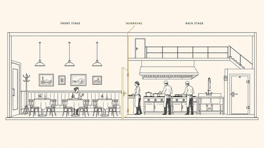
Definition
Front-stage / back-stage is Erving Goffman’s distinction between two regions of social life. The front-stage is where a performance is enacted for an audience; the back-stage is where the performers prepare, recover, and step out of role. Goffman names the two regions in the long second chapter of The Presentation of Self in Everyday Life (Doubleday, 1959), and his core claim travels intact into the design of service settings. Every place where one group performs a role for another contains both regions. The boundary between them is policed by the performers themselves. And what happens when the boundary fails is predictable and bad. Pine and Gilmore borrow the vocabulary explicitly in The Experience Economy (Harvard Business School Press, 1999, updated 2019), Chapter 5, and treat the front-stage / back-stage cut as the operational substrate of any staged offering.
The boundary is not metaphorical. It is a line in plan and section. A hotel’s lobby is front-stage; the kitchen pass, the housekeeping linen room, the engineering shop, and the cast-only corridor running behind the room block are back-stage. A restaurant’s dining room is front-stage; the line, the dish pit, the walk-in, and the chef’s office are back-stage. A museum’s gallery is front-stage; the prep lab, the registrar’s vault, and the docent ready-room are back-stage. A themed-entertainment land is front-stage; the costuming corridors, the utilidor at Walt Disney World, and the cast break rooms are back-stage. An immersive-theatre production’s performance space is front-stage; the wardrobe, the green room, the call sheet board, and the safety-coordinator’s station are back-stage. The boundary is a circulation discipline, a sightline discipline, an acoustic discipline, and a staffing-language discipline at once.
A second move distinguishes the operational concept from a generic theatrical metaphor: the boundary is bidirectional. Front-stage to the customer is also the staff member’s place of work; back-stage to the customer is the staff’s working environment. The two regions carry different ergonomic, regulatory, and aesthetic requirements. A back-of-house corridor too narrow for a stretcher cart is a service-design failure; a front-of-house corridor that lets a guest hear the cart is also a service-design failure. The discipline runs both ways because the staff and the guest are both being designed for, and the cost of the boundary shows up in the back-of-house spec as much as in the front.
A third move: in service-marketing scholarship, the concept is almost always paired with Stephen Grove and Raymond Fisk’s “The Service Experience as Theater” (Advances in Consumer Research (1992), Vol. 19, pp. 455–461). Grove and Fisk translated Goffman’s theatrical vocabulary into a working services-marketing frame and named the four elements that travel into a service setting: actors (staff), audience (customers), setting (the servicescape), and performance (the service encounter itself). Their reading is the one most cited in service-design literature, and it is the reading practitioners reach for when they treat front-stage and back-stage as a designed boundary rather than as a sociological observation.
Why It Matters
Naming the boundary changes what the practitioner can defend. It does three concrete kinds of work.
The first is the budget conversation. Service design routinely loses budget arguments because the back-of-house cost is large, visible to the CFO, and invisible to the guest. The hotel project budget carries a line item for back-of-house circulation that doubles the building’s construction footprint. It carries a staff entrance that runs around the building rather than across the porte-cochere, a service elevator separate from the guest one, a staff break room three corridors removed from the guest path, and a chef’s office that opens to the line rather than the dining room. Each line item is the front-stage / back-stage discipline drawn in plan. Without the vocabulary, the argument is whether the line item is “necessary.” With it, the argument is whether the staged offering survives if the back-stage discipline collapses — and in every published case, it does not. The cost of the boundary is the cost of the product. A hotel that doubles the back-of-house footprint buys the substrate that makes the service experience legible; a hotel that skips it sells a product whose substrate is wrong.
The second is what counts as a design failure. The vocabulary defines a class of failures the field had no name for: the kitchen door swung open during plate-up so the dining room saw the line yelling; the housekeeping cart parked in the hallway as a guest rolls past; the cast-only sign left in a guest sightline at a themed-entertainment land; the in-room dining tray stack visible through the guest-corridor window; the museum prep-lab dolly clattering down a public corridor between gallery rotations. Each is a boundary breach, and each measurably degrades the experience the operator means to deliver. The literature on guest complaints in upscale hospitality converges on a working observation. Explicit complaints about service mistakes are common; tacit drops in remembered experience after a boundary breach are also common, and harder to attribute. The vocabulary lets the practitioner name the breach and design against it.
The third is the organizational question of who is responsible. A service experience is delivered jointly by an architect, an interior designer, an operator, an experience designer, and a service designer. The boundary cuts across all five practices, and each owns a piece of it. The operator staffs the front-stage with employees who can hold the role. The service designer choreographs the role transitions across the boundary. The experience designer composes the reads from front-stage that telegraph back-stage discipline. The interior designer sets the sightline geometry that makes the boundary legible. The architect lays down the plan-section logic that enforces the boundary across decades of operation. Without a shared vocabulary, the five practices argue past each other. With it, the argument is which practice owns which part of the boundary, and the answer can be staffed.
How It Shows Up
Three cases run the concept at three settings and three different boundary-policing intensities.
Walt Disney World’s utilidor (Walt Disney Imagineering with WED Enterprises, opened October 1971). The Magic Kingdom at Walt Disney World sits on top of a back-stage circulation system the guest never sees. The ground-level corridor network, internally called the utilidor, runs underneath the entire park and connects every land’s back-of-house, every costuming station, every cast cafeteria, every food and beverage commissary, and every utility riser. A cast member working as a Tomorrowland greeter walks to work through the utilidor, exits up an internal stair into Tomorrowland’s back-of-house, and steps onto a sightline-controlled threshold that puts them, in costume, exactly into Tomorrowland’s themed register. The cost of the move is enormous: the entire park is built one story off the original swamp grade so the utilidor can fit, and the original 1971 budget overran in part because of this single decision. The published Imagineering rationale, traceable in The Imagineering Field Guide to the Magic Kingdom at Walt Disney World (Disney Editions, 2005) and elsewhere in the company’s design literature, is exactly the front-stage / back-stage discipline. A cast member crossing land themes on the surface (a Frontierland cowboy walking through Tomorrowland to clock out) is a boundary breach. The breach was large enough that the operator chose to bury the entire back-of-house circulation rather than absorb it. Walt Disney’s own published instruction on the question, paraphrased in the Field Guide, is that the guest should never see “anything that breaks the spell.” The utilidor is what that instruction looks like as construction.
Eleven Madison Park’s pass and floor protocol (Eleven Madison Park, with Daniel Humm and Will Guidara, 1998–; current ownership 2011–). A three-Michelin-star tasting-menu service at this scale is policed at the boundary by a dense set of habits that Will Guidara’s Unreasonable Hospitality (Optimism Press, 2022) names directly. The pass (the serving counter where kitchen plates are checked and released to the floor) sits on the geometric line between the line cooks’ working environment and the dining room’s circulation path. The line cooks face the back side of the pass; the floor staff read slips off the front side. The audible cues at the pass, the expediter’s call and the pickup confirmation, are audible only on the kitchen side. The pass enclosure, the airflow direction, and the relative noise levels between kitchen and dining room are all set deliberately, so the cooking apparatus registers in the dining room as ambient hum rather than as kitchen sound. The captains’ choreography across the floor is timed against the pass’s release pattern, and a dropped course is recovered through the floor without the kitchen’s apparatus becoming visible. Guidara’s chapters on the daily lineup meeting and the one-percent advantage describe the back-stage substrate: the briefing ritual at the start of every shift, the per-guest preference notes circulated on dossier sheets in the back office, the discretionary spend the captain can deploy on the floor without seeking permission. Each is a back-stage discipline the front-stage performance presupposes; each is invisible in the dining room and operationally expensive behind it.

Mass MoCA’s gallery / fab-shop boundary (Massachusetts Museum of Contemporary Art, North Adams, opened May 1999). Mass MoCA shows large-scale contemporary work in a converted nineteenth-century industrial complex of nineteen interconnected buildings, much of which is open to visitors. Buildings 4 and 5 carry the long-running Sol LeWitt wall-drawing retrospective and the Robert Rauschenberg Synapsis Shuffle (rotating). The boundary worth watching here is not the gallery sightlines, which the converted-mill plan handles generously. It is the boundary between the public gallery floors and the museum’s fabrication shop, where work is built on commission for installation. The fab-shop is back-of-house in the strict sense, but for some installations the gallery floor and the fab-shop intersect. Scaffolding is staged in the public corridor during install windows; a wall drawing is generated by drafters working visibly in front of guests during the daytime hours of an active install. The museum’s published install-cycle protocol is unusually transparent about this. A strict invisibility discipline would mean closing whole wings during installs. Instead the museum stages the install as part of the visitor experience and declares the boundary’s location explicitly: the install team wears a recognizable uniform; a posted notice names the work in progress; the scaffolding is roped off but not screened; a docent stands by to answer questions. The boundary is honored by being named rather than honored by being hidden. The discipline here is to declare what the guest is looking at, not to hide it, and the boundary stays deliberately translucent.
A note on the three cases. Walt Disney World represents the extreme of boundary suppression (build a tunnel system so the breach can’t occur); Eleven Madison Park represents boundary management at the line (run a working kitchen feet from the dining room and still hold the line through choreography and acoustic design); Mass MoCA represents boundary translucency (declare the boundary publicly when the install can’t be hidden). All three are correct uses of the concept, and they show that “back-stage” isn’t synonymous with “invisible.” It’s synonymous with “the region whose discipline the front-stage performance presupposes.” Sometimes the right design move is to bury that region; sometimes it’s to manage its visible edge; sometimes it’s to declare its presence and let the guest watch.
Caveats and Open Questions
The concept is foundational; it isn’t the whole story, and four open seams matter to working practice.
The first is the open-source-restaurant case. Some restaurants make the kitchen the dining room: the chef’s counter at a sushi restaurant, the wood-fired-oven seating at a pizza-counter format, the chef’s table inside the working line at a destination tasting menu. In each case, the kitchen is the front-stage, and the boundary collapses by design. The honest reading is that the concept still applies but with the polarity reversed: there’s now a back-stage region (the prep kitchen, the dish pit, the walk-in) farther removed from the guest, and the working line has become the staged region. The boundary’s location moves; the discipline doesn’t.
The second is the digital-channel question. The customer-experience literature has tried to translate the concept into digital settings, with mixed results. A SaaS support team has a “back-stage” (the internal Slack channel where engineers triage tickets) and a “front-stage” (the email or chat the customer reads). The vocabulary travels usefully when the friction is the back-of-house process leaking into the customer’s view, as in the “Sorry, escalating to engineering” reply that betrays the internal handoff. It travels less well when the digital channel collapses time and space in ways the spatial metaphor cannot follow. A customer who reads an old support thread in a public forum is reading a front-stage exchange recorded out of context, and the framing breaks down. The digital-channel translation is its own problem, treated under Mixed-Channel CX.
The third is the fully-public-process case. Some experiences are deliberately staged with no back-stage at all — a busker, a street-performance, a community theatre production where the company prepares in full view of the audience. Goffman’s argument predicts this is unstable: a performance with no back-stage cannot recover from a slip, cannot rotate roles, and cannot sustain a long run. The empirical record is mixed. Some all-front-stage formats survive (a busker’s shift is short by design and the slip is part of the format) and some collapse (a long-running production whose backstage was abolished for budget reasons typically loses cast continuity). The reading the book takes is that the boundary is cheaper to maintain than to abolish in most settings, and that abolishing it deliberately is a defensible choice in formats where the slip is part of what is being shown.
The fourth is the moral hazard at the boundary. The concept invites a critique the book takes seriously: a discipline of invisible support can shade into a discipline of invisible workers, where the people doing the back-stage work are paid less, treated worse, and rendered organizationally irrelevant by the very fact that they are not visible to the customer. The history of hospitality and themed-entertainment labor includes long passages where this was the operating reality. The vocabulary describes a real and useful design discipline, and the discipline can be operationalized in ways that compound a labor harm the field has not always reckoned with. The corresponding caution belongs in the design brief. A back-of-house spec that is generous, ergonomic, well-lit, and well-staffed is the version of the discipline worth defending. A back-of-house spec that minimizes its inhabitants’ welfare to subsidize the front-stage budget is a misuse of the concept, and it shades into the Manufactured Authenticity antipattern from a different angle.
A separate caveat about names. The Disney parks call the two regions onstage and backstage in cast-language; some hospitality operators call them front-of-house and back-of-house; service-design literature uses line-of-visibility in the service blueprint diagram to mark the same boundary. This book uses front-stage and back-stage when discussing the concept directly because it is Goffman’s own pair and the one that travels intact across settings; it uses the operator-specific synonyms when a particular case calls for them.
Related Articles
Sources
- Erving Goffman, The Presentation of Self in Everyday Life (Doubleday, 1959). The founding text; the front-stage / back-stage distinction is named and elaborated in the second chapter and runs through the remainder of the book. Goffman’s framing is sociological rather than design-prescriptive, which is the version every later service-design treatment translates from.
- Stephen J. Grove and Raymond P. Fisk, “The Service Experience as Theater,” Advances in Consumer Research (1992), Vol. 19, pp. 455–461. The canonical translation of Goffman into a working services-marketing frame; introduces the four elements (actors, audience, setting, performance) that the design literature has adopted as the operating vocabulary for service-as-staged-event.
- B. Joseph Pine II and James H. Gilmore, The Experience Economy (Harvard Business School Press, 1999, updated 2019), Chapter 5 (“The Show Must Go On”). The translation of the front-stage / back-stage discipline into the working brief of a staged offering, and the source for the practitioner-facing reading the book inherits when it talks about service work as designed performance.
- Mary Jo Bitner, “Servicescapes: The Impact of Physical Surroundings on Customers and Employees,” Journal of Marketing (April 1992), Vol. 56, No. 2, pp. 57–71. Bitner’s three-dimensional servicescape model treats employees as a population acted on by the environment alongside customers and discusses the customer-facing / staff-only zoning explicitly; the source for the spatial reading of the boundary as a designed circulation discipline.
- Will Guidara, Unreasonable Hospitality (Optimism Press, 2022). The published playbook from Eleven Madison Park’s reorganization; chapters on the daily lineup, the dossier sheets, the empowered-staff discretionary spend, and the one-percent advantage are the working substrate of the floor protocol described above and the most cited contemporary source on what back-stage discipline looks like inside a three-Michelin-star tasting-menu service.
- Walt Disney Imagineering, The Imagineering Field Guide to the Magic Kingdom at Walt Disney World (Disney Editions, 2005). The Imagineering staff’s own published explanation of the utilidor and of the Walt Disney instruction that “nothing should break the spell” for the guest; the working source for the themed-entertainment reading of the boundary.
Emotional Contagion
The automatic transfer of feeling from frontline staff to guest through facial mimicry, posture, voice, and bodily coupling, governed more by authentic affect than by display frequency.
“Contagion” borrows the language of infection. An emotion spreads by contact, often before either person decides to share it. Hatfield, Cacioppo, and Rapson named the construct in 1993 to describe an automatic bodily sequence: you mimic the face, voice, and posture in front of you, and feeling follows the muscle. The term sounds clinical, but every host knows the effect. A genuinely warm server makes the table warmer. A server going through the motions makes it colder, whatever the script says.
Definition
Emotional contagion is Elaine Hatfield, John Cacioppo, and Richard Rapson’s claim in Emotional Contagion (Cambridge University Press, 1993) that people tend “to automatically mimic and synchronize facial expressions, vocalizations, postures, and movements” and then converge emotionally. The mechanism has three steps: mimicry, bodily feedback, and convergence. You copy a smile, posture, or tone before noticing it; the body feeds back a faint version of that state; your own feeling drifts toward what you copied. Empathy is considered understanding. Contagion is the automatic catching.
In service, the direction matters. The frontline staff member is the source and the guest is the receiver. Sandi Mann’s work and S. Douglas Pugh’s “Service with a Smile: Emotional Contagion in the Service Encounter” (Academy of Management Journal, 2001) established the applied effect in bank tellers: employee positive affect predicted customer positive affect, which then predicted the customer’s service-quality rating. The smile did not merely accompany good service. It transferred a state.
The design-relevant refinement comes from Thorsten Hennig-Thurau, Markus Groth, Michael Paul, and Dwayne D. Gremler in “Are All Smiles Created Equal? How Emotional Contagion and Emotional Labor Affect Service Relationships” (Journal of Marketing, 2006). They separate surface acting from deep acting. Surface acting paints on the expression while the staff member feels something else. Deep acting summons the underlying state so the display is genuine. Authenticity, not display frequency, drives the transfer. A deep-acted smile warms the guest; a surface-acted smile transfers little and can read as worse than a neutral face when the guest detects the seam. Hofmann and colleagues’ 2024 work in Psychology & Marketing tightens the boundary conditions in hospitality and retail, but the authenticity finding still stands.
The construct isn’t a greeting tactic. It explains why a welcome lands, why a recovery is believed, and what an operator is really managing when they manage “warmth”: the staff member’s actual state and the conditions that sustain it.
Why It Matters
The service-ritual patterns name the moves. Emotional contagion names the variable that decides whether those moves work.
A smile standard is useful but insufficient. A venue can script the words, train the timing, audit compliance, and still leave guests cold because compliance measures the display while contagion runs on the affect underneath. “Did the staff member smile?” is a training-and-audit question. “Did the staff member have something genuine to transfer?” is a hiring, scheduling, training, and recovery question.
The concept also names a failure worse than absence. A hollow display doesn’t transfer nothing; it transfers the gap between face and feeling. This is the empirical core of Experience-Washing: staged warmth without substance is not neutral. The guest catches the hollowness.
That relocates the design surface. If guests catch the staff member’s genuine state, the real levers are disposition for the work, deep-acting training, shift length, back-region recovery, and the authority to solve the problem in front of the guest. The Front-Stage / Back-Stage split is partly emotional infrastructure. The back region is where staff recover the warmth the front stage spends. For a client buying service design, this turns “our people care more” from a soft culture claim into a mechanism worth funding.
How It Shows Up
The mechanism is clearest when an operator manages staff affect as deliberately as staff words.
The Ritz-Carlton “Lineup” and the empowered-staff substrate (Ritz-Carlton Hotel Company, in continuous use since 1983). The daily fifteen-minute pre-shift Lineup is an affect-priming ritual as much as an information meeting. A “wow story” reconnects staff to the meaning of the work before they step onto the floor, which is deep acting by design: the ritual summons the state the company wants transferred. The empowerment policy, a discretionary spend per guest per day to resolve a problem without escalation, supplies the recovery condition. Staff who can fix the problem in front of them carry less depletion into the next encounter.
Will Guidara’s “one-percent” practice at Eleven Madison Park (2006–2019, NYC), in Unreasonable Hospitality (Optimism Press, 2022). Guidara’s dossiers, permission to abandon the script for a single guest, and insistence that hospitality be wanted rather than performed all form a deep-acting engine. The staff member enters the encounter in a real state of generosity. That is what crosses the table. Guidara is clear that fake warmth is worse than quiet competence. The two-decade run atop The World’s 50 Best Restaurants priced transferred affect as part of the product.
Disney’s cast-member affect discipline and the back-stage tunnels (Walt Disney Company, 1955-present). The parks’ “onstage” rule asks cast members to hold character and affect wherever guests can see them. That demand is paired with “backstage” infrastructure: the utilidor tunnels under the Magic Kingdom, break areas out of sightline, and cast-only movement that keeps Frontierland out of Tomorrowland. The construct explains why. Positive affect is depletable. A cast member forced to hold the display without a place to drop it will be surface acting by the seventh hour, and the guest catches the depletion. The tunnels are not only sightline control. They are affect-recovery infrastructure.
The absence is just as visible. A fast-casual chain that mandates a greeting without protecting the staff’s state produces the textbook surface-acted display. The words are present. The affect is gone.
Caveats and Open Questions
The construct is foundational but bounded.
First, the transfer is strongest in high-contact encounters where guest and staff share attention, proximity, and enough time for mimicry and convergence to run. It is weak at a kiosk. Hofmann and colleagues’ 2024 work makes the point directly: the smile’s effect depends on encounter length, perceived authenticity, and the customer’s incoming state. Match the affect investment to the contact intensity.
Second, the real variable is hard to audit. A floor audit can confirm that staff smiled. It can’t confirm whether the smile was deep-acted or surface-acted. If the venue measures only smile compliance, it will report compliance and lose the transfer. The real variable is managed indirectly through hiring, training, scheduling, recovery, and the back region.
Third, emotional labor costs the worker. Deep acting transfers better than surface acting, but sustained emotional labor still depletes people, and surface acting is the more burnout-linked version. An operator who extracts frontline emotion without funding recovery is running a hidden cost on staff. Back-region quality and shift-length discipline are ethical controls, not only guest-experience controls.
Fourth, transposition is limited. The mechanism runs on bodily co-presence: face, posture, voice, and shared space. It weakens in asynchronous and pure-digital channels where the kinesic substrate is absent. A chat agent’s “😊” does not transfer affect the way a host’s genuine smile does. Voice-only and video channels remain live research territory; the working assumption should be that the effect weakens as the channel strips away the body.
Use the word narrowly. “Contagion” should not mean “good vibes spread.” In this book it means the replicated construct: automatic, bodily, authenticity-gated transfer with an applied service literature behind it.
Related Articles
Sources
- Elaine Hatfield, John T. Cacioppo, and Richard L. Rapson, Emotional Contagion (Cambridge University Press, 1993). The founding work; names the construct and lays out the mimicry–feedback–convergence mechanism. The early chapters on the automaticity of the transfer and on facial feedback are the load-bearing references for treating the staff member’s affect as the variable the guest catches.
- S. Douglas Pugh, “Service with a Smile: Emotional Contagion in the Service Encounter,” Academy of Management Journal 44, no. 5 (2001), pages 1018–1027. The canonical applied study; the bank-teller field setting establishes that employee displayed positive affect predicts customer positive affect and service-quality evaluation. Journal article; no Open Library record.
- Thorsten Hennig-Thurau, Markus Groth, Michael Paul, and Dwayne D. Gremler, “Are All Smiles Created Equal? How Emotional Contagion and Emotional Labor Affect Service Relationships,” Journal of Marketing 70, no. 3 (2006), pages 58–73. The design-relevant refinement: authenticity (deep acting) drives the transfer more than frequency (surface acting), which is what makes the prescription about staff disposition and recovery rather than mandated displays. Journal article; no Open Library record.
- Yannik Hofmann and colleagues, “The Role of a Smile in Customer–Employee Interactions: Primitive Emotional Contagion and Its Boundary Conditions,” Psychology & Marketing (2024). Recent experimental and field replication in hospitality and retail that refines the mechanism’s boundary conditions (encounter length, authenticity, the customer’s incoming state). Journal article; no Open Library record.
- Erving Goffman, The Presentation of Self in Everyday Life (Doubleday, 1959). The dramaturgical substrate the surface-acting/deep-acting distinction sits inside; contagion supplies the empirical test for when Goffman’s performed self transfers belief and when it reads as a mask.
- Will Guidara, Unreasonable Hospitality (Optimism Press, 2022). The contemporary working-practitioner account of designing for genuine, transferable affect; sourced here for its deep-acting method (the dossier, the one-percent practice, the insistence that the warmth be real), not as theory.
Peak, End, and Memory
The architecture of remembering: the peak moment, the ending, the afterimage, the trophy, the ritual artefact, the share-out.
The remembering self is not the experiencing self. Kahneman’s distinction is the cognitive ground for this whole section: a long pleasant flight can be remembered worse than a short uncomfortable one with a great ending, because the remembering self disproportionately weighs the peak and the end and largely neglects the duration of the rest. Experience design that aims at average pleasantness is solving the wrong problem. Experience design that aims at the shape of the experience — a composed peak, a deliberate ending, a memory-anchor the guest carries home — gets the leverage.
The patterns in this section operationalize that finding. Peak-End Composition is the most-leveraged single pattern in the book: the deliberate authoring of the experience’s most intense moment and its final moment together, with awareness that the rest will be largely forgotten. The Trophy Artefact names the take-home object that anchors later memory — earned, not bought; a Disney photo-pin or an Aman writing instrument rather than a generic souvenir. The Shareable Moment names the composed moment optimized for the guest’s social-media share, knowing that the share IS part of the experience tail, with the section taking a position on whether that is corruption or design. Duration Neglect, the Kahneman-finding companion to Peak-End, lets the book argue for short well-composed experiences over long average ones.
The section is concept-and-pattern dense. Peak-End Rule and Duration Neglect live in Foundations as the cognitive concepts; Peak-End Composition and the Trophy Artefact and the Shareable Moment live here as the design patterns built on top of them. The split keeps the foundations entries clean (the cognitive science) and the application entries actionable (the design moves).
The section connects backward into Foundations (Peak-End Rule, Duration Neglect, Experiencing vs. Remembering Self, Narrative Transportation), into Service and Ritual (Farewell as Peak is both a service pattern and a peak-end pattern; Service Recovery Theatre is a peak-and-memory pattern), and into Sensory and Atmospheric (the Sensory Anchor is a memory device). It connects forward into Setting-Specifics (the Restaurant Tasting Menu’s chef-out-of-kitchen moment, the museum exhibition’s last-room composition, the immersive-theatre waltz finale).
The cognitive psychology in this section is the most-actionable single body of evidence the book draws on. The patterns make it usable.
Entries
Peak-End Composition
Author the experience’s most intense moment and its final moment together, and accept that the rest will be largely forgotten.
Peak-End Composition is the hard-budget version of the peak-end rule. The guest lives the whole duration, but the remembered story usually prices two moments hardest: the most intense moment and the end. This pattern turns that finding into a briefable composition.
Understand This First
- Peak-End Rule — the cognitive finding the pattern operationalizes; without it, the budget-reallocation move below has no warrant.
- Experiencing Self vs. Remembering Self — the dual-target framework the pattern serves; the peak and the end are addressed to one of the two selves, and the trade-off below is between them.
- Duration Neglect — the companion finding that licenses the under-investment in the middle.
Context
The pattern applies to a bounded experience: hotel stay, museum visit, themed-attraction ride, tasting menu, immersive-theatre run, guided tour, brand activation, or flagship-store visit. The operator has a finite budget of attention, staff training, lighting, scent, choreography, money, and architectural care. The guest will be sampled during the visit and afterward, through review, NPS, rebooking behavior, or the story told to a friend. The second sample usually books the next visit.
The pattern lives at the composition scale, between strategic positioning, such as Aman versus Marriott or a Royal Academy exhibition versus a kunsthalle program, and moment-scale tactics such as one threshold, signature scent, or greeting line. It names which moments are load-bearing and how much marginal budget each gets.
Problem
Designers and operators want every moment equally good. The instinct is honorable. Even pacing reads as professional; uneven pacing reads as a lapse. The budget is a flat line: similar design care, staff time, and operator focus.
The evidence points at a different loss function. The remembered quality of an extended experience is pulled toward two anchors, the peak and the end, while the duration and middle carry less weight. A flat budget produces a flat curve. The same spend, redistributed toward two well-engineered spikes, can produce a stronger memory and a higher rebooking probability.
The dilemma is political as much as creative. Uneven pacing admits that some moments matter more than others. The operator must defend a budget that will not plot as a smooth line on any in-stay dashboard.
Forces
- Average-utility instinct vs. peak-end evidence. Even pacing optimizes the experiencing self’s running average; the remembering self prices the curve’s anchors.
- Operational consistency vs. compositional emphasis. Operations rewards predictable delivery; composition asks for amplification at two intervals and restraint elsewhere.
- In-stay metrics vs. retrospective metrics. The on-property pulse samples the experiencing self; the post-stay survey samples the remembering self.
- Defensible budget vs. honest budget. Treating every moment as equal is easier in a review meeting; naming the middle as floor is easier on the rebooking dashboard.
- Restraint vs. saturation. Two equal, similar peaks blur. The pattern needs one peak, one end, and a clear difference between them.
Solution
Author the peak and the end deliberately, share the budget asymmetrically across them and the rest, and treat the middle as the operational floor rather than the design ceiling.
Name the two anchors. Specify the peak by location, sensory channels, and intended register: awe, recognition, surprise, catharsis, intimacy, release. Specify the end the same way. The pair should not be identical. Two similar peaks summarize as one diffuse peak, with the second dampening the first.
Budget against the pair. The literature has no universal ratio, but hospitality, themed entertainment, and tasting-menu service often converge on a 40 / 30 / 30 heuristic: roughly forty percent of marginal compositional spend at the peak, thirty at the end, and thirty across the rest. The middle remains the floor that keeps the experience safe to remember.
Engineer the middle as a floor, not a weak spot. Service-blueprint discipline, staff training, cleanliness, predictable wayfinding, and absence of friction live there. They are what make the peak affordable. If the middle is unreliable, the experiencing self will not forgive the trough.
Differentiate the peak and end by register. If the peak is high-arousal, such as fireworks, a chef-out-of-kitchen moment, or a reveal, the end should run lower-arousal but high-recognition: a hand-written note, personal escort, or small ritualized gesture. If the peak is intimate, the end can run higher.
Finally, name the trade. The average in-stay rating may be lower than under flat pacing; the post-stay rating, review distribution, and rebooking conversion are the intended beneficiaries. Naming the trade keeps operations from undoing the composition when the middle dips.
Sensory Channels
- Primary at the peak: setting-specific. Visual at the Disney fireworks ($5{,}000 in pyrotechnics across roughly 12 minutes); gustatory at the Eleven Madison Park signature dessert reveal; auditory at the Punchdrunk Sleep No More waltz finale; haptic at the Aman in-stay turndown ritual.
- Primary at the end: typically lower-arousal multimodal. Visual + auditory at the Disneyland Main Street exit (warmer color temperature, instrumental music); haptic at the Aman send-off (paper bag in hand, escort to the elevator); olfactory at the high-craft restaurant’s parting petit-four (a scent the guest carries on their hands into the cab).
- Tertiary across both anchors: explicit register differentiation between peak and end. If the peak runs at, say, 65 dB ambient and 50 lux, the end should sit roughly 10–15 dB lower and 20–30% dimmer. The exact numbers are setting-specific; the directional rule is constant.
Inheres-In
- Primary: transposable. The pattern’s canonical form lives nowhere; it is a cross-setting compositional move.
- Settings where the pattern is canonical: hospitality, themed-entertainment, immersive-theatre, museum, service-flow.
- Settings where the pattern transposes with care: retail (the “peak” is often product try-on or personalization, the “end” the bag-hand-over and parting line); brand-experience (the peak is typically the shareable moment, the end the giveaway hand-off); mixed-channel-cx (the digital-physical seam needs an end-of-session anchor).
- Does not transpose: open-ended attractions without a definable end (a public square, a continuously running ambient installation) — the pattern presupposes a bounded duration with a recognizable terminus.
How It Plays Out
Disney’s “Happily Ever After” / “Wonderful World of Animation” park-close fireworks (Walt Disney Imagineering, Walt Disney Studios, current rotation). The Walt Disney Company’s parks have used a deliberate end-of-day peak since Disneyland opened in 1955, with Walt Disney’s instruction that the close of the day “must equal the first.” At Magic Kingdom, Happily Ever After (2017–2023, returning in 2025) and, at Disney Hollywood Studios, Wonderful World of Animation (2019–) turn the close into a roughly 18-minute peak: pyrotechnics, projection-mapped facade animation, a John Williams-and-Alan Menken cue list, and choreographed crowd lighting. Then the register drops. Main Street, U.S.A. shifts into warm light, instrumental music, a slower exit walk, and cast members thanking departing guests by name where possible. That “kiss goodnight” sequence, documented in The Imagineering Field Guide to the Magic Kingdom at Walt Disney World and forty years of trade-press coverage, is the end. Parades and queues hold the floor; the close gets the memory budget. Per-guest spend, next-visit booking, and pass-renewal lift are the operator’s evidence, tracked internally and described in Cornell Hospitality Quarterly features on themed-attraction guest-experience design.
Eleven Madison Park’s tasting menu close (Daniel Humm and Will Guidara at Eleven Madison Park, NYC, 1998–present in current ownership form; Guidara’s Unreasonable Hospitality, 2022, as the playbook). The tasting menu runs roughly two-and-a-half hours across nine to twelve courses. The courses are the experiencing-self middle. The peak is a signature reveal, historically the savory cheddar-and-apple cracker that opens an “Eleven Madison Park, The Story” account of the restaurant’s New York lineage, or a later dessert from the chef-de-cuisine. The end is the carried home hand-off: granola or chocolate, a date card, and, when staff recognized a celebration, a note from the table’s server. Guidara’s Chapter 7 on signature moments and Chapter 12 on the parting gesture name the discipline. Staff attention, plating elaboration, and chef visibility load toward the reveal and parting gift; the courses hold the floor.
Punchdrunk’s Sleep No More waltz finale (Punchdrunk and Emursive, the McKittrick Hotel, NY, 2011–2024). The 13-year New York run of Sleep No More composed a roughly three-hour immersive-theatre experience around one peak and one end. The peak was the third-act “Macbeth banquet”: the full cast converging in a ballroom for a slow-motion scene with live cello, culminating in the Macbeth-Lady Macbeth waltz returning audiences used as shorthand for the show. The end was the Manderley Bar exit, a 1930s-styled jazz lounge where masks came off, a torch-singer set lowered the intensity, and audiences could leave or sit for another twenty minutes. The wandering middle, partial scenes, and missed encounters were not optimized as an average-utility path; many audiences saw less than half the available scenes. Studies in Theatre and Performance, Theatre Journal, The New York Times, and The New Yorker treated the pair as the product.
The cases run at three durations: an evening at a theme park, two-and-a-half hours at a restaurant, and three hours at an immersive-theatre run. They also run at three price tiers: approximately USD 130 to 250 a head, approximately USD 365 a person at EMP’s three-Michelin-star tenure, and approximately USD 200 to 350 a head. The move is the same: load budget onto a peak and an end, differentiate them by register, and accept a lower in-stay average for higher remembered value.
Consequences
The pattern lifts the metrics that price the remembering self: post-stay surveys, reviews, one-week and one-month NPS, rebooking conversion, and the friend-told-a-friend chain. It works best in moderate-length experiences, from a few hours to a day or two, with a single dominant valence. Multi-day experiences still benefit from a strong final morning.
It also makes the brief a budget instrument. Once the peak and end are named, cost lines become traceable: lighting for the peak, staff training for the floor, furniture for the end. Reviewers can ask where a cost belongs and get a defensible answer.
The cost is real. The in-stay running-average metric may fall because the middle is less spent-on by design. The end also becomes fragile: a disorganized checkout, forgettable curtain call, or fireworks rain-out without recovery hits the remembered curve hard. That is why Service Recovery Theatre matters here.
The pattern also tempts saturation. Once peak-engineering becomes craft, every moment starts to look like a candidate peak. The composition drifts toward two, three, or four peaks in a row, and no one can tell which mattered. Ritual Saturation names the service-ritual version.
Failure Modes
- Two-peak saturation. The composition runs two equal peaks of similar register. The remembering self averages them into one diffuse peak; the differentiation rule has been violated.
- Peak without floor. The middle falls below the operational threshold. The peak is impressive in isolation but does not survive contact with an unsatisfied experiencing self. Aman’s five-star floor makes Aman’s send-off legible as a peak; the same send-off at a three-star property fights the in-stay average.
- End without peak. The composition has a strong farewell but no engineered peak earlier in the experience. The end has nothing to anchor against; the remembered curve summarizes as “a mediocre experience with a memorable parting moment,” which is the failure mode the sector calls “all end, no journey.”
- Mis-transposition into open-ended formats. The pattern is applied to an experience without a definable end (a public space, a continuously running installation, a brand pop-up with rolling entry). The end-anchor has nowhere to land, and the peak collapses into a single attraction rather than a composed pair.
- Cultural miscalibration. The composition assumes the individual remembered curve as the unit of analysis. When remembering is socially mediated by a family unit, religious community, or business delegation, the peak and end need to land at the social-narrative scale. A peak the group cannot retell will not compound.
- Saturation drift over operational time. The operator’s craft improves; every moment becomes a candidate peak; the composition drifts into Ritual Saturation. The protection is reserving two anchor moments and deprecating the rest.
- Optimizing for the surveyed peak instead of the felt peak. The operator engineers the peak that scores highest in the post-stay survey (the photogenic moment, the social-share-friendly reveal) rather than the one that does the most for the guest’s actual remembering self. The risk is the Shareable Moment drift: the peak optimized for the share is sometimes — not always — a peak the guest’s remembering self files away as performance rather than as experience.
Related Articles
Sources
- Daniel Kahneman, Barbara L. Fredrickson, Charles A. Schreiber, and Donald A. Redelmeier, “When More Pain Is Preferred to Less: Adding a Better End,” Psychological Science (November 1993), Vol. 4, No. 6, pp. 401–405. The founding cold-pressor study and the founding statement of the rule the pattern operationalizes.
- Daniel Kahneman, Thinking, Fast and Slow (Farrar, Straus and Giroux, 2011), chapters 35–36. Kahneman’s own retrospective treatment of peak-end and the experiencing-self / remembering-self distinction; the source for the dual-target framing the pattern’s solution depends on.
- B. Joseph Pine II and James H. Gilmore, The Experience Economy: Competing for Customer Time, Attention, and Money (Harvard Business Review Press, updated edition 2019), originally published 1999, especially the chapter on “memorabilia” and the staging-design discussion in the second-edition afterword. The framing that lets a hotel director, a museum director, or a producer treat the staged composition as the priced product.
- Will Guidara, Unreasonable Hospitality: The Remarkable Power of Giving People More Than They Expect (Optimism Press, 2022), Chapters 7 and 12 in particular. Eleven Madison Park’s working playbook for the signature-moment / parting-gesture composition; the source for the in-house translation of peak-end thinking into a hospitality-service operating procedure.
- Donald A. Redelmeier and Daniel Kahneman, “Patients’ Memories of Painful Medical Treatments: Real-Time and Retrospective Evaluations of Two Minimally Invasive Procedures,” Pain (July 1996), Vol. 66, Nos. 1–2, pp. 3–8. The clinical replication that established the rule’s robustness outside the lab and grounded the practical recommendation that extending an experience with a milder ending improves remembered evaluation.
- Bernd H. Schmitt, Experiential Marketing: How to Get Customers to Sense, Feel, Think, Act, and Relate to Your Company and Brands (Free Press, 1999), the chapters on experience modules and on the retail and entertainment cases. The first widely-cited translation of peak-end thinking into a working brand-and-experience composition vocabulary; the source the pattern’s “register differentiation” rule is most directly indebted to.
The Trophy Artefact
Give the guest a small, earned object that carries the peak, the crossing, or the farewell out of the venue and lets the remembering self re-open the experience later.
Also known as: memory artefact, earned keepsake, residue object, parting gift, take-home anchor, proof-of-participation object.
You already know the difference between the object you bought in the shop and the object you kept because something happened around it. The bought object says, “I was there.” The trophy artefact says, “I did this, witnessed this, was recognized here, or crossed this threshold.” That distinction is the whole pattern.
The object doesn’t have to be expensive. It can be a pin traded from a cast member’s lanyard, a folded card carried through a museum, a printed menu signed at the end of dinner, a mask, a wristband, a small jar of granola, a note, or a stamped booklet. What matters is not the object’s retail value. What matters is the event the object proves.
Understand This First
- Peak-End Composition — the compositional pattern this one specializes.
- Peak-End Rule — the cognitive finding that explains why a remembered object can carry more weight than its material value.
- Experiencing Self vs. Remembering Self — the two-self distinction that explains why the object keeps working after the visit ends.
- Farewell as Peak — the closing pattern that often places the object in the guest’s hand.
Context
The pattern applies to bounded experiences with a remembered afterlife: a restaurant dinner, a hotel stay, a museum visit, a theme-park day, a guided tour, an immersive-theatre run, a brand activation, a retreat, a class, a festival, or a retail appointment. The operator has already authored a peak, a crossing, a recovery, or a farewell. The question is whether the memory dies when the guest walks out or whether something leaves with them.
The pattern sits at the memory layer, downstream of the experience’s design. A weak visit can’t be repaired by handing out objects at the door. A trophy artefact works only when it attaches to a moment that already had weight inside the experience: the child traded for this pin; the diner received this parting gift after the captain remembered the table’s story; the museum visitor carried this card through the exhibition and returned to it afterward.
That makes the pattern different from ordinary merchandise. Merchandise is bought. A trophy artefact is earned, received, assigned, traded for, completed, stamped, signed, or otherwise made specific by the guest’s participation. The same physical item can be either. A generic postcard bought at the register is a souvenir. A postcard written by the performer in response to the guest’s choice in the show is a trophy artefact.
Problem
Many experiences end too cleanly. The guest leaves with a feeling but no handle for the feeling. The peak was strong, the farewell was competent, and the review score may be fine, but the memory has to survive in a crowded home, inbox, photo roll, and social feed. Without a durable cue, the remembered summary decays into a vague sentence: “It was great.”
Operators often respond by adding retail. The shop gets larger, the checkout path routes past more products, and the “exclusive” item gets a logo and a price tag. That solves a revenue problem, not a memory problem. Retail can support memory, but only when the object carries the right story. A bought t-shirt proves purchasing. An earned object proves participation.
The recurring difficulty is that the pattern has to thread a narrow line. Too little object and there is no memory handle. Too much object and the gesture becomes clutter, bribery, or merchandise in costume. The object has to be small enough to keep, specific enough to matter, and honest enough that the guest doesn’t feel sold to at the moment they were supposed to feel recognized.
Forces
- Memory cue versus clutter. The object must be durable enough to survive the visit but not so large, fragile, or awkward that it becomes a disposal problem.
- Earned meaning versus purchased meaning. The object’s authority comes from the participation that produced it. If the guest can buy the same thing from a rack, the trophy reading collapses.
- Personalization versus scalability. A hand-written note lands because it is specific; a venue with 10,000 daily guests needs a form that can hold specificity without impossible labor.
- Gift cost versus lifetime value. The object’s cost appears on the operating ledger immediately. The repeat-visit, referral, and memory-tail value appears later, and often in another team’s dashboard.
- Recognition versus manipulation. The object should help the guest remember what happened. It should not trap them in a purchase funnel disguised as gratitude.
Solution
Attach a small physical object to a peak, crossing, recovery, or farewell, and make the object’s path into the guest’s hand part of the experience rather than an afterthought.
A working trophy artefact has five design decisions.
First, name the moment the object carries. The object can carry the peak (the signed menu after the chef’s table-side course), the crossing (the wristband, mask, stamp, or identity card that licenses the visit), the recovery (the hand-written note after a failed stay was repaired), or the farewell (the jar, printed recipe, card, or wrapped object placed in hand at departure). If the brief can’t name the moment, the object is probably merchandise.
Second, decide how the guest earns or receives it. The strongest paths are participation paths: trade, completion, witnessed action, assigned identity, personalized recognition, or a staff handoff tied to something the guest did. A bought object can become trophy-like only when the purchase itself is part of the authored experience, and even then the pattern is weaker. The operator should be able to finish this sentence: “You receive this because…”
Third, make the object specific at one point. Specificity can be a name, date, stamp, cast-member trade, seat number, table story, route completed, person assigned, course eaten, or threshold crossed. Specificity is what separates a trophy artefact from a branded freebie. It also keeps the object from becoming a generic premium the guest immediately prices against its material cost.
Fourth, make it easy to keep. Flat paper, a small pin, a card, a printed menu, a textile band, a pocket-size jar, a handwritten note, a small object that can sit on a shelf: all can survive the trip home. Oversized packages, fragile objects, messy foods, and objects that trigger airport-security or customs problems create friction exactly when the pattern should be reducing it.
Fifth, protect the object from the shop. The object may live near retail, and it may even increase retail value by making the shop feel like part of the afterimage. But the trophy itself should not be indistinguishable from a purchasable item. If guests can buy the same object without the event, staff need a visible distinction: a stamp, date, variant color, signature, route mark, assigned identity, or handoff script that the retail rack doesn’t carry.
The fastest way to break this pattern is to call a generic object “earned” when nothing in the experience made it so. Guests detect the fraud quickly. The failure mode is not weak memory; it is Manufactured Authenticity with inventory attached.
Sensory Channels
- Primary: haptic / visual. The object must feel and look specific enough to re-open the memory when handled later: paper weight, pin weight, handwriting, emboss, stamp, ribbon, box, scent residue, or surface wear all matter.
- Secondary: olfactory where the object carries a scent, especially hospitality and retail parting gifts. A cedar note on a card or a food gift with a house aroma can become the memory cue.
- Tertiary: linguistic. The naming line, inscription, card text, cast-member exchange, or farewell sentence is often what makes the object legible as earned rather than handed out.
Inheres-In
- Primary: transposable. The pattern’s canonical form lives at the intersection of memory and participation rather than in one setting.
- Settings where the pattern is canonical: hospitality, themed-entertainment, museum, immersive-theatre, service-flow.
- Transposes to: retail, brand-experience, mixed-channel-cx when the physical object is tied to a physical action and not merely mailed as promotional fulfilment.
- Does not transpose: purely ambient public space with no operator-owned close, purely digital flows where the object becomes a badge or receipt, and settings where an object would cheapen the ethical weight of the experience. In those cases, use a different memory cue.
How It Plays Out
Disney pin trading at Walt Disney World (The Walt Disney Company, formalized as an official guest practice with published pin-trading guidelines). Disney sells plenty of pins, but the traded pin is a different unit from the pin bought at the register. The official Walt Disney World guidelines specify the social and material rules: guests trade only official metal pins, ask before touching a cast member’s lanyard or pin pack, trade one pin at a time, and may trade up to two pins per cast member or board per day. The object the guest leaves with is still a commercial object, but its value has been changed by the exchange. It records a staffed encounter, a choice, a small negotiation, and sometimes a route through the park. A child who traded a starter pin at Frontier Trading Post for a character pin from a cast member’s lanyard did not simply buy merchandise; they completed a tiny social ritual inside the park’s operating frame. The pin is small, durable, visible, and specific to the trading episode. That is why it works as a trophy artefact while the identical pin purchased without the trade reads as a souvenir.
Eleven Madison Park’s granola parting gift (Eleven Madison Park, New York; Daniel Humm and Will Guidara era, documented in Guidara’s Unreasonable Hospitality and in Eleven Madison Home’s current product page). The restaurant’s granola is now sold as a packaged product, but the practice that made it famous was the parting gift. Eleven Madison Home describes it as served for more than a decade as a parting gift at the end of the meal. In the dining room, the gift worked because of where it arrived in the curve: after a long, high-control tasting menu, at the farewell, in a register that turned tomorrow morning into the last beat of tonight’s dinner. The object was inexpensive relative to the check, easy to carry, and immediately legible. It did not pretend to be the meal’s peak. It extended the close. When a guest opened the granola the next morning, the remembering self got a second contact with the restaurant, not through a review request or a marketing email, but through breakfast. That is the pattern in its clean hospitality form: small object, timed handoff, house-specific sensory cue, durable memory tail.
The identification cards at the United States Holocaust Memorial Museum’s Permanent Exhibition (Ralph Appelbaum Associates with James Ingo Freed / Pei Cobb Freed & Partners, opened 1993, Washington, D.C.). This is the ethical boundary case, and the language matters. The card is not a prize. It is not a celebratory trophy. It is a carried witness object. The museum’s education material says visitors receive identification cards just before entering the Permanent Exhibition; each card describes the experience of one person persecuted during the Holocaust, and the card is designed as a small booklet to be carried through the exhibition. The object personalizes historical scale without pretending the visitor owns the story. Its power comes from assignment, sequence, and return. The visitor receives a named life at entry, carries it through the floors, and can reexamine it after the visit. The pattern is present, but under a stricter ethical rule: the artefact must deepen responsibility rather than turn witness into possession. This case is the warning against casual language. Some experience settings can call the object a trophy. A memorial museum cannot. The underlying design move still deserves to be named because the craft requirement is the same: small object, assigned participation, durable afterlife, no retail substitution.
The three cases show the range. Disney uses the pattern as a repeatable exchange ritual in a high-volume themed-entertainment setting. Eleven Madison Park uses it as a personally timed hospitality close. The Holocaust Museum uses the same object logic under a non-celebratory, historically grounded duty of care. The pattern can survive across all three only because it is not defined by fun, price, or sentiment. It is defined by the relationship between object and event.
Consequences
Benefits. The trophy artefact extends the memory tail. It gives the remembering self a cue that lives outside the venue: on a desk, in a drawer, on a jacket, in a kitchen, in a scrapbook, in a child’s collection, in the folder a visitor reopens months later. That cue can re-trigger the peak, the crossing, the recovery, or the farewell without requiring a marketing contact from the operator.
It also gives operators a more precise retail distinction. A souvenir shop asks what guests will buy. A trophy-artefact brief asks what the guest has earned, what object can honestly carry that earning, and which retail items should remain ordinary merchandise. The distinction improves both sides. Retail stops pretending every object is meaningful, and meaningful objects stop being priced only as retail.
The pattern also helps staff. A tangible handoff gives the service performer a concrete closing move, especially in hospitality and service recovery. The guest leaves with something in hand, and the staff member has a scripted but human moment to say why it matters. That makes the close easier to train and easier to audit than a vague instruction to “make the ending memorable.”
Liabilities. The object can become clutter. If every small moment receives a pin, card, patch, note, and box, the pattern degrades into stuff. The guest’s home becomes the operator’s storage overflow, and the object shifts from memory cue to waste.
The object can also create inequity. If only high-status guests receive the meaningful artefact, while first-time or low-spend guests receive nothing, the pattern may deepen a tiering logic the venue did not intend to expose. High-end hospitality can handle some differentiation, but the floor has to be high enough that the ordinary guest does not experience the absence of an artefact as non-recognition.
The pattern carries an ethical risk in memorial, civic, healthcare, and culturally specific settings. Some experiences should not be converted into keepsakes. Where the experience involves suffering, mourning, sacred practice, or someone else’s identity, the object must be framed as witness, learning, consent, or responsibility. The more serious the setting, the less the operator should rely on retail language or collection behavior.
Failure Modes
- Generic premium. The object is handed out to everyone, identical, with no relation to what happened. It is a branded freebie, not a trophy artefact.
- Shop substitution. The same object can be bought by any passerby. The earned path no longer matters, so the trophy reading collapses into merchandise.
- Oversized keepsake. The object is too large, fragile, heavy, or awkward to live with. It becomes a burden, and the guest discards it with irritation.
- Forced sentiment. The object arrives with a script telling the guest how meaningful it is. The operator has mistaken instruction for feeling. The object should let the memory open; it should not demand reverence.
- Fake personalization. The card, note, or object uses the guest’s name but reveals no real knowledge of the visit. This is Manufactured Authenticity, not recognition.
- Collection over experience. Guests start optimizing for the object rather than the visit: chasing every pin, every stamp, every badge, every variant. This can be productive in a designed collecting game, but it is a failure if the collection displaces the experience it was meant to remember.
- Ethical misnaming. A witness object, memorial object, or culturally specific object is treated as a trophy in the celebratory sense. The design move may be sound, but the language has broken trust.
- No object audit. Objects accumulate across seasons, sponsors, and departments without a single owner deciding what each one carries. The venue ends up with a drawer full of artifacts and no memory strategy.
Related Articles
Sources
- Grant McCracken, “Culture and Consumption: A Theoretical Account of the Structure and Movement of the Cultural Meaning of Consumer Goods,” Journal of Consumer Research, Vol. 13, No. 1 (1986), pp. 71-84, and Culture and Consumption (Indiana University Press, 1988). McCracken’s transfer-of-meaning account and possession-ritual vocabulary supply the cultural substrate for why an object can carry an experience forward.
- Russell W. Belk, “Possessions and the Extended Self,” Journal of Consumer Research, Vol. 15, No. 2 (1988), pp. 139-168, and Mihaly Csikszentmihalyi and Eugene Rochberg-Halton, The Meaning of Things (Cambridge University Press, 1981). These are the object-meaning sources behind the article’s distinction between an object with retail value and an object that extends identity, memory, and relationship.
- B. Joseph Pine II and James H. Gilmore, The Experience Economy (Harvard Business Review Press, updated edition 2019). The experience-as-priced-offering frame and the chapter treatment of memorabilia provide the economic vocabulary for separating merchandise from memory-bearing objects.
- Will Guidara, Unreasonable Hospitality (Optimism Press, 2022), and Eleven Madison Home’s page for Eleven Madison Park’s Granola Trio Gift Box. Guidara supplies the service-system logic behind the parting gift; the current product page documents the granola’s more-than-decade use as a parting gift at the end of the meal.
- Walt Disney World Resort, Pin Trading Guidelines. Disney’s published rules show how a purchasable object becomes a participation object through trade etiquette, cast-member interaction, official-material constraints, and daily exchange limits.
- United States Holocaust Memorial Museum, Activities and Resources for Use Before Your Visit to the Permanent Exhibition and the museum’s identification-card packet. These sources document the identification cards as small booklets given before entry, carried through the Permanent Exhibition, and used to personalize historical events through one person’s experience.
The Shareable Moment
Compose one moment so it can be photographed, recorded, or retold, while keeping the body’s experience primary and the share as the afterimage, not the point.
Also known as: photo-op moment, social-photo peak, camera moment, share-out, digital trophy, postable beat.
If you design experiences now, the camera is in the room whether you invite it or not. Guests photograph entrances, plates, views, mirrors, costumes, receipts, ceiling details, staff gestures, and the face of the person across from them. The question isn’t whether the experience will be documented. It will. The question is whether the share carries the experience honestly or replaces it.
A shareable moment is not a backdrop. It is a composed beat that survives being photographed because it already works without the camera. The guest lifts the phone because the moment landed first in the body: surprise, recognition, awe, tenderness, absurdity, status, witness. The image extends that beat into the guest’s later story. When the image is the only reason the beat exists, you’re no longer inside this pattern.
Understand This First
- Peak-End Composition — the compositional pattern this one specializes.
- Peak-End Rule — the cognitive finding that explains why one photographed peak can outweigh long stretches of competent middle.
- Experiencing Self vs. Remembering Self — the two-self distinction the pattern has to respect.
- The Trophy Artefact — the physical memory-object cousin to the digital share.
- Experience-Washing — the antipattern boundary when the surface replaces the staged experience.
Context
The pattern applies to experiences whose afterlife matters: a theme-park reveal, a museum room, an experiential retail flagship, a hospitality farewell, a tasting-menu course, a brand activation, a city-facing building skin, or an immersive-theatre threshold. The operator knows the visit will continue later as photographs, clips, messages, and retold stories. The share is part of the product’s memory tail.
This pattern lives in the peak-end-memory section because the share is a memory instrument before it is a marketing instrument. Marketing may benefit from it. Search may benefit from it. But the design question starts with the guest’s remembering self: what moment should this person want to re-open later, and what image, clip, or sentence will carry it without lying about what happened?
It is also a contested pattern. Many practitioners distrust it for good reason. The 2016-2019 pop-up wave taught the field what happens when the room is composed for the phone first and the participant second: queues of backdrops, shallow interaction, weak endings, no recovery surface, and a metric structure that counts social reach while ignoring what guests felt on the floor. The answer is not to pretend the camera isn’t there. The answer is to subordinate it.
Problem
Guests increasingly use the phone as part of how they remember, prove, and share an experience. If the design refuses to account for that behavior, the shareable afterimage is left to chance: a bad angle, a crowd-control bottleneck, a staff member trying to keep a sightline clear after the guest has already decided the view matters, a final image that misrepresents the experience’s best work.
But designing for the share can corrupt the experience. A camera-facing peak pulls budget, space, and attention toward what reads in a rectangle. The body gets demoted. The guest starts working as content producer. The operator starts measuring reach instead of memory. The experience becomes a set of surfaces that ask to be captured rather than a sequence that asks to be lived.
The practitioner problem is to make the share possible without making the camera the client. The designed image should carry the experience’s truth after the visit. It should not become a substitute for that truth.
Forces
- Remembering self versus experiencing self. The share addresses the remembering self, but it has to be earned by the experiencing self first.
- Guest agency versus operational flow. Guests will stop to photograph the moment. If the brief doesn’t plan for that stop, the photo behavior becomes congestion, conflict, or staff improvisation.
- Image clarity versus bodily richness. The moment has to read in a frame, but the experience has to exceed the frame through sound, scale, temperature, service, scent, taste, movement, or risk.
- Reach versus trust. A shareable beat can extend the venue’s visibility, but an image that overpromises damages trust when the floor can’t support it.
- Peak discipline versus saturation. One strong shareable beat can support the memory curve. Every beat asking to be photographed flattens the experience into work.
Solution
Author one shareable beat as part of the experience’s memory curve, then protect the rest of the experience from becoming a support system for that beat.
Start by naming the remembered moment, not the image. The brief should finish a sentence like this: “The guest should want to share this because they just felt…” Awe at scale, relief after a threshold, pride at completion, intimacy at recognition, absurdity inside a framed fiction, witness at a civic or memorial site. If the sentence ends with “because it will look good,” the pattern hasn’t earned itself.
Second, decide whether the moment is personal, social, or public. A personal share is a table-side course, a handwritten farewell, a private fitting-room reveal, or a character encounter. A social share is a group photograph, a room designed for a party to gather, or a completion moment. A public share is a building skin, parade, fireworks show, city-facing installation, or large-scale spectacle. Each asks for a different distance, dwell time, staff posture, and recovery plan.
Third, design the phone behavior as part of the choreography. Place the stop where bodies can stop. Give the camera an obvious sightline without requiring the guest to block a route, lean over a barrier, or step into a staff path. If the moment sits on a route, provide a bypass. If it is private, protect the guest from being watched while they document it. If it is public, assume many people will record at once and design the viewing field accordingly.
Fourth, make the non-camera version stronger than the camera version. The person who doesn’t photograph the moment should still receive the full value. The camera should capture a residue, not the primary event. The test is simple: if phones were checked at the door, would this beat still belong in the experience? If no, either cut it or move it to marketing.
Fifth, give the share an honest frame. Don’t pretend a staged beat is discovered. Don’t present a staff-authored moment as spontaneous intimacy. Don’t use borrowed heritage, fake scarcity, or false participation to make the image feel more earned than it is. A shareable moment can be deliberately staged and still honest if the frame is declared and honored.
Finally, cap the count. One primary shareable beat per bounded experience is usually enough. A longer experience may carry two, but they should have different jobs: a public arrival image and a private farewell, for example. If every room has a mark on the floor telling guests where to stand, the pattern has already turned into a queue of obligations.
The share is a memory tail, not the design brief. If the photographed version reads better than the lived version, the design has crossed into Experience-Washing or Manufactured Authenticity.
Sensory Channels
- Primary: visual / spatial. The frame has to read clearly from the guest’s natural standing point: scale, silhouette, color contrast, face lighting, background control, and a clean route around the stop.
- Secondary: haptic / kinesic. The guest’s body should do something before the share: step through a portal, lift a glass, receive a note, stand inside scale, complete a route, turn a corner, or join a group.
- Tertiary: auditory / social. A cue, staff line, crowd reaction, silence, or sound bed often tells the guest that the moment has landed and that documentation is permitted.
Inheres-In
- Primary: transposable. The pattern lives wherever memory, documentation, and social retelling meet.
- Settings where the pattern is canonical: themed-entertainment, brand-experience, retail, hospitality, immersive-theatre, museum.
- Transposes to: service-flow when the share is tied to a recognition or farewell; mixed-channel-cx when a physical visit needs a digital afterimage that doesn’t falsify the physical event.
- Does not transpose: memorial, sacred, clinical, therapeutic, or culturally restricted settings unless the share is explicitly consented to and ethically framed. In some settings the correct design move is to prevent the share.
How It Plays Out
Sphere’s Exosphere (Sphere Entertainment / Populous / Sphere Studios, Las Vegas, first exterior illumination July 2023). The Exosphere is the clean public-scale case because the operator declared the share function from the start. Sphere Entertainment’s launch notice described the exterior as a signature feature seen by guests, by tens of millions of Las Vegas visitors, and by people around the world through photographs and social media. Populous’s project account notes the same public afterlife: the eye, emoji, basketball, and moon appearances generated videos that circulated globally.
The design move is unusually honest. The shareable moment is not hidden inside a private visit, and it isn’t pretending to be accidental discovery. It is a city-facing media surface designed to be seen and recorded from outside the venue. The bodily experience still matters: the scale, distance, traffic noise, desert light, and Las Vegas Strip context are part of why the image works. But the image is also explicitly part of the offering. That makes the Exosphere a legitimate public shareable moment rather than a covert marketing trap. Its failure risk is saturation. If every program is a foreground event, the exterior becomes a permanent demand on attention, and the city loses the contrast that made the first images land.
Meow Wolf’s House of Eternal Return fridge portal (Meow Wolf, Santa Fe, opened 2016). The fridge portal works because the photograph is downstream of a bodily discovery. The guest opens a domestic object that shouldn’t be a door, steps through, and finds a different world on the other side. Meow Wolf’s own account of the original Santa Fe installation emphasizes hidden passageways, tunnels, and portals inside a 33,000-square-foot former bowling alley; the fridge image is published by Meow Wolf because it is one of the installation’s clearest visual signatures.
The shareable image is strong: person entering a glowing refrigerator, ordinary kitchen object turned threshold, household scale broken by otherworldly light. But the image doesn’t exhaust the experience. The guest has to find the object, open it, stoop or step, feel the shift in scale, and continue into a non-linear story world. The photograph says, “I crossed this threshold.” It doesn’t replace the crossing. That is the difference between a legitimate shareable moment and a selfie wall wearing the language of exploration.
The camera-first course in a tasting menu. A fine-dining course may deserve to be photographed. The plate is sometimes the peak: table-side smoke, an object opened by the diner, a final sweet that quotes an earlier dish, a composed surface so striking that the table falls silent before anyone eats. Inside a tasting menu, that can be a strong shareable moment because it is attached to taste, service rhythm, room light, and the meal’s memory curve.
The failure is equally easy to see. A plate designed for the overhead photograph before it is designed for temperature, aroma, texture, or appetite turns the diner into a camera operator. The course may travel well online and fail in the mouth. The recovery is the priority test from The Restaurant Tasting Menu: the dish remains a course first and a camera object second. If the camera disappears, the course still has to justify its place in the meal.
The three cases show three scales: public building skin, found threshold, table-side object. The pattern holds only where the share carries an already-authored peak. The moment can be public, private, or intimate. It cannot be hollow.
Consequences
Benefits. A well-composed shareable moment extends the memory tail without needing an operator-owned follow-up channel. The guest does the retelling in their own voice, to their own network, with an object they chose to make. That can re-open the experience for the guest and create discovery for people who weren’t there.
It also clarifies the brief. When the shareable beat is named explicitly, the operator can budget for sightline, dwell, staff behavior, lighting, route recovery, and accessibility rather than discovering photo behavior on opening weekend. The venue can protect circulation and protect the guest at the same time.
The pattern gives marketing a cleaner relationship to experience design. Marketing can ask for a shareable beat; the design team can ask what remembered moment the beat carries. That conversation is healthier than the usual fight between “no phones” purity and “make it postable” opportunism.
Liabilities. The pattern attracts the wrong metric. Social reach is easier to count than remembered quality, and once reach becomes the dashboard, the design drifts toward surfaces that photograph loudly. The wrong thing becomes measurable fast.
It also changes guest behavior. A shareable moment creates a small production site: people wait, pose, retake, review, and sometimes ask staff or strangers to help. That can be delightful when planned and irritating when dumped onto a route that wasn’t built for it.
The pattern may also exclude guests who don’t want to document themselves, guests whose bodies are not supported by the designed pose, guests whose cultures or safety concerns make public self-documentation risky, and guests who came to be present rather than watched. The strongest applications make the share available without making it mandatory.
Failure Modes
- Backdrop substitution. The moment is only a surface. Nothing happens before or after it, and the image is the whole offering.
- Camera-first peak. The photographed version is stronger than the lived version. The guest’s body receives less than the feed receives.
- Route blockage. The designed stop sits in the path of travel. Guests who want the image block guests who want the experience.
- Mandatory performance. The venue pressures the guest to pose, tag, record, or publish. The guest reads the share as labor.
- False spontaneity. The moment is staged to look discovered or intimate while every detail is operator-authored. That is Manufactured Authenticity, not this pattern.
- Saturation wall. Every room asks for the phone. The experience becomes a sequence of micro-productions, and the guest never gets a recovery state.
- Ethical trespass. The shareable beat is placed in a memorial, sacred, cultural, clinical, or private context where documentation itself violates the frame.
- Metric capture. The team optimizes the beat for impressions, not remembered quality. The experience starts serving the dashboard instead of the guest.
Related Articles
Sources
- Daniel Kahneman, Barbara L. Fredrickson, Charles A. Schreiber, and Donald A. Redelmeier, “When More Pain Is Preferred to Less: Adding a Better End,” Psychological Science (November 1993), Vol. 4, No. 6, pp. 401-405, and Daniel Kahneman, Thinking, Fast and Slow (Farrar, Straus and Giroux, 2011), chapters 35-36. The peak-end and remembering-self substrate behind the article’s claim that a single documented beat can outweigh a long competent middle.
- B. Joseph Pine II and James H. Gilmore, The Experience Economy: Competing for Customer Time, Attention, and Money (Harvard Business Review Press, updated edition 2019). The experience-as-priced-offering frame and the memorabilia discussion behind the distinction between an authored memory object and a marketing surface.
- Nathan Jurgenson, The Social Photo: On Photography and Social Media (Verso, 2019; updated edition 2026). The article’s social-photo frame owes its core distinction to Jurgenson’s argument that networked photographs are social acts, not merely media files.
- John Urry, The Tourist Gaze (Sage, 1990). The source for treating photographed looking as a social practice with expectations, scripts, and objects of attention rather than as a neutral record of a visit.
- Sphere Entertainment Co., “Hello World! Sphere Illuminates Entire Exterior for the First Time,” July 5, 2023, and Populous, “Sphere”. These sources document the Exosphere’s public, social-media-facing design intent and the building-scale case used in the article.
- Meow Wolf, “House of Eternal Return: The Original Meow Wolf Explained” and “House of Eternal Return”. These sources document the 2016 Santa Fe installation, the former-bowling-alley site, the hidden passageways and portals, and the fridge portal case used in the article.
- Amanda Hess, “The Existential Void of the Pop-Up ‘Experience,’” The New York Times, September 26, 2018. Hess’s critique of the 2010s pop-up format is the trade-press substrate for the article’s antipattern boundary; the corrective pattern here is not “make no shareable moments,” but “do not let the share replace the experience.”
Duration Neglect
Kahneman’s finding that the length of an experience contributes far less to its remembered evaluation than the intensity of its peak and its end — the licensing argument for short, well-composed experiences over long, average ones.
Duration neglect is why a two-hour dinner with one unforgettable course and a graceful farewell can beat a longer dinner that was merely good throughout. The guest lived every minute, but the remembered score doesn’t add those minutes evenly. It compresses the episode around a few anchors. For an operator, that changes the budget question from “How long can we make this?” to “Which moments will the guest carry?”
Definition
Duration neglect is the regularity, first reported by Daniel Kahneman, Barbara Fredrickson, Charles Schreiber, and Donald Redelmeier in 1993, that the length of an extended experience contributes little to the remembering self’s retrospective evaluation. It is the companion finding to the peak-end rule. Peak-end says which moments dominate the summary; duration neglect says the rest of the duration receives little weight once that summary is formed (Kahneman, Fredrickson, Schreiber, and Redelmeier, “When More Pain Is Preferred to Less: Adding a Better End,” Psychological Science (1993), pp. 401–405).
The founding cold-pressor protocol made the finding hard to ignore. In the short trial, a subject kept a hand in painfully cold water for 60 seconds. In the long trial, the same subject endured those 60 seconds, then 30 additional seconds during which the water became slightly less painful but still uncomfortable. The long trial contained every painful second of the short trial plus an extra half-minute of pain. Yet when asked which trial they would prefer to repeat, a majority chose the longer one. The choice makes sense only if the remembered evaluation is dominated by the peak and the end, not by the full duration.
Duration neglect doesn’t mean the experiencing self fails to feel the extra thirty seconds. It means the remembering self compresses the episode when asked for a single retrospective number, choice, or sentence. The compression weights the peak and end heavily, then gives the middle’s length far less influence than a running-average model would predict.
The result has held across more than the lab protocol. Donald Redelmeier and Daniel Kahneman replicated it in a 1996 clinical study of colonoscopy patients, where extending the procedure by a few minutes of lower-intensity discomfort at the end improved remembered evaluations and increased willingness to return for follow-up screening. Fredrickson and Kahneman’s dedicated 1993 paper isolated the duration term, and Cojuharenco and Ryvkin’s 2008 formal model names when peak-end plus duration neglect predicts retrospective evaluations better than average utility. The signal is strongest in moderate-length experiences with one dominant valence: vacations, music listening, sports outcomes, and consumer-service encounters all show versions of the same compression.
Why It Matters
Duration neglect changes what length means in a working brief. Operators often treat duration as a proxy for value: a four-hour tasting menu is “more” than a two-hour one; a multi-day staged event is “more” than an evening; a fourteen-day vacation is “more” than a long weekend. The remembering self doesn’t price experience that way. At the margins where most design decisions sit, a shorter experience with a peak and a composed end can outperform a longer experience with a competent but diffuse middle.
That changes budget allocation. The marginal hour spent extending the experience rarely buys a proportional increase in remembered quality. The marginal dollar spent intensifying the peak or composing the end often does. Briefs that name peak-end and duration neglect together are not maximizing total positive experience minute by minute. They are maximizing remembered positive experience, while keeping the experiencing self above a defensible floor.
It also changes diagnosis. When a multi-hour or multi-day experience performs well in the moment but poorly in reviews, NPS, repeat bookings, or friend recommendation, the default explanations are training or price expectation. Duration neglect points to a third possibility: the experience was long without a peak. The operator extended where they should have intensified, paid for hours the remembering self threw away, and underinvested in the moment the remembering self would have priced.
The finding can also support more honest guest-facing promises. A short experience marketed as intensive, a one-day film festival instead of a week, or a ninety-minute exhibition instead of a half-day wander isn’t automatically a cost cut in disguise. It may be a real design choice: shorter, denser, better remembered. The ethical line is whether the shorter format still serves the experiencing self, not whether it flatters the operator’s cost model.
How It Shows Up
Sphere’s short-form programming against the multi-hour Las Vegas circuit (Sphere Entertainment, Las Vegas, 2023–present). Sphere opened with U2 residencies at one end of the portfolio and Postcard from Earth, a 50-minute Darren Aronofsky-directed cinematic experience, at a cheaper end. Postcard is duration-neglect economics in venue form: one dense 10-minute peak, the asteroid sequence and dome-scale overhead reveal, carried by a 40-minute composed bed. It competes in the same evening as a four-to-six-hour casino-and-restaurant circuit, but its remembered value is concentrated in the peak. The operator treated that shorter, peak-dense format as a portfolio anchor, not filler, because the remembered satisfaction per minute can beat a longer but less composed night.
Aman Tokyo and the two-night luxury stay (Aman Resorts, Tokyo property opened 2014). Aman properties have moved many urban stays away from the mid-2010s seven-night legacy toward two-and-three-night formats. The memory argument is direct: the remembered impression of an Aman stay is dominated by arrival, send-off, and one or two in-stay peaks, such as a private dinner, ryokan-style breakfast in the suite, or deliberate cultural excursion. A two-night stay can carry both anchor moments and one peak. A seven-night stay carries the same beats across five more nights of operational consistency. The marginal night is useful for revenue only if it adds a remembered anchor; otherwise the remembering self mostly discards it.
Tate Modern’s “Yayoi Kusama: Infinity Mirror Rooms” and the 90-minute exhibition (London, 2021–present). Museums have been moving headlining exhibitions from three-to-five-hour wandering formats toward sixty-to-ninety-minute peak-and-frame formats. The Kusama run is the clean case: a small number of rooms, one canonical peak in the Infinity Mirror Room, and an exit composition that supplies the second anchor. Ralph Appelbaum, whose practice shaped the U.S. Holocaust Memorial Museum and the National Museum of African American History and Culture, has described the exhibition trade-off in similar terms: shorter can be more remembered when the design engineers the peak instead of filling the duration.
The cases run at three time scales: a 50-minute show, a 48-hour stay, and a 90-minute exhibition. They also span themed entertainment, hospitality, and museum design. The operating move is the same in all three: hold the experience above a quality floor, place a deliberate peak inside it, compose the end, and stop treating added middle as the highest-yield spend.
Caveats and Open Questions
The first caveat is scale. The original effect was reported on experiences of seconds to minutes, and the finding is cleanest there. Vacations and multi-day experiences have been tested less rigorously. At that scale, a strong first day, one standout excursion, or the day-of-arrival imprint competes with the duration-neglect signal. The right summary isn’t “duration is irrelevant for a five-day stay.” It is that duration is a smaller term, often dominated by a few episodic peaks. Multi-day briefs should engineer two or three peaks across the days and a strong final morning; single-evening briefs usually need one peak and one close.
The second caveat is valence. Duration neglect is cleanest in experiences with one dominant emotional tone, mostly painful or mostly pleasant. Mixed-valence experiences behave differently: a museum exhibition that pairs distress and reflection, a wedding that moves between catharsis and celebration, or a retreat that pairs grief and quiet. In those cases, the duration may be part of the signal the remembering self needs to encode.
The third caveat is comparison class. Duration neglect predicts within-subject preference between two trials of the same kind more cleanly than it predicts choices across categories. A four-day vacation against a fourteen-day vacation, or a short concert against a long film, brings in price, anticipation, category norms, and practical constraints. Treat duration neglect as a within-format finding unless you have separate evidence for the cross-format choice.
The fourth caveat is ethical. Once an operator accepts that duration is a small input to remembered evaluation, the temptation is to truncate at the experiencing self’s expense: push guests through faster, compress contemplative experiences below the dosage at which they land, or move guests off-property before they have rested. Kahneman’s colonoscopy example permits the trade only because the experiencing self’s net experience was not made worse; the procedure was extended with a milder ending after the hard part had already happened. A meditation retreat compressed below the dosage needed for meditation isn’t the same move. That is the edge where duration neglect starts to shade into Synthetic Scarcity or Manufactured Authenticity.
The final caveat is trade-press flattening. Customer-experience copy often treats duration neglect and peak-end as one slogan, stripped of the experimental basis and limits. Don’t use it that way. The finding licenses shorter experiences only when the shorter form protects the experiencing self and invests honestly in the peak and the end.
Related Articles
Sources
- Daniel Kahneman, Barbara L. Fredrickson, Charles A. Schreiber, and Donald A. Redelmeier, “When More Pain Is Preferred to Less: Adding a Better End,” Psychological Science (November 1993), Vol. 4, No. 6, pp. 401–405. The founding cold-pressor study; the joint statement of the peak-end rule and duration neglect; the within-subject preference reversal that anchors the duration-neglect literature.
- Barbara L. Fredrickson and Daniel Kahneman, “Duration Neglect in Retrospective Evaluations of Affective Episodes,” Journal of Personality and Social Psychology (1993), Vol. 65, No. 1, pp. 45–55. The dedicated treatment of the duration term; the cleanest experimental isolation of duration neglect from the peak-end effect, with film-clip stimuli of varied lengths and matched intensities.
- Donald A. Redelmeier and Daniel Kahneman, “Patients’ Memories of Painful Medical Treatments: Real-Time and Retrospective Evaluations of Two Minimally Invasive Procedures,” Pain (July 1996), Vol. 66, Nos. 1–2, pp. 3–8. The clinical replication; the source for the practical recommendation that extending a medical procedure with a milder ending improves remembered evaluation and increases willingness to return for follow-up screening.
- Daniel Kahneman, Thinking, Fast and Slow (Farrar, Straus and Giroux, 2011), chapters 35–36. Kahneman’s own retrospective treatment of duration neglect alongside the experiencing-self / remembering-self distinction, with the colonoscopy and “vacation memory” thought experiments that have since become the field’s standard examples.
- Irina Cojuharenco and Dmitry Ryvkin, “Peak–End Rule versus Average Utility: How Utility Aggregation Affects Evaluations of Experiences,” Journal of Mathematical Psychology (2008), Vol. 52, No. 5, pp. 326–335. The most-cited formal treatment of when the peak-end-and-duration-neglect heuristic predicts retrospective evaluations better than an integrated-utility model and when it does not; the foundation for the meta-analytic refinement of both findings.
Setting-Specific Patterns
Patterns that genuinely do not transpose: the immersive-theatre mask convention, the museum interpretive-label tradition, the themed-entertainment land, the restaurant tasting menu, the experiential flagship store.
Most patterns in the book are cross-setting. The Weenie is a Disney-coined term that applies cleanly in museum, retail, and convention design. Peak-End Composition applies in every setting where a guest’s memory is the metric. The Greeting Standard transposes from hospitality to retail to themed entertainment to museum. Refusing to claim transposition where it works is a courage failure; claiming transposition where it does not work is a credibility failure. This section addresses the second.
The patterns here are setting-specific by design — they live in their canonical setting and the book argues that they do not generalize cleanly. The Mask Convention is Punchdrunk’s invention of the white-masked, silent audience as a constitutive design element of immersive theatre. The book covers the convention’s invention, the imitations, the fatigue (other immersive companies that tried it and burned the device), and the open question of whether it transposes — and concludes, with sources, that it does not, at least not in any honest contemporary form. Refusing to claim transposability is itself a teaching move.
The section also includes The Interpretive Label (museum exhibition design’s most-debated micro-pattern), The Themed-Entertainment Land (Disney’s bounded-region invention with its threshold work — sightlines, music, scent, ground-material transitions), The Restaurant Tasting Menu (the Michelin-tradition multi-course tasting as a designed experience), and The Experiential Flagship Store (retail’s brand-owned destination format). Each is canonical in its setting and earns its place in this section because the cross-setting move would lose what makes the pattern work.
The Inheres-In field on each entry is set to the canonical setting; the field’s transposes-to value is empty or carries explicit qualification (“transposes with severe loss,” “transposes only when [condition]”). Patterns elsewhere in the book that almost-transpose-but-not-quite are noted in Failure Modes (“when over-applied to setting X, this pattern becomes Y”).
This section is a credibility surface. A book that claimed everything transposes would not be credible to working practitioners; a book that refused to talk about setting-specific moves would skip the patterns most central to the field’s most-cited bodies of work. The compromise is to name when a pattern is setting-specific, why it is, and what working practitioners do instead when they need a similar effect in a different setting.
Entries
- The Mask Convention
- The Interpretive Label
- The Themed-Entertainment Land
- The Restaurant Tasting Menu
- The Experiential Flagship Store
The Mask Convention
A constitutive design device of immersive theatre: the white-masked, silent audience as a structural condition that licenses the production’s whole-building dramaturgy and gates the audience’s relationship to the cast.
Also known as: white-mask convention, Punchdrunk audience contract, masked spectator, silent observer protocol.
Understand This First
- Dramaturgical Frame — Goffman’s vocabulary for the audience-and-cast distinction the convention inverts. The mask is legible as a frame-flipping device only because the room already understands the frame it is flipping.
- Threshold of Disbelief — the cognitive condition the production needs the audience to enter before the show begins. The mask is the form immersive theatre gives the threshold.
- Front-Stage / Back-Stage — the operational substrate that makes the convention’s whole-building exploration legible. The mask works because every other audience pattern is forbidden.
Context
A specific subset of immersive theatre: a production that asks its audience to wander through a multi-floor or multi-room performance environment in which the cast performs a fixed sequence of scenes and the audience moves freely among them. Sleep No More in Chelsea, New York, is the canonical case (Punchdrunk and Emursive Productions, opened March 2011, closed January 2024 after a thirteen-year run). The Burnt City in Woolwich, London, is the company’s most recent same-form work (opened March 2022, closed September 2023). The form is now called “site-sympathetic immersive theatre” by the company that invented it; the mask convention is what distinguishes it from adjacent forms (one-on-one immersive, promenade theatre, environmental staging) that share some apparatus but not the audience contract.
The convention sits at the form’s center of gravity. Every audience member, on entry, receives a featureless white half-mask and is asked to wear it for the duration of the show. They’re also asked to remain silent: no speaking with cast, no speaking with other audience, no audible reaction beyond breath. The two rules together are the convention. They aren’t stage business; they aren’t safety theatre; they aren’t ornament. They are the structural condition that the rest of the production’s compositional moves depend on, and they are the precondition for everything the company’s directors will ask of their performers and the venue’s operations team across the run.
The pattern is setting-specific by design. The book carries this entry to make a teaching move that recurs across the catalog: refusing to claim a pattern transposes is itself a discipline of the form. A book that imported the mask convention into hospitality, retail, museum, brand experience, or themed entertainment would be making a credibility claim it can’t honestly defend. The convention’s apparatus is not portable. The book argues this with named cases on both sides: the productions that ran the convention well, and the productions that imitated the surface and burned the device.
Problem
Immersive theatre asks the audience to do what no other theatrical form asks: to be inside the performance, free to move, free to choose what to watch, free to be the camera. The form’s whole compositional argument is that the audience’s freedom is the work’s most generative variable. But every freedom granted to the audience is a problem the production has to solve. An audience free to move is an audience whose attention the production cannot direct by lighting and proscenium. An audience free to choose is an audience that may witness only a fraction of the show. An audience free to react is an audience whose visible reactions become part of the performance for every other audience member in the room, and whose audible reactions break the performers’ work.
The recurring difficulty is the audience-side load. A traditional theatre audience knows what to do: it sits, it watches, it laughs and gasps in unison, it applauds at the end. A promenade-theatre audience knows what to do: it walks together in a guided group from scene to scene. An immersive-theatre audience without a convention, set free in a five-floor building with twelve performers and three loops of a fixed narrative, doesn’t know what to do. Without an explicit contract, the audience defaults to the conventions they know from outside the room: tourist behavior, gallery-going behavior, party behavior. They speak to each other across the scene. They photograph the cast. They follow each other rather than the work. They perform their own watching for the audience members near them. They become, individually and collectively, a noise floor that the production can’t lower.
The other recurring difficulty is the cast-side load. A performer working in a five-foot radius of an audience member who is not constrained by an audience contract is a performer doing two jobs at once: the choreographed scene, and the ad-hoc management of audience proximity, audience speech, audience attempts to intervene. The performance’s risk profile rises sharply. The cast cannot fully commit to scenes that depend on physical or emotional intimacy because they are managing audience behavior in parallel. The director cannot rehearse against a stable audience condition because the audience condition is itself a variable.
The mask convention is the apparatus the form invented to absorb both loads at once. The mask names the audience as an undifferentiated population (no faces visible, no individual reactions readable, no eye contact possible at the usual social register). The silence rule names the audience as observers (no speech licensed, no group audience-formation possible). Together they let the production direct against a single audience instrument, and they let the cast commit to the work without a parallel management task. The two-rule contract, accepted at the door, is what licenses everything that happens inside the building.
Forces
- Audience freedom versus production legibility. The form’s compositional argument is the audience’s freedom, but the production needs the audience condition to be predictable enough to compose against. The mask resolves the tension by granting freedom of movement while constraining the social register the audience operates in.
- Anonymity versus accountability. The mask grants the audience anonymity from each other and from the cast. This licenses the silent observer who follows the work seriously; it also licenses the audience member who stalks, who interferes, who exploits the anonymity to behave in ways they would not behave with a face. The convention has to be policed by other means (security at entrances, the operational discipline of the run, post-incident protocols), and the policing is itself part of the apparatus the convention ships with.
- Surface device versus full apparatus. The mask is the visible device. The full apparatus is the briefing ritual at intake, the silence rule, the no-photography rule, the bar-and-restroom protocols, the front-stage/back-stage operational discipline, the cast’s training in audience management within the contract, and the run’s stable ticket pricing that selects an audience that bought the form deliberately. Productions that adopted the mask without the rest of the apparatus discovered what the apparatus was for.
- Setting-specificity versus the temptation to transpose. The convention has been imitated, with regularity, in restaurant immersive dining, brand activations, art installations, and corporate events. Most imitations break the convention, sometimes spectacularly. The pattern’s most useful editorial move is to name where it works and to be specific about where it does not.
- Form-fatigue versus form-establishment. The convention is now associated overwhelmingly with Punchdrunk. After Sleep No More’s long Manhattan run, the device’s first-time effect is increasingly hard to recover for audiences who have already seen it. Productions adopting the mask post-2014 work against a fatigue the company that invented it did not have to fight.
Solution
Adopt the mask convention as a constitutive condition of the form, not as a stage device. Specify the full apparatus (mask, silence, briefing, photography, intake choreography, security, post-show protocol). Confine the application to whole-building immersive theatre with a fixed performance loop and free audience movement. Refuse to import the device into adjacent settings whose substrate cannot honestly support it.
The pattern lives in five concrete decisions plus one editorial discipline.
-
Adopt the convention as constitutive, not decorative. The mask is not a costume choice or a marketing image. It is the structural condition the production composes against. Treating the mask as decoration produces a production whose audience contract is undefined and whose cast bears the load the convention was invented to absorb. The brief decision is at the production’s earliest stage: either the form is built around the convention, or the form is something else.
-
Specify the full apparatus. The visible device is the mask. The working apparatus is the mask plus the silence rule plus the briefing ritual at intake plus the no-photography rule plus the bar-and-restroom protocols plus the cast’s training in audience management within the contract. Each of these is a specific operational decision that the production must make and rehearse. Productions that ship the mask without the rest of the apparatus are running the convention with most of its load-bearing structure missing. Common omissions: the silence rule announced but not enforced; the no-photography rule announced but not enforced; bar-and-restroom protocols that license audience speech (because the bar and restroom are read as venue rather than performance) and produce a noise floor that bleeds back into the rooms.
-
Calibrate the audience size and the performance density. The convention works at a specific population density: enough audience to make individual masks unrecognizable, not so much that the rooms become impassable. The Punchdrunk calibration at the McKittrick Hotel was roughly 200–400 audience members across a 100,000-square-foot, six-floor building, with twelve cast members running three loops of a roughly hour-long sequence over a three-hour audience window. The density is the mathematical precondition for the convention’s social work: too few and the masks become individually identifiable to the cast and to each other; too many and the audience becomes the obstruction it was meant to dissolve into. Productions calibrating outside this band have to decide which of the convention’s effects they are willing to lose.
-
Choreograph the intake. The audience’s transition into the masked silent state is itself a designed sequence. The Punchdrunk intake choreography ran over roughly fifteen minutes: arrival in the lobby; ID check and ticket; coat check; bar visit (the only space where speech remained licensed, with a doorman tracking the contract’s edge); a separate room for the briefing and the mask handoff; the elevator transit (a deliberate liminal interval) to the building’s interior; release into the show. Each step trains the audience into the contract. Productions that abbreviated the intake (a mask handed at the door, no briefing, immediate release into the show) discovered that the audience entered the rooms still in their public-self register, with the contract not yet absorbed, and the first ten minutes of every show was a noise floor the cast could not lower.
-
Plan the post-show debrief and the unmasking. The contract has an end. The show closes, the audience reaches the venue’s exit-side bar, and the masks come off. The unmasking is part of the apparatus: it returns the audience to the public-self register, lets them speak about what they saw, and provides the production’s last operational beat (a debrief with the cast members on rotation, a ritualized exit through a designed space). Productions that ended the show with the audience still masked or that released them into the lobby with masks on found that the audience never fully exited the contract, and the next day’s word-of-mouth was less coherent because the audience had not yet rehearsed speaking about the work in their own voice.
The editorial discipline that runs across all five decisions: the convention is the form, not an effect inside another form. Trying to import the apparatus into a different form (a hotel, a museum tour, a brand activation, a wedding) isn’t a transposition; it is the building of a different production that uses the device cosmetically. This book takes the position that the convention does not transpose. The honest move when a non-immersive-theatre venue wants the convention’s effects is to use a different pattern entirely: a Briefing Ritual for the rule-transmission load, a Symbolic Crossing for the threshold load, a Front-Stage / Back-Stage discipline for the operational load, calibrated against the venue’s actual substrate.
Sensory Channels
- Primary: visual (the mask itself; faces obscured at the social register; eye contact reduced to a narrow keyhole; the audience legible to the cast as a population rather than as individuals).
- Secondary: auditory (the silence rule; the audience contributes only breath, footsteps, and the soft sound of mask edges; the room’s auditory floor sits at performance level rather than at audience-chatter level, roughly 30–45 dB).
- Tertiary: haptic (the mask’s weight on the bridge of the nose; the elastic on the back of the head; the slight warmth and condensation inside the mask after the first hour; the strap as a physical reminder of the contract carried for the duration).
Inheres-In
- Primary: immersive-theatre.
- Transposes to: none in the honest sense. The convention is the form’s defining apparatus and ships only with the form.
- Does not transpose: hospitality (the audience is paying for service, not for a contract that licenses staff to ignore them); retail (the guest’s freedom is to leave at any moment, not to stay inside an audience contract); museum (visitors are already silent observers by museum convention; adding the mask is gestural and decorative); themed-entertainment (the substrate is full-day-pass throughput rather than a fixed three-hour show, and the operational scale defeats the apparatus); brand-experience (most activations cannot fund the full apparatus and end up shipping the mask as a costume photo-op).
How It Plays Out
Three cases run the convention at three calibrations: the canonical case, the company’s own most recent application, and the imitations that broke the device.
The McKittrick Hotel run of Sleep No More (Punchdrunk and Emursive Productions; creative direction by Felix Barrett, co-direction and choreography by Maxine Doyle, associate choreography by Steven Hoggett; opened in New York at 530 West 27th Street in March 2011, closed in January 2024 after a thirteen-year run — the canonical case for the form and the longest-running deployment of the apparatus.) The production occupied a five-story warehouse rebuilt as a fictional 1930s Manhattan hotel and noir-cinema interior, with roughly 100,000 square feet of detailed environmental staging across approximately 100 individual rooms. The audience contract was the apparatus described in step 2 in full: the mask was issued at intake, silence was rule-bound and enforced, photography was forbidden, the bar (the Manderley Bar on the second floor) was the only licensed-speech space and was patrolled by staff. The intake choreography ran roughly fifteen minutes from lobby to release. The cast ran three loops of a fixed sequence (a non-linear adaptation of Macbeth layered with elements from Daphne du Maurier’s Rebecca and Hitchcockian noir), with each loop running roughly one hour. The audience contract held across the entire run: incident reports were managed by the production’s operational team, accessibility provisions were established and refined across the production’s life, and the company published audience-protocol guidance in the program materials that named the rules and explained their compositional purpose. The run is documented in interviews with Felix Barrett and Maxine Doyle in The Stage, The Guardian, and Time Out across the run; in academic analysis by Adam Alston in Studies in Theatre and Performance and by various authors in Performance Research and Theatre Research International across the production’s life; in the Royal Court Theatre’s published interview series with Punchdrunk’s directors; and in the production’s own audience-protocol notes circulated as part of the McKittrick Hotel’s pre-show communications. The McKittrick run is also the case the rest of this entry’s calibration numbers are drawn from: the audience-density band, the intake-choreography duration, the unmasking-and-debrief sequence, the operational structure that held the convention across 4,500-plus performances.
The Drumsheds run of The Burnt City (Punchdrunk; creative direction by Felix Barrett, designs by Felix Barrett with Livi Vaughan and Beatrice Minns; opened in Woolwich, London, at 1 Cartridge Place in March 2022, closed in September 2023 after an eighteen-month run — the company’s most recent same-form work and the case for the convention’s continued operation by the company that invented it.) The production occupied a 100,000-square-foot former munitions factory rebuilt as a layered ancient-Greek city — a Trojan side and a Mycenaean side, separated by a market square that audiences could cross — staging an adaptation of The Trojan Women and The Oresteia. The audience contract was the same apparatus, with two production-side adjustments learned across the company’s intervening decade. First, the intake choreography was slowed to roughly twenty minutes and the briefing was longer and more explicit about the silence rule’s compositional purpose; the company had observed that audiences who had read about the form before arriving had absorbed simplified accounts of the convention from press coverage and arrived with assumptions that needed unwinding. Second, the post-show debrief was formalized into a designed exit sequence with cast members rotating through the bar to license audience questions in a specific window; the company had observed across the McKittrick run that audiences who exited without a debrief sequence reported diminished memory of specific scenes the next day. The Drumsheds run is documented in The Stage, The Guardian, and The Times of London’s production reviews and longer feature pieces during the run; in American Theatre’s feature on the production’s transatlantic comparison with Sleep No More; and in interviews with Felix Barrett conducted around the production’s opening and closing. The run is the case for the convention’s portability within the form: the same apparatus, calibrated against a different building and a different source material, produced the same audience contract and the same compositional license.
The post-Punchdrunk imitations that adopted the device without the apparatus. The case here is the convention’s failure mode at the field level. After Sleep No More’s critical and commercial success, a generation of immersive productions adopted the mask as a visible signal of the form, often without specifying the rest of the apparatus. The pattern of failure is consistent across cases. Then She Fell by Third Rail Projects (Williamsburg, Brooklyn, 2012–2020) adopted aspects of the form’s whole-building exploration without the audience-as-undifferentiated-population calibration; the production worked at intimate scales (15 audience members per show, one-on-one and small-group encounters with cast) and the mask’s sociological function was less load-bearing than at Sleep No More — the production succeeded on different compositional terms, but trade-press coverage that conflated it with the Punchdrunk form muddied the field’s understanding of what the convention was for. Speakeasy Dollhouse (Cynthia von Buhler, New York, 2011-onward) adopted period-themed masks and the silent-observer aesthetic without the silence rule’s enforcement, and the experience that resulted was a costumed party with theatrical inserts rather than a production audience could compose against. Various brand activations, restaurant immersive-dining concepts, and pop-up experiences across the 2014-2020 period adopted the white half-mask as a marketing signal without specifying any of the apparatus, and the productions that resulted were photo opportunities that exhausted the device’s first-time effect for audiences who would later encounter the actual form. The cumulative trade-press coverage of the imitations did three things to the field: it conflated the visible device with the form, it produced audience expectations that the convention is detachable from the rest of the apparatus, and it left the company that invented the form working against an audience condition the imitations had degraded. The history is documented in The New Yorker’s long-form coverage of the post-Sleep No More immersive-theatre wave, in American Theatre’s ongoing critical coverage of the form, and in the Studies in Theatre and Performance analyses that name the apparatus-versus-device distinction the imitations failed to make.
A note on the three cases. Sleep No More runs the convention at its canonical scale, with the apparatus invented and refined across the long Manhattan run. The Burnt City runs the convention at the same scale with the apparatus calibrated against a decade of the company’s accumulated learning. The imitations run the device at varying scales without the apparatus, and the cumulative field-level effect is the pattern this entry’s editorial position responds to: the device is not the form; the apparatus is the form; the convention does not transpose; refusing to claim it does is the move the catalog asks the field to make.
Consequences
What the convention buys: an audience condition the production can compose against. With the apparatus running, the cast can commit fully to scenes that require physical or emotional risk (intimacy, violence, nudity, sustained held tableaux) without the parallel load of audience management. The director can rehearse against a stable audience-as-instrument condition. The compositional moves the form is most associated with (the Choreographed Beat at the cluster scale; the whole-building exploration; the audience’s freedom to handle props and read backstory letters; the multi-floor simultaneous staging with the cluster-by-cluster encounter discipline) all depend on the audience condition the convention produces. A production running the convention well also buys a specific kind of audience pricing: the apparatus filters for an audience that has bought the form deliberately, and the resulting audience-cohort coherence is itself a compositional asset.
What it costs: significant operational infrastructure and the willingness to run a multi-year apparatus rather than a season’s production. The intake choreography, the in-show monitoring, the bar-and-restroom protocols, the post-incident response, the accessibility-and-safeguarding work, the cast training, and the front-of-house staffing are all part of the convention’s cost-of-goods. The form does not budget like traditional theatre. The convention also costs a specific kind of audience filtering: the apparatus excludes audience members whose access requirements are not compatible with the mask, the silence, the multi-floor exploration, or the three-hour duration, and the production must address those exclusions explicitly through sensory-friendly performances, mask alternatives, and accommodations the company developed across the McKittrick run.
Where it stops working: outside whole-building immersive theatre with a fixed performance loop. The convention does not deliver its compositional benefits in any other form, and trying to run the apparatus in adjacent settings produces the failure modes named below. The convention also doesn’t deliver its benefits in immersive theatre forms that are not whole-building (one-on-one immersive, intimate-scale group immersive, environmental staging at single-room scale): those forms have different audience contracts, calibrated against different scales, and adopting the mask at those scales produces neither the anonymity nor the cluster-as-instrument effect the apparatus exists to create.
Failure Modes
The predictable failures, drawn from the field’s history with the device:
-
The mask without the silence. The production issues the mask, omits or fails to enforce the silence rule, and discovers the audience speaks freely behind the mask. The mask alone produces a costumed audience, not a silent one. The cast cannot compose against costumed audience speech, and the production’s compositional benefits fail to land. The fix is step 2: the apparatus is the mask plus the silence rule plus the enforcement; partial apparatus is not partial benefit but no benefit.
-
The mask without the briefing. The production hands the mask at the door and releases the audience without the intake choreography. The audience enters the rooms still in their public-self register, and the first thirty minutes of every show is the audience absorbing the contract on the cast’s time. The fix is step 4: the briefing and the choreographed intake are the rehearsal of the contract, and skipping them defers the load onto the cast.
-
The cosmetic adoption. The convention is borrowed for a wedding, a brand activation, a corporate retreat, a restaurant immersive-dining experience. The mask is purchased; the apparatus is not. The result is a costume photograph and a fatigued audience contract for the rest of the field. The shading is into Manufactured Authenticity at the convention scale: the surface form of the device without the substrate that earns it.
-
The over-scaled adoption. The production runs at audience density well above the calibration band — eight hundred audience members in a building that comfortably runs four hundred — and the rooms become impassable, the sightlines fail, the cluster-as-instrument condition collapses into a crowd-control problem. The fix is step 3: the calibration is part of the apparatus, and the compositional benefits depend on the density numbers being correct.
-
The under-scaled adoption. The production runs at audience density well below the calibration band — twenty audience members in a five-floor building — and the masks become individually identifiable, the anonymity dimension fails, the convention’s social work does not happen because the social conditions for it are absent. The fix is again step 3: at audience scales below the band, the form is something else (intimate immersive, single-room environmental, one-on-one), and that something else needs a different apparatus.
-
The unmonitored anonymity. The convention’s anonymity dimension licenses audience members who follow the work seriously; it also licenses audience members who use the anonymity to behave in ways they would not behave with a face. Without the apparatus’s monitoring layer (cast trained to spot and report; security at the floor edges; bar staff licensed to intervene; post-incident protocol with named consequences), the convention becomes a vector for harassment and a safeguarding failure. The fix is to specify the monitoring layer as part of the apparatus from the production’s earliest planning stages, not as an addition after an incident.
-
The accessibility omission. The mask, the silence, the multi-floor exploration, the three-hour duration, and the low-lux environment all create access barriers. A production that fails to specify accommodations (sensory-friendly performances, mask alternatives for audience members for whom the mask is medically unworkable, accessible routing for audience members with mobility limitations, captioning or translation for audience members for whom English is not a first language) is shipping a convention that excludes by design. The shading is into Exclusion-by-Design. The fix is to design the accommodations as part of the apparatus; the McKittrick run developed sensory-friendly performances, accessibility resources, and consent-and-touch protocols across the run, and the company’s later work has carried them in from production launch.
-
The mis-transposition. A non-immersive-theatre venue (a hotel, a museum, a brand activation, a retail flagship) adopts the apparatus and discovers the substrate cannot honestly support it. Hotels cannot enforce silence on paying guests; museums already operate at the silence band the convention seeks to produce; retail flagships cannot run a fixed performance loop. The fix is to abandon the convention and use a different pattern calibrated to the actual substrate: a Briefing Ritual for the rule-transmission load, a Symbolic Crossing for the threshold load, a Front-Stage / Back-Stage discipline for the operational load.
Related Articles
Sources
- Adam Alston, Beyond Immersive Theatre: Aesthetics, Politics and Productive Participation (Palgrave Macmillan, 2016). The canonical academic-side treatment of the immersive-theatre form’s emergence in the British-and-American theatre scene; the chapters on participation and on the audience’s productive role inside the form supply the substrate this entry’s apparatus-versus-device distinction works against. Alston’s analysis of Sleep No More and the post-Punchdrunk wave is the field’s most-cited critical-academic account.
- Josephine Machon, Immersive Theatres: Intimacy and Immediacy in Contemporary Performance (Palgrave Macmillan, 2013). Machon’s interviews with Felix Barrett, Maxine Doyle, and other Punchdrunk directors are the closest published sources to the production’s working method; her chapter-length analysis of the company’s compositional approach names the audience contract as a constitutive condition rather than as a stage device.
- Erving Goffman, Frame Analysis: An Essay on the Organization of Experience (Harvard University Press, 1974). The cognitive-and-sociological substrate the convention inverts. Goffman’s vocabulary for keying, framing, and the audience-cast distinction is what makes the mask legible as a frame-flipping device rather than as costume; the form depends on the audience having the frame Goffman names already operating in the room.
- Erving Goffman, The Presentation of Self in Everyday Life (Anchor Books, 1959). The earlier dramaturgical-frame text whose front-stage/back-stage vocabulary is the operational substrate the whole-building exploration collapses; the mask convention’s audience-side device is what licenses the front-stage/back-stage inversion the form depends on.
- Gareth White, Audience Participation in Theatre: Aesthetics of the Invitation (Palgrave Macmillan, 2013). White’s analysis of the audience’s participatory role and the production’s invitation-and-contract structure provides the academic-side language for the audience contract this entry treats as the convention’s load-bearing apparatus; the chapters on invitation and on the production’s framing of audience choice are the closest published source for the working brief vocabulary.
- Margherita Laera, ed., Theatre and Adaptation: Return, Rewrite, Repeat (Bloomsbury Methuen Drama, 2014). The collection’s essays on Punchdrunk’s compositional method and on the Sleep No More adaptation of Macbeth document the production-side decisions the apparatus encodes; the chapters most directly engaging the mask convention are cited across the post-Punchdrunk academic literature as primary-source-adjacent accounts.
- Patrick Healy, “Sleep No More in Chelsea: Bring Your Mask,” The New York Times (April 2011), and The New Yorker’s subsequent feature coverage across the run, are the most-cited trade-press primary sources for the McKittrick Hotel production’s intake choreography, audience-contract specification, and the cumulative changes the company made to the apparatus across the thirteen-year run.
The Interpretive Label
Attach the right amount of authored context to an object, room, or sequence at the moment of looking, with the label’s tier, voice, placement, and access conditions treated as part of the exhibition design.
Also known as: exhibit label, object label, gallery text, panel text, wall text, object card, interpretive text.
The small card beside an object is never small work. It is where the museum decides what the visitor can know without asking a guide, how much authority the institution claims, and whether the object is allowed to stand before the explanation catches it. If the label is too thin, the visitor is stranded. If it’s too long, the object becomes an illustration for an essay. The craft is not “write less.” The craft is deciding what job this text has at this exact point in the visitor’s body, sightline, and attention.
Understand This First
- The Wayfinding Spine — the visitor meets labels along a route, not as detached text blocks.
- Backstory Detail — some meaning should be carried by the object or setting before the label speaks.
- Sensory Layering — light, glare, sound, crowding, and material conditions determine whether text can be used.
- Exclusion-by-Design — label height, contrast, language, reading load, and alternate formats can become quiet filters.
Context
An interpretive label is a museum-specific pattern. It belongs beside an object, case, room, image, model, or exhibit sequence where the visitor needs context at the moment of attention. The label may be a wall panel, section panel, object caption, case label, handheld device entry, audio-text pairing, or digital layer. The physical form varies. The job is stable: give the visitor enough orientation, claim, evidence, and invitation to make the looking usable.
The pattern is most mature in museums because museums make the problem unavoidable. The object is often separated from its maker, original use, culture, place, date, and stakes. A visitor can look closely and still not know what matters. The label supplies the missing relation between the visible thing and the meaning the institution is asking the visitor to consider.
That doesn’t make every text block an interpretive label. A donor credit, prohibition sign, ticketing notice, menu description, product specification, or legal disclosure can borrow label craft, but it is not this pattern unless it interprets an object, room, or sequence at the point of use. A good label is not an information dump. It is a designed encounter between visitor, object, institution, and evidence.
The pattern transposes only in a narrowed form. A themed-entertainment land may use in-world plaques, decoded messages, cargo tags, or device-based entries to carry backstory at the point of looking. A retail flagship may use an object card to explain a material, process, or repair ethic. A brand experience may use short object-side text to give a prototype or archive item its meaning. But those are cousins. The full pattern belongs to exhibition work, where interpretation, collection authority, visitor access, and object ethics are all present at once.
Problem
The recurring failure is a bad bargain between silence and over-explanation.
If the institution says too little, the visitor is forced to guess. The visitor may admire the object, photograph it, or pass by it, but the object remains mute in the wrong way. Its material, maker, use, conflict, provenance, joke, risk, or beauty may be invisible to everyone except the already-informed visitor. Silence then becomes an access privilege.
If the institution says too much, the visitor stops looking. The label becomes the real exhibit and the object becomes supporting evidence for a wall of prose. The body has to stand, angle, squint, wait for a crowd gap, and hold attention while the label tries to do the work of a catalogue essay. Even a literate visitor can feel punished by a text that ignores the conditions of reading in a public room.
The practitioner problem is to decide what this label must do and what it must refuse. The label has to orient without flattening, interpret without claiming too much, disclose uncertainty without becoming vague, and give access without making every visitor read the same amount at the same pace. It has to be written, placed, lit, sized, translated, and tested as part of the exhibition, not added after the room is otherwise finished.
Forces
- Object presence versus institutional voice. The visitor came to see the thing, not to watch the institution speak over it. But the institution is responsible for context, evidence, and care.
- Accuracy versus usable attention. A curator may know fifty things that are true. The visitor at standing height can use only a few before attention moves on.
- Authority versus humility. A label has to say something. It also has to show what is known, what is inferred, what is contested, and whose voice is being used.
- Text hierarchy versus route hierarchy. Introductory panels, section panels, object labels, captions, and device entries must work together. If every tier tries to carry the same load, the visitor gets repetition and fatigue.
- Accessibility versus aesthetic control. Designers often want smaller text, lower contrast, dramatic light, or hidden labels. Visitors need reading distance, contrast, height, language support, and alternate channels.
- Stillness versus crowd movement. Reading creates a pause. In a narrow gallery, at a case corner, or beside a popular object, that pause becomes a traffic condition.
- Fixed wall text versus changing interpretation. Scholarship, provenance, cultural claims, names, and community relationships change. A label system needs an update path or it fossilizes the institution’s old position.
Solution
Treat the interpretive label as a calibrated text object with a job, tier, reading condition, authorship stance, and access floor. Then test it in the room, not only on the page.
Start with the tier. A room panel opens a frame. A section panel narrows the frame. An object label interprets one object or a small group. A caption identifies. A device entry can extend, branch, or give alternatives. Do not let an object label do the work of a room panel, and do not let a caption pretend to be interpretation. The visitor reads the hierarchy before reading the sentences.
Name the job before writing. The label may identify, slow looking, correct a false first impression, explain use, reveal material, disclose provenance, introduce a maker, locate the object in a conflict, or ask a question the object can sustain. One label can carry more than one job, but the lead job has to be chosen. If the team cannot finish the sentence “This label exists so the visitor can…” the draft is not ready.
Write from the object outward. Start near what the visitor can see, then open the invisible layer. “This vessel was repaired six times” works because the visitor can look for the repairs. “This vessel shows resilience” is weaker unless the label earns the abstraction through visible evidence. The label should make the visitor look back at the object, not only forward to the next sentence.
Set the length by the tier and the room. Many exhibition teams work with tight bands: a caption may be one line, an object label may be a short paragraph, and a panel may carry a fuller frame. Those bands are not moral rules. They are attention budgets. A label in a crowded, dark, standing gallery gets less room than a label in a quiet study room with seating. The room spends the budget before the writer does.
Choose the voice explicitly. The default museum voice is institutional and evidence-led. A curator voice, artist voice, community voice, first-person voice, or visitor voice can work, but only when the source and warrant are clear. A label that impersonates intimacy or inherited authority without naming its ground drifts toward Manufactured Authenticity. “We” is not innocent. It asks whose “we” has the right to speak.
Design the label-object relation. The visitor should be able to find the object from the label and the label from the object. That means distance, angle, line of sight, case height, glare, lighting, and crowd position are part of the label. A brilliant label placed below the visitor’s comfortable reading line, behind reflected glass, or at a turn where people collide has not been installed as interpretation. It has been installed as decoration.
Build the accessibility floor into the spec. The floor includes type size, contrast, line length, label height, lighting, plain-language discipline, language access, large-print or digital alternatives, audio or screen-reader access where appropriate, and a plan for visitors who cannot or do not want to use a handheld device. Accessibility is not a polish pass. It is the condition that decides whether the label is a public artifact or a private privilege.
Finally, test with live behavior. Put the draft in the room at size, height, lighting, and crowd condition. Watch whether visitors can find it, read it, look back to the object, and move on without blocking the route. Ask what one sentence they retained and what object detail the label made them notice. Edit from the answer. A label is finished only when it works in posture and time.
Sensory Channels
Primary channel: visual text. The label’s main channel is written language rendered as type. Its craft includes hierarchy, line length, contrast, size, leading, alignment, and the gap between label and object. A label with beautiful wording and weak visual form is not usable.
Secondary channel: spatial relation. Labels instruct the body: stand here, turn here, look through this glass, compare these two objects, move along this case, stop before entering the next room. Placement and sightline are not neutral. They choreograph reading posture.
Tertiary channel: light and material. Low light may protect fragile objects or preserve atmosphere, but it taxes reading. Glossy substrates, glass cases, dark walls, and dramatic spotlights can make text harder to use. The label specification has to survive the actual lighting design.
Optional channels: audio, handheld, and large-print alternatives. A device layer can deepen interpretation, translate, pronounce, describe, or branch. It cannot be the only access path unless the institution is willing to exclude visitors who do not use that device, cannot hold it, cannot see the screen, or need to keep attention on the room.
Inheres-In
The pattern inheres most strongly in museum settings: art museums, history museums, science centers, memorial museums, natural-history displays, house museums, archives, temporary exhibitions, and collection displays. These settings carry object authority, public education, provenance responsibility, and accessibility obligations at the same time.
It transposes partially to themed-entertainment when artifact-side text, in-world signage, decoded messages, or app entries carry backstory without breaking the frame. It transposes partially to retail when an object card explains material, process, repair, provenance, or use at the point of choice. It transposes partially to brand-experience when a prototype, archive piece, or demonstration object needs context beside it.
It does not transpose cleanly to hospitality service scripts, mobile onboarding, workplace signage, or ordinary marketing copy. Those forms may borrow the label’s hierarchy, brevity, and access discipline, but they do not carry the same visitor-object-institution triangle.
How It Plays Out
Wellcome Collection: labels as part of inclusive exhibition text. Wellcome Collection’s public guidance on exhibition texts treats labels and panels as one part of an inclusive display system, not as copy added after the fact. That matters because the label’s success depends on the relation among object display, lighting, text hierarchy, and access. The useful lesson is not a single house word count. It is the operating position: text has to be planned with the physical and sensory conditions that let a visitor use it.
In practice, that means the label is not allowed to solve every interpretive problem by itself. A room text can frame. A section text can group. An object label can point to the thing in front of the visitor and name why it matters. A more detailed layer can live elsewhere. This is the discipline a museum needs when inclusivity is part of the design brief rather than a final compliance check.
Mona’s O: removing wall labels does not remove the pattern. Mona in Hobart is famous for not putting conventional labels on the walls. Its O device moves interpretation into a handheld layer that visitors can use near the art. That move changes the pattern’s physical form. It does not make interpretation disappear.
The advantage is real. The wall can stay visually quiet. The visitor can choose depth. The institution can update entries more easily than printed panels. Voice, audio, and branching can become part of the encounter. But the tradeoffs are just as real. A device asks the visitor to look down, manage a screen, decide when to read, and accept the institution’s interface as a mediator. The O is a strong case because it understands that this is a designed interpretive system, not an excuse to abandon labels. A weaker venue copies the absence of wall labels without funding the device, content, access support, and staff explanation that make the absence legible.
Star Wars: Galaxy’s Edge: the qualified transposition. Galaxy’s Edge is not a museum gallery, and its in-world texts are not exhibition labels in the full sense. The land is a fictional place built by Walt Disney Imagineering and Lucasfilm as Black Spire Outpost, with its own history, vocabulary, signage, transmissions, and app-mediated decoding. The useful comparison is narrower: the setting still has objects, fixtures, cargo, inscriptions, and signals that need context at the point of looking.
The themed-entertainment version cannot use the museum’s normal institutional voice without breaking frame. Instead, context has to appear as in-world sign, material trace, spoken clue, app layer, or environmental backstory. The same discipline still applies: do not explain what the guest can infer from the object, do not overload every surface with lore, and do not make the phone the only route to meaning. The label craft has been translated into backstory-side interpretation, not imported whole.
Consequences
A strong interpretive label system makes the exhibition more public. Visitors who arrive without specialist knowledge can still enter the object. Visitors who know the field can see the institution’s claim and test it. Staff can point to a clear interpretive hierarchy rather than improvising basic context on every shift. The design team can compose text, object, light, and movement as one system.
The pattern also protects the object. A label that does one job well lets the object remain foreground. It sends the visitor back to looking: at a repair, scale, use-wear, maker’s mark, material, absence, or contradiction. The best label changes the second look.
The liabilities are real. Labels are slow to produce because they force unresolved questions into public language. They expose uncertainty, provenance gaps, contested names, cultural authority, and access decisions. They require maintenance. They can irritate designers who want cleaner walls and curators who want more nuance. They can irritate visitors who want either no text or much more text. That irritation is not proof of failure. It is the ordinary pressure on a public interpretive surface.
The pattern stops working when text is asked to compensate for a weak exhibit. A label cannot make a confused selection coherent, cannot repair a broken route, cannot make a borrowed culture legitimate, and cannot make a hostile room accessible by itself. It can only carry its own share of the interpretation.
Failure Modes
- The label as essay. The label tries to carry the catalogue, the thesis, the biography, the controversy, and the institutional anxiety. Visitors skim, quit, or read without looking.
- The object stranded. The institution gives only title, date, medium, and lender credit where the object needs use, stakes, or context. The already-informed visitor is served; everyone else is filtered.
- Text wallpaper. Every surface has text, every label is similar in length, and no tier is visible. The room reads as noise before any sentence is read.
- Accessibility afterthought. The label is too low, too high, too small, too glossy, too dim, too idiomatic, too language-dependent, or available only through a device. The institution has written for visitors it imagines rather than visitors it receives.
- Curator impersonation. The text uses intimacy, certainty, or cultural authority it has not earned. “We,” “our,” and first-person voices become claims, not pronouns.
- Device-only dodge. The wall is clean because the interpretation has been pushed to a phone or handheld device without an equivalent access path. Visitors who cannot or won’t use the device lose the exhibit.
- The transposed retail card. A store copies museum label form to make ordinary product claims feel serious. If the card interprets material, process, repair, or provenance, it may be a legitimate cousin. If it just lends a display aura to marketing copy, the pattern has been borrowed for status.
- The unmaintained label. Names, dates, provenance, community language, or ethical positions change, but the printed text remains fixed because no one owns update authority.
Related Articles
Sources
- Beverly Serrell and Katherine Whitney, Exhibit Labels: An Interpretive Approach. Serrell’s work is the field reference for label purpose, hierarchy, visitor attention, and the discipline of writing for looking rather than for the catalogue.
- Smithsonian Accessibility Program, Smithsonian Guidelines for Accessible Exhibition Design. Useful for the accessibility floor that turns label placement, contrast, type, lighting, and alternatives into design requirements.
- Smithsonian Exhibits, A Guide to Interpretive Writing for Exhibitions. A practitioner guide for exhibition writing, hierarchy, audience awareness, and object-centered interpretation.
- Wellcome Collection, Exhibition texts. Part of Wellcome’s inclusive exhibition design guidance, useful for treating labels, panels, object display, and access as one system.
- Mona, The O. The strongest public case for moving wall-label interpretation into a handheld visitor layer while still treating interpretation as a designed system.
- Walt Disney Imagineering, Star Wars: Galaxy’s Edge. Useful as a qualified themed-entertainment transposition: in-world text, transmissions, vocabulary, and device layers carry context without using museum label voice.
The Themed-Entertainment Land
Compose a bounded region whose architecture, operations, service, retail, music, scent, and sightlines all hold one declared world.
Also known as: the themed land, the bounded land, the themed region, the themed sub-park.
A themed-entertainment land is not a decorated zone. It is a piece of territory with a working border. Cross from the hub into Adventureland, Galaxy’s Edge, Pandora, or the Wizarding World and the rules change: the music, ground texture, costume language, plant palette, signage, retail mix, and backstage routing all start answering to one frame. When that frame holds, the guest stops reading the region as a collection of themed objects and starts reading it as a place.
Understand This First
- Theme Coherence — the whole-region discipline a working land enacts; without theme coherence, a land is a section of the park rather than a land.
- Front-Stage / Back-Stage — the operations substrate the land depends on. The bounded region’s coherence rests on back-stage operations the guest never sees.
- The Wayfinding Spine — the spatial scaffold a multi-land park is hung against; the hub-to-land geometry is the canonical arrangement, and the boundary between hub and land is one of the spine’s primary calibration points.
Context
A themed-entertainment land needs three things before design begins: territory the operator controls, a frame strong enough to govern a whole region, and the operating budget to keep the frame alive after opening week. The canonical setting is the multi-land theme park: Disneyland’s original five lands, Walt Disney World’s Magic Kingdom, Galaxy’s Edge, Pandora, the Wizarding World of Harry Potter, Ghibli Park’s named areas. Each asks the guest to cross from one authored place into another and to accept the shift without a spoken instruction.
The pattern can appear outside theme parks only when the same conditions hold. A resort village, a Las Vegas integrated resort, or a department-store room sequence may borrow the discipline if it owns the footprint, the service rules, and the refresh budget. Most venues do not. They copy the visible surface (paint, props, costumes, invented backstory) and skip the substrate: backstage routing, merchandising rules, music programming, maintenance discipline, and the boundary that lets the guest know when the rules have changed.
That is why this entry sits in Setting-Specific Patterns. The land convention is powerful because it is narrow. Its home is themed entertainment. Its lessons travel farther than its full apparatus.
Problem
A room can carry a theme through finish, light, and a few props. A land cannot. It has to survive walking time. The guest passes restaurants, restrooms, stroller parking, merchandise, cast handoffs, service doors, trash cans, parade routes, and maintenance moments. Every one of those can either support the frame or break it.
The problem is not proportional. One visible contradiction can flip the read. A maintenance cart parked in the wrong sightline, music from the next land bleeding over, a rack of unrelated merchandise, or a cast member crossing the boundary out of register can make the whole place read as a set. The guest may still enjoy it, but the region has lost the deeper effect: the feeling that this place has its own rules.
The operational problem follows. A land is not bought once at capital-project approval. It is bought every day through costuming, cleaning, buying, training, routing, lighting, sound, scent, and refresh. A venue that funds the facade but not the operating system gets a first-season photograph and a long-term credibility problem.
Forces
- Surface versus substrate. A themed surface can be built quickly. The working substrate (back-of-house routing, cast training, vendor rules, music programming, scent delivery, lighting calibration) takes years and ongoing labor.
- Bounded versus unbounded. A land needs an edge the guest crosses. The edge has to be perceptually clear (sightline, music, scent, pavement) and operationally clear (the rules apply on one side and not the other).
- Theme density versus operational legibility. If every surface shouts the theme, the land becomes exhausting. If the theme is too thin, the region reads as ordinary real estate with props.
- Region scale versus venue scale. A land works because it is part of a venue, not the whole venue. A guest entering a fully themed venue has no contrast register to read the land against; the land’s effect depends on the boundary, and the boundary is meaningful only because what is on the other side is not the same. The convention’s emergence at multi-land theme parks is not coincidental.
- Authored versus inherited. A land invents a place. Place-Identity works from the actual place the venue inhabits. The two positions can inform each other, but they are not the same bet.
- Permanence versus refresh. A land’s surface ages. Paint, planting, signage, costume, IP references, and material standards all drift unless the operator funds long-cycle refresh.
Solution
Compose a contiguous region around one declared world. Mark the boundary through several channels, write the rules that govern the region, and fund the backstage system that lets those rules survive daily operation.
Start by deciding what the land does for the whole venue. Which register does it open that no adjacent land opens? How long should guests dwell there? What visual anchor pulls them in? What services, food, merchandise, attractions, restrooms, and exits have to exist inside the frame? The answer belongs in a land bible: period, place, motifs, exclusions, vocabulary, costume rules, music rules, material rules, food-and-beverage rules, and the edge cases teams will otherwise settle ad hoc.
Then design the boundary. Sightlines should block the previous register before the next one fully arrives. Music should cross-fade across walking distance, not snap at a property line. Scent, planting, ground texture, grade, shade, and costume should all help the body understand the crossing. A guest should not need a sign saying “now entering.” The body should know first.
Inside the boundary, turn the bible into operating rules. Costuming applies to food, retail, custodial, characters, and any staff the guest can see. Music libraries are chosen by land, daypart, and show cycle. Merchandise is bought against the land’s logic, not against whatever the IP team wants to push this quarter. Menus, refuse bins, stroller parking, maintenance carts, lighting scenes, and queue overflow all answer to the same frame. This is where most failed lands break: the design team finishes, the operations team inherits a mood board, and the rules decay into taste.
Fund the substrate before the surface. The land needs back-of-house movement that does not cross guest sightlines, costume-change access near the boundary, sound and scent systems whose plant is hidden, night lighting that gives the land a second register after dark, and maintenance budgets sized to the footprint. The Disney utilidor system is the large canonical version. Smaller lands still need their own equivalent: routes, rooms, schedules, and authority that keep operations from leaking into the show.
Finally, design the release as carefully as the entry. Guests need to leave the land without feeling shoved back into the venue’s outer register. A quieter path, a music decay, a last view back to the Weenie, or a change in pavement can let the authored state taper. Entry without release is a common park-scale mistake. It creates a strong arrival and a weak memory.
The ongoing discipline is inspection. A working land needs regular walkthroughs against the bible, merchandise audits, costume and conduct review, and a refresh plan for materials, paint, planting, lighting, and references. The land is not done at opening. Opening is when the real test starts.
Sensory Channels
- Primary: visual (sightline blocking, massing, planting, fixture finish, signage, costume, lighting, ground material).
- Secondary: auditory (per-land music, boundary cross-fades, cast voice, prop sound, animatronic beds, show-cycle quiet).
- Tertiary: olfactory (low-throw scent transitions, planted scent, food smells, deliberate scent-system delivery).
- Quaternary: kinesthetic (pavement texture, grade change, crowd density, route width, ride-vehicle movement, shade and heat across walking time).
Inheres-In
- Primary: themed-entertainment.
- Transposes to: hospitality when a resort village or sub-property has the footprint and operations discipline to hold a region; rare retail or brand-experience cases with a large bounded footprint and a dedicated operations team.
- Does not transpose: museum (the rule-system is curatorial and evidentiary rather than thematic); immersive-theatre (the frame is held by The Mask Convention and the audience contract); residential, civic, corporate, institutional, and ordinary commercial settings whose daily use will contradict the authored frame.
How It Plays Out
Three cases show the pattern’s range: the original multi-land park, a contemporary same-form build, and a hospitality transposition that works because it borrows the operating discipline rather than the costume.
Disneyland Park (Walt Disney Imagineering; opened July 17, 1955; Anaheim, California) and Magic Kingdom (opened October 1, 1971; Lake Buena Vista, Florida). Disneyland opened with Main Street U.S.A., Adventureland, Frontierland, Fantasyland, and Tomorrowland arranged around a hub. That geometry became the field’s reference because each land could hold a distinct frame while the hub stayed legible as the switching device. Berms blocked the outside world. Buildings, planting, grade, and massing protected sightlines between lands. Music and costuming changed by region. The Magic Kingdom extended the substrate through the utilidor system, which let cast and operations move underneath the park without crossing guest space. The visible lesson is the lands. The deeper lesson is the operating system beneath them.
Pandora: The World of Avatar (Walt Disney Imagineering with Lightstorm Entertainment; opened May 27, 2017; Disney’s Animal Kingdom, Bay Lake, Florida). Pandora is a modern same-form case because the boundary, substrate, and daypart shift are all part of the published teaching. The land occupies roughly 12 acres on the former Camp Minnie-Mickey site. The entry bridge changes sightline, music, planting, and scent across a walked transition so the guest leaves Animal Kingdom’s outer register before entering the Pandoran clearing. The floating mountains are engineered structures, not scenic flats. The bioluminescent planting and lighting plot change the land after dark. The case works against a licensed film property without collapsing into IP display because Disney funded the geology, lighting, planting, ride mechanics, and operations at the same scale as the promise.
Aman Tokyo (building by Pelli Clarke & Partners, 2002; lobby and interiors by Kerry Hill Architects; opened December 2014; Otemachi, Tokyo). Aman Tokyo is not a theme-park land, and calling it one too casually would weaken the pattern. Its usefulness is narrower. The property turns the upper floors of an Otemachi office tower into a coherent hospitality region with a strong material, light, scent, service, and silence register. The arrival floor, rooms, spa, restaurant, wardrobe, and service choreography answer to one brand bible. Aman does not pretend the tower is a fictional world; it composes against a Japanese-modern hospitality register with real materials and operating discipline. That is the honest transposition: the land convention’s bounded-region and rule-system logic, applied to a hospitality footprint whose substrate can actually hold it.
The shared lesson is not “make everything themed.” It is substrate before surface. Disneyland and Pandora show the pattern at home. Aman Tokyo shows the small part that can travel: a bounded region, a governing bible, and daily operations that keep the frame from leaking.
Consequences
The pattern buys a region that can change the guest’s state for more than a moment. It gives the operator a way to organize circulation, attractions, food, retail, service, and memory around one frame. It also creates a long-cycle asset. Disneyland’s lands have carried value for decades because the underlying convention is still legible.
The cost is not optional. A land needs capital for the visible build and for the hidden system: back-of-house corridors, costume facilities, scent and sound plant, lighting control, themed maintenance equipment, material refresh, music programming, merchandise discipline, and staff training. It also costs opportunity. The footprint and operations budget used for one land cannot be used elsewhere.
The pattern stops working when the venue cannot fund the substrate. A corporate atrium, hospital wing, residential community, or ordinary retail corner cannot usually carry the daily contradictions a land would have to hide. The result is Theme-Park Pastiche: imported surface without the system that makes the surface credible.
Failure Modes
-
The surface land. The visible theme is built without the hidden system: no back-of-house routes, no music rules, no cast-costume discipline, no merchandise filter, no maintenance routing. The land works for photos and fails in use.
-
The porous boundary. Music, sightlines, costumes, merchandise, or operations leak across the edge. The guest cannot tell when the frame starts or ends, so the region reads as a zone rather than a place.
-
The over-scaled adoption. A small property splits itself into several “lands” that are too small to produce cumulative coherence. The fix is fewer regions with more footprint and more operating attention.
-
The under-scaled adoption. A single themed wing or corner sits inside a much larger ordinary venue. The surrounding register dominates, and the land reads as decoration.
-
The cosmetic land. The build honors the theme, but operations do not. Servers use the wrong voice, shops sell off-frame merchandise, restaurant playlists revert to generic music, and custodial equipment breaks the picture.
-
The inherited contradiction. The land is composed inside a building whose existing register contradicts it: a medieval restaurant in a glass office tower, a frontier entrance against corporate-modern architecture, a themed hotel wing off an unrelated lobby. The operator must either compose honestly with the inherited substrate or mask every guest-facing contradiction. Decorative treatment is not enough.
-
The decayed land. The land opened well and drifted. Materials aged, paint faded, signage changed, staff turnover broke the rules, and merchandise buying moved away from the bible. The fix is refresh budget and operating authority, not nostalgia.
-
The mis-transposed land. A hospital, corporate campus, residential community, or downtown imports the surface of the pattern into a setting whose real use will always contradict it. This is the edge where the pattern becomes Theme-Park Pastiche.
-
The land as marketing. The region is built for launch coverage, not for a working life. Operations are staffed for opening week, the photo beats get funded, and the daily rule-system is left unfunded. If the operator wants a short-term marketing event, an activation is the more honest pattern.
Related Articles
Sources
- Karal Ann Marling, ed., Designing Disney’s Theme Parks: The Architecture of Reassurance (Flammarion, 1997). The canonical academic-leaning treatment of the multi-land theme park as a designed object, with chapters by Marling, Beth Dunlop, and others on the architectural and operational discipline of Disneyland and the Magic Kingdom; the volume the field reaches for first when the question is what the pattern is and how it works at the venue’s full scale.
- The Walt Disney Imagineers, The Imagineering Field Guide to the Magic Kingdom at Walt Disney World (Disney Editions, 2005). The Imagineers’ own published account of the Magic Kingdom’s working details: the forced-perspective architecture on Main Street, the boundary work between lands, the utilidor system that lets the substrate hold, and the relationship between the land convention and the Weenie pattern at park scale.
- John Hench with Peggy Van Pelt, Designing Disney: Imagineering and the Art of the Show (Disney Editions, 2003). The longest-tenured Imagineer’s published practitioner-side account of how the lands work and why; Hench joined Disney in 1939 and led theme-park design for the next 65 years, and the book’s chapters on the lands’ boundary work and the substrate discipline are the field’s primary practitioner-side reference.
- David Younger, Theme Park Design & The Art of Themed Entertainment (Inklingwood Press, 2016). The contemporary working manual; Younger’s volume runs to roughly 800 pages and treats the land convention as the field’s organizing pattern, with chapters on boundary geometry, rule-system composition, substrate-side discipline, and the long-cycle refresh planning the pattern’s working life requires. The forewords by Joe Rohde and Tony Baxter place the volume inside the practitioner tradition the pattern emerged from.
- Scott A. Lukas, The Themed Space: Locating Culture, Nation, and Self (Lexington Books, 2007). The academic cultural-studies analysis of themed spaces as a category, with chapters that treat the land convention as one variant inside a larger family that also includes themed-resort compounds, themed retail, themed museum exhibitions, and themed urban districts. The volume is the field’s clearest published treatment of the boundary between the land’s home setting and the cases where the pattern transposes or fails to.
- Michael Sorkin, ed., Variations on a Theme Park: The New American City and the End of Public Space (Hill and Wang, 1992). The critical-architecture volume that named the broader cultural concern about the land convention’s spread into urban and civic settings; the chapters by Sorkin, Margaret Crawford, Mike Davis, and others are the field’s reference for the substrate-versus-surface failure at the urban scale, and the volume’s argument is the position-marker against which any cross-setting transposition of the pattern has to be defended.
- Robert Venturi, Denise Scott Brown, and Steven Izenour, Learning from Las Vegas (MIT Press, 1972; revised edition 1977). The foundational text on the duck-and-decorated-shed distinction the land convention’s surface-versus-substrate question turns on; the volume is older than the multi-land theme park’s full elaboration but the analytical framework is what later writers (Marling, Lukas, Sorkin’s contributors) build their land-convention readings against.
- B. Joseph Pine II and James H. Gilmore, The Experience Economy (Harvard Business School Press, 1999; updated edition Harvard Business Review Press, 2019; the OL ID covers the updated edition). The business-school framing for the experience as a designed economic offering; the land convention is one of the volume’s reference cases, and the volume’s “staging an experience” argument is the working register the pattern’s operations discipline maps cleanly onto.
- Erving Goffman, Frame Analysis: An Essay on the Organization of Experience (Harper & Row, 1974). The dramaturgical-frame substrate the pattern’s rule-system enforces; the land’s bounded region is one of the field’s clearest worked examples of Goffman’s keying-of-activity move, applied at the regional scale across an extended dwell-time band, and the framework’s vocabulary is the substrate the failure-mode analysis above turns on.
- Kevin Lynch, The Image of the City (MIT Press, 1960). The foundational text on urban legibility (paths, edges, districts, nodes, landmarks) that the land convention’s boundary-and-Weenie geometry imports cleanly. Lynch predates the multi-land theme park’s full elaboration, but the imageability framework the volume named is the analytical substrate the pattern’s wayfinding-side discipline rests on.
The Restaurant Tasting Menu
Author a multi-course meal as a bounded experience with a declared frame, a scored course sequence, a peak, a close, and a back-stage system that lets the table feel the meal as composed rather than merely served.
Also known as: tasting menu, degustation menu, chef’s menu, prix fixe sequence, menu as performance, course sequence.
A tasting menu looks, from the outside, like a longer dinner with less choice. That misses the craft. The serious version is closer to a two-hour stage work with edible media: the host opens the frame, the kitchen controls the tempo, the captain and sommelier carry exposition, the plates change the sensory channel, and the final handoff decides what the diner remembers on the walk home.
Understand This First
- Peak-End Composition — the menu needs a remembered curve, not an even average.
- The Choreographed Beat — each course is a timed beat with a cue, a landing, and a recovery path.
- Sensory Layering — taste is only the foreground channel; aroma, sound, light, texture, temperature, and service cadence carry the rest.
- Front-Stage / Back-Stage — the apparent ease at the table is purchased by the pass, the lineup, the reservation notes, and the kitchen’s unseen rhythm.
Context
A restaurant tasting menu is a hospitality pattern, not a universal sequence pattern. It applies where the diner has consented to a bounded meal in which the chef and service team choose the order, the duration, and most of the content. The working setting is a restaurant with a reservation-led service, a kitchen capable of holding a multi-course cadence, a front-of-house team trained to read pace and permission, and a dining room whose physical plant supports the length of the meal.
The pattern sits in the setting-specific section because the whole apparatus is restaurant-shaped. A museum can learn from the menu’s beat discipline. A brand activation can learn from its opening and close. A hotel can learn from its anticipatory-service substrate. But the pattern itself belongs to hospitality: a seated table, a constrained duration, food and drink as the primary medium, and a service team whose work is live in front of the guest.
The menu’s scale is small enough to be scored tightly and long enough to need structure. A four-course prix fixe may be a format, not yet this pattern. A 12-to-18-course tasting, a nine-course menu with pairings, or a shorter menu with table-side peaks and a composed farewell can carry the pattern. The count matters less than the presence of a declared frame, a beat sequence, a peak, a close, and a service system that can run the whole arc without making the diner feel managed.
Problem
The default failure of a tasting menu is accumulation. The kitchen writes a list of dishes it is proud of, the beverage team writes a pairing sequence, the service team learns the descriptions, and the diner receives a long procession of competent plates that blur by course six. Skill is present. Memory is weak.
The other failure is theatre without care. The room dims for a reveal, a server mist-sprays a dish, a course arrives on an object designed to be photographed, and the table feels the restaurant trying to produce importance. The gesture might be technically impressive, but the guest reads effort before meaning. At that point the menu has stopped being hospitality and has become an audition.
The practitioner problem is to make a meal feel authored without making the diner feel trapped inside the author’s cleverness. The diner has ceded choice, appetite timing, and sometimes the right to know what comes next. That consent is valuable and fragile. The menu has to repay it with pacing, recognition, sensory calibration, and a close that makes the loss of choice feel like the right bargain.
Forces
- Chef authorship versus guest consent. The menu asks the diner to accept the kitchen’s sequence, but the diner still owns hunger, fatigue, allergy, mood, budget, and the right to stop enjoying the performance.
- Novelty versus coherence. Each course needs enough difference to land, while the meal needs enough continuity to read as one composition.
- Kitchen rhythm versus table rhythm. The pass wants repeatable timing; a live table may need a pause, a shorter explanation, a skipped pairing, or a recovery that breaks the planned cadence.
- Memory peak versus appetite curve. The strongest course is not always the richest course. A menu that peaks after the diner’s appetite has collapsed pays for a peak the body can’t receive.
- Documentation versus presence. Photographed dishes extend the meal’s afterimage, but a room that optimizes for the camera can make the actual diner secondary.
- Back-stage precision versus front-stage ease. The diner should feel cared for, not processed. That ease depends on an unusually strict back-stage system.
Solution
Score the tasting menu as a hospitality sequence: declare the frame, write the course arc, choose the peak, protect the body’s pacing, pre-authorize live adjustment, and close the meal as deliberately as you opened it.
The first decision is the frame. Before the first course, the restaurant tells the diner what kind of agreement they have entered: duration, dietary handling, photography posture, pairing choices, whether courses will be explained, whether the kitchen will appear, and how much agency the diner keeps. This can be a sentence from the host, a card, a captain’s opening, or the booking flow. The form doesn’t matter as much as the clarity. A diner who knows they have consented to a three-hour menu receives the first pause differently from a diner who thought they had booked dinner.
The second decision is the course arc. Write the menu as a sequence of beats, not as a portfolio. The opening courses settle the body and establish the grammar. The middle carries variation and contrast: hot against cold, quiet against loud, familiar against strange, table-side against plated, explanation against silence. The peak is chosen before service and protected in the pass. It may be the technical dish, the chef-out-of-kitchen course, the room-wide reveal, the wine-pairing turn, or the course that moves the diner physically to another part of the property. What matters is that the team knows which beat is the peak and doesn’t accidentally spend peak-level attention on five adjacent courses.
The third decision is the appetite curve. The body is not a neutral receiver of narrative. It gets full, warms up, tires, drinks, metabolizes, and loses acuity. A working menu respects that curve. Heavy, slow, or high-fat courses need position discipline. Brightness, temperature contrast, bitterness, acid, and lower-volume courses can reopen attention. Pairings should pace alcohol and hydration against the same curve, not against the sommelier’s wish to display the cellar. The kitchen can score surprise; it can’t repeal satiety.
The fourth decision is sensory channel assignment. Taste is the foreground, but the menu’s memory often rides on secondary channels: the scent released when the lid comes off, the change in table light for one course, the sound of a broth poured tableside, the weight of a service piece, the silence around a final bite. Use these channels sparingly. One course can carry sound. One course can carry table-side smoke. One course can move the guest out of the chair. If every course tries to be multi-sensory at foreground level, the result is Sensory Overload with better china.
The fifth decision is live adjustment. A tasting menu is planned, but service is live. The captain needs authority to shorten an explanation, slow a table, split a pairing, skip a course, replace a plate, or move a recovery into the farewell slot without waiting for permission from a manager who isn’t reading the table. The kitchen needs a pass discipline that can absorb those changes without making the table feel like an exception. The best version feels personal. The bad version feels improvised.
The final decision is the close. The menu should not end when the last dessert leaves the table. It ends when the diner has re-entered the ordinary world: bill handled, coat returned, dietary or celebration note acknowledged, printed menu or parting object handed over, door opened, and the final sentence spoken. A tasting menu that spends two hours composing the diner and then lets the check arrive like a utility bill has abandoned the highest-yield closing minute.
Sensory Channels
- Primary: gustatory and olfactory (course order, aroma release, temperature, acid, bitterness, fat, sweetness, and pairing cadence).
- Secondary: visual (plating, tableware, room light, menu typography, the visibility or concealment of the kitchen, and the table-side reveal).
- Tertiary: auditory (room noise, service voice, glass and plate sound, music if present, and the deliberate use of silence around a high-attention bite).
- Quaternary: haptic and kinesthetic (chair comfort across duration, service-piece weight, cutlery changes, napkin handling, the body leaving the chair for a kitchen or cellar beat).
Inheres-In
- Primary: hospitality.
- Transposes to: service-flow as a teaching model for bounded, staffed, timed experiences, but only at the level of beat scoring and closing discipline.
- Does not transpose: museum, themed-entertainment, brand-experience, retail, or immersive-theatre as a full pattern. Those settings can borrow the sequence grammar; they don’t inherit the seated meal, appetite curve, kitchen-pass cadence, or live table read that makes this pattern work.
How It Plays Out
Eleven Madison Park’s Humm-Guidara era as service-led menu composition (Eleven Madison Park, New York; restaurant opened 1998, Daniel Humm became executive chef in 2006, Will Guidara led the dining-room side through the restaurant’s 2010s rise). The menu’s most useful lesson is that the meal wasn’t treated as food plus service. The daily lineup, guest dossier, captain authority, wine pacing, chef-out-of-kitchen moments, and farewell gestures were one operating system. Guidara’s Unreasonable Hospitality documents the back-stage culture that let the table feel personally read: the team didn’t merely remember birthdays and allergies; it looked for one detail that could be lifted into the meal without breaking the frame. That substrate let the menu run a composed arc while still adapting to the table. The course sequence carried the kitchen’s craft, but the remembered episode often lived in the recognition move, the kitchen visit, the take-home object, or the specific goodbye. That is the pattern’s service-led form: the tasting menu as a scored meal whose memory is paid out by the front-stage and back-stage system together.
The Fat Duck as multisensory menu composition (The Fat Duck, Bray, Berkshire; Heston Blumenthal, opened 1995). Blumenthal’s published work makes the tasting menu’s sensory dimension explicit. The Bloomsbury page for The Big Fat Duck Cookbook describes the book as the story of the restaurant’s rise, its signature recipes, and the scientific questions behind smell, taste, temperature, and expectation; The Fat Duck’s own 30-year note names theatricality and multisensory richness as part of the restaurant’s origin story. In pattern terms, The Fat Duck shows what happens when the kitchen treats taste as one channel inside a larger sensory score. The menu’s strength is not that a course can use an unusual technique. It is that the unusual technique has a job in the sequence: to reopen attention, invoke memory, shift the diner from analysis to play, or create a beat the table will still be able to name the next day. The failure risk is equally clear. Once every course promises surprise, surprise becomes the bed. The working discipline is to place the highest-sensory courses where the appetite curve and memory curve can receive them, then let other courses serve as ground.
Alinea as object-and-interaction composition (Alinea, Chicago; Grant Achatz and Nick Kokonas, opened 2005). Alinea’s official page describes three current dining-room experiences: Kitchen Table, Gallery, and Salon, all organized around a multi-course tasting menu. The restaurant’s published book and early design coverage show why the case matters to experience design: the food, tableware, interaction, and technology were designed together. Metropolis described Martin Kastner’s Crucial Detail service pieces as tools that changed the mechanics of eating, not merely the appearance of serving. That is the pattern’s object-led form. The vessel is not decoration; it changes what the diner can do with the course and how the body receives it. Alinea’s risk is the risk every object-led tasting menu inherits: the service piece can become the star and the food the excuse. The pattern holds when the object changes the course’s meaning, timing, or bodily action. It fails when the object exists mainly to announce the restaurant’s inventiveness.
The three cases mark the pattern’s working range. Eleven Madison Park foregrounds service recognition. The Fat Duck foregrounds memory and sensory expectation. Alinea foregrounds object, interaction, and table-side mechanics. All three are tasting menus because the core apparatus is the same: a consented sequence, a live table read, a controlled pass, a sensory score, a peak, and a close.
Consequences
What the pattern buys: a meal whose value is not reducible to ingredient cost, technique, or the number of courses. The diner can remember the meal as a composed episode: opening, turn, peak, release, close. The operator gets a stronger pricing argument because the priced product is time inside a staged hospitality sequence, not plates alone. The team gets a working brief that joins kitchen, beverage, room, service, and farewell rather than letting each team optimize its own part.
What it costs: planning time, rehearsal, staff density, a stronger pass, more pre-service information, more authority at the captain level, and more discipline from the kitchen than a dish-led menu demands. The format is expensive because it has to be. A menu that asks the diner to surrender choice has to return care, pacing, and recognition at a level that justifies the surrender.
Where it stops working: anywhere the restaurant can’t read and adjust the table. A tasting menu can be casual, short, vegetarian, plant-led, no-pairing, counter-service, or low-theatre and still work. But it can’t be indifferent to the live table. If the format continues after a guest is full, lost, bored, anxious about price, or clearly no longer consenting to the performance, the pattern has become a trap.
Failure Modes
-
The dish parade. The kitchen serves a sequence of strong dishes with no curve. The diner leaves impressed and unable to name the meal’s shape. Recovery starts with choosing the peak and cutting or lowering the dishes that compete with it.
-
The course-count arms race. The operator treats more courses as more value. The body disagrees. The pattern’s metric is remembered composition, not count.
-
The theatrical gimmick. A course arrives with smoke, sound, scent, hidden compartments, or table-side action because the restaurant wants the beat, not because the beat earns its place. Recovery asks whether the course would still matter if the device disappeared.
-
The unbriefed server. The kitchen has a story for each dish, but the person at the table has not been trained to tell it in the room’s register. The explanation becomes a recital. Recovery is a written service script with permission to shorten, adapt, or stay silent when the table has already understood.
-
The appetite misread. The menu peaks after the diner has lost the body capacity to receive it. Recovery is course-arc work: volume, fat, alcohol, sweetness, and brightness scored against actual satiety, not against kitchen pride.
-
The pairing takeover. Wine, cocktails, or nonalcoholic pairings become a second menu competing for attention. Recovery is pairing restraint and a hydration plan, with the sommelier treating the beverage sequence as support unless a specific pairing has been chosen as the peak.
-
The camera-first course. The plate is designed for the photo before it is designed for the bite. The share may extend the afterimage, but the diner experiences the course as content production. Recovery is the same priority rule as The Shareable Moment: the designed image is allowed only when the bodily experience remains primary.
-
The administrative close. The final sweet lands, the table waits, the check appears, and the room’s energy drains into payment. Recovery is to write the close as a course: bill handling, parting object, coat, door, and final sentence all timed as part of the menu.
Related Articles
Sources
- Will Guidara, Unreasonable Hospitality (Optimism Press, 2022). Guidara’s account of Eleven Madison Park is the working source for the daily lineup, the guest-read discipline, and the service-side system that turns a tasting menu from a dish sequence into a hospitality sequence.
- Heston Blumenthal, The Big Fat Duck Cookbook (Bloomsbury, 2008), paired with The Fat Duck’s 30-year restaurant note. Together they supply the multisensory and memory-led version of the pattern: smell, taste, temperature, expectation, and theatricality treated as ingredients in the menu’s score.
- Grant Achatz, Alinea (Achatz LLC / Ten Speed Press, 2008), and Grant Achatz with Nick Kokonas, Life, on the Line (Gotham / Penguin, 2012). These are the practitioner sources for Alinea’s object-led and interaction-led tasting-menu discipline, with the restaurant’s own current dining-room description documenting the continuing multi-course format.
- Tiffany Meyers, “Turning the Tables” (Metropolis, 2005). The clearest design-press source on Alinea’s early service-piece work with Martin Kastner’s Crucial Detail and on the way tableware can change the mechanics of a course.
- B. Joseph Pine II and James H. Gilmore, The Experience Economy, With a New Preface by the Authors (Harvard Business Review Press, 2019). The strategic substrate for treating a tasting menu as a priced experience rather than as food plus service.
The Experiential Flagship Store
Design a brand-owned retail place as a destination whose main job is to stage the brand, not merely to sell inventory by the square foot.
Also known as: themed flagship brand store, flagship brandstore, brand temple, brand embassy, retail theatre, house of innovation.
An experiential flagship store is where retail stops pretending the shelf is the product. The visitor may buy something, but the deeper assignment is to let the brand prove itself in space: through architecture, staff behavior, material grade, product trial, event programming, repair, membership, display, and the small rituals that make a store feel worth crossing town for. If the same visit could have happened on a product grid, the flagship has failed before the receipt prints.
Understand This First
- Experience Economy — the economic frame: a flagship often prices the visit, the brand memory, and the social proof around the product, not only the product.
- Servicescape — the physical-service substrate the pattern composes at maximum retail intensity.
- Theme Coherence — the rule structure that keeps the brand world from collapsing into campaign decor.
Context
This pattern lives in retail and brand experience. The operator owns the brand, controls the site, and has enough equity to fund a place whose return is not measured only by sales per square foot. A flagship may sell heavily, but per-transaction margin is not the whole case. The site also works as press object, membership room, event venue, service center, product laboratory, hiring signal, loyalty machine, and proof of the brand’s self-image.
The academic name is themed flagship brand store. Kozinets, Sherry, DeBerry-Spence, Duhachek, Nuttavuthisit, and Storm used that term in their 2002 Journal of Retailing study of ESPN Zone Chicago. They named three diagnostic features: single-brand control, brand-image purpose over simple transaction profit, and a designed environment with mythic or narrative appeal. Later studies of American Girl Place and luxury flagships extended the point: the strongest flagships sell the brand’s world, not only the brand’s goods.
That makes the pattern setting-specific. Ordinary retail can borrow pieces of it: better entry sequence, richer servicescape, more disciplined material register, a repair desk that proves product care. But the full flagship pattern needs preconditions most stores don’t have: a known brand, a destination site, a budget that can tolerate indirect return, and guests who arrive already willing to meet the brand halfway.
Problem
The recurring failure is an expensive store that has no reason to exist in public. The brand spends on a prime corner, a sculptural stair, a scent system, a cafe, a launch wall, and a staff uniform, but the visit remains a prettier version of the website. The visitor sees merchandise arranged by category, a few campaign images, and maybe a queue at the door. Nothing in the place explains why the brand needed a building.
The opposite failure is spectacle with no retail truth underneath it. The room photographs well, the opening party lands, and the first wave posts it. Then the visitor tries to use the place: find a size, ask for repair, test a product, get a straight answer, sit down, understand the brand’s craft, or leave with a reason to return. If the operating system behind the spectacle is thin, the flagship becomes Experience-Washing with better lighting.
The practitioner problem is to make the place earn its footprint. A flagship has to stage what the brand uniquely knows, makes, repairs, teaches, hosts, or stands behind. If it can’t name that job, it shouldn’t be a flagship.
Forces
- Image return versus sales return. Finance wants the store to justify rent. Brand, press, hiring, loyalty, events, and service may be the real return, but they still need measures.
- Destination drama versus everyday utility. The store has to be worth a special trip without becoming useless to a customer who came for a repair, pickup, fitting, class, or quiet conversation.
- Brand world versus product truth. The environment may mythologize the brand, but the product, service, and staff competence have to survive close contact.
- Local place versus global house style. A flagship needs recognizable brand DNA while answering the city, building, street, climate, and audience it inhabits.
- Queue energy versus false scarcity. A visible line can signal demand and stage arrival. A managed line that exaggerates constraint risks Synthetic Scarcity.
- Event novelty versus durable operation. Launch programming can open the frame, but the store has to work on a slow Tuesday six months later.
Solution
Give the flagship one brand job that a normal store, ecommerce flow, or pop-up can’t do. Then design the site, service, product trial, events, and operations around that job.
Start by naming the flagship’s reason for being in one sentence. It may be a workshop where the brand’s craft becomes visible, a clubhouse where the customer’s identity is recognized, a service and repair center that proves durability, a city landmark that makes the brand public, or a product playground where trial is the offer. Do not accept “brand immersion” as the answer. Immersion is an effect. The job is the thing the place does that another channel can’t.
Then write the store’s operating bible. What does the door promise? What does the visitor do first? What is the staff’s role: host, guide, technician, stylist, educator, cast member, or concierge? Which products are displayed as saleable inventory, which as evidence, and which as tools for trial? Which events belong here, and which would turn the room into rented content space? What are the rules for scent, light, music, material, queue, repair, fitting, transaction, return, and farewell?
Compose the store as a sequence rather than as a planogram. The arrival has to recruit from the street. The decompression zone has to let the body catch up before the first ask. The central feature has to do more than photograph well; it should teach the visitor how to use the place. Product trial, service, and checkout need positions that make sense in the experience curve, not merely in the lease plan. The best flagships make the transaction feel like one possible outcome of the visit, not the reason every other surface exists.
Fund the substrate. A flagship needs training, maintenance, stock discipline, event production, cleaning, repair capability, accessibility, back-of-house routes, appointment handling, and authority for staff to solve real problems. The substrate is where most “brand temple” projects fail. The design team builds a room; the operating team inherits a mood board. Six months later the scent is too strong, the cafe is under-staffed, the repair desk has no parts, the event calendar is empty, and the sculptural stair has become a storage problem.
Measure both the direct and indirect return. Sales still matter, but the flagship also earns through repeat visits, services booked, repairs completed, classes attended, membership signups, press, social sharing, recruiting, local partnerships, and customer problems solved in person. A flagship whose metrics see only same-day conversion will drift toward ordinary retail with expensive finishes.
Sensory Channels
- Primary: visual-spatial (facade, threshold, room sequence, product display, service counters, event zones, landmarks, and sightlines).
- Secondary: haptic and material (product trial, repair benches, furniture, floor, door pulls, packaging, fixtures, and the surfaces a visitor touches while deciding whether the brand is real).
- Tertiary: auditory (music, staff voice, event sound, workshop sound, crowd level, and the quiet needed for service conversations).
- Quaternary: olfactory and thermal (brand scent where justified, cafe or material smell, temperature shifts at entry, and the body’s first read of comfort).
Inheres-In
- Primary: retail.
- Transposes to: brand-experience when the place has a durable operating program rather than a short activation; hospitality only when the retail offer is embedded in a larger property with its own service substrate.
- Does not transpose: ordinary retail branches, wholesale concessions, museum shops, pure pop-ups, digital storefronts, or mixed-channel CX flows that lack a destination site and staff operating model.
How It Plays Out
ESPN Zone Chicago as the academic founding case (Disney Regional Entertainment; Chicago, opened 1999, studied by Kozinets and Sherry’s team in 2002). ESPN Zone was not a conventional store. It was a single-brand environment built around ESPN’s media identity: restaurant, game room, screen field, merchandise, and sports-bar sociality under one brand frame. The 2002 Journal of Retailing study used it to name the themed flagship brand store because the site wasn’t merely distributing ESPN merchandise. It staged ESPN as a place you could enter. The lesson is diagnostic: single-brand control, experience-first economics, and mythic brand appeal have to appear together. Without all three, the format is just a themed shop.
American Girl Place as brand ideology made spatial (American Girl; first flagship opened in Chicago in 1998; analyzed by Borghini, Diamond, Kozinets, McGrath, Muniz, and Sherry in 2009). American Girl Place sold dolls, but the stronger product was a girl’s relationship to a carefully authored world: cafe, theater, salon, book line, historical characters, birthday rituals, family outing, and merchandise arranged as identity work. The 2009 Journal of Retailing study is useful because it shows how a flagship can operate as ideology rather than display. The store made the brand’s values and contradictions visitable. The pattern’s ethical edge sits there too: once a brand stages identity, the question is not only “does it sell?” but “what view of the customer is this place teaching?”
Apple Tower Theatre as civic flagship (Apple with Foster + Partners and the Apple retail team; opened June 2021; Broadway and 8th Street, downtown Los Angeles). Apple did not need another place to sell phones in Los Angeles. The Tower Theatre project had a different flagship job: make Apple read as a civic and cultural steward inside a restored 1927 movie palace. The move works because the store doesn’t erase the building’s prior life. The auditorium volume, proscenium, ornament, and marquee remain legible, while Apple’s tables, forum, service model, and events occupy the room at a quieter register. That is a mature flagship move: the brand proves confidence by letting the inherited place share authority.
The three cases mark the pattern’s range. ESPN Zone shows the construct’s themed-brandstore origin. American Girl Place shows the flagship as identity theatre. Apple Tower Theatre shows the contemporary civic form, where restoration, public programming, service, and product trial together make the brand’s claim.
Consequences
A strong flagship gives a brand a public room. It can turn abstract positioning into evidence a visitor can test: try the product, watch the repair, ask the expert, attend the workshop, meet other users, notice material choices, and feel whether the staff behaves like the brand says it behaves. The store becomes a memory object and a proof object at the same time.
It also gives the operator a harder brief. The flagship is expensive, public, and slow to correct. A weak ecommerce page can be A/B tested by Friday. A weak flagship sits on the corner until the lease, press cycle, or retrofit budget catches up. It concentrates failure as well as value.
The pattern stops working when the store’s promise outruns the substrate. If the staff cannot answer deeper questions, if repair is outsourced and invisible, if the event calendar is thin, if the material grade contradicts the price, or if the line at the door is managed as theatre rather than demand, the flagship teaches the visitor not to believe the brand.
Failure Modes
- The photogenic branch. The store has a dramatic stair, cafe, or art wall, but the visit is still category retail. The camera gets a moment; the customer gets a branch store.
- The campaign set. The flagship changes surface language every season without a durable rule system. Staff, fixtures, product trial, and service never know which brand world they are inside.
- The hollow clubhouse. The brand claims community but supplies no regulars, programming, ritual, hospitality, or reason to return. The room borrows third-place language without hosting a third place.
- The queue-as-proof trap. The line at the door becomes the metric. Staff throttle entry to manufacture demand, and the arrival energy slides into synthetic scarcity.
- The luxury-material lie. The room claims craft but uses thin substrate: imitation stone, disposable fixtures, poor repair access, rough lighting, or product trial surfaces that feel cheaper than the product’s price.
- The staff as scenery. Staff are costumed into the brand but not trained or authorized to solve problems. The store photographs as service and operates as ordinary retail.
- The unmeasured indirect return. Leadership demands branch-store conversion from a place designed to earn brand memory, service trust, and loyalty. The store is then optimized against the wrong scoreboard.
Related Articles
Sources
- Robert V. Kozinets, John F. Sherry Jr., Benet DeBerry-Spence, Adam Duhachek, Krittinee Nuttavuthisit, and Diana Storm, “Themed Flagship Brand Stores in the New Millennium: Theory, Practice, Prospects” (Journal of Retailing, 78:1, 2002, pp. 17-29). The canonical academic source for the themed flagship brand store and the ESPN Zone Chicago field case.
- Stefania Borghini, Nina Diamond, Robert V. Kozinets, Mary Ann McGrath, Albert M. Muniz Jr., and John F. Sherry Jr., “Why Are Themed Brandstores So Powerful? Retail Brand Ideology at American Girl Place” (Journal of Retailing, 85:3, 2009, pp. 363-375). The strongest source on the American Girl Place case and the identity work a flagship can stage.
- Veronica Manlow and Karinna Nobbs, “Form and Function of Luxury Flagships: An International Exploratory Study of the Meaning of the Flagship Store for Managers and Customers” (Journal of Fashion Marketing and Management, 17:1, 2013, pp. 49-64). Useful for the luxury-flagship manager/customer split and for treating the flagship as more than an oversized store.
- “The Evolution of the Flagship Store: Re-Defining the Design of Commercial Spaces for Fashion” (2024 review). Useful for the contemporary shift toward full experiential retail environments and for current fashion-retail cases such as Gentle Monster, Glossier, and Aesop.
- B. Joseph Pine II and James H. Gilmore, The Experience Economy, With a New Preface by the Authors (Harvard Business Review Press, 2019). The strategic substrate for treating the flagship as a staged experience rather than as square footage assigned to sales.
Ethics and Antipatterns
The dark side of the discipline: experience-washing, manipulated urgency, synthetic scarcity, dark patterns at the threshold of physical space, theme-park pastiche, manufactured authenticity, designed exclusion.
Experience design and dark patterns share a methodology. Both shape behavior using the substrate of human cognition. The line between honest urgency (the limited-edition that genuinely is limited) and dishonest urgency (the synthetic countdown that resets when the user reloads) is not a difference of technique. It is a difference of whether the constraint named is the constraint that exists. Brignull’s deceptive-design library names the screen-mediated version; this section names the physical and service version, and patrols the line.
The entries here include Experience-Washing (marketing a superficial engagement as a transformative experience without the underlying compositional work — the pop-up shop with backdrops for Instagram and no narrative or service substance); Synthetic Scarcity (manufactured time-pressure or capacity-pressure where the underlying constraint is fictional); Manufactured Authenticity (pretending a designed environment is an organic discovery — the “hidden speakeasy” with billboard advertising, the “real history” of a fabricated story); Theme-Park Pastiche (importing the surface of theme-park design into a setting that does not earn it — a corporate office, a hospital lobby, a real downtown); Sensory Overload (the over-application of Sensory Layering until the channels compete rather than reinforce); Exclusion-by-Design (composing an experience whose participation requires a baseline that excludes substantial populations and not naming this in the design); and Ritual Saturation (the high-end equivalent of dark patterns: well-meaning service moves applied without restraint).
The section’s posture is teaching, not preaching. Each antipattern entry covers diagnosis (the recognition checklist), the positive pattern it inverts (via the inverse-of relation), and the recovery move (subtractive editing, honest sourcing, alternative composition). Where the line interacts with regulation — accessibility (ADA, EAA, the SEGD ADA Task Force standards), advertising claims (FTC enforcement on synthetic-scarcity claims), occupancy and child-safety codes — the entries cite the regulatory frame and refer the reader to licensed counsel for jurisdictional applicability.
The section connects backward into the section each antipattern inverts: Experience-Washing inverts much of the rest of the book; Sensory Overload inverts Sensory Layering; Manufactured Authenticity inverts Authenticity-Within-Frame in Narrative and Meaning; Exclusion-by-Design inverts the accessibility-as-design-feature posture that pervades the positive patterns. Each inverse-of link is a teaching link: the positive entry tells you what to aim for; the antipattern entry tells you how the pattern fails when over-applied or weaponized.
A book about experience design without an ethics shelf would be a credibility failure. The section is here because the field is at a moment where the line between design and dark pattern is genuinely contested, and a serious reference has to take the line seriously.
Entries
- Experience-Washing
- Synthetic Scarcity
- Manufactured Authenticity
- Theme-Park Pastiche
- Sensory Overload
- Exclusion-by-Design
- Ritual Saturation
Experience-Washing
Marketing a superficial engagement as an experience, in the Pine-and-Gilmore sense of the word, without doing the compositional work the price tier and the vocabulary imply.
Also known as: the Instagrammable pop-up, the activation-as-experience, experience inflation, immersive-as-marketing-word.
The term tracks the construction of greenwashing (Jay Westerveld, 1986): a word borrowed by an industry to perform the appearance of a quality it has not earned. “Experience” entered the marketing lexicon in Pine and Gilmore’s 1998 Harvard Business Review article and 1999 book as a coined offering category with a staging discipline behind it. Within a decade the word had migrated into agency copy as a free upgrade label. Experience-washing is what is left when the language can be priced and the practice cannot be checked.
Understand This First
- Experience Economy — the founding vocabulary the antipattern abuses; without it, the antipattern is just a bad pop-up rather than a category misuse.
- Authenticity-Within-Frame — the curator-named position the antipattern’s correction holds against it.
- Peak-End Composition — the pattern whose absence the diagnostic checklist depends on.
Symptoms
One symptom is reason to investigate, two are reason to refuse the brief.
- The vocabulary outruns the work. The brief and the signage saturate with “experience,” “immersive,” and “transformative”; the floor plan uses no staging vocabulary at all.
- No peak. No engineered high point. If the peak is the moment the guest’s phone is up, the activation has none in the field’s craft sense.
- No end. An exit door without a farewell. The last beat is a logo wall and a hashtag card. Per Kahneman, the end weights memory as heavily as the peak; an activation with no authored end has surrendered half of its remembered evaluation.
- No service ritual. Wristband-checker, flow monitor, turnstile. No staffed surface where the craft lands.
- No sensory layering. One visible channel (paint, backdrop, prop wall) and nothing in the others. The room is photogenic and silent.
- No narrative beat. Rooms are themed but not sequenced. A setlist of photographable scenes is not a sequence.
- The metric is photo-feed, not floor. The case study counts impressions, hashtag reach, creator unboxings, not dwell time, return visits, or anything the participants had.
- The price tier outruns the substance. Priced at the experience tier on the strength of a service offering, with the gap large enough that the guest feels it.
- And it still calls itself an experience. Owed to the WXO’s professionalization argument: fail the other diagnostics and keep the label, and you are the antipattern in one sentence.
A four-minute walking diagnostic: walk the route, count the channels (visual, auditory, olfactory, haptic, thermal), name the peak, name the end, locate the staffed recovery surface, read the published metric. Five of seven is composition; two or fewer is washing.
Why It Happens
Three conditions compound, each rational on its own.
Vocabulary leakage. “Experience” entered the marketing lexicon in 1998 as the founding term of a discipline; by the time the wave of imitator activations opened, the word cost nothing to say and committed the seller to no specific staging. The language ran ahead of the practice.
The camera as proxy KPI. Activation budgets clear against marketing P&Ls, and those P&Ls measure what is countable: hashtag reach, creator unboxings, earned-media value. The camera-feed is the most legible, fastest-attributed KPI in the building. An activation engineered to score on the camera will optimize for photogenic surfaces and against the slower substrates of the field’s craft.
The agency time horizon. Brand-experiential builds run six to twelve weeks against fixed media windows. The field’s craft (peak-end composition, sensory layering, service recovery, narrative beats) takes longer. A six-week build ships the surfaces it can finish and skips the rest. The antipattern is the systematic accumulation of those skips.
Underneath the three: the field has lacked an authoritative reference catalog that names the discipline at the brief stage. Without a working reference that lets the buyer say “this is a service activation, not an experience activation, and here is the price difference,” the antipattern fills the vacuum.
The Harm
To the participant. A guest sold an experience and given a setlist of backdrops pays the gap as disappointment, sometimes as the embarrassment of realizing the room was for the photo and not the visit. Over enough activations the cost lands as a learned skepticism toward the word experience itself, the antipattern’s most durable harm at the participant scale. The next genuine experience has to overcome the prior debt before it earns back what the word used to imply.
To the operator. Camera-engineered activations have short half-lives. The first cycle’s hashtag-reach numbers underwrite the next brief; by the third or fourth cycle the camera fatigue sets in, the creators have priced themselves up, and the format needs ever-more-distinctive surfaces to hold the same reach. The activation either escalates into novelty or collapses into the long tail of forgotten pop-ups.
To the field. Architects, hospitality operators, museum directors, and service designers read the field’s published activations and decide whether experience design is a serious practice or a high-margin pastiche. The WXO’s professionalization argument names the cost: a discipline whose most visible public output is experience-washed activations loses standing with every adjacent profession whose collaboration the field needs. Reputational losses across adjacent disciplines compound over generations, not seasons.
To the language. Experience was the founding nominal precision of the discipline. Saturation use has eroded it; the word does less work in 2026 than it did in 1998, and every practitioner now does more lexical work to assert the same craft commitment.
Underneath the four sits the contract between operator and audience. A guest sold an experience and given a backdrop has been broken with; an operator who breaks the contract repeatedly across categories pays at the brand level, and the field pays at the category level.
The Way Out
The correction is a discipline at the brief stage, the install stage, and the metric stage that distinguishes an experience activation from a photo activation and prices each at its tier.
- Name what is being commissioned. The brief states which offering category, in Pine and Gilmore’s vocabulary (entertainment, educational, esthetic, or escapist), the activation is composed for, what the peak is, what the end is, what the service ritual is, and which sensory channels carry the bed and the accents. When the brief commissions a photo activation rather than an experience activation, the brief calls it that and prices it as one.
- Compose at least one peak and one deliberate end. Per Kahneman’s peak-end finding, an activation without an engineered peak and end has surrendered the moments that disproportionately weight remembered evaluation. Name the peak before the install (the room, the moment, the cue, the dosage); name the end (the farewell, the take-home object, the threshold-out ritual); design the rest as the route between them.
- Stage at least two sensory channels at coordinated dosage, with an anchor. Per the Sensory Layering entry, one visible channel is a backdrop. Two or more at coordinated dosage around a named anchor is the channel-level minimum.
- Staff the recovery surface. A host, a docent, a maître d’, or a steward: a staffed surface where failure modes get caught in real time and the participant can ask a real question. No staffed surface, no recovery; no recovery, no service ritual; no service ritual, one diagnostic short of the antipattern.
- Measure the floor, not only the feed. Capture dwell time, return visits, on-floor sentiment (intercepts, exit interviews, sentiment analysis on the staffed surface’s logs), and the offering-category-specific outcome: narrative-transportation construct for narrative offerings, flow-channel construct for participatory offerings, peak-end composition signatures for visit offerings. The camera-feed is fine to collect; it is not fine as the only metric.
The five compose. The named category is what the peak-and-end is composed for; the sensory layering is what it is composed of; the staffed recovery catches it when it fails; the floor metric tells the operator whether it worked.
A useful refusal-language: this brief is for a photo activation, priced as one. The brief for an experience activation costs more, takes longer, and earns a different metric structure. Which one do you want to commission? The refusal is a precision position, not a moral one.
How It Plays Out
The Museum of Ice Cream and the 2010s pop-up era. Maryellis Bunn and Manish Vora opened a 25-day ticketed activation in New York’s Meatpacking District in 2016; it sold 30,000 tickets at $18 within five days and ran an estimated 200,000 visitors across the run. Permanent venues followed in San Francisco, Miami, Chicago, and Singapore through the early 2020s, with coverage across the New York Times arts section and The Atlantic culture section from 2016 through 2019, and longform features in Wired and Bloomberg Businessweek. The format was the canonical experience-washed activation: a sequence of single-channel rooms (a sprinkles pool, a candy-jar swing, a banana-leaf room, a pink-walled corridor), each engineered around a single photogenic surface, with no peak, no engineered end (the exit was a gift-shop and a turnstile), no staffed recovery beyond ticket-takers, no sensory bed beyond the visual, no narrative beat across the rooms. The published metric was social-feed reach: roughly 1.4 billion social impressions in the first run, an Instagram hashtag count in the millions through 2017–2018, and a creator-economy multiplier that licensed the format into a chain.
The commercial success seeded a five-year wave of imitators (Color Factory, the Egg House, Candytopia, the 29Rooms tour, and at least two dozen smaller pop-ups in mid-2017 through 2019), most using the same template. Press tone shifted: 2016 read as enthusiasm, 2018 as fatigue, and 2019–2020 as critical reassessment in which the New York Times, The Atlantic, Wired, and the WXO Campfire Reports each argued the wave had hollowed out the word experience and damaged the field’s standing with adjacent disciplines.
The recovery vector is documented in the activations that survived the shakeout. Meow Wolf’s House of Eternal Return opened in 2016 in Santa Fe; permanent venues followed in Las Vegas, Denver, Houston, and Grapevine through the early 2020s (coverage across the WXO weekly, Wired, and The New Yorker). Meow Wolf ships the photogenic surfaces but also an authored peak (the central convergence room), an authored end (the discovery of the family’s fate), a sustained narrative spine (the House family back-story across every room), at least three sensory channels at coordinated dosage (visual; auditory at 50–55 dB; haptic at the touchable interactive surfaces), staffed recovery (trained-actor staff who answer in character), and a measured-floor metric: median dwell time of 1.5 to 2.5 hours per visit, 30-percent-plus return rate at the permanent venues. Meow Wolf is the working answer to whether the format can survive the antipattern’s exposure: yes, when the discipline is on the floor.
The Color Factory and the activation circuit. A clean instance of the antipattern’s commercial half-life. Color Factory opened in San Francisco in 2017, with venues in New York (2018), Houston (2018), and Chicago (2021); the closures of 2023 and 2024 are documented in the San Francisco Chronicle business section and the New York Times arts section. The template (single-channel rooms, photogenic surfaces, no peak, no end, no service ritual, no narrative beat, hashtag-reach metric) ran successfully through the 2018–2019 commercial peak, lost market share through 2020–2022 as the audience saturated, and closed its San Francisco and New York venues in 2023 and 2024. The closures are the antipattern’s structural-exhaustion signature: the operator did nothing wrong against the commissioned brief. The brief itself ran out of audience.
Meow Wolf and the Museum of Ice Cream both opened in 2016 with photogenic interiors and viral first-cycle reception. They diverged on the five disciplines: Meow Wolf shipped all five; the Museum of Ice Cream and its imitators shipped one, the photogenic surface with the camera-feed metric attached. At the eight-year horizon Meow Wolf is a permanent multi-venue operator with a measured-on-floor reputation; the Color Factory has closed its flagship venues; the Museum of Ice Cream operates at reduced footprint. The disciplines that distinguish the two cases are the disciplines this entry asks the practitioner to add to the brief.
Related Articles
Sources
- B. Joseph Pine II and James H. Gilmore, The Experience Economy: Competing for Customer Time, Attention, and Money (Harvard Business Review Press, updated edition 2019; originally published 1999). The founding work whose vocabulary the antipattern abuses; the four-step progression and the four offering categories are the framework against which an experience-washed activation reads as category misuse rather than as an unfortunate pop-up.
- B. Joseph Pine II and James H. Gilmore, Authenticity: What Consumers Really Want (Harvard Business Review Press, 2007). Pine and Gilmore’s diagnosis of the adjacent failure mode (the inauthentic experience), arguing that the experience economy’s next axis of competitive value is whether the staged offering reads as authentic to the participant.
- Daniel Kahneman, Thinking, Fast and Slow (Farrar, Straus and Giroux, 2011) and the underlying peak-end-rule literature (Kahneman et al. 1993; Redelmeier and Kahneman 1996). The cognitive substrate the diagnostic depends on: an activation without an engineered peak and end has surrendered the moments that disproportionately weight remembered evaluation. Cited inline in the Peak-End Rule entry’s Sources.
- The World Experience Organization (WXO) Campfire Reports and weekly newsletter coverage of the professionalization argument, 2019 through 2024. The practitioner-publication-of-record source for the field’s own diagnostic; the WXO’s argument that the discipline needs a working reference catalog at the brief stage is one of the field’s standing reform positions.
- Mark C. Green and Timothy C. Brock, “The Role of Transportation in the Persuasiveness of Public Narratives,” Journal of Personality and Social Psychology 79, no. 5 (November 2000), pp. 701–721. The peer-reviewed substrate for the narrative-transportation construct cited in the diagnostic and the recovery move’s metric layer.
- Mihály Csikszentmihalyi, Flow: The Psychology of Optimal Experience (Harper & Row, 1990). The peer-reviewed substrate for the flow-channel construct cited alongside narrative transportation. Cited inline in the Flow Channel entry’s Sources.
- The New York Times arts and culture coverage of the 2016–2019 pop-up wave and the 2020–2024 critical reassessment, including Amanda Hess’s longform on the Instagrammable-pop-up format, the Times business-section coverage of the Color Factory closures, and the Atlantic culture-section longform on the Museum of Ice Cream’s chain operations. The trade-press substrate for the field’s external read of the antipattern’s commercial half-life.
Synthetic Scarcity
Manufactured time-pressure, capacity-pressure, or limited-edition framing where the underlying constraint is fictional, and an invented urgency shapes the guest’s decision.
Also known as: false urgency, fake scarcity, manufactured FOMO, the resetting countdown, the perpetual “almost sold out.”
Understand This First
- Experience Economy — the offering category whose price tier the antipattern abuses; without that vocabulary, manufactured urgency reads as ordinary marketing rather than as category misuse.
- Dramaturgical Frame — Goffman’s substrate for the consensual frame the antipattern’s fictional constraint breaches.
- Threshold of Disbelief — the consent move synthetic scarcity corrupts when the rules transmitted at entry include constraints the operator has invented.
Symptoms
How to recognize the antipattern at the venue, on the booking page, and in the on-site briefing. The list is diagnostic, not exhaustive: one symptom is reason to investigate, two are reason to refuse the brief.
- The countdown that resets. The booking page shows a per-session countdown (“00:14:32 remaining at this price”) that restarts at full duration on reload or in a new session. The constraint is decorative; the timer is a nudge dressed as a clock.
- The perpetual “almost sold out.” The capacity badge reads “Last 3 tickets!” or “Almost sold out for Saturday” continuously across weeks. A genuinely capacity-limited offering exhausts and reopens; one whose badge never resolves to “sold out” is using it as a steering signal, not a status.
- The fabricated waiting list. Guests sign up for a list that gates nothing: everyone who signs up is admitted, sometimes the same day. It’s a demand signal the operator wants to publish, not a queue.
- The refilling “limited edition.” A drop labeled “limited 100 units” reappears in stock without a new SKU, a new label, or a published next-edition date. The number is a tier marker detached from any real production constraint.
- The moving window. “Only this weekend” rolls over into “extended one more week,” then again, then permanently. The rollover is the reveal: the window was never the constraint.
- The ritual that names a fictional rule. A briefing tells the guest “only forty masks are issued each night” while the operator quietly issues sixty when demand is up. The rule transmitted at the threshold is a script, not a fact about the operation.
- The price-anchor mismatch. The page shows a struck-through “regular” price the offering has never charged, beside a “today only” rate that is the standard rate. The anchoring does the work a genuine constraint would, if one existed.
- The vendor-side tell. Vendor docs, sales decks, or a third-party aggregator’s portal expose the toggle that controls the public urgency display (“set capacity badge to: Almost Sold Out / Selling Fast / Available”). It’s set by sentiment, not inventory.
A two-minute operator test at any venue: would the operator behave the same if you doubled the demand? If the answer is “the price would rise” or “the calendar would extend,” the constraint is real. If it’s “the badge would flip to ‘sold out’ while we kept admitting,” the constraint is synthetic. The test comes from the consumer-protection literature on disclosed-versus-undisclosed inventory limits and is the cleanest single instrument the field has.
Why It Happens
The antipattern is rarely cynical. It’s the residue of three operating conditions that compound, each rational on its own.
The first is a vocabulary leak from screen marketing into venue marketing. The countdown timer, the “Last 3 left” badge, the manufactured waiting list, the resetting “today only” banner: all of them originated on the screen, where the deceptive-pattern field has documented the moves at scale for fifteen years. Many of the same marketing organizations now fund and brief experiential activations, and the moves migrate with them. The venue inherits the screen’s instruments without the screen’s regulatory pressure. A website that fakes a countdown faces the FTC; a lobby that runs the same script through a host’s mouth has, until very recently, faced nothing.
The second is the conversion-rate KPI. A booking flow rewards the unit-attribution case (“the countdown timer lifted same-session conversion 12 percent”) and rewards no equivalent case for honest framing. Behavioral pricing teams, working under the framework Cialdini’s Influence (1984) and its long literature describe, are organized to move the conversion number daily; the venue absorbs the experiment because it sits downstream of the booking flow. The team that ships the timer rarely sees the lobby. The team that runs the lobby rarely sees the timer.
The third is the agency time horizon. A pop-up on a six-week build cycle has a thin tail and no return-visit horizon: the brief is to maximize the run, and an urgency overlay is a cheap, fast lever that moves it. The team that ships the synthetic countdown won’t be there six months later, when the cohort it sold to has learned that the urgency was fake. The structural fix lives at the operator, not the activation.
A fourth condition runs underneath the three. Behavioral economics reads scarcity as an asymmetric-influence lever; Cialdini’s scarcity principle is one of the cleanest documented effects in the persuasion literature, and the loss-aversion findings in Kahneman’s Thinking, Fast and Slow (2011) operationalize it cognitively. The practitioner reading often stops at “scarcity works,” not “honest scarcity works, and dishonest scarcity launders behavioral influence into deception.” The antipattern is what the field looks like when the first reading wins.
The Harm
The harm runs across four registers, deepest in the contract between operator and audience.
Direct harm to the participant. A guest who books under a manufactured urgency pays a cognitive tax: a decision shaped by a constraint they were told was real and wasn’t. It registers as later regret, as the felt absence of the agency the booking flow implied, and on second exposure as a learned skepticism toward urgency framings. That skepticism is a real cost on the next purchase the guest faces. The venue that taught the lesson doesn’t pay it; every subsequent operator pays it on first contact.
Harm to the operator at the second cycle. The first cycle’s conversion lift is real. By the second or third, the audience has learned the format, booking engagement softens, and the team escalates: shorter timers, harder badge text, a fabricated “secret tier.” The escalation has a ceiling, and on the wrong side of it the operator is in deceptive-design enforcement territory. The sequence rarely shows in the dashboard until it’s too late to walk back.
Harm to the field’s standing. Architects, hospitality operators, museum directors, and regulators read activations against a working test of seriousness. An activation whose published urgency is fake, and whose enforcement risk is climbing, reads as venue-scale dark pattern, not designed experience. The reputational cost compounds across decades, not seasons, and is a standing item in the field’s own professionalization argument across the 2019–2024 period.
Harm to the regulator’s working canon. Synthetic scarcity is a named item in the FTC’s deceptive-pattern enforcement architecture. The 2023 Notice of Proposed Rulemaking on Subscriptions and the 2024 Click-to-Cancel Rule (Federal Register, October 16 2024) extend the agency’s posture on misleading reference prices, drip pricing, and false urgency from the screen into adjacent commerce. The European Union’s Digital Services Act and the 2022 Unfair Commercial Practices Directive guidance carry parallel obligations on EU operators. The canon is moving toward treating a manufactured constraint, disclosed or not, as an enforceable harm. An operator who has built a booking flow on the antipattern is building on a surface that hardens underneath them.
The deepest harm runs underneath the four. Honest urgency is a real, working compositional move: the genuinely capacity-limited Sleep No More run that sells out at 5pm on show day; the seasonal pop-up at a real site whose lease ends; the numbered art edition signed by a working artist; the capped Galaxy’s Edge lightsaber-build slot a Disney park exhausts daily. When the field’s activations saturate the audience with fake scarcity, the audience flinches at every urgency framing, the honest ones included. The antipattern’s most durable cost is what it does to the credibility of the genuine constraint. The operator who invents a fake constraint today raises the burden of proof on the next operator with a real one.
The Way Out
The correction isn’t a refusal of urgency. Genuine constraints exist and are part of the composition; an entry is a designed act of consent, and a real capacity limit at the threshold is part of what the guest consents to. The correction is a discipline at the brief, the booking flow, and the on-site briefing that separates a real constraint from a manufactured one and prices each at its own tier.
The discipline lives in five moves. Together they form the working test for honest urgency: an activation that runs all five stages real urgency, and one that runs the urgency theatre without them is faking it.
- Name the constraint, in concrete units. The brief states the constraint in numbers the operator can defend: “nightly capacity is 220 across two performances; we sell up to 200 to leave service headroom; the reservation closes when 200 sell.” The numbers needn’t be public, but the operator has to know them, and the booking copy has to reflect them rather than a sentiment indicator. Naming is the first defense, because the antipattern’s substrate is vocabulary leaked from screen marketing.
- Wire the booking flow to the inventory. The countdown, the “almost sold out” badge, and the waiting-list trigger derive from real-time inventory, not from sentiment levers in a vendor portal. The operator can publish the rule the flow uses (“the badge reads ‘almost sold out’ below 10 percent of nightly capacity”) and stand behind it. If the rule is too sensitive to publish, it’s too sensitive to use: the guest is being asked to consent to a constraint they can’t inspect.
- Make the briefing ritual factual. The on-site briefing transmits the genuine rules of the imagined world. If forty masks really are issued nightly, the briefing names the number; on a sixty-mask night, it names sixty. The threshold briefing is the most legible surface for the dishonest variant, and the easiest to clean: the host says what’s true.
- Refuse the resetting timer; price the offering at its worth. Remove the struck-through reference price the offering never actually charged. Remove the “today only” overlay. Remove the per-session countdown. The price the flow asks for is the price the operator will charge tomorrow. The argument for keeping any of the three is that the offering doesn’t convert at its honest price, which is an argument for repricing it, not for staging an urgency it hasn’t earned.
- Audit the deceptive-pattern surface annually. The operator reviews every booking surface, every on-site briefing, and every signage element against the test “would the operator behave the same if demand doubled?”, checked against the FTC’s enforcement canon, the Digital Services Act materials, and the deceptive-pattern field’s published taxonomy. The review is also where the operator retires the framings the field has retired: the resetting countdown, the perpetual waiting list, the unnumbered “limited edition.” The antipattern’s vocabulary moves; the operator who reviews annually doesn’t get caught a cycle behind the regulator.
A working refusal for the practitioner briefed to build the antipattern: the booking flow you’re commissioning runs a manufactured constraint. The conversion lift is real on the first cycle and erodes by the second. The regulatory exposure is rising and the guest cost is real. The brief I can take is for an honest-urgency overlay priced at the constraint that actually exists; it converts at a lower rate and earns a longer cohort. The refusal isn’t a moral posture but a precision claim about which constraint the operator is asking the guest to consent to.
Inheres-In
- Primary: mixed-channel-cx (the booking-and-conversion seam where the screen’s urgency instruments leak onto the physical offering).
- Transposes to: brand-experience (the pop-up’s “only this weekend” overlay), retail (the refilling “limited edition” drop), hospitality (the perpetually “fully booked” reservation flow), themed-entertainment (the manufactured-capacity reservation tier).
- Does not transpose cleanly: immersive-theatre, where a genuinely capped masked run is real capacity rather than invented urgency; the line has to be drawn case by case, and the test is whether the constraint survives the doubled-demand question.
How It Plays Out
Two named cases run the antipattern at its booking-flow surface and at its venue surface, with one published recovery vector for each.
The 2024 Federal Trade Commission case against Adobe (FTC v. Adobe Inc., complaint filed in U.S. District Court for the Northern District of California, June 17, 2024). The complaint, brought by the FTC with the Department of Justice, alleges that Adobe enrolled subscribers into an “annual paid monthly” plan whose early-termination fee was disclosed only behind a hover-over tooltip, and whose cancellation flow multiplied the steps required to leave. It cites Adobe’s false-urgency overlays in the upgrade flow, including a “limited time” promotional tier whose availability didn’t in fact end at the displayed deadline. The case is one of several filed under the FTC’s Restore Online Shoppers’ Confidence Act authority and is the most-cited recent example of a synthetic-urgency overlay at industrial scale.
The recovery vector is the FTC’s Negative Option Rule (the “Click-to-Cancel” rule), finalized October 16 2024 and published in the Federal Register on November 15 2024. The rule names manufactured-urgency overlays and undisclosed reference prices as deceptive acts under Section 5 of the FTC Act and obligates operators to disclose the genuine terms of any time-bounded promotion. It’s the regulator’s answer to what the field looks like once the antipattern’s substrate is named at the regulatory layer.
The 2018–2024 wave of “secret speakeasy” and “members-only” experiential bars in New York and Los Angeles, covered across Eater, The New York Times dining section, Time Out, and Hospitality Design. A clean instance of synthetic scarcity at the venue layer. A typical operator opens a bar behind an unmarked door (the speakeasy entry is itself a designed move, sometimes a real one); publishes a “members-only” tier whose application admits effectively everyone; runs a reservation flow whose “fully booked” message is set by sentiment, not capacity, confirming walk-ins most nights when seats exist; and asks guests to accept a “membership rules” briefing (“only twelve members may sit at the bar at one time”) the staff visibly don’t enforce. The cohort cost is documented in the trade-press reassessment, the Eater “is the speakeasy era over?” feature in 2022 and the Times coverage of flagship closures across 2023–2024, and reads as an audience-trust collapse by the third cycle: the format earns a viral first cycle, runs a stable middle one, and burns through cohort trust by the time the fourth cohort arrives and recognizes the formula.
The recovery vector lives with the operators who run the same template, unmarked door, intimate room, considered drinks list, scripted welcome, on an honest footing. That footing is four things: a hard-capped list of eight to twelve seats per seating, a published cancellation policy, a “membership” tier that’s a real annual rate against a real annual benefit (a quarterly tasting, a copy of the seasonal menu, a named bar slot), and a briefing that names the genuine rules of the room (“we can host eight; the bar closes at 1am; we don’t seat parties over three”). Death & Co’s 2014 Death & Co book (Ten Speed Press, by David Kaplan, Nick Fauchald, and Alex Day) and the venue’s 2018 expansion to Denver, Los Angeles, and Washington document the operator-side discipline of the form. Attaboy in New York, run by Sam Ross and Michael McIlroy across the same period, runs it at similar fidelity. The contrast is the antipattern’s clearest test: the operators with the real constraint exhausted into multi-decade reputations, and the operators with the manufactured one exhausted into closures.
Related Articles
Sources
- Robert B. Cialdini, Influence: The Psychology of Persuasion (William Morrow, 1984; revised editions through 2021). The persuasion-psychology substrate that names scarcity as one of the six asymmetric-influence levers and that documents the lever’s operation in laboratory and field settings. The work is the practitioner-side foundation for the position that scarcity is real, that honest scarcity composes, and that the lever’s misuse is what the antipattern operationalizes.
- The deceptive-pattern field’s published taxonomy as it has developed across academic and practitioner work since the early 2010s, including the ACM CHI and Conference on Human Factors in Computing Systems paper trail on dark patterns (Gray et al., 2018; Mathur et al., 2019; Mathur et al., 2021), the Journal of Consumer Research and Stanford Law Review literature on drip pricing and false urgency, and the regulatory canon that has absorbed these categories into enforceable form. The taxonomy is the screen-mediated lineage the antipattern inherits; the venue field has begun absorbing it into its own working vocabulary across the same period, with the regulatory pressure now extending to physical commerce surfaces.
- Daniel Kahneman, Thinking, Fast and Slow (Farrar, Straus and Giroux, 2011). The cognitive-psychology operationalization of loss aversion the antipattern leans on; the volume’s chapters on prospect theory and on framing effects describe why a fictional impending loss moves a participant’s decision in ways a comparable gain framing does not. The construct is the cognitive substrate for the regulatory canon’s working argument that manufactured urgency is a non-trivial behavioral influence rather than mere puffery.
- B. Joseph Pine II and James H. Gilmore, The Experience Economy, updated edition (Harvard Business Review Press, 2019). The founding offering-category framework whose price tier the antipattern abuses; the four-step progression and the four offering categories are the framework against which a manufactured-urgency overlay reads as category misuse rather than as ordinary marketing.
- Federal Trade Commission, Negative Option Rule (the “Click-to-Cancel” Rule“), final rule, 16 CFR Part 425, published in the Federal Register November 15 2024. The U.S. regulator’s working argument that manufactured urgency is a deceptive act under Section 5 of the FTC Act; the rule names countdown overlays, undisclosed reference prices, and false capacity badges and is the most current canonical regulatory text on the antipattern’s enforcement surface.
- Erving Goffman, Frame Analysis: An Essay on the Organization of Experience (Harper & Row, 1974). The framing-and-keying substrate that names the consensual frame the antipattern breaches; the source for the position that the rules transmitted at the entry to a constructed mode are themselves part of the framing work, and that an entry whose stated rules are fictional has not framed the experience but staged a deception.
- Dan Ariely, Predictably Irrational (Harper, 2008). The behavioral-economics field-experiment substrate for the price-anchor and decoy-effect findings that the antipattern’s “regular price” struck-through display operationalizes; Ariely’s published experiments document the conditions under which an anchored reference price shifts the participant’s evaluation of the actual price, which is the cognitive substrate for the recovery move’s “remove the struck-through reference price” discipline.
Manufactured Authenticity
Passing off deliberate composition as organic discovery: the billboarded speakeasy, the contract-supplied artisanal, the fabricated heritage, the found space leased from a holding company.
Also known as: staged authenticity, fake authenticity, heritage washing, the discovered-not-designed claim.
Manufactured authenticity is easiest to spot when the story gets nervous under a simple question. A bar can stage a Prohibition fantasy honestly. A resort can build a fictional island culture honestly. The failure starts when the venue asks the guest to treat the fiction as provenance. If the staff, signage, materials, and marketing only work while the guest remains uninformed, the frame has moved from theatrical artifice to false claim.
Understand This First
- Authenticity-Within-Frame — the curator-named position this antipattern is the inverse of. Read it first; this entry is its negative space.
- Experience-Washing — the sister antipattern at the offering layer; the two run together so often that recognizing one sharpens recognition of the other.
- Place-Identity — the positive pattern this antipattern most frequently impersonates.
Symptoms
Use this list as a floor check. One symptom warrants investigation; two are enough to refuse the brief.
- The discovered-not-designed claim. The venue’s marketing presents the place as if the guest is finding something the operator did not stage: the speakeasy reachable only through an unmarked door, the apothecary that just happens to occupy a 19th-century pharmacy, the country inn that just happens to serve grandmother’s recipe. The marketing budget that promotes the discovery is the giveaway: a discovery is what no one is paying to point you toward.
- The borrowed heritage. The venue claims a lineage (a family, a region, a tradition, a craft) the operator does not in fact stand inside. The host’s accent, the menu’s vocabulary, the staff’s costume, the wall plaque attribute themselves to a history the operating entity has no demonstrable relationship with.
- The fabricated provenance. Material elements (the recipe “passed down four generations,” the “century-old” fixture sourced last quarter, the “small-batch” production that ships through a contract manufacturer at industrial scale) are presented with origin claims that don’t survive a phone call to the named source.
- The asymmetric disclosure test fails. Ask whether the design move would read the same if the fabrication were disclosed at the door. If the truth about the venue’s heritage, the recipe’s origin, or the discovery’s contrivance would change the guest’s evaluation, the move depends on the guest not knowing.
- The detail discipline pointed the wrong way. The venue runs a competent Backstory Detail discipline at the prop layer (period-correct typography, in-character signage, weathered surfaces, era-appropriate vocabulary) and uses the discipline to support a frame that has not in fact been declared. The discipline is real; the frame is not.
- The vocabulary outruns the standing. “Authentic,” “real,” “honest,” “traditional,” “heritage,” “artisanal,” “small-batch,” and “founder’s” are deployed as adjectives without the underlying claims those adjectives would warrant. A brief that uses any of those words more than once without naming what specifically is authentic, real, honest, traditional, or small-batch is the linguistic substrate of the antipattern.
- The substrate fails the senses. Materials read as what they are not (vinyl as cedar, MDF as oak, painted plaster as travertine), surfaces age uncharacteristically (the patina that sits on top of new paint, the wood that does not weather), and the body’s slow read of the room contradicts the eyes’ fast read. The senses’ verdict is the antipattern’s most reliable detector and the hardest to deceive at the body’s scale.
- The asked-about question turns the frame. A guest who asks where the recipe comes from, who carved the door, where the proprietor grew up, or what year the original opened receives an answer that is either evasive, internally inconsistent across staff members, or audibly scripted. The antipattern is fragile at the conversation layer because the staff briefing cannot anticipate every question, and the lie has to be maintained where the script ran out.
A three-minute operator diagnostic is enough to catch most cases: read three pieces of marketing copy and three pieces of on-site signage, ask one staff member where the central claim originates, and inspect one material surface at touch-distance. If the claims converge and survive the touch-distance read, the venue is composing within a frame. If any source breaks, the venue is performing a frame it has not authored.
Why It Happens
The antipattern is rarely a single decision and rarely reads as cynical to the operator deploying it. It is the product of three operating conditions, each defensible on its own and dangerous in combination.
The first is the commercial premium on perceived organic discovery. Audiences pay more for the felt sense that they have found something: the speakeasy that does not advertise, the inn that locals know, the boutique whose name is not above the door. The premium is real, and often the discovery is also real: the operator is small, the marketing is light, and the audience finds the place through word of mouth. The antipattern appears when an operation that is not a discovery wants the discovery’s premium, then manufactures the conditions for the feeling the audience pays for.
The second is the heritage shortcut to credibility. A venue claiming a lineage the audience already trusts (a region, a tradition, a family) starts the conversation closer to the deal than a venue with no claim. The shortcut tempts every operator opening into a category whose audience expects heritage. The legitimate move is to acquire heritage by making it (the new operation that will be heritage in thirty years) or by partnering with it (the licensed collaboration with the actual holder of the lineage). The antipattern is the third option, claiming it without the work, and the option is always present at the margin where a strong creative hand can fabricate a plausible enough story for the launch window.
The third is the substitutability of surface for substrate. Many of the field’s strongest disciplines, including Backstory Detail, Theme Coherence, Material Honesty, and Sensory Layering, operate at the surface and the substrate at once. The discipline is to author both in registered relation, with the substrate carrying weight the surface alone cannot. The antipattern is what remains when an operator deploys the props, typography, costume, and lighting register without the actual heritage, material, or provenance. The surface is faster and cheaper. The substrate takes time. Under launch pressure, an operation chooses the part it can finish, and enough such choices become the venue.
A fourth contributing condition runs underneath the three: the field’s working vocabulary has not, until recently, named the move clearly enough to refuse it on a brief. The book’s Authenticity-Within-Frame entry is the curator’s positive position on the same question, and this entry is the corresponding refusal language. A brief stage that has both entries available can hold a line a brief stage with neither cannot.
The Harm
The harm runs through the participant, the operator, the field, and the language the field needs.
Direct harm to the participant. A guest who has paid the premium for a discovery that turns out to be a manufactured claim has been overcharged for the felt sense they purchased. The overcharge is sometimes small (the speakeasy that is in fact owned by the hospitality group whose other venues are next door); sometimes large (the heritage hotel whose family story turns out to be a marketing invention); sometimes serious (the cultural experience that misappropriates a tradition the guest is expected to recognize but the operator has no standing in). The cost is paid both at the disappointment scale and at the participant’s accumulating skepticism toward the field’s claims, with the second cost the more durable.
Harm to the operator. Manufactured-authenticity claims have a half-life. The first cycle’s audience accepts the story; the second cycle’s audience checks the story; the third cycle’s audience publishes the inconsistencies on the platforms the field’s audiences live on. By the third or fourth cycle the inconsistencies have crystallized into a critical reading of the venue, and the operator faces either an expensive recomposition or a steady erosion of the price tier. The operator who deployed the antipattern in the launch window often does not pay the cost; the operator who acquired the venue, who runs the third cycle, who reports to a board on the venue’s reputation, is the one who pays.
Harm to the field. Adjacent disciplines (architecture, hospitality, museum practice, anthropology, food studies, design history) read the field’s published activations and decide whether experience design is a serious practice or a high-margin pastiche. A field whose most visible public output trades in manufactured heritage and fabricated provenance loses standing with every adjacent discipline whose collaboration the field needs. The cost compounds the way reputational losses across professions compound: by the time the field notices, a generation of practitioners in the adjacent disciplines has formed an opinion, and the opinion is the substrate against which the field’s next generation has to argue.
Harm to the language of authenticity. The word “authentic” once helped the field distinguish a composed offering from a counterfeit one. Saturation use in agency copy, marketing copy, and trade press has eroded that precision. Today the word does less work than it did in MacCannell’s first formulation, and the field’s working vocabulary is thinner for it. The book’s position, authenticity as consistency within a declared frame rather than the absence of artifice, is partly an attempt to reclaim the word. That attempt depends on naming the antipattern that has been spending the word’s credit.
The deeper harm is to the trust contract between operator and audience. A guest who buys an experience predicated on a manufactured frame is paying for one transaction and receiving another. The contract is violated even when the guest never sees the violation, because the guest has not consented to the transaction the operator is running. A field that ships such transactions at scale faces the consumer-protection version of the same critique screen-based deceptive patterns face. The critique is harder to deflect because the field’s own positive position on authenticity, consistency within a declared frame, names the violation in its own terms.
The Way Out
The correction is not a refusal of artifice. Every venue in the field is artifice; Authenticity-Within-Frame holds that artifice is the medium. The question is whether the artifice is consistent within a frame the operator has declared. The correction is a discipline at the brief stage, the staffing stage, and the metric stage that distinguishes a declared frame from a manufactured one and prices each at its own tier.
The discipline lives in five composing moves.
- Declare the frame. The brief states explicitly which frame the venue operates inside (declared fiction, declared interpretation, declared documentary, declared homage to a named tradition with a named relationship to the holder of the tradition). The declaration is published in the venue’s surfaces: on the website, in the lobby, on the menu’s first page, in the staff training. A frame that cannot survive being declared at the door is a frame the operator has not in fact authored.
- Apply the asked-about test before the install. For each visible claim the venue makes (about heritage, recipe, provenance, materials, place, history), answer the question “what is the operator’s standing to make this claim?” in one sentence with a verifiable referent. If the answer is “we are inheriting it from the named owner of the lineage with their named consent”; “we are inventing a new tradition and we are calling it that”; “we are interpreting the named tradition through our standpoint and we are saying so” then the claim has standing. If the answer requires the guest not to know something to land, the claim is manufactured.
- Pay the substrate cost. Where the visible discipline is competent (period-correct props, in-world signage, accent training, costume), the substrate has to carry equivalent weight: actual material where material reads, actual training where training reads, actual relationship where heritage reads. The substrate cost is what distinguishes a Backstory Detail discipline that supports the frame from one that is in service to the antipattern; the cost is the entire point.
- Train the staff to the truth, not the script. The conversation layer is the antipattern’s most fragile surface and its most reliable detector. The staff who can answer where the recipe came from, who carved the door, what year the original opened, without contradicting each other and without scripted evasions, is the staff trained to a frame the operator has actually authored. The staff who recite a story that comes apart at follow-up questions is the staff briefed on a frame that does not survive the conversation.
- Measure consistency-within-frame as a published metric. The venue audits its own claims at intervals (six months for the launch year, annually thereafter): a single auditor walks the venue, tests the claims at marketing, signage, staff, and substrate, and publishes the audit (internally at minimum; externally where the operator is willing to lead the field). The audit is the working operational form of the asked-about test, and the publication is the discipline’s commitment device.
A useful refusal-language for the practitioner who recognizes the brief: this brief asks for an authenticity claim the operator does not have the standing to make. We can author a declared frame the operator does have standing in (declared fiction, declared interpretation, declared homage with a named partner). The composed-within-the-declared-frame option costs more, takes longer, and earns a different metric structure. Which brief do you want to commission? The refusal is precision, not moralism. The operator either has the standing to make the claim or doesn’t, and the field’s working craft now has the vocabulary to tell the buyer which transaction they are paying for.
How It Plays Out
Two named cases run the antipattern at two intensities and two recovery vectors.
The “speakeasy” hospitality category and the manufactured-discovery format. The format spans dozens of venues opened across U.S. metro markets between roughly 2008 and 2020. The New York Times dining coverage and Eater tracked the format’s saturation through the 2010s; Punch and Imbibe covered the commercial economics; The New Yorker and The Atlantic dissected the format across 2015 through 2019.
The format opened with venues that genuinely traced their lineage to Prohibition-era operations or to the post-Prohibition cocktail revival. Milk & Honey in New York, opened 2000 by Sasha Petraske, is the canonical reference; PDT in New York, opened 2007 by Jim Meehan, is the second. The antipattern variant is the order-of-magnitude larger wave of venues that opened between roughly 2010 and 2020 with the same surface: the unmarked door, the password reservation system, the tin-ceiling decor, the period-costume bartender, the Prohibition-vocabulary menu. The substrate was missing: no actual lineage to Prohibition-era operations, no historical relationship to the cocktail revival, no operator standing in the tradition the surface invoked.
The format’s commercial logic was straightforward. The discovery premium, the felt sense that the guest had found something hidden, compounded with the heritage premium, the felt sense that the guest was sitting inside a tradition. Together they supported a $16-to-$22 cocktail price point that the venue’s actual offering could not have supported on its own merits.
The third-cycle critical reassessment, especially the Atlantic and New Yorker longforms across 2015 through 2019, named the format as the canonical post-2010 case of manufactured authenticity in American hospitality. Audience saturation through the late 2010s, the COVID-19 closures of 2020 and 2021, and the post-COVID hospitality reconfiguration toward openly-marketed venues with actual lineage reduced the format’s footprint. The antipattern’s structural-exhaustion signature is visible in the closure rate.
The recovery vector is documented in the post-format venues that survived the wave by re-declaring their frames. Operators that opened in the manufactured-discovery format in the 2010s and stayed open through the 2020s broadly took one of two recoveries. The first is to convert to a declared-fiction frame: the venue acknowledges the surface as a designed homage, drops the discovery claim, and prices the cocktails on the merits of the program. The second is to acquire actual lineage by partnership: the venue licenses or collaborates with a named holder of the tradition, then publishes the partner’s name and standing on the website and in the venue. Both recoveries are versions of the same move, declaring the frame the operator does have standing in. The takeaway is that recovery is available; the cost is the launch-window premium the antipattern was engineered to capture.
Disney’s Galaxy’s Edge and the contested-frame case. Galaxy’s Edge opened May 2019 at Disneyland Park in Anaheim and August 2019 at Disney’s Hollywood Studios in Orlando. Lead show producer Scott Trowbridge and Walt Disney Imagineering are the published production credits; Architectural Record, The New York Times, Wired, and the Themed Entertainment Association journal covered the project across 2019 through 2021. This is not a clean instance of the antipattern. It is the antipattern’s most contested edge, and the field’s most-published debate about manufactured authenticity has often taken this form.
Galaxy’s Edge ships an unusually strong Backstory Detail discipline: Aurebesh signage, in-world food vocabulary, a fictional planet’s day-cycle, and weathering that extends to trash receptacles and queue handrails. All of it serves a declared fiction frame. The venue is openly the Star Wars universe at Batuu; no claim is made that the visible elements are real outside the fiction; staff training and on-site signage support the declaration consistently. Under the position this book takes in Authenticity-Within-Frame, Galaxy’s Edge sits inside the position rather than outside it. The frame is declared, the discipline serves the frame, and the working test returns no, the frame is already disclosed.
The case belongs here because the edge is real. The field’s published debate (The New York Times arts coverage and The Atlantic’s culture writing on the venue’s opening, the Themed Entertainment Association journal’s roundtable, and Wired‘s longform on the design process) names a specific contention: the venue’s immersive substrate operates at a depth some critics read as manufactured discovery. The in-character staff register, in-fiction transactions, and prohibition on out-of-character communication hold while the guest is inside the venue’s boundaries. The operator’s answer is that this manufactured discovery is internal to the declared frame. The guest knows the venue is Star Wars; the in-character substrate is the staging the guest chose. The critics’ answer is that the substrate can suspend the declared-fiction acknowledgment so completely that the execution shades toward the antipattern inside the immersive register.
The book’s position, per the Authenticity-Within-Frame caveats section, is narrower: Galaxy’s Edge is a high-fidelity within-frame execution with a contested edge worth naming. The case is a teaching surface for the boundary, not a verdict that the venue is in the antipattern.
The contrast between the two cases is instructive. The speakeasy-format case is the antipattern in its straightforward form: the frame is undeclared, the substrate is fabricated, the asked-about test fails at the staff layer. The Galaxy’s Edge case is the antipattern’s contested edge: the frame is declared, the substrate is consistent with the declared frame, and the contestation is over whether the immersive register inside the declared frame inherits the antipattern’s risk from the depth of its execution. The two cases together teach both halves of the practitioner’s working judgment: the easy refusal at the antipattern’s clear instance, and the careful walk along the antipattern’s contested edge where the field’s most ambitious work lives.
Related Articles
Sources
- Dean MacCannell, The Tourist: A New Theory of the Leisure Class (Schocken Books, 1976; revised editions through 2013). The founding sociological treatment of staged authenticity as the post-tourism category, named by MacCannell to describe the way modern travel sells the felt sense of access to a “back-stage” reality that has in fact been arranged for the tourist’s consumption. The book is the canonical source for the antipattern’s analytical lineage and remains the deepest peer-reviewed substrate for the working position the book takes here.
- B. Joseph Pine II and James H. Gilmore, Authenticity: What Consumers Really Want (Harvard Business Review Press, 2007). Pine and Gilmore’s practitioner-facing companion to The Experience Economy, arguing that the post-economy axis of competitive value is whether the staged offering reads as authentic to the participant. The argument’s working contribution to this entry is the real-versus-fake 2x2 grid, which the antipattern’s diagnostic checklist is a working translation of, and the practitioner-side framing of authenticity as a measurable property of the offering rather than a rhetorical claim about it. Read with Authenticity-Within-Frame, where the book’s own position relative to Pine and Gilmore is set out.
- B. Joseph Pine II and James H. Gilmore, The Experience Economy: Competing for Customer Time, Attention, and Money (Harvard Business Review Press, updated edition 2019), originally published 1999. The framework whose offering categories the antipattern abuses; the four-step progression and the four offering categories are the substrate against which a manufactured-authenticity claim reads as category misuse rather than as an unfortunate marketing flourish.
- Erving Goffman, The Presentation of Self in Everyday Life (Doubleday, 1959). The dramaturgical-frame substrate the antipattern depends on: a venue is a performance with a front-stage and a back-stage, and the antipattern is what happens when the operator’s performance includes a claim about the back-stage’s contents that is itself part of the front-stage. The Goffman lineage is the analytical frame in which manufactured authenticity reads as a category of performance rather than as a moral failing.
- The Annals of Tourism Research literature on staged authenticity descended from MacCannell, including Erik Cohen’s “Authenticity and Commoditization in Tourism” (1988) and Ning Wang’s “Rethinking Authenticity in Tourism Experience” (1999), which together refine the staged-authenticity framework with the constructive, objective, and existential authenticity distinctions and provide the academic substrate the trade-press coverage of the antipattern routinely fails to cite. Cited collectively rather than as a single article because the literature’s contribution is the cumulative refinement of MacCannell’s first formulation.
- The Cornell Hospitality Quarterly and Journal of Consumer Research literature on perceived-authenticity manipulation across the 2010s (Beverland on luxury-brand authenticity, Grayson and Martinec on indexical and iconic authenticity, the recent perceived-brand-authenticity meta-analyses). Cited as the practitioner-publication-of-record substrate for the antipattern’s working diagnostics; the trade-press coverage of the format-level cases (the speakeasy wave, the Galaxy’s Edge debate) draws on this literature without consistently naming it.
- Tricia Austin, Narrative Environments and Experience Design (Routledge, 2020). The closest contemporary academic articulation of the within-frame position the book takes; Austin’s working principle that narrative environments succeed when the frame is declared and the design honors it is the positive form of the antipattern’s negative space, and her case-study readings of within-frame versus manufactured-frame projects are the closest thing the field has to a textbook on the boundary the antipattern lives across.
Theme-Park Pastiche
Importing the surface vocabulary of theme-park design (forced perspective, pastel palettes, costumed greeters, scripted “magic moments”) into a setting that did not earn it: a corporate office, a hospital lobby, a real downtown, a residential community.
Also known as: Disneyfication, themed-environment kitsch, the corporate atrium dressed up, faux-village development.
Theme-park pastiche is not the same as theming. A theme park can use false rockwork, forced perspective, cast language, and scripted delight honestly because the guest enters a declared theatrical frame. The failure starts when a setting with another job (workplace, hospital, civic street, residence) imports those surfaces and asks them to do the work of a frame the operator never authored.
Understand This First
- The Themed-Entertainment Land — the legitimate pattern the antipattern imitates without paying its preconditions; the contrast is the cleanest way to see what’s missing in the failure case.
- Authenticity-Within-Frame — the curator-named position the antipattern fails; the entry’s frame-test is what this entry’s diagnostic checklist is built from.
- Theme Coherence — the rule structure a coherent theme imposes; pastiche is what theming becomes when the surface is shipped without the structure.
Symptoms
How to recognize the antipattern in practice. The list is diagnostic, not exhaustive; one symptom is reason to investigate, two are reason to refuse the brief.
- A frame the operator can’t name in one sentence. Ask the principal: what is this place a place of? If the answer wanders (“we wanted it to feel welcoming,” “we wanted some of that Disney magic,” “we wanted it to be more fun than a typical office”), the frame doesn’t exist; the visible elements are decorating an absent center.
- Stylistic anthology instead of declared frame. A faux-Tuscan colonnade meets a faux-Mediterranean fountain meets a New England general-store-front retail strip meets a neon Main Street arch, all in the same property. The elements don’t quarrel because they don’t share a frame, and a frame they don’t share can’t enforce a rule structure that would have stopped any of them from being installed.
- Forced perspective and weenie geometry in a setting that doesn’t host a journey. The themed-entertainment vocabulary (false-perspective architecture, focal beacons drawing the eye down a controlled route, scenic flats screening sightlines) is built for guests who came to be moved through a sequence. An office worker arriving for the day, a patient walking to an oncology appointment, or a resident returning from groceries isn’t on a sequence; the staged geometry registers as theatre staged at someone who didn’t buy a ticket.
- Costumed staff in a non-theatrical service role. Costumes work where the role is theatrical (the cast member at a themed attraction, the actor in an immersive show, the docent in period dress at a living-history museum). Costumes in a setting where the role is professional and the encounter is consequential (a nurse in pirate dress, a leasing agent in 1890s Western drag, a corporate receptionist in faux-Edwardian) read as cue-conflict between the role’s actual stakes and the role’s borrowed surface.
- “Magic moments” scripted into operations that have other jobs. The hospital where the discharge process pauses for a balloon-and-mascot send-off, the corporate campus where the cafeteria opens with a fanfare, the residential community where the security gate recites a themed welcome. The script is borrowed from settings whose entire offering is the moment; pasted into a setting where the offering is care, work, or shelter, the script consumes attention the actual job needed and reads as performance staged over the real interaction.
- Material register at the kitsch threshold. Foam rocks, fiberglass beams, painted plaster pretending to be plaster of an older century, EIFS facades pretending to be masonry, vinyl flooring pretending to be plank, gypsum-board archways pretending to be load-bearing stone. The material grammar collapses on touch and on the slow visual reading guests do across a long dwell-time, which is why the antipattern fails most reliably in long-dwell settings (offices, hospitals, residences) and least obviously in short-dwell ones (a forty-five-minute mall pop-up).
- Theming applied as renovation rather than as composition. A normal building gets a themed lobby insert, a themed cafeteria overlay, a themed wayfinding signage refresh; the rest of the building is unchanged. The theming reads as a costume thrown over a body that was already dressed, and the seam between the costumed area and the unchanged remainder is visible from twenty feet away in any direction.
- The architects’ own term shows up in coverage. “Disneyfication” is the architectural-criticism tradition’s diagnostic term for the move (Sorkin’s Variations on a Theme Park; Boddy on the corporate atrium; Kunstler on the themed downtown). When trade press and architectural press independently apply the term to a project, the project has crossed the line; the field whose vocabulary is being used as a pejorative has reason to take notice.
A useful operator-walkable diagnostic, three minutes at any property: name the declared frame in one sentence; if the sentence requires more than one frame, the antipattern is present at the frame layer. Walk twenty feet from any imported themed element and locate the unchanged remainder; if the seam is visible at that distance, the antipattern is present at the composition layer. Touch one material surface at hand-distance; if the material reads as a substitute for what it pretends to be, the antipattern is present at the substrate layer. Three pass marks compose; three fails are the antipattern.
Why It Happens
The antipattern is rarely deployed cynically. It is the product of three operating conditions, each defensible on its own and dangerous in combination.
The first is the wrong reference customer. A developer, a hospital administrator, or a corporate facilities lead has visited a theme park, walked the Galaxy’s Edge cantina, eaten at a Universal Cabana Bay diner, and arrived at the working hypothesis that what made those settings good was the visible theming. The reference customer is real: the visit happened, and the impression is genuine. The misreading is structural. The visible theming was only the readable surface of a substrate the visitor didn’t see: decades of Imagineering practice, a vertical content-and-IP backbone, sightline-and-flow research, costuming, casting, dedicated story-development teams, and a square-foot budget far above a non-attraction venue. The brief that asks the agency to “make our office more like Disney” commissions the surface and assumes the substrate; the antipattern is what gets delivered when the assumption is unchallenged.
The second is the agency-side path of least resistance. An experiential-environments agency asked to deliver an “engaging” or “memorable” workspace, hospital, or town center has a near-fixed cost structure: staffed art directors, a vendor list of themed-element fabricators, and a pre-existing kit of weenies, props, and signage typographies that ship at scale. The agency’s marginal cost on a themed-element refresh is low; the agency’s marginal cost on declaring a frame, holding it across decisions, and refusing themed elements that don’t fit is high. Under brief pressure, the kit ships; under brief discipline, the frame holds. Most briefs do not enforce the discipline, and most agencies find the kit cheaper to deliver than the discipline. The antipattern is what compounds, project by project, when the kit and the brief converge.
The third is the borrowed-energy thesis. A facilities lead under pressure to retain talent or attract patients reads the office, hospital, or campus as competing for attention against the world’s most engineered environments and reasons that some of that energy can be borrowed. The reasoning is sound at the level of intent: settings do compete for attention, and ambient richness does affect dwell and recall. The reasoning fails at the level of execution because the energy can’t be borrowed without the frame; an unframed import of theme-park vocabulary into a setting whose actual frame is work, care, or residence produces cue-conflict, not borrowed energy, and the cue-conflict is what guests read as kitsch.
A fourth contributing condition runs underneath the three: the architectural-criticism tradition has been sharp on the antipattern for forty years and the experience-design field has not, until recently, internalized the critique. Sorkin (1992), Boddy (1992), Kunstler (1993), and the line of urbanist writing they founded have published a sustained reading of the move; the field’s own working catalogs have largely failed to reciprocate. A reference catalog that names the antipattern from inside the discipline is one of the few instruments the field has to refuse the brief without sliding into either uncritical celebration or moralistic refusal of all theming.
The Harm
The harm runs across four layers, with the deepest cost beneath them.
Direct harm to the participant. A guest, worker, patient, or resident who arrives at a setting marketed as themed and finds an over-decorated remainder of their actual day pays the cost in three forms. The first is cue-conflict: the visible surface argues that this is a place to be moved through with delight; the actual job (work, recovery, residence, transit) argues that this is a place to be inhabited with attention. The second is performative pressure: a setting staged for delight implicitly asks its inhabitants to be delighted, and a worker on a deadline, a patient in pain, or a resident hauling groceries reads the implicit ask as a small additional load on top of the load they came in with. The third is the slow accumulation of skepticism toward the field’s vocabulary: a guest who has been over-themed enough times learns to flinch at “experiential,” “immersive,” and “themed” as warnings rather than invitations, and the next genuine themed environment that guest encounters has to overcome the prior projects’ debt.
Harm to the operator. Themed renovations have a half-life. The opening cycle’s photography looks fresh in trade press; by year three the format has aged, the kit has dated, the staff costumes have started to fray, and the foam rocks are showing the seam where two pieces meet. Maintenance costs on themed substrates run high and unrelenting because the materials were specified for a short visual life rather than a long structural one. The operator who commissioned the renovation in the optimistic phase often is not the operator who pays the maintenance bill in the third phase, and by the time a successor operator inherits the property the choice between expensive recomposition and steady erosion is the choice the antipattern bequeathed.
Harm to the field. Adjacent disciplines (architecture, urbanism, hospitality at the high end, museum practice, healthcare design, civic planning) read the field’s published projects and decide whether experience design is a serious craft with its own substrate or a high-margin pastiche. A field whose most-visible cross-into-other-domains projects are themed-corporate atria and themed-residential developments loses standing with every adjacent profession whose collaboration the field needs for its non-attraction work. The cost compounds at generational scale: a generation of architects and urbanists trained against the antipattern’s worst published cases forms an opinion of the field that the field’s next generation has to argue against.
Harm to the language of theming. “Theme” was a working word in the field’s vocabulary, calibrated by Imagineering practice and refined across the themed-entertainment industry’s six decades. Saturation use of the word in agency copy and developer marketing has eroded the precision; today the word does less work than it did when Marling published Designing Disney’s Theme Parks, and the field’s working vocabulary is correspondingly thinner. The antipattern’s cost at the language layer is that every subsequent practitioner has to do more lexical work to assert the same craft commitment.
The deepest harm, underneath the other four, is to the relationship between the experience-design discipline and the architectural and urbanist disciplines whose ground the discipline shares. Architects, urbanists, and planners have professional reasons to be skeptical of theming: they hold an inherited responsibility for the long durability of the built environment, and theming as deployed in the antipattern’s worst cases is a bet against durability. The field’s most durable projects (the cited themed-entertainment lands, the great hospitality interiors, the disciplined museum buildings) are the ones where the experience-design disposition and the architectural disposition converge on a coherent frame. The antipattern is what the relationship looks like when they diverge, and recovering the relationship is partly a matter of refusing the briefs that drive the divergence.
The Way Out
The antipattern’s correction isn’t a refusal of theming. The themed-entertainment land is one of the field’s most-cited working patterns, and the field’s strongest hospitality interiors, museum environments, and immersive theatres run a coherent theme as the substrate of the whole composition. The correction is a discipline at the brief stage, the install stage, and the metric stage that distinguishes a theme this setting can declare and hold from a kit of themed elements imported as decoration.
The discipline lives in five composing moves.
- Refuse to theme without a declared frame. The first move is to ask the brief stage: what is this place a place of? If the answer can’t be named in one sentence, the brief does not yet license theming. The operator may want their headquarters to feel like a place of patient craft, their hospital to feel like a place of restoration, their downtown to feel like a place of civic attention; each of those is a frame that can hold a coherent set of decisions. “We want it to feel more like Disney” is not a frame; it’s an aspirational reference. The discipline is to convert the reference into a declared frame the operator can name, defend, and live inside, or to refuse the theming work until the frame is named.
- Adopt place-identity as the default alternative. Many of the briefs that arrive asking for theming are briefs whose actual frame is the place itself. A regional medical center isn’t a Disney park and shouldn’t try to be one; it can be the most-restorative regional medical center in its county, with materials, vocabulary, art, and circulation that distill the county into the building. A corporate campus isn’t a themed attraction; it can be the regional version of the company’s craft, with locally specific materials, locally referenced food, and locally recognizable art. The Place-Identity entry covers the discipline; the move is to substitute place-identity as the default frame for non-themed-entertainment briefs and to keep theming for the briefs whose offering actually is a themed offering.
- Test every imported themed element against the declared frame. Once a frame exists, every imported themed element answers the same question: does this honor the declared frame? A weenie in a contemporary craft-distillery campus dishonors a frame whose grammar is restraint; a costumed greeter in a regional medical center dishonors a frame whose grammar is care; a forced-perspective archway in a real downtown dishonors a frame whose grammar is civic durability. The test isn’t aesthetic. It’s structural: does the element come from the same frame the rest of the setting belongs to? Where the answer is yes, the element belongs; where the answer is no, the element is what produces the seam guests read as pastiche.
- Pay the substrate cost or don’t ship the surface. The themed-entertainment land’s preconditions (sightline rules, costume rules, music rules, ground-material transitions, scent transitions, lighting-temperature transitions at land boundaries, dedicated cast-member training, the substantial backstage required to keep the front-stage clean) are what makes the land legible as a land. A setting that wants the visible surface of those preconditions has to pay for the preconditions or refuse the visible surface. Foam-rock walls without the substrate of the land’s whole spatial discipline are kitsch; the same foam rocks inside a properly composed themed land disappear into the frame. The ratio between visible surface and the substrate that licenses it is the antipattern’s most reliable predictor.
- Recover through subtractive editing rather than additive renovation. The temptation when an over-themed setting is read as kitsch is to escalate: more theming, more story-detail, more scripted moments, more renovations. The discipline runs the other way. The recovery move is to remove imported themed elements one at a time, name what remains, and let the underlying frame surface. A corporate atrium that has lost its weenies, its faux-Tuscan facades, and its scripted greetings is left with the actual building, the actual people, and the actual work; the actual building can then be re-composed against a frame the operator can declare honestly. Subtractive editing is the antipattern’s correction in the same way that subtractive editing is the Sensory Overload correction: the move is to reveal the frame rather than to drown the cue-conflict in more cues.
The five moves compose. The declared frame is what every imported element is tested against; place-identity is the default frame for non-themed-entertainment briefs; the substrate cost is what licenses the visible surface; subtractive editing is what recovers a setting whose surface has run ahead of the frame. A setting that runs all five disciplines is composing within a frame; a setting that runs the surface without the others is performing one. A useful refusal-language for the practitioner who recognizes the brief: this brief is for a themed-entertainment land, priced and substrated as one. The brief for a corporate, healthcare, residential, or civic setting is a different brief; it does not commission a land, and the moves it commissions are the moves of place-identity rather than the moves of theming. The refusal isn’t a moral position; it’s a precision position. The setting either is a themed-entertainment land or isn’t, and the field’s working craft now has the vocabulary to tell the buyer which one they are paying for.
How It Plays Out
Two named cases run the antipattern at the spatial substrate and one runs the corrective at the same scale.
Celebration, Florida (The Walt Disney Company, master-planned town opened 1996; documented across Andrew Ross’s The Celebration Chronicles (Ballantine, 1999); Douglas Frantz and Catherine Collins’s Celebration, U.S.A. (Henry Holt, 1999); ongoing New York Times, Architectural Record, and Architecture magazine coverage from the late 1990s through the 2010s; and the urbanist literature including Sorkin’s Variations on a Theme Park (Hill and Wang, 1992) and Kunstler’s The Geography of Nowhere (Touchstone, 1993)). Celebration was Disney’s late-1990s attempt to apply the company’s themed-environment discipline at the scale of a master-planned residential community. The town’s architecture was governed by a roster of name architects working within a New Urbanist code. Its downtown commercial core had themed civic buildings (a Cesar Pelli movie theater, a Robert Stern town hall, a Michael Graves post office), regulated sightlines, and a strict architectural-review process intended to hold a coherent visual frame across the development’s lifespan.
The architectural critics’ early reading treated the development as a landmark moment for theming-at-civic-scale. The residents’ decade-and-after accounts tell a narrower story. The downtown’s themed civic buildings hold their register; the residential streets read as a credible New Urbanist neighborhood; the commercial corridor outside the downtown core reads as a normal Florida arterial. Together, the seams between those registers, the maintenance debt in the themed downtown, and the residents’ published account of negotiating the architectural-review process across two decades make Celebration the most-cited working case for theming-at-residential-scale. It is a credible piece of work where the frame held, and a cautionary note where the imported preconditions of themed entertainment (cast-member training, dedicated maintenance, fully controlled boundaries) didn’t transpose to civic life. Disney sold its non-residential interest in 2004; the development persists; the architectural-criticism record on the project is the field’s most thoroughly documented case study of the move at scale.
Las Vegas Strip casino-hotel themed exteriors and the 1990s themed-resort era (the Mirage 1989; Excalibur 1990; Treasure Island 1993; New York-New York 1997; Paris Las Vegas 1999; the Venetian 1999; trade-press and architectural coverage in Architectural Record, Architecture, Las Vegas Sun, New York Times travel sections; Mark Gottdiener et al., Las Vegas: The Social Production of an All-American City (Blackwell, 1999); David Schwartz, Suburban Xanadu (Routledge, 2003)). The Strip’s 1990s themed-exterior wave is the antipattern’s most photographed installation. Each property installed a substantial faux-environmental exterior (a New York skyline at one-third scale, a Venetian canal frontage, an Eiffel Tower at half scale, a faux Italianate Bellagio frontage with an artificial lake) attached to standard casino-hotel interiors that did not carry the themed frame across the property’s full operational scope. The themed exteriors did the marketing-and-arrival work the operators commissioned them for; the seam between the themed exterior and the unchanged casino-hotel interior is visible across every property at the moment a guest steps from the themed lobby into the gaming floor.
The 2000s and 2010s saw the next generation of Strip properties move away from themed exterior toward declared design frames: contemporary luxury at the Wynn (2005), contemporary urban hospitality at the Cosmopolitan (2010), and integrated contemporary architecture at ARIA (2009). The trade-press reception of that move is informative. The post-themed properties read in the architectural press as design rather than as theming, and their commercial performance has not validated the early-2000s expectation that themed exteriors were the format’s commercial substrate. The antipattern’s 1990s peak and the post-2005 retreat together constitute the field’s largest single working case for the limits of imported themed surfaces at urban scale.
The recovery at the same scale is documented in the Disney Springs reframing and in the small set of master-planned developments that learned from Celebration. Disney Springs at Walt Disney World (the Disney Springs reframing of the Downtown Disney property, completed 2016 with master-plan work by FXFowle and the Disney Imagineering studio; documented in Architectural Record coverage of the redevelopment, the WDW Imagineering Field Guide editions covering the property, and the Theme Park Insider trade coverage 2014 through 2018). Disney Springs replaced the previous Downtown Disney’s themed-attraction-style architecture with a declared frame: a fictional Florida lakeside town with four districts, each carrying a distinct local character. Marketplace holds the lake edge; the Landing reads as a turn-of-the-century waterfront; Town Center reads as a Spanish-revival commercial street; West Side reads as a contemporary entertainment district. The frame holds across roughly 120 acres of mixed retail, dining, and entertainment because each district honors its declared character at the spatial-grammar level rather than at the imported-element level.
The contrast with Celebration runs at the substrate. Disney Springs is on Disney property, with Disney’s full operational substrate behind it: cast-member training, ride-and-attraction maintenance discipline, dedicated theme-integrity work. The declared frame is fictional rather than civic, so the imported-preconditions question does not arise the way it did at Celebration. The contrast with the 1990s Strip runs at the discipline. Disney Springs declared the frame and held it across the property’s full scope; the 1990s Strip declared the frame at the exterior and abandoned it at the interior, and the seam is what the trade press reads. The two contrasts together describe the antipattern’s working envelope: theming at the scale of a declared frame, with the substrate that licenses the surface, holds; theming as imported decoration on a frame the operator did not declare or could not hold, fails.
Related Articles
Sources
- Karal Ann Marling, ed., Designing Disney’s Theme Parks: The Architecture of Reassurance (Canadian Centre for Architecture / Flammarion, 1997). The canonical academic-leaning treatment of the themed-entertainment land’s substrate, written from inside the design-history discipline. The book’s argument that Disney’s parks earn their architectural standing through coherent frames and dedicated substrates is the working substrate the antipattern violates by importing the surface without the frame and the substrate.
- Michael Sorkin, ed., Variations on a Theme Park: The New American City and the End of Public Space (Hill and Wang, 1992). The architectural-criticism tradition’s foundational reading of the theming-at-civic-scale critique, with chapter contributions from Mike Davis, Trevor Boddy, Margaret Crawford, M. Christine Boyer, Edward Soja, and others. The book’s title supplies the discipline’s working diagnostic name and the chapters’ analyses supply the substrate of the architects’ critique that the antipattern names.
- James Howard Kunstler, The Geography of Nowhere (Simon & Schuster, 1993). The urbanist tradition’s parallel reading, with the themed-environment-in-real-cities critique developed across the chapters on civic theming, faux downtowns, and the developer-themed residential community. The book’s long durability in the urbanist canon is one of the reasons the field’s reckoning with the antipattern matters.
- Andrew Ross, The Celebration Chronicles: Life, Liberty, and the Pursuit of Property Value in Disney’s New Town (Ballantine, 1999); Douglas Frantz and Catherine Collins, Celebration, U.S.A.: Living in Disney’s Brave New Town (Henry Holt, 1999). The two contemporaneous longform accounts of Celebration’s first years, written from inside the development by participant observers; together they constitute the closest thing the antipattern’s most-cited civic-scale case has to a working case study.
- Mark Gottdiener, Claudia C. Collins, and David R. Dickens, Las Vegas: The Social Production of an All-American City (Blackwell, 1999); David G. Schwartz, Suburban Xanadu: The Casino Resort on the Las Vegas Strip and Beyond (Routledge, 2003). The peer-reviewed substrate for the 1990s themed-resort era, written from inside the urban-sociology and gaming-studies disciplines. The two books together document the antipattern’s exterior-only application at urban scale, which is the field’s most thoroughly recorded working case for the seam between themed surface and unchanged interior.
- The architectural-press record of the corporate-atrium critique, including Trevor Boddy’s “Underground and Overhead: Building the Analogous City” in Sorkin’s Variations on a Theme Park and the Architectural Record coverage of themed corporate environments through the late 1990s and 2000s. Cited as the trade-press substrate for the antipattern’s appearance in non-residential and non-resort settings rather than for any single article.
Sensory Overload
The over-application of Sensory Layering until the channels compete rather than reinforce. The dining room where every visual surface is themed, every auditory channel is loud, and every olfactory cue is scenting, and the result reads as ambient noise rather than as composed environment.
Also known as: cue overload, multisensory saturation, the cacophony, the cue storm, channel-count drift, the everything-is-loud venue.
Understand This First
- Sensory Layering — the positive pattern this antipattern is the over-application of; the figure-ground-accent grammar whose dosage discipline is exactly what the antipattern abandons.
- Sensory Anchor — the single-signature-cue concept; an environment with two or more competing anchors is already inside the antipattern at the figure layer.
- Servicescape — Bitner’s three-dimension model; the substrate the antipattern lives at and the substrate where it stays invisible to operators who don’t audit for cue-conflict.
Symptoms
How to recognize the antipattern in practice. The list is diagnostic, not exhaustive; one symptom is reason to investigate, two are reason to refuse the brief.
- No nameable anchor. Stand at the threshold, the most-occupied position, and the back of the room, close your eyes, and try to name the signature cue in one modality. If you can’t, the brief was a checklist and the pattern was never deployed. Two channels compete for the anchor slot, or you can name three channels but no anchor; either way, the antipattern is the result.
- Every channel running near peak. The room is bright, loud, scented, and busy underfoot at the same time. The auditory bed is at 70 dB or above; the lighting is at full saturation across the visible spectrum; the scent is detectable at the threshold and at the back wall; the haptic stratum is busy underfoot with patterned flooring; the visual field carries six to ten patterns in a single sightline. Each channel was specified against its own internal optimum; none was specified against the others.
- Vendor-driven channel selection. A scent vendor sold an oud-and-leather diffusion at premium-luxury throw; a music vendor sold a high-BPM retail playlist; a lighting vendor sold a circadian-shift ceiling at full programmable range; a digital-signage vendor sold a 95-inch LED running animated content at the entry. Each vendor’s catalog default reads as that vendor’s bestseller, not as a decision against the place, and the catalog defaults stack into the antipattern in the brief’s first round.
- Channel-count drift. The original brief specified three channels at compatible dosage; six months later, six channels are running, and the additions were each defended in isolation as small. The fourth channel always lands when the first three are loud, and the fifth, sixth, and seventh always lose nothing the operator can name in the moment, but the composition has become unreadable across the additions taken together.
- Time-axis flatline. The space runs at maximum stimulus from open to close, with no episodic accents, no quieter zones, no rest-and-recover pacing. The choreographed-beat pattern’s punctuation is absent. Every interval is foreground; nothing is background; nothing reads as composed.
- Post-survey complaint pattern. Guest feedback returns “the music was too loud,” “the smell was too strong,” “the lighting was wrong,” “I couldn’t hear my server,” “I couldn’t read the menu,” “I left because of the noise.” Each complaint names a different channel, and the operator’s working response is to remove or replace one channel at a time, which compounds the problem because the remaining channels are still tuned to compete with whichever one was just adjusted.
- Staff complain before guests do. Front-of-house staff working an eight-hour shift inside the saturated environment register the cue density before guests do because they don’t get the experiencing-self relief of leaving. Persistent staff complaints about headaches, voice strain, hearing fatigue, and the inability to hear orders are the antipattern’s earliest internal signal, and the signal is routinely dismissed as staff acclimatization rather than treated as the working metric it is.
- Sensory-sensitive guests are absent. Autistic visitors, migraine-prone guests, hearing-aid users, low-vision readers, and older guests with sensory thresholds tuned over decades are missing from the post-stay sample. They arrived, attempted, and either turned back at the threshold or left during the visit; their absence reads in the dataset as approval among the survivors, and the operator’s metric structure treats the filtered population as not the target rather than as the population the venue couldn’t receive.
- The complaint is “it doesn’t feel calm.” A guest who can’t articulate which channel is wrong but reports that the venue felt overwhelming, exhausting, or anxious-making is reporting cue-conflict at the substrate layer that the channel-by-channel diagnosis doesn’t surface. The complaint is the antipattern’s most reliable single tell because it cuts under the channel decomposition the operator’s brief used.
A useful operator-walkable diagnostic, three minutes at any property: walk to the threshold and the most-occupied position; close your eyes for thirty seconds at each; try to name the anchor in one modality and the bed in one or two complementary modalities. If the anchor is nameable and the bed is unobtrusive, the pattern is in place. If two channels compete for the anchor slot, the composition is overdosed. If you can name four or more channels at parity, the antipattern is shipping.
Why It Happens
The antipattern is rarely deployed cynically. It is the product of four operating conditions, each rational on its own and dangerous in combination.
The first is more-is-better as the default brief reading. The brand that wants a memorable lobby, the museum that wants a high-affect entry gallery, the restaurant that wants a distinctive room reads “memorable” and “distinctive” as instructions to add. Adding is what the brief stage produces because adding is what the brief stage funds: a scent line, a music line, a lighting line, a signage line, a wayfinding line, each its own line item, each its own vendor, each defendable in isolation. Subtracting is what the brief stage doesn’t fund because subtracting doesn’t have a vendor and doesn’t have a line item. The antipattern is what compounds when every brief stage adds and no brief stage subtracts.
The second is vendor-driven channel selection. Each sensory channel has a vendor catalog with its own optimum: a scent vendor’s signature-throw spec is calibrated to be perceptible from the door; a retail-music vendor’s playlist is BPM-tuned for dwell rather than for ambient calm; a lighting vendor’s specification is built around peak output rather than around legible baseline. Each vendor’s default is the vendor’s bestseller, which is what the vendor sells most of, which is what the vendor’s other clients also installed. Specifying against the place rather than against the vendor’s catalog is the move that distinguishes a composition from a checklist, and the move is what is missing in the briefs that produce the antipattern.
The third is the metric structure that samples survivors. Post-stay NPS, post-meal feedback, repeat-visit rate, and digital-survey responses are received from guests who finished. The guest who turned back at the threshold, the parent who left at intermission, the customer who walked off the floor at first irritation aren’t in the dataset, and the dataset reads as approval. The operator who reads the survivor data sees the antipattern’s filter as customer-base composition rather than as design failure, and the next renovation cycle adds rather than subtracts because the survivors didn’t say to subtract.
The fourth is the camera’s gravitational pull. A venue whose marketing depends on social-media share rewards visual saturation, signature backdrops, and high-affect set-pieces; the brief stage internalizes the camera’s preference for density. The marketing return is real (the saturated venue does photograph well; the photographs do circulate; the circulation does drive footfall), and the design cost is that the room composed for the camera is also the room saturated for the body. The two readings (the camera’s two-second still and the body’s eight-minute dwell) diverge, and the antipattern is what happens when the brief is written for the first reading without auditing the second.
A fifth contributing condition runs underneath the four: the field’s working vocabulary for less is thinner than its working vocabulary for more. A practitioner asked to specify a maximalist environment has a deep catalog of channels, dosages, and vendor relationships; a practitioner asked to specify a calmer environment has fewer named patterns, fewer vendors, and a harder time defending the brief at budget review. The asymmetry is structural, and one of the few instruments the field has against the antipattern is a reference catalog that names the dosage discipline at a vocabulary level the brief stage can use.
The Harm
The harm runs across four registers and a deepest harm beneath them.
Direct harm to the participant. A guest in a saturated environment pays the cost in three forms. The first is cognitive load: every channel running at parity asks the working memory to filter, and the filtering itself consumes the attention the venue’s actual offering needed. The guest who came to a hotel lobby to read a contract, to a restaurant to talk with a partner, or to a museum to look at an artifact finds the cognitive bandwidth for the actual job already spent on the room. The second is physiological strain: sustained high stimulation across multiple channels produces measurable cortisol elevation, voice fatigue (guests raise their voices to be heard over the bed; the staff raise theirs to be heard over the guests), eye strain from saturated lighting, and headache onset whose threshold varies by population but whose distribution is well documented in the International Journal of Hospitality Management and in the autism-society sensory-overload literature. The third is the exit decision: the guest who can leave often does, before the experience the operator priced in occurs; the guest who can’t (a parent with a child, a worker on a shift, a patient who must complete the visit) endures, and the enduring is the cost the metric structure can’t see.
Harm to the operator. The operator’s apparent metric reads strong because the metric samples survivors and survivors finished; the underlying business reality is that the addressable market has shrunk by the population the antipattern filtered out, and the population in their social orbit who won’t return without them, and the population that reads about the saturation on social media or in the trade press. The Cornell Hospitality Quarterly literature on inverted-U service intensity names a similar curve at the service stratum; the same curve runs at the sensory stratum, and the operator who has only the survivors’ data has no instrument that can see the loss. Maintenance costs on saturated environments compound at a higher rate than calmer ones because every channel needs continuous tuning, every vendor needs continuous coordination, and the staff needed to maintain the front-stage behavior of poise inside the saturated bed runs at higher turnover.
Harm to the field. Adjacent disciplines (architects, urbanists, accessibility consultants, public-health researchers) read the field’s published projects and decide whether experience design is a serious craft with a substrate or a maximalist trade. A field whose most-cited published projects ship the antipattern as default loses standing with every adjacent profession whose collaboration the field needs for its non-attraction work. The credibility cost compounds at generational scale: a generation of architects, urbanists, and clinicians trained against the antipattern’s worst cases forms an opinion of the field that the field’s next generation has to argue against.
Harm to the language of stimulation itself. “Immersive,” “experiential,” “multisensory,” and “activated” were working words in the field’s vocabulary, calibrated by the canonical literature (Pine and Gilmore on staged offerings, Krishna on multisensory marketing, Spence on cross-modal correspondence, Bitner on servicescape) and refined by the practitioner’s working brief. Saturation use of these words in agency copy and developer marketing has eroded the precision; today the words do less work than they did a decade ago, and the field’s working vocabulary is correspondingly thinner. The antipattern’s cost at the language layer is that every subsequent practitioner has to do more lexical work to assert the same craft commitment.
The deepest harm, underneath the other four, is to the populations the saturated environment filters by default. The autistic visitor for whom a 70 dB bed plus a high-throw oud anchor plus saturated lighting is not a stylistic preference but a sensory injury. The migraine-prone reader for whom the 95-inch animated LED at the threshold is a trigger event. The hearing-aid user whose device’s algorithmic compression collapses under cue density. The older guest for whom the environmental psychology of cue overload registers earlier than for younger ones. The parent whose autistic child is the population the venue could have received and didn’t. The deepest cost of the antipattern is the foreclosure of the audience the field could have had, and the foreclosure is what the metric structure can’t measure because the foreclosed audience never registered as customers.
The Way Out
The antipattern’s correction isn’t subtraction for its own sake. The pattern that the antipattern is the over-application of, Sensory Layering, is the field’s most-applied positive pattern in the sensory section, and the field’s strongest hospitality interiors, museum environments, themed lands, and immersive theatres run multisensory composition as the substrate of the whole work. The correction is a discipline at the brief stage, the install stage, and the metric stage that resists addition by default and treats subtraction as the working move when the composition has run past the threshold the audience can read.
The discipline lives in five composing moves.
-
Audit the channels at the most-occupied position. Bring an SPL meter, a lux meter, a thermometer, and the operator’s senses. Sit at the most-occupied seat in the room (the table, the bench, the chair, the queue waiting position) and measure each channel against published thresholds:
- the auditory bed against the 35 to 50 dB range that hospitality and museum settings live in (higher in retail and themed entertainment; lower in tasting-menu and gallery work);
- the lighting at eye-line against the lux range the activity demands (250 to 500 for retail browsing; 50 to 200 for hospitality dining; 15 to 100 for museum and themed work; below 5 for cued immersive work);
- the scent throw at the threshold and the back wall against the perceptible-but-not-foreground concentration the channel’s vendor brief calls for;
- the temperature differential against the activity.
The audit identifies which channels are overdriven against the reference range the literature has established for the activity, and the channels over the threshold are where the correction starts.
-
Subtract until you can name the anchor. The single discipline that distinguishes a composition from a saturation is whether one channel is the figure and the others are the ground. Walk the room with the audit data and turn channels off one at a time (first the digital signage, then the saturated overhead lighting, then the secondary scent diffuser, then the playlist’s high-BPM track, then the patterned flooring’s dominant register) until you can name the anchor in one modality at the most-occupied position. The subtraction order matters less than the willingness to subtract; the operator who refuses to remove a channel because the channel was specified by an executive or by a vendor’s contract has not yet engaged the correction. Recover the anchor first; the bed and the accents are reconstructed against the recovered anchor in the next stage.
-
Calibrate the bed against the anchor and the activity. Once the anchor is nameable, the bed is composed in one or two channels at the steady ambient register the activity calls for:
- an auditory bed at the activity’s literature-published range, with silence treated as a designed condition where staffing density allows;
- a lighting baseline at the working lux for the activity, with episodic accents reserved for the time axis rather than running flat;
- a temperature and humidity profile chosen for the activity rather than for the architectural default;
- a haptic stratum delivered through the seating, the door pull, and the floor underfoot.
The bed’s job is to reinforce the anchor’s affective register without competing for attention. A bed that competes with the anchor is the most common composition error in the wild, and is what the recovery’s calibration stage corrects.
-
Reserve accents for the time axis, not for the parallel-channel field. A small inventory of rotating, time-cued accents (three to seven across the visit duration is the working range) is what gives the composition phrasing rather than flatness. The fanfare on the cast-member’s introduction; the fractional temperature drop as the guest crosses the threshold; the espresso machine’s sound layered for thirty seconds at the beginning of the meal service; the seasonal ikebana that changes monthly. Accents are one channel at a time by discipline, and they fire on the time axis, not on the parallel-channel field. An accent that fires three channels simultaneously is an anchor, not an accent, and the antipattern is what the operator’s brief produces when accents are budgeted as parallel rather than as serial. The discipline above is what gives the next renovation cycle a working answer to “where do we add?” The answer is: we don’t; we re-phase the existing composition’s time axis.
-
Sample the turned-back, not only the survivors. The metric structure is rebuilt to capture the guests who arrived and couldn’t participate. The methods are documented in the inclusive-design literature (Holmes, Mismatch; the IBCCES Certified Autism Center protocols; the SEGD ADA Task Force published guidance): turn-around interviews at the door, abandoned-ticket surveys, walk-off cohort analysis on the floor sensors, partnership data with disability-advocacy and sensory-sensitivity communities, and front-of-house staff debriefs treated as working data rather than as morale signal. The mid-funnel data is the antipattern’s only honest mirror; without it, the operator has no instrument that can see whether the recovery worked.
The five moves compose. The audit names the channels overdriven against the activity’s reference range; the subtraction recovers the anchor; the calibration reconstructs the bed against the recovered anchor and the activity’s reference range; the time-axis reservation moves the renovation budget away from parallel-channel addition and toward serial accent phrasing; the turned-back sampling is what audits the recovery against the populations the antipattern’s saturation filtered out. A venue that runs all five disciplines is composing within Sensory Layering’s working dosage envelope; a venue that runs the saturation without them is performing it.
A useful refusal-language for the practitioner who recognizes the brief in arrival: this brief is authored against the camera and the survey, not against the body and the dwell. The brief for the body and the dwell is a different brief; it caps the channel count, it specifies the dosage at the most-occupied position, and it samples the turned-back. We are happy to deliver either; the operator picks which. The refusal isn’t a moral position; it is a precision position. The setting either is composed for the body’s eight-minute dwell or it isn’t, and the field’s working craft now has the vocabulary to tell the buyer which one they are paying for.
Sensory Channels
- Visual: the dimension where overload lands first because the eye registers cue density at the highest temporal resolution; saturated lighting (full-range LED at peak output, animated digital signage, every-fixture-on retail floors) compounds with patterned wall, floor, and ceiling decisions to produce a sightline whose unparseable density reads as cacophony.
- Auditory: the dimension where overload is most measurable; a bed above 65 dB in hospitality or museum settings, above 75 dB in retail and themed entertainment, exceeds the literature’s thresholds for sustained dwell and produces voice strain at the staff and guests both.
- Olfactory: the dimension where overload is hardest to retract because the channel decays slowly; a scent throw that exceeds the room’s volume saturates the textile and porous surfaces and persists across the operator’s attempt to subtract by turning the diffuser down.
- Haptic and thermal: the dimensions where overload is least obvious because the cues operate below conscious attention; a thermal differential that runs hot and humid combined with a haptic stratum of patterned flooring and busy textile produces the body’s read of uncomfortable without naming a single channel.
The antipattern is the over-application of the multisensory composition discipline, so the channels it operates on are the same channels Sensory Layering names; the difference is dosage and competing dominance, not channel selection.
Inheres-In
- Primary: transposable. The antipattern’s canonical form genuinely lives nowhere; cue overload at parallel channels is a cross-setting failure mode whose specifics vary by domain but whose shape is invariant.
- Transposes to: hospitality (the over-decorated lobby with competing scent, music, and lighting at peak), retail (the flagship store running peak in every channel for camera reasons), themed-entertainment (the over-themed land or queue running every channel at theme-park amplitude past the dwell window the format actually supports), brand-experience (the activation pop-up running maximalist density on a short install), immersive-theatre (the production whose ambient bed is overdriven enough that the cued accents can’t read against it), service-flow (the staff-guest interaction layer where saturated bed-level cue conflict produces voice strain and order errors), museum (the gallery sequence whose interpretive stratum competes with the architectural and lighting strata at parity rather than subordinating one to the others).
- Does not transpose: mixed-channel-cx without modification. The asynchronous channel cross (web session, app interaction, voice response) does not share the temporal and spatial co-presence the antipattern depends on, and the same saturation failure becomes a different antipattern (interface clutter, notification fatigue, attention-economy overload) in the digital cross. Public-space interventions where the operator does not control the channels (the open street, the airport concourse outside the airline’s lounge boundary) also resist clean diagnosis because the operator cannot tune the bed it inherits.
How It Plays Out
Three named cases run the antipattern at three settings, three failure substrates, and one recovery vector at each.
A maximalist American casual-dining chain (composite case from the International Journal of Hospitality Management coverage of high-stimulation dining environments through the 2010s, the Cornell Hospitality Quarterly literature on cue conflict in casual dining, and the trade-press reception including the long-running Eater and New York Times coverage of “the Cheesecake Factory effect” as the field’s working shorthand for the syndrome). The format’s rooms run at the antipattern’s high end across every channel. Visually, the dining room composes a Mediterranean-Egyptian-Roman pastiche of imported architectural elements (faux-Pompeiian columns, lotus-leaf chandeliers, Beaux-Arts ceiling medallions, gilt-and-mirror walls, multi-tone tile floors with three competing patterns in a single sightline) at peak ornamentation density. Auditorily, the bed runs at 75 to 85 dB across the main dining floor through a bass-heavy playlist mixed against a high-volume open-kitchen line and an unbaffled ceiling, with the staff voicing orders over the bed at conversational distance. Olfactorily, a deep-fryer dominant note from the open kitchen runs against the table-side garlic, basil, and dessert-station vanilla cross-currents at the threshold. Lighting runs warm at 200 lux at the table with high-contrast accent fixtures over each booth that produce localized glare. The menu runs to 250-plus items in laminated multi-page binders set at the table at 7-point body copy, which the room’s dim accent-and-glare lighting renders nearly unreadable for any guest with low vision. The post-dinner survey sample (a self-selected post-meal email response) reads strong; the Eater and NYT trade-press coverage reads otherwise. The autistic-rights community has named the venue type as the standard counter-example to inclusive dining for fifteen years. The format’s recoverability lives in calmer-spec sister concepts that the parent corporation has launched in parallel, which run measurably calmer beds, calmer lighting, and a smaller ornamentation register without losing the format’s commercial substrate. The chain is the antipattern at hospitality-casual scale, and the parallel sister concepts are its working refutation: the format’s commercial logic does not require the saturation; the saturation is a brief-stage and renovation-stage default that the parent corporation can demonstrably correct when the brief is written for it.
The 1990s-2000s Las Vegas casino floor’s sensory stratum (the open gaming floor at the Mirage 1989, the Rio 1990, Treasure Island 1993, the Bellagio 1998, the Venetian 1999, the Wynn 2005; trade-press coverage in Casino Player, Las Vegas Sun, the New York Times travel section, and Mark Gottdiener et al., Las Vegas: The Social Production of an All-American City (Blackwell, 1999)). The Strip’s open-floor casinos in the era’s middle pushed the sensory stratum to the antipattern’s working limit and crossed it across the central decade. The auditory bed combined a mid-tempo wallpaper soundtrack at 60 to 70 dB with the slot floor’s continuous coin-and-bell soundscape at 75 to 90 dB at the most-occupied position, with the cocktail-server and table-game speech overlaid at conversational distance. The olfactory stratum combined the property’s signature scent (different per property; uniformly run at high-throw concentration through HVAC) with the smoke-permitted floor’s tobacco baseline and the food-court-and-restaurant cross-currents at the floor’s perimeter. The visual field combined slot-machine display saturation (every machine at peak animated graphic with attract-mode loops at 4 to 8 second cadence), high-key floor lighting at 800 to 1500 lux at table, mirrored ceilings at the perimeter, and signage at the highest density of any commercial floor format on the planet. The format’s economic logic argued that the saturation was load-bearing. Every published account of casino design through the era treats cue density as the format’s working substrate. The format’s actual operating data (sustained dwell on slot machines, gambling spend per visit, repeat-visit rate among the player-club cohort) argued back. The 2005 to 2015 retreat at the Wynn, the Cosmopolitan, ARIA, and the Cosmopolitan-influenced renovation cycle at older properties measurably reduced the cue density across all five channels without crippling the commercial substrate. The bed dropped to 50 to 60 dB; the lighting dropped to 300 to 600 lux at table; the smoking-permitted footprint shrank; the scent program moved from high-throw to low-throw at the lobby and the spa rather than the gaming floor; the slot-machine display calibration moved from peak attract-mode to lower-amplitude resting-state with episodic accents. The post-retreat properties’ commercial performance has not validated the early-2000s expectation that the saturation was load-bearing. The era’s saturation and the post-2005 retreat together constitute the field’s largest documented working case for the antipattern’s recoverability at urban-commercial scale.
The autism-and-sensory-sensitivity recovery cycle in themed entertainment (Sesame Place’s 2018 IBCCES Certified Autism Center designation as the format’s first; Aulani 2018; Six Flags 2019 across the chain; the protocols documented in IBCCES’s published certification standards and in Visitor Studies coverage of the calibration’s roll-out). The themed-entertainment industry through the 2010s had accumulated working data on the sensory stratum’s filter against autistic visitors and against sensory-sensitive guests more broadly: the post-stay interview programs at the major parks, the parent-advocacy reporting through the Autism Society and through the family-disability-travel community, the trade-press coverage in Theme Park Insider and blooloop. The format’s response in the late 2010s was a calibration program that the IBCCES Certified Autism Center designation operationalized as a working standard. The protocols (sensory maps published per attraction; quiet-room substrates installed at park-perimeter and at land-perimeter; queue-time alternates that allow waiting outside the queue’s saturated sensory environment; reduced-stimulation versions of selected attractions on selected days; staff training that names the cue-overload threshold and the de-escalation moves) compose the format’s working answer to the antipattern at themed-entertainment scale. The cost of the program is the calibration work plus the substrate (the quiet rooms, the alternate routing, the staff training); the gain is the population the format had been filtering by default and the population’s social orbit that doesn’t return without them. The working data through 2024 supports the gain: per-guest spend in the certified properties is unchanged or higher; family-return rate among autism-affected families has measurably risen; the format’s parent-advocacy reception has moved from critical to constructive across the same window. The case is the antipattern’s recoverability at scale. The recovery doesn’t eliminate the saturation everywhere (the rides are still loud; the parks are still bright; the concentration of stimulation is still part of the format’s working substrate), but it audits the substrate, names the filter, builds the parity track, and samples the turned-back. That audit-name-build-sample sequence is the discipline the rest of the field can lift from this case.
A note on the three cases. The casual-dining case is the unrecovered version of the antipattern: a format whose commercial logic appears to depend on the saturation but whose sister concepts demonstrably do not. The casino case is the recovered-at-scale version: a format that ran the saturation as load-bearing for a generation and then recovered measurably without losing the substrate. The themed-entertainment case is the recovery-as-working-standard version: a format that built the recovery into a published certification protocol the rest of the field can read and apply. The three cases together describe the working span. Most commercial briefs that arrive at the brief stage are closer to the first case than to the third; the discipline above is what the third case has and the first case doesn’t.
Related Articles
Sources
- Aradhna Krishna, ed., Sensory Marketing: Research on the Sensuality of Products (Routledge, 2010), and Krishna, Customer Sense: How the 5 Senses Influence Buying Behavior (Palgrave Macmillan, 2013). The two volumes that turned multisensory psychology into a working brief vocabulary for managers and supply the per-channel research on dosage thresholds the antipattern’s correction draws on. Krishna’s working principle that multisensory composition is bounded by the audience’s processing capacity is the antipattern’s analytical lineage, and her warnings against cue overload at the channel layer are the source the entry’s diagnostic checklist is built from.
- Charles Spence, Sensehacking: How to Use the Power of Your Senses for Happier, Healthier Living (Viking, 2021). The most current synthesis of the cross-modal correspondence literature; the source the entry draws on for which channel combinations are predictably dominant or recessive and which combinations push past the audience’s processing capacity in lawful ways. Spence’s working position that the unaudited multisensory environment defaults to cue conflict rather than to coherence is the substrate the entry’s correction operates against.
- Mary Jo Bitner, “Servicescapes: The Impact of Physical Surroundings on Customers and Employees,” Journal of Marketing 56 (April 1992), pp. 57–71. The peer-reviewed substrate the antipattern lives in: an over-driven ambient-conditions dimension converts the servicescape from a designed stimulus into a cue-storm, and the antipattern is the design failure to compose against the full guest population the servicescape will receive. (Journal article; no Open Library record.)
- Albert Mehrabian and James A. Russell, An Approach to Environmental Psychology (MIT Press, 1974). The pleasure-arousal-dominance framework Bitner imports as the organism layer of her S-O-R chain; the source of the basic claim that ambient stimuli predict approach or avoidance behavior in lawful ways and the underlying argument that overdriven stimuli predict avoidance at the population level. Cited as the antipattern’s underlying cognitive-substrate source rather than as the working manual.
- Kat Holmes, Mismatch: How Inclusion Shapes Design (MIT Press, 2018). The framework the entry endorses for the discipline above. Holmes’s mismatch construction names the design-level failure where a designed artifact is mismatched against the human range it will encounter, and the antipattern is the channel-level expression of the same failure: a sensory composition mismatched against the audience’s processing capacity is what the working brief produces when the brief is composed against the camera and the survey rather than against the body and the dwell. The recovery’s “name the filter, audit the substrate, sample the turned-back” sequence the entry above teaches is a direct translation of Holmes’s working brief into the sensory stratum.
- The IBCCES Certified Autism Center program and the Visitor Studies and International Journal of Hospitality Management literature on sensory-accessibility calibration in themed entertainment, museum, and hospitality settings. The methodological substrate for the recovery’s sensory-stratum calibration, including the dosage protocols at the major theme parks (Sesame Place, Aulani, Six Flags) and the sensory-friendly-hour conventions in major museums. Cited for the calibration discipline at the channel layer rather than for the antipattern’s overall framing.
- The trade-press record of the Las Vegas casino floor’s saturation-and-retreat through the 1990s and 2000s, including Mark Gottdiener, Claudia C. Collins, and David R. Dickens, Las Vegas: The Social Production of an All-American City (Blackwell, 1999), and the Casino Player and Las Vegas Sun coverage of the post-2005 calibration cycle at the Wynn, the Cosmopolitan, and ARIA. Cited as the field’s largest documented working case for the antipattern’s recoverability at urban-commercial scale rather than for any single article.
Exclusion-by-Design
Composing an experience whose participation requires a physical, cognitive, financial, linguistic, or cultural baseline that excludes substantial populations, and not naming the filter as a design decision.
Also known as: ableist design, accessibility theatre’s mirror, the unmarked baseline, designed-out, the invisible filter.
Exclusion-by-design is the quiet version of a closed door. Nobody says the room is only for one kind of body, one language, one budget, or one cultural fluency. The design simply assumes those conditions and lets everyone else discover the assumption at the threshold, in the queue, at the label, or in the seat. The failure is not that every experience can receive everyone in the same way. The failure is inheriting a filter and pretending it is neutral.
Understand This First
- Servicescape — Bitner’s three-dimension model; the substrate every guest reads, and the substrate where exclusion gets baked in if it isn’t authored.
- Experiencing Self vs. Remembering Self — the cognitive frame that explains why the antipattern stays invisible to the metrics: the operator samples the survivors, not the turned-back.
- The Greeting Standard — the first-contact protocol where exclusion either lifts or compounds; the earliest service surface the antipattern lives at.
Symptoms
How to recognize this antipattern in practice. The list is diagnostic, not exhaustive; one symptom on this list is enough to investigate.
- The unmarked stairs. The route to the second-floor immersive set, the back-room dining, the cellar bar, or the upper-gallery exhibit is reached only by stairs, and no equivalent route is offered or even disclosed. The choice was made and not named.
- The single-register interpretive label. Museum or attraction text is set in 8-point body copy at low contrast on a glossy surface, in one language, at standing eye-line. The label is interpretive in name and gatekeeping in operation.
- The greeting calibrated to one register. The host’s first line presumes a cultural fluency the guest doesn’t have (an idiomatic English aside, a specific dress-code vocabulary, a tipping-norm reference, a club-membership name-drop). The guest’s read isn’t “I am being welcomed” but “I am being filtered.”
- The price-and-dress-code combination without disclosure. The venue’s website is image-led and price-and-policy silent; the filter operates at the door rather than at the search. The exclusion is priced in but not labeled, and the cost falls on the guest who arrived in the wrong shoes.
- The briefing in idioms. The threshold instructions use phrasing that lands only for the practiced theatregoer or the practiced themed-entertainment guest. The newcomer guesses, often wrongly, and recovers in real time at their own expense.
- The sensory-saturation entry. The lobby is loud, bright, and scent-heavy by default, with no quieter route, no calmer hour, and no published sensory map. The sensory-sensitive guest, the autistic visitor, the migraine-prone reader, and the older guest with hearing aids aren’t in the brief.
- The AR or app-required overlay. The exhibit’s interpretive layer or the queue’s wait-management or the in-restaurant ordering depends on a personal device, a recent OS, color vision, fluent English, or a paid data plan. The guest without one is incomplete in the room.
- The seat that was always going to be wrong. The fixed seating in the sixty-minute show, the height-restricted ride, the bench-only cocktail bar with no back support, the standing-only pre-show were chosen against an unstated body. The body the design was for is the one the design accommodates.
- The metric that samples survivors. The post-stay NPS, the post-meal feedback card, and the digital-survey link are received only from guests who finished. The guests who turned back at the door, the parent who left at intermission, the customer who walked off the floor at first irritation aren’t in the dataset, and the dataset reads as approval.
A useful operator-walkable diagnostic, three minutes at any venue: stand at the threshold and ask, whose body, whose mind, whose vocabulary, whose budget, whose schedule was the design composed against, and where was that decision recorded? If you can’t point to the decision, the decision was made by default, and the default is designed exclusion.
Why It Happens
The antipattern is rarely the product of intention. It is the product of three operating conditions, each of which is rational on its own and dangerous in combination.
The first is the unmarked baseline. Designers and operators design against a body, a mind, a budget, and a fluency they themselves carry. The team’s reference for “a normal arrival sequence” is what the team’s bodies do at an arrival sequence. The hospitality executive who has never queued for two hours with a stroller and the museum curator who has never read a wall label with low vision specify the experience their own bodies will pass through cleanly. The baseline is invisible to the people who match it; the design ships with the baseline encoded and unstated.
The second is budget pressure routed through the wrong department. Accessibility, language access, sensory calibration, and cultural translation cost money and time at the brief stage and at the verification stage. In the operating P&L the costs sit with one or two named line items (an accessibility consultant, a language translation, an alternate-route construction cost), while the upside (the population that will actually arrive) sits invisibly across every line of revenue. Finance teams cut what is named; they can’t cut what is unnamed. The antipattern is what is left when the named cost is cut.
The third is compliance theatre as substitute for design. The team meets the legal floor (a ramp designed to meet ADA requirements but tucked behind the main entrance; a captioning track that runs on a separate device; a sensory hour at 8 a.m. on Tuesdays in February) and treats the floor as the brief. The compliance answer is honest about regulation and silent about design; a venue that meets every code and is unreadable to the populations the codes were written for is the most common version of the antipattern in serious operations.
A fourth contributing condition runs underneath all three: the metrics the operator uses are sampled only on the survivors. The post-stay NPS, the post-meal review, the post-show survey, and the repeat-visit rate are received from guests who completed the experience. The guest turned back at the door, the parent who left at intermission, the customer who walked off the retail floor at first irritation are absent from the dataset, and the dataset reads as approval. The antipattern is invisible to a metric structure that can’t see what it filtered out.
The Harm
The harm isn’t abstract. It compounds across four registers.
Direct harm to excluded guests. A guest who arrives at a venue authored against their body, mind, vocabulary, or budget pays the cost of the design’s baseline in real time. The cost shows up as effort (the long detour to the back ramp), as embarrassment (the dress-code rebuke at the door, the host’s phrase the guest didn’t catch), as frustration (the unreadable label in the gallery the guest paid to enter), as shame (the parent who realized the show is too loud for the child after the curtain), and sometimes as physical pain (the seat that was always wrong, the bench with no back at the cocktail bar). The guest’s experiencing self records the difficulty in real time; the experiencing self doesn’t forget. Where the difficulty is sharp enough, it becomes the peak. Kahneman’s finding cuts both ways, and the venue’s worst moments lodge with the same disproportionate weight as its best.
Harm to the operator. The directly excluded population, plus the population in their social orbit who won’t return without them, plus the population that reads about the exclusion on social media or in the trade press, is a large multiplier on the apparent customer count. A venue that excludes a parent with a stroller doesn’t lose only that parent’s revenue; it loses the friend group, the company outing, and the family return visit. The operator who reads only the survivors’ surveys doesn’t see this loss; the operator who reads both the survey and the social listening sees it clearly.
Harm to the field. Adjacent disciplines (architects, urbanists, accessibility consultants, public-health researchers, disability advocates) read the field’s published work and decide whether experience design is a serious practice or a high-margin pastiche. A field whose published reference catalog ships a designed-exclusion antipattern as the unstated default loses credibility with every adjacent discipline whose collaboration the field needs to be taken seriously. The credibility loss is hard to recover; it is one of the few losses in the field that compounds over a generation.
Harm to the brand. A venue whose exclusion becomes legible in the public record (through a single viral post, a single trade-press feature, a single legal challenge) carries the cost across every property, every renovation, and every sister property in the portfolio. The cost is asymmetric: an inclusive-by-design feature accumulates slowly into reputation; an exclusion incident lands as an event. The brand’s posture toward inclusion is therefore not optional even on the cynical reading; it is the operator’s insurance against the asymmetric event.
The deepest harm, underneath the other four, is to the relationship between the field and the populations it implicitly excludes. A discipline whose canonical case studies are all of able-bodied, English-fluent, design-literate guests participating in venues priced for the upper end of the income distribution teaches that population that experience design is for them and teaches everyone else that experience design is something to be navigated around. The antipattern’s most expensive cost is the foreclosure of the audience the field could have had.
The Way Out
The antipattern’s correction isn’t a checklist. It is a reorientation of the brief: name the filter the design enacts, author the inclusion the design will offer, and verify the result on the floor with the populations the design has to receive.
The reorientation lives in five disciplines, all of which the operator authors before the install and re-runs after every renovation.
- Name the population the design is composed against. The brief states explicitly whose body, whose mind, whose vocabulary, whose budget, and whose schedule the experience is authored to receive. The naming is honest about the bound: a paid-luxury experience that filters by price discloses the filter at the point of search rather than at the door; a fast-casual concept that filters by speed names the rhythm so the guest can plan; an immersive theatre piece that filters by ambient mobility says so on the ticketing page rather than at the threshold. The naming is the antipattern’s first defense because the unmarked baseline is the antipattern’s substrate.
- Compose for the realistic span, not the conveniently narrow one. Holmes’s Mismatch frame is the working tool: a design is exclusionary when it is mismatched against the human range it will encounter, and the correction is to widen the range the design contemplates. The discipline is concrete: the ramped main entrance rather than the side ramp; the legible label at multiple eye-lines and reading registers and contrasts; the briefing delivered in two registers (the idiomatic and the literal) so the practiced and the new arrive at the same moment; the sensory bed dosed to the population’s lower threshold with episodic accents rather than a high-baseline saturation; the seating with at least three configurations across the venue at densities the population will actually use.
- Treat compliance as the floor, not the brief. ADA, SEGD Accessible Design Task Force guidance, IBCCES Certified Autism Center protocols, AAM accessibility frameworks, Smithsonian exhibition guidance, and the European Accessibility Act for covered products and services are floors, not briefs. The European Accessibility Act has applied to covered services since June 28, 2025; it is not a blanket venue-design code. The discipline above the floor is to author the experience so that the populations the standards were written for can read, navigate, and participate at parity with the populations the venue’s marketing imagines.
- Audit the substrate, not the moment. A venue’s accessibility hour isn’t its accessibility position. The audit is across the servicescape’s three dimensions (the ambient conditions, the spatial layout, the signs and symbols) and across the service stack’s three layers (front-stage, back-stage, off-stage), and it asks whether the experience reads at parity for every population the venue receives. Where the audit names a gap, the gap is closed at the substrate rather than papered over with a discrete program; the museum that adds a sensory hour without recalibrating the standard hour has paid the cost without buying the result.
- Sample the turned-back, not only the survivors. The metric structure is rebuilt to capture the guests who arrived and couldn’t participate. The methods are documented: turn-around interviews at the door, abandoned-ticket surveys, walk-off cohort analysis on the floor sensors, and partnership data with the disability-advocacy and language-access communities whose members will report the floor honestly. The mid-funnel data is the antipattern’s only honest mirror; without it, the operator has no instrument that can see the design’s actual reach.
The five disciplines compose. The named population is what the realistic-span composition is composed against; the floor-not-brief discipline is what the realistic-span composition refuses to declare done; the substrate audit is how the realistic-span composition is verified; the turned-back sampling is how the verification’s blind spots are surfaced.
A venue that runs all five disciplines will still encounter cases where a deliberate exclusion is the right answer. A paid-luxury hospitality experience that filters by price; an immersive theatre piece that filters by ambient mobility because the showbuilding’s substrate can’t be made universally accessible without destroying the work; a religious or cultural ritual whose participation requires a baseline the venue can’t dilute without destroying the ritual: these are real cases. The discipline’s answer isn’t that exclusion is never permissible; it is that the exclusion be named, disclosed at the point of search rather than at the door, and paired with an alternative the excluded population can reach. The line between the discipline and the antipattern is whether the operator authored the filter or inherited it.
How It Plays Out
One composite audit and one named production run the antipattern at two settings, two recovery vectors, and two scales.
A flagship-retail accessibility audit (composite diagnostic case, not a single cited project). A brand opens a concept store in a major U.S. metropolitan retail district. The brief specifies a heritage-driven sensory composition: dark-stained timber floors, a single low-lux pendant ring at the central island, a saturated olfactory anchor (oud and leather) at the threshold, and a sonic bed at 55 dB from the brand’s playlist. The executive committee specifies a height-restrictive entry vestibule with a brass step-up at the threshold for set-piece reasons and approves a single staffed customer-experience desk on the second floor, reachable by an open-tread spiral staircase positioned as the floor’s centerpiece. The project team provides an elevator at the rear of the building behind a staff door and treats that as the access answer.
In the first quarter the venue’s NPS reads strong because the survey samples guests who completed the visit. In the second quarter the operator runs the audit the survivor metric missed. The ramped rear entrance is unmarked from the street. The elevator sequence requires three staff interactions. The threshold scent is strong enough to filter sensory-sensitive guests before they reach the product. The second-floor desk is the only place where a guest can ask a real question. The main-floor product copy is set in 7-point type on a glossy timber surface under dark-pendant lighting, which fails the plain-language, contrast, and multiple-eye-line discipline AAM, SEGD, and Smithsonian guidance each treat as basic exhibition and environmental communication practice.
The recovery runs the five disciplines. The brief names the realistic population the address receives. The scent program is reduced and a quieter route is signed at the same threshold. The elevator is visible at arrival rather than hidden behind staff mediation. Labels are rewritten and reset for contrast, type size, plain language, and multiple eye-lines. A staffed service surface is added on the main floor. The operator then pairs the retrofit with turn-around interviews and advocacy-community review. The case is useful precisely because it is composite: it lets the practitioner recognize the common failure without pretending a measured revenue lift has been sourced when it has not.
The McKittrick Hotel and Sleep No More’s mask-anonymity question (Punchdrunk, New York previews beginning March 7, 2011; final performance January 5, 2025, at the McKittrick Hotel, 530 West 27th Street). The piece’s design specified a five-floor unmarked walk-through, a mask convention requiring all audience members to wear an identical Bauta-style mask, a 35-to-50 dB cued soundtrack delivered through the building’s acoustic substrate, period-correct low-lux lighting (one-to-five lux across most rooms), and a ticket structure that did not reserve seating because there was no seating to reserve. The design was uncompromised in its own terms; the experience remains one of the most-cited cases of immersive theatre at scale, and the production’s craft is documented across the field’s literature.
The mask-anonymity question ran across the production’s roughly fourteen-year New York operation. A mask is a sensory and cognitive load on a guest with claustrophobia, a hearing aid, low vision, or a face the mask doesn’t fit. The unmarked walk-through is unreadable to a guest with mobility constraints across stairs and uneven floors. The low lighting is below the legible threshold for many guests with low vision. The ambient soundtrack and cued accents are difficult to parse for guests whose hearing aids are calibrated to higher-frequency speech registers. The standing-only character of the run is a constraint on guests whose ambient mobility is limited. The production’s archived guest advisements required masks, recommended contact lenses for guests who wear glasses, warned about strobe lights, haze, laser effects, and intense psychological situations, and invited accessibility requests by email. That disclosure did not remove the filter; the filter was constitutive of the work. It did make the filter more visible before the guest crossed the threshold.
The case is instructive because it is the edge case, not the easy one. Sleep No More did not become a universally accessible work; given its substrate, it could not. The discipline’s correction at that edge is narrower and more honest: name the participation requirements, disclose them at the point of search, invite access requests before arrival, and stop describing the standard run as neutral. The line between an authored constraint and an inherited exclusion is whether the operator can point to the filter, explain why it is part of the work, and show what reachable alternative or request path exists for the populations the standard run filters out.
A note on the two cases. The flagship retail case is the recoverable version of the antipattern: ordinary design defaults compound into a population-scale filter, then an audit and retrofit can remove the filter from the substrate. The Punchdrunk case is the constitutive version: a filter that cannot be removed without destroying the work, and therefore has to be named before arrival. The two cases together describe the discipline’s working span. The retail case is the most common version of the antipattern in the field; the immersive-theatre case is the harder pedagogical case the field needs in order to think clearly about constitutive versus inherited exclusions.
Related Articles
Sources
- Kat Holmes, Mismatch: How Inclusion Shapes Design (MIT Press, 2018). The framework the entry endorses for the discipline above. Holmes’s mismatch construction names the antipattern at the substrate the entry’s correction targets: design as the source of mismatched conditions between the human range and the artifact, with the correction a deliberate widening of the human range the design contemplates rather than an after-market accommodation grafted onto a narrowly composed default.
- Mary Jo Bitner, “Servicescapes: The Impact of Physical Surroundings on Customers and Employees,” Journal of Marketing 56 (April 1992), pp. 57–71. The peer-reviewed substrate the antipattern lives in: an exclusion built into the ambient conditions, the spatial layout, or the signs and symbols dimension of the servicescape converts the substrate from a designed stimulus into a population filter, and the antipattern is the design failure to author against the full population the servicescape will receive. (Journal article; no Open Library record.)
- Selwyn Goldsmith, Designing for the Disabled (RIBA Publications, 1963 and successive editions through the 1990s). The originating practitioner reference for the design-against-disability literature; the source the antipattern’s pre-Holmes correction draws on for the substrate-level discipline (the ramp as primary route rather than secondary; the wayfinding at multiple eye-lines; the door-handle reach at multiple body heights). Cited here as the lineage source rather than as the working manual; the working manual for the contemporary brief is Holmes’s Mismatch.
- Erving Goffman, The Presentation of Self in Everyday Life (Doubleday, 1959). The dramaturgical-sociology substrate the front-stage / back-stage architecture of the antipattern’s recovery rides on; an excluded guest’s experience is read against the front-stage performance the venue offers, and the back-stage discipline is what the venue’s published accessibility position discloses or hides. Cited for the frame the recovery’s “name the filter” discipline operates within.
- SEGD, SEGD 2012 ADA White Paper Update. Current SEGD guidance names the SEGD Accessible Design Task Force and frames the 2012 white paper as a signage-and-wayfinding resource for the 2010 Standards. Cited for the signs-and-symbols dimension of the correction at the floor: type, contrast, eye-line, route legibility, and the discipline of making access information discoverable before a guest has to ask.
- American Alliance of Museums, Accessible Communications Guidelines (2021). The museum-sector source for plain language, print legibility, contrast, and the position that participation barriers exist by design whether or not the exclusion was intentional.
- Smithsonian Institution / WBDG, Accessible Exhibition Design. The institutional exhibition-design reference for treating accessible exhibition guidance as a living standard across temporary and permanent installations.
- IBCCES, Sesame Place Philadelphia Reaffirmed as Certified Autism Center (2026). Current practitioner evidence for Certified Autism Center practice: staff renewal, facilities review, low-sensory room, sensory guide, low-sensory areas, low-sensory parade and dining options, and noise-canceling headphones.
- European Commission, European Accessibility Act, and AccessibleEU, A New Era of Inclusion Begins: EAA Enters Force (2025). Cited for scope and timing: the EAA applies from June 28, 2025 to covered products and services, including e-commerce, ticketing and check-in machines, public transport surfaces, e-books, banking, and emergency communications. It is relevant to mixed-channel and ticketing surfaces, not a blanket venue-design code.
- DKC/O&M, Sleep No More to Play Its Absolute Final New York Performance on January 5, 2025 (2024), and Playbill, Sleep No More Closes Off-Broadway January 5 (2025). Cited for the production’s New York final-performance date, March 7, 2011 preview start, five-floor free-roam structure, mask requirement, silence rule, and scale.
- The McKittrick Hotel, Sleep No More Guest Advisements (archived production advisements). Cited for the disclosed participation requirements: mask use, contact-lens recommendation, strobe / haze / laser and intense-psychological-situation warnings, and email-based accessibility requests.
Ritual Saturation
The over-application of service rituals until care reads as pressure, performance, or surveillance: the over-greeting, the seventh check-in, the chef’s table visit repeated past its charge, the farewell that will not release the guest.
Also known as: over-service, service redundancy, over-attentiveness, luxury fatigue, the hover, care-as-pressure.
Understand This First
- The Greeting Standard — the positive opening discipline whose repetition is the most common entry point into this antipattern.
- Anticipatory Service — the cue-reading pattern that becomes saturation when the operator removes the permission to abstain.
- Front-Stage / Back-Stage — the operational boundary saturation exposes when care is performed too loudly.
- Service Recovery Theatre — the repair pattern that becomes saturated when every small friction receives the full recovery script.
Symptoms
How to recognize the antipattern in practice. One symptom is reason to inspect the service script; two mean the operating model is already teaching the staff to over-serve.
- The greeting repeats after it has landed. The bell attendant, host, manager, server, captain, and runner each deliver a welcome as if the guest has just crossed the threshold. The first one reads as recognition. The fifth reads as the venue noticing itself being hospitable.
- No service move carries new information. A staff member appears, asks whether everything is all right, receives the same answer as the previous staff member, and leaves no new value behind. The ritual is now maintenance of staff anxiety, not care for the guest.
- The guest starts managing the staff. The diner says “we’re fine” before the next check-in has begun; the hotel guest avoids the lobby to escape the greetings; the retail client cuts off the associate’s second personalization pass. The guest is doing the work of lowering the service dose.
- The ritual can’t be declined without social cost. A guest who refuses the welcome drink, the bag carry, the table-side explanation, or the farewell object has to explain the refusal, soften it, or apologize for it. The ritual has become a demand on the guest’s attention.
- Personalization exposes the apparatus. The staff member uses a name, preference, birthday, or prior-stay fact in a way that reveals the CRM sheet behind the moment. Instead of feeling remembered, the guest feels read from a file.
- Every closing moment wants to be a peak. The note, the dessert, the manager visit, the chef wave, the signed menu, the escort to the door, and the follow-up text all compete for the same memory slot. None wins because the venue refused to choose.
- Staff describe the ritual count, not the guest state. The shift brief says every table gets three check-ins, every arrival gets two named welcomes, every departure gets a manager goodbye. The metric is visible activity rather than fit.
- Quiet guests receive louder service. The guest who signals restraint gets more attention because the staff interpret quiet as a problem to solve. This is the service-side expression of Exclusion-by-Design: the operating model is calibrated to one social register and imposes it on another.
A useful operator-walkable diagnostic: sit in the lobby, dining room, or admissions queue for twenty minutes and count how many staff-initiated contacts deliver new value. Separate recognition from maintenance noise. If more than half the contacts repeat a signal the guest has already received, the service system is saturated.
Why It Happens
The antipattern usually starts from a respectable impulse. Operators are taught to exceed expectations, personalize, recover quickly, and make guests feel seen. None of those moves is wrong. The failure appears when “more care” becomes the only available interpretation of “better care.”
Four operating conditions push the system there.
The first is activity as an audit proxy. A manager can see whether the greeting happened, whether the captain checked back, whether the note was delivered, and whether the chef appeared. It is harder to audit whether the gesture fit this guest at this moment. So the visible count becomes the controllable count, and the staff learn that delivering the move is safer than judging whether to withhold it.
The second is luxury by imported code. A property borrows the surface of a higher-touch setting: the white-glove escort, the name recall, the elaborate explanation, the procession of goodbyes. The source setting may have had the staffing density, guest expectation, and price tier to carry those rituals. The borrowed setting often doesn’t. A $90 tasting-menu room can carry a different ritual load than a fast-casual lunch, and a quiet resort can carry a different one than a convention hotel lobby at 6 p.m.
The third is staff anxiety under premium pricing. At the high end, doing less can feel like neglect from the staff side even when it reads as restraint from the guest side. A junior staff member who hasn’t been licensed to abstain will often fill silence, refill water too early, ask again, explain again, and walk the guest through a moment that would have landed better unspoken.
The fourth is metric blindness to the guest who leaves early or returns less. Over-service often doesn’t produce a complaint in the moment because complaining requires more service contact. The guest leaves, rates the meal politely, and doesn’t come back. The post-visit survey samples the survivors and the socially polite; the lost guest is visible only in revisit intention, dwell, staff tips, and the private account told to friends.
The academic literature is now catching up with the field’s working intuition. Studies of high service attentiveness, service redundancy in fine dining, restaurant over-service, and perceived service stress all point in the same direction: attention has a positive range, but it can backfire when it strips control, produces suspicion, or makes the guest manage the service.
The Harm
Direct harm to the participant. The guest loses control of attention. Every unnecessary greeting, explanation, check-in, refill, courtesy, or farewell asks the guest to exit their own experience and answer the venue. The cost is small per contact and large in aggregate. A couple trying to speak privately at dinner, a solo traveler wanting to disappear after a flight, a neurodivergent visitor managing social load, and a returning guest who knows the route all pay different versions of the same cost: the service system keeps asking to be acknowledged.
Harm to the operator. Saturation spends labor on moments that don’t lift the remembered evaluation and may depress revisit intention. It also trains staff badly. Instead of learning to read guests, staff learn to execute visible moves. A service team built this way looks polished during inspection and brittle during real operation, because judgment was never the skill being trained.
Harm to the staff. Saturated service is tiring work. Staff perform warmth while monitoring whether they have delivered enough visible attention, and the guest’s retreat can feel like rejection even when the retreat is a rational response to overdosing. Over time the staff either become mechanical or burn out from making every small contact feel important.
Harm to the field. Experience design loses credibility when the public-facing version of service craft looks like fussiness. The field’s best service patterns are about precision: the right gesture, at the right moment, at the right dose, for the right guest. Saturation teaches clients the opposite lesson, that “experience” means adding ceremony until the customer notices.
The deepest harm is to trust. A ritual is a promise that the operator saw the guest and chose this act for them. When the same ritual is deployed indiscriminately, the promise is false even if the staff mean well. The guest may not name the falsehood, but they feel the difference between being recognized and being processed through a premium script.
The Way Out
The correction is not colder service. It is service with dosage. The operator keeps the rituals that carry meaning and removes the repetitions that carry only staff anxiety.
The discipline lives in six moves.
- Name the job of each ritual. A greeting opens the social contract. A briefing licenses behavior. A check-in detects a need. A recovery repairs a breach. A farewell closes the visit. If a ritual’s job can’t be named in one sentence, it is probably covering for a vague desire to feel premium.
- Assign one owner per interval. The guest should know, even without being told, which staff member owns the next piece of care. Everyone else supports invisibly. A room where every role owns the same guest produces repeated contact because no one owns the boundary.
- Write the abstain rule into the standard. The standard names when not to greet, when not to check in, when not to personalize, when not to recover, and when not to extend the farewell. This isn’t optional polish; it is the rule that separates a ritual from saturation.
- Set a contact budget. For a restaurant, name the maximum number of staff-initiated interruptions between ordering and clearing. For a hotel arrival, name the maximum number of verbal contacts from curb to room. For a museum tour, name when the docent speaks and when the object is allowed to hold the room. The budget can be broken by judgment, but judgment has to name why.
- Train the exit cues. Staff learn the signals that the ritual has landed: the guest turns back to their companion, the table resumes conversation, the visitor starts reading the label, the retail client touches the product instead of the associate’s words. The cue means stop.
- Measure fit, not frequency. Replace “did the staff check in three times?” with “did the guest need to ask for anything the staff could have read?” Replace “was the farewell delivered?” with “did the guest leave with the intended closing state?” The first questions reward activity. The second reward judgment.
A useful refusal-language for the practitioner at the standards review: this ritual is doing useful work once. Repeating it shifts the work from guest care to staff reassurance. Keep the first deployment, give one role ownership, and write the abstain rule so the staff know restraint is part of the standard.
Sensory Channels
- Primary: kinesic and proxemic. The staff member’s distance, approach path, eye-line, body angle, and timing determine whether the ritual reads as care or intrusion.
- Secondary: linguistic. The words matter less than the fact of being asked to answer. Repeated phrases (“how is everything?”, “anything else I can do?”, “are you still enjoying?”) become noise when they don’t change in response to the guest.
- Tertiary: visual / haptic. The tangible tokens of care (welcome drink, towel, note, dessert, signed menu, wrapped object) become saturation when their count exceeds the visit’s carrying capacity.
The antipattern operates mostly on service contact rather than on light, sound, or scent. Its sensory dose is social dose: how often another person enters the guest’s perceptual field and asks for response.
Inheres-In
- Primary: service-flow. Saturation is a service-system failure before it is a setting failure.
- Transposes to: hospitality (over-attentive luxury hotel arrivals, dining-room check-ins, farewell processions); retail (sales associates repeating recognition and assistance scripts); museum (docent or guard interventions that keep breaking the visitor’s own looking); themed-entertainment (cast-member scripted contact repeated outside the moment that needs it); immersive-theatre (ushers, hosts, or in-world staff over-explaining the frame); brand-experience (activation staff performing enthusiasm on every contact).
- Does not transpose: pure mixed-channel-cx without modification. A screen can produce notification fatigue, chatbot over-helping, or CRM creep, but the embodied staff-guest pressure is absent. The related digital antipattern is over-assistance rather than ritual saturation.
How It Plays Out
Four cases show the antipattern at four levels of evidence: a measured restaurant construct, a fine-dining redundancy study, a practitioner boundary case where the positive ritual is strong enough that codifying it badly would create the failure, and a contemporary market signal that the luxury tier has a restraint-seeking segment.
Restaurant over-service as measured construct (Lou-Hon Sun, Guei-Hua Huang, Raksmey Sann, Yi-Chun Lee, Yi-Ting Peng, and Yu-Ming Chiu, Journal of Hospitality and Tourism Management, 2022). Sun and colleagues built a five-dimension, 23-item instrument for restaurant over-service from focus groups, manager input, exploratory factor analysis, and confirmatory factor analysis. The point for practitioners is not the instrument’s exact item list; it is that over-service has now been measured as a recognizable customer perception rather than treated as a few irritated reviews. Their definition is close to this entry’s working line: service can exceed expectations and still produce unpleasantness. The design lesson is direct. A restaurant standards manual that counts check-backs, refills, explanations, table visits, and courtesy gestures without measuring whether the guest wanted them is measuring the substrate of saturation.
Service redundancy in Taiwanese fine dining (Shi-Hwa Tsaur and Chih-Hung Yen, International Journal of Contemporary Hospitality Management, 2019). Tsaur and Yen interviewed 36 customers and 36 managers in fine-dining restaurants and identified 16 categories of service redundancy across service behavior, service regulations, and environmental factors. The setting matters. Fine dining is the format most likely to defend repeated service as part of the price tier, and it is also the format where redundancy is most visible because every interaction occurs under high attention. The useful finding is the split between the customer and manager sides: managers often read redundancy as assurance, while guests read it as interruption, control loss, or excess. That split is the antipattern’s operating surface. The staff think they are proving care; the guest experiences the proof as another demand.
Eleven Madison Park as the boundary case (New York, Humm-Guidara era through 2019; Will Guidara’s Unreasonable Hospitality, 2022). Guidara’s account of the daily lineup, dossier sheets, one-percent moves, and personalized gestures is not a case of ritual saturation. It is useful because it shows the boundary. The moves worked when they emerged from a live read of the table and when the staff had permission to choose one detail rather than perform all available detail. The one-percent move was not a quota that every table had to receive at full volume; it was a discipline for noticing which single move would actually matter. If an operator copies only the visible surface (manager visit, personalized note, chef appearance, take-home object) and mandates the whole inventory for every table, the EMP playbook is converted into its opposite. The same repertoire that produces care under judgment produces saturation under compliance.
Quiet luxury as service restraint (EHL student research, northern Italy luxury-hotel study, 2025). EHL’s student business project interviewed guests and executives, benchmarked properties, and scraped 869 online reviews across seven luxury hospitality properties in northern Italy. One finding matters here: guests praised warm, welcoming service over formal or excessive service. The study is not a universal rule for every luxury property, and it is not a replacement for venue-specific research. It is a useful contemporary signal that the market for premium experience has a strong restraint-seeking segment. The “luxury fatigue” complaint isn’t anti-service; it is a request for service that lets the guest remain in their own state.
A note on the cases together. The restaurant over-service studies give the construct a measurement floor. The fine-dining redundancy study gives it a high-touch setting where the failure is easiest to observe. The EMP boundary case keeps the correction from becoming blunt anti-ritual minimalism. The EHL signal keeps the practitioner honest about the current luxury market’s appetite for restraint. The conclusion is narrow and useful: service rituals need a dose, an owner, and an abstain rule.
Consequences
Once recognized, Ritual Saturation changes the standards conversation. The operator stops asking whether a ritual is good in the abstract and asks whether this ritual, at this frequency, in this setting, for this guest population, is still delivering new value. That question is harder to manage than a checklist, but it is the question that protects the experience.
The correction buys three things. It gives guests back attention, which is the scarce resource service rituals spend. It gives staff permission to use judgment rather than performing constant visible care. It gives the operator a cleaner service P&L because labor is aimed at moments that carry remembered value instead of at rituals that only satisfy inspection.
The correction also costs something. It asks managers to tolerate invisible competence: the staff member who correctly doesn’t approach a guest has done good work that no dashboard easily counts. It asks training teams to teach judgment instead of only procedure. It asks executives to accept that luxury, hospitality, and experience design often read stronger when one precise act is left to stand alone.
Failure Modes
- Cold correction. The operator sees saturation, cuts rituals indiscriminately, and ships under-service. The fix is not subtraction alone; it is retaining the rituals that carry a named job and removing the repetitions that don’t.
- Abstain rule without authority. The standard tells staff to use judgment, but managers punish missed visible-contact targets. Staff will believe the punishment, not the prose. The fix is to remove or rewrite the frequency metric.
- Data-personalization creep. The CRM contains more information than the moment can carry, and staff use it because it is available. The fix is a personalization floor and ceiling: which data may be surfaced, when, by whom, and in what register.
- Cultural-register misread. The service team interprets low verbal response, lack of eye contact, or refusal of a ritual as dissatisfaction rather than as a different social register. The fix is cross-register cue training and a higher threshold before adding contact.
- Manager theatre. A manager visits every table to prove standards are active, but the visit has no problem to solve and no relationship to build. The fix is condition-triggered manager contact rather than universal manager contact.
- Recovery inflation. A small breach receives a large apology ritual because the team has a strong recovery playbook and no breach-severity discipline. The fix is the calibration step in Service Recovery Theatre.
- Farewell procession. A closing moment accumulates staff, gifts, notes, and follow-ups until departure feels like an obstacle course. The fix is Farewell as Peak: one closing gesture, inside the venue’s frame, at the dose the visit can carry.
- Cost-cut restraint. The operator uses “restraint” as cover for reducing staff below the level needed to read and act. Real restraint requires enough staffing to notice and abstain by choice; thin staffing produces neglect, not discretion.
Related Articles
Sources
- Lou-Hon Sun, Guei-Hua Huang, Raksmey Sann, Yi-Chun Lee, Yi-Ting Peng, and Yu-Ming Chiu, “Too much service? The conceptualization and measurement for restaurant over-service behavior,” Journal of Hospitality and Tourism Management 53 (2022), pp. 81-90. The measurement substrate for restaurant over-service as a customer-perceived construct rather than a handful of anecdotes.
- Shi-Hwa Tsaur and Chih-Hung Yen, “Service redundancy in fine dining: evidence from Taiwan,” International Journal of Contemporary Hospitality Management 31, no. 2 (2019), pp. 830-854. The fine-dining study that classifies redundant services and shows how managers and guests can read the same service act differently.
- Maggie Wenjing Liu, Lijun Zhang, and Hean Tat Keh, “Consumer Responses to High Service Attentiveness: A Cross-Cultural Examination,” Journal of International Marketing 27, no. 1 (2019), pp. 56-73. The cross-cultural attentiveness study that ties high-attention backlash to suspicion of motive and self-construal.
- Wenjing Li, Yuchen Xu, Ting Jiang, and Catherine Cheung, “The effects of over-service on restaurant consumers’ satisfaction and revisit intention,” International Journal of Hospitality Management 122 (2024), article 103881. The restaurant study that identifies perceived service stress as the mechanism linking over-service to lower satisfaction and lower revisit intention.
- Matthew Dixon, Karen Freeman, and Nicholas Toman, “Stop Trying to Delight Your Customers,” Harvard Business Review (July-August 2010). The practitioner-side counterweight to “always exceed expectations”; the useful frame here is that reducing effort often beats adding delight.
- Will Guidara, Unreasonable Hospitality (Optimism Press, 2022). The contemporary practitioner playbook for the positive side of the boundary: service rituals that work because they are read, selected, and licensed rather than mandated as a full inventory for every guest.
- Erving Goffman, The Presentation of Self in Everyday Life (Doubleday, 1959), and Stephen J. Grove and Raymond P. Fisk, “Service Theatre: An Analytical Framework for Services Marketing,” in Marketing Services (Prentice Hall, 1992). The dramaturgical substrate for treating visible service as performance supported by back-stage discipline.
- EHL, “Luxury Hospitality Moves Beyond Opulence,” 2025. Contemporary practitioner signal on quiet luxury and restrained service, based on guest and expert interviews, property benchmarking, and review analysis across northern Italy luxury hotels.
Sludge
Excessive or unjustified friction placed between a person and the action they came to complete, where the friction does no useful work and instead extracts time, attention, money, or compliance from the guest.
Also known as: administrative friction, unjustified friction, the cancellation maze, hassle-by-design, the runaround, the form that asks twice.
Sludge is the point where friction stops earning its cost and starts extracting rent. The form that asks twice, the cancellation maze that runs ten minutes after a one-click sign-up, the queue with no progress signal, the museum that demands an app before entry: none is paced, none is protective, none transmits anything the guest needed. Most of experience design defends friction. The deceleration on The Driveway, the held breath of The Vestibule Pause, and the transmitted rules of The Briefing Ritual all compose attention or protect the experience. Sludge is what’s left when the same mechanics run on after the payoff is gone.
Understand This First
- The Vestibule Pause — the cleanest worked case of friction that earns its cost; sludge is its failure mode, the pause with no attentional payoff.
- Front-Stage / Back-Stage — the seam discipline that keeps operational process off the guest path; most sludge is backstage process that leaked onto the front stage.
- Experiencing Self vs. Remembering Self — the cognitive frame that explains why long unjustified friction damages the lived experience even when the outcome succeeds and why the metric structure can’t see it.
Symptoms
One symptom is reason to walk the path yourself; two are reason to refuse the brief.
- The asymmetric path. Sign-up takes one tap; cancellation takes a phone call during business hours, a retention script, and a confirmation email the guest has to act on. The gap between starting and stopping is the single most reliable tell.
- The form that asks twice. The guest re-supplies a name, address, or confirmation number the operator already holds: a backstage data-handoff failure pushed onto the guest.
- The queue with no progress signal. The line or loading state gives no position and no estimate. The wait may be unavoidable; the missing signal is the design choice that does the damage.
- The app-before-entry gate. The museum or parking structure demands a download, an account, and a recent operating system before the guest can do what they came for. It filters by device and patience, not by anything the experience needed.
- The eligibility runaround. The guest is sent between a desk, a kiosk, and a phone number, each referring to the next, none resolving the request.
- The defaulted-in extra. A pre-checked box, a “recommended” upgrade on the path of least resistance, an opt-out buried two screens deep. The operator’s outcome is frictionless; the guest’s is work.
- The confirmation theatre. “Are you sure?” gates and forced read-throughs stacked on a low-stakes action to wear the guest into the operator’s default: friction in the costume of care.
- The vendor-side tell. The booking platform or CRM exposes a “retention flow” module whose job is to multiply the steps to cancel. The friction was purchased as a feature.
A ten-minute test: walk the full path of the action a guest most wants to complete (cancel, get a refund, change a reservation, leave) and count the touches, waits, and re-entries. Ask of each: whose interest does this friction serve? Safety, pacing, consent, and eligibility the guest benefits from are earned; operator convenience and the conversion number are sludge. The instrument comes from the sludge-audit literature in behavioral policy.
Why It Happens
Sludge is almost never authored. It’s the residue of three operating conditions, each rational alone.
The first is backstage leakage. Internal process (the eligibility check, the data re-entry, the handoff between two systems that don’t talk) has to live somewhere, and the cheapest place is on the guest. From the backstage the process looks complete, so the leak stays invisible until it lands on the front stage, in the guest’s time. Front-Stage / Back-Stage names the breached seam.
The second is asymmetric incentive. The team that owns acquisition is measured on how easy it is to start; no one is measured on how easy it is to stop. The retention KPI rewards it: a “save” booked by exhausting the guest counts the same as one earned by loyalty, and is cheaper to ship.
The third is friction as the residue of complexity. Nobody decides to make the path long; it accretes. Each new requirement (a compliance step, a data field, a partner integration) is added by someone solving a local problem, and no one owns the cumulative length. The guest experiences the sum; the operator shipped only the increments.
Underneath the three runs choice architecture. Thaler and Sunstein’s framing gave operators a vocabulary for nudging, and the same toolkit that smooths a path can roughen it. Sunstein’s later work named the roughening sludge: friction that’s excessive or unjustified, the inverse of a good nudge. The practitioner reading often stops at “friction steers behavior” rather than “friction that steers against the guest’s interest is an extraction.”
The Harm
The harm runs across four registers, deepest in the last.
Direct harm to the guest. The guest pays in time on hold, attention decoding a form, money lost to an unnoticed default, compliance surrendered to an “are you sure?” they hadn’t the energy to fight. It compounds unevenly: a resourced guest absorbs ten minutes of cancellation maze as an annoyance, while a guest with less time, device access, or language fluency abandons a valid request, which is where sludge shades into Exclusion-by-Design.
Harm to the operator at the second cycle. Sludge buys a real first-cycle number: the retention save, the upsell, the cancellation not completed. By the second or third cycle the guest has learned the path, resents the operator, and routes around the brand. The cost surfaces not in the green metric but in the next purchase the guest gives a competitor.
Harm to the field’s standing. Sludge is now a named category in the regulatory and public-policy canon, the analytic bridge between choice architecture and the deceptive-pattern taxonomies the screen-design world already polices. A venue whose published friction is unjustified reads, to the adjacent disciplines the field needs, as venue-scale hassle, not designed experience.
Harm to the guest’s relationship with friction itself. This matters most. The positive patterns spend the guest’s time deliberately: the pause, the briefing, the queue staged as show. Each depends on a guest who grants the operator the benefit of the doubt when asked to wait. A guest worn out by unjustified friction stops telling earned friction from extraction and treats every imposed wait as a tax. The most durable cost is what it does to the guest’s willingness to be paced at all, the substrate the craft is built on.
The Way Out
The correction isn’t eliminating friction but a discipline that separates friction serving the guest from friction serving the operator, then prunes the second. Five moves.
- Count the friction from the guest’s side. Map the journey for the action the guest most wants to complete and inventory every touch, wait, re-entry, and decision. The sludge-audit method counts the search, decision, cognitive, and emotional costs the guest bears, not the operator’s process steps.
- Make every friction justify itself by the guest’s interest. Safety, eligibility the guest benefits from, consent, and deliberate pacing stay; operator convenience, the conversion number, and process residue go. A friction that can’t name a guest-side justification is sludge.
- Make the exit as easy as the entrance. If starting takes one tap, stopping takes one tap. This is now a regulatory floor in several jurisdictions, and the one-click cancel wired against a one-click sign-up removes the most reliable sludge surface, the one most likely to draw enforcement.
- Pull backstage process off the guest path. Where a friction is internal process leaked onto the front stage (the re-entered field, the eligibility runaround), the fix is structural: pre-fill what the operator already holds, collapse the multi-desk loop into one resolving surface, absorb the integration seam where it belongs.
- Signal the unavoidable wait. Some friction can’t be removed: a genuine queue, a real processing time, a security check. For those the correction is legibility, not elimination: a position in line, a time estimate, a host who names the wait. The wait the guest can read costs a fraction of the wait they can’t, because the experiencing self tolerates a signaled delay and resents an opaque one.
A working refusal for the practitioner briefed to build the friction: the flow you’re commissioning multiplies the steps to cancel against a one-step sign-up. The retention number it produces is a guest exhausted into staying, not one who chose to. The regulatory exposure is rising and the cohort cost is real. The brief I can take is for a symmetric path that earns the retention it keeps. The refusal isn’t a moral posture but a precision claim about whose interest the friction serves.
How It Plays Out
Two named cases run the antipattern at its booking-flow and public-service surfaces, with a documented recovery vector each.
The U.S. Federal Trade Commission’s “Click-to-Cancel” rulemaking (FTC, Negative Option Rule, finalized October 16, 2024). Cancellation sludge named at the regulatory layer. The FTC’s case against Adobe (FTC v. Adobe Inc., complaint filed in the U.S. District Court for the Northern District of California, June 17, 2024, in coordination with the Department of Justice) alleges Adobe disclosed a plan’s early-termination fee only behind a hover-over tooltip and built a cancellation flow that multiplied the steps to abandon the subscription. Enrollment was one path; exit a maze.
The recovery vector is the rule itself. The FTC’s Negative Option Rule, published in the Federal Register on November 15, 2024, obligates operators to make cancellation at least as simple as the sign-up that created the obligation, and names the multiplied-step flow a deceptive act under Section 5 of the FTC Act. It is move three, exit as easy as entrance, written into enforceable form.
The OECD’s documentation of public-service sludge audits (OECD, Fixing Frictions: “Sludge Audits” Around the World, 2024). Government services are sludge’s canonical home: no one in a public agency owns the cumulative length of a process. The OECD’s survey documents the residue: benefit applications requiring information the agency already holds, waits with no status update, eligibility loops that route a citizen between offices, and the cognitive and emotional costs (search cost, decision cost, the stigma of a humiliating form) that appear in no process diagram. Cass Sunstein’s Sludge Audits (Harvard Public Law Working Paper No. 19-21, 2019; published in Behavioural Public Policy) supplies the framing: sludge is excessive or unjustified friction, and the audit is the instrument that finds and prices it.
The recovery vector is the audit itself. The OECD documents agencies, including the New South Wales Behavioural Insights Unit’s recurring “sludge-a-thon,” that walk the citizen’s path, count the friction from the citizen’s side, and cut the steps serving only internal process. Move one at public-service scale: invisible until counted from the citizen’s seat, and once counted, most of it justifies nothing.
The two cases mark the antipattern’s span. Click-to-Cancel is the commercial version, friction built as a retention lever, recovered by a regulatory floor; the public-service case is the accretive version, friction no one authored and everyone added, recovered by an audit that prices what accreted. Designers build the first and inherit the second when they consult into civic, healthcare, or transit projects.
Inheres-In
- Primary: service-flow.
- Transposes to: mixed-channel-cx (the booking-and-cancellation seam between digital and physical), hospitality, museum, retail.
- Does not transpose cleanly: immersive-theatre, where a deliberate disorientation is often the authored work rather than unjustified friction; the line between the two has to be drawn case by case, and the test is whether the friction serves the guest’s experience or the operator’s convenience.
Related Articles
Sources
- Cass R. Sunstein, Sludge Audits (Harvard Public Law Working Paper No. 19-21, 2019; published in Behavioural Public Policy). The originating definition the entry endorses: sludge as excessive or unjustified friction (paperwork, waiting time, cost, stigma, humiliation, loss of access) and the audit as the instrument that names and prices it. The source for the position that sludge is the inverse of a good nudge and that the correction is to count the friction from the affected person’s side.
- Richard H. Thaler and Cass R. Sunstein, Nudge: Improving Decisions About Health, Wealth, and Happiness (Yale University Press, 2008; final edition Penguin, 2021). The choice-architecture substrate the antipattern abuses; the same toolkit that smooths a path can roughen it, and the volume’s framing of frictionless versus friction-laden defaults is the cognitive substrate for the entry’s “make every friction justify itself” discipline. Thaler’s later coinage of sludge as the toolkit’s misuse is the direct lineage for this entry.
- OECD, Fixing Frictions: “Sludge Audits” Around the World (OECD Publishing, 2024). The public-service field’s working documentation of sludge audits: the search, decision, cognitive, and emotional costs a process imposes, and the audit practice that walks the citizen’s path to find them. Cited for the public-service worked case and for the audit method that move one of the discipline operationalizes. (OECD report; no Open Library record.)
- Federal Trade Commission, Negative Option Rule (the “Click-to-Cancel” Rule), final rule, 16 CFR Part 425, published in the Federal Register November 15, 2024. The U.S. regulator’s enforceable statement that cancellation must be at least as simple as the sign-up that created the obligation, and that a multiplied-step cancellation flow is a deceptive act under Section 5 of the FTC Act. The current canonical regulatory text on the antipattern’s commercial-cancellation surface.
- Daniel Kahneman, Thinking, Fast and Slow (Farrar, Straus and Giroux, 2011). The cognitive-psychology substrate for the dual-self distinction the entry leans on: the experiencing self records every minute of unjustified middle friction while the remembering self is sampled only on the survivors who finished, which is why sludge stays invisible to the operator’s outcome metrics and why a signaled wait costs a fraction of an opaque one.